
Background
I applied for this real job because it was my first one and it was a fairly simple brief. The original email explained the board and its need for ‘prestigious, elegant typography’. I am good with type and I believed I could achieve this elegant style the client wanted.
The British Association of Friends of Museums (BAFM) exists to help, encourage, advise and inform supporters, volunteers, and friends of museums, galleries and, other cultural organisations in all sections of the UK’s heritage. They support local Friends’ groups, keep them informed about items of benefit, and provide a network to help share problems and solutions. Friends of Reading Museum (FoRM) exists to promote the importance of the Museum’s collections and their presentation to the community. They create a greater awareness of Reading Museum and raise funds for the purchase of artworks and artifacts and support activities that would otherwise not be possible.
Restated brief
Friends of Reading Museum (FoRM) needed a sponsorship board to be made for the national conference of the British Association of Friends of Museums hosted by FoRM. The event is on the 11—13 of October 2019. The idea for having a donor board was taken from the ‘Reading Dispensary Centenary Fund Donations Board’ launched in 1902 and shown in figure 1. The client, Evelyn Williams wanted a board that displayed the names of sponsors and organisations who contribute £100 or more to the conference. There are a total of 8 names. Some specific objectives for the project include:
- Use of the FoRM colour, teal blue.
- The board needs to be ‘prestigious and elegant in style’. It needs to be visually stimulating to catch the attention of the attendees at the event so they read the list of donors.
- A board that is light enough to be easily moved around and can be propped up on an easel
- A board that contrasts the Dispensary Centenary Fund Donations Board by being ‘lighter, more engaging and modern’.
- The client hopes to see people sharing photos of the board on social media

Research
Initial research was simply to get a better understanding of BAFM and FoRM. What is the purpose of each company and how do they interact with one another? Reviewing both associations websites provided this information. The client sent a folder of PDFs that contained a lot of great information including a brief, speaker biographies, an event programme and more.
It was clear that the final outcome would be almost purely typographical. On the Graphic Communication course at the University of Reading, there is a large focus on students ability to handle type. Therefore, this project would largely be about me using my knowledge and applying it appropriately by choosing the right typeface, using appropriate type sizes for the viewing distances and organising the information in a way that is clear and easy to follow.
In my research for the project, I was influenced by my reading of Thinking with type by Ellen Lupton and The elements of typographic style by Robert Bringhurst. “Typography is to literature as musical performance is to composition: an essential act of interpretation, full of endless opportunities for insight or obtuseness” (Bringhurst, 2004). This project is text-based and I wanted to use my skills to create some beautiful, engaging and particularly insightful typography with reference to Reading and the museum.
When looking into existing donation board designs I was disappointed by what I found (fig 2). They all looked very similar and use plaques for the individuals names. They tend to use a lot of black which gives the finished piece a quiet negative tone. I think donations boards should be celebrating the fact that these people have donated money and therefore be designed in a more visually exciting way.
Designing
During a meeting with the client, we agreed to print the donor board at A1 within the department. From carrying out lots of research into imagery and typography I created 3 style scapes (detailed mood boards). After some discussion, Evelyn and I decided on a direction. She specifically picked out the teal of design one (fig 3) which is FoRMs colour and the idea of using a thin line illustration of Reading Museum. However, she thought the typography on design two (fig 4) was the best and enjoyed the vibrant colours, specifically mentioning how the red reminded her of Reading red brick.

I created some design options shown below. Reflecting on these designs they both have their pros and cons. Design one on the left has a beautiful title but the boxes (inspired by the plaques used on donors boards I found in my research) around the names are too distracting. Design two on the right feels more complete. It uses a really great illustration of Reading museum sent to me from Martin Andrews. However, the gold and white text is lacking some contrast with the background, the ornamentation feels a bit unnecessary and all text being set in capitals comes across as a bit harsh. In conversation with Rob Banham, he said “the two pieces are trying too hard… it’s a simple job so don’t overcomplicate it”.

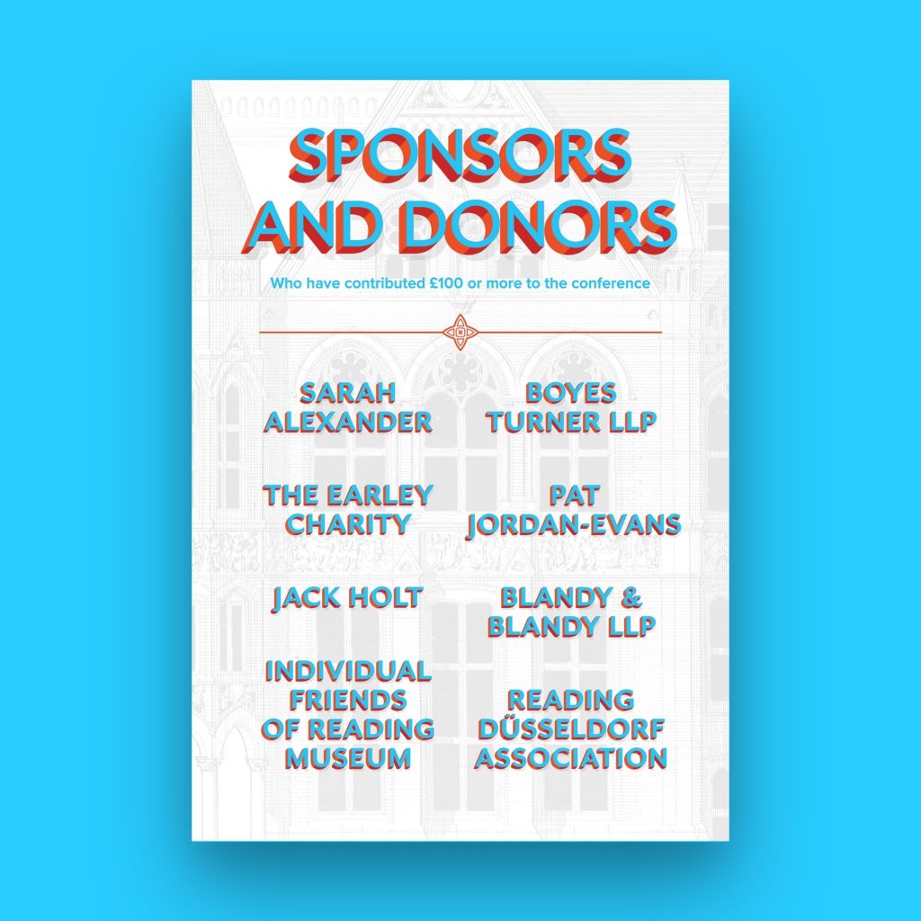
The final design
The final design, shown below (fig 7), was really a combination of the two design concepts. Evelyn loved the use of the background image of Reading museum. Although, I reduced the opacity of the image so it would argue less with the foreground and sit further back. The subtitle was set to lowercase and the list of names were capitalised. These people had donated a lot of money to the conference and it felt fair for their name to act as a title. I experimented with the names being flat colour however, this left the piece feeling like it was missing something so I applied the same effect as the title.

In a feedback session with James Lloyd, he said he liked the idea of adding some ornament seen in design two (fig 6). He suggested I looked into the background image to see if there were any shapes I could extract for this purpose. After not finding anything usable I remembered in a conversation I had with the client she had mentioned her love for the old museum logo. I recreated the shape in Adobe Illustrator and made it into a rule that is very simple but holds the final piece together very well. Martin Andrews, who worked a lot with Reading museum explained how the old logo was inspired by a tile within the museum. I believe this is why the rule feels very in keeping with the style of the background image.
Other than this I enlarged the image to fill in the white space and also enhanced the colour of the text to make them pop more so it would have that attention-grabbing effect on people.
Reflection
This was my first real job so there was a lot to learn. During this project my biggest mistake that meant I could have used my time better, was that I should have worked more closely to what the client had told me. After the meeting where I presented the style scapes to Evelyn, she told me she wanted a design that used the background image and bright colours. However, in an attempt to provide more options and get a better understanding of what the client liked for our next meeting I created 3 design concepts that were noticeably different from one another. Figure 6, although it is a quite nicely designed piece and it did give us a lot to talk about, it wasn’t what the client had been hoping for. Next real job I will make sure I am always designing to meet the clients needs. Overall it was a great experience and the biggest lesson I learned was how to better interact with clients in a professional way. In particular how to navigate a client meeting and how to best prepare for the topics you will talk about and questions they may ask.
Conclusion
The final piece was printed at A1, mounted on card and sat on an easel at the conference. It was met with a great response from the client – “I am very impressed with the final results; it looks really stunning”. The client wanted a piece that was prestigious and elegant in style, one that was lighter, more engaging and modern in comparison to the old Dispensary Centenary Fund Donations Board (fig 1). The final design achieves these objectives we set in the finding out stage. When handing over the work to Evelyn she replied – “Thank you very much for the final design it looks lovely and certainly fits the brief. I am looking forward to the others reactions when they see it!”