Helping to improve student understanding of electronic marks
Background
The Electronic Management of Assessment Programme at the University (EMA) required an infographic in order to inform students of the ‘journey of the mark’. This was to target students and ensure that they had a good understanding of how their marks were handled electronically, and how consistency and transparency is maintained. The client initially proposed that the graphic would be used on the Carrington Screen, on webpages, and as a poster.
Defining the scope of the project
Once I had met with the client, my understanding of the job enlarged and clarified as I was provided with a draft of the copy in order to begin working with. I restated the brief in order to agree the specifics of the project with the client. The client emphasised how the graphic should ensure that students understand what happens to their marks after submission, and the difference between marks on Blackboard and RISIS. This followed feedback of student confusion over when marks are changed.
The client wanted my input in developing the copy, in order to make sure that it made sense from a student perspective, and I was happy to do so. We defined 4 deliverables for the project, but each would broadly contain the same information as part of the same campaign, therefore the same visual identity would be sustained throughout. The deliverables included:
A digital infographic for use in electronic handbooks, web pages, Powerpoint, etc.
A poster for display in student support centres
A postcard to share at student events
A design to display on the Carrington screen
Initial research and communications
I took on board the concerns raised by the client about the lack of student knowledge related to electronic marks. From this I composed a short questionnaire with relevant questions, which I then send out to students. I gained several responses, giving me a reasonable insight into the levels of knowledge that students had. Answers were conflicting and students were uncertain on whether they had a good understanding of their marks, and not at all knowledgable on the difference between marks on Blackboard and RISIS, and who to contact regarding their marks. Confirming this was beneficial as it gave me focus for what to content to propose to additionally include or emphasise in the deliverables.
Design process
Digital infographic
I began designing the digital infographic with the preliminary copy I had received from the client. We considered this to be the best starting point, as once it was complete, the same design principles could be applied to the remaining deliverables without addition of content. The client provided the copy in a tabular format, so I first did some sketches to explore alternative possibilities for layout which might be feasible. Due to the nature of the preliminary copy, it was challenging to break it up in an effective way on the format the client requested (landscape). Despite format, I feel that this was more the fault of the imbalance of the ‘sections’ within the copy: compare ‘Blackboard’ and ‘RISIS’.
Initial sketches exploring layoutOne of my initial layouts with the first iteration of preliminary copy
The feedback on my initial developments resulted in unexpected but positive change. The client was grateful for my work with the layout, and it made them realise that the underlying structure that they had set out wasn’t really working, and as such they made drastic changes to the copy. They also obtained feedback from stakeholders on their end. Ideally the copy I had started out with would have been final, and I made this clear to the client, however it was apparent that everyone who looked at it had a different idea of how it might be structured. ‘Designing’ it in this case I believe aided in its development and improved its ease of digestion.
‘Seeing the versions you produced has helped us realise some of the additional elements that may be required and helped us to see which parts are a priority.’ – Siobhan Crathern, EMA Programme
Refined layout with 2nd iteration of the copy
The copy then went through 2 more substantial changes each not initially expected by the client. Each section of copy became more evenly spread and weighted which made for better reading experience. This also made it easier to design and lay out. I utilised a border around the ‘Help’ section as I considered this to be a fundamental part of information, stemming from my research questionnaire, as well as being separate to the remainder of the information.
Poster
For the poster, we quickly came to the conclusion that an enlarged version of the digital infographic would suffice with a small visual tweak to the title to help add impact and attract the eye. In the end the client decided that they thought they wouldn’t really make use of a poster, so the design didn’t go ahead, however this did not cause me to lose significant time or effort. I was pleased with the result and believe it would be successful in its intended environment (student support centres).
Poster design concept
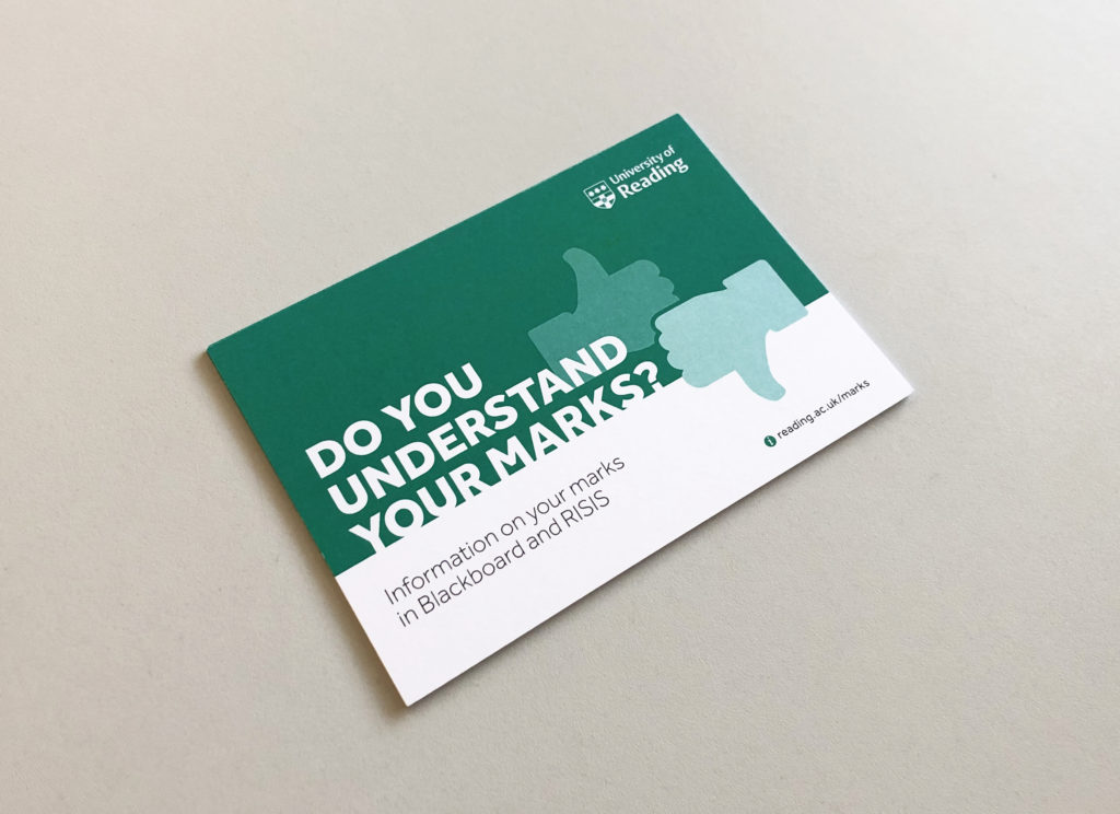
Postcard
Designing the postcard began to shape more of a visual identity for the project. As a postcard has 2 sides, the client initially thought that the copy, although extensive, could be fitted over both sides. However, this is not the norm for a postcard, and I made it evident in discussion that this would not enable it to have a clear impact or intention at a glance, which may result in less people paying attention to it or picking it up. Having 1 side to introduce the topic and create visual impact therefore became the plan, leaving 1 side on which all the information could be kept bundled together.
First draft of the postcard
Some of the icons which I developed
Throughout the design process I asked the client if it was possible to cut down the copy since it wouldn’t all fit on the postcard at a comfortable size. While designing I also took the opportunity to experiment with altering it myself, and I then presented this to them. In the end they considered it would best if none of the information was cut out so that it remained as informative as the digital infographic; this was important to them. The decision did leave the type size small, but fortunately the target audience is of a young age and so visual deficiencies are not of the greatest concern.
I attempted to add some icons to the postcard in order to aid with the digestion of information after my supervisor highlighted that the text was very linear in its initial form. The challenge was finding icons which accurately enough represented the topics or headings. Blackboard and RISIS are not well suited to icons considering they have no strong visual image or logo associated with them. They also share great similarities: they are both online, for students, and for viewing marks. This lead me to conclude that it wasn’t worth using icons for a lot of the text as it may only confuse a reader. The icons that I did implement were deemed a little small by the client, restricted by the scale of the information on such a small format.
The reverse of the finished postcard
Carrington screen
The design for the Carrington screen was worked on towards the latter half of the project. The client was uncertain as to whether all of the information should be used on the screen or not. If it were all to be used and all on 1 screen, it would be too small and likely not be paid attention to by people walking past. I took the initiative to experiment with splitting the copy across multiple screens in order to account for this. I also proposed, in line with the client’s other path of thinking, that the design just be 1 simply visual screen which points towards further information.
Initial experiment with multiple screens of copyExperiment with a photographic approach
Along with the client I met the manager of the Carrington screen. We made the decision to go with the visual solution as it was more appropriate to the nature of the screen. People are not likely to stop to read a lot of text on the screen, and there it might be frustrating to wait for it to change slides. The design took the same approach as the postcard, but at this stage the postcard had no ‘visual’ element, just the title set in a large size. As the screen design was the first element of the project that particularly needed to grab attention, I sought to find a way to make this happen.
The ideation for this was tough, as the topic is not particularly visual. Marks can be visually represented by things such as handwritten ticks and crosses, or with rubrics. The place to put something like this was within the large and prominent green area of the graphic. I considered these typical ‘mark’ related visuals to be too ‘obvious’, and they don’t exactly relate to the idea that the marks of relevance are electronic. I tried a selection of photographs sourced from the University Imagebank, but these were fairly boring – students with laptops – and barely connected to the topic. The range of photography was limiting and the relevance was not imminent.
I came up with the idea of using two thumb icons at large scale to represent the 2 answers to the question that is proposed. By having the downwards thumb more prominent, this reflects that the viewers (students) are likely unsure of the answer to the question, as shown by my research. This also then points towards the link which they should follow for more information. I am pleased with this as it is a somewhat engaging solution for what is a somewhat mundane topic, definitely more than text alone. I also ended up utilising this on the postcard to retain the identity of the campaign.
Finished screen graphic
Approval of design work
Once the client was happy with all of the designs collectively, I obtained official sign-off from my supervisor and the client. The client was very pleased with outcome of the project and my attention to detail throughout. I also produced a few alternate versions of the deliverables for a variety of reasons. At the last minute the client asked if I could alter the ‘help’ section on the postcard so that it would apply to Malaysian students, so I produced a Malaysian version of the postcard and supplied this to the client print-ready. I also provided a secondary version of the digital infographic to account for Powerpoint presentations. I split up the information onto separate slides to allow for greater type size and therefore a better reading experience (for example, from the back of a lecture theatre) after both my own consideration and feedback from my supervisor.
Finished digital infographicFinished postcardMockup of the finished Carrington screen graphic
Reflection
In summary, I am pleased with the outcomes of the project. Although the design process was slightly hindered my the client’s decision to restructure the copy, the outcomes have benefitted from it. I feel that I managed to sustain a good work ethic throughout, both over Summer and in term time, and strived to remain in regular contact with both my supervisor and client at all times. This aided me with gaining feedback and ensuring that the project remained organised and on track. The deliverables retain a consistent visual aesthetic, and comply with the University brand guidelines. If possible I might have benefitted from trying to push the boundaries of the guidelines more, yet my designs remain visually impactful, logically structured, and therefore easily digestible, dependant on the nature of the deliverable and whether it is to be seen at distance or up close.
‘Thank you so much for all your hard work. You have done an absolutely brilliant job and been so patient with the constant changes.’ – Jo Mortimer, EMA Programme