Background
Students on this course often struggle to manage their time in the most effective way so that they can excel in each module. On this course there is a mixture of design and written work, readings, and Real Jobs, all of which can be hard to balance especially come deadlines. As well as this, it is important to balance this with other aspects of university life such as societies and nightlife, as well as other things such as part-time work and commuting.
Restated brief
Main points of focus
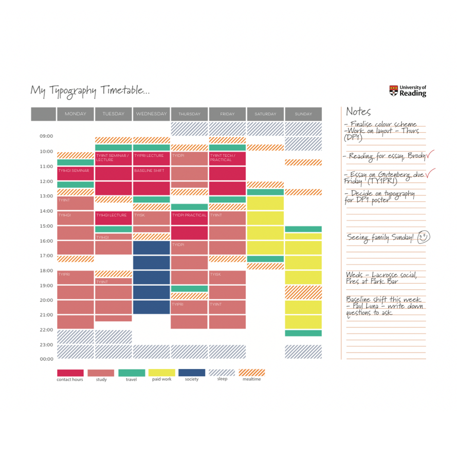
Our aim for this project was to create a set of timetables which aids students in their time management and organisation through the course, in a fun and engaging way, but still giving across the serious and useful message. I think that we were successful in achieving this as the timetable highlights to students how best to use their time and therefore helping them with their time management. By us using the bright colours and note typefaces I think that we have made something that tends to be somewhat boring more visually engaging.
Deliverables
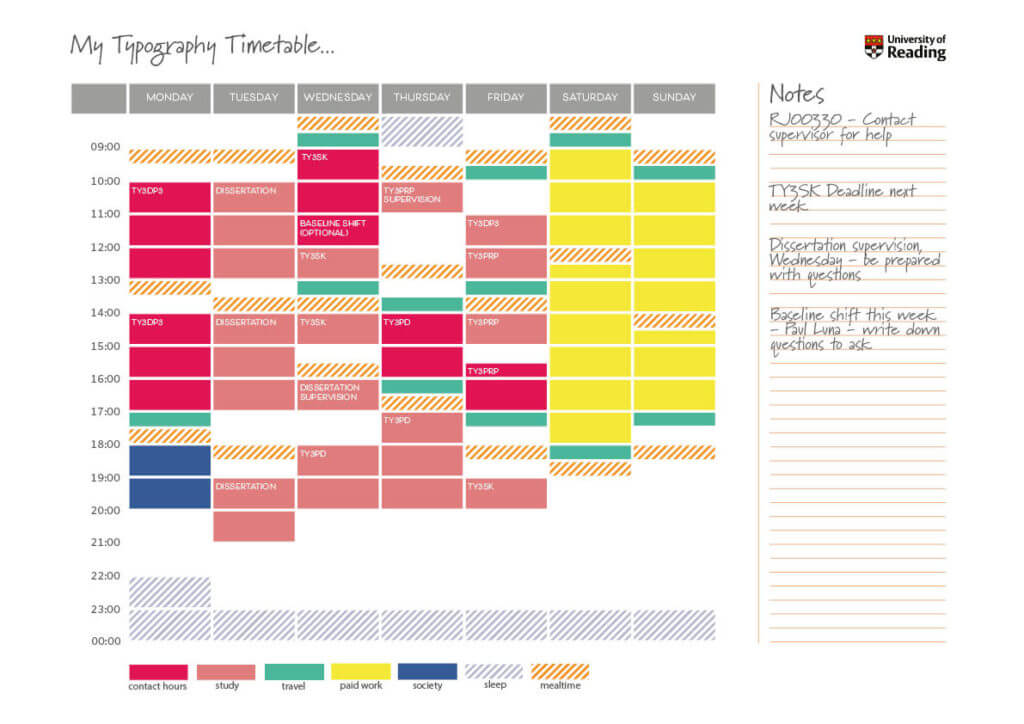
The deliverable for this project was a series of timetables for Part 1, 2 and 3 students that suggest how to fill their time outside of class with independent study to best benefit them on this course while still allowing them to do other activities such as sport societies, going out, part-time work and more.
In our restated brief that we completed at the start of the project, our list of potential deliverables also had listed a webpage with tick boxes to generate a more personalised timetable and a personalised app. These things were very ambitious, and while we would have loved to have been able to make them more interactive and personal, we were aware that we would’ve needed help from the university to generate the app, but also mainly our client decided that it was a better idea to see if people find the timetables useful before making more variations. If there is a good reaction to them then making a webpage to make them personal or an app with the university would be the next step after this project as we could not do that ourselves.
Schedule
Unfortunately, the original deadline was not met. Ironically, seeing as the purpose of our project is to help students with time management, we struggled to keep on top of our personal deadlines, especially come summer term when we had a big project due in, as well as the project being difficult in areas to perfect at first. This was disappointing for myself, however the client was not worried and was very relaxed as to when the next deadline was to be, so we chose to set ourselves one once we were back from summer and this we stuck to. It was a challenge trying to continue this work over summer without seeing each other or our supervisor/client due to everyone being busy at different times. However, I think due to circumstance we made good progress and this allowed us to not let the project stretch out too much longer once we were back. With this being my first real job I think that it is a big learning curve in how to handle these extra deadlines alongside our module work and I think it has definitely improved my time management this year – maybe I should even follow the timetables we made myself!
Process
Initial contact with client
Our project was a bit unique in the sense that our client was also our supervisor, and therefore was a lecturer in the department. This meant that when we set up client meetings we could also talk to him as a supervisor too, however it was important to specify if we were talking to him as a client or supervisor, which was very useful in getting quick feedback on our work.
Throughout the project we had relatively good client and supervisor communication, although we could’ve made it a bit more consistent and maybe add a set day each fortnight to meet which could’ve helped us stay on top of personal deadlines and get it done a bit sooner. Over summer of course it was harder, however the meeting were always very helpful. We exchanged a lot of emails with the client/supervisor though which was useful.
Research
Our users are undergraduate students in each year of the BA Graphic Communication programme which is the same demographics as ourselves so we should be able to have more of an insight into what this timetable needs to include. Our Trello board also shows possible user personas that would benefit from these timetables, with them talking about other commitment they have and different commuting situations and how it is possible and suggestions to balance their time is possible. With the target group being ourselves and our peers, we had easy access to peer reviews and feedback. I think that we didn’t reflect the benefits of this enough on our Trello board. We recorded the two main occasions where we got feedback from our peers, however we were able to get casual comments from those around us and each other while working in department.
Trello board
I now have a better understanding of how Trello works and I can now use it more effectively. However, I think during this project I was successful at uploading development of our work through different stages and explaining why we had decided to do things a certain way.
Design stage
Initial ideas from meeting with client were around what the purpose fo the timetables were and how he wanted them to look. He said that they should be made to look how we’d like to read them, so making them colourful and engaging was important. University timetables can be very generic and boring and therefore, although having to include university branding, it was to be kept minimal as the client felt that if it looked too official students may engage less. Overall, he said that it was being designed by students for students, so to design it in a way that us, the designers and students, think is effective. We decided the use of colour coding and some sort of more personal, notes handwriting would be good touches. Similarly, initially our client was interested in having something like geometric shapes feature on the timetable. we played around with these however it looked too busy and a bit sound for the audience.
The next important stage was gathering the timetables for a part 1, 2 and 3 student to base them off. From this we then mocked up some basic timetables with class time filled out to show the time free around this. A tricky and vital part of this project was them working out independent study time, how much for each module and where to put it on the timetable. We had assistance from our supervisor on this, getting ideas on the hours that should be spent on what. As a client too he could confirm this as we went and make amendments where necessary when it came to different years. It was relatively left up to us to allocate time for other things such as societies or paid work as we have close understanding of what students get up to in their spare time. We are aware that not all people will spend their time as we have suggested but it is there to highlight one possibility of what you can do with your time and to show you can fit things around your studies. Throughout this project and our feedback we changed details with timings, for example, the length given for breakfast, after meetings or emails with our client, as well as talking to our peers and getting their feedback. This task, albeit daunting, was useful!
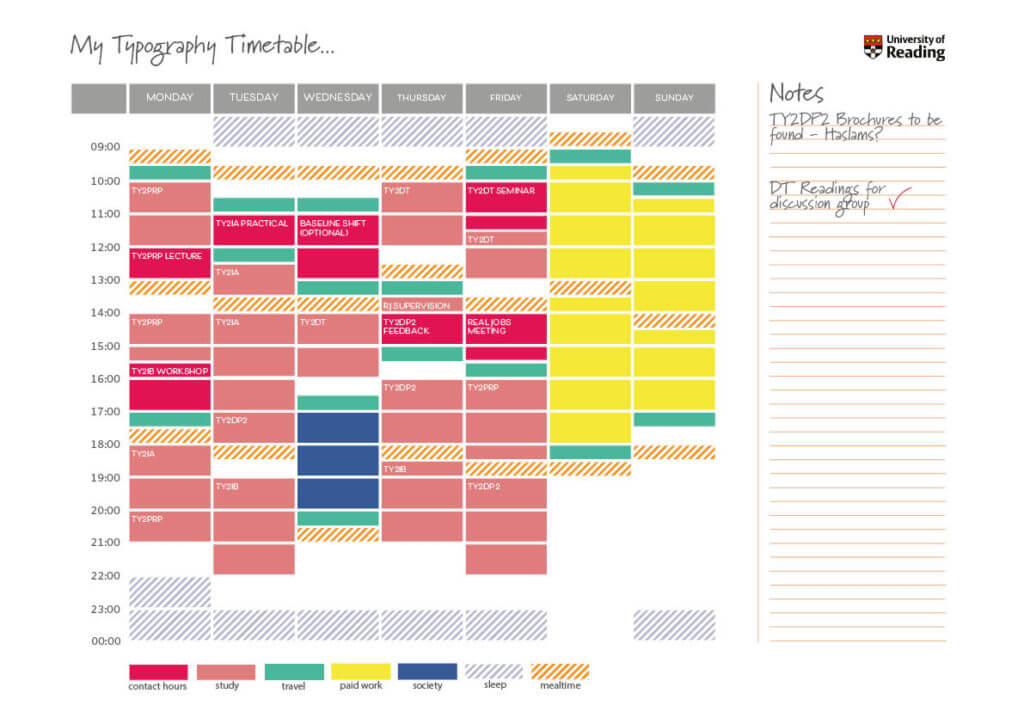
The organisation of the page was decided and signed off on quite early, we tested a few layouts but found the notes on the right was most effective. Details with this changed as it developed due to table sizing and type size. The organisation and placement of the key was something we were stuck on for a while, but we decided to keep it simple and clear by having it straight across the bottom. The typefaces used for the table is Poytner Gothic Text as it is simple and clear, especially compared to Marydale which is used for the title and notes, which I think adds a fun feel to the timetable.
Another key part to the design process was choosing the correct colours, in their shade, brightness and the way they correlated with each other and what they were coded as. For example, contact hours and independent study in the end were made to be similar colours to show their connection, with something like society being in dark blue to show they’re not related and to avoid at-a-glance confusion. We had to play around more with how to fill the more mundane parts of meal time and sleeping as this has no need to steal focus. We started by simply making them more pale, however there were too many colours on the page and the important events of the week such as lectures and study weren’t differentiated enough. Our supervisor suggested trying greys. this was a step in the right direction I think as it looked more professional and not so in your face. However, our client asked us to try to find an alternative for solid colour fills for the cells. At first we were unsure, however we settled on stripes as they were subtle but help to distinguish optional things from compulsory/university stuff.
Feedback that we frequently received throughout this project was often about the consistency of spacing on the tables. Therefore, in the final stages we had to sort this out by making a lot of small, fiddly changes to the InDesign file. The main change we had to make was remaking the tables, which initial seemed like a lot of work, but I was taught the align tool which made it speedy and accurate. Other amendments were things such as the spacing and alignment of the different elements so that they were consistent across all three timetables.
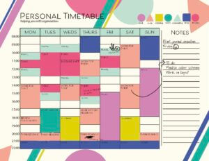
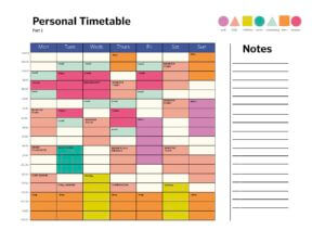
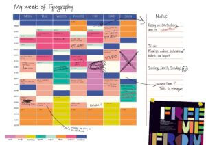
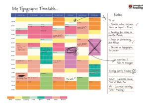
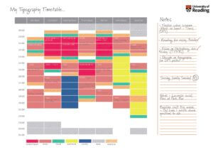
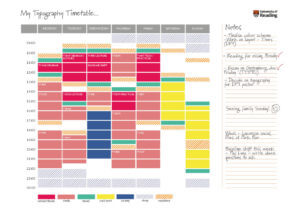
Below are examples of our timetables at the different stages and showing the different things that we tried out before we got our final design. I think that you can see form these images how it looks less busy but still eye-catching and exciting by the end.


Final designs

Feedback
The timetable are yet to be put out and therefore we haven’t had any official feedback from that as of yet. However, the client was happy when signing off the designs as the aims of the timetables had been met. In terms of feedback from our peers, when we showed the signed off designs in a real jobs meeting there was positive feedback from them and James, highlighting the engaging colours used and the fun space for notes.
Reflection
This was my first real job I took on and have completed so far. I feel that I have learnt many valuable things during this job as I had to learnt to juggle the tasks from this project alongside my other module work, which goes hand-in-hand with the context of this project as it was showing us and our peers how to use our time properly while studying this course. It has benefitted me to hear and see it in a visual way, how I should be spending my time to benefit most on this course. The timings for this project were a downfall unfortunately, however the client was still happy with the final deadline and the designs, and it is a good experience and learning curve in how to better deal with deadlines. Another key thing that I have learnt is how to organise and name my files so that I keep them organised more efficiently. This will be a key skill that I carry through the rest of my time at university and have already found myself benefitting from, as well as into my professional career.
In terms of the final result of the timetables, I am pleased as I think that we met the aims form our brief and the client, as well as benefitting me and my peers in opening our eyes as to how we should be approaching our time and studies. I think that the colours we used really catch your eye and make it clear and easy to read. The note-like writing on the timetable I think adds a more personal feel to it, which was something the client was looking for. I enjoyed working on this project with my peers and client/supervisor, in making something rather plain look interesting and fun.

