

Background and briefing
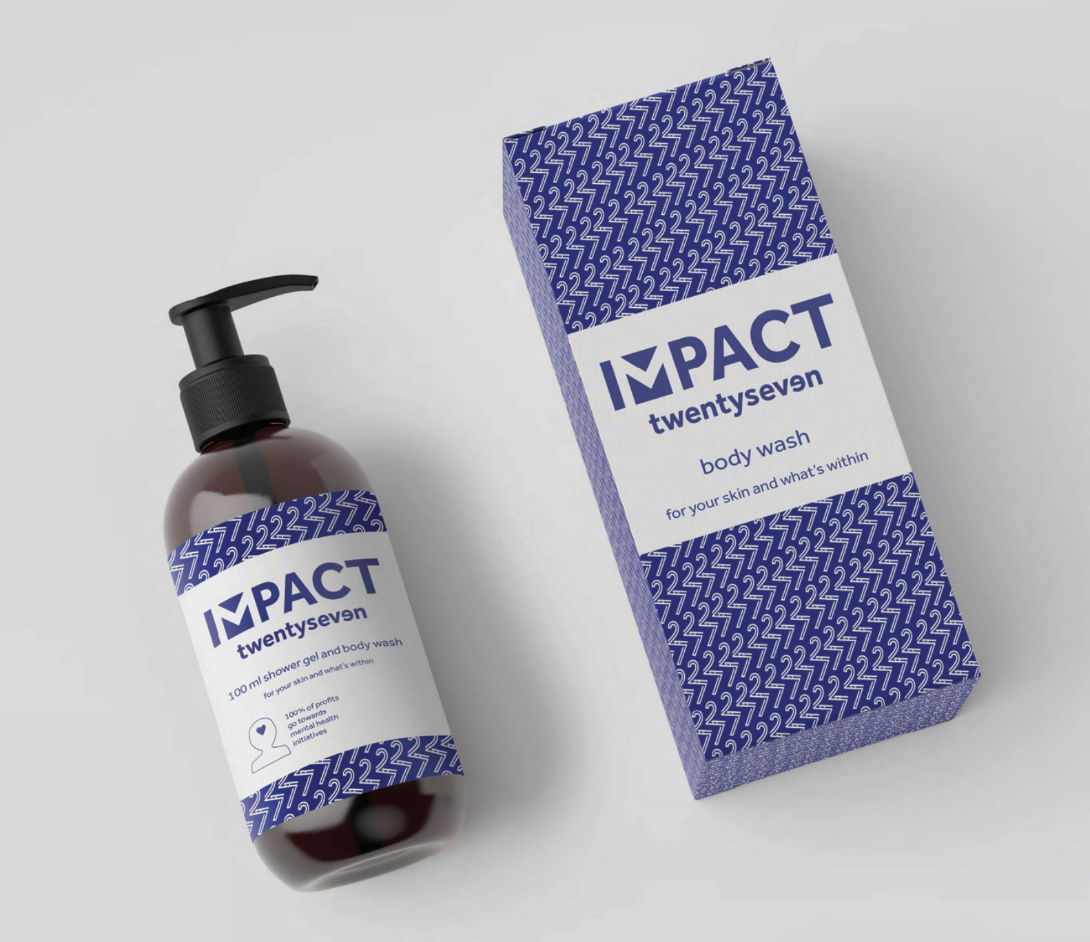
Impact TwentySeven is a new charity start-up which is looking to harness the huge market potential of the beauty industry. The aim of the charity is to raise funds for mental health initiatives. The money will be generated through the sale of self-care products. 100% of the profits from the sales will either go back into the business to grow its market hold or it will be donated to mental health charities and projects.
For this project I worked as part of a 3 person team. The brief we received was to design a logo and brand that had enough impact to grab attention in the beauty industry but also represented the charitable aspects, mental health awareness and the fact that not everyone is perfect. We then had to design the packaging for the first product which is a body wash.
Initial steps
After being appointed to the job and having an initial meeting with the client we worked as a team to create a restated brief for this project. We gathered some specific points from our client about the brand she wanted:
- 100% of the profits are donated to mental health programmes.
- Inclusivity, imperfections are what make us better.
- Inspiring and motivating.
- 27 different emotions with a focus on mental health blue.
From gathering these points we then checked what the deliverables of the project are and created a schedule for the project. After some feedback from our supervisor and a few amendments we sent the client our restated brief.
We started with some research into the existing leaders of the cosmetic market such as Nivea, Dove, and many more. From this we gained an idea of the trends and we created some mood boards to gain an insight into what our client was really looking for in her new brand.
After this initial research we started on the design of the logo; we all sketched several ideas. We presented these to each other and chose a selection of them to develop. We presented these developed logos to the client over Skype. Using Skype allowed us to interact and communicate with our client in a more personal way than over emails and allowed us to have real time feedback on our work.


We developed the main logos that the client was interested in and chose to work more with the blue colours and skin tones that our client thought represented her brand vision the best.
A bump in the road
After working on the logo as a team and developing it into a near finished version we faced some bad news. We were emailed by our client saying that she no longer needed us for her project. Our client had won an award as a start-up company which included the free use of a professional design agency. This was a great opportunity for her new start up but meant that we were left without a client. Here we faced the difficult decision of whether to stop here and lose all the effort and time we had invested or to carry on with the project without a client making it a self-led project. We all decided that we couldn’t let our time go to waste and we carried on with the project.
We then met with our supervisor to get some advice of where to go from this situation and we decided that we would produce digital mock ups for the packaging which used our branding instead of the physical packaging which would have been produced for our client.
Packaging design
Once we had decided on the logo we edited and improved the previously supplied copy from our client. Using the edited copy and our branding which included the logo, colour schemes and patterns we started the design of the packaging.

We initially all produced some different designs but as we developed them we decided that it would be better if one of us designed each section of the packaging whilst working within the branding we had created. We started with the front and one of us designed this section using our brand style. I then replicated this style on the back of the packaging and used typographic variation to create a structure for the text-heavy back of the packaging. We worked on an icon for the bottle to show the fact that it is a charity and that all money raised goes to charitable causes. One of us designed the icons and myself, our other group member and some other peers gave feedback until we came to a good outcome for the charity icon.

We then did a test print of the digital mock-ups to check the size and legibility of all the type and information by printing our design at the correct scale. After a few minor adjustments from feedback in a real jobs meeting and a meeting with our supervisor (such as having the logo in blue instead of the black which it was originally and some type size issues on the back) we came to our mock-up outcome for this project.

Summary
Overall I think this project was a success. Even though we did lose our client due to an unexpected and uncontrollable circumstance, we did produce a design that was effective and taught us the importance of being self-critical in a team. From this project I learnt how you can seek lots of useful feedback from other places than just the main client. Some of these areas are meeting with peers and tutors, working in areas around your peers so they can look and suggest ideas and regular meetings with the supervisor of the project.
In the future when I am working on design projects I will seek as much feedback and thoughts from those around me and from any meetings in which I attend. I will also work more critically in a team and will be more comfortable in giving and receiving critical feedback to and from my peers.