Category: publications

User-friendly point-of-use instructions for home use diagnostic tests: guidance and tools

Sue Walker and Josefina Bravo have produced guidance in the form of a toolkit and a dataset for the design of instructions to support home and community diagnostic testing. This derived from the AHRC-funded Covid Rapid Response project ‘Information Design for Diagnostics: Ensuring Confidence and Accuracy for Home Sampling and Home Testing’. The work was also support by funding from the University of Reading’s Rapid Response Policy Engagement funding from Research England, which enabled consultation with research users and implementors of the toolkit.
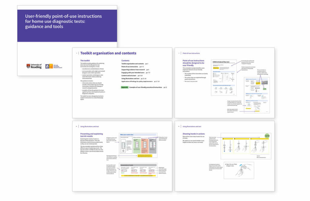
The toolkit, organised in 5 sections provides guidance on writing, visual organisation and how to engage with your users.

User-friendly point-of-use instructions for home use diagnostic tests provides evidence-based guidance and tools for manufacturers of tests, service providers and content and design specialists who produce instructions to accompany diagnostic tests for home and community use.

The toolkit, organised in 5 sections provides guidance on writing, visual organisation and how to engage with your users. A related data set includes templates and illustrations for download and use.
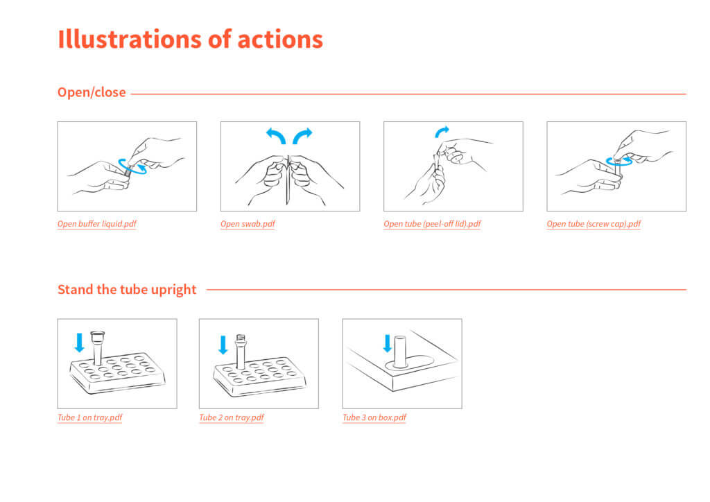
The resource includes templates and illustrations for download and use

An open-access account of the project is in Information Design Journal doi: https://doi.org/10.1075/idj.22011.wal

Chinese publishing collaboration proceeds

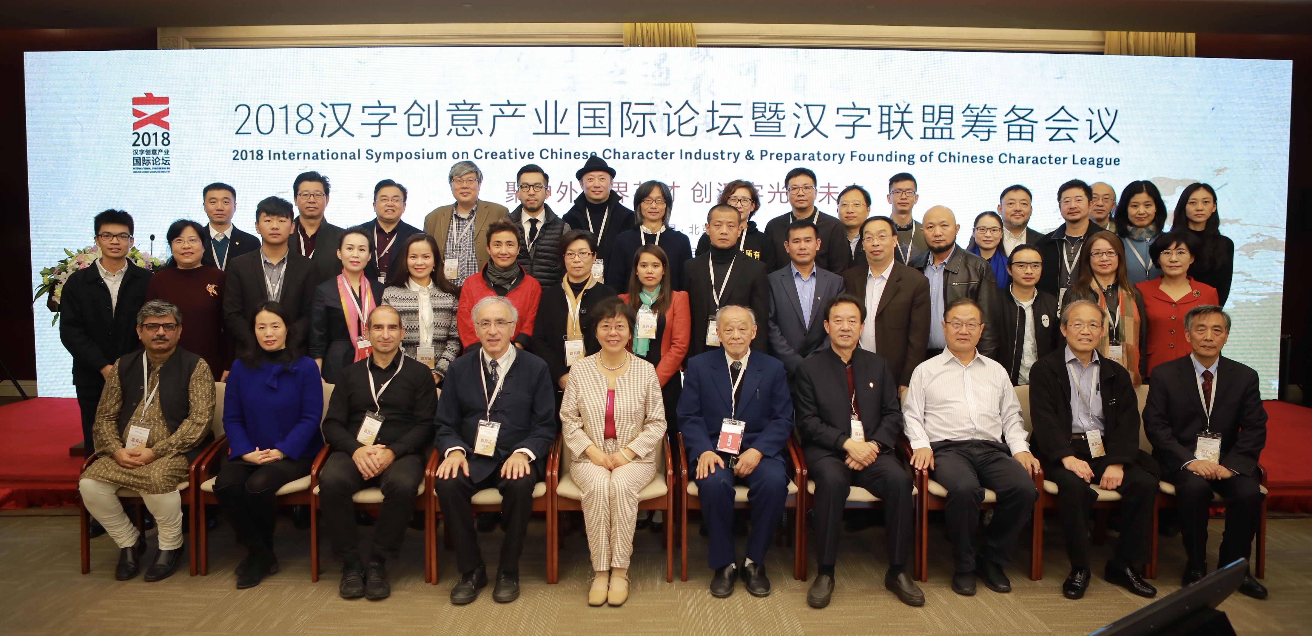
Group photo of the speakers and organisers of the Creative Chinese Character Industry Symposium

The inaugural symposium of the Creative Chinese Character Industry took place at the Beijing Convention Center on 3 and 4 November. The symposium brought together speakers from different areas of research and professional practice relating to the Chinese script: linguistics, Sinology, typeface design, publishing, and calligraphy. The symposium concluded with the preparatory work for the founding of the Chinese Character League, an interdisciplinary body bringing together organisations and agencies, including the Chinese Character Museum in Anyang.

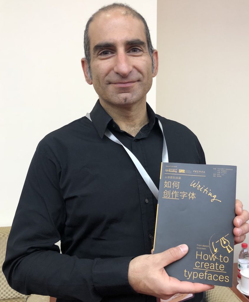
In addition to speaking at the Symposium and being invited to act as guide for the CCL, Gerry Leonidas had the opportunity to update plans for a project, supported by the University of Reading and ATypI, of publishing key typography texts in Chinese. The first title in the series, Jan Middendorp’s Shaping Text, is nearly out of print already; below, Gerry holds the proof edition of the second title, How to create typefaces by Cristobal Henestrosa, Laura Meseguer, and José Scaglione. The series extends to twelve titles, with a schedule of publishing two titles per year.

Gerry Leonidas holds the proof copy of How to create typefaces

Reading in Eye’s typography issue

Eye magazine cover

The latest issue of Eye magazine, the international review of graphic design, is dedicated to typography and typeface design. The Department is very well represented in the issue: it includes an extensive profile of Fred Smeijers, long-time collaborator of Eric Kindel on research in stencil letterforms, and past External Examiner for the MA Typeface Design programme. Our graduate Paul Barnes wrote a tribute to James Mosley’s contributions to scholarship in typography, and Gerry Leonidas led Beyond Latin, a panel article on typeface design for global scripts featuring John HudsonNeelakash KshetrimayumKamal Mansour, and Pascal Zoghbi.

Yearbook of Type

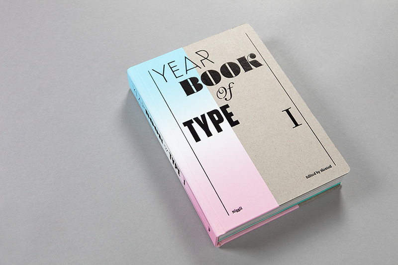
Yearbook of Type 1

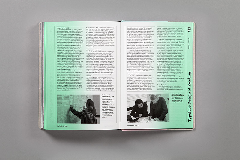
Edited by the same team that publish the Slanted magazine, this substantial reference volume for new typefaces has just been published by Niggli. The  volume presents typefaces in generous specimens, and includes a number of essays on typeface design. Amongst them, a detailed presentation of the MA Typeface Design programme. The impressively produced volume is available from Slanted’s shop.

Slanted_YearbookofType1_30


Monotype Recorder online

Monotype Recorder online

Monotype’s lauded Pencil to Pixel exhibition (in Wapping last November, and New York earlier this month) included a relaunched Monotype Recorder, after a hiatus of fifteen years (the previous issue had been published to mark the Centenary of the company, on the occasion of the 1997 ATypI conference, in Reading). The new issue celebrates Robin Nicholas’ long career and contribution to the company, as well as to typeface design in general. A few days ago Monotype posted the bulk of the issue as an online magazine, including Robin’s interview to Eye magazine, and Gerry’s comment on Robin’s work.

Non-Latin scripts: from metal to digital type

Available from the St Bride shop, Non-Latin scripts: from metal to digital type reproduces previously unpublished items for the Department’s Non-Latin Type Collection. Collection curator Fiona Rosscontributes a major essay on the type design process for non-Latin scripts and describes the exhibits, Graham Shaw discusses the relationship between these scripts and print technology, and John D. Berry’s afterword discusses the need for global resources in typography. An introduction by Paul Luna draws attention to the research possibilities of the Reading collection.


The publication records the ground-breaking exhibition this autumn at ATypI Hong Kong, hosted at the Hong Kong Polytechnic University Library, which displayed over 150 items from the collection, many of which are illustrated in the book. Exhibition co-curators Ross and Vaibhav Singh selected documents and artefacts to tell the story of type production across technologies in Amharic, Arabic, Bengali, Burmese, Devanagari, Gurmukhi, Kannada, Malayalam, Oriya, Sinhala, Tamil, Telugu, and Thai. A supporting display of newspapers in these scripts showed many of the fonts in use.

The 3-week long exhibition was launched by a keynote presentation by Paul Luna, who discussed the research possibilities of the Reading collection and laid stress on the need for the more immaterial evidence of contemporary font production to be preserved in the same way as physical evidence from the past, the survival of which helps us understand the processes involved and provides an evidence base for current font design. With an audience drawn from China and the East Asia region, India, Europe and the Americas, this was global exposure for one of Reading’s key research collections, with appreciation being expressed both at the conference and subsequently on social media.

For more images from the book and the exhibition, follow this link.