Erasmus-supported Teaching Fellow, Sara Chapman and nine of our Part 3s spent Week 6 in Duale Hochschule Baden-Württemberg (DHBW) in the mediaeval town of Ravensburg, Germany.
Students from both Reading and Ravensburg were working on the same ‘New Blood’ briefs from the D&AD 2017 competition.
Everyone enjoyed a very creative, inspiring and positive week away, during which both students and teachers were able to share skills and approaches.
After an intensive week working together in the shared studio space — sometimes up to ten hours a day — each student made a short presentation to the group about their project.
Students from Reading found that the Ravensburg emphasis on idea generation and conceptual thinking generated some unusual responses. Solutions tended to include a wider variety of multi-media outputs such sculpture, installation, and film making, as well as graphics. In comparison, the Reading approach was more pragmatic and decisive; we have a tendency to identify problems quickly, and use quite tight processes to solve them.
Whilst the Department has enjoyed an individual student exchange relationship with Ravensburg for some years, this was a new development in that a greater number of students could experience a short time in Germany, that complimented their degree studies. We hope to invite German students on a return trip, and also to repeat the collaboration in Spring 2018.
We are grateful for the support from the Ernest Hoch fund for covering the students’ competition entry fees and IMAGINE for covering the students’ travel costs.
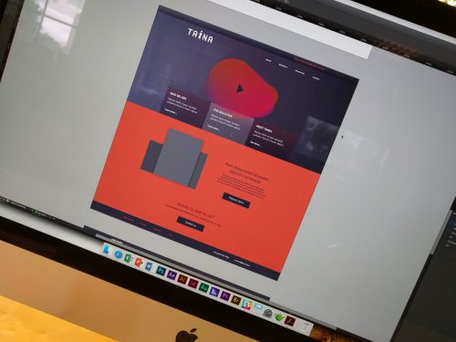
Typography students use simulation tools to appraise whether information in everyday contexts are presented in visually inclusive ways
Breaking down Barriers (BdB) – our multidisciplinary inclusive design project – has received a Highly Commended Award for Innovation in Education and Training in the 2016 Chartered Institute of Building (CIOB) International Innovation & Research Awards Scheme.
BdB champions a unique cross-disciplinary initiative to embed inclusive design across the University. Our BdB vision is to ensure Reading graduates across all disciplines advocate inclusion in their professional practices and bring real benefits to the everyday lives of all users, particularly people with conditions related to ageing and/or cognitive and physical disabilities. In Typography, we are engaging with inclusive design across a range of professional design contexts, including digital, packaging, print and wayfinding applications.
Typography students say that our BdB workshops have helped them “gain insight as to how thoughtful design can influence other industries and how we as designers must work together with these other industries in order to make the lives of the people that need a helping hand that little bit easier”.
CIOB Innovation and Research Awards highlight the importance of innovation and research in raising performance levels, enhancing best practice and improving the quality of the built environment. The CIOB judges said: “This innovation in education is a practical, engaging and demonstrable way to bring to life a real social challenge with widespread value and application. The innovation shows a genuine commitment to invest in the UK’s building stock and educate the next generation of professionals to ensure the needs of all users of a facility are firmly met.”
BdB began as an exciting collaboration between the School of Built Environment, the Henley Business School and the School of Arts and Communication Design in 2015. Since then we have been joined by staff within the School of Biological Sciences and collaborated with the Centre for Staff Development and, most recently, the School of Psychology and Clinical Language Sciences, as well as external partners.
Congratulations to Visiting Lecturer, Irmi Wachendorff who has been awarded a studentship from the German Academic Scholarship Foundation. Irmi’s doctoral research at the University of Duisburg-Essen explores social positioning through typographic variation in linguistic landscapes.
Irmi has joined the Department for the spring term as a visiting lecturer from Folkwang University of Arts. Drawing on her extensive professional experience working in Germany, Switzerland and Australia, she is primarily working with our Part 2 students on practical projects while she is in Reading. She is also leading a new theme in the Design Thinking module: “Graphic design theory: Reflecting practice”.
Staff exchanges play a key role in knowledge exchange and we are pleased to have Irmi with us to share her cross-disciplinary expertise and professional experience. Welcome to the Deparment, Irmi, and congratulations on your achievement!
Typography is very pleased to announce an exciting new Goodwill Partnership between the Centre for Ephemera Studies (one of our research centres) and the John Johnson Collection at the Bodleian Library (University of Oxford). Commenting on this new initiative, Julie Anne Lambert, Librarian of the John Johnson Collection said:
The John Johnson Collection is delighted to partner the Centre for Ephemera Studies at the University of Reading. Our joint aim is to further the academic and popular potential of ephemera to cast light on the everyday lives of our forebears through the documents they themselves saw and handled. We are particularly excited to work with the Department of Typography & Graphic Communication in exploring the materiality of ephemera in their (often innovative) design and printing.
The Partnership will include working together on exhibitions, symposia, funding applications, projects with postgraduate and undergraduate students, and sharing of expertise on cataloguing, conservation, and print identification and conservation. It will reinforce the potential of ephemera to engage academics from a wide range of disciplines as well as the public.
Professor Roberta Gilchrist, Research Dean for Heritage and Creativity at Reading supports the collaboration:
The University of Reading warmly welcomes the new partnership between the Centre for Ephemera Studies and the Bodleian Library, John Johnson Collection. The collaboration will highlight the rich potential of ephemera to illuminate the history of everyday life and to inspire new approaches to printing and design.
The examples below are from the Rickards Collection and the John Johnson Collection.
Loans from the Isotype Collection on display in the new Mathematics gallery at the Science Museum, London. From left: chart from the British Council Study Box on the National Health Service (‘Estimated cost and personnel, 1949–50’); Women and a new society (1946), opened to chart 9, ‘Literacy in England and Wales’; original exhibition chart, ‘Infant death rate and income’ (1933).
The Department has made a long-term loan of Isotype work to the Science Museum, London. The loans are featured in the museum’s new Mathematics gallery, designed by Zaha Hadid Architects, which opened to the public today (8 December). Following a visit to the Isotype Collection, Science Museum curator David Rooney chose examples of Isotype that convey simply and directly the underlying application of mathematics to the production of pictorial statistics. Captions written for the items note Marie Neurath’s early training as a mathematician.
Our experienced supervisors welcome applications in the history, theory and practice of design for reading. Here are some of our recent and current PhD topics
If you have any ideas do get in touch with Sue Walker for an informal chat, and to discuss funding opportunities.
Why not join us as an AHRC-funded Design Star student?
Our Graduate School at Reading is excellent, and provides a stimulating environment.
And the experience we provide in Typography is world leading, not least because much of our PhD work is supported by our outstanding collections and archives, and the research training we provide.
One of the digital projects Typography students Louise Lee and Sophie Rahier worked on during their placement at Design Portfolio. (image used with permission from Design Portfolio).
Part 3 students Louise Lee and Sophie Rahier completed an exciting placement at Design Portfolio’s Canary Wharf office during the summer vacation. Louise, Sophie and Anna Scully were the gold, silver and bronze winners of the 2016 Vince Ma Prize, which is awarded to the best performing students in Part 2, and includes a placement for gold and silver winners.
Louise and Sophie said the experience was “a real insight and great lesson on how projects are managed within a design agency”. They agreed it was an “enriching” experience for student designers.
During their placements, Louise and Sophie jobs undertook a range of design tasks, ranging from simple photo editing to website redesigns. The projects they worked on included branding, designing icons, and working with a range of material and deliverables. They also had an opportunity to apply their production knowledge since they were able to oversee a full design project being sent to print.
Louise and Sophie said: “The Design Portfolio team were very keen to have us involved, asking for our opinions as well as giving us the opportunity to attend client meetings. At these we presented our own work and had the chance to explain the rationale behind it. We were also given permission to share the work we were involved in and present them in our portfolios, as well as finishing off other briefs that we did not get to see through to the end.”
“Communicating with the rest of the Design Portfolio team (not just the designers) was highly important and added a new dimension to the design work. Whether it was with clients, marketing, or production, it was great to collaborate while still maintaining a certain freedom as designer, which is something that can’t easily be experienced through coursework.”
“Overall, working at Design Portfolio was invaluable experience, and taught us a lot. We’ve realised that even within a corporate design agency, the diversity in their jobs and clients provides an abundance of new and interesting challenges to a designer, which definitely builds versatility. Although we did not imagine a placement to be so enriching, we can now see why they are encouraged since the end of first year, and would in turn definitely recommend applying for one even if you are not 100% sure of what area of design you would like to pursue.”
They added: “It was also great to learn new life-saving keyboard shortcuts in which we cannot wait to share with our fellow coursemates!”
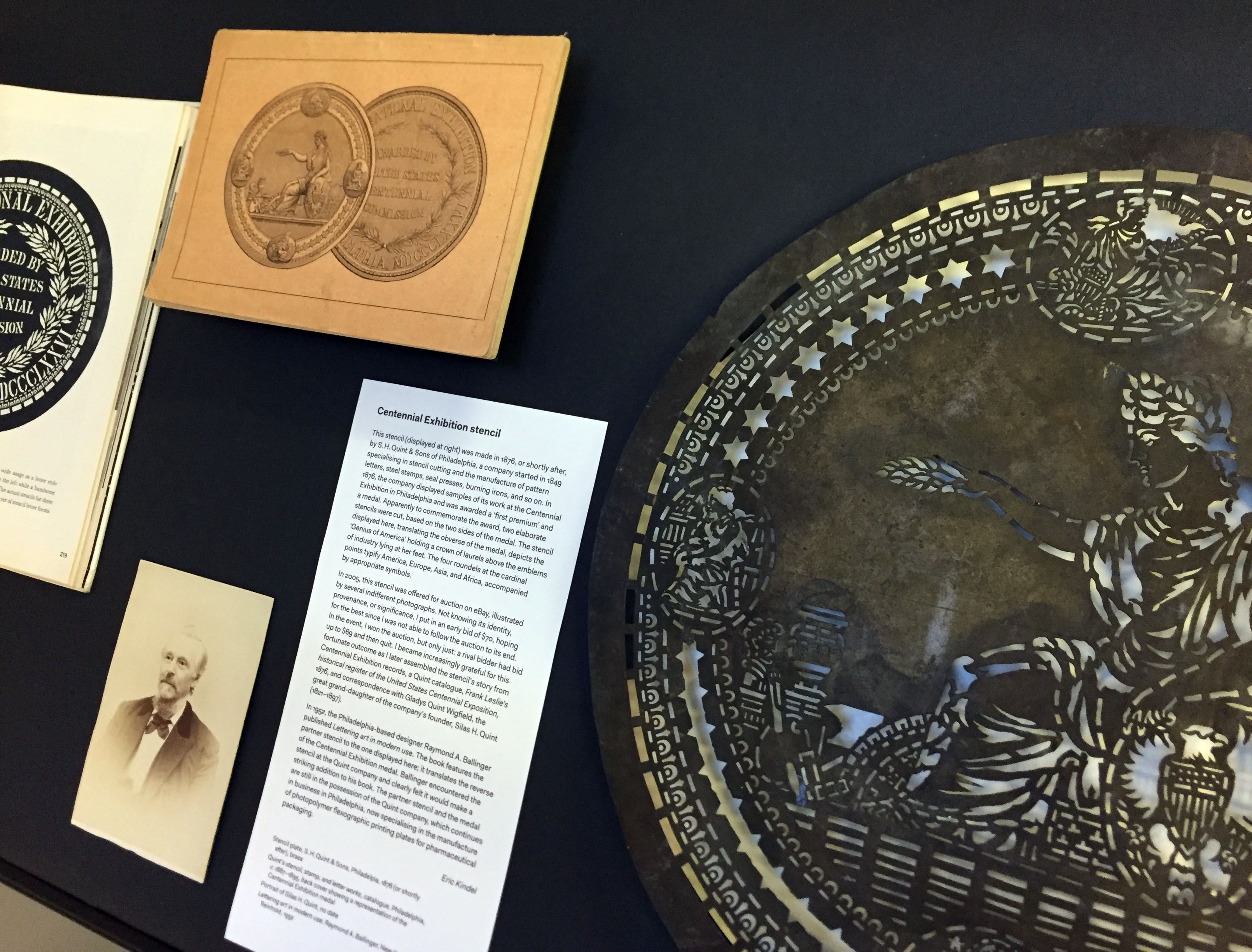
In the last in a series of posts about artefacts in the exhibition ‘Material histories’ (now on in the Department), Eric Kindel tells the story of a stencil cut to commemorate the 1876 Centennial Exhibition in Philadelphia.
Centennial Exhibition stencil (at right), alongside (from left) Lettering art in modern use (1952) by Raymond A. Ballinger; portrait of Silas H. Quint (no date); and back cover of the catalogue Quint’s stencil, stamp, and letter works (c. 1887–1895) showing a representation of the Centennial Exhibition medal.
Centennial Exhibition stencil
This stencil (shown above, at right) was made in 1876, or shortly after, by S. H. Quint & Sons of Philadelphia, a company started in 1849 specialising in stencil cutting and the manufacture of pattern letters, steel stamps, seal presses, burning irons, and so on. In 1876, the company displayed samples of its work at the Centennial Exhibition in Philadelphia and was awarded a ‘first premium’ and a medal. Apparently to commemorate the award, two elaborate stencils were cut, based on the two sides of the medal. The stencil displayed here, translating the obverse of the medal, depicts the ‘Genius of America’ holding a crown of laurels above the emblems of industry lying at her feet. The four roundels at the cardinal points typify America, Europe, Asia, and Africa, accompanied by appropriate symbols.
In 2005, this stencil was offered for auction on eBay, illustrated by several indifferent photographs. Not knowing its identity, provenance, or significance, I put in an early bid of $70, hoping for the best since I was not able to follow the auction to its end. In the event, I won the auction, but only just: a rival bidder had bid up to $69 and then quit. I became increasingly grateful for this fortunate outcome as I later assembled the stencil’s story from Centennial Exhibition records, a Quint catalogue, Frank Leslie’s historical register of the United States Centennial Exposition, 1876, and correspondence with Gladys Quint Wigfield, the great grand-daughter of the company’s founder, Silas H. Quint (1821–1897).
In 1952, the Philadelphia-based designer Raymond A. Ballinger published Lettering art in modern use. The book features the partner stencil to the one displayed here; it translates the reverse of the Centennial Exhibition medal. Ballinger encountered the stencil at the Quint company and clearly felt it would make a striking addition to his book. The partner stencil and the medal are still in the possession of the Quint company, which continues in business in Philadelphia, now specialising in the manufacture of photopolymer flexographic printing plates for pharmaceutical packaging.
On display
Stencil plate, S. H. Quint & Sons, Philadelpia, 1876 (or shortly after), brass Quint’s stencil, stamp, and letter works, catalogue, Philadelphia, c. 1887–1895, back cover showing a representation of the Centennial Exhibition medal
Portrait of Silas H. Quint, no date Lettering art in modern use, Raymond A. Ballinger, New York: Reinhold, 1952
‘Material histories’ presents graphic communication artefacts with a story to tell. The stories – the material histories – describe the artefacts in particular: what they are about, where they came from, their material qualities, their circumstances of production, how they were acquired, and crucially how they link to other artefacts, narratives and representations.
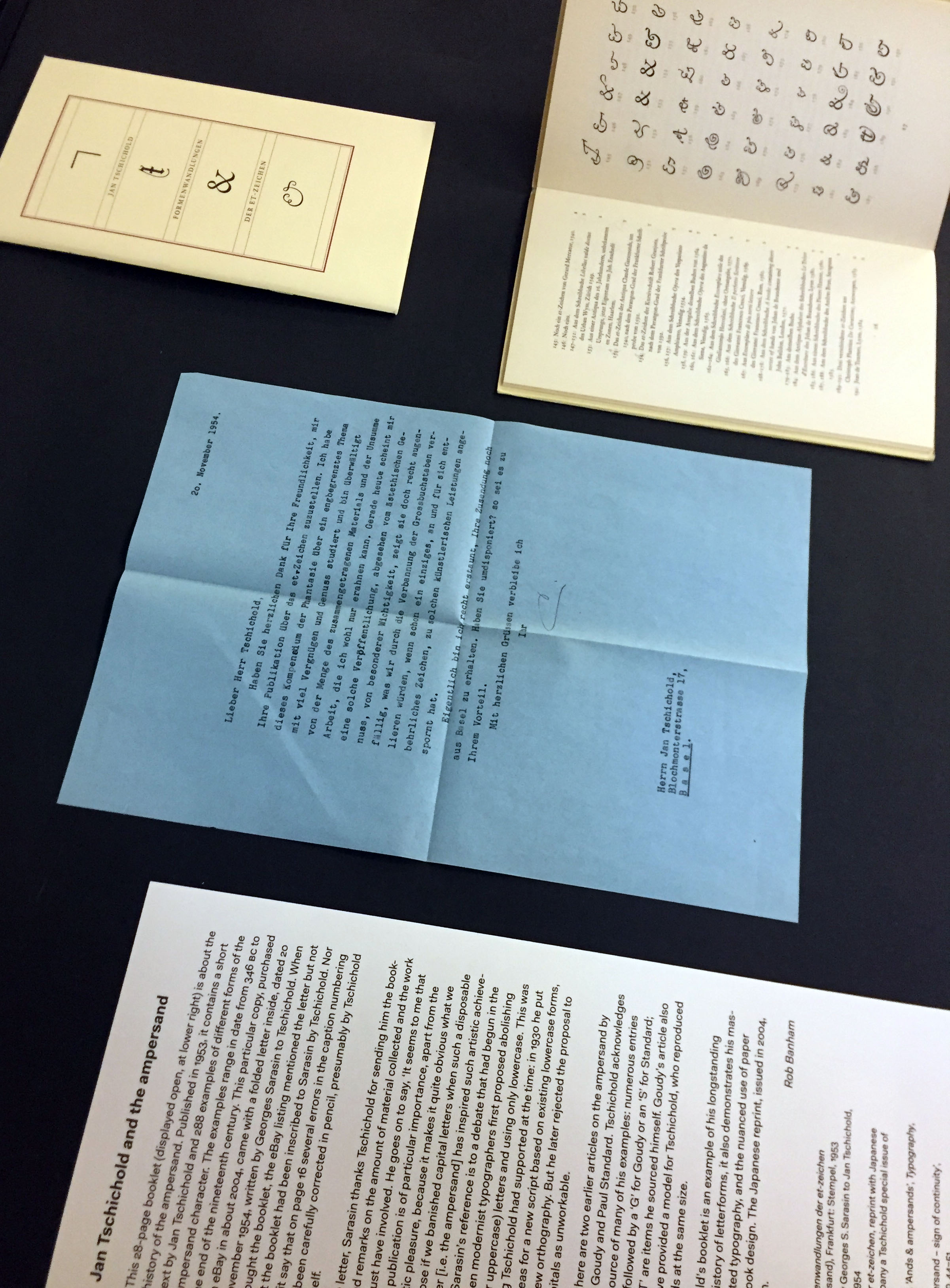
In the third in a series of posts about artefacts in the exhibition ‘Material histories’ (now on in the Department), Rob Banham tells the story of Jan Tschichold’s history of the ampersand.
Formenwandlungen der et-zeichen (Forms of the ampersand) (1953) by Jan Tschichold (at upper right); letter from Georges Sarasin to Tschichold (centre); reprint of Formenwandlungen der et-zeichen (2004).
Jan Tschichold and the ampersand
This 28-page booklet (above, displayed open at upper right) is about the history of the ampersand. Published in 1953, it contains a short text by Jan Tschichold and 288 examples of different forms of the ampersand character. The examples range in date from 346 BC to the end of the nineteenth century. This particular copy, purchased on eBay in about 2004, came with a folded letter inside, dated 20 November 1954, written by Georges Sarasin to Tschichold. When I bought the booklet, the eBay listing mentioned the letter but not that the booklet had been inscribed to Sarasin by Tschichold. Nor did it say that on page 16 several errors in the caption numbering had been carefully corrected in pencil, presumably by Tschichold himself.
In the letter, Sarasin thanks Tschichold for sending him the booklet, and remarks on the amount of material collected and the effort this must have involved. He goes on to say, ‘It seems to me that such a publication is of particular importance, apart from the aesthetic pleasure, because it makes it quite obvious what we would lose if we banished capital letters when such a disposable character [i.e. the ampersand] has inspired such artistic achievements.’ Sarasin’s reference is to a debate that had begun in the 1920s when modernist typographers first proposed abolishing capital (or uppercase) letters in favour of only lowercase. This was something Tschichold had supported at the time: in 1930 he put forward ideas for a new script based on existing lowercase forms, and for a new orthography. But he later rejected the proposal to abolish capitals as unworkable.
Also on display are two earlier articles on the ampersand by Frederick W. Goudy and Paul Standard. Tschichold acknowledges both as the source of many of his examples: numerous entries in his list are followed by a ‘G’ for Goudy or an ‘S’ for Standard; those with a ‘T’ are items he sourced himself. Goudy’s article also appears to have provided a model for Tschichold, who reproduced his ampersands at the same size.
While Tschichold’s booklet is an example of his longstanding interest in the history of letterforms, it also demonstrates his mastery of understated typography, and the nuanced use of paper and binding in book design. The Japanese reprint, issued in 2004, is a pale imitation.
On display
Jan Tschichold, Formenwandlungen der et-zeichen (Forms of the ampersand), Frankfurt: Stempel, 1953
Copy of a letter sent by Georges S. Sarasin to Jan Tschichold, dated 20 November 1954 Formenwandlungen der et-zeichen, reprint with Japanese text, issued to accompany a Tschichold special issue of Idea magazine, 2004
Frederick William Goudy, ‘Ands & ampersands’, Typography, no. 3, 1937, pp. 11–18
Paul Standard, ‘The ampersand – sign of continuity’, Signature, no. 8, 1938, pp. 44–51
‘Material histories’ presents graphic communication artefacts with a story to tell. The stories – the material histories – describe the artefacts in particular: what they are about, where they came from, their material qualities, their circumstances of production, how they were acquired, and crucially how they link to other artefacts, narratives and representations.
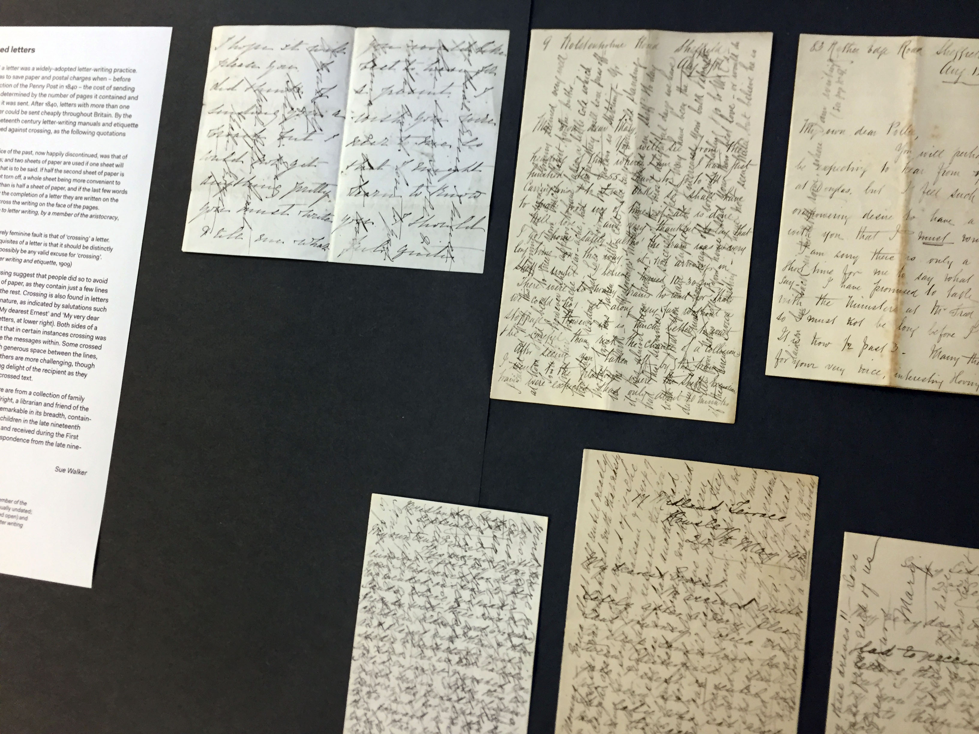
In the second in a series of posts about artefacts in the exhibition ‘Material histories’ (now on in the Department), Sue Walker tells the story of ‘crossed letters’.
Crossed letters, 1880s–1910s, from the collection of Sue Walker.
Crossed letters
‘Crossing’ a letter was a widely-adopted letter-writing practice. The aim was to save paper and postal charges when – before the introduction of the Penny Post in 1840 – the cost of sending a letter was determined by the number of pages it contained and the distance it was sent. After 1840, letters with more than one sheet of paper could be sent cheaply throughout Britain. By the end of the nineteenth century letter-writing manuals and etiquette books cautioned against crossing, as the following quotations confirm:
‘Another practice of the past, now happily discontinued, was that of crossing letters; and two sheets of paper are used if one sheet will not contain all that is to be said. If half the second sheet of paper is left blank it is not torn off, a whole sheet being more convenient to hold and to fold than is half a sheet of paper, and if the last few words are necessary for the completion of a letter they are written on the margin and not across the writing on the face of the pages.’ (The correct guide to letter writing, by a member of the aristocracy, 1892)
‘Another almost entirely feminine fault is that of ‘crossing’ a letter. As one of the first requisites of a letter is that it should be distinctly written there cannot possibly be any valid excuse for “crossing”.’ (E. M. Busbridge, Letter writing and etiquette, 1909)
Some examples of crossing suggest that people did so to avoid starting a second sheet of paper, as they contain just a few lines written at 90 degrees to the rest. Crossing is also found in letters of a personal or intimate nature, as indicated by salutations such as ‘My own true Ernest’, ‘My dearest Ernest’ and ‘My very dear Ernest’ (see row of three letters, at lower right). Both sides of a sheet fully crossed suggest that in certain instances crossing was a deliberate ploy to disguise the messages within. Some crossed letters, especially those with generous space between the lines, are relatively easy to read. Others are more challenging, though one can imagine the unfolding delight of the recipient as they slowly deciphered a densely crossed text.
The crossed letters shown here are from a collection of family letters given to me by Vivian Wright, a librarian and friend of the Department. The collection is remarkable in its breadth, containing letters sent and received by children in the late nineteenth century, love letters, letters sent and received during the First World War, and day-to-day correspondence from the late nineteenth century to the 1960s.
On display
Crossed letters, 1880s–1910s
Etiquette books: The correct guide to letter writing, by a member of the aristocracy (published in many editions, usually undated; on display are editions from 1892 and the early 20th century); E. M. Busbridge, Letter writing and etiquette, 1909
‘Material histories’ presents graphic communication artefacts with a story to tell. The stories – the material histories – describe the artefacts in particular: what they are about, where they came from, their material qualities, their circumstances of production, how they were acquired, and crucially how they link to other artefacts, narratives and representations.