Author: Test User

Material histories: crossed letters

In the second in a series of posts about artefacts in the exhibition ‘Material histories’ (now on in the Department), Sue Walker tells the story of ‘crossed letters’.


Crossed letters, c. 1880s–1910s, from the collection of Sue Walker.
Crossed letters, 1880s–1910s, from the collection of Sue Walker.


Crossed letters

‘Crossing’ a letter was a widely-adopted letter-writing practice. The aim was to save paper and postal charges when – before the introduction of the Penny Post in 1840 – the cost of sending a letter was determined by the number of pages it contained and the distance it was sent. After 1840, letters with more than one sheet of paper could be sent cheaply throughout Britain. By the end of the nineteenth century letter-writing manuals and etiquette books cautioned against crossing, as the following quotations confirm:

‘Another practice of the past, now happily discontinued, was that of crossing letters; and two sheets of paper are used if one sheet will not contain all that is to be said. If half the second sheet of paper is left blank it is not torn off, a whole sheet being more convenient to hold and to fold than is half a sheet of paper, and if the last few words are necessary for the completion of a letter they are written on the margin and not across the writing on the face of the pages.’ 
(The correct guide to letter writing, by a member of the aristocracy, 1892)

‘Another almost entirely feminine fault is that of ‘crossing’ a letter. As one of the first requisites of a letter is that it should be distinctly written there cannot possibly be any valid excuse for “crossing”.’ 
(E. M. Busbridge, Letter writing and etiquette, 1909)

Some examples of crossing suggest that people did so to avoid starting a second sheet of paper, as they contain just a few lines written at 90 degrees to the rest. Crossing is also found in letters of a personal or intimate nature, as indicated by salutations such as ‘My own true Ernest’, ‘My dearest Ernest’ and ‘My very dear Ernest’ (see row of three letters, at lower right). Both sides of a sheet fully crossed suggest that in certain instances crossing was a deliberate ploy to disguise the messages within. Some crossed letters, especially those with generous space between the lines, are relatively easy to read. Others are more challenging, though one can imagine the unfolding delight of the recipient as they slowly deciphered a densely crossed text.

The crossed letters shown here are from a collection of family letters given to me by Vivian Wright, a librarian and friend of the Department. The collection is remarkable in its breadth, containing letters sent and received by children in the late nineteenth century, love letters, letters sent and received during the First World War, and day-to-day correspondence from the late nineteenth century to the 1960s.


On display

Crossed letters, 1880s–1910s
Etiquette books: The correct guide to letter writing, by a member of the aristocracy (published in many editions, usually undated; on display are editions from 1892 and the early 20th century); E. M. Busbridge, Letter writing and etiquette, 1909


‘Material histories’ presents graphic communication artefacts with a story to tell. The stories – the material histories – describe the artefacts in particular: what they are about, where they came from, their material qualities, their circumstances of production, how they were acquired, and crucially how they link to other artefacts, narratives and representations.

The exhibition continues until 11 November.


Material histories: Emil Hübner

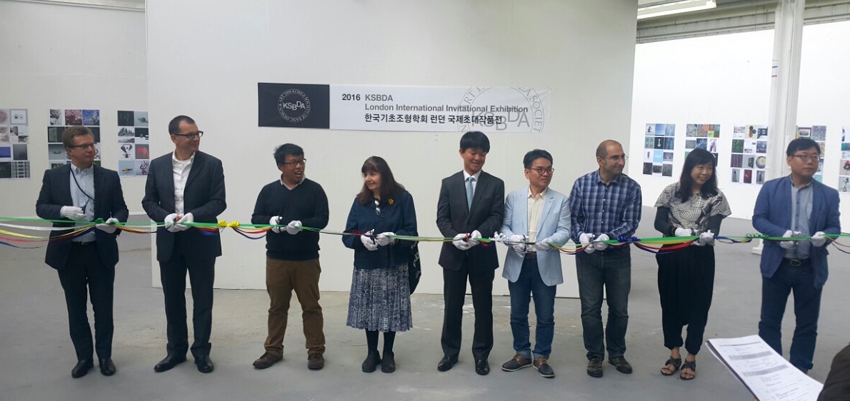
‘Material histories’ is a small exhibition now on display in the Department. It presents graphic communication artefacts with a story to tell. The stories – the material histories – describe the artefacts in particular: what they are about, where they came from, their material qualities, their circumstances of production, how they were acquired, and crucially how they link to other artefacts, narratives and representations.

In the first in a series of posts about artefacts in the exhibition, James Mosley tells the story of Emil Hübner’s Exempla scripturae epigraphicae Latinae.


Exempla scripturae epigraphicae Latinae

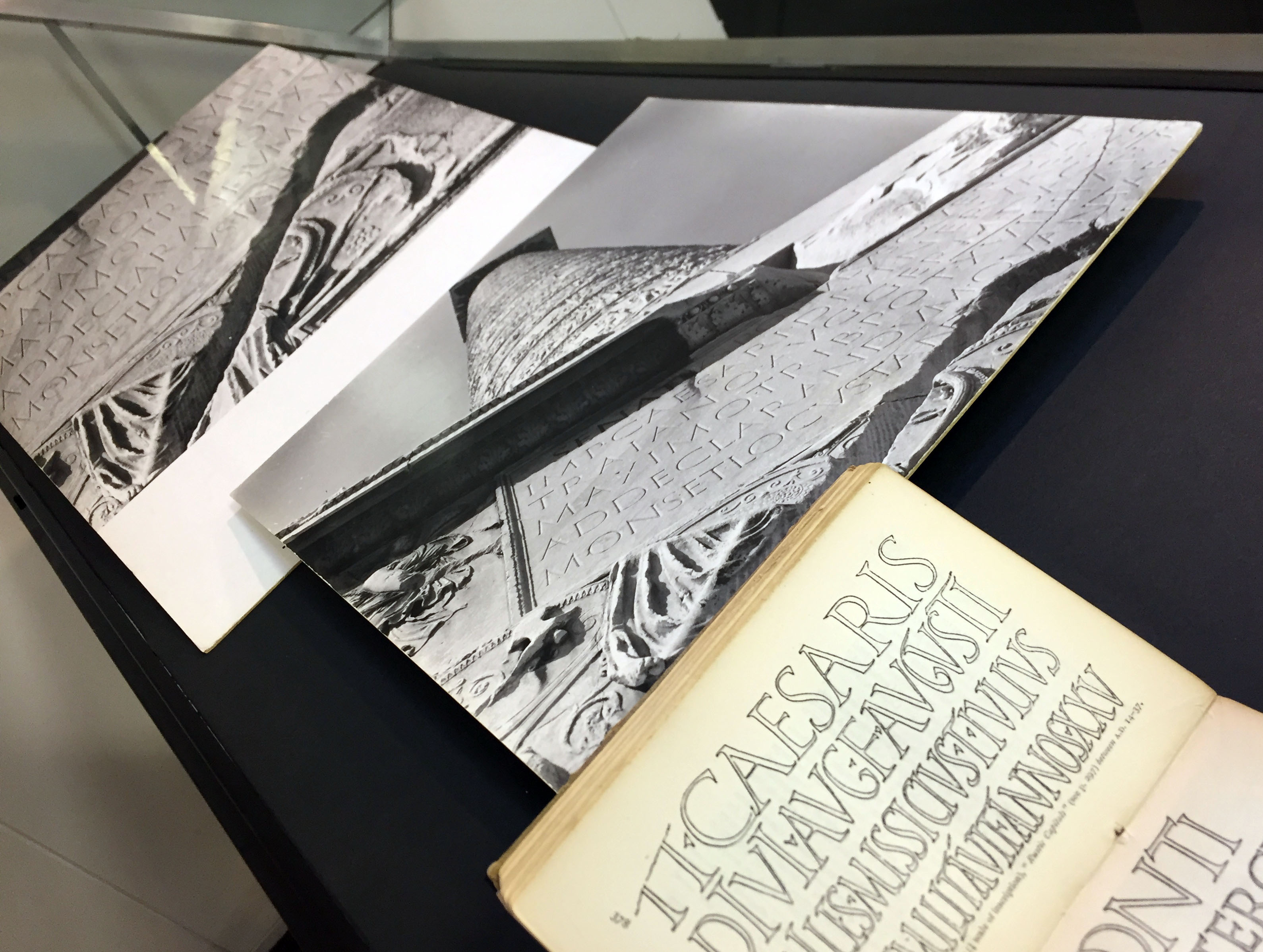
Emil Hübner’s collection of Latin inscriptions, Exempla scripturae epigraphicae Latinae, is a big book. It is not easy for the ordinary reader to approach. All the text – and there is a lot of it – is in Latin. But every inscription that is listed is shown in a line illustration. Many of the original inscriptions are routine jobs, while others delightfully capture calligraphic qualities. The inscriptions, as presented in the book, are well drawn, often (according to the captions) from photographs of the originals. They are printed from ‘zincographs’, which are relief etchings made directly from the drawings. Zincography was a relatively new process at the time, whose early history needs recording.

Emil Hübner, Exempla scripturae epigraphicae Latinae, entry 265 showing a sample of letters from the inscription at the base of Trajan's column, Rome.
Emil Hübner, Exempla scripturae epigraphicae Latinae, opened to item 265, a sample of letters from the inscription at the base of Trajan’s column, Rome.

Edward Johnston was rightly impressed with what he called these ‘fine outline drawings’, and he included samples of them in his little handbook, Writing & illuminating, & lettering (1906). In her book, Lettering on buildings (1960), Nicolete Gray complained that the scale of the originals was difficult to judge, which is true. But over a thousand inscriptions are shown and the size of each line is given.

So Hübner’s book is on many people’s list of things to look at. In 1979, I received a prospectus from a publisher in Berlin offering a reprint, which I ordered for the St Bride Library. What I got was a surprise: a copy of the original book, printed in 1885, and not bound, but sewn and ready to use. I imagine that before the reprint was put in hand someone must have come across copies of the original book that had somehow survived in a warehouse, perhaps in Berlin, for nearly a century. I tipped off the ‘Typography Department’ at Reading, which ordered its own copy of the 1885 printing. This is the copy displayed here.

At Reading, Hübner’s book served a serious purpose. Study tours of Rome and Florence to see inscriptions on the spot and in context had become a distinctive part of the teaching undertaken by the newly created department. My own contribution was to offer images of some of the originals that I had made during my own research trips, and which I used in my teaching. Two of these are on display.

Edward Johnston's Writing & illuminating, & lettering; photographs of the Inscription at the base of Trajan’s column, Rome, by James Mosley, 1963
Edward Johnston, Writing & illuminating, & lettering, showing reproductions from Hübner; photographs of the inscription at the base of Trajan’s column, made by James Mosley in 1963.


On display

Emil Hübner, Exempla scripturae epigraphicae Latinae, Berlin: George Reimer, 1885
Edward Johnston, Writing & illuminating, & lettering, London: John Hogg, 1906 (2nd edition, 1908)
Inscription at the base of Trajan’s column, Rome, photographs by James Mosley, 1963


‘Material histories’ continues until 11 November.


Minister for disabled people visits Reading

Dr Jeanne-Louise Moys and our recent graduate Ryzard Akita showcased Ryzard's inclusive design project at yesterday's Ministerial visit to the University
Dr Jeanne-Louise Moys with graduate Ryzard Akita following their presentations to the Minister
Penny Mordaunt, Minister for disabled people, health and work visited the University yesterday to find out more about our transformative Breaking down Barriers project on inclusive design.
Penny Mordaunt, MP visited the University to meet our Breaking down Barriers team.

Yesterday, Penny Mordaunt, Minister for Disabled People, Health and Work visited the University of Reading to find out more about our transformative Breaking down Barriers (BdB) project.

BdB focuses on embedding inclusive design in our curricula across the University. Typography have been highly involved in the project from its inception and were proud to present the ways in which we are engaging with inclusive design across a range of applications including digital, print and wayfinding design.

In particular, we were pleased to welcome Ryzard Akita, one of our 2016 graduates who is now working as a user experience designer, back to Reading. Ryzard presented his final year self-directed project – an innovative mobile app for visually-impaired users – to the Minister. Some of our recent MA and undergraduate dissertations on inclusive design were also on display for the event.

The Minister also engaged with some of the simulation tools we have been using in our courses to increase students’ awareness of the everyday challenges people face in terms of mobility, dexterity and visibility. She praised the project, saying: “Inclusivity and accessibility should be at the forefront of good design, and I’m delighted to see the University of Reading leading the way with their Breaking down Barriers scheme.”

Rick Poynor joins Typography

Rick_Poynor

We are very pleased to announce that Rick Poynor has been appointed Professor of Design and Visual Culture by the University of Reading, and will join the Department of Typography & Graphic Communication on 10 October.

As author, editor, curator and commentator, Rick’s longstanding and wide-ranging critical engagement with design, design history and many dimensions of visual culture is well known. We look forward with great anticipation to his contributions to Reading’s own longstanding excellence in teaching and research.

Welcome, Rick!

A July like any other in Reading

Ribbon ceremony
Ribbon-cutting ceremony in the Art Department gallery.

The Department of Typography did not get the memo that July is supposed to be a quiet period. We kicked off the month by hosting the KSBDA International Invitational Exhibition, its first stop after Seoul, and on its way to Katowice, Poland. The exhibition, attended by members of the current Board of the KSBDA and several past presidents, was held with the kind collaboration of the Department of Art. The visitors had the opportunity to examine material from the Collections in Typography, and discuss their use in teaching.

Michael Twyman at ICTVC
Professor Michael Twyman delivering the opening keynote at Thessaloniki.

The second week of July saw many staff, research students, and postgraduates fly off to Thessaloniki, to take part in the 6th ICTVC conference. The triennial event is spearheaded by alumnus Dr Klimis Mastoridis and aligns closely to the research strands of the Department. Several members delivered papers, and Emeritus Professor Michael Twyman delivered the opening keynote.

Monotype celebration
Celebrating the Monotype Studentship, from left: senior designer Malou Verlomme, Type Director Dr Nadine Chahine, the VC Sir David Bell, and Head of Department Professor Eric Kindel.

Back in Reading, we marked the tenth anniversary of the Monotype Studentship, a substantial initiative in funding support for our postgraduates. The Studentship is only one element of our deep collaboration with the company, which stretches from research support to technical training.

Over the two last weeks of July the Department was taken over by the annual TDi summer course. The international cohort (with participants from Bangladesh, Brazil, Canada, Dubai, India, Jordan, Korea, Malaysia, UAE, USA, as well as European countries and the UK) spent long days in sessions led by several members of the Department’s staff and student community, working in our studios, with material from the Department Collections, and personal staff collections. Through lectures and seminars, to hands-on sessions with archival material and letterpress equipment, the TDi provides a unique distillation of key areas of the Department’s narrative on typography and typeface design. Marek Jeziorek documented this year’s course in several albums, starting here.

Soapbox host one of our typography summer placements

IMG_0923 copy
Visiting student Gabriela Lyrio Assreuy (far right) joined design studio Soapbox for her summer placement. Gabriela is pictured here with Soapbox’s team of Reading alumni from our BA and MA programmes (from left to right): Žiga Kropivišek, Megan Weston, Francesca Romano and Rachel Bray. Photo: Cormac Bakewell

Our Part 2 visiting student, Gabriela Lyrio Assreuy is spending her summer enjoying a stimulating, two-month placement at Soapbox. The London-based studio specialises in design that ‘helps leading policy, research and advocacy organisations to communicate their ideas’ and is the home to a number of Typography alumni from our BA and MA programmes (see pic). 

Gabriela says: ‘At Soapbox I’m having the opportunity to watch closely how a successful design studio is run and how to deal with real demands, clients and timelines. Besides that, I have been able to work alongside other designers in different sorts of projects mostly permeating print design, such as publication design, infographics, branding. From typesetting to creative design processes, I am putting my abilities to practice and gaining new valuable skills and knowledge that will be essential to build a successful career.’

Soapbox designer and MAID alumnus, Žiga Kropivšek commented: ‘Introducing new colleagues to the work process is always a struggle, that is why working with Gabriela has been such a delight. She was very quick to learn all the tricks and, coming from Reading, we knew she would have a sharp eye for typographic detail. It has been very valuable for our company that we could entrust her with more complex jobs so quickly and her ambitiousness and creativity surprise us again and again.’

Gabriela is a visiting student from Brazil. She has spent this year at Reading as part of the Ciência sem Fronteiras (Science without Borders) scheme. Since 2013–4,Typography & Graphic Communication have hosted three visiting students as part of this scheme. It’s been great having Gabriela in our part 2 cohort and we wish her well as she returns to her studies in Brazil.

Information Design at DRS 2016

Sue Walker and Alison Black attended the Design Research Society 2016 conference in Brighton. They organised a session, Effective Information Design, to raise the profile of the history, theory and practice of information design.

Support for health care is an area where information designers have undertaken research projects ranging from health promotion, through clinical practice, to medicines safety. The session included three health related papers. Jenny Darzentas reported her team’s work on patient information leaflets for mobile devices, with reference to Fentanyl patches, affirming that conventions for the organisation of patient information on paper are not directly transferable to mobile devices. A team from the Helen Hamlyn Centre for Design at the Royal College of Art and British Red Cross present their project about a smartphone app that helps to raise the awareness of ‘balance health’ as an aid to prevent falls in people over the age of 65. David Craib discussed approaches to creating and understanding meaning in communication design, working with the Canadian Institutes of Health Research.

Maxwell Roberts talked about work that compared objective measures of performance and subjective ratings of design effectiveness in two variants of the London Underground map. Continuing the visualization theme, Joanna Boehnert presented her Mapping Climate Communication project which introduces discussion around impact and power in data visualisation. Eden Potter identified some of skills and personal qualities that information designers need to successfully undertake a project reinforcing that information design is as much about process as it is about artefact.

The papers can be found in the proceedings following the introduction:

Walker, S., Black, A. (2016). Introduction: Effective information design. in: P. Lloyd & E. Bohemia, eds., Proceedings of DRS2016: Design + Research + Society – Future-Focused Thinking, Volume 6, pp 2303–2308, DOI 10.21606/drs.2016.603

Presses in action for open days

IMG_1300

Thank you to all our prospective applicants and their parents who visited the Department on Friday and Saturday as part of the University’s Open Days. We hope you enjoyed the displays and workshops as much as we did.

If you didn’t have enough time to view the BA Graphic Communication final display, you can still see some display highlights on the show website.

If you want more information about studying with us, please email our departmental admissions team (Lauren, James and Jeanne-Louise) at graphiccommunication@reading.ac.uk.

Our next round of Open Days will be in October. Once again, we’ll be inking up the presses so that visitors can print a memento of their visit and get a taste of our hands-on experiential learning approach. There will be also be new digital and print displays of student work to view. For more information about open days at Reading, click here.

Typography in Beijing

TDC opening

Soon after the conclusion of a successful visit by students from CAFA to Typography in 2015, we commenced working on a reciprocal visit to Beijing. As it happened, several strands of activity came together to make this an exceptionally productive visit. A short report follows below; the local organisers, led by CAFA teacher Liu Zhao, recorded all presentations for translation and reposting on the Chinese social networks, and microblogged almost every minute of the trip to a jaw-droppingly numerous online audience.

Opening the visit with a more formal occasion, Gerry Leonidas and José Scaglione (Reading alumnus and ATypI president) took part in the judging of the 8th Founder Type Design Competition. The event, held every two years, included for the first time Latin typefaces by Chinese designers. The next day, the winners were announced in the National Centre of the Performing Arts (the “Egg”), together with the opening of the TDC61 exhibition, the Chinese leg of the global tour of the annual design competition; and the opening of the “Chinese Type Modern 1919–1955” exhibition with material from the archives of Founder Electronics on the transition of Chinese type-making across technologies – with clear influence by Reading’s TDi 2015 course, in which Founder staff participated in.

Font Forum line-up

Font Forum conference

The exhibition and competition awards served as the opening events for the two-day Font Forum, a conference on typeface design with speakers from China, Japan, and Europe, to packed auditoria. At the end of each day lively panel discussions demonstrated the interest of the student and professional audience, and the desire for stronger engagement with the international typographic community. (In the sidelines of the conference, plans were hatched to coordinate a BA module on typeface design between Reading and CAFA in 2016–17.)

workshop at CAFA

CAFA workshop

The main part of the visit was taken over by a workshop on typeface design at CAFA. The interest in Latin typeface design is considerable, and the skills of many students impressive. This is a sign of the gradual globalisation of Chinese design education, and the demands by the local professional employers for skills that can serve markets across language and script regions. Although the workshop was primarily focused on typeface design, there was great interest in typographic design, and especially for mobile platforms.

at Founder

Centre for Chinese Font Design and Research

Two visits at the Centre for Chinese Font Design and Research, hosted in the offices of Founder Electronics, focused on design issues in fonts for Chinese, design  tools and processes, and professional training for multi-script design. The second of the visits had very concrete aims, with Gerry orchestrating the localisation of Glyphs (the key font design application) into Simplified Chinese, to enable designers in China to experiment with new workflows.

CITIC publisher agreement

Starting in TDi 2015, Gerry Leonidas guided Liu Zhao to compile a list of books on typography and typeface design in English to be translated into Chinese by CITIC, one of the most prominent publishers in the country. The project is progressing well with many rights already secured, and schedules for the translations and launches in place. Gerry’s involvement in the curation of the series provides the opportunity for the University’s approach to typographic scholarship to be transplanted in a new market in a unique manner. This is part of a wider collaboration between the University, CITIC, and CAFA, with the aim of building up typeface design education in China.

Dongdao Design

Dongdao Design

Despite the timing on a Sunday evening, over 140 designers from Dongdao, one of the largest design agencies in China, turned up to listen to José and Gerry talk about typeface design solutions and studies. The presentations were followed by Q&A sessions and interviews, which will be posted on Chinese social media with subtitles.

p.s. ATypI in Beijing?

Seeing in person the typographically maturing environment in Beijing and particularly the concretely supportive attitude in CAFA convinced José and Gerry (president and vice-president of ATypI respectively) of the importance and timeliness of bringing the annual conference of the type design community to mainland China. They outlined the key parameters of a proposal with Dean Wang Min and Liu Zhao, and explored timing options. Look for announcements through ATypI!