This workshop, based around the printing press collection in Typography, attracted postgraduate students, academic staff, museum and library professionals, and members of the public interested in the materiality of text, books and ephemeral documents.
Participants used the presses under craft supervision, and had a go at casting metal type.
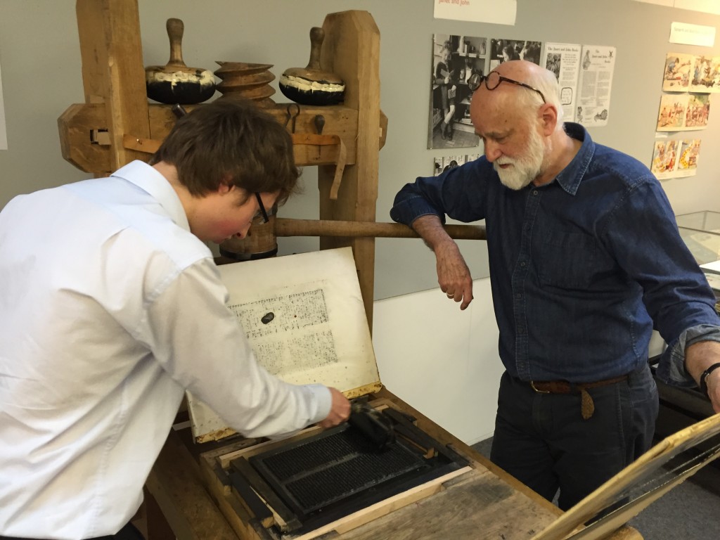
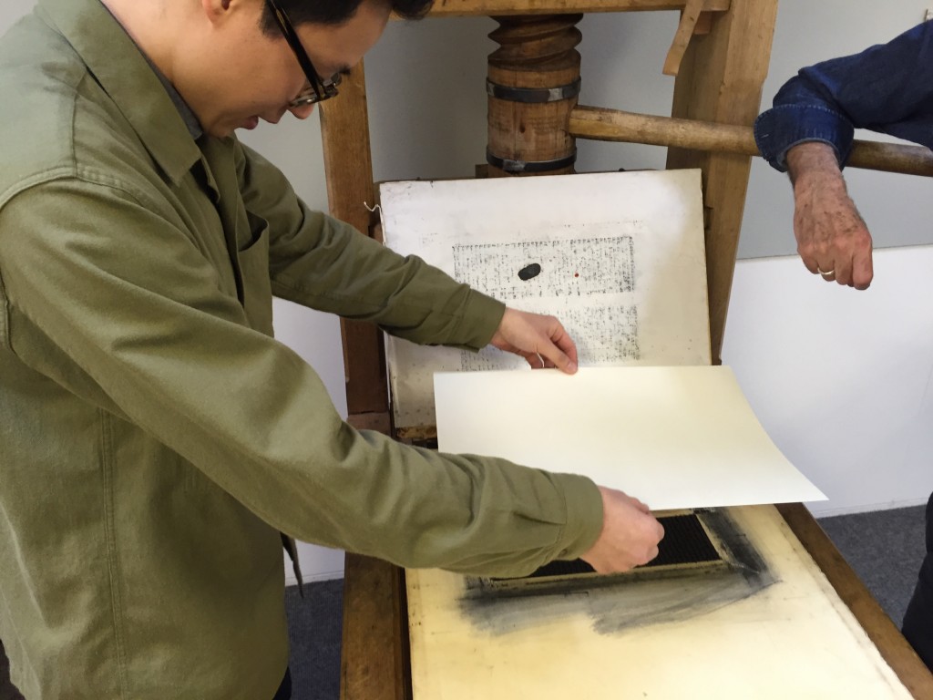
They printed a page from the Gutenberg bible on a reconstructed one-pull wooden press that Gutenberg would have used, as well as 19th century woodblocks on another.
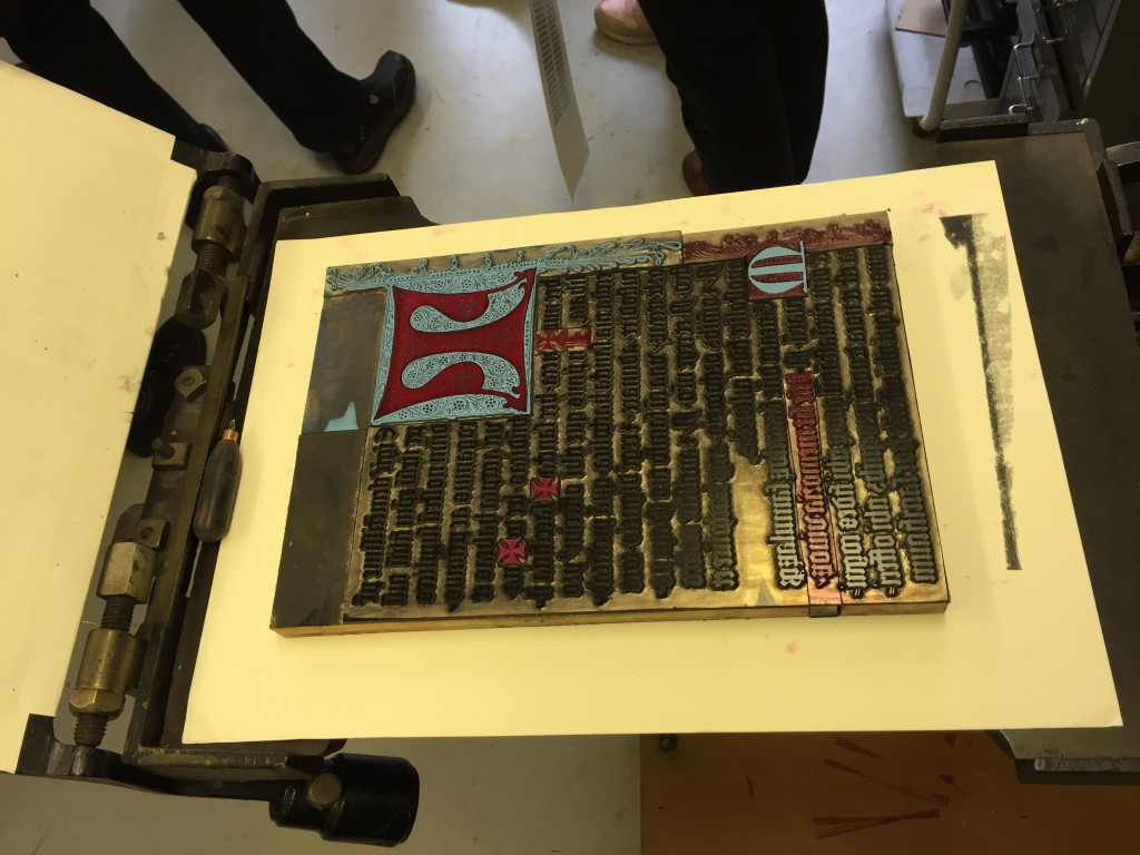
Alan May demonstrated printing of a Fust and Schoeffer 2-colour initial.
The workshop culminated in a fascinating talk by Dr Elizabeth Savage (British Academy Postdoctoral Fellow, Centre for Material Texts & Research Fellow, History of Art,Cambridge University) ‘Deciphering the First Colour-Printed Images in England: The Book of St Albans, 1486’
Our final year BA Graphic Communication student Jess Lewis shared her Reading typography experience with online forum Creative Digest earlier this year. You can read her post here.
Final year typography students are busy gearing up for our 2016 degree show and you can follow them on Twitter @andreadingshow for more news and previews.
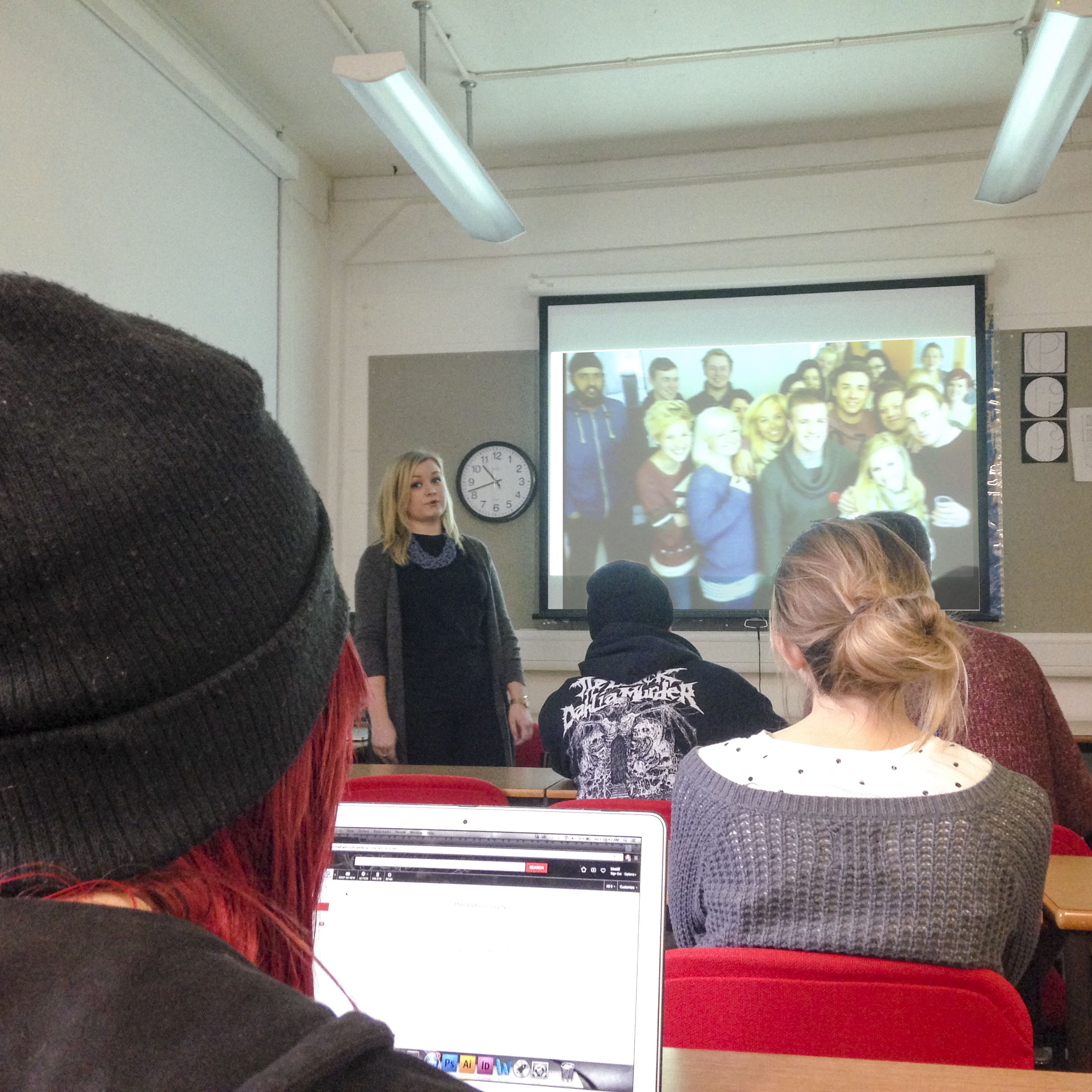
Five talented design graduates, five talks, and five very different approaches. Last week, our Graphic Communication BAs got an incredible insight into the range of career paths that might await them when they graduate.
Hannah Smith gets nostalgic for the Class of 2012
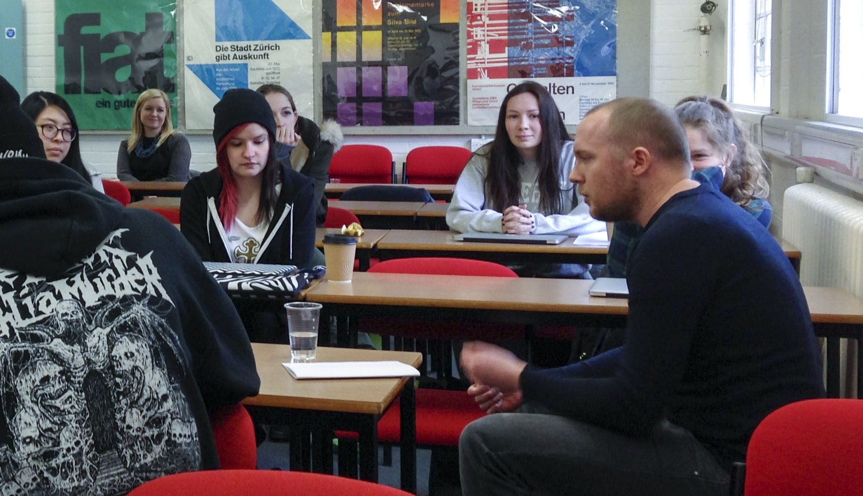
As part of #UoREnhancementWeek, we asked some of our alums to come back to the Department and give 20 minute talks about their experiences since graduation. With such an open brief we knew we’d see a range responses, but the diversity of what the students experienced couldn’t have been more marked. Our speakers covered such a range of visual approaches, client bases, budgets and presentational styles that it was hard to keep up. It was a great reminder that personal expression is at the core of what a designer has to offer, even if most their work is constrained (perhaps quite rightly) by client needs and practical realities.
I found the alumni talks really useful. It was great to see what people are doing now and how they got to where they are.
Sarah Carrington. Part 3 BA Graphic Communication
In offering advice and encouragement to the next generation of designers, the themes that emerged from the day were:
Hard work and persistence pay off
Play up a your genuine specialism in typography, it’s not that common in the industry.
Make the most of the Real Jobs scheme, it’s your USP at interviews
Think about what kind of specialism, sector, scale and working environment will really bring satisfaction at work (and at home).
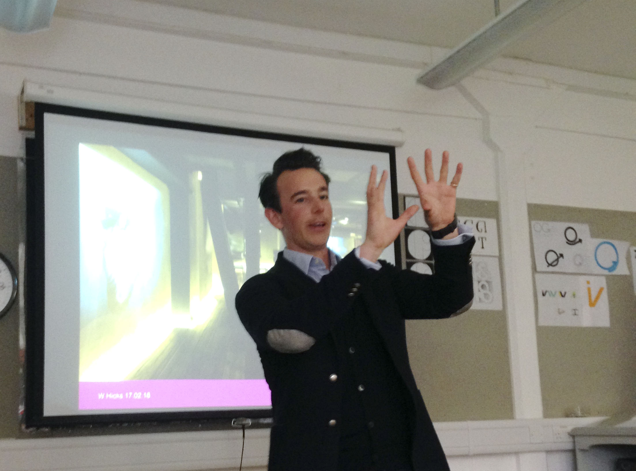
Will Hicks gets animated explaining how to keep his portfolio of Property clients happy (they’re always more interested in work you’ve done OUTSIDE their sector)
Will Hicks spoke about his transition from practising designer (at Penguin, DK and, later, his own firm, Graphicks) to sales director. He’s still passionate about design, but hasn’t touched Adobe software for year. By embracing delegation, playing to the strength of his team and taking on a stream of recent Reading grads, he’s found a balance that keeps his staff satisfied and his clients coming back for more.
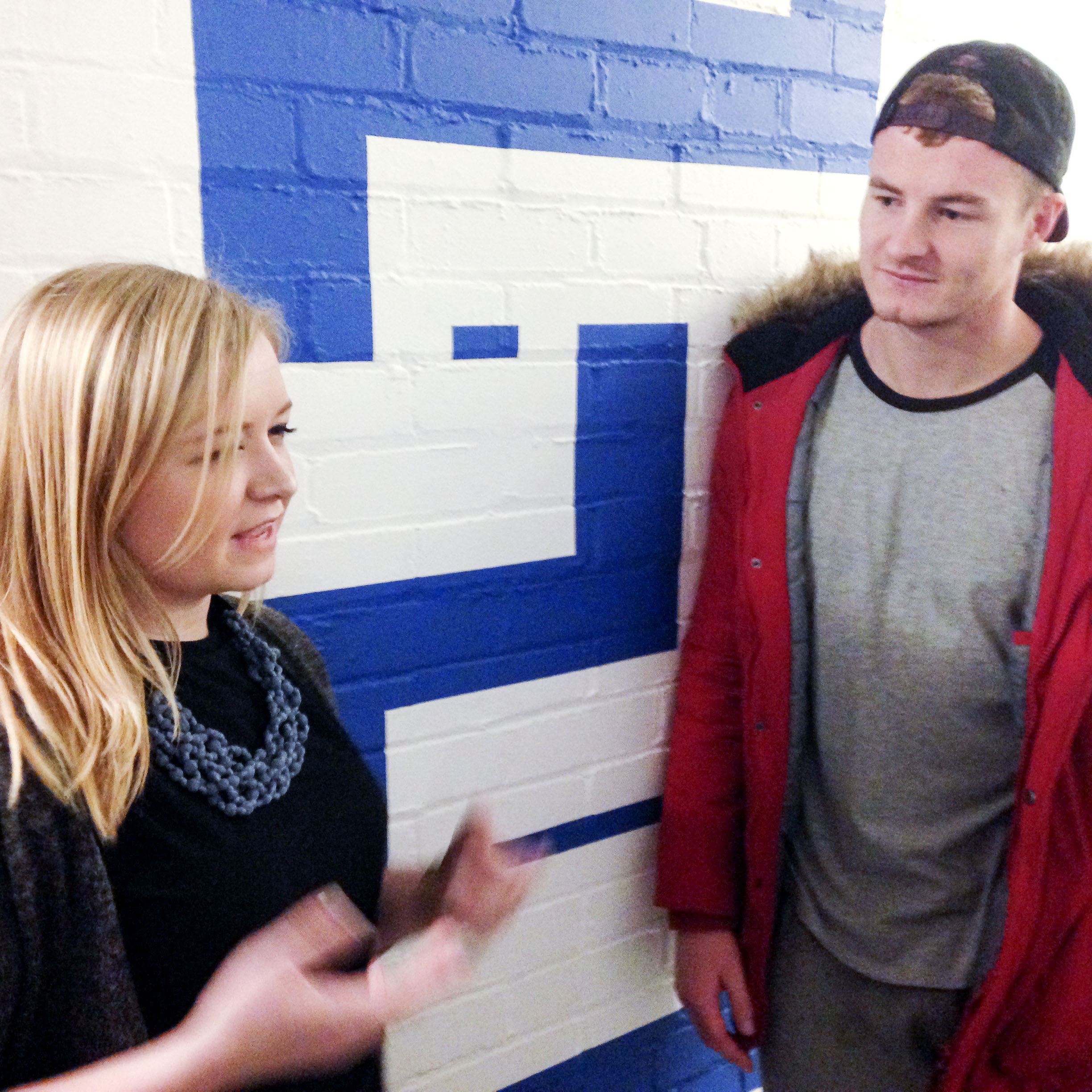
Hannah stuck around to give advice on some current projects, too
Hannah Smith felt like a designer in full swing, relishing the constant revolution in technology that changes both what we design and how we design it. With no meme left untouched, she raced through an introduction to cutting edge UX design overloaded with practical tips (get feedback all the time, ditch Photoshop for Sketch, usepanda.com, mobile first!) and really focussed examples that explored the minutiae and impact of good design (look out for the new checkout at asos.com soon, UI design with an exceptionally clear goal). It felt like a distillation of a whole years’ thinking in one 30 minute chunk. Amazing.
Rob Coomber find the right place to talk signage
Rob Coomber managed to land his dream job as a wayfinder at Applied immediately after graduating, and he’s stayed there ever since. Rather than showing breadth in terms of graphic style or different kinds of design problem, Rob’s presentation demonstrated the breadth of experiences and scales that a wayfinding designer can enjoy. He’s pounded the rainy streets of the West End for the Legible London project, and sweltered in the heat of Dubai in the summer. In all instances, he’s looking at genuine user-focussed scenarios to identify and solve pinch points for tourists and locals alike. Rob is also an exemplar of the kind of calm, methodical, slightly droll approach that is often needed for success in this field.
Rebecca Kirby works in house as a senior designer for Scott Brownrigg, a large firm of architects. She painted a vivid picture of the kind of challenges that exist in convincing colleagues in a large organisation of the value of good design. By building great relationships and sticking to her guns on typographic detailing, she’s been able to ramp up the value that the firm places on graphic design. Taking on external commissions gives her the variety to counteract the brand consistency that flows through her standard project work (mainly proposals) and reaching out into environmental graphics has helped strengthen a connection with the studio’s architects.
Tom Derrett got the students moving around the Department in fresh ways
Our final speaker, Tom Derrett , co-founder of daughter.is, stunned the group with a practical demonstration of the notion that a leader is defined by whether or not anyone actually follows them. He tore around the department with students in train, captivating the group with a real heart-on-sleeve tale of what it means to run your own studio, and which sacrifices are actually worth it in the long run (short answer, not your integrity). Tom’s visceral way of presenting ideas is something we remembered from his student days and it was a brilliant lesson in how to command an audience, without hiding behind a PowerPoint. Our course has a real focus on presentation skills these days, but Tom brought something that can’t really be taught. It just needs to be experienced.
By the time Tom returned us all to the studio, he’d gained everyone’s respect and attention
Although we happen to be graphic communicators, we are, first and foremost, just communicators. Hearing this group of designers discuss how they found their feet in the industry was inspiring as much for the stories they told as for the work they shared.
After several years of development, Adobe published the updated version of Bickham Script Pro, a connecting script based on the examples in George Bickham’s The Universal Penman. The typeface captures the complexity of the style perfected in the eighteenth century by writing masters, making use of a substantial set of alternate letterforms, ligatures, and swashes. Additionally, Bickham Script Pro 3 provides an extended character set that supports the Cyrillic and Greek scripts, as well as pan-European Latin. The typeface makes use of the rich variety of alternate forms in all three scripts, providing an innovative approach to display typography for Greek and Cyrillic.
In a series of blog posts by Sally Kerrigan, Adobe Type introduces the project, the design and technical challenges, and the international team that contributed. Gerry Leonidas and alumna Irene Vlachou contributed to the project.
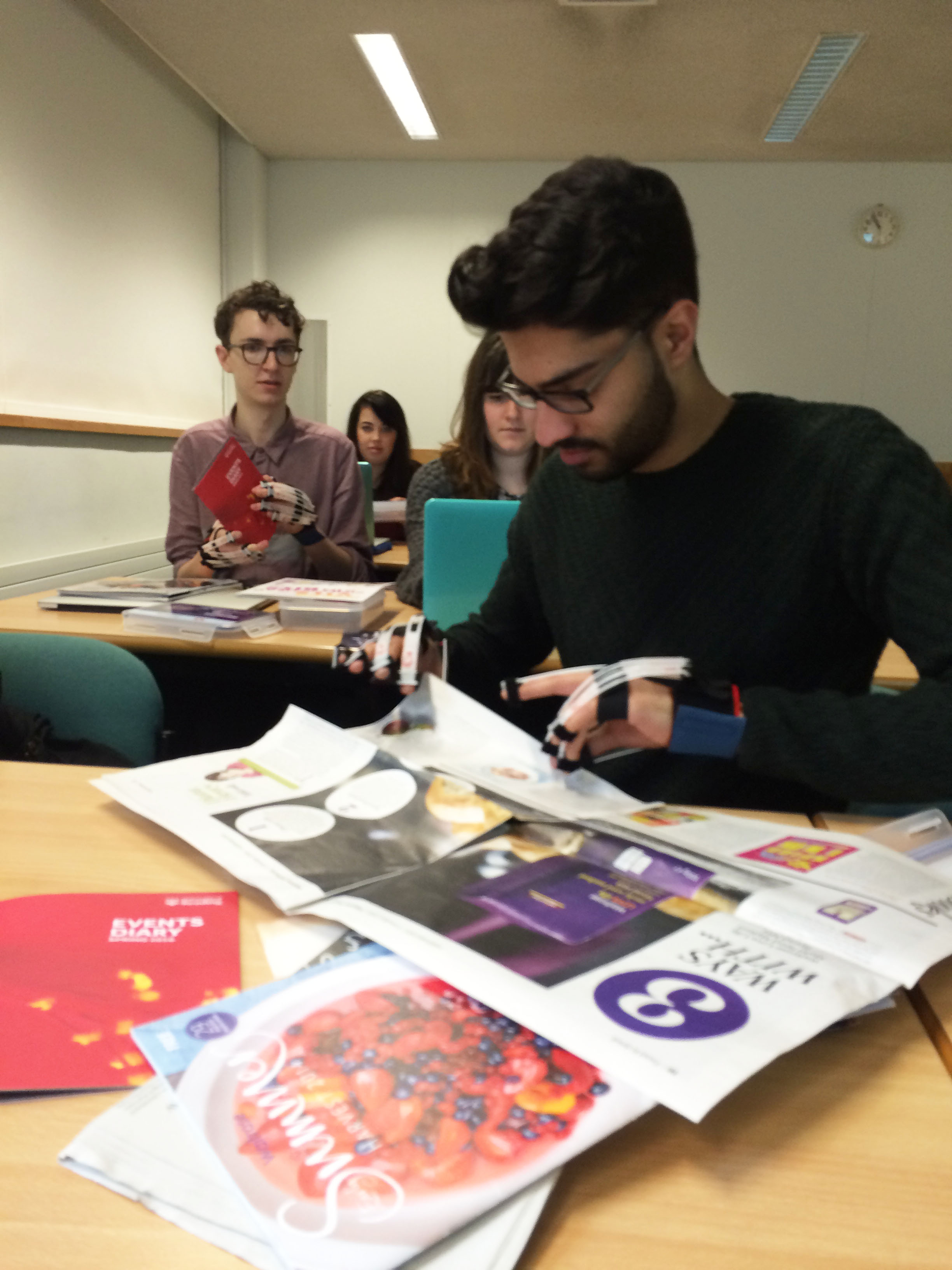
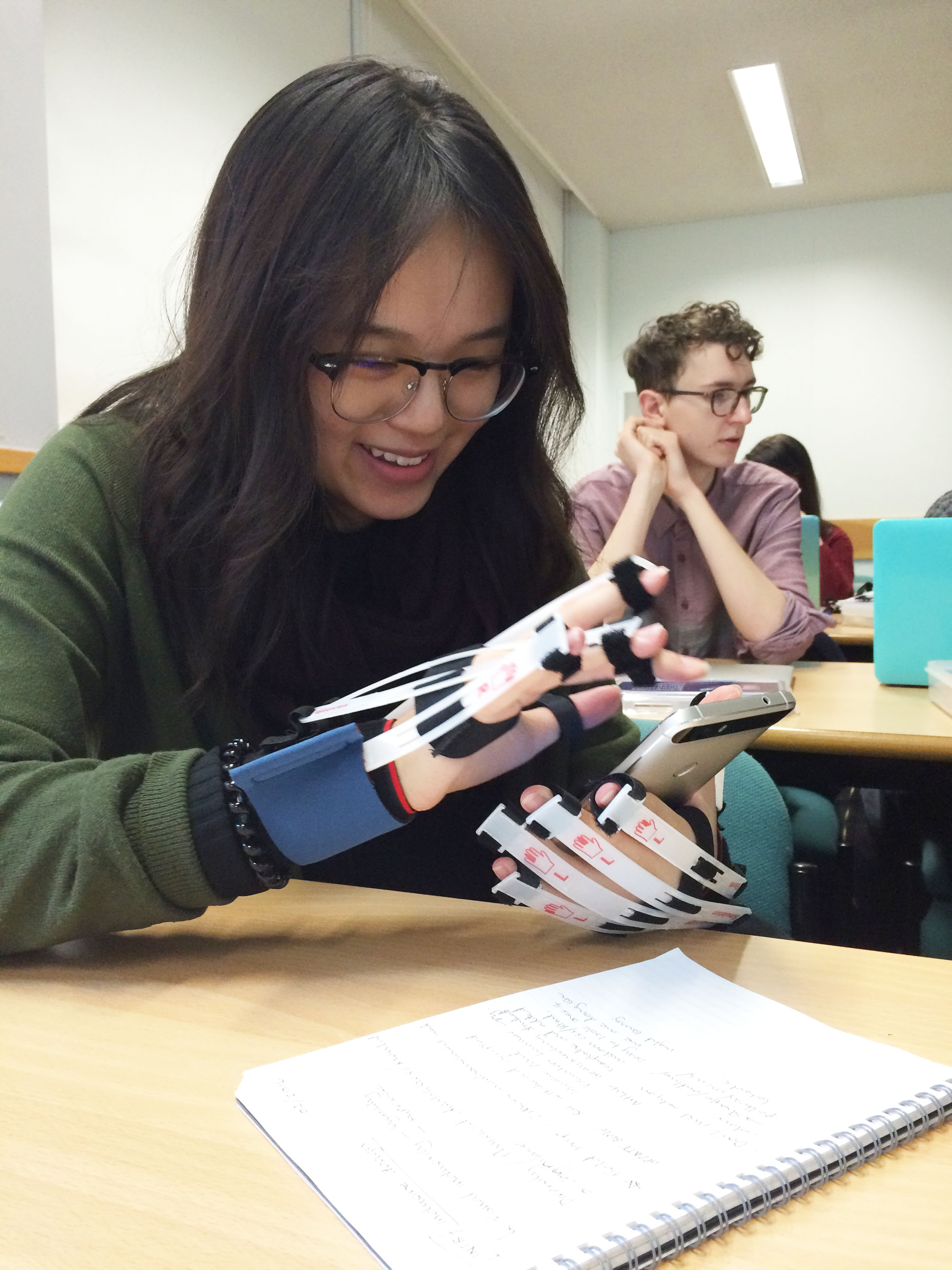
This week our part 2 undergraduates participated in exciting inclusive design workshops as part of the Breaking down Barriers project. Students wore simulation gloves to discover how conditions such as arthritis may affect user experience across print and digital design. Read more about the inclusive workshops here.
Rajan Dole exploring how paper stock can influence inclusive designLouise Lee wearing simulation gloves to experience the challenges people with arthritis experience when interacting with mobile devices
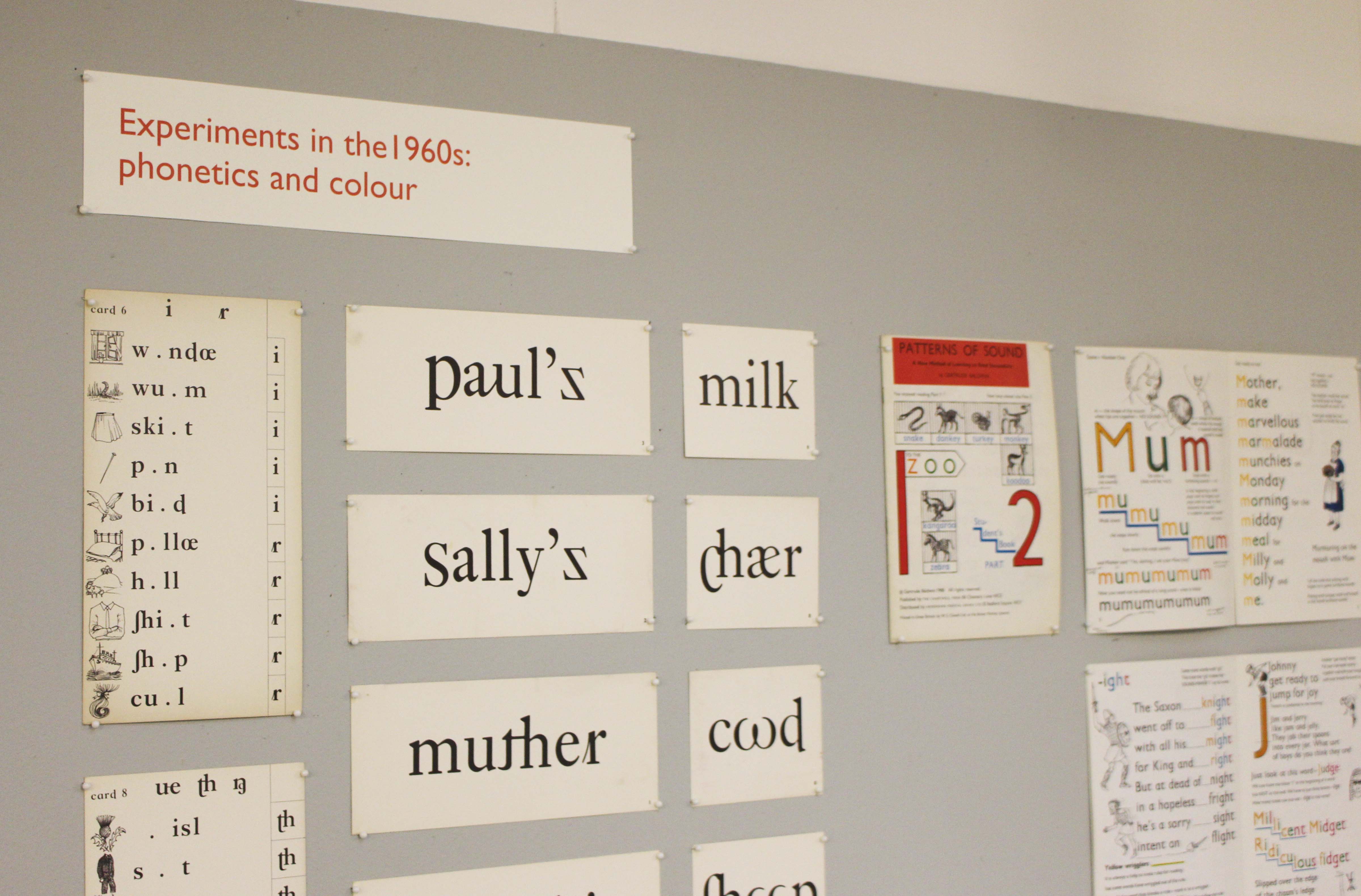
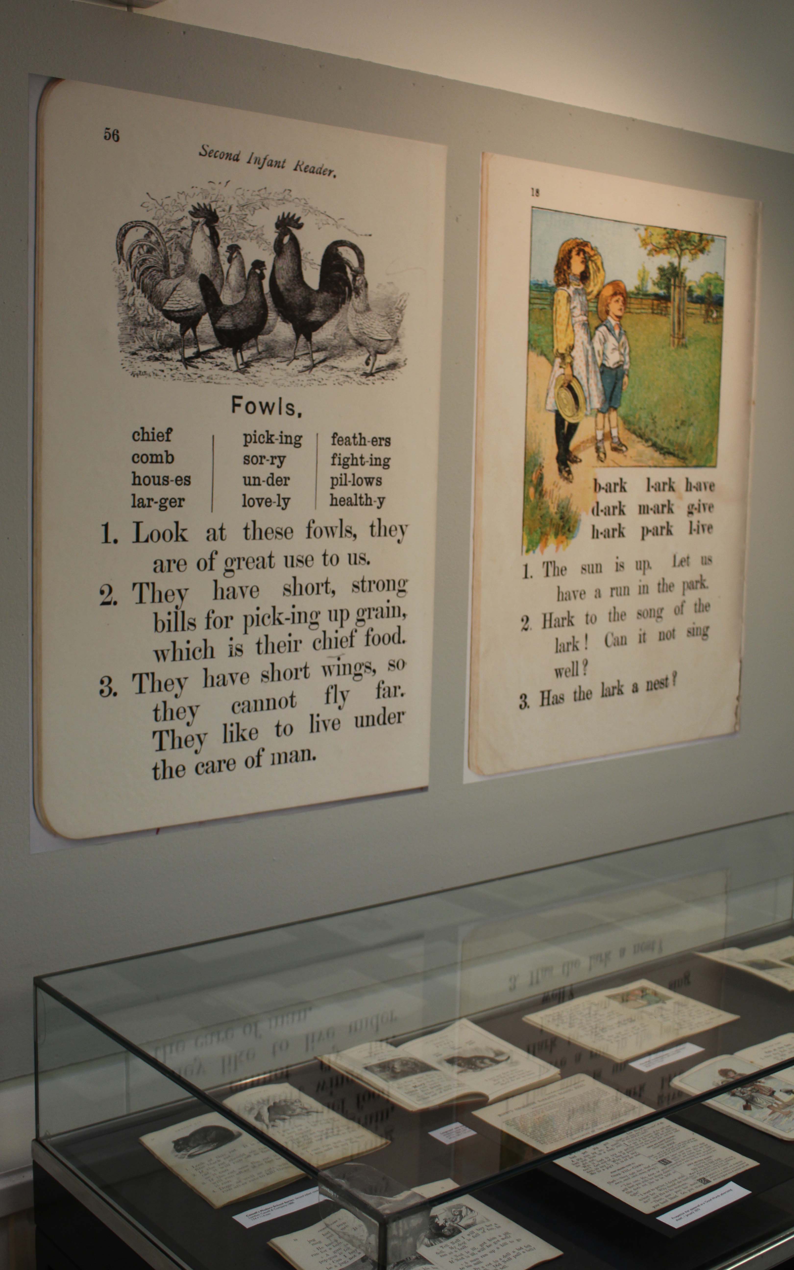
The use of typography and illustration in reading books for children has changed during the last hundred years. There has been a gradual shift from graphic conventions determined by printing and typesetting practice for adult readers to those more appropriate for beginning and emerging readers. Illustrations have become more important and many reading schemes used known artists to create the much-loved characters who featured in the narrative.
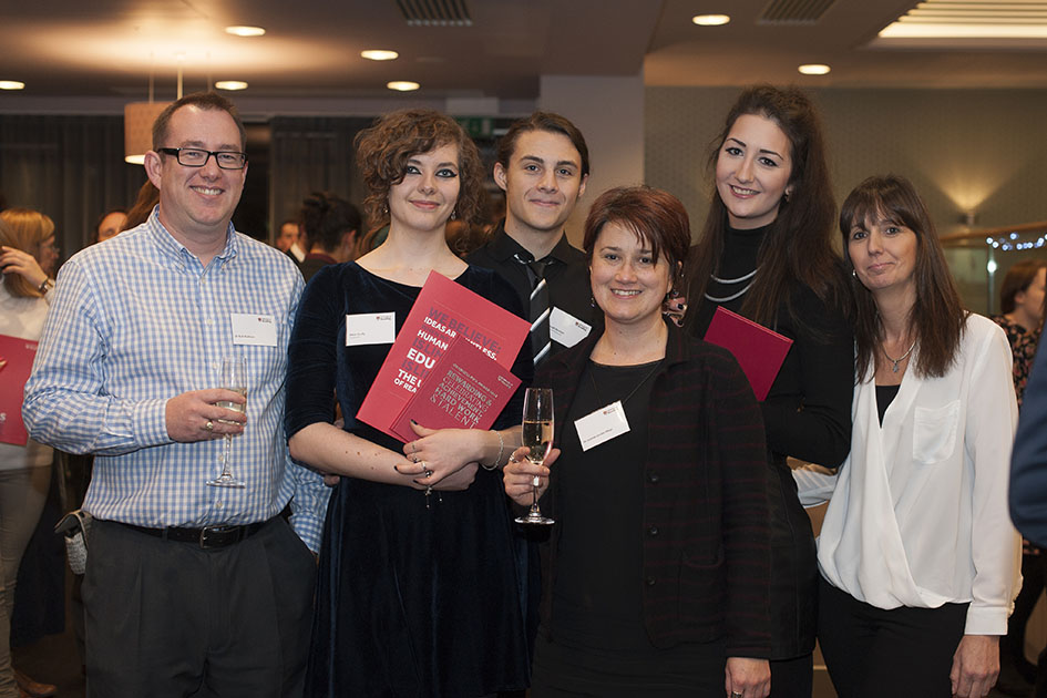
Congratulations to typography undergraduates Emma Cain and Anna Scully who are recipients of the prestigious 2015 Chancellor’s Awards. Celebrating their achievement at the awards ceremony were (from left) Rob Banham, Anna Scully, Joe Bannon, Jeanne-Louise Moys, Emma Cain and Elizabeth Cain.
Lists and rankings are great fun, especially if you hit the upper reaches of the charts! That’s exactly what John Morgan, Reading alumnus and visiting teacher on our MA Book Design programme, has achieved in the Wallpaper* list of Top Twenty Graphic Designers. ‘Culture’s go-to art director’ is the way it describes John, picking up on his work for AAFiles, Tate Britain, the Venice Architecture Biennale, HMS Victory, and countless art-related publishing projects. Also cited by Wallpaper* as an ‘influential editorial designer’ is the external examiner for our BA programme, Simon Esterson.
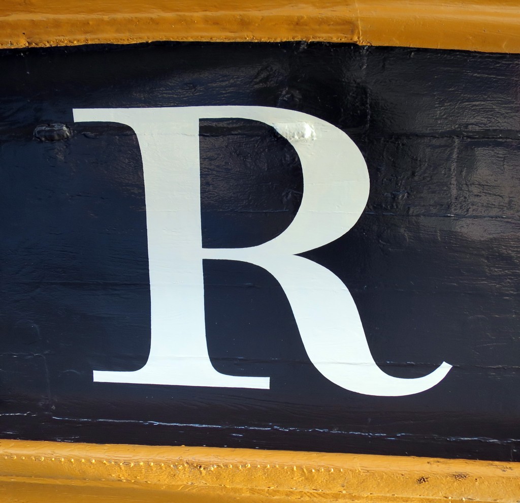
The name of HMS Victory, launched in 1765, the oldest ship of the Royal Navy that is still in commission, has been repainted. The name had been painted when the vessel was refurbished in 2005 for the two-hundredth anniversary of the battle of Trafalgar, but unfortunately the style used was Trajan, the Roman inscriptional letter that was quite unknown in England in 1805. Since the ship was being repainted during 2015 in a colour that is believed to be closer to that used in 1805, the opportunity was taken to repaint the name at the stern, using the ‘English vernacular’, the bold traditional style of lettering that is believed to have been in use at that date. The model for the style was engraved lettering by George Bickham. There was also guidance from contemporary paintings, and from scale models of 18th-century warships at the National Maritime Museum.
The letters were painted by Phil Surey from drawings by Adrien Vasquez of John Morgan Studios. Advice and historical research was by James Mosley.
Good typography is at the heart of government and public services: it enables access to information, builds trust, and ensures accessibility. This statement will not surprise anyone who appreciated the impact of the redesigned GOV.uk site, and similar efforts in other european countries. Well, now the US government has published its own comprehensive guidelines for the web, to “set a new bar for simplicity and consistency across government services”.
Dig down a bit, and the Reading connection is clear: the two typefaces recommended for all US government websites are Merriweather and Source Sans Pro. Merriweather was designed by MATD alumnus Eben Sorkin, and was based on his research at Reading for his typeface Arrotino. Source Sans Pro was designed by MATD alumnus Paul D. Hunt, as part of his work at Adobe.
It’s a nice thought that, through the work of graduates, a little bit of Reading’s methodology and attention to detail has found its way on sites that can impact so many lives.