
Lists and rankings are great fun, especially if you hit the upper reaches of the charts! That’s exactly what John Morgan, Reading alumnus and visiting teacher on our MA Book Design programme, has achieved in the Wallpaper* list of Top Twenty Graphic Designers. ‘Culture’s go-to art director’ is the way it describes John, picking up on his work for AAFiles, Tate Britain, the Venice Architecture Biennale, HMS Victory, and countless art-related publishing projects. Also cited by Wallpaper* as an ‘influential editorial designer’ is the external examiner for our BA programme, Simon Esterson.
Category: media
Reading in Eye’s typography issue

The latest issue of Eye magazine, the international review of graphic design, is dedicated to typography and typeface design. The Department is very well represented in the issue: it includes an extensive profile of Fred Smeijers, long-time collaborator of Eric Kindel on research in stencil letterforms, and past External Examiner for the MA Typeface Design programme. Our graduate Paul Barnes wrote a tribute to James Mosley’s contributions to scholarship in typography, and Gerry Leonidas led Beyond Latin, a panel article on typeface design for global scripts featuring John Hudson, Neelakash Kshetrimayum, Kamal Mansour, and Pascal Zoghbi.
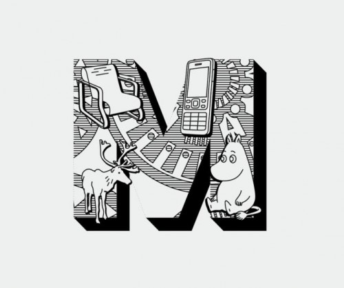
This is not about fonts
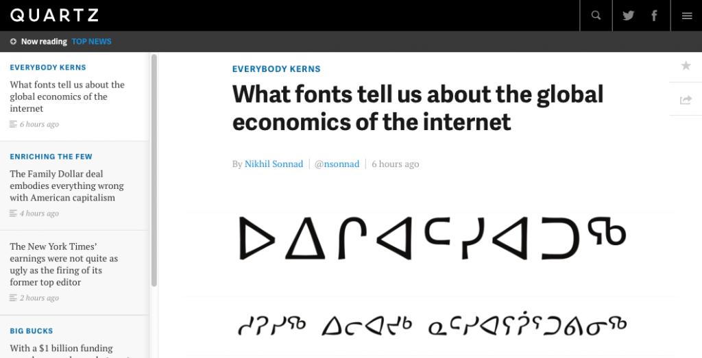 Quartz just published an extensive report on the globalisation of the typeface design market and the impact on the communication sector, with support from Gerry Leonidas, alumnus David Březina, and a reference to MATD alumna Juliet Shen’s design for Lushootsheed.
Quartz’s post is another entry in a the growing list of articles in business and general interest publications about typefaces, evidence that awareness about the importance of typeface design is spreading to fields far outside the design sector.
Design is not a matter of surface appearance
Typography supports the Design Commission’s launch on 13 March 2013 of Restarting Britain 2: Design and Public Services, and strongly endorses its opening statement: ‘Design is integral to the DNA of each and every public service. Design is not a matter of surface appearance.’
Prof Sue Walker, who contributed written evidence to the Commission, has also been invited to become a member of the Associate Parliamentary Design and Innovation Group (APDIG) to highlight existing work in the design research field that has not yet been exploited by policy makers and those in government, to point to design research as an untapped resource for policy makers. The group will report to a parliamentary seminar in June.
APDIG brings together colleagues from universities recognised for excellent and relevant design research. Information design research has much to offer government and public services through its user-centred and often collaborative methods, as well as through research outcomes that inform the presentation of complex material, in print and online.
An example of research-led information design is the Centre for Information Design Research’s work for the Behavioural Insights Team, a group of economists and psychologists working within the Cabinet Office, to help with a trial they are running to support unemployed people looking for work. Earlier this week the forms were shown in the Independent in a piece describing the impact made during testing.
CIDR in the media

A collaboration with Post Office and Freeview on research examining people’s comprehension of broadband and TV providers’ web sites was picked up by the media last week, with Alison Black appearing on Sky News, Radio 5 Live and various local radio stations. Read more about the work here.
Martin Andrews is William Caxton

Martin Andrews as Caxton and Fraser Mackenzie as the printing assistant in Sky Atlantic’s documentary The British. There’s also a starring role for the Department’s wooden Gutenberg press, designed and constructed by Alan May. Watch an extract on YouTube.
Simplicity at the London Design Festival

Alison Black, Professor of User-centred Design, shared a platform with leading designers and creative thinkers at the 2012 London Design Festival, explaining the importance of simplicity when developing products and services. Charing the event, which took place at the V&A Museum, was Philip Davies of Siegel+Gale. Other panel members were Merlin Crossingham, creative director of Wallace and Gromit at Aardman Animations; Stephen Fear, British Library entrepreneur-in-residence; and Charlie Allen, bespoke London tailor.
The panel shared their perspectives on the fundamental significance of implementing simplicity to connect to the modern consumer. They also provided their views on a wide range of topics, including how to embrace simplicity while avoiding the simplistic. Another interesting discussion centered around the idea that people have different perceptions and interpretations of simplicity.
“Brands that provide simpler interactions and experiences are winning the battle to stand out in the competitive marketplace,” said Philip Davies. “Simplicity is a powerful tool that helps brands get into consumers’ heads faster, and stay there for longer. As the UK continues to struggle in economic uncertainty, those brands that offer experiences that are clear, direct and easily communicated will generate strong customer loyalty and forge ahead.”
The lively debate played out on Twitter. Highlights from both #SimplicityTalks and the live event will be curated, together with opinions, images and ideas from select influencers who are renowned for simplicity in their fields, to create a book that will showcase the profound impact of simplicity.
Radio marathon for clarity in government forms
Earlier this week Gerry Leonidas joined Bernard Baker, Business Development Director for the Public Sector at SAS UK in a series of radio interviews to discuss the just released ‘Communicating with the Citizen’ report, commissioned by SAS and carried out by YouGov. The marathon session (seventeen radio stations in one day!) picked up on the report’s clear indications that the public wants forms to be more clear, to see a greater use of online channels for communication with the government, and to explore positive incentives in form-based communication.
Interview in the Haaretz
Earlier in the year Reading alumnus Adi Stern, now the Head of the Visual Communication department at Bezalel Academy of Art and Design, invited Gerry Leonidas to give two lectures and work with students of the academy. One lecture was for a wide audience in the academy and visitors (entitled “Where is type now?”) and one for the annual staff meeting of the Academy, on the approach taken at Reading in integrating research and teaching in design. Haaretz reporter Yuval Saar interviewed Gerry during the trip, and the interview is now online (in Hebrew).
Live on BBC Radio Berkshire
We’re live this morning on BBC Radio Berkshire with Maggie Philbin in the Department. Listen in on 95.4FM / 104.1FM / DAB