
The Christmas break is officially over and 2019’s first Baseline Shift event kicked off this Wednesday morning with a very special talk from Paul Luna, former head of our very own Department of Graphic Communication & Typography for eight years.
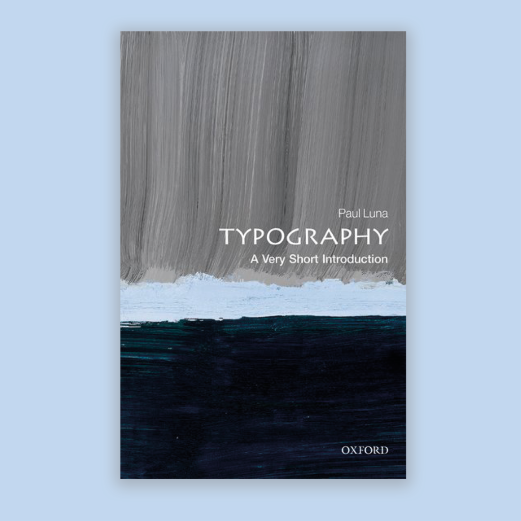
Paul came to give students an insight into the content of his brand new book, ‘Typography: A Very Short Introduction’, published by Oxford University Press in November 2018.

Some university applicants visiting for their portfolio days were even lucky enough to join us for the talk. Considering how unique the Graphic Communication course is here at the University of Reading, this gave applicants a realistic insight into the everyday life of a Typography student, and how different it is to many other graphic design courses.
‘At A Level and GCSE you get given a brief and just carry out the project. It surprises me how technical graphics and typography is at this level and how much theory is behind it. I didn’t expect to learn so much coming to a portfolio day.’
– Sophie and Becky, applicants for our BA Graphic Communication course
Typography, ‘that’s just fonts isn’t it?’
Delving straight into the world of typography, Paul explained that the intention of a designer is to evoke responses in the viewer, based on how material is designed on a page.
Emphasising the full extent of the job of a typographer, he explained that ‘It’s not all about fonts. If typography was just about typefaces our lives would be easy’.
Upon being asked about the moment in which he first showed an interest in design, Paul explained how the Influence of growing up in Clapham, where he took buses and the underground as well as flying to Italy, when he became fascinated by travel words and graphics, really sparked his interest in how language was presented in words and graphics.
‘It was really interesting to see someone who used to be the Head of Department talk about something they have accomplished and are so passionate about. We had never really considered the link between how people talk, and how typography supports or replicates spoken features, so hearing and seeing the different graphic representations of sequences of text from the BBC shipping forecast was fascinating.’
– Darcy, Olivia and Anna
Going beyond fonts
Explaining that there have been multiple attempts at defining typography, Paul suggested his most favoured definition; the totality of design for reading. Typography as a whole is about the set of choices made in order to make information more accessible, more easily transmitted, more significant and more attractive.
In relation to the layout, hierarchal and typographic choices made by a designer, Paul note that a huge visual impact can be made. Demonstrated through animations, he showed that giving importance to key words can be achieved through separating elements with colour, layout, space and arrangement.

Printed language
Talking about the differences between written language and spoken language, Paul emphasised the key role typographic differentiation plays in the comprehension of a piece of information. As verbal language, information is relayed as a continuous stream of sound however, as demonstrated through the organisation of the same information in a written format, understanding can be aided visually. Through alterations made to the structure and hierarchy of a shipping forecast, Luna clearly relayed how a piece of continuous ‘prose’ can become much more decipherable and accessible if organised through methods of listing, matrixing and the grouping of elements. This highlighted the advantages of written and visual language over spoken language, or ‘linear interrupted prose’.
Modern formats
Paul’s interest also extends to the recent transference of printed information the digital formats, and the effects this has had on the rendering and applications of typography and its conventions. Discussing the importance of abiding by gestalt principles of psychology and sticking to an underlying grid layout in design work across all platforms, he proposed that typographers should translate information between formats with as little lost content as possible. The challenge for typographers is to ‘move beyond the generic or technologically determined’.
‘I found Paul Luna’s talk quite mind-expanding, especially when he asked “Is layout dead in an electronic world?” This question made me think about how our society and generation is advancing, and how design is adapting to these changes but still sticking to the foundations of our discipline.’
– Angie Li Bacallan, Part 2

Our own applications
The content of the book and talk are highly relevant to many aspects of our degree course at Reading.
Underlying grid layouts were discussed – a very important area to us designers, and linking to almost every aspect of design. These theories can be applied to projects throughout the three years on the degree course and beyond. From the website project in Part 1 where grids must be used to ensure consistency and to create complexity from a series of simple items, through to the editorial project in Part 2 involving the combination of images and hierarchal text into a clear book format .
‘A lot of what Paul Luna spoke about relates to the website project were currently doing.’ – Xinyi Zhang, Part 1
Opportunities
Overall, the talk gave an excellent overview of the content of his new book and the state of the discipline. We feel lucky, on our course, to be given the opportunity to delve into the world of design theory with guidance from such experts.