Year: 2021

Primary Colours

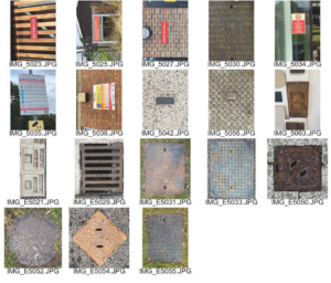
This session run by Eric was all about ‘Lettering in the environment’ we had to search for lettering around the campus based on a theme of our choice and take photos of it.

We were given an hour to go around campus and collect photos for our theme. However I hadn’t really thought of a theme at this point and decided to just take photos of almost every piece of lettering that I walked past or could see.

Once I had finished taking photos I then decided to look through them and see if I could pick out a theme from it, which I did! I found that the majority of the photos that I took were primary colours.

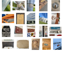
As I was laying them out of my document I decided to group all the blue images together then all the red ones in another corner and then all the yellow ones. I chose to lay them out this way so that the colours stand out a lot more and to try show what my theme was.

Karaoke Jewellery box  


In this session Habibah gave me three words the first two were based off things that she liked and the last word was a fun fact.

The words she gave were:

  • Zayn Malik
  • Jewellery
  • Her dad knows Mr Tumble

I Began to brainstorm some ideas however I found it really difficult to try incorporate all three of her words. Initially I came up with a jewellery box that was decorated in the Mr tumble theme colours, although I thought this idea was good, I quickly realised that I had not incorporated Zayn, which was her most important word. I then realised that I was thinking about generic gifts and things that probably exist already and the aim of this task was to make the ‘ideal gift’ for your partner meaning I could come up with anything.

For my final outcome I continued with the idea of a jewellery box decorated with the Mr Tumble theme but I added a flat screen on the lid of it so that when it opens you can chose the songs that you want it to play for you as well as having the lyrics displayed on the screen so that you can sing along, This way Habibah can listen to her favourite singer Zayn


Obsession

Obsession

I chose the obsession brief and decided to take a quite literal approach to the storyline. The beginning of the book appears normal, until a mouse scurries along the bottom of the page, and from here the destruction mirrored in the brief begins through the majority of the book to convey the frantic search for the mouse. This continues up until the tears in the pages reveal a growing blackness, to represent that after all of the destruction there is nothing to be found.

Lettering and the relationships with the colours surrounding them

Signs around Campus

I decided to focus on the relationships between colour of letters and the background they are presented on for this project, where I found that the majority of lettering is white or black and surrounding by a bold and eye-catching colour. When looking at the majority of signs it is evident that this design choice is made to initially capture the attention of a passer by through a large body of bright colour and then have the lettering as the secondary, despite the text being the core of the sign. I found that this technique is more effective than say, a white sign with red lettering, since there is a larger body of white which does not grab the eye as efficiently as a bold colour.

Labyrinth

After choosing labyrinth as my selected word for the task, the start of the brief stated that the story started with a family entering a house. This encouraged me to use a scalpel to cut out the shape of windows, a door and a roof to connotate this. As the book progresses the pages start to slowly change and include different textures to link with how each room within the brief all look different, adding to the illusion that the characters are completely lost within the labyrinth.

Textures of lettering

Textures of Lettering Presentation

After wandering around the campus and taking photographs of typography within the department building as well as outside; I found that all of the examples I had taken had a very similar pattern. All of my photos displayed different styles of typography using different textures and techniques, for example the many carvings/engravings on stone and metal grates. Looking at the various font styles and techniques of how information had been conveyed, gave me a further understanding of how information that is conveyed for a purpose has to suit a particular style for what is being displayed.


Raised and Indented Lettering

For my ‘Lettering in the Environment’ project, I decided to photograph the themes of raised and indented typography around campus. I chose this theme as walking through campus I realised how common place such techniques are in many areas such as construction, maintenance and even signage. That became apparent to me firstly from the many maintenance and manhole covers that where present an the pavement and the roads, which I believe were raised cast metal in order for the preservation of the type to be present for longer than a print based design. This technique can also be seen in building signs as the text is raised from the buildings wall however, unlike the sturdy maintenance based items, I believe this was designed with the attention of the reader in mind other than rigidity.