Context
The ‘I am, we are… Different by design’ is a zine created by students, published by the Department of Typography & Graphic Communication. The project aims to represent a diverse set of perspectives and experiences within the School of Arts and Communication Design.
Project overview
This year’s ‘Different by design’ brief challenged us to change the format of previous years. From an early stage we knew we wanted a range of deliverables that encapsulated the current student experience. Discussing our options, we decided to leave the format flexible until after our research and content collection phase. Which we would do through a student survey sent out to students in the School of Art and Communication Design. Understanding their struggles and showcasing them in our zines was important to connect the audience to their experiences. Zines are a great format for this because they feel close and personal. Handmade qualities, imperfections really tell a powerful story to its audience. Expanding on the previous issues, we have also promoted our issue on Instagram and have a digital copy of the issue hosted on Github, allowing further reach.
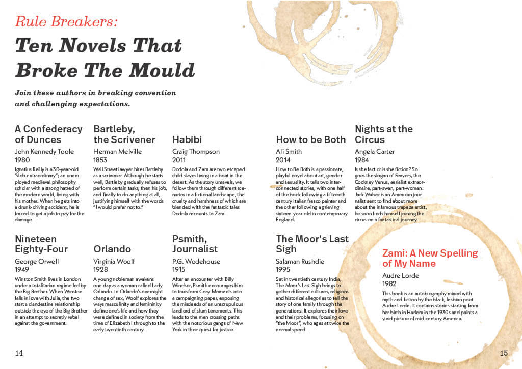
We started this project by understanding what previous years had done, the A5 booklet format needed refreshing. As a group we visited The Wellcome Collection’s ‘Zine’s Forever’ exhibition during the summer break. We were inspired by the variety and creativity showcased in the zines that we saw and wanted to change the format that previous years had used. While staying true to the fundamental principles of ‘Different by design’.
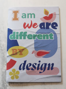
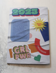
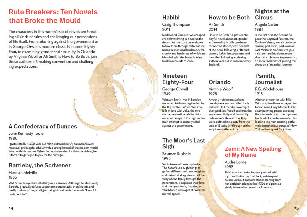
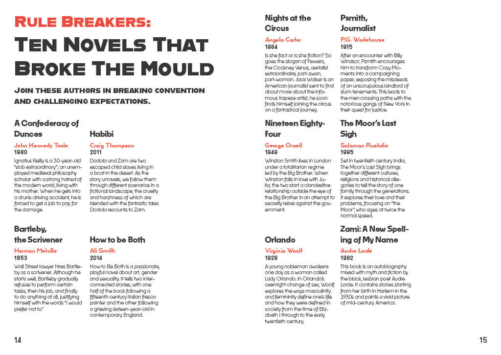
Figure 1: previous year zines booklet example.
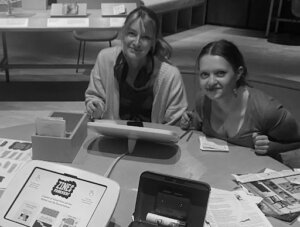
Figure 2: London visit to the Wellcome collection Zines forever! Exhibition.
Timeline
We worked on this project for nearly a year: we had a rough schedule for what we would be doing and when with key dates like:
-
-
- Group sessions
- Client meetings
- Print deadlines.
-
This outline serves as a way of showing how we broke down the work into stages in such a long time-frame, so that future issues have a rough sense of what the timelines look like.
June – September:
-
-
- London trip, Ethics approval, Preliminary research, Student survey, Branding development
-
September – October:
-
-
- Review responses & supplement with research
- Begin exploring fold options for zines
-
October – December:
-
-
- First drafts of each zine
- Branding finalised
- Pricing estimates
-
December – January:
-
-
- Zines developed for feedback on return after Christmas
-
January – February:
-
-
- Design iteration-feedback cycles
- Paper stock explorations
-
February – March:
-
-
- Paper sponsor finalised
- Continued zine refinements
- Copy-editing
-
March – April:
-
-
- Last adjustments before sent to print
-
April – May:
-
-
- Animation development
- Zine folding
- Distribution
-
Project direction development
We had a series of meetings over summer discussing our individual aspirations for the project using FigJam to collaborate live and discuss mood-boards together.
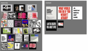
Figure 3: Figjam moodboards .
Student survey & themes
We split our survey into four main themes. Probing experiences related to; Mental health, Women’s health, Community & inclusion and Student finances. We felt we covered, at large, the student experience with relevant topics for different audiences.
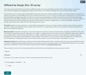
Figure 4: Student survey.
Branding
It was important that while we had a collection of items they all felt like a part of the same set. Here is our development of brand logos.
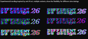
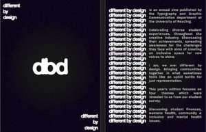
Figures 5-6: Initial direction was for anti-ai style, we removed colour because we felt like it was too distracting, and also optimised the logo for simplicity and printing. Conceptually the outlines give a sense of ‘container’ for the zines.
Zine Packet – CMYK
C – Mental health zine
The mental health zine’s objective was to create a space where students could share their thoughts and feelings regarding their mental health and mental health services at the University. The data was then taken and created into something thought-provoking but also eye-catching for the reader. Mental health is typically spoken about in a more medicinal sense, and we really wanted this zine to feel full of creative expression and freedom. This juxtaposing approach took some experimentation to get right, with many stages of refinements.
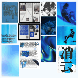
Figure 7: Mental health zine moodboard. Image sources: Cosmos.
The mental health zine started looking very modular at the beginning stages. Lots of harsh shapes and each page felt quite isolated. We re-explored how we could work with this and decided to incorporate more of a flowing design system. This meant the spreads flowed seamlessly together, like a journey.
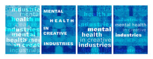
Figure 8-11: Iterations of mental health zine cover design.
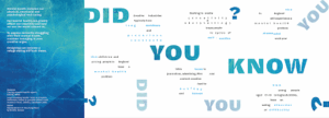
Figure 12: Final spread of mental health zine. Side 1.
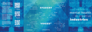
Figure 13: Final spread of mental health zine. Side 2.
M – Menstrual health zine
The purpose of this zine is to highlight the significant challenges that over half of the students at the University of Reading are encountering. According to Ucas.com (2026), 53% of the students at the University of Reading are female. Despite this substantial majority, there are no systems in place to provide assistance and support to individuals who menstruate.
This critical issue was highlighted in the survey that our team conducted, which revealed that many of the students studying here felt under supported and were expected to “suck it up” and cope with extreme stress and workloads while suffering from debilitating pain and fatigue, along with a combination of other symptoms making it impossible to keep up. The objective of this zine is to bring attention and recognition to the invisible pain and struggles being dealt with by menstruating students. To achieve this effectively, I chose a comic book theme to illustrate the complex story of menstrual health in an engaging and accessible way.
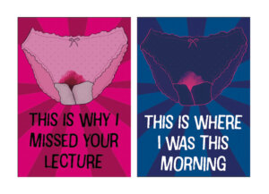
Figures 14 & 15 :Zine front cover and navy cover.
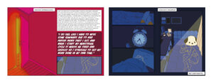
Figures 16 & 17: Spread one magenta and navy versions.
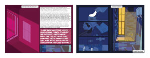
Figures 18 & 19: Spread two magenta and navy versions.
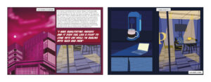
Figures 20 & 21: Spread three magenta and navy versions.
The fold divides this zine into two booklets. The first half, on the magenta side, shares facts and personal stories of university students. It uses peekaboo windows to subtly hint at the full illustrated dark blue comic side. Each spread corresponds to its opposite. Spread 1 shows a bedroom door leading to a woman suffering in her bedroom, unable to resume her normal activities. Spread 2 shows a bathroom window correlating to a woman attempting to get ready and care for herself. Spread 3 displays the University of Reading library, with its opposite showing a person in the library suffering through their pain.
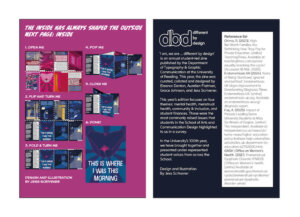
Figures 22 & 23: Back cover magenta and navy versions.
This zine is not a fictional narrative, it represents the lived experiences and challenges faced by every menstruating individual within the educational system. The primary aim of this zine is to inspire meaningful conversation and ignite a movement for change within our university community.
Y – Community & inclusion zine
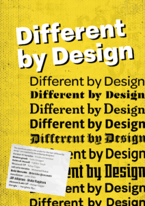
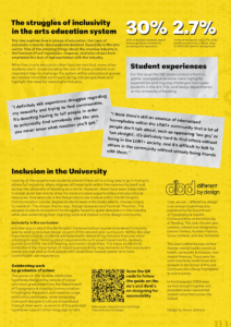
Figure 24 & 25: Zine front and back unfolded.
The community and inclusion zine aimed to highlight issues within the University of Reading in the School of Arts and Communication Design. However, the zine also celebrates the inclusion in courses and showcases work of previous students through a poster design. Working as the front cover of the zine, allowing for more engagement when viewing and opening, teasing the design as it is unfolded.
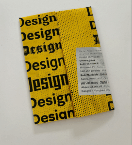
Figure 26: Poster folded.
The chosen typefaces featured in the zine, and on the poster, were designed by previous MA students of the department – who have multi-cultural backgrounds. Using this with the survey results shows both positive and negative experiences.
To keep cohesiveness throughout the zines, halftone was used in the background with the same blurb repeated on all 4 zines. This allowed for more flexibility with other elements such as type, folds and layout.
K – Finance zine
The finance zine showcases the difficulties of working while studying; inspired by the unfolding of a receipt. Supported by national statistics and observations of how student loans have changed over the last 10 years. Validating their experiences.
The receipt concept was good but I found it difficult to interweave the results of our survey into that style at such a small scale. Deciding that it could take away impact from the personal stories. Adapting this into a poster felt more natural and would give the potential for an interactive leaflet. Content on one side and the large poster on the other.
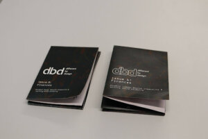
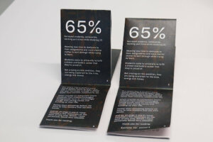
Figure 27: Early print tests.
After some feedback, we strayed away from all using Halyard as a cohesive typeface, which we had picked up from previous years. As it allowed for more creative expression, which opened up new options for the receipt concept.
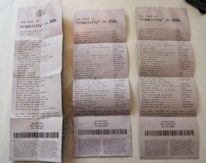
Figure 28: Receipt development.
The fold of this zine went through many different iterations in consideration for how the end-user would interact with it. Through many observations of people struggling to open it which was getting in the way of the experience.
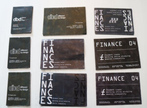
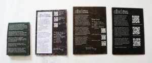
Figure 29 & 30: Developments after feedback and back panel refinements.
Packet Band
When creating the band, we experimented with what content it would include. In one of our first ideas, we considered adding a blurb however, as the back of the finance zine can be seen, we felt this was redundant. Keeping it simple helped the colours of the zines to pop.
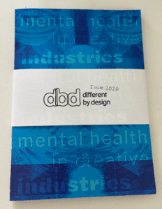
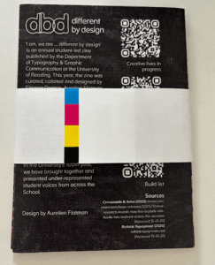
Figure 31 & 32: Packet band front and back.
Production
We knew that hand folding the zines would take a considerable amount of time with (150 copies) we liked that it brought a handmade quality into the final packet.
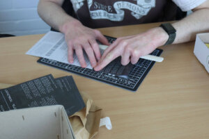
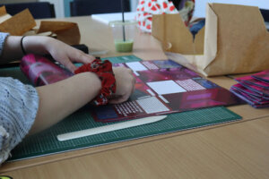
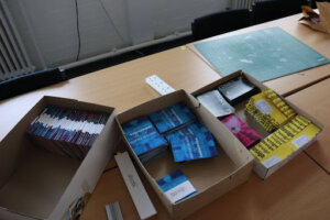
Figure 33-35: Folding day photos.
Animation
Wanting to promote the collection online, we decided to create a simple animation. At first it was just the After Effects animation but we wanted to tie it back into the physical product more so we had the idea to film it in a ‘sea of zines’ (see cover image). Sound designing the entire audio, writing a simple beep intro using an online sequencer. Listen to the original here.
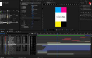
Figure 36: After effects screenshot.
Final zine packet
Bringing everything together we released the zines to the department and posted our Instagram reel! Hosting our zines as e-friendly versions on Github.
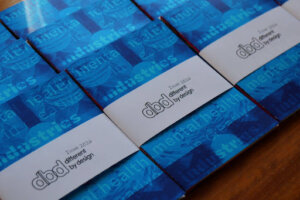
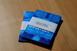
Figures 37-38: Final zine distribution.
Reflections
Eleanor:
On reflection, this project has been a great opportunity to work as part of a team to represent a community of students in the creative industry. With the combination of topics that were of most importance to the student body, being able to represent those who have struggled with their mental health and create something for them was really inspiring, as someone who has used the University’s services myself. I enjoyed the collaborative aspect of this Real Job and really enjoyed working with this team to curate a little pack of creative representation.
Grace:
Overall, this project has been an amazing experience with understanding how meaningful design can be created in a fun and conceptual way. Through challenging the traditional A5 format, we were able to push beyond something plain. Being experimental throughout the process helped me build confidence in taking creative risks throughout other projects. This project has helped me to understand the importance of the power of design, especially through hearing the stories of peers and sharing them through our work to try and create a more inclusive environment. Collaborating with the team was also a rewarding aspect of the project as I learned a great deal from working with my teammates and listening to their ideas. This helped me to see different perspectives and how they strengthened the overall outcome.
Jess:
Executing this project has provided me with the opportunity to create an activist feminist zine that has the potential to bring about change within our university. It has been a unique chance to develop something entirely self-directed, free from any limitations. This project has allowed me to delve deeply into a topic I am personally passionate about and to craft a piece of work that is exceptionally complex, which I have created from beginning to end. The experience gained from this project has been invaluable, as it has taught me how to work effectively within my own time-frame, establish my own brief, and tackle a complex project centered around creativity. Additionally, it has enabled me to collaborate very successfully in a group setting while still maintaining my independence.
Aurelien:
Working on this project has been an incredibly gratifying experience, at times it has been challenging but I really feel like we ‘pushed the envelope’ forward for future years to be inspired from and iterate on top of. I also think the depth of the work is quite significant, sharing these incredibly vulnerable but important stories does a lot in building solidarity for those with similar experiences. When we started this project, I think we all had a lot of high expectations and I think that, quite remarkably, we met them! Many thanks to Rachel, our supervisor, with continual guidance and for having the ambition to do something radically different this year and Rob, our client, for always offering helpful feedback.