
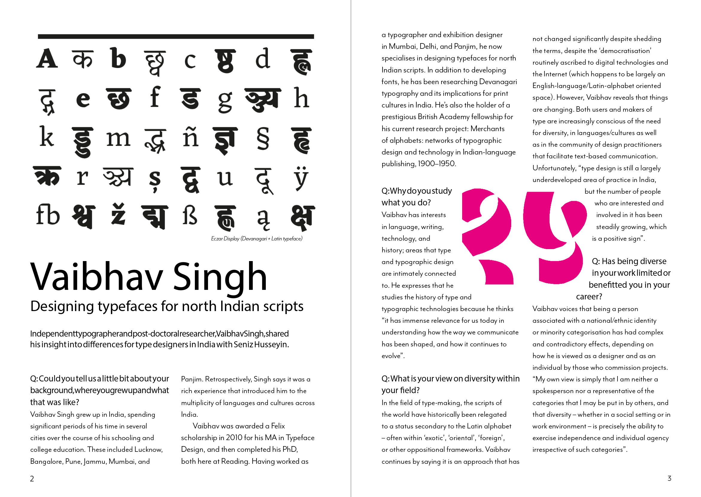
Highlights and insights from Joan and Zofia's all-digital signage project in Mecca.
Category: Diversity & Inclusion
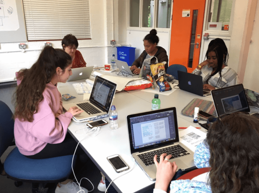
UX insights from visiting graduates
Graphic Communication and Typography graduates, Carmen Martinez, Neil Linford-Relph and Aman Verma, share their experiences of UI and UX design.
Tate Exchange Diversity Project
Background
Alongside my I am, We are Different by Design group members, in March of this year (2019) we held a workshop at the Tate Exchange in London. We led a creative workshop with members of the public during the schools Reading Assembly. The theme of the Reading Assembly event/workshop day was movement. We set out to creative a fun and interactive activity for people of all walks of life to do collaboratively and/or independently. This experience has led us to develop our organisation skills as well as event planning and execution which isn’t necessarily a ‘designers’ job.
Brief
Our brief was to establish, create and execute an activity to be done with the public at the Tate Exchange representing the university, and primarily the course of typography. It was an open brief to come up with any type of activity trusting it could be done by children as well as adults, could be done within the given space and involved typography and movement in some way. The downside of having such open briefs is that it can be quite overwhelming to make decisions and come up with ideas because the list of options appears non exhaustive.
Research
In order to come up with a concept for the activity we looked online to see what kinds of activities were plausible. This was necessary due to the fact that we had to create and conceptualise an idea ourselves. But also it allowed for us to test out different activities to determine which served as most effective and more importantly fun!

Communication
Again throughout this project, we all communicated through Trello, Facebook and with weekly group meetings that always took place on a Wednesday similarly to the way in which we did so for other projects we worked on together. These sessions usually lasted between 1-2 hours, so we often discussed more than one thing we were working on collaboratively.
Process
After researching what activities were possibly suitable, we tested them out on each other. Eventually, after discussing many different options (see figure 1 and 2) we decided to initiate an activity that involved participants creating their own flags.
As the theme was movement, we connected that to the idea of migration and immigration. With this, we also attached the idea of citizenship and nationality. Not in a way that made people explore patriotism, but more so to give them the power to create their own flag that represented their identities as opposed to where they were from (unless this was what they wanted – there were no rules).

The participants would be able to create their ‘flags’ by cutting out (or using pre-existing) pieces of paper to paste onto an A4 sheet. This A4 sheet that contained their flag was to then be printed onto tote bags for them to take home with them. The fact that participants were able to take this keep sake home was alone successful as tote bags are commonly favoured as collateral. In order to get the bag printed, the ‘flag’ was scanned in and flipped on laptops provided by the Tate. Once scanned and flipped, the prints were printed onto transfer paper that was to then be heat pressed onto the tote bags. When we practiced this at the university everything went seamlessly, however on the day, after confusion surrounding the use of a heat press on the premises, we had to use hand held irons instead of the heat press (which made it quicker and easier to process tote bags). This did not set us back too far however, as it allowed for us to interact with people more whilst they waited for their bags to get printed.

Feedback
Feedback we received from the public was very positive as we asked many of them what they thought of the activity and if they enjoyed it. It was also clear to see the satisfaction on their faces once seeing their designs printed on bags they could use. This made me realise that that was how we had the privilege of feeling way more often whilst being on the course, that the everyday person does not.
Additionally, the Reading Assembly organisers and course leaders from different courses within the school had positive words for us as the organisation and planning led to positive execution.
Conclusion
In conclusion, this experience was completely different from what we’re normally used to on the course. We did not design a product or piece of work, but more so designed and curated an experience for the general public. Being able to produce work and an activity for an institution such as the Tate was a great experience as well and probably something not everyone gets to do.
I am, We are Different by Design
Background
In the beginning of part 2, myself and other students that ranged across the three-year groups started, alongside staff, the I am, We are Different by Design group. The group set out to create a sense of diversity and inclusion within the department as we felt this was somewhat lacking. We aimed to do this in a range of different ways, this specific reflection however relates to the process and creation of the first edition of an annual zine. As a group, we received funding from the university’s Partnerships in Learning and Teaching (PLanT) scheme to create this zine and send it to print in order to distribute it across the university. Our motivations stemmed from believing that the zine would be the best way for us to communicate our opinions and also it gave us all an opportunity to use out graphic design skills learned on the course.
Brief
Our brief was to create a zine (mini magazine) that showcased work from current and past students within the school (Art, Film and Theatre and Typography). This included sourcing content, conducting interviews and designing the entire zine within a short time. Our production time was quite short as we all had different schedules (due to the different year group scheduling) and the moment we got funding to the deadline for production being quite close to each other.
We planned for an A5 dimension as it allowed for more content to be included and more copies to be printed and distributed. Additionally, we collectively decided on a matte finish to ensure durability over time. Due to the nature of the content we aimed for the zine to look fun and exciting and like a celebration of the diverse work that is created at this university. Our main aim was to showcase this and allow for people to see and read about work they normally would not be exposed to.
Research
For inspiration and research, we looked at different zines and magazines. The tasks were delegated between us so some of us researched typography whereas others researched layouts etc. Although somewhat useful, sketching out themes and ideas served more effective than looking at other examples as we were creating something that closely reflected the content used throughout.
Communication
Throughout this project, we all communicated through Trello, Facebook and with weekly group meetings that always took place on a Wednesday. This was due to the fact that this was the only day where we all had time to meet for a couple of hours at an appropriate time. Having weekly group sessions was really useful as it added to a sense of community we were all lacking, but also made it easier to collaborate and bounce ideas off of each other.
Process
Our process started with discussions concerning who and what we wanted to feature and why. Our featured contributors needed to be engaging with diversity in some kind of way as that was what we aimed to showcase. At times this was quite challenging considering we didn’t want to interpret certain works in the wrong way if they weren’t intended to be about diversity and inclusion (but instead merely personal projects – so diverse by default).
In order to compile and design content, we interviewed individuals across the school as well as researchers and graduates. In order to do this we needed to do research and get ethics approval beforehand. This process of conducting interviews was very useful as it allowed us to explore and develop our professional skills as we had to be respectful and professional in our data collection.
The interviews we conducted allowed us to create articles and spreads showcasing a nice range of work showcasing projects that explored diversity, identity and inclusion (as hoped). Some examples of works that we featured is artwork representing equality within visual arts as well as more researched based content focussed on assisting medical staff.
The cover design of our zine featured a motif of camera lenses – this represented seeing things from different perspectives and capturing these. The range of colour used reflect inclusion and add to the fun and inspiring aspect of the zine. Overall, I can say we were collectively pleased with the outcome and reception.
Feedback
After completion of our zine, we received a range of positive feedback.
“We are very inspired by the whole project and how we can expand it to other departments. The zine turned out so well!” – Lisa Woynarski (School diversity lead)
Encouraging words like this have led us to be even more motivated to continue to do this kind of work, which we did having recruited members in this year (and hope to continue to do so throughout the years).
Conclusion
In conclusion, this project was one of the most fruitful and beneficial personal projects that I have been involved with throughout the three years of my time at the university. Getting to know members from different year groups allowed for us all to experience diversity and a sense of community in a way that isn’t very common. I am grateful to staff members that allowed for this and encouraged it as often times extra-curricular activities may seem overwhelming or big commitments. We were never made to feel like we had to attend the session, or we would get into trouble. Due to this, it seems we were more inclined to get involved because that pressure was lifted. Additionally, being able to create collaboratively whilst not being marked gave a different perspective into what and how design work can be (considering in most cases this is paid work that doesn’t always serve the designer themselves). Now being at the end of my journey here I really encourage other students to get involved with groups and communities such as these, and if in the future I am, We are Different by Design doesn’t exist, I hope our efforts can inspire others to undertake their own projects within the school.
HMP Huntercombe Prison Research Project
Background
This blog post covers a project we carried out for HMP Huntercombe Prison in Oxfordshire. Huntercombe is a Category C adult male foreign national deportation prison. The prison governor wanted to improve communication, particularly with prison inmates, about some of the support services available to them. The project was a collaboration with students from Reading’s Linguistics Department who were tasked with improving the wording of information provided for inmates.
Brief
The brief for this project was to redesign three noticeboards from different sectors of the prison; DARTS (Drug and Alcohol Recovery Team), Chaplaincy and Resettlement Office. The client and the prison department leaders stated that:
- The language used should be understandable by those with B1 English level.
- The design should take into account the need for the posters to be understood by people from different cultures.
- The design must be legible from afar because inmates aren’t allowed to stand and look at the notice boards in the corridors. Therefore the design should be legible enough for inmates to absorb the information within 30 seconds or less.
Deliverables
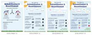
Three redesigned A1 posters to be placed within the notice boards on the walls of the prison. Each of the A1 posters must either represent information regarding the DARTS (drug and alcohol recovery team), Chaplaincy and Resettlement Office.
Design Development
Given the short time period proposed for this project the design development for this poster required rapid changes to meet the demands of the client, the prison department leaders, inmates and the linguistic students. This was somewhat challenging due to the breadth of the initial requirements of both the students and the prison department.
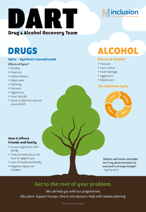
DART (Drug and Alcohol Recovery Team)
The original noticeboard for DART (Drug and Alcohol Recovery Team) raised awareness about how drugs, specifically spice, and alcohol affect an individual and informed inmates about how the DART department would help them. Discussion with the prisoners suggested this information was not being conveyed clearly currently due to small type size and a limited amount of time in the corridors.
On one of the DART notice boards situated in the residential wings, there was an image of a tree which the prison inmates found very hopeful. They wanted the tree theme incorporated into the redesign of the noticeboard. Relating to the feeling of hope, an inmate would write weekly inspirational quotes on a whiteboard in the DART department, and the DART team felt would be a suitable addition to the redesign of the noticeboard, as it connects with what they want to achieve.
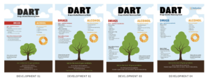
Development 1:
Developing on the ‘tree’ theme, tree was used the central focus of the poster. An inspirational quote was placed on the left side of the tree to relate back to the inspirational quotes in the department. Suggested the idea of separating information about drugs and alcohol by incorporating a colour coding system, allowing easy identification of information.
Development 2:
The DART team requested to change the word ‘marijuana’ to ‘cannabinoids’, as although scientific language might be difficult to understand for non-English speakers, the use of scientific language was necessary. Additional rephrasing and repositioning of bullet points under the various categories, as well as changing the bottom paragraph below the tree to ‘education, support groups, one to one sessions, and help with release planning’ to keep it short.
Development 3:
The Inclusion logo, the charity which funds the department, was incorporated at the top right-hand corner of the poster, and to accommodate this the DART title was shifted to the left hand corner. The colour of the drugs section was changed to the blue used in the Inclusion logo, as I wanted to show the relationship between the department and the charity.
Development 4:
The last and final development of the poster showcased the final amendments given by the DART team and was sent back to them for printing confirmation. The team stated that they were grateful for the work we have done and were really pleased with the posters final outcome. The inmates were also proud to have contributed to the design process of the DARTs poster.
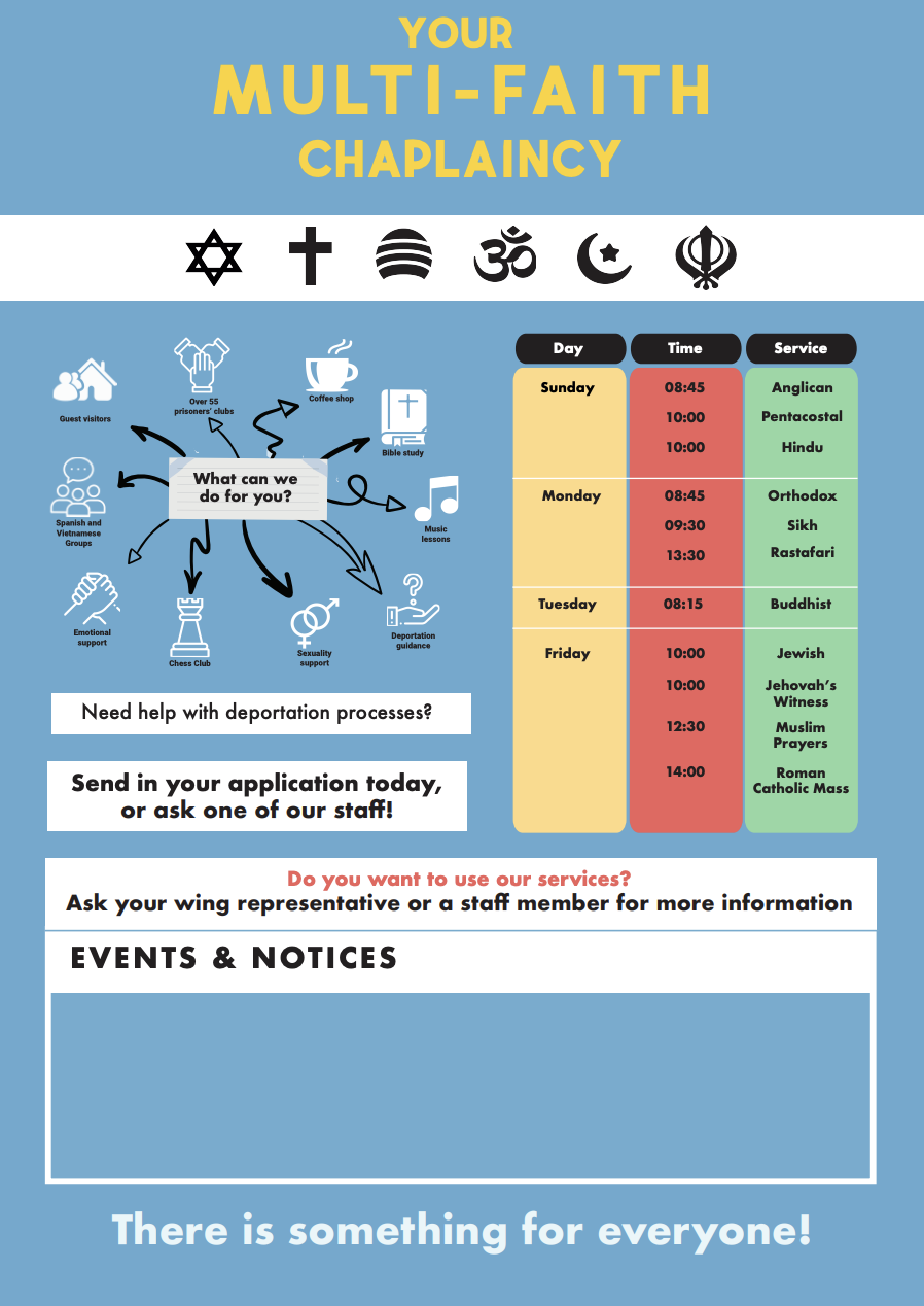
Chaplaincy
The chaplaincy board was the sole board that did not have a lot of information compared to the other two noticeboards. It consisted a single sheet of A4 paper outlining the schedule and activities occurring in the prison. This allowed flexibility and areas of improvement to design the noticeboards in the most effective manner.
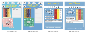
Development 1:
Input from the inmates provided during a focus group suggested that they wanted bright colours and a timetable suggesting when each session of prayer was (as prior to this they only knew this by word of mouth). The head of the chaplaincy also required an area of the poster where he would be able to add notices and etc.
Development 2:
With this in mind, I played around with the concept of brightness and the sky as the inmates also suggested that they would also like more colour. This paired with the presentation of several religious symbols would allow the inmates to immediately associate the poster with the chaplaincy.
Development 3:
However, after a time away from looking at the poster, along with my group mates I decided to change the structure of the poster to make it look more cohesive and aligned. However, I continued to play with colour. I chose blue not only for its brightness but also for it to look more connected the other posters to create a more cohesive project.
Development 4:
Finally, the last and final development showcased the developments with more writing as well as adding the word ‘your’ to make the piece more personal
Resettlement Office
The noticeboard for the resettlement office was about letting the inmates know about the options they have for resettlement within the UK. Officer Macdonald’s noticeboard was a flowchart made of separate small paper pieces and wanted to change this to a single sheet. In terms of the colour choices, such as black background and white text, this needed to be changed as it interfered with the content in terms of legibility. The prison inmates stated that they did not even know this board or this department existed hence the design needed to showcase a clear typographical hierarchy.
Development 1:
The notice board features two houses to showcase the choice between resettling in the UK or back into their home country. A quote was placed in the centre to remind the inmates about the resources available for them in the prison. The title was made bigger so that the inmates are able to recognise the board and the department the board belongs to.
Development 2:
After speaking with the client and the linguistic students, the overall approach to the noticeboard was revised. The options open to inmates were removed as the responsible officer primarily wanted to use the notice board as a prompt to inmates to come to ask for help and talk about the various ways of resettling and rehabilitation.
Development 3:
There was a suggestion to brighten the poster with more colour. The visual elements within the poster were kept minimal and to avoid information confusion and to not create high contrasts, which could confuse the inmates about the information being presented.
Development 4:
Once showing the redeveloped poster, the Linguistic students strongly felt that the sun needed to be more expressive. In addition to that they felt that the pictograms placed near the text required different colours to make the poster more lively. This was done and it did uplift the poster. However, it is unsure if it could cause confusion for the inmates. Additional small changes were made to the wording at the request of the officer responsible.
Final design features
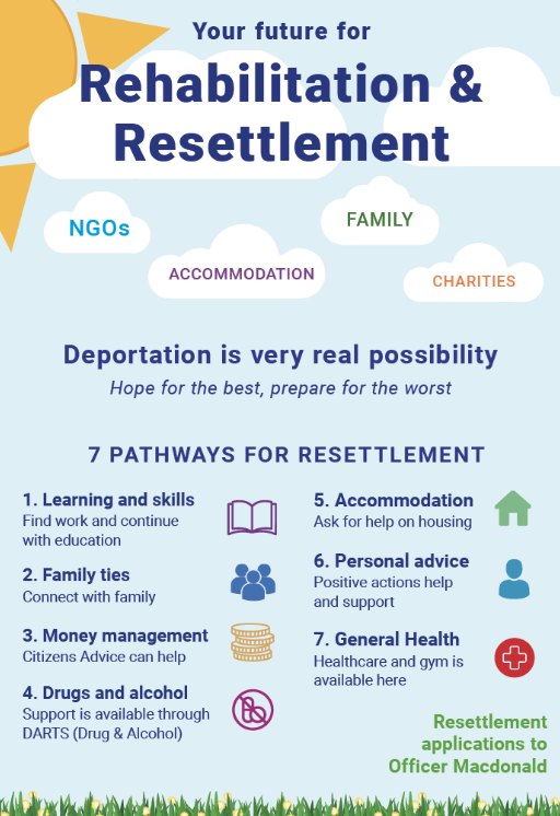
The poster for this department consists a shade of the blue colour background we have established to create a sense of cohesiveness along with the use of clouds. This is to create an illustrative approach of the poster rather than a poster filled with just text. Using these minor illustrations makes them playful and engaging in an environment where there is not a lot of use of colour and the atmosphere is dull and dark. Therefore these posters are in attempt to make a subject that seems daunting more friendly and inspire more inmates to seek help or to look at the poster.
Key takeaways
Although working with several different departments was challenging, it gave insight into what working with several clients would be like. As the project began to develop, all graphics students were put into different groups with the linguistic students who would handle the information being stated in the posters themselves. This led to each poster having a different timeline and set of outcomes it needed to achieve due to the different nature of information each poster had to show.
This caused some stress, extending the project to give both departments time to asses and change both the information and design to ensure that the poster that was created was the best possible produced.
The feedback given from the inmates for resettlement poster noted that the background created a light airy atmosphere to the subject. The symbols help clarify the text for the 7 pathways and the signposting helped clear misunderstandings. They liked the words within the clouds but felt the term ‘NGO’ would not be understood but as a whole, it was clear and informative. In terms of the Chaplaincy poster, they noted that there was a nice contrast between yellow and bellow as well as the symbols helped explain the meanings of the text presented. The poster is inclusive with clear signposting and the timetable was easy to read. However, they mentioned some of the alignment of the information created a strange shape but didn’t hinder the design as a whole.
Nonetheless, when returning to the prison to showcase the redesigned posters, the prison inmates were delighted that the posters brought vibrant colours which stood out from the dull walls of the prison, and highlighted the information in a clear and concise manner
BrEDS Eating Disorder logo
Background
The British Eating Disorder Society is a new organisation aiming to improve awareness of eating disorders, and the care and treatment of people with eating disorders and their families. The society is a body representing people working in the field of eating disorders across the United Kingdom with the intension to host conferences and meetings, as well as elevate their form, to create a well-supported of professionals. Their main aims are to promote communication, collaboration and consensus amongst people in the field of eating disorders, especially disciplines, professions, academic and clinical settings and sector. BrEDS will represent the views of people working with these people to the media, the public, businesses, government and relevant bodies. Simon Chapman, the main point of contact, is a Paediatrician at King’s College Hospital and specialising in Eating Disorders, as well as working with obese patients. He is part of the Child and Adolescent Mental Health Clinical Academic Group.
Restated Brief
BrEDS would like a clear brand identity, specifically starting with their logo design, to be applied across their website as well as using the logo on social media. The image and feel needs to appeal to professional and hold authority in the field, whilst still being sensitive and subtle with the subject matter of the cause.
The main points of focus are:
- To create a simple, clear yet impacting logo that communicates with their audience and the wider public. This will need to convey their main aims of working with professionals to improve awareness and care of people with eating disorders. The Society intends to be far reaching and influential with government and media.
- To re-structure and apply the logo and secondary branding to the website
- To present a positive/collaborative view of the disorder: it is about recovery, restoration of health, food as medicine and essential to physical and emotional wellbeing. It is also about communication.
The client has not set strict guidelines or preferences for the style or approach for the deliverables. The items should however explore their initial idea of wheat and be sensitive to the subject matter and their audience. The basis of the deliverables and necessary to carry through to the other items is the logo design.
The key deliverables are:
- Design the logo for BrEDS, to be used on website and social media.
- Assist with brand guidelines and website recommendations for a coherent and consistent brand identity. This will include providing a brand guideline document as a PDF
- Design a one-sided business card
- The later request for an A1 poster was added two weeks before the final deadline
Process
Initial contact with the client
Despite being my first real job, I was feeling comfortable with working with an external client having experience as a freelance designer. With a personal investment in the cause I was eager to build a strong and trusting rapport with my client from the very beginning and showed willingness and enthusiasm in my initial correspondence. I was privileged enough to be a part of the BrEDS committee skype meetings, held every two months, from the very beginning of the process, giving me a well-rounded perspective of the whole organisations and the different voices beyond just my main client. The first skype session coincided with the start of my project and I was able to gather the key points that were the basis for my research and design ideas moving forward:
- Remember that BrEDS is a professional body
- There needs to be a balance between medical and emotional in the overall visual identity of the charity.
- It is important that there are no religious connotations, trees or apples
- The preference is to take a more simple approach, with inspiration such as NEDA and AED for their logos.
- Charities show the positive so remember this within the approach to any visuals
- It would be good to have a subtly of the overall intention of BrEDS, which aims to connect with lots of different professionals who deal with treating eating disorders to work as a stronger body of people.
Research
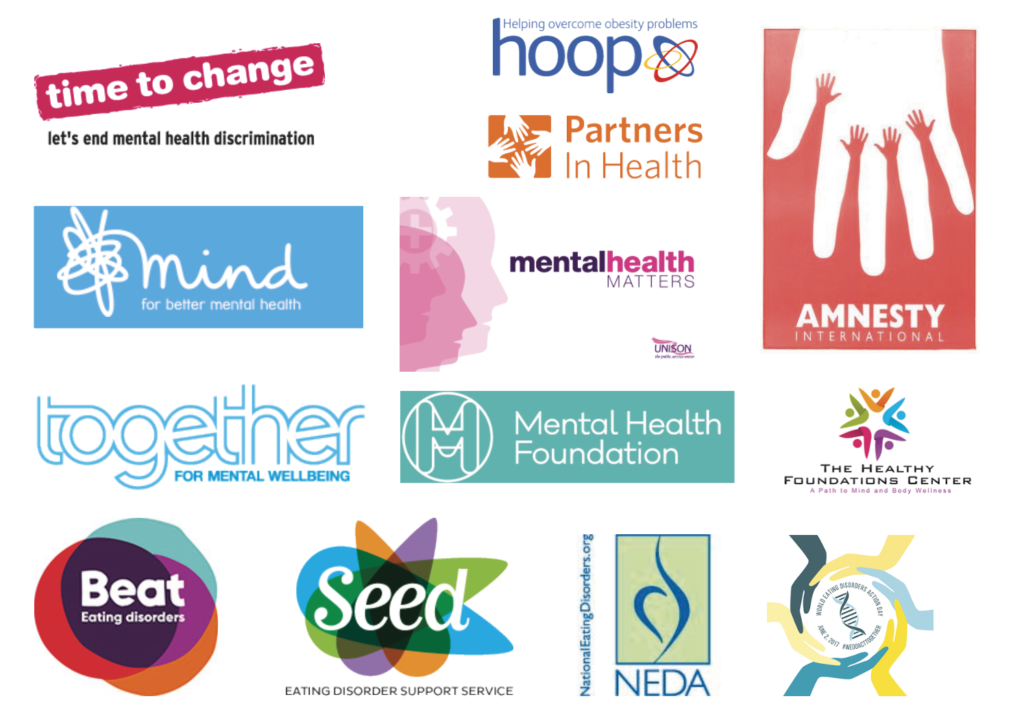
In order to inform my design stage I spent time researching a range of logos, from mental health charities, wellbeing logos and more generally medical branding and logo designs. I look specifically at logos of those mentioned by the client to ensure I was keeping in line with their preferences, as well as trying to form a wider understanding of potential directions that the logo design could go. The research was valuable in showing attention to colour palettes and how these can help create a medical identity without obviously having imagery of something more specific to the cause. Blues and purples appeared to be popular in medical branding.
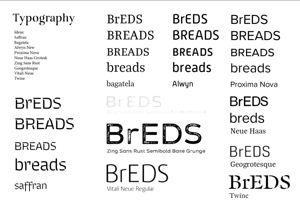
Sketches and initial ideas
From the research done, I created mood boards for presentation, which included ideas for secondary branding and tag lines. As part of the presentation document I became to sketch 10 ideas to show the client as the first stage of the job. Consideration the a predominately illustrative or typographic logo was key and understanding how the graphic style of the illustration or typeface personality needs to be appropriate for both the eating disorder subject and the charity as a professional body of health care experts and doctors. I used Illustrator to both digitalise hand-drawn sketches as well as outline typefaces for greater flexibility and ease of modifying positioning and scale.
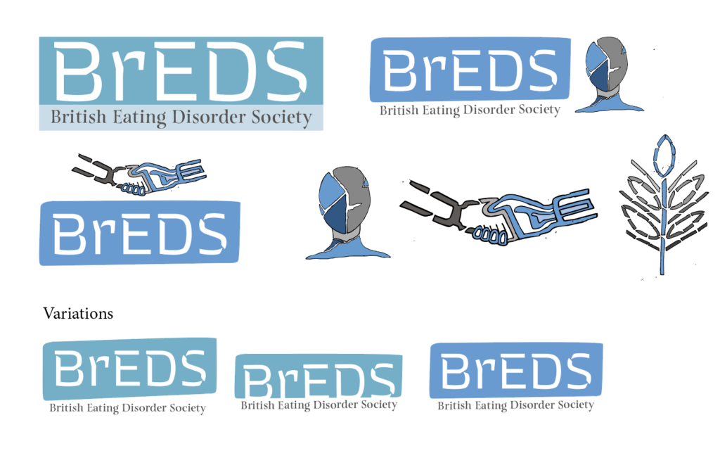
In response to feedback I refined three ideas to take forward to show the client and wider committee. Through this I learnt the attention to detail for how best to present the concepts on the page, drawing on information design, to ensure I kept the description of the idea in the same place on each page as well as keeping the description away from the graphics. Including a short description of the concept and design outline for the designs was a good exercise to consider a concise and professional tone to present my designs to the client and committee. This was a helpful aid for the those considering the designs and the client provided thorough feedback and opinions from the committee that brought together the general consensus in favour of one design. The client also provided a new focus to consider in moving forward with ideas: the group’s wish to focus on integration/collaboration – I would echo this: BrEDS seeks to represent some very different professional groups all of whom work with adults and children with eating disorders. Similarly, another member of the committee emphasised that “For what it’s worth re: logos – I agree with others. Need something more rounded, and welcoming than the fractured images. It’s about bring together. And should be aspirational, and warm.”
“Thank you Philippa for all your work on this – some imaginative and beautiful designs.”
At this point in the job it was clear that the design store would not be working as systematically as I had hope. Attention to adding new concepts and designs to present to the client I learnt how to adapt and evaluate where further designs and concepts needed to be explored rather than pushing on with my own expected deadlines and refinement of one idea. Still considering the preferred design by the client and committee I created two variations of that design whilst presenting two new designs. I spent time digesting the comprehensive feedback I had received to focus more on the togetherness of the charity itself and how differing professionals are coming together under one cause. The new designs were presented in a similar way but it was of benefit to join another skype meeting which fell at the same time as sending through the designs. Before the meeting it was interesting to consider with my supervisor the expectation of the design they would prefer. Up until this point the job had taken a natural course, with there being a general development of one idea leading to the next more refined concept. It was therefore surprising to receive, for what seemed to me, a complete change in direction as the committee all unanimously agreed on a new approach to the brief, overlapping letters, with differing colours to show how differing voices and professionals are coming together to make up BrEDS. This new innovative design was, from my perspective and shared by the committee and client, a fitting direction for the charity and when put against other similar charities. Unfortunately, however as it had been viewed as an alternative approach that would not be chosen the design was very much a draft design, with the overlapping letterforms in need of attention to create a clean and precise composition that would be successful at both a small and large scale. The typeface itself had some awkward curves and inconsistent characteristics that meant that the general appearance was not as crisp as it could be. Whilst this would be expected to go through two stages of refinement to get to the final design there was a turn of events that meant that the committee was now in need of the designs within a week of the skype meeting. The short deadline meant that it was agreed that the design presented would be used as an interim in order to have an identity for the conference. This was a real challenge for me as I did not want the charity to define a visual identity that then may change, even if in a small way, but with such a tight deadline this was necessary. It taught me how as a designer it is important to still maintain a level of refinement of visuals through every stage as people are susceptible to getting attached to ideas and designs. Once sent to them it was hard to retract or modify the designs within my own bounds as a designer which has been an important lesson for me to consider for future jobs in my career.
![]()
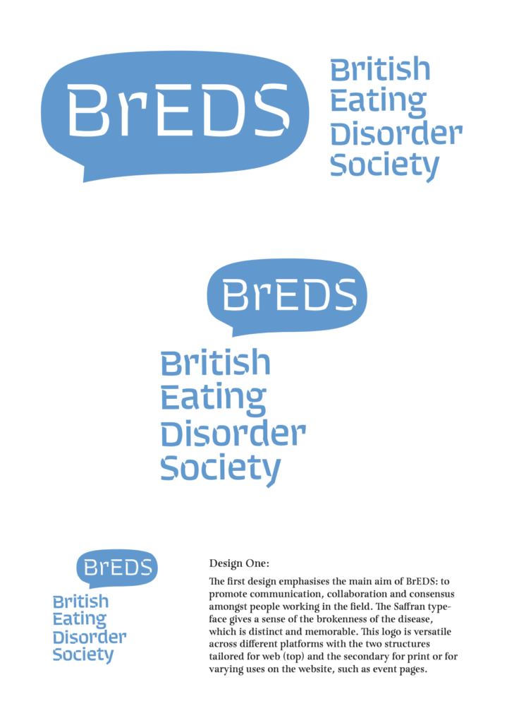
Final stages
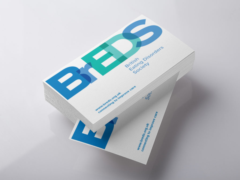
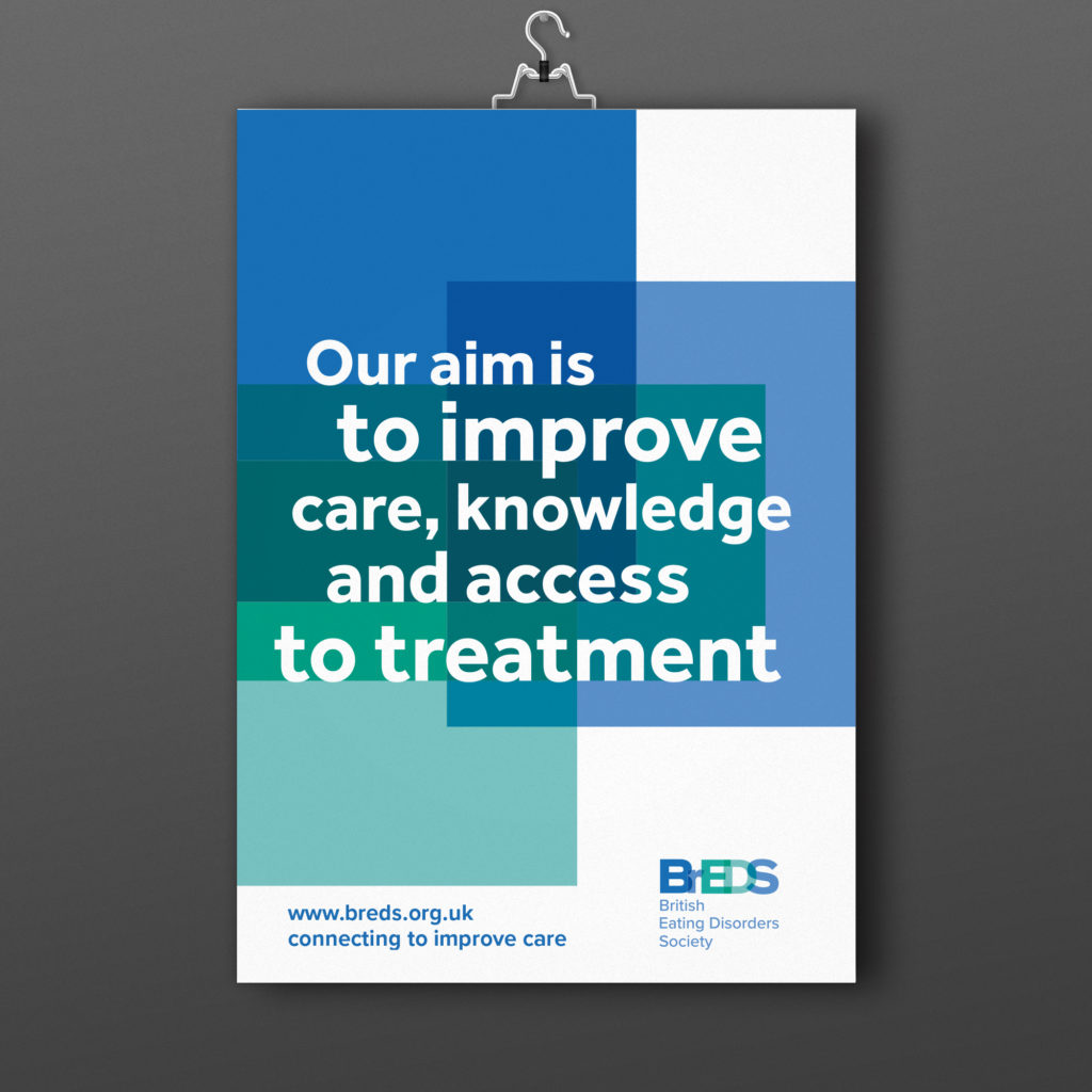
Following on from this the final stages of the job was about creating a more refined identity for the charity within a need deadline. Despite presenting a more visually dynamic and balanced design it was clear that the committee favoured as little variation as possible from the interim design. With this in mind I chose a more structured and uniform typeface that was stronger in overlapping the typeforms to create a clean and crisp logo. Understanding the large and small scale of the logo was crucial as the colours used at times meant that letters got lost at a smaller scale, at times it meant that BEDS or even BS stood out more than the full BrEDS, an issue that needed resolving. In solving these conflicts and balancing the typeforms and points of overlap the final design was approved. In using this and the composition of BrEDS alongside its full name I provided the client with the small scale and large scale variations. Following this I create business cards and posters that used a clearly defined colour palette and drew on the visual identity of overlapping colours, particularly seen in the poster designs.
![]()
Final design
The final designs of the logo incorporates overlapping letters to create a typographic identity. The blue and green colour palette clearly defined the logo as a medical charity and the differing colours of the letters is indented to reflect the joining of different voices under one charity. The refinement of positioning of the overlap ensures the logo is success at different scale. Creating a variation in composition allowed the client to use a stacked or more horizontal position in accordance to the overall design that it might be featured on. The business cards play to the striking nature of the logo, with a more simple and clean approach to the design. The geometric Proxima Nova typeface is used for the website and slogan to balance the dynamic typographic logo. The poster plays to the logo and uses blocks of colour, in line with the colour palette, to create a strong visual identity of the overlapping colours. Ensuring the type sits and interacts with these blocks in a crisp and uniform way the posters maintain a medical professionalism whilst ensuring that there is a bold and eye-catching poster for the committee to use.
![]()
“Very happy with our new identity – already loads of followers on twitter”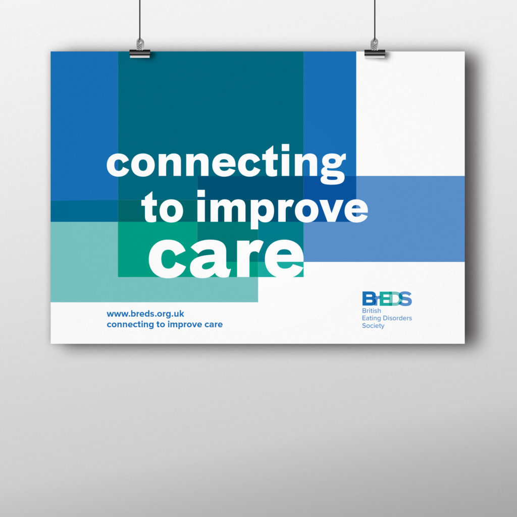
Creating flags to share identities at the Tate Exchange
In March, Typography’s ‘I am, we are … different by design’ project team designed and led a workshop to explore identity and movement as part of the Reading Assembly Tate Exchange. This year’s student team leaders Martha Macri and Seniz Husseyin look back on what made this such a successful day for all involved.
The Tate Exchange is an annual programme of events led by different educational partners hosted at the Tate Modern. Our University of Reading School of Arts & Communication Design were delighted to be invited back for the second year in a row to run our Reading Assembly in the first weekend of March. This year’s theme was Movement. Project teams in the School explored different interpretations of the theme to create fun and exciting activities for the public to get involved with.
Our ‘Different by design’ team for the day included: Camara Dick, Charlotte Prince, Labiba Haque, Liselot van Veen, Malaika Johnson, Martha and Seniz, supported by tutors Geoff Wyeth and Jeanne-Louise Moys. Our team is exploring ways to celebrate and explore diversity in creative disciplines. Our interpretation of the theme ‘movement’ was focusing on global movement and embracing everyone’s individual identities that reflect our diverse personal experiences, culture and journeys. Flags represent collective identities, so we wanted our participants to create flags that express their personal identities that we could collate to form a larger, composite and representative flag for the day.
Project management
In our weekly team meetings, we brainstormed and discussed ideas of what we could do for the workshop with the theme of ‘movement’. As a team we worked together and developed our flag idea. Martha and Seniz co-led the team, which meant we kept in regular contact with Anna Kontopoulou (the School’s Reading Assembly coordinator), identified what equipment and materials were needed and made sure all interim deadlines were met.
To ensure our activity would run smoothly on the day, our team set up a practice run of the workshop to test the process, equipment and to check for any altercations along the way. This proved a success as we perfected any aspects that needed changing and felt more confident as a whole. Overall, the planning process was spread over a few weeks.
On the day
Our workshop activity was designed to allow the public to express their identity through designing their own flag. We supplied them with paper to design on, readymade cut-outs of coloured paper and recyclable materials, as well as the option for them to create their own shapes and images. We encouraged the public to create anything personal to them and also displayed our team’s readymade bags to inspire or stimulate people’s creations.
Once the flags were created individuals handed them over to our scanning and printing section. We scanned the flags, not only to team. Our team printed these onto transfer paper and compiled all the flags into one collective flag showcasing everyone’s amazing work. The transfer paper printouts of each flag were ironed onto tote bags, enabling public partiicpants to take home a bag they designed themselves as a souvenir. Who doesn’t love taking things home after am eventful day out with friends and family…? We noticed that participants of all ages really liked this aspect of our activity and were happy to wait patiently to take home something they created, even when our ironing transfer queue was quite long!
Evaluation
The activity turned out to be a success with the table of crafting always being full and busy. We were happy that everything fell into place, ran smoothly and that our activity was popular to be a part of in the room on the day, highlighting that allowing people to express their identities is a good thing. The variety and quality of work the public created was wonderful to see and the collage of flags were inspiring to everyone.
Our team were very pleased that we received such positive feedback. We had people of all ages and backgrounds take part, from toddlers to Danish cabinet ministers, creating different interpretations of their own identity. All, however, expressed that they enjoyed their time and liked the idea of the activity – some people even stayed on the floor for hours. They especially enjoyed being able to take a tote bag home with something on it that they took their time creating. One person said: “I loved all of it. I would do it all over again”, which shows the positive impact it had on members of the public. The encouraging feedback has left our team eager to continue this workshop activity next year at the Tate Exchange and hope to be invited back.
20th-century Persian newspaper types: investigating the design process
An exhibition exploring the design process of the most significant twentieth-century Persian newspaper types.
Making work experience pay: Introducing the Reading Internship Scheme
Claire Mack and Holly Forsyth outlined the opportunities for paid graphic design internships, co-funded by the University.
QVI Chiropody Clinic Promotional Material
Group members:
Bryony Horne, Cherise Brooker and Lauren Quinn
Clients:
Cherie McBride, Ann Westgarth and Deborah Jenkins
This reflective report aims to explain the process and how the team tackled the brief, presented design ideas through to coming up with a successful design solution to the QVI Chiropody Clinic brief. The report will explain in detail the full process and present the final visual outcomes to the brief.
Allocation:
From meeting with JL we spoke about possible questions to ask the client at our first meeting, and the expectations of the brief. Also in the meeting as a collective we were able ask any questions we had regarding our first meeting with Deborah, and possible alterations that could be made to the existing branding of QVI. This was extremely helpful as it allowed to get a better understanding of what the client is looking for and how we will be able to meet their needs.
We discussed how to go about suggesting ideas such as additional colours to their current colour palette and how to work towards making the poster inclusive for all the audience (both the over 60s and the carers or health workers). It was also useful to be encouraged to take previous website options with us to the initial meeting with the client to work out what they would prefer from their website.
Going forward we have discovered some obstacles which we did not consider before. Different trustees within the charity have conflicting ideas about what designs would be appropriate so we must put forward a range of developed ideas to gain feedback and make sure to include trustees as much in the design process so they are more likely to feel tied to the design process and therefore appreciate our designs more.
Briefing:
Once we met the clients in a meeting, it became clearer to establish what they realistically wanted from this process. We gave them some opinions on deliverables and they made some changes, such as the dimensions of the appointment card and they also decided that it was not necessary to have a ‘hand out’ as well as a leaflet. At times is was difficult for the clients to agree amongst themselves which made the process slower, however we think we were successful in organising meetings with them, which lead them closer to deciding as a collective.
We had to get them to realise what they actually wanted to get out of the design process. They changed the outcomes from the initial brief so that we had get rid of the idea of a postcard sized information handout and merged it into a larger appointment card with the necessary information on the back. This was done through us generating ideas and gaining feedback from the clients as they were not 100% certain on what we could deliver to them.
This process ran smoothly with all parties communicating on what was required and the deadlines the needed to be met throughout the most part. One challenge that we faced as a collective was
after the briefing session, the trustee that briefed us, didn’t fully communicate with the rest of the staff and left gaps in the communication and knowledge of what was needed as the requirements were altered but not fully communicated with all of us. One key aspect that we found to be tricky when designing for QVI was the clashing of ideas between the trustees and the clinic manager. At some points throughout the process this seemed to slow our progress.
Research:
We compared our deliverables to similar surgeries to make sure our aesthetic suited the market and was familiar to potential and current patients. Based on this genre research, we were able to make successful designs and make improvements such as larger font (for older patients) we also took inspiration from other organisations; we established a colour palette for the deliverables and made them coherent as a set.
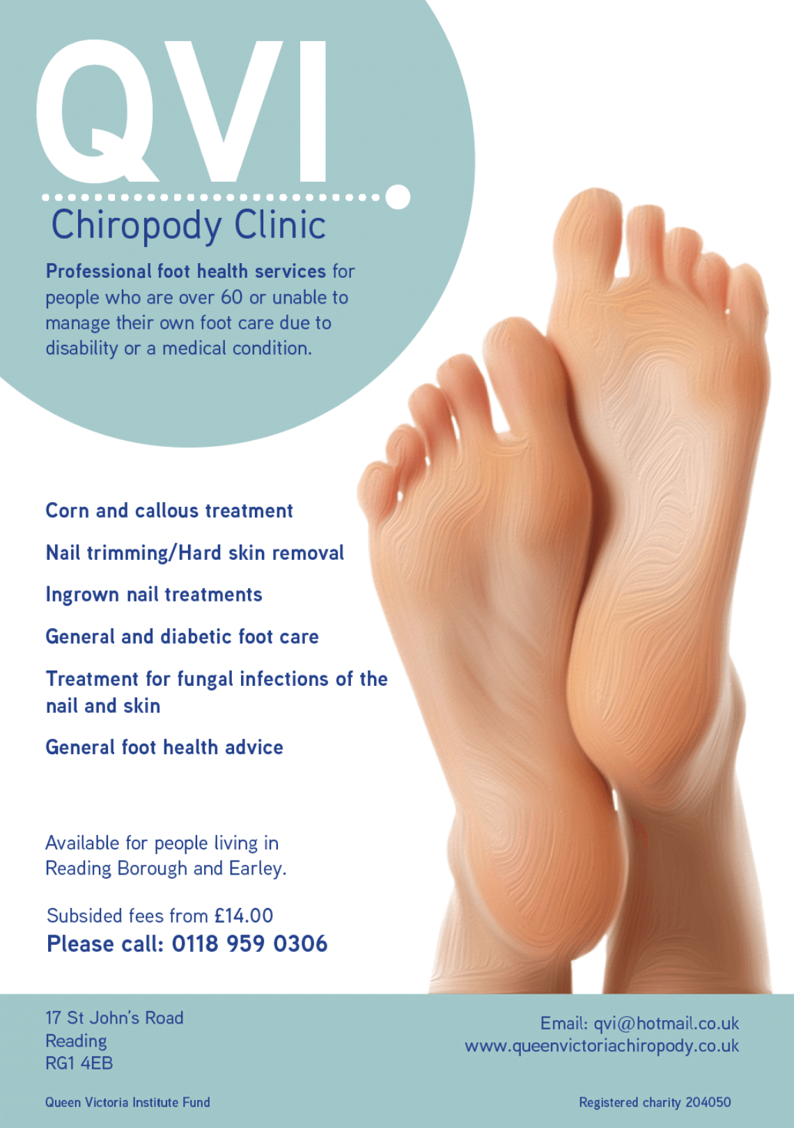
Promotional Material:
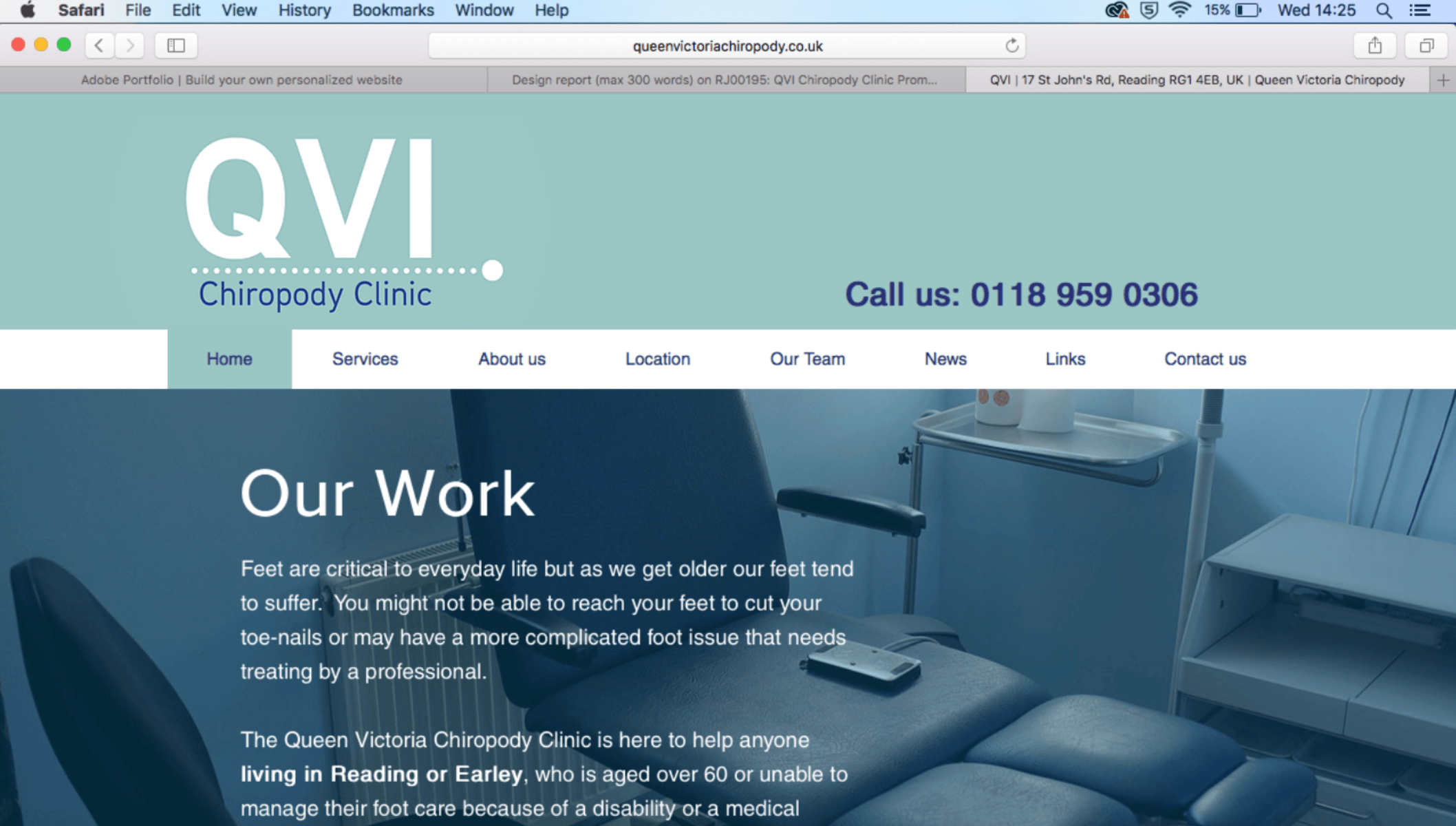
For inspiration we looked at other clinic logos as a comparison to what sort of style the client was after, we researched colour schemes surrounding teal, blue, white, green as clinical but approachable. We also looked at typefaces and did research about the best legibility for the elderly target market. We also looked at other appointment cards, leaflets and posters to see what our designs would be up against in the real world and how weak their original design was in comparison to their competitors.
Website research:
Our first meeting with the clients for website designing was successful, we first went and did research of competitor chiropodists both nationally and locally. Screenshots of various webpages were displayed to the clients where they then explained to us from looking at the various examples what they liked and what they disliked and if we could potentially carry certain areas over into the design of their website. From this we then started sketching up some screens of the webpage when they were present to make sure we were clear of their vision and what they were after.
Design:
Once we had established a ‘house style’ the production process ran a lot smoother as we had decided on a logo, motive, typeface and colour palette. All of which were saved in Adobe library so artwork could be dragged and dropped into InDesign. We made small changes to deliverables based on regular feedback from the clients, who made adjustments, based on their opinions, for example, the QVI ladies liked the circular shapes in the logo and asked if this could be incorporated throughout the printable deliverables, which helped them link to each other.
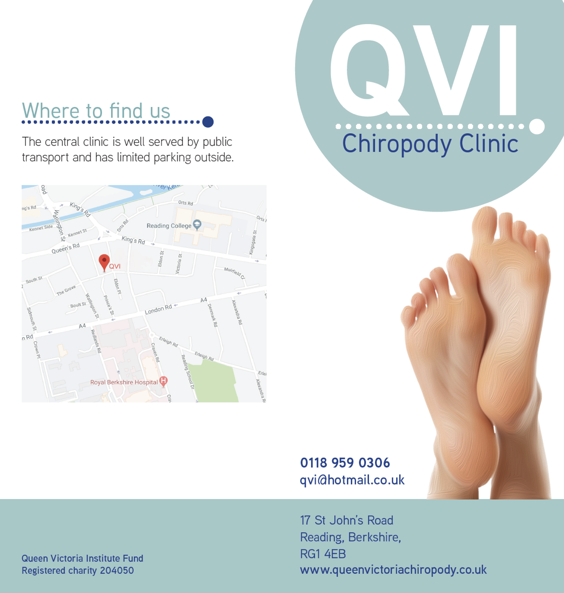
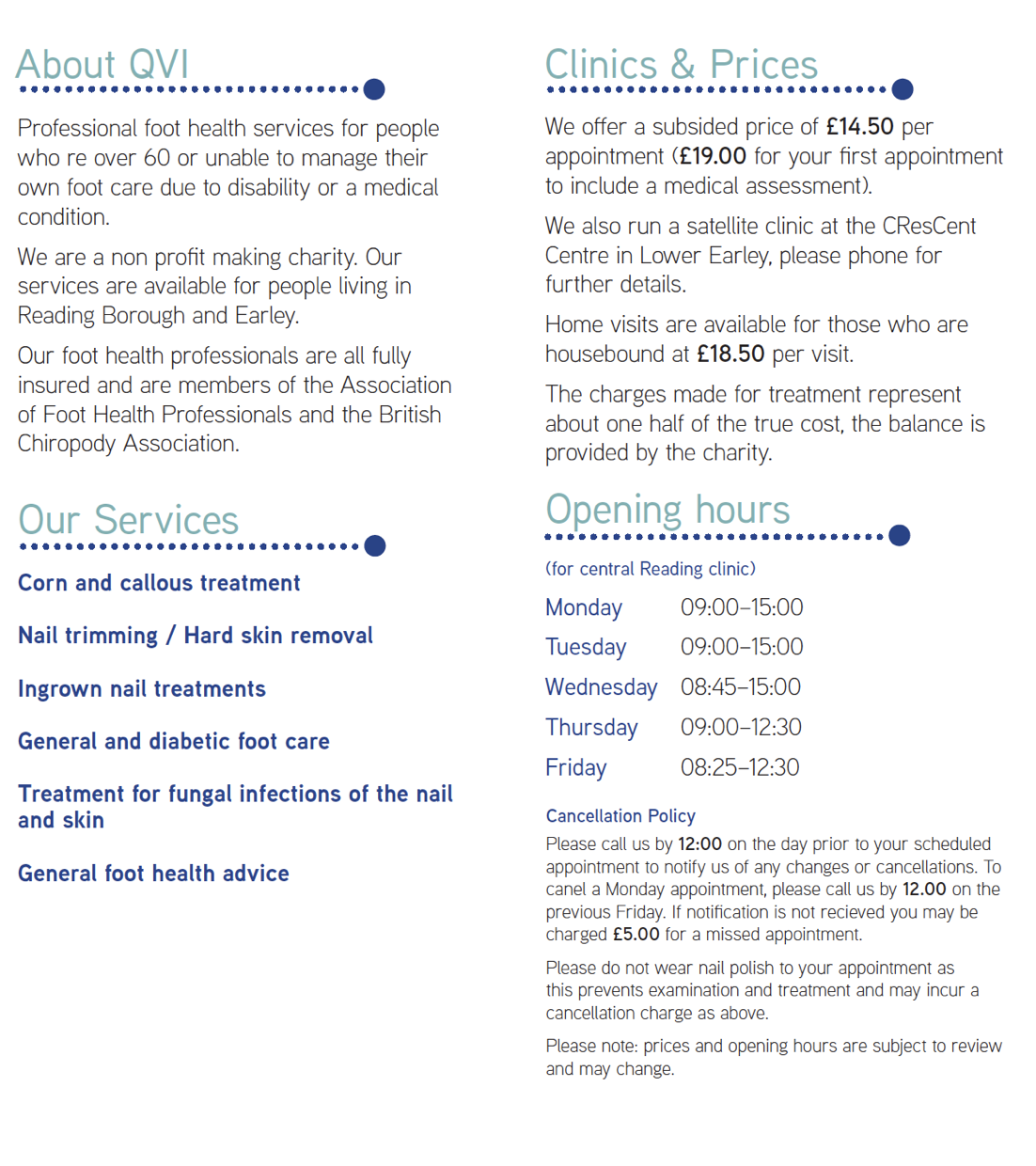
Promotional Material:
![]()
We began by looking at the the poster and working through different ideas. We began working on feet images and trying to develop our own digital versions using Adobe Illustrator and combining a fingerprint image to a foot outline. We decided to go for a more realistic approach and as it would reflect the clinical side of QVI. We came up with the dot aesthetic for the clinic as we wanted to use
geometric shapes to keep the design clean and sharp and the colour scheme made the design approachable and friendly.
Website design:
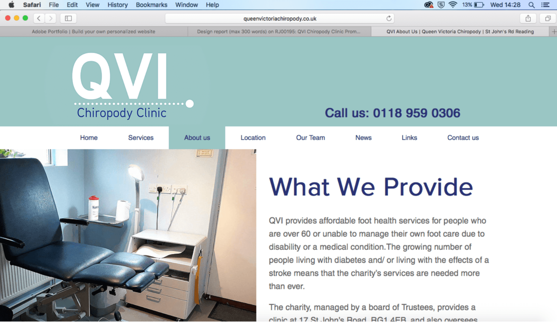
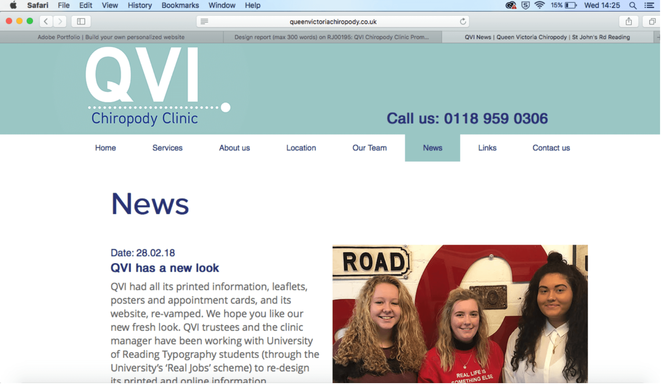
The design process overall went smoothly throughout the whole project and feedback was received and worked on in a quick efficient way. We first started building the new website through a programme they used previously called Yola however, this website builder was extremely difficult to use and was very old in comparison to alternative web design providers out there such as Square space and Wix. Our next step was researching various new builders and confirmed prices with the clinic. https://www.queenvictoriachiropody.co.uk
Please see attached images below of the new improved promotional material for QVI Chiropody:
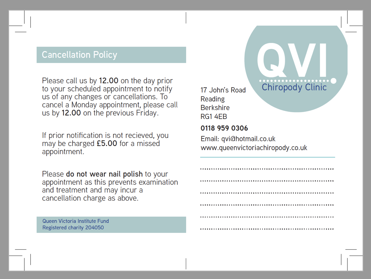
Production:
From working on the QVI project, this was a key opportunity to gain self-knowledge of what was needed in order to make the clients happy and be successful. As our first real job that was taken on suited us perfectly as it contributed to what we see ourselves doing as a career in the future which is branding related work. From taking on this real job we found that it ran smoothly throughout and there was strong communication between everyone throughout the most part, as we frequently went to the clinic and able to get feedback from customers of the clinic themselves and were given a survey to help inform our designs further to suit the needs of the users of the branding items required.
As we used InDesign, it was crucial to check the document before exporting to print PDFs and also export with the correct settings. We learnt that discussing the print finishes with the clients was important to finalise their needs. On this particular real job, the client out sourced the printer so it was important for us to give the printer strict instructions so that the deliverables were correctly printed/assembled. I feel like this is a vital lesson to learn, and it has made us aware of things that can possibly go wrong in an authentic work situation, which now we feel prepared for.
We learnt how to ensure that all the files are ready for press and to check multiple times for any errors in the PDFs. We had multiple design solutions which meant we handled different manufacturing methods from print to digital and large 3D format which meant we could gain experience with all of these. We also learnt about the design constraints surrounding each of these and the practicality that is involved in producing them for a client or manufacturer.
To conclude, throughout this process collectively we found it to be a successful project. As a collective we met all the criteria set by the client and found working with a real life design brief allowed us to gain a wider idea of what will entail when working with clients after we have graduated and go out into the world of work. Once we had produced the final design solutions we received positive feedback from the clients and were happy as we exceeded their exceptions of the final product due to the low funding the clinic had to due being a charitable organisation.