
Real Job: Amrita and Chia-yi created the site at https://greater-than-a-to-z.co.uk . Their report makes clear the value of learning how to communicate effectively with IT professionals in order to bring a design vision to life. Special thanks to @UniRdg_IT for supporting this project throughout.
Author: AmritaShrilal
HMP Huntercombe Prison Research Project
Background
This blog post covers a project we carried out for HMP Huntercombe Prison in Oxfordshire. Huntercombe is a Category C adult male foreign national deportation prison. The prison governor wanted to improve communication, particularly with prison inmates, about some of the support services available to them. The project was a collaboration with students from Reading’s Linguistics Department who were tasked with improving the wording of information provided for inmates.
Brief
The brief for this project was to redesign three noticeboards from different sectors of the prison; DARTS (Drug and Alcohol Recovery Team), Chaplaincy and Resettlement Office. The client and the prison department leaders stated that:
- The language used should be understandable by those with B1 English level.
- The design should take into account the need for the posters to be understood by people from different cultures.
- The design must be legible from afar because inmates aren’t allowed to stand and look at the notice boards in the corridors. Therefore the design should be legible enough for inmates to absorb the information within 30 seconds or less.
Deliverables
Three redesigned A1 posters to be placed within the notice boards on the walls of the prison. Each of the A1 posters must either represent information regarding the DARTS (drug and alcohol recovery team), Chaplaincy and Resettlement Office.
Design Development
Given the short time period proposed for this project the design development for this poster required rapid changes to meet the demands of the client, the prison department leaders, inmates and the linguistic students. This was somewhat challenging due to the breadth of the initial requirements of both the students and the prison department.
DART (Drug and Alcohol Recovery Team)
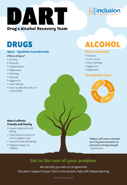
The original noticeboard for DART (Drug and Alcohol Recovery Team) raised awareness about how drugs, specifically spice, and alcohol affect an individual and informed inmates about how the DART department would help them. Discussion with the prisoners suggested this information was not being conveyed clearly currently due to small type size and a limited amount of time in the corridors.
On one of the DART notice boards situated in the residential wings, there was an image of a tree which the prison inmates found very hopeful. They wanted the tree theme incorporated into the redesign of the noticeboard. Relating to the feeling of hope, an inmate would write weekly inspirational quotes on a whiteboard in the DART department, and the DART team felt would be a suitable addition to the redesign of the noticeboard, as it connects with what they want to achieve.
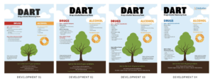
Development 1:
Developing on the ‘tree’ theme, tree was used the central focus of the poster. An inspirational quote was placed on the left side of the tree to relate back to the inspirational quotes in the department. Suggested the idea of separating information about drugs and alcohol by incorporating a colour coding system, allowing easy identification of information.
Development 2:
The DART team requested to change the word ‘marijuana’ to ‘cannabinoids’, as although scientific language might be difficult to understand for non-English speakers, the use of scientific language was necessary. Additional rephrasing and repositioning of bullet points under the various categories, as well as changing the bottom paragraph below the tree to ‘education, support groups, one to one sessions, and help with release planning’ to keep it short.
Development 3:
The Inclusion logo, the charity which funds the department, was incorporated at the top right-hand corner of the poster, and to accommodate this the DART title was shifted to the left hand corner. The colour of the drugs section was changed to the blue used in the Inclusion logo, as I wanted to show the relationship between the department and the charity.
Development 4:
The last and final development of the poster showcased the final amendments given by the DART team and was sent back to them for printing confirmation. The team stated that they were grateful for the work we have done and were really pleased with the posters final outcome. The inmates were also proud to have contributed to the design process of the DARTs poster.
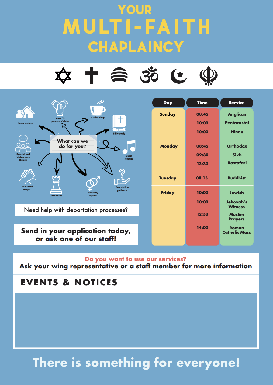
Chaplaincy
The chaplaincy board was the sole board that did not have a lot of information compared to the other two noticeboards. It consisted a single sheet of A4 paper outlining the schedule and activities occurring in the prison. This allowed flexibility and areas of improvement to design the noticeboards in the most effective manner.
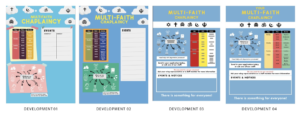
Development 1:
Input from the inmates provided during a focus group suggested that they wanted bright colours and a timetable suggesting when each session of prayer was (as prior to this they only knew this by word of mouth). The head of the chaplaincy also required an area of the poster where he would be able to add notices and etc.
Development 2:
With this in mind, I played around with the concept of brightness and the sky as the inmates also suggested that they would also like more colour. This paired with the presentation of several religious symbols would allow the inmates to immediately associate the poster with the chaplaincy.
Development 3:
However, after a time away from looking at the poster, along with my group mates I decided to change the structure of the poster to make it look more cohesive and aligned. However, I continued to play with colour. I chose blue not only for its brightness but also for it to look more connected the other posters to create a more cohesive project.
Development 4:
Finally, the last and final development showcased the developments with more writing as well as adding the word ‘your’ to make the piece more personal
Resettlement Office
The noticeboard for the resettlement office was about letting the inmates know about the options they have for resettlement within the UK. Officer Macdonald’s noticeboard was a flowchart made of separate small paper pieces and wanted to change this to a single sheet. In terms of the colour choices, such as black background and white text, this needed to be changed as it interfered with the content in terms of legibility. The prison inmates stated that they did not even know this board or this department existed hence the design needed to showcase a clear typographical hierarchy.
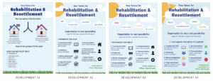
Development 1:
The notice board features two houses to showcase the choice between resettling in the UK or back into their home country. A quote was placed in the centre to remind the inmates about the resources available for them in the prison. The title was made bigger so that the inmates are able to recognise the board and the department the board belongs to.
Development 2:
After speaking with the client and the linguistic students, the overall approach to the noticeboard was revised. The options open to inmates were removed as the responsible officer primarily wanted to use the notice board as a prompt to inmates to come to ask for help and talk about the various ways of resettling and rehabilitation.
Development 3:
There was a suggestion to brighten the poster with more colour. The visual elements within the poster were kept minimal and to avoid information confusion and to not create high contrasts, which could confuse the inmates about the information being presented.
Development 4:
Once showing the redeveloped poster, the Linguistic students strongly felt that the sun needed to be more expressive. In addition to that they felt that the pictograms placed near the text required different colours to make the poster more lively. This was done and it did uplift the poster. However, it is unsure if it could cause confusion for the inmates. Additional small changes were made to the wording at the request of the officer responsible.
Final design features
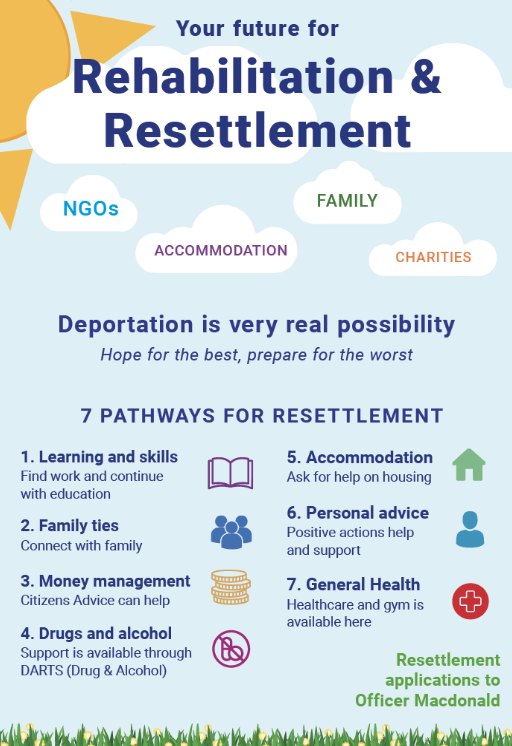
The poster for this department consists a shade of the blue colour background we have established to create a sense of cohesiveness along with the use of clouds. This is to create an illustrative approach of the poster rather than a poster filled with just text. Using these minor illustrations makes them playful and engaging in an environment where there is not a lot of use of colour and the atmosphere is dull and dark. Therefore these posters are in attempt to make a subject that seems daunting more friendly and inspire more inmates to seek help or to look at the poster.
Key takeaways
Although working with several different departments was challenging, it gave insight into what working with several clients would be like. As the project began to develop, all graphics students were put into different groups with the linguistic students who would handle the information being stated in the posters themselves. This led to each poster having a different timeline and set of outcomes it needed to achieve due to the different nature of information each poster had to show.
This caused some stress, extending the project to give both departments time to asses and change both the information and design to ensure that the poster that was created was the best possible produced.
The feedback given from the inmates for resettlement poster noted that the background created a light airy atmosphere to the subject. The symbols help clarify the text for the 7 pathways and the signposting helped clear misunderstandings. They liked the words within the clouds but felt the term ‘NGO’ would not be understood but as a whole, it was clear and informative. In terms of the Chaplaincy poster, they noted that there was a nice contrast between yellow and bellow as well as the symbols helped explain the meanings of the text presented. The poster is inclusive with clear signposting and the timetable was easy to read. However, they mentioned some of the alignment of the information created a strange shape but didn’t hinder the design as a whole.
Nonetheless, when returning to the prison to showcase the redesigned posters, the prison inmates were delighted that the posters brought vibrant colours which stood out from the dull walls of the prison, and highlighted the information in a clear and concise manner