
Group members:
Bryony Horne, Cherise Brooker and Lauren Quinn
Clients:
Cherie McBride, Ann Westgarth and Deborah Jenkins
This reflective report aims to explain the process and how the team tackled the brief, presented design ideas through to coming up with a successful design solution to the QVI Chiropody Clinic brief. The report will explain in detail the full process and present the final visual outcomes to the brief.
Allocation:
From meeting with JL we spoke about possible questions to ask the client at our first meeting, and the expectations of the brief. Also in the meeting as a collective we were able ask any questions we had regarding our first meeting with Deborah, and possible alterations that could be made to the existing branding of QVI. This was extremely helpful as it allowed to get a better understanding of what the client is looking for and how we will be able to meet their needs.
We discussed how to go about suggesting ideas such as additional colours to their current colour palette and how to work towards making the poster inclusive for all the audience (both the over 60s and the carers or health workers). It was also useful to be encouraged to take previous website options with us to the initial meeting with the client to work out what they would prefer from their website.
Going forward we have discovered some obstacles which we did not consider before. Different trustees within the charity have conflicting ideas about what designs would be appropriate so we must put forward a range of developed ideas to gain feedback and make sure to include trustees as much in the design process so they are more likely to feel tied to the design process and therefore appreciate our designs more.
Briefing:
Once we met the clients in a meeting, it became clearer to establish what they realistically wanted from this process. We gave them some opinions on deliverables and they made some changes, such as the dimensions of the appointment card and they also decided that it was not necessary to have a ‘hand out’ as well as a leaflet. At times is was difficult for the clients to agree amongst themselves which made the process slower, however we think we were successful in organising meetings with them, which lead them closer to deciding as a collective.
We had to get them to realise what they actually wanted to get out of the design process. They changed the outcomes from the initial brief so that we had get rid of the idea of a postcard sized information handout and merged it into a larger appointment card with the necessary information on the back. This was done through us generating ideas and gaining feedback from the clients as they were not 100% certain on what we could deliver to them.
This process ran smoothly with all parties communicating on what was required and the deadlines the needed to be met throughout the most part. One challenge that we faced as a collective was
after the briefing session, the trustee that briefed us, didn’t fully communicate with the rest of the staff and left gaps in the communication and knowledge of what was needed as the requirements were altered but not fully communicated with all of us. One key aspect that we found to be tricky when designing for QVI was the clashing of ideas between the trustees and the clinic manager. At some points throughout the process this seemed to slow our progress.
Research:
We compared our deliverables to similar surgeries to make sure our aesthetic suited the market and was familiar to potential and current patients. Based on this genre research, we were able to make successful designs and make improvements such as larger font (for older patients) we also took inspiration from other organisations; we established a colour palette for the deliverables and made them coherent as a set.
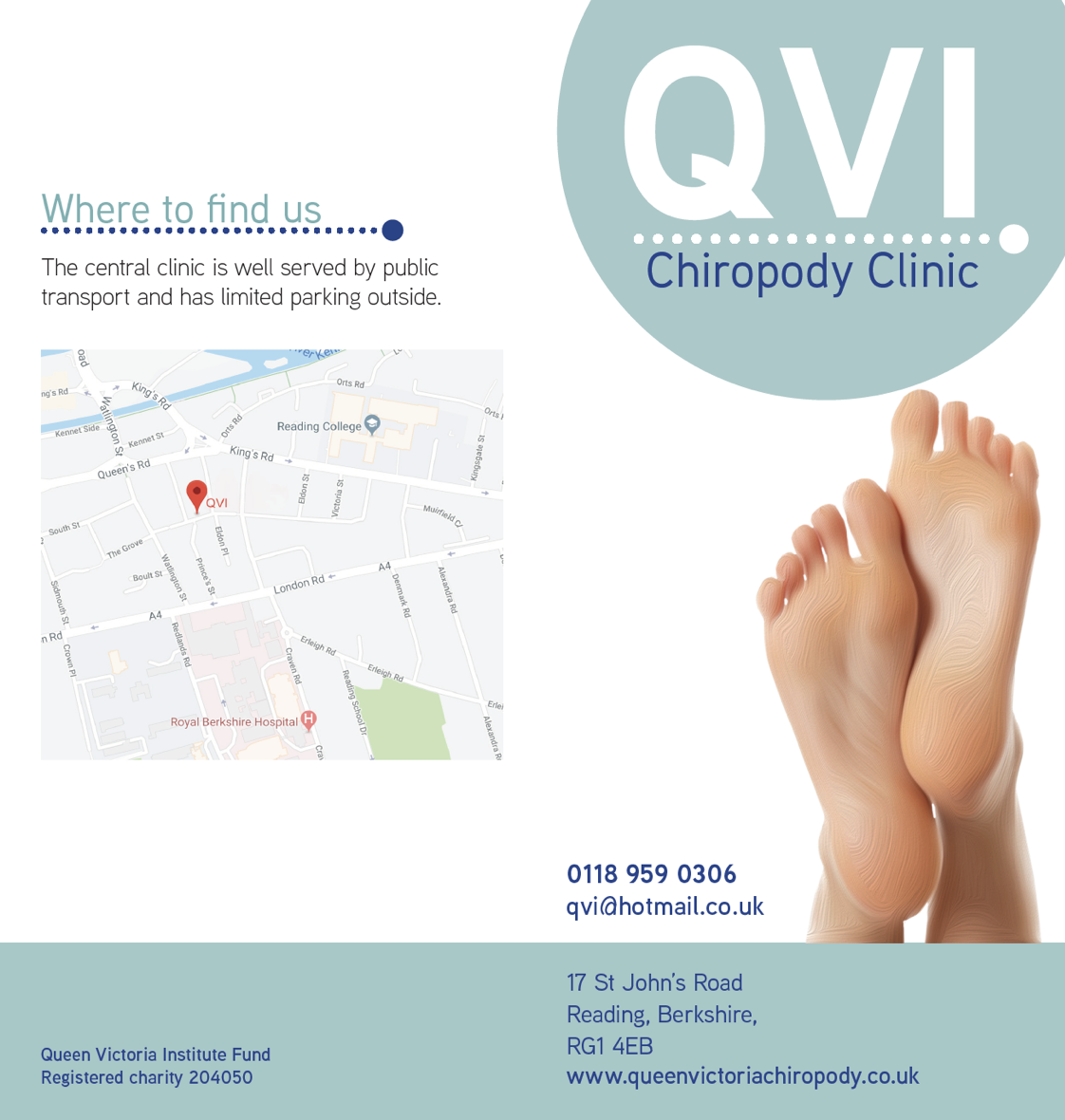
Promotional Material:
For inspiration we looked at other clinic logos as a comparison to what sort of style the client was after, we researched colour schemes surrounding teal, blue, white, green as clinical but approachable. We also looked at typefaces and did research about the best legibility for the elderly target market. We also looked at other appointment cards, leaflets and posters to see what our designs would be up against in the real world and how weak their original design was in comparison to their competitors.
Website research:
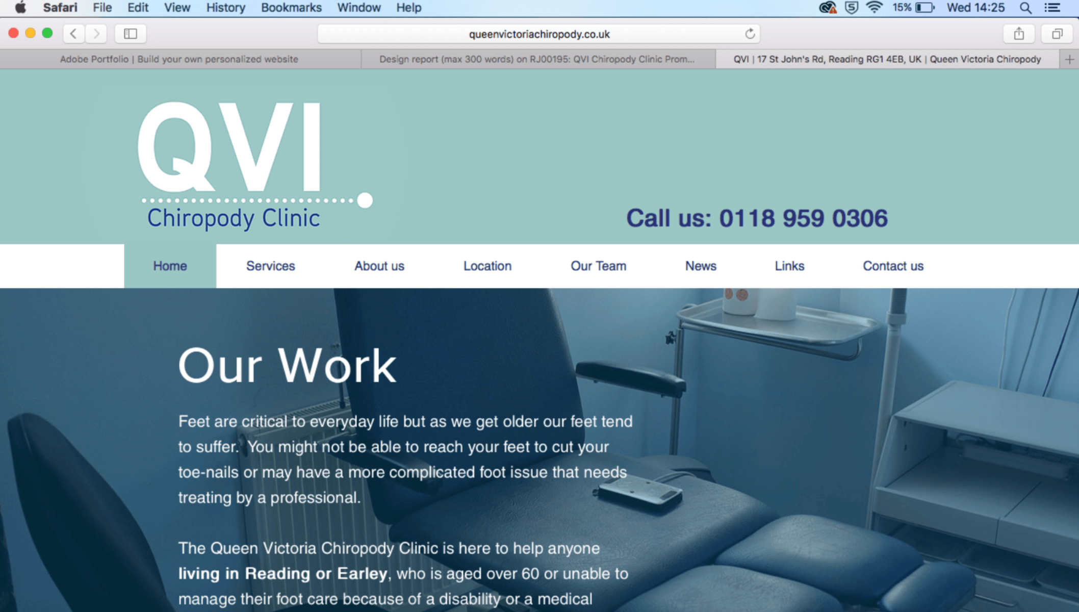
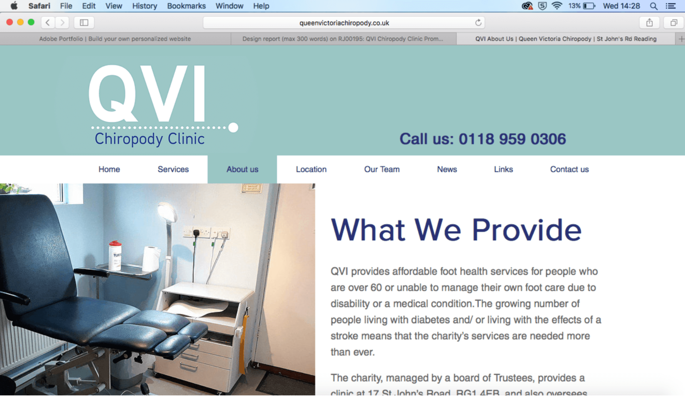
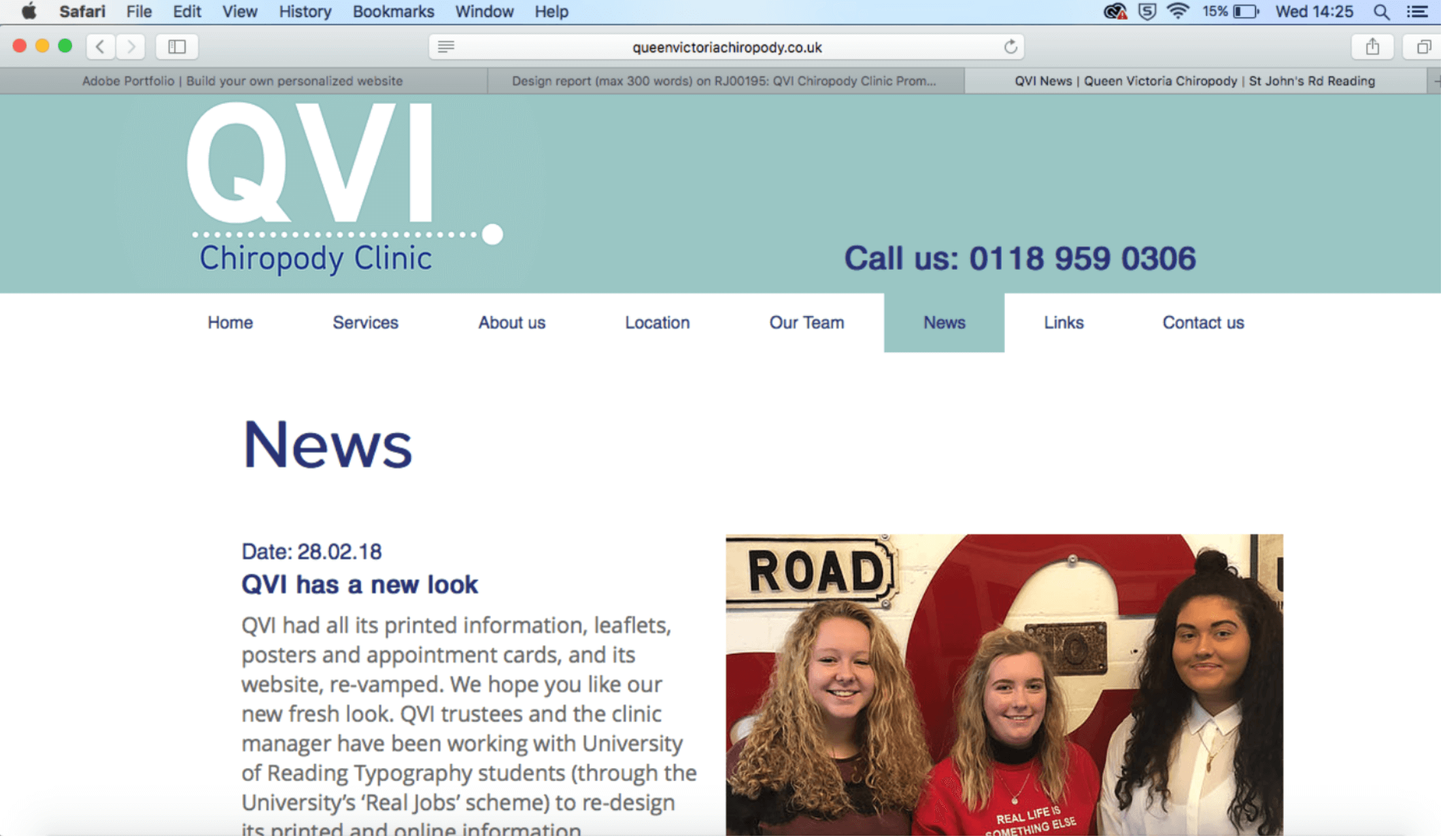
Our first meeting with the clients for website designing was successful, we first went and did research of competitor chiropodists both nationally and locally. Screenshots of various webpages were displayed to the clients where they then explained to us from looking at the various examples what they liked and what they disliked and if we could potentially carry certain areas over into the design of their website. From this we then started sketching up some screens of the webpage when they were present to make sure we were clear of their vision and what they were after.
Design:
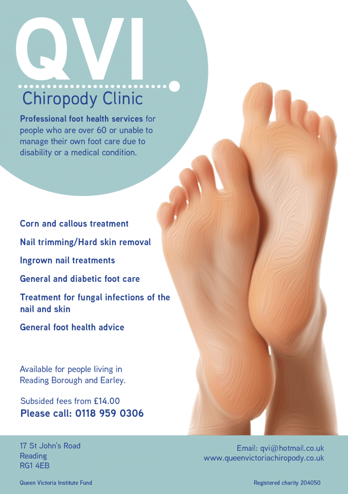
Once we had established a ‘house style’ the production process ran a lot smoother as we had decided on a logo, motive, typeface and colour palette. All of which were saved in Adobe library so artwork could be dragged and dropped into InDesign. We made small changes to deliverables based on regular feedback from the clients, who made adjustments, based on their opinions, for example, the QVI ladies liked the circular shapes in the logo and asked if this could be incorporated throughout the printable deliverables, which helped them link to each other.
Promotional Material:
![]()
We began by looking at the the poster and working through different ideas. We began working on feet images and trying to develop our own digital versions using Adobe Illustrator and combining a fingerprint image to a foot outline. We decided to go for a more realistic approach and as it would reflect the clinical side of QVI. We came up with the dot aesthetic for the clinic as we wanted to use
geometric shapes to keep the design clean and sharp and the colour scheme made the design approachable and friendly.
Website design:
The design process overall went smoothly throughout the whole project and feedback was received and worked on in a quick efficient way. We first started building the new website through a programme they used previously called Yola however, this website builder was extremely difficult to use and was very old in comparison to alternative web design providers out there such as Square space and Wix. Our next step was researching various new builders and confirmed prices with the clinic. https://www.queenvictoriachiropody.co.uk
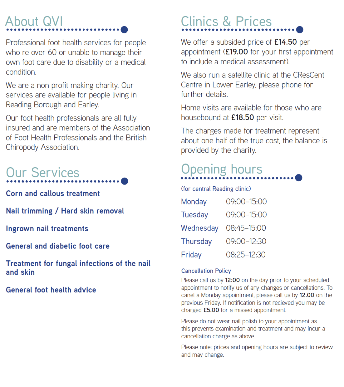
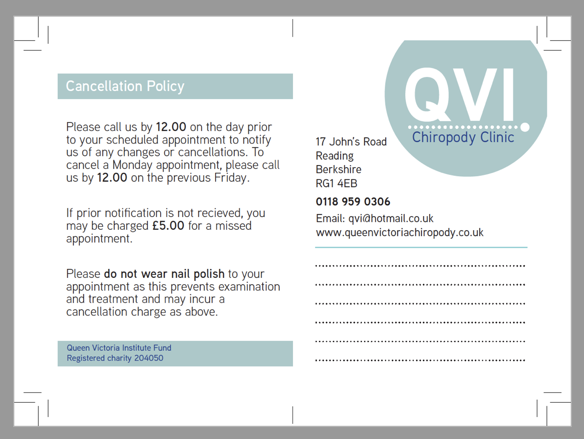
Please see attached images below of the new improved promotional material for QVI Chiropody:
Production:
From working on the QVI project, this was a key opportunity to gain self-knowledge of what was needed in order to make the clients happy and be successful. As our first real job that was taken on suited us perfectly as it contributed to what we see ourselves doing as a career in the future which is branding related work. From taking on this real job we found that it ran smoothly throughout and there was strong communication between everyone throughout the most part, as we frequently went to the clinic and able to get feedback from customers of the clinic themselves and were given a survey to help inform our designs further to suit the needs of the users of the branding items required.
As we used InDesign, it was crucial to check the document before exporting to print PDFs and also export with the correct settings. We learnt that discussing the print finishes with the clients was important to finalise their needs. On this particular real job, the client out sourced the printer so it was important for us to give the printer strict instructions so that the deliverables were correctly printed/assembled. I feel like this is a vital lesson to learn, and it has made us aware of things that can possibly go wrong in an authentic work situation, which now we feel prepared for.
We learnt how to ensure that all the files are ready for press and to check multiple times for any errors in the PDFs. We had multiple design solutions which meant we handled different manufacturing methods from print to digital and large 3D format which meant we could gain experience with all of these. We also learnt about the design constraints surrounding each of these and the practicality that is involved in producing them for a client or manufacturer.
To conclude, throughout this process collectively we found it to be a successful project. As a collective we met all the criteria set by the client and found working with a real life design brief allowed us to gain a wider idea of what will entail when working with clients after we have graduated and go out into the world of work. Once we had produced the final design solutions we received positive feedback from the clients and were happy as we exceeded their exceptions of the final product due to the low funding the clinic had to due being a charitable organisation.