Author: Megan Hancox

Signwriting: A 5 day intensive course with Joby Carter

5 Days of signwriting

Joby Carter

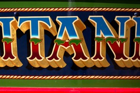
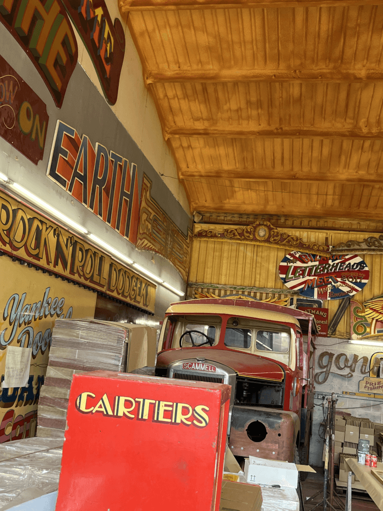
Joby is a signwriter and fairground artist who owns the famous ‘Carter’s Steam Fair’ fairground, which is the largest vintage travelling funfair in the world. Years of experience has led to Joby being one of the world’s leading experts on signwriting, fancy lettering and fairground art. I met Joby during a trip to his workshop for a project and was fascinated by his work, having never been exposed to the world of signwriting before. The precision and artistic skills that Joby possessed to have the ability to create such intricate lettering was amazing to me.

The course

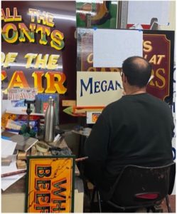
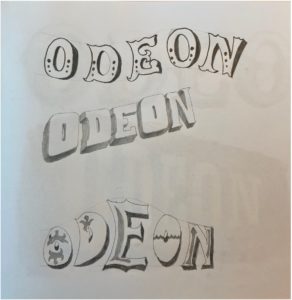
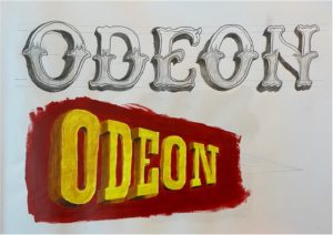
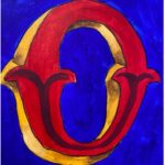
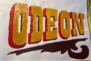
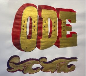
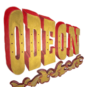
I was lucky enough to receive the opportunity to take part in Joby’s 5 day intensive signwriting course this autumn. This was as a result of coming second place in his contest last year with my fairground-inspired logo redesign for Odeon. The Department offered me a place on his course as a prize using the Typography Student Fund. The course ran from 9am–5pm on Monday through to Friday, giving me 40 hours of teaching and learning with Joby.

Day 1

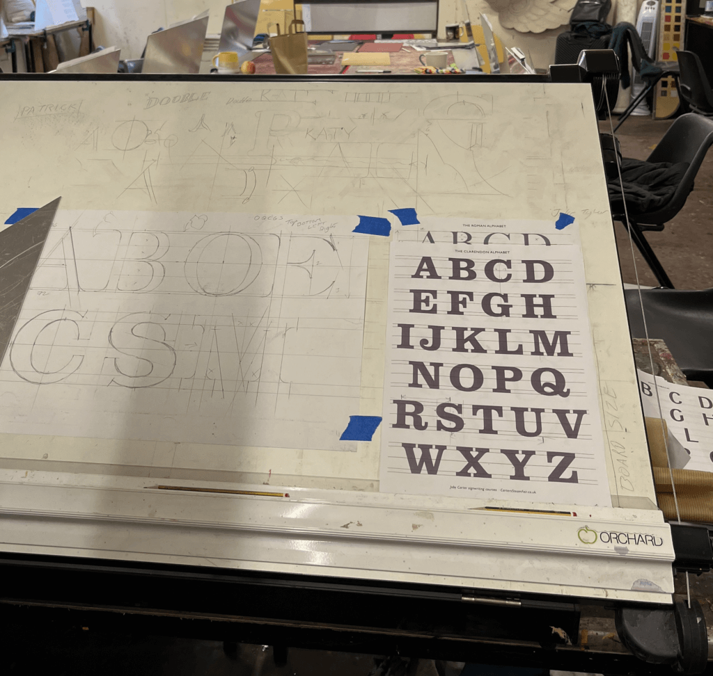
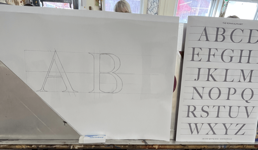
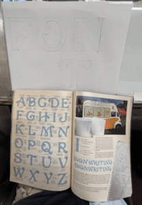
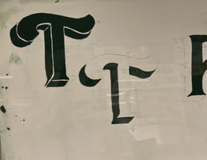
On the first day, we were introduced to the anatomy of roman lettering and the reasoning behind the thin and thick strokes, which mimic the way the brush strokes when painting the letters. We practised precisely drawing letters, copying them from Joby’s examples but accurately measuring each length and angle and scaling them to a bigger size that would be easier to draw at. Having had lots of previous experience in typography from the Department at University, I enjoyed how well I understood the different structures of the letters. We looked at some different typefaces that signwriters commonly use, and again practised drawing these accurately. There was no painting involved on this day as it was all about nailing the shapes of the letters.

Day 2

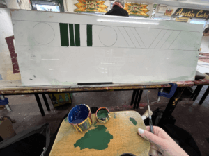
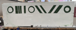
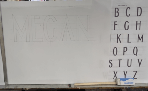
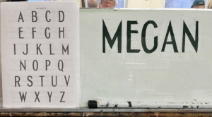
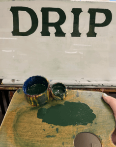
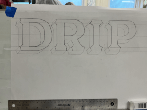
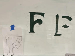
On day 2 we got the paint brushes out. Joby showed us how to prep the brushes and the paint, and the proper way to look after your brushes. We each received a brush, a palette, some dipping pots and a mahl stick. We were shown the specific way to hold the palette in your left hand in addition to the mahl stick, which is used to stabilise your right hand while holding the paint brush. This ensures smooth, straight brush strokes and acts against shaky hands. To begin with, we practised painting rectangles in order to learn to control the brush. Once gaining some confidence, we tried rectangles at a 45 degree angle, and then moved on to circles. Joby showed us the technique of twisting the brush at the start and end of the stroke to get a sharp edge, which seemed difficult at first, but practicing over and over again helped to improve technique. Methods like these are included in Joby’s book ‘Signwriting tips, tricks and inspiration’ which I found really useful to follow. Joby got us to use white spirit to wipe the paint off after each try so that we could reuse the boards over and over again. I then practised drawing out some different fonts, and wrote my name in the Switchback style, which I then transferred onto my board by rubbing charcoal on the back and then drawing over the letters again against the di-bond in order to create a trace of my sketch with the charcoal. I used the same green paint we had been practising with to paint within the lines of the letters as we were asked to use this paint up until the final day when we started our own signs due to the fact that it had a long drying time so that it could be more easily wiped off the practice boards.


Day 3

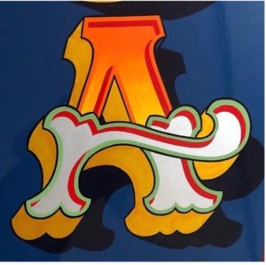
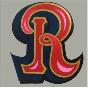
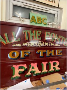
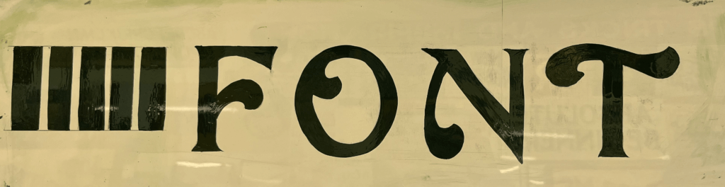
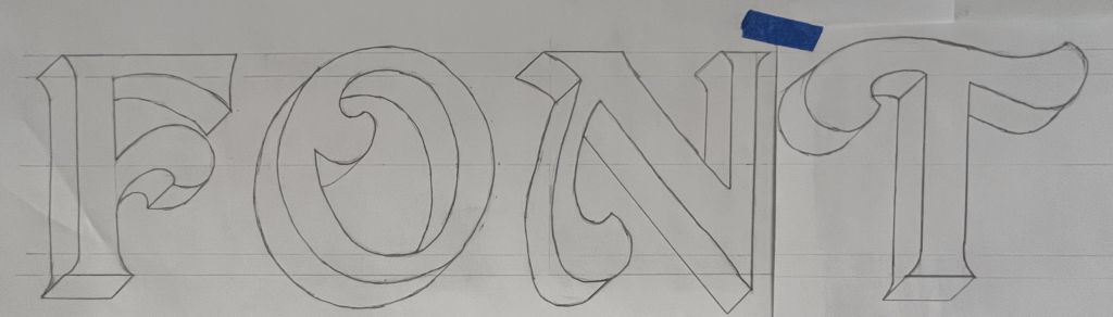
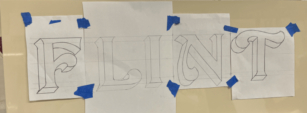
The third day was similar to day 2, and started out consisting of a combination of painting shapes again and sketching out letters. Joby really wanted us to nail letter structure and brush stroke technique before we got stuck into painting letters. One particular style of lettering caught my eye from a sign of Joby’s in the room we were working – it had beautiful curved letters and flourishes. I asked Joby where I could find this font and he revealed that it was a new one he had designed in his new book ‘All the fonts of the fair‘ called Curveside Nouveau. I borrowed a copy of his book so that I was able to analyse and copy the lettering, scaling it up to a bigger size. I once again transferred my drawings on to the di-bond and carefully painted letters to make the word ‘Font’. This combination of letters allowed me to practise drawing different angled letters with variations of flourishes on each one. I painted some other fonts from Joby’s book and found it interesting how many factors influence the appearance of a font and create a different route for your paint brush.


Day 4

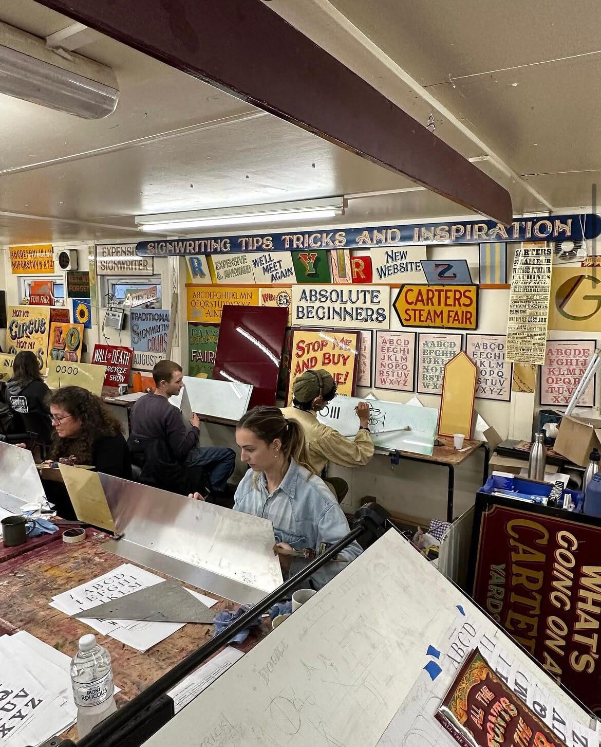
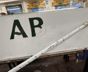
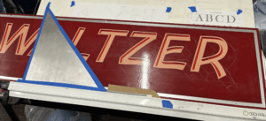
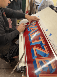
Today, Joby taught us how to create a block to make a letter appear three-dimensional. This technique is often used by traditional signwriters to emphasise letters. Joby’s method allowed us to get the block drawn on accurately without fail. All that was needed was a piece of cardboard cut into the desired width of the block shape, and then with a 45 degree angle cut from corner to corner on one end to the other. This angle is then used to draw a straight line from each point of the face of the letter to create the effect that it has been extended outwards. The block is usually set to the left of the letter as this is often easier than having to block the curves that are often on the right side of the letter, but it comes down to a matter of preference. Joby demonstrated this to us by adding a block on the right hand side to his Waltzer sign. The E and the R are more complicated to do this way, rather than simply having to block their straight edges if it were to the left. This was a compositional choice that Joby decided on, due to the word Waltzer having more empty space on the right edge of the board.

I practised this method by adding blocks to all my previous letter sketches, it was interesting to see how the style of letter affected the shape of the block and influenced the overall appearance of the word.


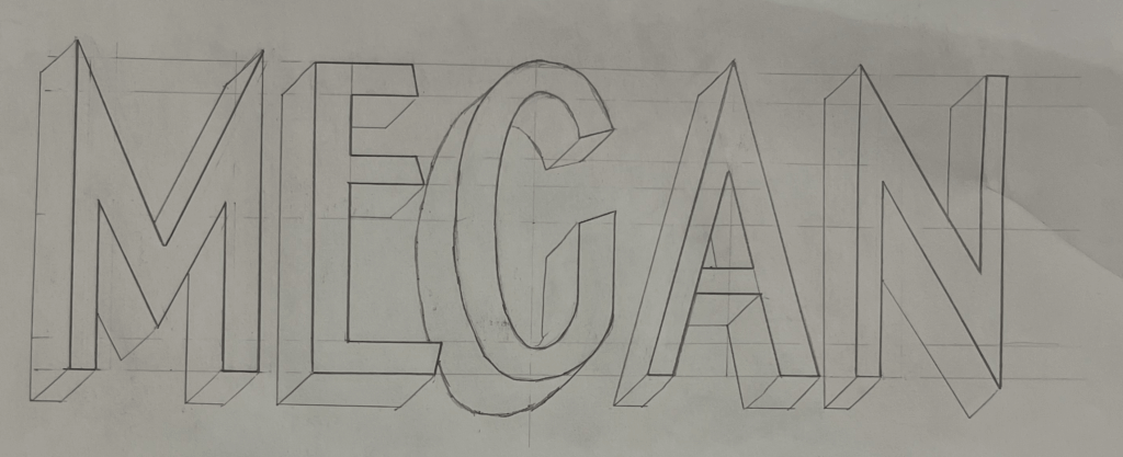
I then practised painting the blocks after sketching them. Joby also showed us the effect of a stepped away block, which I did on the left T. This creates an extra outline around the letter face, which is easy to do, but creates the illusion of an extra effect.

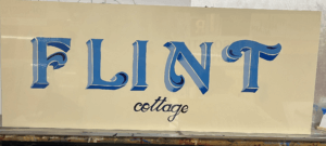
In the afternoon, I began to plan the final design for my sign. I had fallen in love with Joby’s Curveside Nouveau due to the beautiful brush strokes and shapes it created when painted. I found it to be a very fun yet elegant typeface, and I enjoyed painting the subtle curves more than painting rigid letterforms. I originally wanted to paint the name of my village, which is a nine letter word. But for the size of di-bond we were given at 62x25cm, this would be too challenging to fit in. I attempted to condense the font, but due to the thickness of the strokes it was still impossible to be able to paint it at a big enough size. I decided instead to paint my house name, as it was only 5 letters and I would be able to spend more time perfecting and adding blocks and shading. To save time, I used some of the letters that I had already sketched out, drew the additional ones I needed and then cut and taped them together, adjusting the negative space between each letter to create a balanced layout. Here is where a lot of what I learnt about typography at University helped me with my layout choices. Having an L and an I next to one another means that there is a lot of negative space between the letters, so moving these closer together creates the overall illusion that the letters are evenly spaced.

Day 5

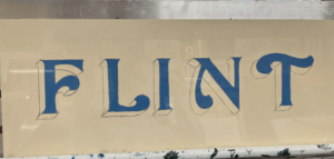
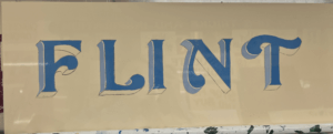
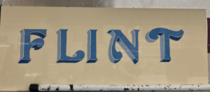
On Friday morning, Joby showed us how to add a shadow to a letter. This helps to bring a letter to life and make it stand out from the background. This was more complicated than adding a block and took time to understand Joby’s demonstration. But I had a go at adding a shadow to some of my previous sketches.

I then started to paint my sign, picking out some shades of blue, that wouldn’t take too long to dry so that I could add layers of block and shading. I started with the face of the letter, then added a stepped back block in a lighter shade of blue for the vertical sections of the block. Once this was dry I used a darker French blue for the horizontal blocks which would be more in shadow. I also added some shading using this blue, to fade some lighter sections into darker parts. Finally, I added some decorative curls within the flourishes of each letter. I then decided to add in the word ‘Cottage’ in a small script copied from Joby’s book, underneath the main word. I painted this in the darkest blue which I used for the flourish curls, to tie everything in together. The script font was difficult to paint as the strokes were so thin, I used a smaller brush to help achieve more accuracy.

If I had had more time, I would have liked to try adding a shadow. However, Joby told me that it was more difficult for signwriters to add a shadow in addition to a block that is stepped back, so this would have been challenging for me. In future I would like to experiment with more bold colour combinations, although I liked the elegance of my blue sign.

Reflection

I thoroughly enjoyed Joby’s course from start to finish and feel as though I learnt a great deal about the world of signwriting and the extensive process involved. Having background knowledge on typography from studying Graphic Communication was a huge help in my understanding of letter anatomy and dealing with spacing. But the process of hand drawing and painting letters has taken my typographic understanding to a whole new level. The act of using a brush to create the curves and the thin and thick strokes of a letter reveals why letters are shaped the way they are, and how they have evolved from the Roman alphabet.

I wish to continue practicing signwriting and  the potentially utilise it in a future career. It has become a dying craft since the emergence of graphic design but is a highly skilled and fascinating trade that should be continued and passed down to future generations in order for it to be kept alive. I am so grateful to have been taught by Joby Carter, a highly respected and experienced signwriter who’s passion for the art of hand-painting letters is clear to see. I also want to thank the University and the Typography Student Fund for allowing me to have had this wonderful opportunity that I will forever cherish.


Joby Carter Fairground Contest: Redesigning Odeon

Redesigning Odeon

Brief

Joby Carter is a signwriter and fairground artist who owns Carter’s steam fair and he set up a competition whereby as the contestants we had to each present a brand that we had reimagined in a fairground font using signwriting techniques and show the idea as a square PNG file, 2000 x2000px. The format / medium could be whatever we chose. The aim of the project was to move away from typographic uniformity and create our own letterforms in eccentric fairground styles.


Schedule

The deadline for this project was 6th December, when Joby would work with our tutors to decide on winners, so this gave me only a few weeks to complete the project from the beginning. I decided to use the first week to research and then to come up with a more developed design each week until the deadline, before which I would create my final design by hand.


My idea

I researched into lots of different logos that I thought were uninteresting and boring, and eventually came across the Odeon cinema logo. Cinemas are supposed to be exciting places to go with friends and family for entertainment purposes, much like fairgrounds and circuses, the main purpose is entertainment and fun. Cinema logos should persuade someone to go and watch a film and evoke the kind of fun that fairground typography gives off, however the Odeon logo doesn’t really do this. It uses a sans serif typeface with rigid angles, creating quite a serious look for the brand that doesn’t scream fun for anyone.

I wanted to rebrand Odeon using fairground inspired typography due to its purpose for advertising a sector of the entertainment industry which should theoretically be the most fun and expressive with its logo typography. With this project, my aim was to bring back the fun and excitement into Odeon’s logo.


Research

After deciding on Odeon, I did a bit of background research into the logo. Odeon was founded in 1930 by Oscar Deutsch. The first logo they used was designed by Deutsch himself around this time. Cinemas during this time period were given a commonplace art deco red and gold design on the inside, which was designed by architect Harry Weedon.

1930–1997

Wolff Olins created a new look for Odeon in August 1997. Camden Parkway was the first cinema to receive the new look. Instead of a red and gold livery, the cinemas were repainted blue, black and silver. By 2002, all cinemas had been given the new look.

 1997–present

I felt that this new logo didn’t give Odeon the exciting connotations that it deserves as a cinema, and the blue certainly didn’t feel appropriate, I felt like I could make it much more exciting.

I also looked at a lot of examples of fairground art and signwriting so that I could adopt the correct style for my own rebrand. Here are some of the examples I found for inspiration. Some things I noticed were the common colours of red and yellow, the extra swirls and flourishes on letter forms, 3D effects, often heavy weighted letters, and that they used all capital letters.

Visit to Joby Carter’s workshop

As part of the contest, we got the opportunity to go and visit Joby’s workshop and he showed us round while we were able to look at lots of pieces of his work which I found really inspiring.

Joby even did some demonstrations of sketching out letterforms for us, and he also picked out one name to do a quick painted sign for, and he picked mine! He painted my name is swift, smooth motions onto dibond material which I had never seen been used before. I liked how he painted my name on a slight curve and the scroll beneath the letters gave it a lot more personality.

Design process

My design process consisted of weekly sketches and paintings which eventually developed into my final sign lettering.

Week 1:

I sketched out three ways to present Odeon in fairground inspired fonts using different angles and curves to create different effects. I liked having a 3D shadow on the letterforms as it really made the word pop out more.

Week 2:

I did another two sketches and turned one of them into a painting. The first sketch I based off the Tuscan alphabet as I liked the fishtail flourishes. The second sketch I chose to draw on a perspective line with a vanishing point so that the letters appear to be getting further away. I liked the yellow on red as it really contrasted and made the letters stand out quite well. For this one I used the Playbill alphabet as inspiration which I thought was very appropriate due to its historic use in the 19th century for advertising theatrical shows on printed posters. This links very well to the concept of a cinema, so I chose to use this style going forward. I also tested a small painted sketch of an O using blue for the background and a Tuscan O, but this didn’t feel the right vibe for a cinema.

Week 3:

This week I painted a developed version of the previous style, trying to refine the letterforms more, and I tried adding a scroll which was inspired by the scroll that Joby added to his painting of my name, however I concluded that this style of scroll didn’t fit the same energy of the letters. I also painted an E with fancy flourishes and tails, but didn’t feel like the colours and style gave as much impact as my previous style, although I wanted shadows on the letters to be thicker so they overlapped more.

Week 4:

For my developments this week I bought some gold paint to replace the yellow that I had been using, because I noticed that gold featured a lot in fairground art and I thought this could be quite impactful, I loved the shine that it gave to the letters under the light. After having feedback last week, I changed the shadows around so that the letters were sitting flat, and you could see the top and the sides instead of the bottom of the letters. I also added some small circles to each letter after seeing this in lots of sign writing. I tested a different style of scroll that I thought contrasted but fit much better with the letterforms, and a dark purple red that I used for the darkest shadows of the letters. Finally, I tested a black outline on the O but didn’t like this as much.

Final submission

My final submission for the competition was based off my last practice but with more accuracy and refinery. I used more accurate vanishing points to make the letters more coherent in their 3D states, and created my own scroll, which was based off one of Joby’s examples, but with some extra flourishes. I used some dibond which James helped me source from the department because when painting on paper, it often created ripples in the painting. This was a material I had never painted on before, and as I was using acrylic paint I had to do many layers of paint each time but it created a shiny finish and I was really pleased with the finished sign.

Evaluation

Overall, I think I did a good job of rebranding the Odeon logo using fairground typography to make a more impactful and exciting logo that actually represents the company a lot better. I thoroughly enjoyed being able to go back to physical drawing and painting instead of working digitally and found the art of signwriting challenging yet enjoyable. It has made me really appreciate fairground art much more, having previously been unaware that it was all done by hand. I wanted to stay away from doing anything digitally throughout this project so as to stay true to the art of hand-lettering, as I felt like doing anything on my laptop would feel like cheating when people like Joby Carter do absolutely everything by hand themselves. Due to doing everything on physical paper, I realise my design may not be the most crisp and have a perfect finish, but when I visited Joby’s workshop I admired the small mistakes and discrepancies that you could sometimes notice when looking closely because they reveal the work of the artists hand and show just how difficult it really is and I felt like these inconsistencies had a certain beauty to them. I learnt that hand-lettering is not about trying to make every letter the same, what makes it special  is that every letter is different and you don’t have to stick to any rules of typography, it creates a unique opportunity to be experimental and expressive with letters.

How to create the perfect present

Ideal gift

Kim’s project 2

Our task was to come to the session with 3 facts about ourselves and share these with a classmate. Using these facts, we then had to brainstorm and sketch out ideas of what could be considered the perfect gift for this person. The facts that my partner gave me were that her family name is ‘The Angels’ in Spanish, her family works with fire arms for their job, and that she once met Bruce Forsyth. We were then given some random words that we had to try to incorporate into our design. One of my random words was banana. My finished design was a trophy of an angel holding a banana gun.  The thought behind this is quite self explanatory, but I chose for it to be a trophy ornament because when she said Bruce Forsyth I thought of Strictly Come Dancing and the trophy.

A Penguin Book cover with a twist

During our Integrated design methods technical session, we were practising using adobe InDesign and started out by replicating a classic Penguin Book cover. This really helped me get to know my way around the software as it was not something I was previously familiar with. It took a little time and patience for me to get thew hang of it, but I feel like I made significant progress in familiarising myself with adobe programmes. We were then asked to use what we had learnt from this session and apply it to our own version of a Penguin Book cover. This could be whatever we chose, but we had to make it ‘clever’. I chose to design a penguin themed book cover for ‘Fifty shades of Grey’ as I thought this would be an interesting theme. I achieved this by using the base of the classic penguin book cover that we created in this session and then began to change each section, take away parts and add new elements. I replaced the penguin books cloud logo at the top of the page with an image of lips, to echo the erotic and romantic nature of the book. In addition, I replaced the typical penguin icon at the bottom with a couple of romantic penguins as I thought this was a fun play on the original logo.

I found this task to be incredibly useful on developing my digital design skills and it gave me the freedom to create a playful design and have a bit of fun while experimenting and learning. There’s still a lot I need to learn when it comes to the technicalities of using InDesign but I already feel a lot more confident in working with adobe softwares as I had to use photoshop as well in order to create and cut out some of the images.

Please mind the gap between your letters

Mind the gap

Gerry’s task 

Gerry gave us two tasks for the day. The first was to look at the typeface that the word ‘hesion’ was written in for us, and to then imitate this and write ‘cadbury’ in the same font below. This was trickier than I thought as we had to imagine what the letters in ‘cadbury’ would look like, by using parts of the other letters in ‘hesion’ and analysing their shape, size and features. For example, one of the fonts had serifs and the other one didn’t, so I tried this task in both ways. I learnt that the most effective way for me to achieve the best outcome with my letters was to start by sketching out each letterform until it looked right. Then I would draw the outlines of each letter using a fine-liner and a ruler to sharpen the edges, and finally to fill in each shape using a thick marker pen. This way, I could achieve good, solid letterforms.

The afternoon task Gerry gave us was to fill in the gaps of letters which were only half printed and had missing parts. So we had to take what we could see from a section of each letter and use this to design the rest. There was some room to be creative, but we also had to make sure that the letters looked natural and each part blended in well to the other.

I liked this mini project, as it involved more hands-on sketching and enabled me to practice drawing different typefaces while encouraging me to look more closely at individual letters, rather than the font as a whole.

Transmogrification of my initials

Creating a monogram

Kim’s project

In today’s brief, our task was simple: to create a graphic representation of our initials. I began by sketching out some initial ideas using the Garamond font, as I liked the serifs that this typeface contained. I brainstormed some ways of how I could combine my initials ‘M’ and ‘H’. These two letters have similar forms, so I tested out different ways of intertwining them in an interesting way. I found that drawing the ‘M’ and ‘H’ separately and then photocopying them in different sizes allowed me to quickly experiment by cutting them out and rotating and shifting the letters to find a monogram that worked, before sticking them onto my page as a series of experiments. This was an efficient and effective way to work for me and produced quick results, rather than sketching out the letters each time to come up with a different design.

After having chosen the compositions that I liked best, I decided to develop my ideas further with use of colour. One idea I tried was inverting the white background and black letterform to create black negative space and a white monogram. I liked the finished look of this, and then proceeded to try a combination of  black and white negative space, switching between the two in different sections of the letterform. I tried this with coloured pens as well, which i liked, but not as much as the black and white one. So, to finish, I drew out the black and white version in a slightly bigger size to produce a final, neat piece.

I really enjoyed this task and the way it encouraged me to think about design in simple letterforms, I effectively developed and created my own glyph based on my two initials which I thought was really fun and creative!

Opening my eyes to the words around me

Lettering in the environment 

Eric’s task

For today’s mini project, we were asked to go out into the environment, around the university campus or out into town, and photograph lettering that we come across. We were not restricted in any way with what lettering we could take photos of, it could be anything from road markings, to building names and sign posts. Anything that we came across that interested us, we were told to photograph using different angles, lighting and compositions. This task really made me aware of my surroundings and I started to notice little things that I never did before. For example, the fonts and colours, the materials used, the shapes and techniques of the words displayed all around me. Actively seeking different forms of lettering around me enabled me to analyse the typography used to convey a message, instruction or display information and the effect it may have on the reader.

I came back with a series of photographs taken of all different words, phrases and names that I had found. We were then asked to sort these photos into groups of our choice. I chose 4 different themes which linked certain photos together and compared and contrasted them with my group. I found this project to be a fun way to learn about lettering in the environment and I came away feeling like my eyes had been opened to noticing new things.