
Real Job: Working with Dr Madeleine Davies and three student editors – Libby Bushill, Zoë Kyle and Maddie Bazin – from @UniRdg_EngLit, Katy Smith designed a book of critical responses to Woolf's work
Author: Katy Smith
A visit from DK
Karen Self (Art Director), Michael Duffy (Managing Art Editor) and Kit Lane (Designer and alumni of the Department) joined us for a day of workshopping, portfolio reviewing, and mock interviewing.
‘It’s never right the first time’
Alison Black led week 3's Baseline Shift talk on approaches to academic writing. She focused on the emotional experience of writing, the barriers that stop us settling down to write, and the mindset required to produce good writing.
Paul Luna: a very short introduction to typography
'It's not all about fonts!' At a special Baseline Shift session, our former Head of Department stressed the importance of design for reading.
Typography alumni talks: a look at our future
Typography graduates from the past 15 years returned to give us an insight into how their careers have progressed since graduating.
IBM iX: design thinking, processes and opportunities
Milly Longbottom and Will Trickey, alumni of our department who now work at IBM, came to talk to Part 1 students about UX design process and internship opportunities at Big Blue's cutting edge London office.
Visiting Oxford University Press
Part 2 students who opted to design book covers for Oxford University Press in their design practice module were lucky enough to be given the opportunity to visit OUP headquarters in Jericho, Oxford.
The basics: a guide to good writing and referencing
In Typography at the University of Reading, a huge importance is placed on having a good academic writing ability. Week four and five of the Baseline Shift sessions therefore aimed to sharpen the writing skills of students, with talks on professional writing and referencing.
Week four kicked off with ‘Let’s eat Grandma!’, a talk from Kim Shahabudin from Study Advice. This session focussed on academic and professional writing, specifically the role and importance of clear communication.
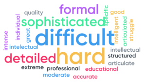
Students were asked to choose one word to describe academic writing and a word cloud was produced. This incorporated the views of all students, with the bigger words representing a larger number of people who all responded with the same word.
From punctuation, spelling and grammar to writing styles and the impressions they give to others, the talk really covered a wide range of points. The importance of appropriate word choice and good paragraph structure was also emphasised.
‘I didn’t expect such basic things to be enforced so much’ – Joanne, Part 1
Typography student’s knowledge was put to the test with an interactive quiz to reinforce the information that had been given, with prizes on offer for the winners!
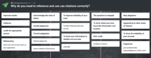
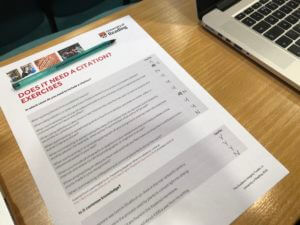
Following this, week five played host to a very important talk on referencing. The talk was led by Karen Drury, one of the Department of Typography’s two Liaison Librarians.
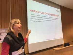
The talk included vital information for students of all years across the department, with as much as 20% of first year essay marks being dedicated to referencing. Even more so for Part 3 students, who are currently working hard on their dissertations.
The talk covered all bases of referencing including how, when and why referencing should be used as well as different styles of referencing, which involves guidelines as to how the information in the reference should be structured (the Harvard style being favoured within the department!)
As a little reminder, the Harvard referencing system is structured as follows:
Author (Last name followed by first initial), year published, title of work, place of publication, name of publisher, pages used
For sources such as journal articles, the publication information is replaced by the journal title, volume and issue numbers. Websites are also slightly different, the date the source was accessed must be included as well as the URL it can be found at.
Talking to some members of Part 1 after the talk, it became clear that, before university, referencing was not as strictly enforced as it is here.
‘I’ve done referencing in the past, but it was never this rigid and strict’ – Joanne, Part 1
Being from a department such as typography, the materials we are required to reference are often different to that in other fields. As well as the more common sources such as books, journal articles and websites, Karen really clarified how we should go about citing materials such as pictures and artworks. She emphasised the basic reference structure which involves four major pieces of information: author, date, title and publication details (such as the place of publication and the name of the publisher although this varies depending on the item being referenced).
Through interactive quizzes, handouts and a variety of examples, Karen really simplified the referencing process, giving students a greater understanding of what is involved in citing correctly.
‘Learning about the specific reference structure to use was really helpful, and the quiz really helped consolidate all of the information given in the talk’ – Ruth, Part 1
Karen also recommended some different tools which are available to assist in referencing such as reference managers (Endnote online, Mendeley and many others). There are also some library guides available as www.libguides.reading.ac.uk which can help in managing and citing referencing.
‘The different tools Karen spoke about will be really helpful, I didn’t know about all of the library resources which are available’ – Caitlin, Part 1
Overall the past two weeks have offered some very key information which is applicable in all areas of study. From Part 1 and 2 essays and reports all the way up to Part 3 dissertations, Typography students at the University of Reading now have a much more solid understanding of how best to structure and communicate written information.
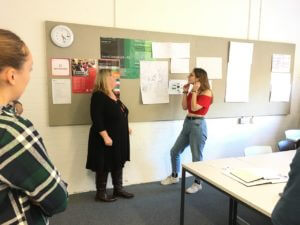
DK at the University of Reading
Our first Baseline shift Wednesday morning session kicked off this week and Typography students were lucky enough to receive a visit from two members of the design department at Dorling Kindersley’s Knowledge team. Kit Lane, who is alumna of our department, and Karen Self, art director at DK, gave a very interesting talk covering many different aspects of the company, as well as promoting the varied internships they offer to students.
‘It was very useful to have industry professionals come and talk to us so early in the course. It was good to know about internships I could apply for sometime in the future’ – Ruth Bartley, Part 1
The DK difference
DK offered students an insight into the exciting world of publishing, from their own unique perspective as market leaders across a range of areas. They covered their practical design process as well as the design thinking that goes along with everything they do, emphasising the importance of considering the consumer (not just the reader) at every stage. The lasting impression was that DK operates very differently to many other competitor publishing companies. This was exemplified by the fact that the majority of design is done in-house, with comparatively huge amounts of time (often four or five months) are spent designing each book, spread by spread, as opposed to flowing text into a prebuilt specification.

Design challenge
Students were given the opportunity to take part in a workshop led by Kit and Karen in the afternoon. This involved generating ideas for a new book named ‘Urban Detective’. Students worked through a design process starting with some initial research into the theme before sketching out rough ideas for book covers and inside spread layouts.
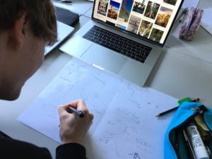
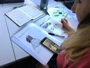

These ideas were then refined through peer discussion and input from Kit, resulting in a handful of clear concepts. A group crit let everyone to receive feedback on their work. Throughout the process, students kept in mind the audience and aim of the book, in true DK style.
‘I enjoyed the workshop, as it made me consider more about book design, than I might have otherwise considered on my current project’ – Alex Ganczarski, Part 1

‘I really enjoyed the workshop and am taking away a greater understanding of how to plan my ideas and concepts, as well as how the 2nd and 3rd-year students plan and execute their work. It’ll help me a lot over the next 3 years of the course’ – Rory Tellam, Part 1
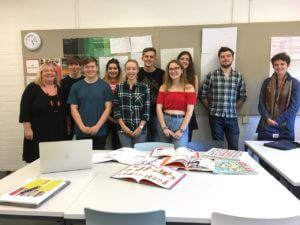
Portfolio reviews and interviews
Some students also took the opportunity of having a mock interview and portfolio review with Karen. This gave a feel of what an interview is like in a professional context, preparing them for heading out into the world of design beyond university.
‘Karen made the experience calm and professional, offering great feedback on how to improve my portfolio’ – Laura Marshall, Part 3
‘It helped me to understand the process and content of a professional interview in a relaxed and casual context’ – Fay Rayner, Part 3
‘I am so glad I took on this opportunity. It has made me feel much more confident and prepared for future interviews’ – Jacob Hawkins, Part 3
Overall, our visit from DK was a big success. Around 65 Typography students were offered an insight into what life is like in the graphic design and publishing industry, which will be very useful when considering career paths later on – and much sooner for our students in Part Three!