
Summary
A Room of Our Own is a book showcasing short pieces submitted by students on the ‘Virginia Woolf and Bloomsbury’ module in the Department of English Literature at the University of Reading. It is a collaboration between university departments and follows on from Second Sight, a book previously designed under the Real Jobs scheme.
Working with Dr Madeleine Davies and three student editors – Libby Bushill, Zoë Kyle and Maddie Bazin – from the English Literature Department, I designed the book which consisted of 10 chapters and 64 entries.
The brief
The existing Second Sight project was helpful in that I already had an idea of what was expected of the A Room of Our Own project before meeting with the client.
The book was to be produced in the same format as Second Sight but was not required to be identical in other aspects. I was keen to maintain an element of consistency to reinforce the family relationship of the two books, but still had lots of freedom in the design.
The deliverables included a print ready file of both the cover and interior pages of the book. The possibility of an e-book design was also discussed.
The book aimed to be published in summer 2020 and it was later decided to aim for the publication date of Dalloway Day.
Research
Upon meeting with Madeleine and the student editors for the first time, it was immediately clear to me how passionate everyone involved was about the project. Their enthusiasm inspired me and despite knowing relatively little about the writer myself, I was keen to learn more to produce the best design possible. Everyone had so many ideas and I came away from the meeting with loads of designs to try out and lots of knowledge about Virginia Woolf.
The Woolf Walk
I was lucky enough to be invited along to London for a walking tour of a combination of routes of the character Mrs Dalloway. I learned more about Virginia Woolf and spent time with more English Literature students enrolled on the module. Following the walk I was even further inspired to produce the best work for the book possible.
Handwriting
One of the key ideas suggested was to emulate the way that Virginia Woolf wrote in purple ink. Although this a detail not all readers would necessarily notice, I wanted to use a handwritten typeface in a purple shade to reflect this. I looked at images of letters written by Virginia Woolf but could not find a typeface I was happy with. I was very keen on the inclusion of such small meaningful details in the design so decided to study the handwritten letters myself and attempt to create my own hand drawn typeface in a similar style. I created a letter bank showing the different ways Virginia Woolf formed each letter of the alphabet. I then experimented combining each letter in the same style seen in images of her letters. I started by using a fine liner to draw the words but after a few attempts, found that a calligraphy pen with a square nib was most effective. I then scanned and vectorised the lettering to use in the book.


Purple ink
I did some research into the ink used by Virginia Woolf, hoping I would be able to find an exact shade of purple. I couldn’t find an exact colour but did find some links to a website selling a writing ink which people believed to be a similar shade. I colour picked this colour as best I could in CMYK and used this as the accent colour, applied to elements throughout the book.
Icons
Second Sight used icons on each chapter opening page which I was keen to maintain this in A Room of Our Own. The use of white space on a full page opening each chapter was very clear in indicating a new section whilst still appearing interesting to the reader. Meeting with the editors, they compiled a list of iconic objects which could represent each chapter. I created a set of cohesive icons to be used on the chapter opening pages and the contents page.

Designing
The process
I needed to consider many different things in the design of the book:
- The hierarchy of titles and authors of each entry as well as headings of different levels within each entry
- Separating entries from those either side
- Indication of a new chapter
- Page furniture which allowed for easy navigation of the book
- Maintaining an element suggestive of a relationship between A Room of Our Own and Second Sight, whilst making sure it was not a ‘carbon copy’ and made design decisions appropriate to the specific content of the book.
I was assigned the job while students on the module were still writing their entries. This meant I had time to work on the type setting and information hierarchy of the interior pages before receiving any actual content. This was very useful as this phase took much longer than I anticipated. Entries submitted by the previous year’s cohort were available, so I used these to work on the type setting.
Despite experimenting with justified text, I decided on a flush left, ragged right text alignment which is much more conventional. This also allowed for the multiple different styles of entry in the book. At first I also used left alignment for headings and authors, but eventually changed this to be centre-aligned as this separated the heading from the main body of text, implying it was higher in the information hierarchy.
Another design decision I had to make was whether to have each entry start on a new page. The length of many of the entries was such that they took up just over a full page, but not a sufficient amount of the next, meaning a lot of white space would be left at the end of entries. This was the approach taken in Second Sight, and when combined with line breaks between paragraphs (as opposed to indentation of the first line) it resulted in a page that was clear, light and easy to follow. I did however experiment with running articles on from the previous to attempt to save on predominantly blank pages. I used the icons designed for the chapter opening pages to act as dividers here. I was keen on this approach as it looked consistent and professional however I didn’t continue with this. The client felt that a new page per entry let each entry stand alone as a piece, which I agreed with. Some entries with varying alignment would also not fit as well visually in this structure (such as centre aligned poems following on from flush left, ragged right blocks of text).
The baseline grid
Initially keeping all paragraphs aligned to the baseline grid and not wanting to indent every new paragraph, this meant that full line spaces fell between paragraphs. This created a lot of white space on the page. I decided that I would stray from the baseline grid, using half line spaces between paragraphs.
The typeface
I felt that using the same page margins as Second Sight was appropriate as this would maintain an element of consistency in the appearance of the two books. I experimented with different typefaces, creating mini specimens of each set in different sizes and with different leading values using the column width as a starting point. Discussing my options with my supervisor – Eric Kindel – he suggested that perhaps I use a typeface designed by a student on the MA Type Design course in the Department. Madeleine was very keen on this idea, especially as it drew on the idea of the project being a collaboration across departments within the University. Madeleine also suggested that a font designed by a female type designer might complement the book. Looking through the catalogue of MA type designs, I chose the typeface Alkes by Kaja Słojewska as it consisted of multiple weights, ligatures and punctuation elements which I anticipated using. When I contacted the designer it turned out she was also a Virginia Woolf fan which tied in nicely!
Having chosen this typeface, I once again created mini-specimens to print at full size and correct line length. This helped to establish an appropriate type size for headings and body text, as well as an appropriate leading value. Initially beginning the design phase using 12 pt leading, I later added half a point of leading upon suggestion from my supervisor. This meant that the body text was 9pt / 12.5pt.
The cover
Initially the cover artwork was intended to be that of the winner of a competition run in the Art Department. A winner was selected and their image was chosen to be used on the cover. I began producing rough layout options combining the cover copy and the image in a way that reflected the book interior. I felt that the purple colour used throughout the book should be included on the cover in some way for cohesively and professionalism so we spoke with the cover artist who sent back a few different colour variants of her artwork, one of which was purple. I felt that this cover design suited the book very well, but we later ran into issues with permissions forms meaning we had to replace the cover image.
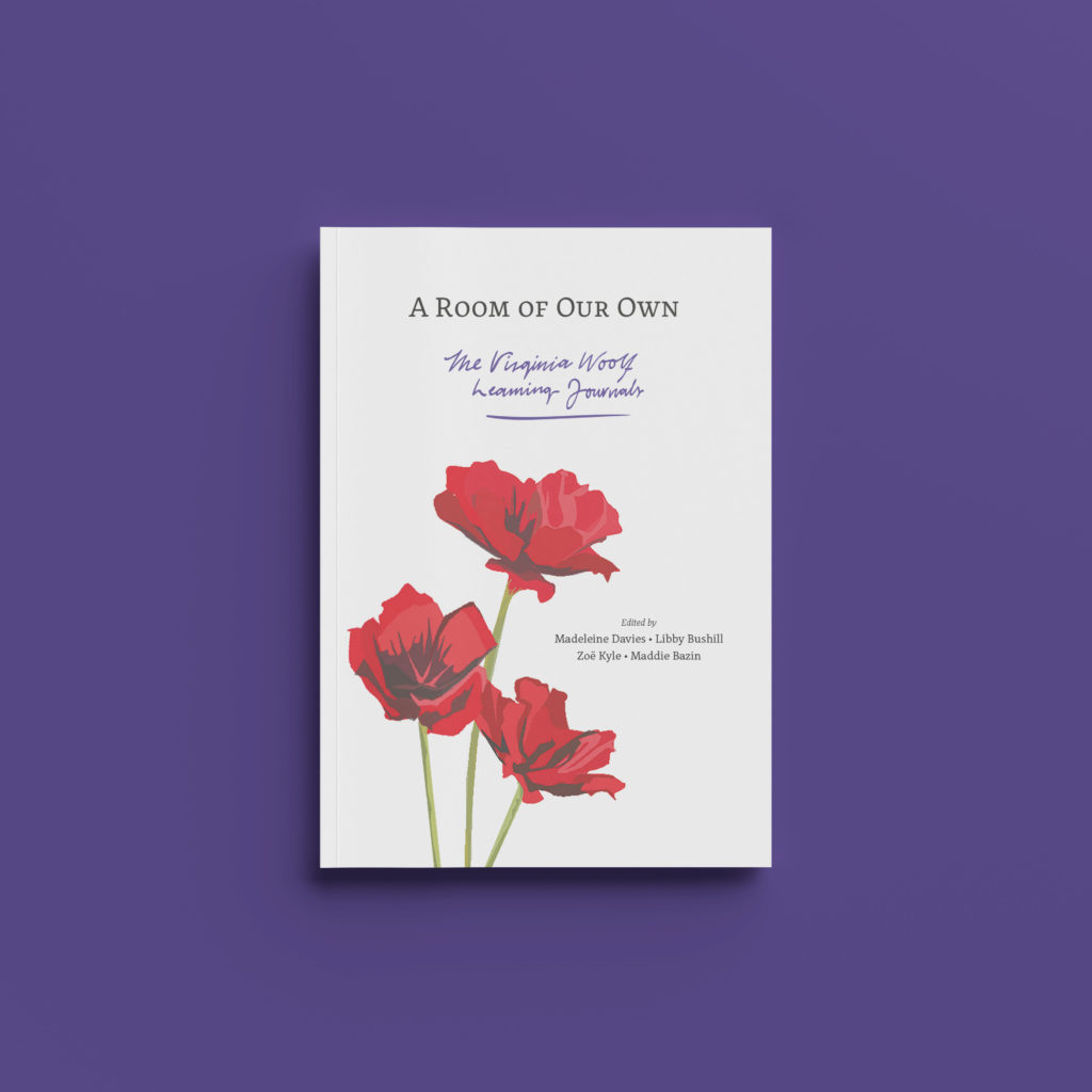
I was now required to completely rethink the cover. We decided to use an image of red poppies created by an English Literature student on the cover. The image was very strong and impactful due to its shades of red, however this clashed with the purple shade used inside. Madeleine and the student editors liked the idea of a black background for the red poppies as this would make the colour jump out. A black cover would also fit nicely with Second Sight which had an off-white cover. Upon discussion with my supervisor, I advised that a black cover would be risky due to potential uneven printing of the colour, fingerprinting of the cover and the potential for cracking along scores and folds.
I began to work with a pale purple or white background colour instead and experimented with different ways to including the purple colour without it clashing with the image. Initially using the purple colour on text on the cover, to tie it in with the handwritten font, my supervisor suggested I only use the purple colour for handwritten text. It was then that I decided to write the book subtitle ‘The Virginia Woolf Learning Journals’ in the handwritten style to tie the cover to the inside pages. This meant I could use both the handwriting and purple shade on the cover, and their reserved use meant that it didn’t conflict with the image.

The spine
The spine is one of the design elements that I decided should relate in some way to Second Sight, as both books are likely to be stored on a shelf next to each other with only their spines visible. Despite the use of different typefaces in both books and slightly different colours of the paper printed on to, I felt the books should appear related in some way in the environment they will most likely be seen. I aligned the start of the text on the A Room of Our Own spine with that of Second Sight so that they appear as a set.
Receiving the final edited text
As the editors began to edit student journal entries, I continued working on the cover design, typesetting and design of various different elements. However, due to the wide variety of styles of entry written by students, not all different approaches could be anticipated. For example, some entries were essay-style, others were prose or poems, some were written in the style of a play, others were question and answer papers or quizzes and some were letters. One entry even took the form of a newspaper article. Upon receiving the final edits, I began properly setting the text and looking through each entry thoroughly.
The editors were great in trying to maintain consistency across entries, despite being written by different students in their own styles. However in some cases I did make design decisions myself to ensure this (after discussion and approval from the editors). For example, making sure quote attributions were done consistently.
This phase involved a lot of creating of paragraph styles based of the initial ones I had created, each with slight variations to cater for different writing approaches. Small typographic details such as indentations, italics and small caps were considered to differentiate different parts of the text.
Having set the entire text, including the prelim pages and bibliography, the next phase involved a lot of discussion with my supervisor about smaller typographic details. Making sure en-dashes and hyphens were used correctly, sorting out line breaks and the rag of paragraphs and making sure all character and paragraphs were applied correctly.
Images
Along with written entries, the book also contains 10 images of artwork. I had to ensure that there were integrated successfully to the predominantly text-based design. I made sure that an object style with text wrap above and below was applied to all images. The text wrap offset value was set to 12.5pt so that spacing between text and images would fit to the baseline grid. A full line break (rather than the half line break used between paragraphs) also meant that where an image was placed on the same page as an entry written by someone other than the artist, the work would appear separated. Captions were also included below every image, giving information about the creator of the artwork.
Production
This was the first project I had seen through to production myself so this was a learning curve. Tasks such as applying for an ISBN numbers and discussing print specifications and estimates were something I had not done before.
The format of the book is identical to that of Second Sight, however, it does include the use of colour on more pages. Originally, the colour purple was applied to all titles throughout the book, but this meant that printing would become more expensive. I suggested that purple was reserved for the cover, prelim pages, introduction, chapter opening and bibliography pages so as to reduce the cost and allow for a larger print run instead.
Reflection
This project has been the biggest learning curve of the course for me. Although the job was within the University, the ‘real’ nature of communicating with my client, my supervisor, the student editors and following through to print and production is something that you would not usually experience in the average piece of coursework. In particular I have learned so much about setting up and making sure files are suitable to be sent to print – ensuring colour profiles and image resolutions are correct and communicating specific information about the project to generate print estimates.
This Real Job was also particularly interesting as it required communication with not only the client, but also a team of student editors, all of whom were incredibly passionate about the project. Although I was involved on the design side of the project, I sat in on the editors meetings and involved in the entire process. Rather than just being sent the copy and asked to produce a book design with a tight turn around on a subject I was unfamiliar with, I was able to see all aspects of the book production. From the discussion of editing points and consistencies between editors to joining the students on the Woolf Walk, I felt very involved with the projects. Rather than separate editorial and design meetings, the small team meant that we could all meet together and share ideas from a range of different perspectives. The editors from the English Literature Department brought fresh ideas and suggested details about the subject of the book which I would not have thought about had I not met with them so regularly. Being able to sit and mock up rough designs with the editors as they described ideas in meetings meant I could also help them to visualise their ideas. Having the different approaches from attending Real Jobs meetings and speaking with my supervisor from a design perspective and then speaking to the editors for a more contextual view really helped the book to progress. An example of this is the inclusion of Woolf’s handwriting in purple ink. The editors may not have been able to produce this without using an existing typeface, whilst I would not have thought of such a small detail without their contextual knowledge.
Overall I have thoroughly enjoyed the project and being part of the team behind it. I intend to follow it through past print and production, creating more of a social presence and creating artwork for the book launch.
Further work
The book is currently in the production phase and hopes to be published in June 2020. As the project has developed, plans for a book launch event and an online presence have been created. Although originally planned for summer 2020, the book launch is currently scheduled for later in the year. The design and production of small pieces of merchandise in the style of the book has been suggested and I hope to work on these in the near future. Ideas include tote bags and book marks which could be given away to contributors and guests at the book launch with a copy of the book. A Twitter page has also been running alongside the book design and production phases for publicity which I designed some artwork for. The Twitter page can be found here: https://twitter.com/RoomofOurOwnUOR
One comment
Comments are closed.