
Background
The Reading Assembly has been holding events in The Tate Exchange for the past couple years that involve exploration of contemporary topics following an annual theme. The Tate exchange is located on the fifth floor of the Blavatnik Building at Tate Modern and founded in 2016. It holds free events every day and each day is different. The Reading Assembly event occurs over a number of days with activities and workshops that are run by students from the University of the Reading that follow the main theme. The topic for 2020 is ‘Power’ and this subject matter is put to the question ‘what happens when art and society meet?’. In order for the event to run smoothly signage and a leaflet of scheduled events is required for visitors and for navigational use. These deliverables need to be coherent and reflect to core aspects of the organisation and others involved.
This real job has been allocated as a one-person project. Although this may make the workload substantially more it means that organising can become easier to ensure the deadlines are met and the final outcome is delivered. Therefore, I will be taking on full responsibility for contacting the client, researching, designing and ensuring they are printed correctly. The first meeting with my supervisor helped me to discuss the client and task that had been set and begin to speak about the approach that will be taken. In addition, the tight deadline meant we needed to schedule multiple meetings each week to allow for quick progression and development.
The Reading Assembly comprises three departments that make up The School of Arts and Communication Design at the University of Reading; Typography and Graphic Communication, Film, Theatre and Television and Reading School of Art. This organisation has an established logo, and previous deliverables created from recent years such as t-shirts and leaflets. These previous designs have followed the identity of the Reading Assembly yet still conveyed each topic subject in a unique and innovative manner. The event is made up of workshops, performances and collaborative games to explore the different ways we experience power and the meaning of the word. As the term power is used in various ways to reflect art and ideas, the final deliverables must not be too linked to one interpretation of the subject. There were limited funds to conducting this event and therefore the design needed to be effective and innovative without being too costly.

Restated Brief
The restated brief was written alongside forming the final outcomes, with a short time frame it meant more emphasis was placed on discussing the design with both my supervisor and the client in order to meet the deadline. Sections of the restated brief were conversed and iterated in emails to ensure that I was taking the correct approach with the project. Once the restated brief was written it became a base for the effectiveness to measured and meant I could go over my objectives before sending the final designs to the client. The brief was written in a professional and coherent manner and using checklists I was able to make sure that I had all the necessary information.
Furthermore, this brief demonstrated my understanding of the event and how the deliverables had been tackled in previous years. By collecting this core information during the design process ensured that constant referral was happening at all stages to form an effective design within this short period of time. Although the schedule was realistic at the beginning of this design project, the tasks I set myself where changing daily through delays occurring with copy and feedback for the art department. Therefore, on reflection I would have benefitted more from a schedule of each day of the week rather than a set task each week.
Process
Initial contact with client
The initial meeting with the client was held in the art department with Anna Kontopoulou, unfortunately due to a storm this meeting was put back as Anna was stuck abroad. In the meantime, I had opportunity to research both Tate Exchange and The Reading Assembly helping to form useful questions that I could ask my client. In this meeting Anna outlined the key information that I needed to include within the design and highlighted that the copy was still being written. She also provided the sizes of the signage needed for the event space with 8 A3 posters and 1 A1. I asked questions such as ‘is imagery needed to display the event?’ and ‘what is the key message that you want me to put across?’. These questions allowed me to fill gaps within my research and begin designing as soon as possible.
Research
The research process began by finding out more about the Tate Exchange and the Reading Assembly. This meant I was able to identify the current brand identity and also understand the space which my design will be sitting in. The Reading Assembly already had a logo that was red, black and white but the Tate Exchange just used the main Tate gallery logo for representation. The Tate Exchange was formed as a place to share debates and reflection on contemporary topics and ideas but also to get actively involved with the subject and therefore clear navigation it needed to help visitors move around the different activities.
The design needs to promote the activities being held and inform the audience of what the workshops include. The question I asked the client about imagery releveled that the design is purely type based. This meant I could research creative layouts of different hierarchy of types without wasting time on forming designs using images. It also helped to discover creative ways to design flyers without increasing the cost of printing. The research also involved creating personas of different age groups that reflected their needs from an event leaflet. The audience is varied and therefore the way in which the information is presented needed to be applicable to all.
Furthermore, the finding out also led me to discover typefaces that reflected the topic of ‘Power’ and how I could display the typeface without being too connected to the topic.
During my research process I got in contact with Geoff to advise me on a printing size of a leaflet that would allow space for all the information without being too costly for the client. Geoff suggested an A5 bi-folded leaflet and I took his cost estimate for this to the client. The other deliverables had a set size so the cost estimate was more straight forward.
Sketches and ideas
Sketches were made to help visualise the amount of space I had for each day of the event and helped when considering all the elements that were required on the leaflet (logos, dates and location). Although these sketches were useful, I didn’t put too much detail into them in order to save time and to show the client a more finished design of what the outcomes could look like. This was again a decision made based on the time scale.
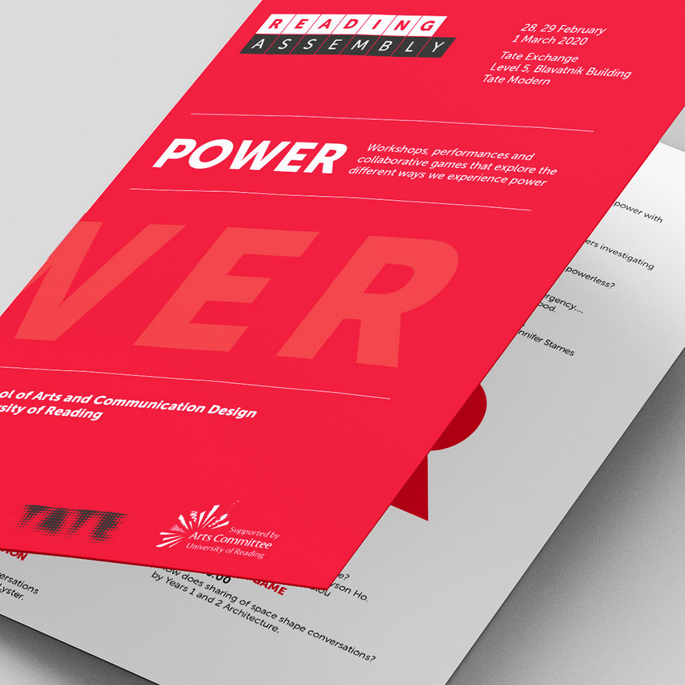
The client hoped to see 3 designs that could be circulated around the art department, therefore I put together the 3 designs of the leaflet that I thought were most suitable for the event. As there was a short time limit, I decided to wait for feedback from the client on these designs before constructing the posters. As I aimed to create a coherent design within the deliverables it meant I could base the poster off the chosen leaflet to save time. These designs ranged in typography but had similar colour palettes that connected with the Reading Assembly. The idea of power was reflected using a strong typography to display the word boldly and the use of red can also depict strength, rage and confidence, all linking to power.
The client was happy with how quickly I began designing and was grateful for having choices to allow for more involvement from her department. The designs were clear and concise with all relevant information displayed. The copy was delayed and therefore I used placeholder text for the first couple of iterations but made sure I allowed for enough space.
The client and I agreed on the most successful design which involved the font Effra, which is part of the University of Reading brand. The design also involved having all the information within the leaflet and the key information in relation to The Reading Assembly on the front and back. This design was imitated on the posters of each of the activities and welcome sign.

Final stages
The week leading up to the deadline for the project I spent most of my time in the library delivering emails between the client, Geoff and Eric my supervisor. This allowed me to be readily available to make the suggested changes quickly without holding up the design process. My client was very grateful for my quick responses and my late night working.
The production process involved a lot of communication as last minute changes were stated by the client. Geoff was aware of the event date and gave me a final date and time of production submission. The format of the document was straight forward and meant that the actual printing was a smooth process. The time pressure however meant I was constantly communicating with my client and supervisor to ensure the design was nearly ready and correct.
The client had been in contact with the Tate and discovered that the entrance poster wasn’t necessary for the event and therefore only the leaflets and activity signage needed to be sent to print.
Unfortunately, there was a spelling mistake for the name of the building ‘Blavatnik’, which we only discovered after I had sent the designs off for printing. I got in contact with the printers straight away and luckily the printing process hadn’t begun. This has taught me to apply more checks to my designs to avoid this stressful scenario again.


Final design
The final design of the leaflet involves using the word ‘Power’ to span across both the outside and the inside of the document. The details about the events sits above and below this ‘Power’ making it clear that they are different days to reduce confusion. On the cover of the document I have mentioned the core information such is location and dates, as well as displaying the logos of organisations that they work with and the Tate logo. The days of the week were designed in a way to match the cubes used within the Reading Assembly logo. On the final print out the word ‘Power’ on the cover of the leaflet didn’t come out as bold as I had hoped, and this was a result of not checking the printing results before sending off the designs. If I had more time this is definitely something, I would have changed but it has taught me to prioritise this aspect for future project.


Reflection
On reflection I was pleased with the overall design, but I felt the functionality of the design was more successful than the creative side of the project. If I had more time I would have explored further solutions that had a further visual appeal to make my design more of a promotional material. This was my first Real Job involving print and production management making it a very valuable experience. Even though there was some hiccups it made it more of a learning curve of how best to approach it and the careful considerations that need to be considered.
This project involved a great deal of organisation and commitment to meet the set deadlines. Shortly after the completion of this task I had an interview with the Cambridge University Press and one of my interview questions was on the topic about how I compromise design decisions in order to meet a tight deadline. I used this project as an example of a time I put this into practice. I stated the stages where I needed to have a number of tasks going on at once and spending less time on certain parts of the design process. I was very grateful I had this learning experience that became a useful asset to me within this interview. Unfortunately, due to COVID-19 my second interview has been put on hold.