
Background
Art for Research Reading is a very new organisation that aims to raise money for Cancer Research Children and Young People. Their aim is to run an annual art competition for children in the Reading area, with an exhibition of the best entries at the end. To enter, each child is to donate £2 along with their art entry. This money then goes to Cancer Research UK. Art for Research Reading, which was once Young Art Reading in the beginning, is made up of a committee of 8, very committed members. Some of whom have a very personal connection to Cancer Research UK, making the project all the more engaging and motivating. Their aim is to raise money for the charity that they hold close to their hearts.
Deliverables
Being a new organisation, meant that there was uncertainty in what deliverables the Art for Research Reading team really wanted. The client also had a small budget and were fundraising for the money as the project was going on. This meant that deliverables could not fully be decided until later on in the project, when a figure was known. This also meant that some deliverables could not be created, such as the information pack for schools.
The original deliverables:
-
- Young Art Reading logo
- Letter template
- Header/footer
- Marketing flyer(s) – for schools, for volunteers, for funders
- Information pack for schools – how to get involved, what to do, etc.
- Support with website design (initial website created here – www.youngartreading.com
- Social media branding (in addition to logo if needed).
- Certificates
- Exhibition guide / brochure
- Exhibition posters / banners
- Tote bag print design
- Apron print design
The final deliverables for this project were somewhat different to what the client wanted in the end. The project lasted for around a year and a half, and so the project was growing with each passing day, and the deliverables were always up for debate, depending on the changing needs of the client. Art for Research Reading was brand new, and so was just figuring out what they needed, while tackling the tasks of being a new organisation.
The final deliverables:
-
- Art for Research Reading logo
- Flyer for wine tasting event
- Flyer for exhibition
- Banner
- Exhibition programme
Research
Extensive research was done into other charity events, especially the branches of Young Arts. Upon the first meeting with the client, I presented them with some examples of existing logos and branding of other charities and organisations in order to evaluate what their preferred style is. This gave me a good idea of what kind of approach to take with the project. To begin with, the client was entirely open to different approaches for the project, as they had barely started working on the organisation yet.
Upon research, and presenting the client with that research, it became clear that preferred a ‘sketchy’ and child-like approach, making the project more child-friendly (the primary audience).
The Renaming of Young Art Reading
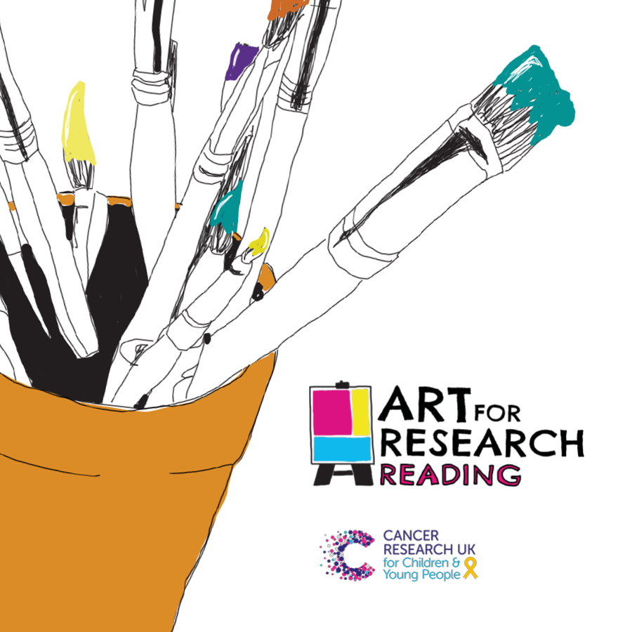
During the design process, and after the logo and 2 flyers were designed, Young Art Reading was notified of a legal issue with their name. It had been copyrighted by another organisation, Young Art Oxford, that had recently left Cancer Research UK to join another charity, taking their name with them. So, Young Art Reading was no more, and Art for Research Reading became the new title. Because of this, the old logo had to be changed in order to cater for the new name, which didn’t fit with the old design, seen below.
![]()
The Design Process
The design process was very long, especially considering the design changes that were needed halfway through. The design process was also long because the client was not entirely sure what they wanted, so many approaches were taken. Many sketches were drawn and after these were shown to the supervisor, it was shortened to 1 page. The dot method was then used with friends and family to determine which logos were the preferred design. These logos were then developed and shown to the client, after approval of course. Then, the paintbrush logo was decided on, which was later developed into what is seen just below. The one in the bottom left corner was chosen.

The renaming of Young Art Reading put a huge spanner in the works, as everything then had to be changed, almost creating a new project in itself. A whole new process was needed for the logo. It was back to the drawing board, so to speak. More sketches were created, and more developments of designs. This lead to the creation of the new logo, seen below on the left. The creation of the new logo was a long process in itself as many iterations were created to fit the new perspective.
![]()

After the logos, came the flyer. One of which had already been created after the first logo. A wine tasting flyer was also created before the remodel of the brand. These flyers were distributed at the client’s fundraiser events, such as netball tournaments and bake sales, see example below.


After the renaming of the organisation, the design process had to start again and these designs were discarded. Because of the changing needs of the client, a new flyer design concept was thought of, to match the new logo, see below. The banner was then designed to match this, below on the right.


A programme was then created for the exhibition. This consisted of around 23 pages, and took the longest to complete. It included the names of all winners and the names of the children whose artwork was exhibited. This part of the project could not be finished until the names were known, as well as other details, such as the note from the Vice Chancellor of the University of Reading. The client wants this programme to be sold at the exhibition for £1 a piece. A tote bag will also be available to buy with the logo on, and all committee members will be wearing an apron with the logo too.
Interactions With The Client
In the first meeting with the client, I was given the privilege to join their committee. We held monthly meetings to stay up to date. This was such a highly beneficial and valuable experience, as it meant that I was able to gain first-hand knowledge on the project, and was able to keep up-to-date with the on-goings of all aspects of the project, not just on the design front. I was instantly added to the WhatsApp group chat with all members of the committee for instant communication. This was much better than email as that can sometimes take a while to get a response.
While on the committee with the client, I volunteered to help in any way I could with things such as fundraising events, organising the exhibition, gaining prizes and all sorts of other things. Volunteering with them was very rewarding, as it meant that I was also volunteering for Cancer Research UK. One of the fundraising events that I did was a money collection at a London Irish rugby game at Madejski stadium in the pouring rain. We raised over £600! I still am a volunteer for Cancer Research UK, and still have the volunteer card and member number. As the project was such a long one and through volunteering, I gained the trust of the client and this made the project so much easier, and also more fun.
Also, I was able to help with selecting the winners for the exhibition, and also engaged with helping to paste the artwork onto boards, ready for the exhibition. Furthermore, because I was on the committee, it meant that I was able to meet the judges that selected the final winners, Kathleen Soriano (Sky Arts TV Presenter & artist), Garry Parsons (children’s book illustrator), and Judith Appiah & Dr Kate Allen (both from PurpleStars).
Final Conclusions
In conclusion, this project was a very rewarding one. It lasted for over half of my degree, and so has taught me many skills that I will take forward on my way to becoming a professional designer. It has allowed me to grow, and to figure out my strengths and weaknesses. Also, the client has assisted me a lot, and has always replied with speed. The client engaged with the design aspect and really helped me to figure out the idea that they were going for. Both the client and I, grew together in the formation of Art for Research Reading.