
Background
Dr Mark Dallas, an Associate Professor at the University of Reading was looking to have a set of Happy Family styled cards designed to promote the diverse nature of the Pharmacy professions. Unfortunately, there is a common misconception that a Pharmacy degree can only lead to a career as a pharmacist, and this is an issue that our client and his team are keen to change. Our client wanted the set of cards to be fun and engaging to capture the imagination of school children ages 14 –16 who may be wondering what a career in Pharmacy looks like. The cards should also have accurate information regarding each job role.
Restated brief
After our initial meetings with both the client and our supervisor Matthew, we gathered the information that we had received in conjunction with our own initial research and ideas. We created a restated brief to send to our client for review to ensure that we had understood every aspect of the brief and all the deliverables expected from us. We were given the deadline of March 2020 by our client. However, we were told that this was a flexible deadline for us to work with. For us to stay on track we based our schedule around this deadline. The client was happy with the restated brief that we had devised, and we were able to promptly move onto the design phase.
Deliverables:
- A set of twenty-eight Happy Family styled cards with three/four cards from one family to also be printed A3 to be used to showcase the course.
- A family card outlining the different families and a rules card to outline the aims and guides of the game.
- A box to contain and carry the cards
Aims:
The primary aim of the cards is for schools to be able to use the cards as a method for breaking down misconceptions surrounding a career in Pharmacy. It was paramount that we developed a set of visually appealing and fun illustrations that work together as a consistent set. It was important to create a balance between the educational elements of the game and the fun aspects of playing it — we did not want the aim of the cards to be overlooked in favour of visual appeal and entertainment. The cards needed to be both engaging and informative for children aged between 14 – 16.
Research
Whilst we knew of the game Happy Families, we had no knowledge of the rules or aims of the game. Therefore, this was our first step after receiving the brief. We looked at the wide range of approaches to the game, there were a vast array of different concepts and illustrative styles adopted (figure 1). We decided that we wanted to adopt a modern, vector style approach to our illustrations. Neither of us are strong illustrators but we are very confident in creating and using vectors in Adobe Illustrator. Therefore, it seemed appropriate to play to our strengths to produce the best possible outcome for our client. Furthermore, it was paramount that the cards were visually appealing to the intended audience and we believe that a modern approach would appeal to a younger audience.

After our initial meeting with the client we were provided with prototypes that he and his team had created. These prototypes included written outlines of each profession. It was our responsibility to edit the copy accordingly so that a younger audience with no prior knowledge of Pharmacy would be able to understand each job role. As we also had no previous knowledge of Pharmacy professions, we did our own research into each role to ensure that our editing of the copy was successful and accurate. The cards provided us with a detailed outline of each profession, allowing us to edit the text with greater speed and ease. In addition to this, the images included were also very useful during the initial design phase as we were able to replicate some of the images using our own illustrations to reflect our client’s original ideas. (figure 2).

Design development
The name
During a Real Jobs meeting we informed our lecturers and fellow peers that the client had intended to call the game ‘Happy Pharmalies’. The response we received from the room echoed our own thoughts — that this was not the most effective name and that it could be ambiguous. Therefore, to make the link to the Happy Family’s card game more apparent we decided to rename the game, calling it ‘Pharmacy Happy Families’. We felt that this not only avoided any ambiguity, but it also reflected other sets of happy family cards that also took on a theme. We proposed the name change to the client who was very open to a change in name and agreed with us. Once we had addressed the name we moved onto designing the cards.
Establishing an illustrative style
Our team consisted of two people. Instead of allocating particular design roles we decided to work together creatively to tackle all aspects of the brief. We found that this benefited us as it allowed us to combine our different ideas and strengths to create the best possible work that we could for our client.
As previously mentioned, we decided to adopt a modern style for our cards and illustrations to reflect the intended audience. Upon investigation into illustrative styles we came across two contemporary, but very different styles of illustrations (figure 3) on a public domain website. Therefore, these figures were available free to us and we decided to adapt these basic figures to suit each profession. Consequently, whilst we cannot take credit for the original vectors of the illustrations of people, we have edited each by changing colours, adding appropriate clothing, furnishing, and props to make them our own.

After attending a Real Jobs meeting, it was advised to us that we should not show the client the illustration style on the right as all of our peers present at the meeting preferred the other illustration style. We agreed and decided that the other style was not appropriate and therefore should not be shown to our client. We met with the client who was very happy with the style of illustration that we showed him. We then proceeded to create the rest of the cards using this style. We maintained contact with the client continuously throughout the process and met with the client numerous times to update him on our progress and to take on feedback to further the development of the cards.
Changes in response to client feedback
We showed our client our proposed card designs and we received feedback with regards to the details of some of the illustrations. For example, for the medical information card our client felt that extra details were required in order to create further differentiation between cards. In response to this feedback we added a poison symbol to reflect the job description and our client suggested adding a stack of books including a BNF to reflect the publishing aspect of the profession (figure 4). Our client felt that the PhD student card did not reflect the job role and he suggested that we could create more of a lab environment, so we took his feedback onboard and altered the design accordingly (figure 5).


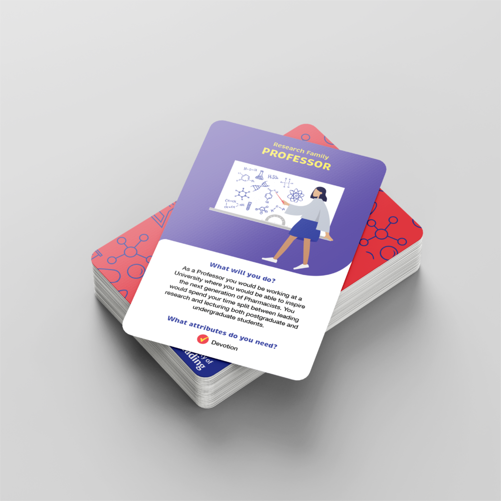
In addition to this the client felt that the lecturer card looked too similar to the professor card, to amend this issue we decided to add additional figures to try and create a closer resemblance to a lecture environment, this helped to create further differentiation between the professions (figure 6). It is important that the cards are unique to one another to maintain engagement with the audience and to demonstrate the profession accurately. Finally, our client asked us to change the equations on the board on the professor card to be chemistry equations to reflect a pharmacy degree (figure 7). We made these amendments. We fed the changes back to our client who was pleased with the alterations. The combination of our ideas and our clients’ expert knowledge of each profession allowed us to create an accurate and engaging set of cards. This demonstrated to us the value that client contribution adds to design work to ensure a successful outcome is achieved. It also showed us the importance of allowing and encouraging the contribution of the client to ensure that us as designers can create the best work that we can for our client.


Diversity
It was paramount to both the client and ourselves that the cards represented a diverse range of individuals. It is important that the intended users see a diverse range of people in the cards to represent reality. We created and adapted a set of illustrations to reflect the diversity of the pharmacy professions. We tried to create an even balance between genders and ethnicities throughout the set of cards. However, during the process our client felt that we had not quite achieved this equal balance in some of the families; in response we edited our cards further to ensure this (figure 8).

Further editing of copy
We were provided with extensive copy by our client after our initial meeting which we edited so that the intended audience could clearly understand each profession without any prior knowledge of the job or pharmacy. Following on from this, we received feedback from the client and his team. Overall, they were happy with our edits but unfortunately due to our limited knowledge of pharmacy some of the job descriptions that we created from their initial notes had errors. They then made alterations which we fed back into our design work. This unfortunately did extend the duration of the project, and this was down to simple errors that we had made in our editing of the copy that they gave us. In hindsight, we should have been more vigilant and thorough in checking our edits against each profession before we sent them to the client. This is a mistake that we will ensure not to make in the future.
Back of the cards
Once we had finalised the design of the front of the cards with our client; focusing on typographic details, appropriate wording, the diversity of individuals, and a successful layout, we turned our attention to the back of the cards. We created a pharmacy themed pattern early on in the process which we thought would work well on the back of the cards (figure 9). In addition to this we also thought that this pattern could then be applied to the box which would help to ensure cohesion between all components of the game. We proposed this pattern to our client who approved of the pattern proposal. We decided to only add the name on the back of the cards as we wanted to create a simple design, keeping the main focus on the front of the card. It was important that all of the cards had the same design on the back as during the game the cards will be turned face down and the players must remain unaware of which family each card belongs to until they pick up a card. Therefore, cohesion was paramount.

The client liked the design that we had proposed but after a discussion with the rest of his team, he decided that he would like some additional information added. He wanted to add the names of the production and design teams. In response to this we altered our design to accomodate this additional information. We then proposed three different ideas for the client. However, after consulting with our lecturers during a real jobs meeting we were told that the University of Reading’s crest could not be used without the accompanying copy (figure 10). Therefore, we had to alter the design of one of our proposals. We then sent the amended proposals to the client who chose the third option (figure 11).


The rules and family cards
Before we could move onto the design of the box, we needed to create cards that included the rules of the games and the families included. The client provided us with a list of rules to format. We ensured the rules were simple enough to quickly understand, whilst remaining informative. Although the rules included a large amount of text, we ensured that formatting into individual steps prevented the users from feeling overwhelmed and confused. In addition to the text on the card, elements of the pattern from the back of the cards and box have been subtly included around the edges. This certifies coherence across the entire set (figure 12). The family card has also been designed to ensure that the users are able to easily and quickly understand which colour belongs to which family. As this displays the seven different family colours, the card utilizes a white background. This is to ensure each individual shade stands out and does not become a risk of blending into the background.

The box
Once the client had approved our card designs, we turned our attention to the design of the box needed to contain the cards. The client gave us free reign over the design of the box. We sent the client a selection of proposals for him to choose him from (figure 13). He chose his favourite which incorporated the pattern used on the back of the cards (centre left). We decided with the client to opt for a tuck style box due to the size of the pack consisting of only thirty cards; we agreed that a larger box would not be appropriate. The pattern used on the box and the back of all cards helps to create cohesion between all components of the game.

Final outcomes
Throughout the design process, our work evolved continuously as we experimented with different aesthetics, typographic details, and the adaptation of illustrations to suit each profession accurately. Our designs changed in response to feedback from the client and Real Jobs meetings to ensure that the final set of cards were accurate with regards to each profession and engaging with regards to the overall design (figure 14).

Unfortunately, due to unforeseen circumstances caused by COVID-19 we were not able to arrange the production of the set of cards, the box, or the demonstration cards. We discussed options with our client who informed us that he was in no rush to have the game produced. As a result, we decided with our client that we would send our client the packaged, ready to print files for the set of cards, the demonstrations cards, and the box. Therefore, in the future the client will be able to have the cards professionally produced or adapted by any future designers working on the game who will have full access to all our files. In addition to this we also provided our client with the contact information for the Design Print Studio, so that he would be able to arrange production with them in the future.
Reflection
We thoroughly enjoyed and valued the opportunity to work in an area of design that we had never tackled before. This project provided us with the opportunity to learn more about not only game design but also a career in Pharmacy. It was of paramount importance that we were able to create a set of cards that were both engaging and educational. We achieved this balance by working closely with our client to ensure that the copy and illustrations accurately matched each pharmaceutical career. However, the job did take slightly longer than we had anticipated due to errors that we made along the way with the regards to the copy, which our client needed us to alter on a few occasions. If we had been more thorough during the editing phase, then the project could have stayed more on track with our initial deadline of March.
Unfortunately, we did encounter some unexpected challenges during this project. COVID-19 forced us to adapt certain aspects of the project with regards to production. However, by supplying the client with all the packaged, ready to print files we feel confident that our client will have everything required to have the cards printed or adapted in the future. Reflecting on our progress as a team, we feel that we were consistent and professional in our communication with each other, our client, and our supervisor, both in terms of face to face meetings and emails. Although due to unforeseen circumstances the entirety of our communication with our client during the end of the project was over email, we did make sure to keep our client updated with our progress throughout the duration of this time.
Overall, this project has highlighted to us the importance and value of a client’s contributions and ideas, especially when you are working with a topic where your knowledge of the subject is limited. This allowed us to create the balance between accuracy and fun to ensure that the intended audience has the best experience possible when using the cards. We thoroughly enjoyed working in an area of design that we had no prior experience with and the opportunity to work with a topic that we had no prior understanding of. We have gained an abundance of knowledge in relation to pharmaceutical careers, the design of cards, and the many things that you have to consider when designing a game.
By Caitlin Aitchison and Ella Griffiths