
When we asked for volunteers to come and talk to our students about careers, we got quite a response. 17 generous friends and alumni stepped up to offer interviews and portfolio reviews. Robin Smith has a write-up (with a long list of credits) …
Category: teaching
2020 Postgraduate Open Day
The Department of Typography & Graphic Communication warmly invites prospective MA applicants and offer holders to visit us for our annual postgraduate open day. This will be held in the Department on Thursday 5 March 2020 from 11.00–15.00.
This is a fantastic opportunity to find out more about the specialist postgraduate study routes we offer. You will be able to talk to current students and academic leads for our Book Design, Creative Enterprise, Graphic Design, Information Design, Typeface Design, and Masters by Research options. View examples of student practical projects and dissertations, get a taste for our approach to collections-based teaching and research, and view highlights from our world-renowned Collections.
To register your interest and receive joining instructions, please email Victoria (typography@reading.ac.uk). We look forward to welcoming prospective MA students to the Department.
What is creativity?
James Lloyd gave us an insight into expanding student skills in creativity and ideation.
Tldr? Learn stuff, and mix it up.
Good essay writing: techniques, tips and characteristics
Rob Banham explains what is expected of a high quality essay for Graphic Communication and Typography BA, and how university essays are different to A-level essays.
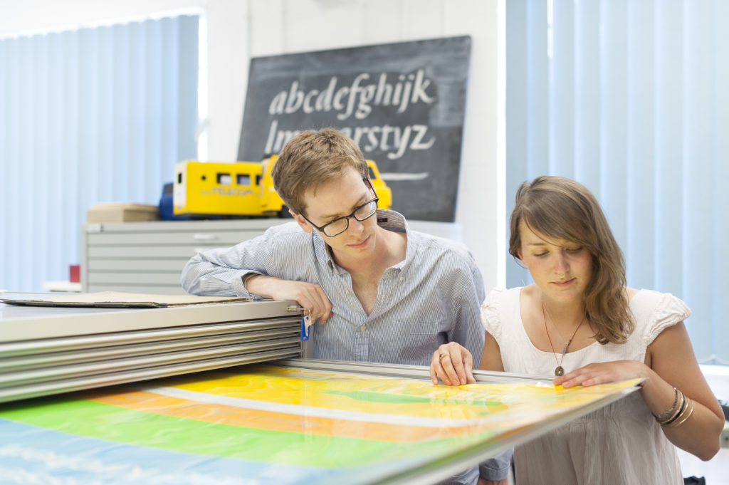
Real Jobs: Celebrating over five decades of professional design practice on our undergraduate course
Alongside our degree show opening last week, we also launched a new exhibition celebrating our ‘Real Jobs’ scheme.
Real Jobs has been our flagship professional experience programme for as long as Typography has existed as a department. It allows our students their first taste of working alongside clients to co-create, and deliver on, a design brief. Our graduates regularly tell us that their experiences on these projects exposed them to unique and powerful moments that helped them secure their first paid positions, and continue to inform their professional practice today.
Standout projects on display include the Tomos Jones’ recent gold medal-winning University display at the Chelsea Flower Show and Maddi Davies’ collaborative project on Margaret Atwood, Second Sight. But a full range of work is on show, everything from books to branding, and we hope it is a fitting tribute to the students, staff and clients who have contributed to making Real Jobs such a successful part of the curriculum here in Typography.
The exhibition runs until 28 June. If you’ve ever been a client of Real Jobs, or if you’d like to know more about how the scheme could help your project or organisation, please do stop by to enjoy this celebration of five decades of students’ first steps into the world of professional graphic design.
To see our archive of recent Real Jobs, click here. If you think you have a project that would benefit from student design support you can also book in your own project here.
“I believe this is a great scheme, both supporting students with real life projects and work experience and also providing great value to small companies in need of professional design support” – Sirin Myles, International Education Consultant
“The Real Jobs scheme is an excellent way for students to get experience working towards a brief and is a great way to help everyone involved gain experience that will be useful when transitioning into a working environment. I will be recommending the scheme to my employer as I believe it provides unique opportunities for all involved.” – Isabel Cash, Holland House Books


Designing for an evolving publishing industry
The Department recently collaborated with Oxford University Press on an exciting digital publishing project. OUP’s brief gave final year students an opportunity to explore the challenges and possibilities of user-centred design for evolving digital platforms.
Join us for our May postgraduate visit opportunity
We’re delighted to let you know we have scheduled another visit opportunity for prospective MA applicants to visit us. The Department of Typography & Graphic Communication warmly invites prospective MA applicants to visit us for a postgraduate open day. The visit opportunity will be held in the Department on Thursday 2 May 2019 from 12.00–14.00. It’s a fantastic opportunity to find out more about the specialist postgraduate study routes we offer through talking to our subject experts in Book Design, Communication Design, Creative Enterprise, Information Design, and Typeface Design. We’ll also be able to see highlights from our world-renowned Collections and examples of past student projects and enjoy our current exhibition on 20th Century Persian newspaper types.
We’ve refreshed our postgraduate taught programmes to build a stronger, integrated typographic foundation for research and practice across all programmes and specialist pathways. These changes include a new general Communication Design pathway to complement our well-known established pathways in Book Design, Information Design and Typeface Design. These four specialist pathways are all offered as part of our newly renamed MA Communication Design – the ideal degree for anyone wishing to develop their professional practice within a world-class research environment.
In addition to the practice-intensive pathways for the MA Communication Design programme, we also offer a multidisciplinary Creative Enterprise programme and two research-intensive programmes. Our MA Creative Enterprise is designed for individuals who wish to combine their study of research and practice in Communication Design with studies of management and law for the creative sector. Our MA Research Typography & Graphic Communication is the ideal route to prepare you for independent research and doctoral study and our MRes Typeface Design is a bespoke route for experienced, practicing typeface designers who want to develop a deeper understanding of the historical and theoretical aspects of their field.
For joining information and to register your interest, please email Victoria Gifford – typography@reading.ac.uk.
Ravensburg ’19 and the D&AD awards
Our collaboration with DHBW Ravensburg saw 40 German students join us for a day of presentations centred on the D&AD New Blood awards. The exchange also saw five Part 3 students, along with Erasmus-supported Teaching Fellow Sara Chapman, make the trip in the other direction.
Lauren Towner: The life of a professional illustrator
Lauren Towner came to speak with our undergraduates about the experience of creating illustrations on-demand, on-brief and on-time, and what designers can learn from the perspective of other specialist in any creative process.
‘It’s never right the first time’
Alison Black led week 3's Baseline Shift talk on approaches to academic writing. She focused on the emotional experience of writing, the barriers that stop us settling down to write, and the mindset required to produce good writing.