Category: Penguin cover (James’s project)

Penguin cover

The Curious Incident of the dog in the nighttime.

‘The curious incident of the dog in the nighttime’, is a book about a 15 year old boy who discovers the body of his neighbor’s dog. The book is written, almost as a diary, about his experiences when trying to uncover the mystery. Although it is wasn’t explicitly stated, it is believed that this boy has autism which is a crucial fact in his adventures.

The main cover of the book is blue with white star shapes. It has a cartoon image of a dog in the middle. The font used is an imitated version of  a handwriting but in a 3D version, so I tried to find a type that looks handwritten but didn’t make it 3D to stick to the original Penguin cover. I made the symbol, that encapsulates the writing ‘penguin books’, purple.  I tried to stick to the main layout of the penguin cover whilst making sure that i add the appropriate features for ‘The Curious Incident of the dog in the nighttime’.

Sharp Objects (and a dangerous penguin)

I chose to recreate the front cover for one of my favourite books, being ‘Sharp Objects’ by Gillian Flynn, the book is an excellent read, dark, twisted and clever. The line on the front of the book I even love ‘This family isn’t nuclear, its toxic’. It’s a fun play on word with ‘nuclear family’ and chose it for my design. I changed the colouring of the book to green, to try and go for that slightly toxic look, however, wish I could have gotten the colour a bit more acidic looking, but still wanted it to fit with the classic penguin look. I chose to change the bottom short green line to two knifes, a very simple design, just adding in the ‘sharp objects’, and if you look closely you can see that the penguin himself is holding a tiny knife behind his back, all connecting to books name and story.

The Handmaid’s Tale

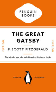
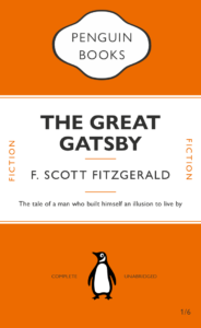
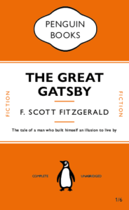
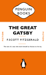
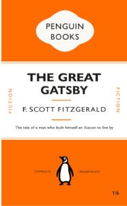
After creating a replica of the penguin classics edition of ‘The Great Gatsby’ (pictured below), we were given the task to create our own book cover following the basic principles of the classic penguin format but deviating from this slightly in order to create some kind of symbology/irony within the cover.

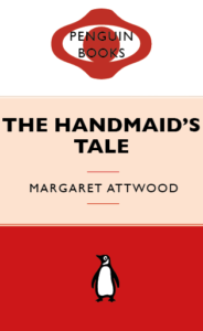
I chose the book ‘The Handmaids Tale’ as this is a book I enjoyed reading and feel as though is an appropriate title for a classic style penguin cover. I knew that I would use the colour red as this is symbolic for the book in that the dresses the handmaids wear are red. I also wanted to use white as this is the colour of their bonnets. I wanted the book cover to resemble the identity of the books main character. My first Idea is pictured on the left below, I switched the cartouche shape, that penguin covers use, to two shapes that create the image of a face and a bonnet in the style that the handmaids wear. I wasn’t overly pleased with the outcome of this so I decided to get rid of this and return back to the cartouche shape and work within this shape to create some imagery. I created a simple eye shape within the cartouche as there is lots of imagery throughout the book to do with ‘the eye’ and being watched. I kept it all red so the eye is slightly hidden (just like it is in the book). I used three colours to represent the white bonnet, a shade of colour to represent the characters skin and red to represent the dress. I felt that this three part background didn’t work well for the cover so I eventually settled on using white for the middle and upper section to allow for contrast against the title text and also to resemble the white of the Handmaid’s Bonnet.


Psycho

This was my first time using Indesign, I found it interesting how you can attach certain elements to text (in this case, lines) that would move with the text depending on what was written. I decided to base my second Penguin cover off the 1960 psychological horror Psycho. I played around with different ideas at first, for instance adding blood splatters across the cover or some sort of water damage effect to highlight the shower scene but I ended up going with a much more subdued look, just adding some drips down the title (although I am worried this makes it look slightly tacky and halloween-ish). I also changed all the colours to greyscale because the film is in black and white.

The Borrowers

Before this project, I’d used InDesign before, but I wasn’t aware of the depth of control that it offered. There is definitely a lot to learn here and I think it will be hard to remember all the tips and tricks, especially for text layout. Moving forward thought, I’m definitely interested to see how much can be accomplished on this software. The book I chose to redesign was ‘The Borrowers’ by Mary Norton. I’d certainly like to think my design doesn’t need an explanation!

Bang! And The Dirt Is Gone!

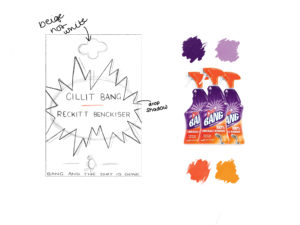
As part of the TY1INT1 module, we were asked to explore Adobe InDesign and create our own Penguin Book covers inspired by a book, movie or quote. I landed on the idea of the cleaning products Cillit Bang which are manufactured by Reckitt Benckiser. I used the colour palette from the limescale remover range to design my book cover. These bright purples and oranges allowed me to create an eye-catching and bold design. I wanted to stray from the simple lines and shapes used in classic Penguin Books, and so I came up with the idea of using an almost star-like, explosion shape to highlight the ‘title’ and ‘author’ of my book.  Below is my initial sketch which I used to plan out my ideas.

I am new to all Adobe apps, so this was a fun experience, trying out the tools available to create each element of my book cover. I am pleased with my final outcome, however there are a few areas that I could improve on. I look forward to gaining a better understanding of InDesign and other Adobe apps in the future.

Blood Orange

I found this session interesting and it refreshed my knowledge on how to use indesign. The one part I struggled with was the penguin book logo. I found it hard to make the curve of the ovals. Which I have gone over by re watching the video from that day.

For my messed up book I chose blood orange, as it is my most recent read book. I kept the layout the same as the original penguin books and altered the other elements. The changed the font to Chalkduster to create a horror effect. Although I would never use this typeface again as it just wrongs all the Typography rules on so many levels. I used neon pink as my colour as original penguin uses neutral respectable colours, so thought it would create more fun. I lastly changed the colour of the penguin symbol to a space galaxy effect. Just to add to the fun quirkinesses of this new cover.

Harry Potter


Having never used Indesign before, after completing this task, I have learned a range of fundamental skills needed to work the software effectively. As well as following the tutorial, when I was not able to do something, I researched alternative ways in doing the same thing. Photoshop is a program I have used before which has been an advantage as I was able to transfer some of the skills I’d known from there onto this task. One of the main skills I learned was how leading and tracking makes a big difference in organising and keeping your titles and headings separated proportionally. Although I did find it difficult at times, I managed to distort the typical Penguin cover into a book from a series I LOVE!

The Shining

PENGUIN BOOK COVER

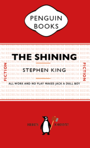
In James’ lesson we followed a tutorial on how to recreate a penguin book cover. I used in design to create both of these covers, in the lesson i learned how to use some of in designs tools as the program is new to me. I learned how to group shapes together and how to manipulate parts of type such as the kerning and the height. In my version of the book cover i choose to represent the movie/ book ‘The Shining’ by Stephen King, i followed the same tutorial and layout we had used in class for the new design. I featured some of the films well known quotes such as ‘Here’s Johnny’ ‘Redrum’ and ‘all work and no play makes jack a dull boy’. I changed the opacity of ‘Redrum’ to 21% so it would be easier to see the title and author of the book, i also gave the penguin an axe as it was an iconic item in the film. I also learned how to change the direction of text as well as make certain objects different colours.