After creating a replica of the penguin classics edition of ‘The Great Gatsby’ (pictured below), we were given the task to create our own book cover following the basic principles of the classic penguin format but deviating from this slightly in order to create some kind of symbology/irony within the cover.

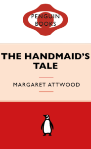
I chose the book ‘The Handmaids Tale’ as this is a book I enjoyed reading and feel as though is an appropriate title for a classic style penguin cover. I knew that I would use the colour red as this is symbolic for the book in that the dresses the handmaids wear are red. I also wanted to use white as this is the colour of their bonnets. I wanted the book cover to resemble the identity of the books main character. My first Idea is pictured on the left below, I switched the cartouche shape, that penguin covers use, to two shapes that create the image of a face and a bonnet in the style that the handmaids wear. I wasn’t overly pleased with the outcome of this so I decided to get rid of this and return back to the cartouche shape and work within this shape to create some imagery. I created a simple eye shape within the cartouche as there is lots of imagery throughout the book to do with ‘the eye’ and being watched. I kept it all red so the eye is slightly hidden (just like it is in the book). I used three colours to represent the white bonnet, a shade of colour to represent the characters skin and red to represent the dress. I felt that this three part background didn’t work well for the cover so I eventually settled on using white for the middle and upper section to allow for contrast against the title text and also to resemble the white of the Handmaid’s Bonnet.