
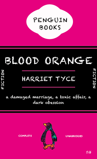
I found this session interesting and it refreshed my knowledge on how to use indesign. The one part I struggled with was the penguin book logo. I found it hard to make the curve of the ovals. Which I have gone over by re watching the video from that day.

For my messed up book I chose blood orange, as it is my most recent read book. I kept the layout the same as the original penguin books and altered the other elements. The changed the font to Chalkduster to create a horror effect. Although I would never use this typeface again as it just wrongs all the Typography rules on so many levels. I used neon pink as my colour as original penguin uses neutral respectable colours, so thought it would create more fun. I lastly changed the colour of the penguin symbol to a space galaxy effect. Just to add to the fun quirkinesses of this new cover.