Category: TY1DP1

Work by Part 1 students as part of their ‘Design Practice’ module.

RW

In today’s session with Kim, our task was to create a process of transmogrifying our initials. We had the choice of two fonts: Futura or Garamond.

I began with Futura as I felt it would be easier to practise sketching out my initial ideas. However, I found that with the letters “R” and “W”, the characteristic of the R got lost in the ‘W’, and ended up looking like a ‘P’ – see examples below.
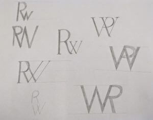
rough sketches and ideas

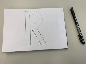
I then began experimenting with Garamond and found that the serif’s made it easier for the individual letters to be identified when merged together. I focused on creating stencils of my initials to replicate the font before experimenting with them and tracing them on layout paper in different ways.

I found this task interesting yet challenging mainly due to the letters I was working with. I struggled to find a way to find a process of transmogrifying my initials due to the curve of the capital ‘R’ and the angles of the ‘W’.

I did, however, create a series of initials layed out in different ways. I then took my favourite outcome into Adobe Illustrator digitalised it in there.
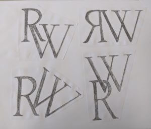
final outcomes

If I were to do this task again, I’d like to play around with different letters and different fonts. However it has taught me to look at things from a different perspective and pay more attention to detail.

 

Labyrinth

Labyrinth: a family moves into a house with unexpected spatial characteristics. The rooms keep shifting position every time a door is opened. The family members are trapped inside the house and start a journey to find the front door. While they keep moving from one room to the next, they discover that they are not the only ones lost in the impossibly infinite labyrinth of the house.

In Berta’s project, our task was ‘to experiment with the form of an existing book to provide a concept that represents the content of an imaginary novel through the materiality of the object.’

I chose the story ‘Labrinth’ and tried to show the continuous journey through doors in the house by cutting out pages and gradually decreasing the size – this created a tunnel-like effect. In addition, I started to add characters trying to run down the corridor.

If I were to do this project again, I wouldn’t be afraid to be more adventurous with my design.

Are monograms always supposed to be uppercase?


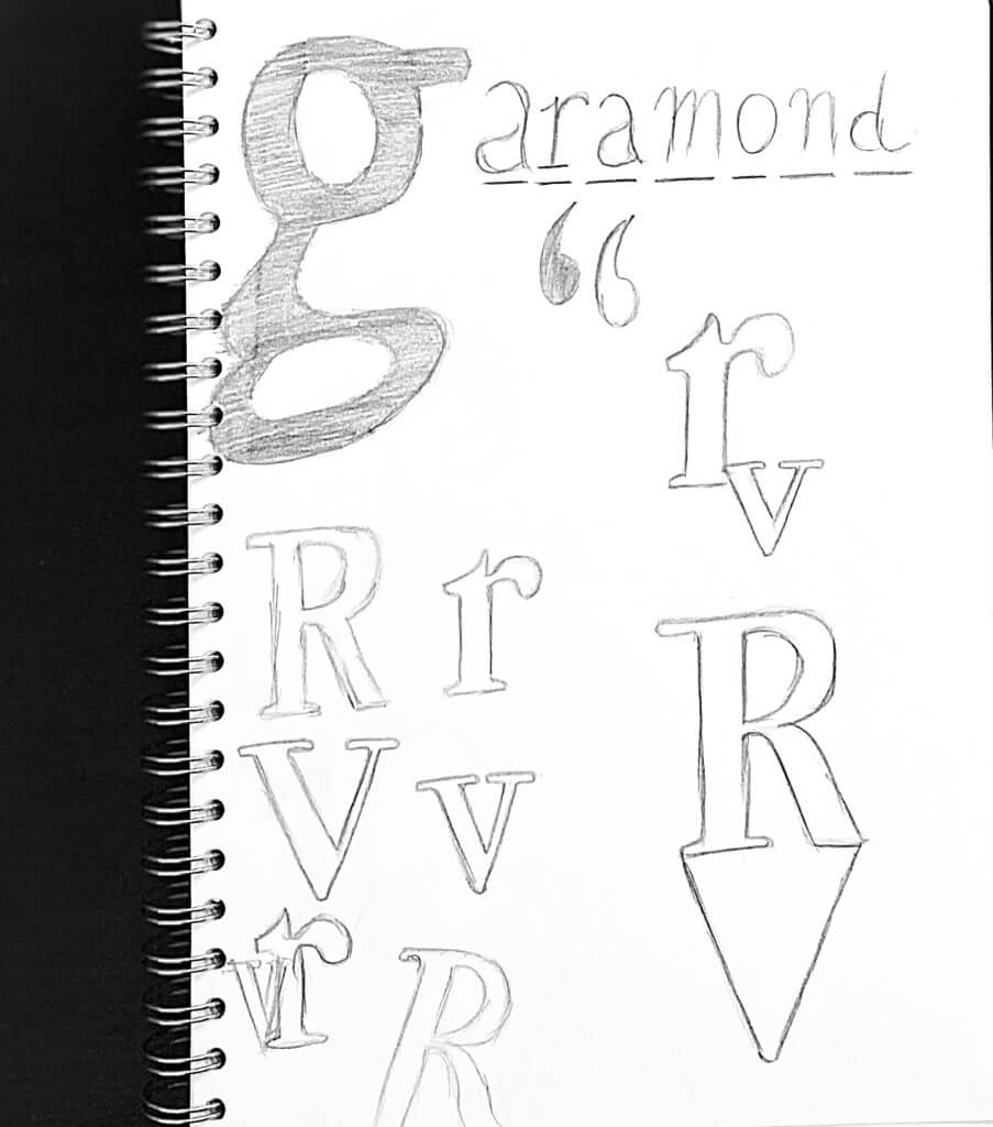
G A R A M O N D     E X P E R I M E N T A T I O N


Initial practice scribble

During the briefing of this mini brief, we were all asked to experiment with our own initials and transform them into a monogram.

Then, a question struck me. Why do we always tend to write monograms with uppercase letters? Many brand/companies prefer uppercase more than lowercase in their identity.

Is it due to our approach to grammar? Perhaps it’s the history? Or it just looks ‘nice?’

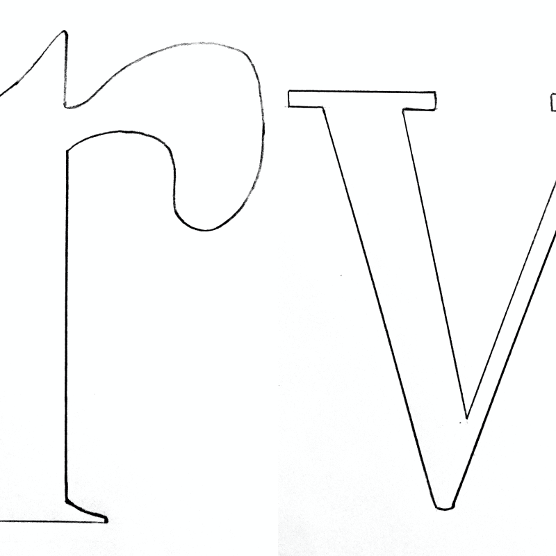
Lowercase ‘stencil’

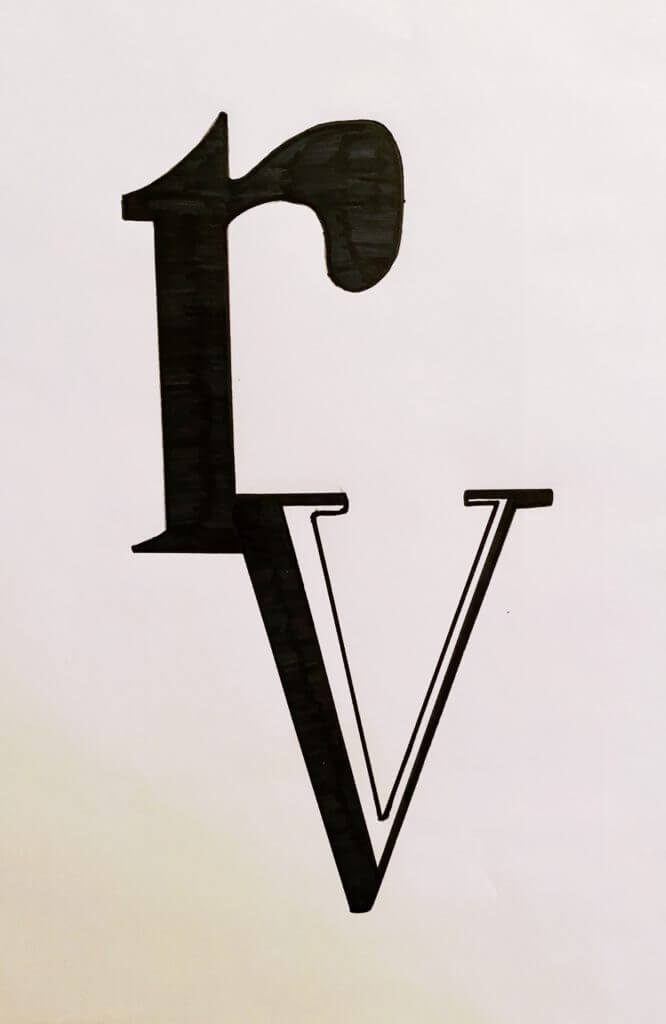
Keeping this as the core idea to my project, I began to draw out my initials (R and V) with lowercase letters, referencing the ever so popular Garamond typeface. Sure, it did seem very strange when I was sketching, almost inaccurate, but it also made me realise how deeply this concept resides within us. Subconsciously, our approach to grammar has enabled our minds to form this complex layer of psychology that instantly ‘corrects’ our approach to lowercase lettering, making it seem/feel ‘wrong’ if it’s(lowercase lettering) on its own (i.e no uppercase).

Experimenting with overlapping lettering
Developing ‘overlapping’ experiment with contrast

Along the journey of experimentation, I accidentally discovered the beautiful contrast that black and white offers, especially in lettering. This was also something that caught my eye, therefore I started to build the core of my project around the basis of ‘contrast.’

After much confusion, on terms of layout and placement of the letters, I looked back at my initial sketches and found an idea that I liked the best, because it had the potential to fulfil both of my main focuses.

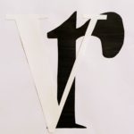
My final design idea

This piece above, embodies the usage of lowercase lettering in monograms, yet also provides a beautiful balance of contrast between black and white. It’s simple and elegant at the same time.

After all, it’s enjoyable to break the norms that can sometimes bind us.

Contrast

From studying all kinds of fonts from safety signs to advertisements, our class was a task to compile a collection of fonts from around Reading University campus. After gathering said photos, I categorised the designs through contrast from high contrast to low contrast and also material contrast. From this, i found that most urgent and hazard information signs featured a more colour contrasted and bold design whilst low contrast designs represented directional and or general information.

Lettering and development of monograms

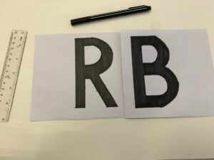
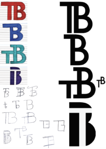
The brief for this project required us to make and develop a representation of our initials, whilst using either the fonts Futura or Garamond. However, we did have the option to use both of these fonts simultaneously. For the start of this mini-project, I decided to draw a spread of sketches and brainstormed ideas to develop further. The whole purpose of this project was to create a monogram for the initials of our names. I personally chose the Futura font, as it is quite geometric compared to Garamond. This means that it would have been even more precise when I create the monograms with it.


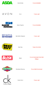
The main attraction with Futura for me, and why I chose it as a font is that it is one of the most geometric and linear. This means that it doesn’t have as many serifs as other fonts and as Garamond, therefore making it easier to create the monogram and was a lot more practical to produce my final design which was what the brief asked of us. I also took a lot of inspiration from certain brands that utilise and implement Futura into their Company names and logos. A few including; Gillette, Calvin Klein, Asda, etc. From looking at these fonts used by these companies, I gathered that they use very different weights and use either: ‘Medium’, ‘Bold’, and ‘Heavy’ for example. By doing this they ensure their logos and names are not stale and have variations and slight changes in the personality of the font.

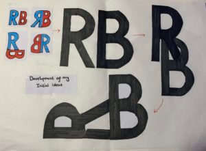
Development of initial ideas


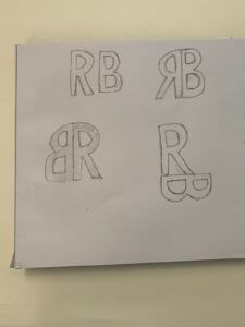
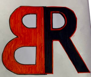
For the final design for this project, I tried to look at the future with a new perspective. By this I mean I used each of the individual letters to combine them both, for the initial designs I decided to look at the initials in an abstract way by putting the ‘R’ into the ‘B’. This then created a lot of options for me to flip and use different structures of the initials. I finally went for two colours, black and red which I did actually use for the first four initial ideas as well.

FINAL DESIGN

KH

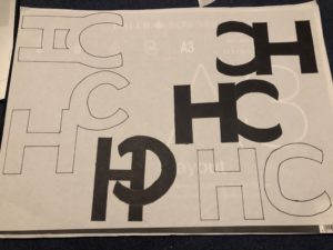
As part of our task today we had to combine our initials to create a transmogrify. We had the choice of two typefaces: Future (A sans serif typeface) and Garamond (a serif typeface) – I experimented with both.
I decided that my initials were better suited to the Futura typeface which created a strong and more angular look, much like my letters K&H. Where as Garamond would’ve created a more rounded, overall, feel which would’ve been better suited to letters like C and G.
I also experimented with different colours, textures and techniques but felt that the block black was better suited to my final piece and ran nicely with the strong, block theme.
Overall i’m happy with my final piece, I think I created something not only abstract but eligible also.

Exploration of the word ‘War’


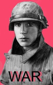
For this task I had to explore the word ‘war’ and create two striking images to show both the positive and negative interpretations of the word. My first image displays a WW2 soldier in his uniform, this could show the pride in fighting for your country. The second image shows a prisoner of war, who has no pride and is stripped from his uniform. The gif lines up both these characters eyes which could suggest they are the same person. This gif explores the effect war has on a man and how the person who’s goes in is not always the same person who comes out. I added a graphic striking pink colour and the text ‘war’ in helvetica font as I think it looks impactful. I’m not sure if the animation with actually play or if I’ve just attached a stationary image.

Structured and geometric design

While studying the future font during today’s lesson, i perceived the style and design as very geometric and fluid in its connection. Therefore I experimented with connected and straight lines throughout the design process. with this, the designs that I imagined are very rectangular and geometric in shape when it came down to the final few iterations presented on the right-hand side the of page. With this, I did also experiment with a more ‘Centeria Script’ esque design in one drawn iteration with more wavey and elegant lines but ultimately went with a more structured and geometric design instead. In terms of my final design, I personally prefer either the T connecting the the B’s crossbar design and or the T integrated into the interior of the B’s salute.

Money (makes the world go round)


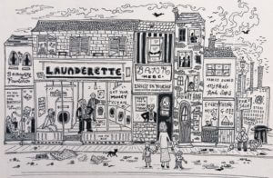
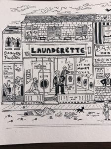
My word to focus on was Money. My design made up one piece in total, but had two very contrasting sides to it. One where those with lots of money are happy and busy being greedy. I drew inside the laundrette Donald Trump, Jeff Bezos, cleaning their money, a play on the term money laundering. Also it has a beauty parlour on the very left, containing only beautiful, slim women, that promise ‘beauty’.

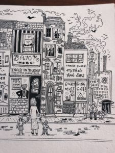
On the other side we start to see HSBC bank in the middle, a bank known for some very corrupt deals, including money laundering in Mexico, taking money from drug lords who were destroying the community and many families lives. (As seen the programme ‘Dirty Money’, I also make a reference to the Volkswagen on the far right with their factories polluting the air and sky above, followed by hundreds of black crows, a symbol of death or tragedy).

The centre of my piece shows a single mother and her children, standing outside a bank ready to take out a loan. Banks often pay out loans, that people will never be able to pay back, and are set back for years by interest that they can’t afford, all of which keeps rolling the ball of capitalism. Putting people like the mum and her children, in a very vulnerable spot. In the UK there is approximately 1.8 million single parents, and 90% of them are mums. And there isn’t much help or support for those struggling to keep the balance, of work, childcare and money.

On the very right is a homeless man, the whole street starts to slowly decade as you look down it, representing the poverty chain. Money is now how we measure success, and is what runs our high street, our banks, laundrettes, and everything basically.