Category: TY1DP1

Work by Part 1 students as part of their ‘Design Practice’ module.

Stuart Little

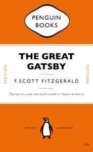
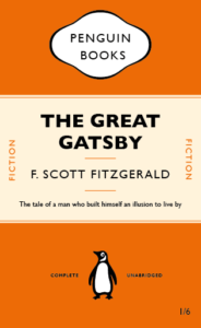
This week in our technical session we were learning some of the essential basics we needed to use Adobe InDesign. To do this we had to create an exact copy of the cover of The Great Gatsby. Throughout this process, I learnt how to appropriately use tracking and the ‘space before’ feature as well as how to great separate paragraphs within one textbox. These are key skills that we needed to learn as they can enhance are designs and perhaps even speed up our design process. For example, the ‘space before’ feature allows for much more control over the space between lines of text compared to just pressing the return key. This also means that no matter what text is inputted into that paragraph, the spacing will always be how it was originally intended to be, making the design easily adaptable. The image below is my copy of The Great Gatsby cover
We were then asked to use our copy of The Great Gatsby cover as a template for a new book cover for our choice of book, movie poem etc. I chose Stuart Little. I decided that every time the word ‘little’ appeared it would be in 8pt text and everything else would be in the same size as the original template. My reason for this is because ‘Stuart Little’ is about a mouse living in the human world so most things around him are much larger than him and so I wanted this to be reflected on the book cover. I also changed the typeface of the title into one that was more like a script font as this is a children’s book and I felt gill sans was too harsh and not playful enough.

House Rolfe -GOT

The project is to design a present for a classmate based on their interest and see how we can develop it with random words.
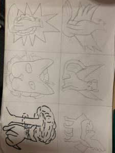
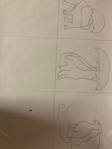
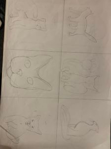
Ideal Gift was an interesting project to do because I got to learn more about my classmate interests and see what kind of work, they can do based on my interests.

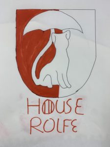
One of my partner favourite tv show is called a game of thrones and His favourite animal is a cat and I used the cat as a symbol in his Game of Thrones house,  In GOT they have houses logo to represent their surnames.

My random words were birds, explosion, and umbrella I experimented with all those words and choose an umbrella with the cat as my best. The final work resembled that of an Egyptian symbol which I found very interesting and I felt it suits the theme of Game of Thrones.

My Experiment


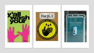
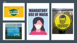
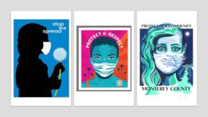
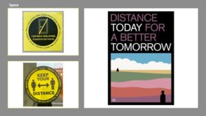
Hands, Face, Space: Covid-19

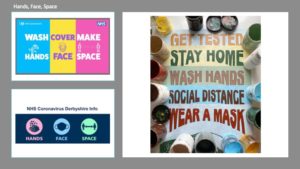
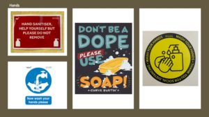
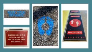
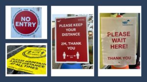
For Sue and Emma’s project, we looked at the graphic language of Covid-19 signs and posters, both on the Whiteknights Campus and from the internet. I began this project by exploring campus to take photographs of all the Covid-19 signs that I could find. I then used social media and google to find some more examples of posters that use imagery and typography to convey information or messages about the Corona Virus. It became clear to me, that there was a wide range of approaches that could be used to create eye-catching and visually appealing designs. One technique most of these signs and posters adopted, was the use of colour. Vibrant reds and bright yellows are often associated with danger and warnings, hence why these colours appear frequently in the Covid-19 signs.

To organise my images, I created powerpoint sides, grouping the signs into the following categories: hands, face, space.

Covid Colour Signs and posters

COVID-19 – POSTERS AND SIGNS

In todays task we found posters and signs online and in person related to covid 19.

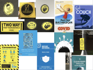
i’ve separated the images into two categories related to the theme of colour, blue and yellow. I’ve realised during the group call a lot of the posters include these colours, i think the creators of these posters and signs choose these colours as they aren’t alarming to the target audience but are still clear and attention grabbing.

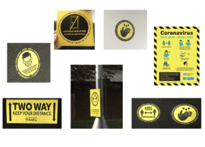
i found all but one of these signs around campus, they all use sans serif type and use the colours black and yellow, the poster also uses a little bit of blue. Most of the signs also use circles with bold black outlines. I’ve also grouped these together as they’re instructions rather than informing the audience. The colours are bold as they’re suppose to catch your attention when you walk past them. They’re also quick, simple and easy to read and understand.

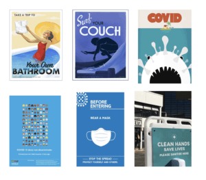
I found these posters online, i grouped them together as they all use different variations of blue. The first three posters are more of decoration, they’re all telling the public to stay at home. The first poster is an image of a woman in the bath holding toilet paper while smiling, this has connotations towards the toilet paper running out in shops, it uses decorative black type. The second poster is an illustration of someone surfing while on their phone, the type is again decorative and is in white and black. The third poster mimics the jaws poster, the covid atom is the shark and the woman is the home, The text is bold and in red making it seem like the situation is a horror. The bottom two posters are used to inform the readers of what covid is and how to prevent it, both posters have a lot of text and would usually be put in places where the reader has a lot of time to read it. They both use white, sans serif typefaces. The last sign is put in this group due its colour, the type is also in white and uses a sans serif typeface, instead of informing the reader it instructs the reader to ‘wash your hands’ the poster uses a similar calm blue, its eye catching and calming with a strong message , it doesn’t scare or intimidate the reader.


friendly Cautious

When first given this project I want on the site Pinterest an image-sharing app to look at images related to Covid 19  at first no results where shown cause the website did not want to risk false info about covid 19 sharing on their platform.
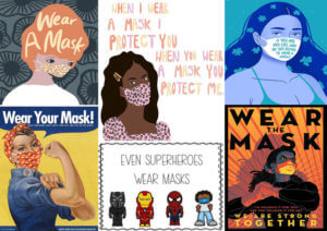
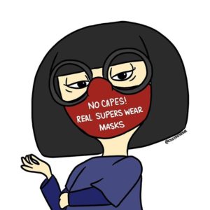
I use the other name Coronavirus and the first image I saw was an illustration of an iconic character in a movie cartoon titled the ‘Incredibles’ and she one of her most iconic lines is ‘No Capes’. When I saw this image, it gives me a feeling of nostalgia and childhood.

I like this illustration cause it is ironic how her she says, ‘no capes but real super wear mask’ to highlight the importance of wearing a mask for anyone especially a superhero. and I believe that anyone who has watched this movie would be able to understand the reference.

Another important thing I like about this Illustration is cause it is funny and allows the viewer to learn about covid but still escape the harsh realities of this pandemic.
This pandemic has taken many lives and cause so many people financial problems so most of the times people don’t want to see posters that keep reminding them of this year trauma however it is still good to remind people about the importance of wearing a mask without scaring them.

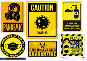
The images are different from those of the usual yellow signs that grab the attention of viewers and remind them to wear a mask. The illustrations are not people friendly and stricter on their information.
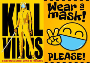


Thou these images are yellow they are more friendly since one is a movie titled ‘Kill Bill which is an action movie that involves a lot of man slaughtering and the other uses an emoji that is popular and friendly to communicate to the viewers.


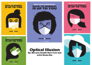
I found this collection very interesting cause of the use of illustrations to form the outline of masks on faces.

It is very simple and straight with the topic of discussion.

I like the use of pale colours cause I feel like the visuals say enough and the use of the usual bright yellow, red and blue would be too chaotic.


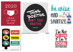
These images are different from the rest as they are mainly typeface with illustrations to support the posters

These are quotes related to covid 19. They are all communicating the basic knowledge surrounding racism

They are straight to the point and witty. They are a play on words and some might find it humorous to read.

A Penguin Book cover with a twist

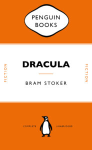
During our Integrated design methods technical session, we were practising using adobe InDesign and started out by replicating a classic Penguin Book cover. This really helped me get to know my way around the software as it was not something I was previously familiar with. It took a little time and patience for me to get thew hang of it, but I feel like I made significant progress in familiarising myself with adobe programmes. We were then asked to use what we had learnt from this session and apply it to our own version of a Penguin Book cover. This could be whatever we chose, but we had to make it ‘clever’. I chose to design a penguin themed book cover for ‘Fifty shades of Grey’ as I thought this would be an interesting theme. I achieved this by using the base of the classic penguin book cover that we created in this session and then began to change each section, take away parts and add new elements. I replaced the penguin books cloud logo at the top of the page with an image of lips, to echo the erotic and romantic nature of the book. In addition, I replaced the typical penguin icon at the bottom with a couple of romantic penguins as I thought this was a fun play on the original logo.

I found this task to be incredibly useful on developing my digital design skills and it gave me the freedom to create a playful design and have a bit of fun while experimenting and learning. There’s still a lot I need to learn when it comes to the technicalities of using InDesign but I already feel a lot more confident in working with adobe softwares as I had to use photoshop as well in order to create and cut out some of the images.

Please mind the gap between your letters

Mind the gap

Gerry’s task 

Gerry gave us two tasks for the day. The first was to look at the typeface that the word ‘hesion’ was written in for us, and to then imitate this and write ‘cadbury’ in the same font below. This was trickier than I thought as we had to imagine what the letters in ‘cadbury’ would look like, by using parts of the other letters in ‘hesion’ and analysing their shape, size and features. For example, one of the fonts had serifs and the other one didn’t, so I tried this task in both ways. I learnt that the most effective way for me to achieve the best outcome with my letters was to start by sketching out each letterform until it looked right. Then I would draw the outlines of each letter using a fine-liner and a ruler to sharpen the edges, and finally to fill in each shape using a thick marker pen. This way, I could achieve good, solid letterforms.

The afternoon task Gerry gave us was to fill in the gaps of letters which were only half printed and had missing parts. So we had to take what we could see from a section of each letter and use this to design the rest. There was some room to be creative, but we also had to make sure that the letters looked natural and each part blended in well to the other.

I liked this mini project, as it involved more hands-on sketching and enabled me to practice drawing different typefaces while encouraging me to look more closely at individual letters, rather than the font as a whole.

For someone who loves to travel

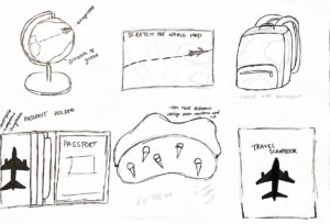
For Kim’s Project on Thursday we got into groups and learnt some interesting/unusual facts about each other. I learnt that my partner loved to travel. I decided to brainstorm and research ideal gifts that would be perfect for a frequent traveller to have and utilise. As seen in my sketches, I played around with mostly items you can take with you as you travel such as a backpack, a scrapbook, a sleep mask and more. I then looked at incorporating the second task into my designs which was to find a word from the random word list and see how I can add it into my designs. My first word was aeroplane and I experimented with how it would look and how I could make it fit in. I decided that the best design was the passport holder as I felt I could incorporate a lot into it and it was the best ideal gift out of the ones I had thought about.

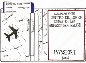
Sketching out my passport holder, I decided to draw a simple icon of an airplane which is of course fitting the theme. I decided to look at the second and third random words in which being compass and money. I included the navigations of the compass; north, east, south and west around the airplane in an order to visually mimic the layout of a compass. I then decided I could include the random word money by also illustrating things that can go in the holder along with the passport, which was bank cards and loyalty cards. I also added pound signs to further accentuate the use of the word money.

UK Government vs Australian Government

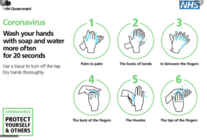
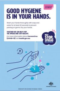
These two Covid-19 awareness posters communicate similar messages but use graphic language in different ways in order to present the information. The HM Government/NHS and Australian Government use graphic language to highlight that washing hands is a huge part of protecting ourselves and others from Coronavirus.

Both posters obtain similar audiences in which being the citizens of their Country. Whilst one being for the United Kingdom and the other Australia, they use similar approaches to convey the same message. Whilst the UK poster initially comes off as simplistic in comparison to the Australian one due to the lack of colour background, it makes up for it in a detailed set of pictograms which provide a thorough step by step process of correct hand-washing. This has been made easily identifiable with the use of numbering and green enclosing circles, allowing the pivotal message can be sent across to the audience effectively.

In comparison to the HM Government posters, the Australian awareness poster convey the message with less imagery and more text. The one simplistic image depicts hand-washing and although they just use one in comparison to the NHS six step process, the topic is still conveyed quickly. The audience know it’s about hand-washing due to the pictogram as well as by the accompanying title “GOOD HYGIENE IS IN YOUR HANDS’ in bold san-serif text allowing it to be easily legible.

However, to know the process of hand-washing the audience would have to actually read the writing which is seen comparatively small to the title. The informative text also isn’t detailed either which doesn’t exactly explain what good hand-washing is, only that it needs to be done and you should use soap and water for 20 seconds.

Due to this different approach the UK government/NHS’ poster convey their message better. Along with the step by step process, highlighting how to wash your hands thoroughly, they use text to further explain some key information. They include the 20 second rule along with extra precautionary steps on how to turn the tap off safely. This ultimately allows them to take the audience from A-Z without too much reading. Both posters do successfully present an eye-catching appeal with san-serif, allowing an easy read, with bold text where appropriate. They both nicely include a general message in their own box and bubble that we’re protecting ourselves and others and we can stop the spread through a collective effort.