Category: Lettering in the environment (Eric’s project)

Lettering in the environment

Noticeable Type

For this project we were asked to capture images of typography across campus and then compile them in some kind of system. I chose to compile these images in a hierarchy from top to bottom in terms of which bits of type I was most attracted to at first glance. Once i had the final compilation of images I found it really interesting to see strong differences between the top and bottom images. The type that I found most appealing tended to be more colourful with bold large letters that made the words legible. I also thought it was interesting to see that certain typography that I placed very low on the list was sometimes portraying an important message such as social distancing. It was strange to see such an important message presented so badly through type.

This task reinforced to me how crucial typography is in portraying certain messages within our environment.

Things I often overlook

For this project, we were instructed to photograph lettering around the University. From what sounded quite a simple task, it was actually very interesting to see things I often overlook. We often don’t stop to thing why things look the way the do and what the impact that has on us.

In the 2 hours we had to photograph, I walked around campus collecting images of signs, posters and words in the environment. Once the time was up, we were then asked to edit and organise the photos into categories of our choice. I chose to organise them into ‘Instruct’, ‘Direct Information’ and ‘Advertisement’.

I found that the ‘Instruct’ category featured signs with bold colours to catch attention and provide a warning. They also featured verbs to act as strong instructions.


Lettering in the environment

For this task we were sent away with the motive of finding lettering in the environment and capturing it in a photo to later analyse. Every day we look and read 100s of different typefaces that we may not even take a moment to think about normally, so it was nice to slow down and really question things like why did the creators of something chose to do it in this particular way?
I tried to capture a wide variety of different letter forms, techniques and materials but this began proving slightly difficult with being restricted to campus where they have a distinctive typeface to help brand the university. Over coming this set-back i looked for inspiration in more creative ways like car window stickers and stone drains.

We were then asked to individually group out photos in-whatever way we please and it was really interesting to see the different and creative ways other people chose to group their work. i grouped mine into the different techniques and materials in which the letters were formed which included vinyl/stickers, stone casts, card/posters and carved metal. I feel i approached this challenge head on and to the best of my ability but if i was to do it again i would try harder to think outside the box and be more creative with my ideas.


Contrast

From studying all kinds of fonts from safety signs to advertisements, our class was a task to compile a collection of fonts from around Reading University campus. After gathering said photos, I categorised the designs through contrast from high contrast to low contrast and also material contrast. From this, i found that most urgent and hazard information signs featured a more colour contrasted and bold design whilst low contrast designs represented directional and or general information.

Attention and caution

   typefaces around campus

This was my presentation which I did for Eric’s project, I have taken some pictures around the campus of typefaces. which looked really different from each other and how by changing the colour of something changes the hole meaning. Especially some of the signs calling for attention and caution such as the yellow danger sign.

I have colour coded the pictures into similar colours such was blue , green and yellow. One of my slide was about the lettering to the metal. However the metal on each picture is different than the other. The metal on the library looked like steel whereas the metal on manhole is diffrent maybe more stronger I guess.

The environment is everything that isn’t me.

Introduction

The lettering in the environment project that I completed really gave me a clear understanding of how much detail there is to where we live and breathe every day. The brief was quite simple, as it said to explore and go around the campus to photograph as many sources of the environment as possible. There was quite a distinctive pattern to what I was taking pictures of, due to the fact I took quite a few pictures of letting on buildings, walls, and floors. Reading’s campus has a strong sense of vibrancy and colors to it. However, the pictures that I took, were quite the opposite of that.

Once I had all my photos, the next step was to categorize them. I displayed my photos into  different categories, that were quite simple but effective at distinguishing each photo to what type of photo is was and where it was taken.   The platform or software I used to display these categories and pictures that I took was on PowerPoint The categories that I mentioned are shown below, they include Colour and Materials.

Colour

The next part of the task wasn’t really difficult, as we just had to organise each picture into different categories. Once I did this, I then noticed after presenting these pictures on Powerpoint that whilst categorising them into colours and materials. The pictures weren’t very relevant to one another and didn’t really do the pictures justice. Which is why I do believe that in the future if I did this task again, I would just update and edit the pictures to black and white. this will hopefully let me maintain my attention and time on the letters of the pictures rather than the actual colours themselves.

The next category of the PowerPoint and pictures I took are below:

Materials


“above”, “below” and “straight on”

During Eric’s session on Monday, we were asked to venture outside and photograph examples of typography in the environment that caught our eye. I found the task interesting as it encouraged me to look at typography in a different way. I found myself paying more attention to the use of typography in the environment, how it was positioned, and the material it was made from.

We were given a couple of hours to take our photos before we went back to present three of our favourite outcomes, and discussed them with the group. It was interesting to see how all of our images differed from one another and who photographed similar examples.

We were then asked to edit and organise our images in a method of our choice. I found editing the photos an enjoyable task and decided to organise them based on perspective. I had three folders labelled “above”, “below” and “straight on” and organised them depending on how I had to capture the object.

Here are some of my favourite outcomes from the session.

The Good, The Bad… but not The Ugly

Introduction

Today I responded to ‘lettering in the environment’. The brief required me to explore the campus and the surrounding environment, whilst photographing as many types of typographic sources as possible. I personally decided to avoid taking pictures in the Typography building as I felt it was too easy to document. Instead I wanted to force myself to explore the surrounding environment. The University contains a range of newly implicated signage, giving the environment a clean and contemporary feel. I wanted to try and look for the forgotten and unloved pieces of typography, to find something to juxtapose the clean reformed style in the updated areas of campus.

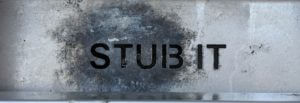
I started by circulating around the old Typography building, finding disregarded engravings made by students from years past. The engravings weren’t perfect and had flaws in consistency and quality. This resulted in the type forms becoming distorted and containing characteristics that varied from its base inspiration, giving it its own personality. I found myself slightly put off by the type forms until I started getting closer and observing the minute details engraved by the student, something not as visible from a distance. From a closer perspective I realised that the form didn’t have to be perfect or a near replica. Instead I tried photographing the source from up-close, getting tight framing to only capture elements. It remined me that the form didn’t have to be as aesthetically pleasing as its inspiration but could be in its own right. Instead of relying on the entire form to be carved well, I could take advantage of close framing and enjoy specific elements, freeing it from being type and allowing it to just be a form. These engravings can be described as bad type by some, but the fact that the form would never logically be recreated for use made it even more unique. I continued to look for letter forms that had been abused and unloved to find the same unique qualities.

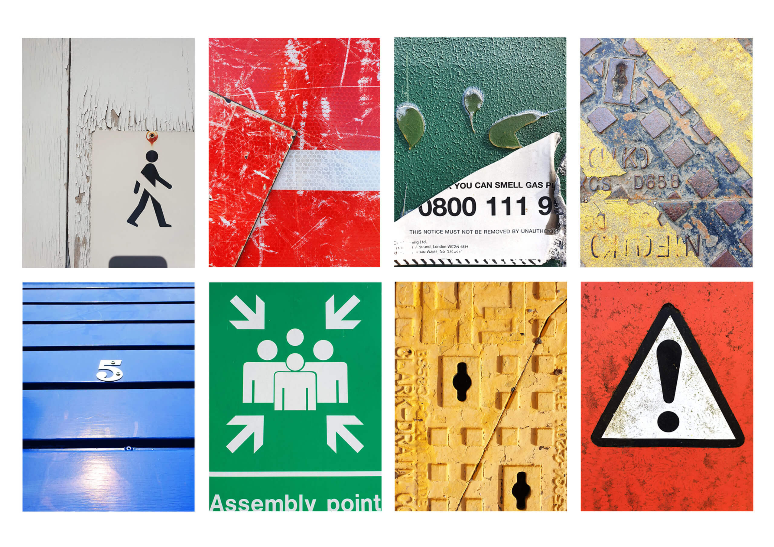
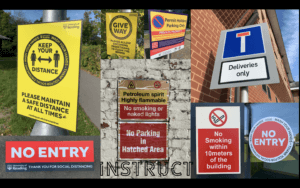
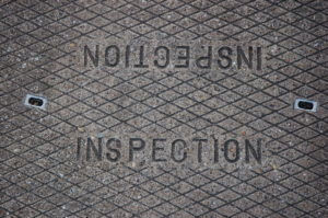
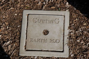
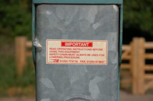
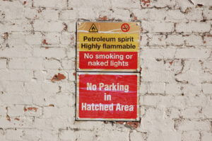
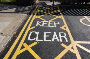
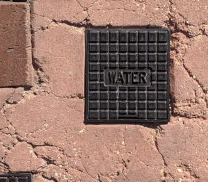
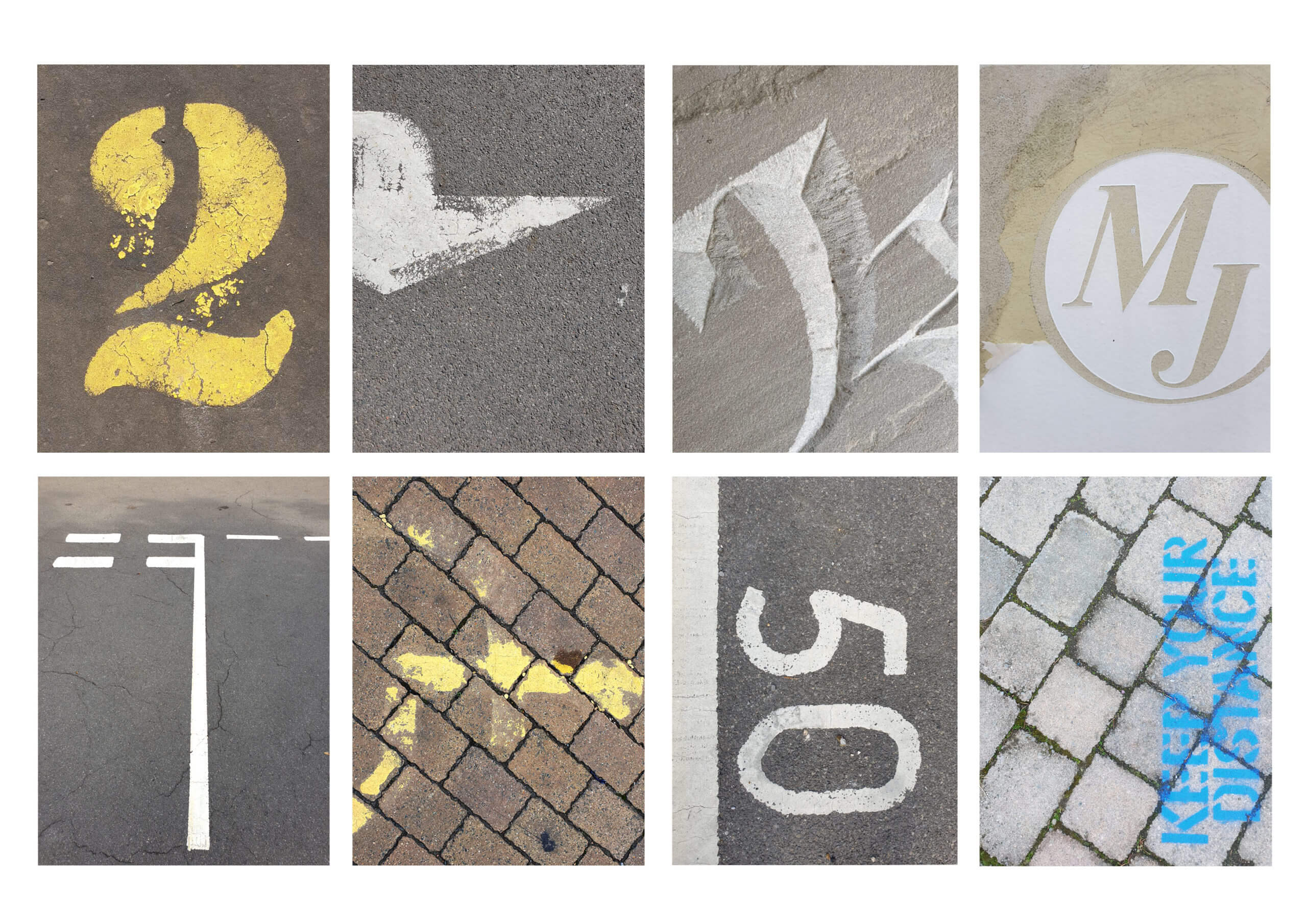
I found that some of the most inspiring sources were of metal signage. The signs are made from metal to endure the weather but over the years it can become dirty and the paint can chip and peal, generating unique markings and creating an overall texture to the sign. I think these elements, as well as close framing, allow the type to interact differently in comparison when it was originally displayed. The changes can result in type becoming less legible, becoming more of a form than a type form as well as creating contrasts in colour and tone from paint chipping. This can also be seen in a lot of signage painted on the roads. I found they offered a different style of texture due to concreate being more porus and tyre friction wearing away less aggressively. It resulted in a more organic and natural texture, leaving behind minimal speckle to big silhouettes.

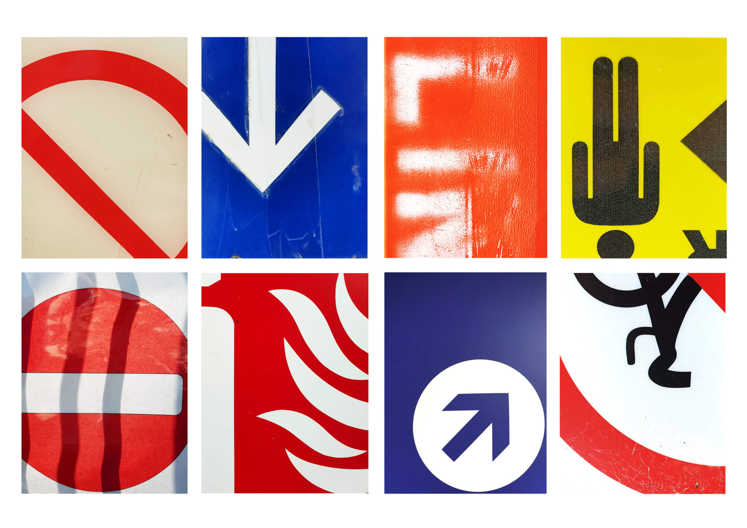
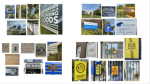
I think these sources are a great source of inspiration and it would be useful to digitally scan them in and use them as textures in the future. After photographing all of the type I encountered, I grouped some of my favourite shots into three categories that I found were the most consistent in my research (Concrete, Metal and Plastic). I chose to group them via their matirial they were printed onto (or out of) as they shared similar characteristics of texture that I found interesting.


Conclusion

After completing the brief I realised how common these degrading sources of type are. It also confirmed a sad theory in that it takes a certain ignorance for these forms to still be present. This is because they need to be neglected and forgotten to gain their textures which give them personality. I think If I could respond differently, I would have photographed similar sources in the town centre and compare how the foot traffic and location could create variation in textures.