Brief
This project with Sophia White from the Brand Design Agency will help you look at design trends and understand how a mood board can be used to help you develop and design with this in mind. You will develop ideas for Logotype Trends for 2022-23 working with a specific theme in mind. This project will help you to look at trends and design logotypes for a specific theme. Using the selected theme, create a logo for yourself as a designer that you may use to promote your work/own design studio.
Process
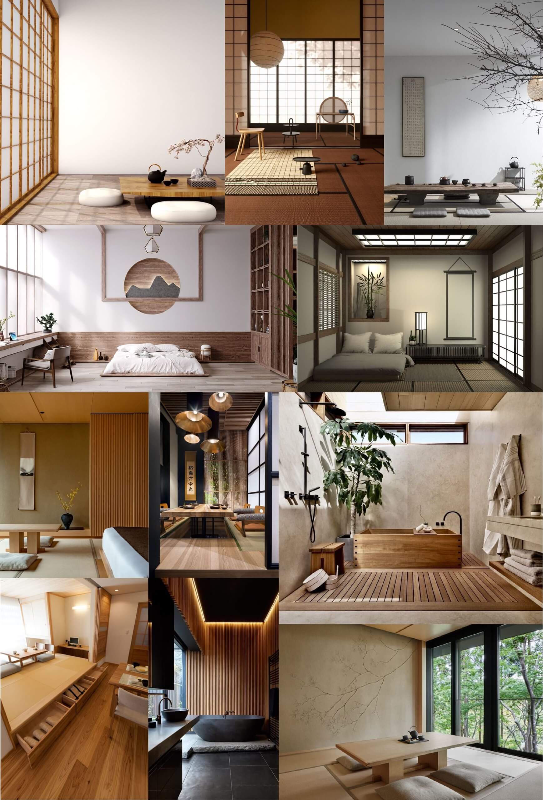
The first step I took to approaching this project was selecting a theme from this article that Sophia sent us in advance that lists 10 upcoming interior design trends for 2022. After looking through the different trends, I found that I was most drawn to the ‘Organic Materials’ theme. This is because I liked how it was very simple yet combining different elements still creates a clear contrast. Whilst looking at pictures associated with my chosen aesthetic, it reminded me of Japanese minimalist interior design so I decided to base my logo ideas around the elements of it. To get a better idea of the elements I wanted to use, I made a mood board of pictures so that I could start creating some sketches of possible logo ideas.
I isolated some prominent features of Japanese minimalist interior design and found the following:
- Organic shapes contrasting with geometric
- Block colours
- Simple lines
- Nature
- Clean cut aesthetic
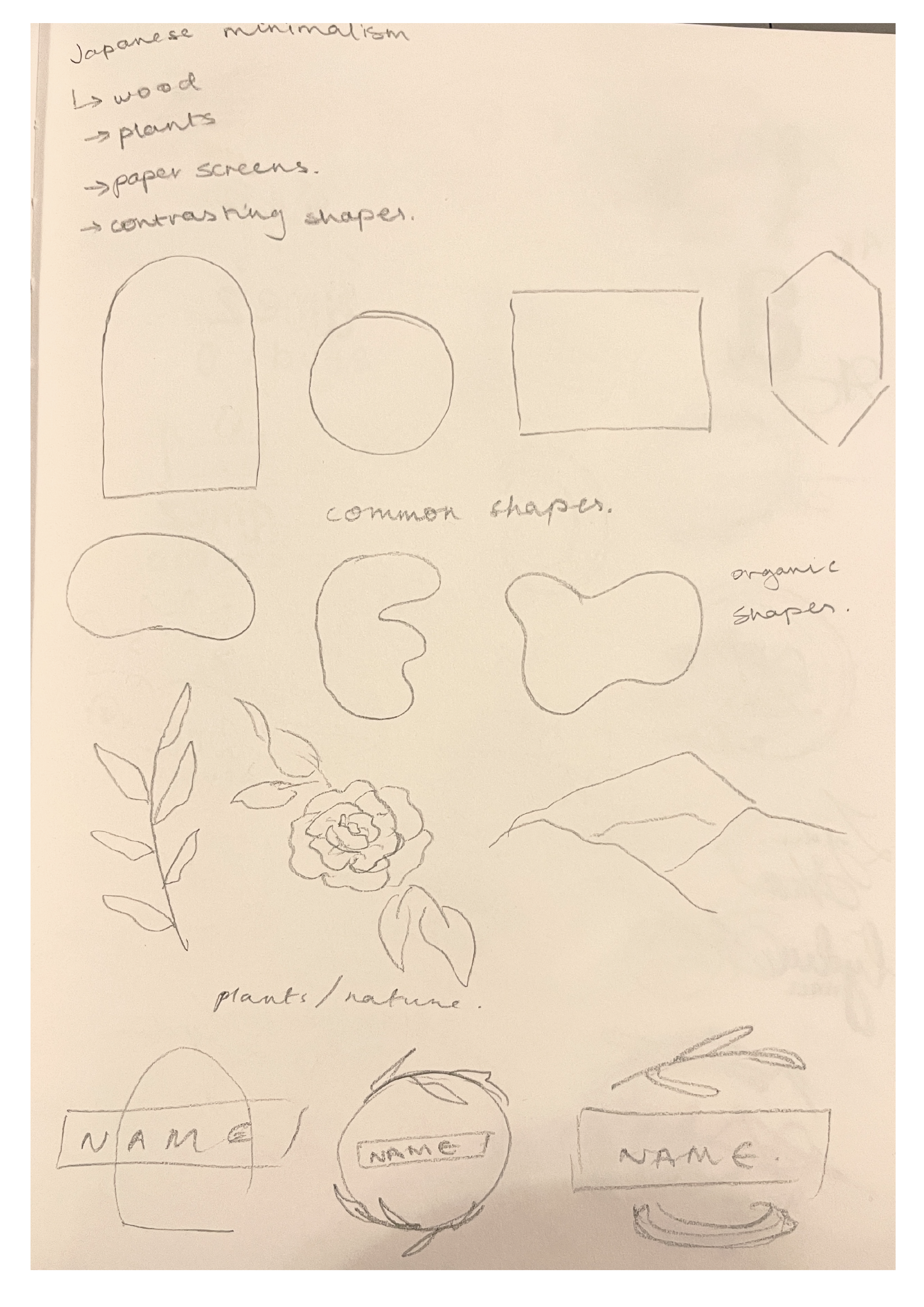
I began by sketching the different elements I found so that I could see them all in front of me and start thinking about how I could combine them into a logo that represents me while adhering to the theme. While considering the theme of the logo, I also had to decided how I would represent myself – either with my own name or a different one. In the end I decided to just use my own name – more specifically my initials ‘AK’ – as it is much more direct and clear; to showcase that the logo is for our own design company, I chose the name ‘AK Design Studio’, with my initials being the main focus. Because I decided to use my initials, I thought to use my signature, which makes the logo much more personal, as well as making it look more refined and clean. As for the inclusion of the theme, I quite liked my initial element sketches around the subheading ‘nature’, so my logo was steered in that direction.
Now that the main base of my logo was decided, I had to begin to try and incorporate the elements of the theme into it. To start this process, I sketched out my initials and drew circles and ovals around it. This is because my signature can create either a general square or rectangle shape, so by drawing a circle/oval around it creates the contrast similar to what I identified in my primary research. In order to add ‘nature’ into the logo, I replaced different sections of the ellipses with a branch of leaves, making them look like wreaths.
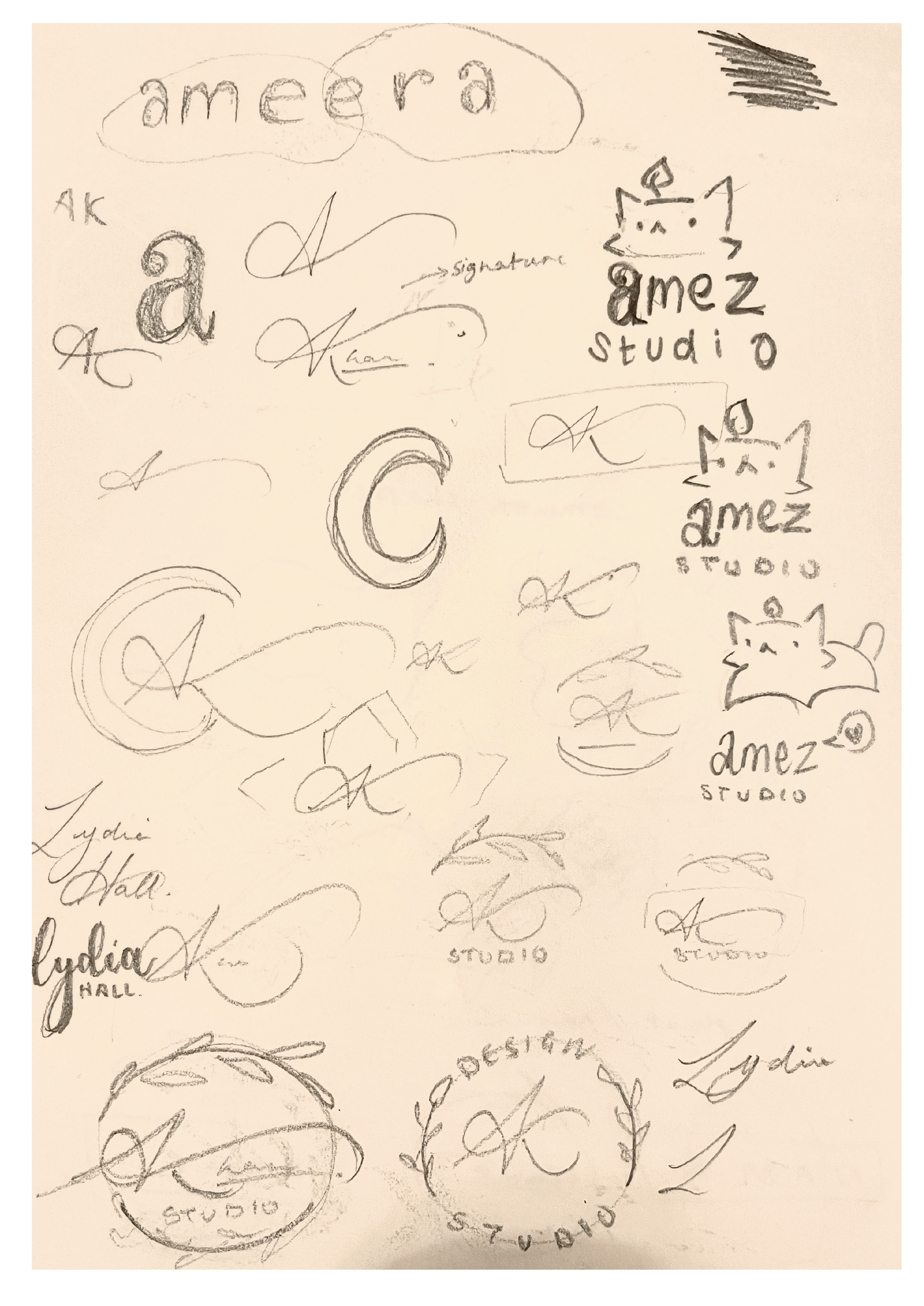
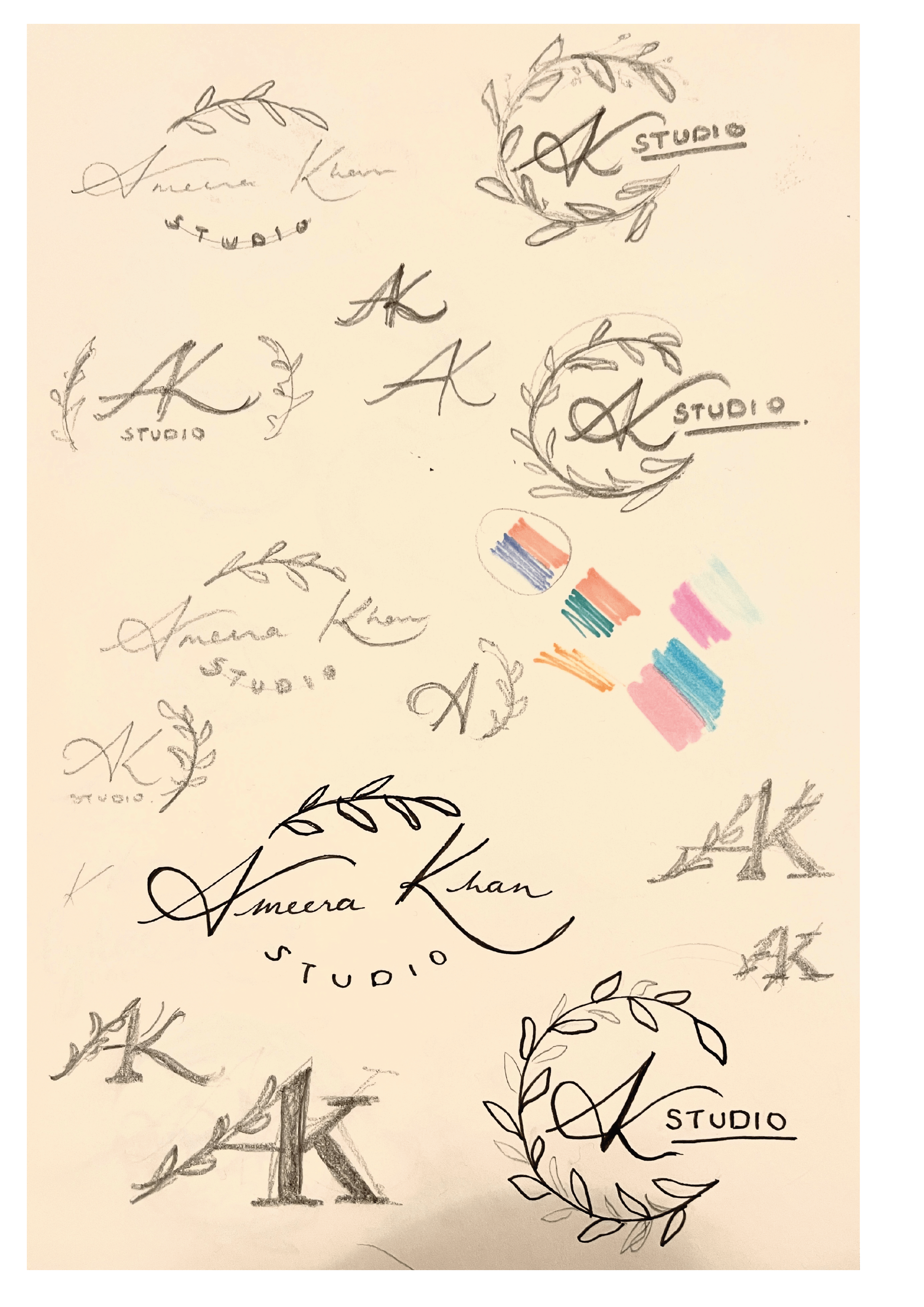
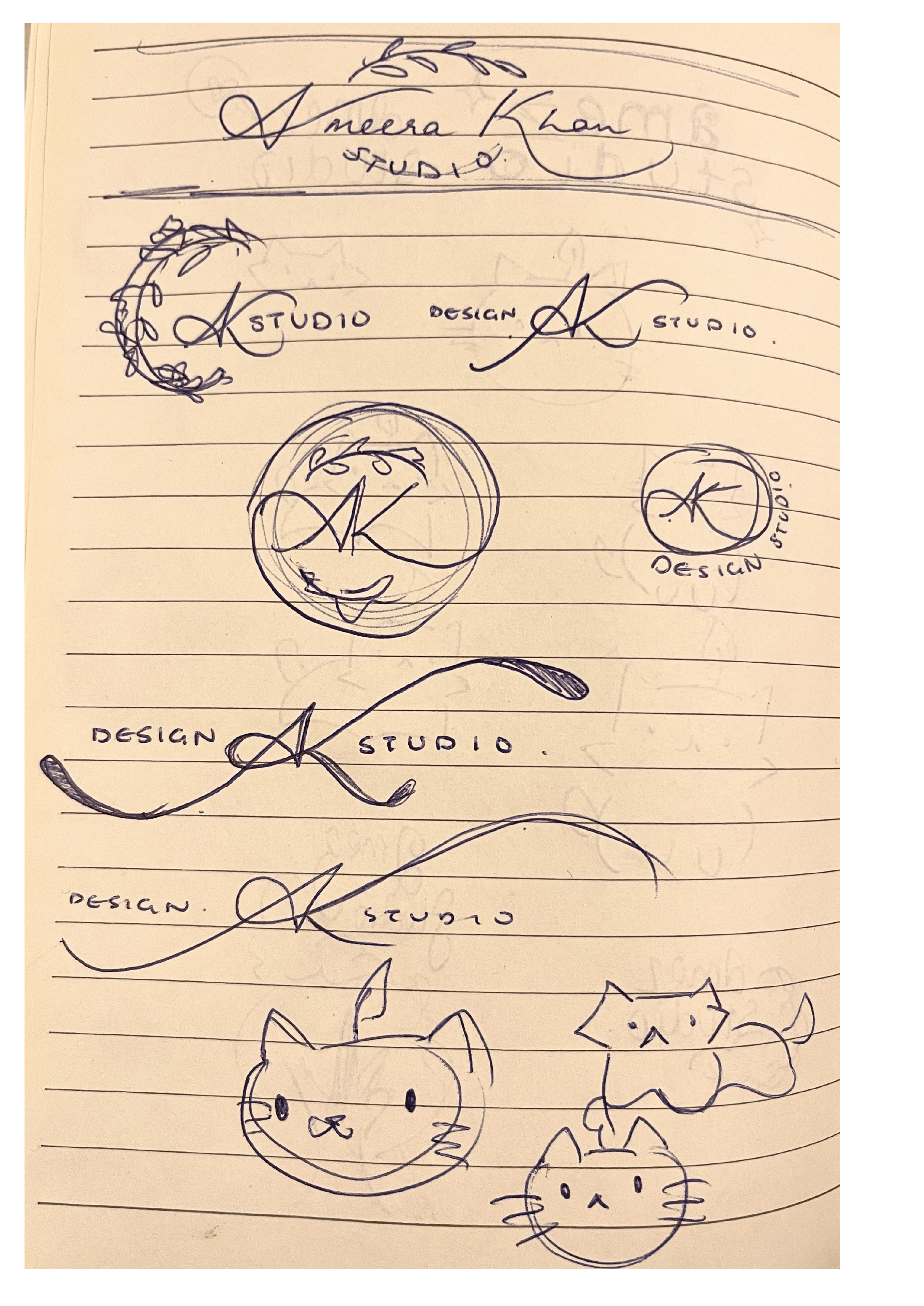
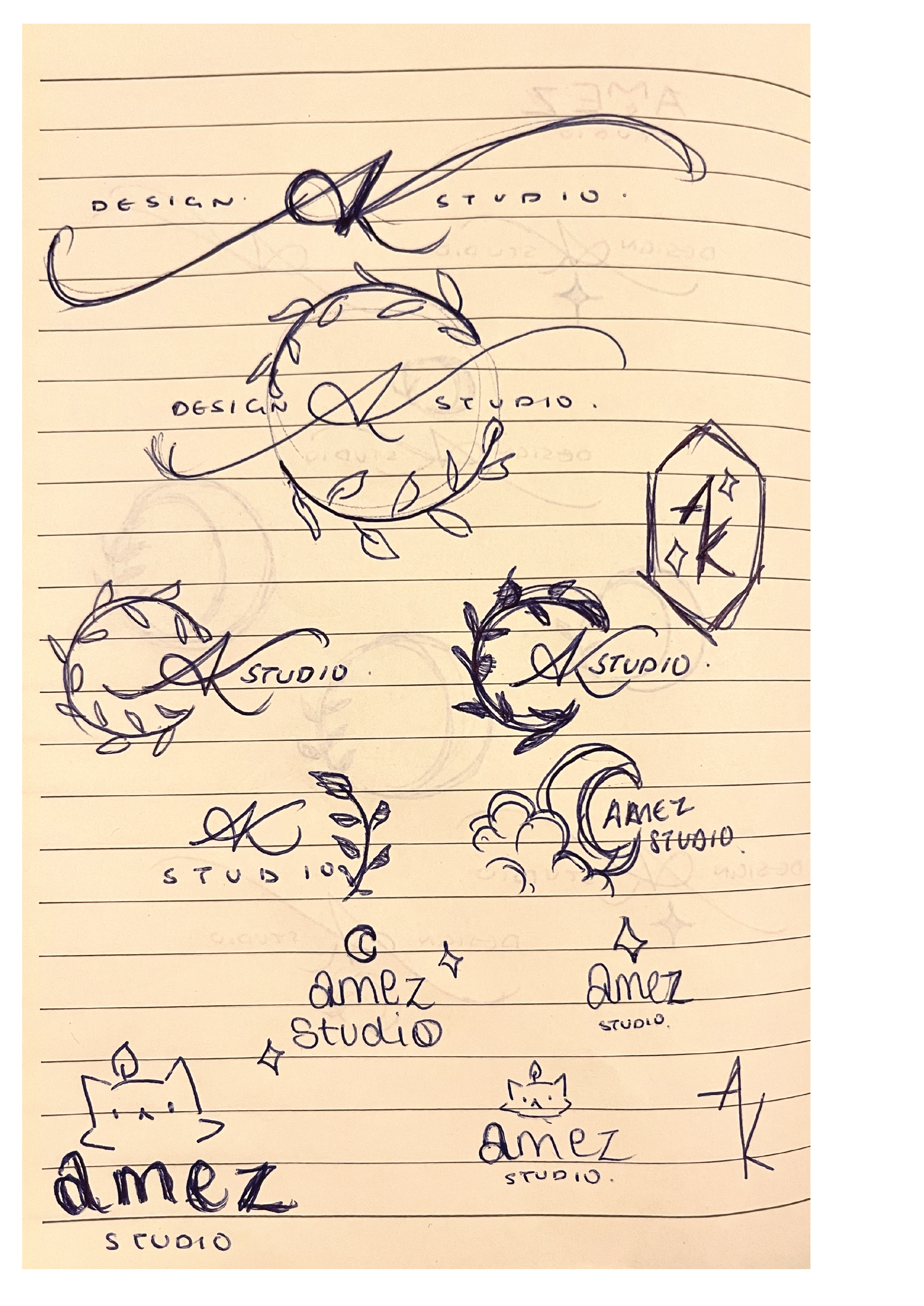
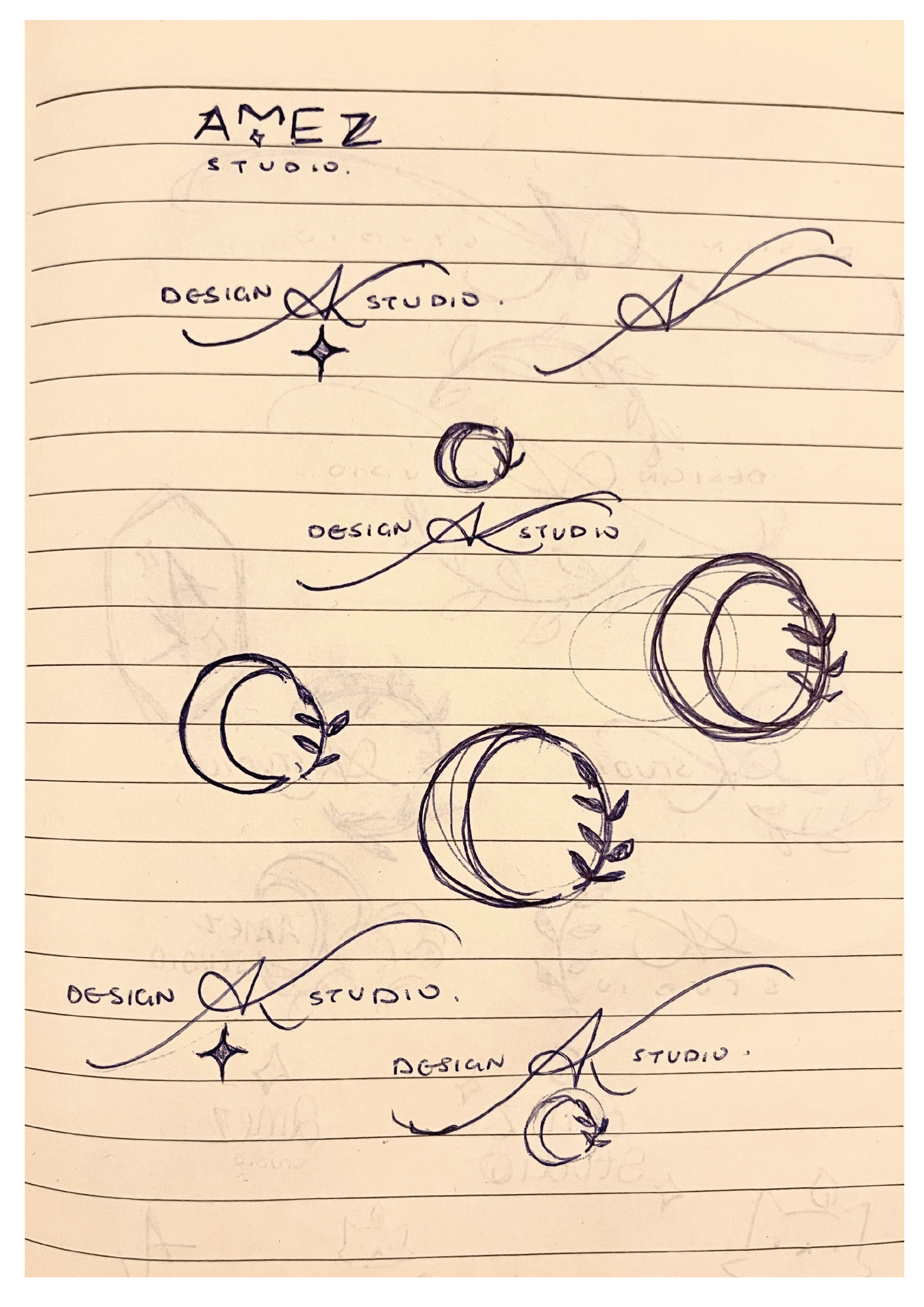
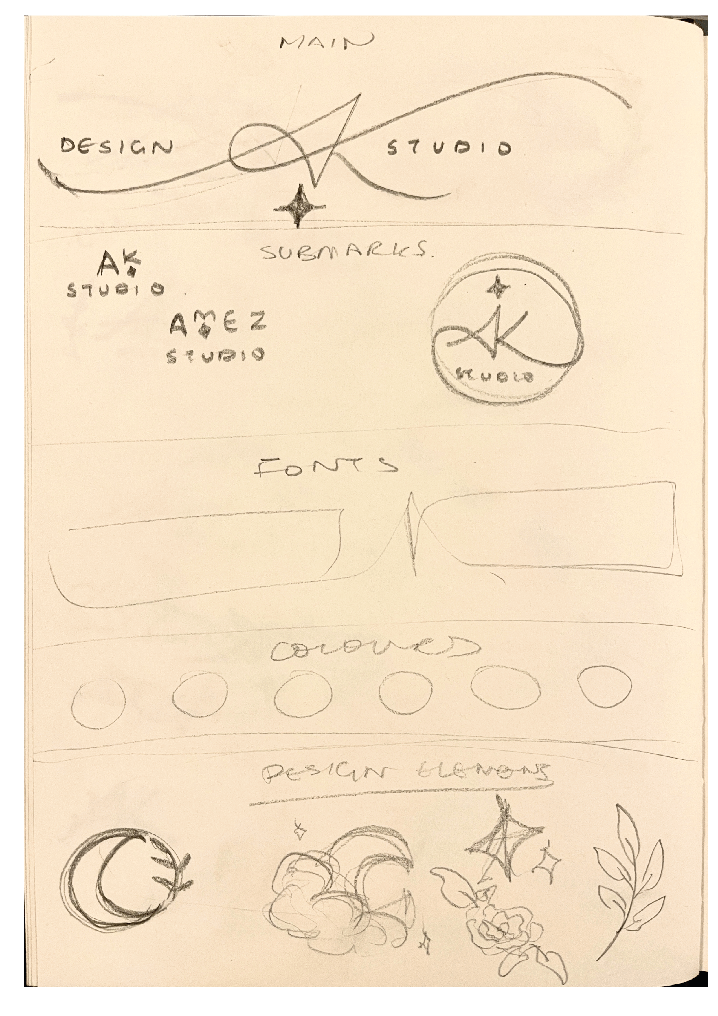 After doing some more sketches experimenting with different placements, I saw that none of the ones I produced seemed to fit the result I was looking for. I then realised that I could venture into the concept of ‘nature’ a bit further, and use imagery such as moons and stars instead, as it still fit in with my original objective. Like before, I started sketching new ideas with these new images. Rather than trying to make the additional illustrative elements a main part of the logo, I decided to accentuate the initials by making the entrance and exit (which serves as the diagonal of the K) strokes longer; by elongating these strokes, it created a gap which I was able to fit the words ‘design studio’ into, hence making the title portion of the logo complete. Concerning the illustrative elements, I noticed the space underneath the ‘AK’ looked quite open, whereas the top half already had the point of the ‘A’ which was balanced out by the valleys either side of it. Because this open space made the logo look unbalanced, I decided to add a four-pointed star underneath. I made this decision as the other images I tried to add into that space didn’t work for the balance overall.
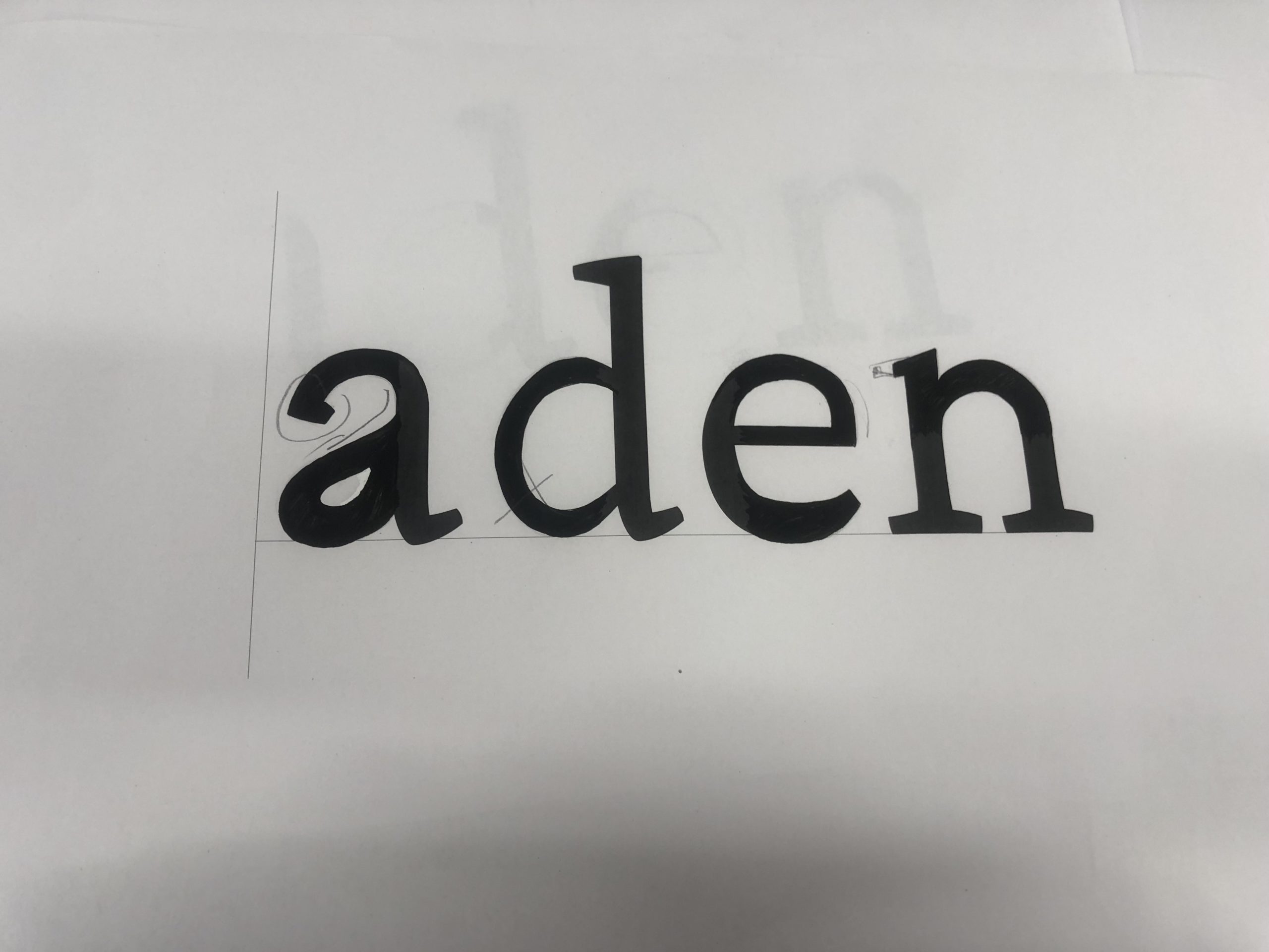
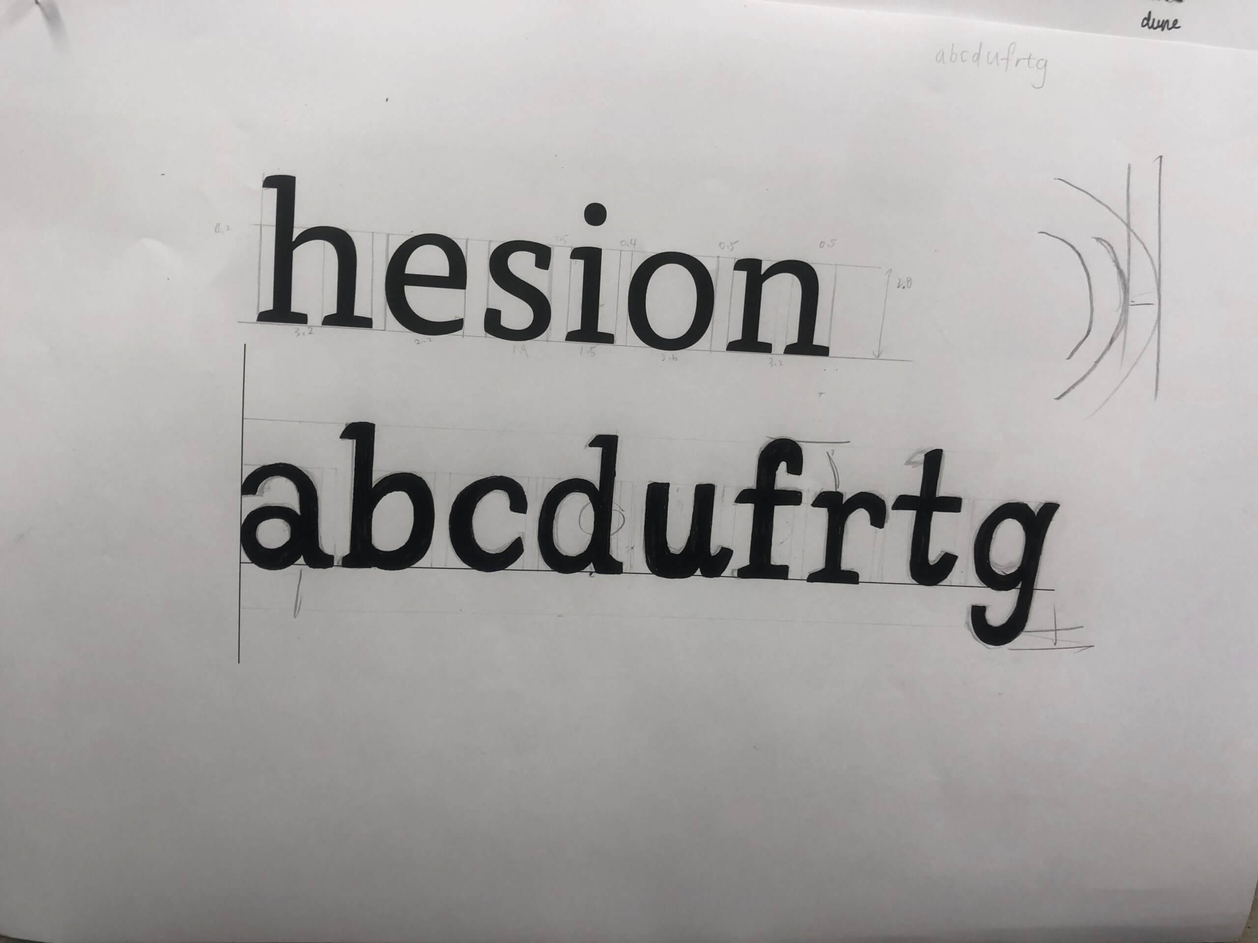
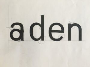
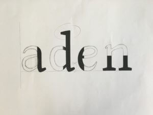
To make the final refined logo, I took a picture of the sketch and imported it into Procreate; this is because the way the letters are written is quite unique, and I couldn’t find a fold that was similar enough to manipulate to recreate them. I used a thin technical brush to trace the ‘AK’ so that I could get a tapered effect that calligraphic typefaces don’t have. After doing this, I took the finished trace into Illustrator and did Object > Image trace > Make & Expand, which recreated my drawing as a vector that I could then manipulate. I then added in the words ‘Design Studio’ using Baskerville, I chose this font as a serif font looks much more cohesive with script/calligraphic lettering. Once this was complete, I created the star by making an oval, the going to Effect > Distort & Transform > Pucker & Bloat, then puckered the oval to bring in the sides apart from the vertical and horizontal points, thus creating a four-pointed star. After this, I positioned all of the elements of my logo together and readjusted them accordingly, to ensure that the balance was correct.
As this was a logo project, I thought that the most appropriate way to present it would be a brand board. In order to complete it, I made two simple submarks that still incorporated my initials and decorative elements. I also showed the fonts I would use in my brand, and displayed a simple colour palette.
Reflection

Overall, I really liked this project, as it allowed us to get an insight from a designer in the industry and showed us part of a professional’s process, which I thought was really interesting. Furthermore, I liked how much freedom the brief gave us, and there weren’t a long list of rules that we had to follow; the only ‘restriction’ being our chosen theme, which we still had freedom to pick. This project let us be creative in a way that was fun but also very useful to show us a real world application of our work, and how a typical project in the industry might proceed. As well as this, because we were able to create branding for ourselves, a lot of us may use these as either a starting point or how they are to develop an identity as a freelancer if we so wish.
brand board pdf

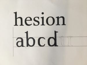
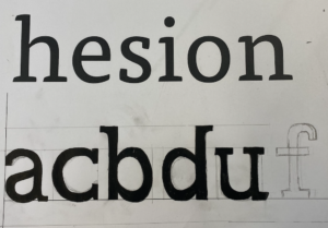
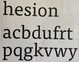
 Before I started my design I made sure that