Category: Student work

Pre ‘Coroni’ 2017 listings

Reading Film brochure2Final

We were given film listings from 2017 and were given the task to present our own film brochures with this information. the list of information wasn’t written properly and contained several errors. for example a lot of them didn’t all include the run time. With this in mind I started sampling bits of information and re-writing it all to read in an order that could more coherent, allowing me to reorganise things more easily if need be. I was aware that there was a lot of information for a single listing which would be difficult to put into an a5 document whilst maintain legibility. I decided to then shorten the information taking liberties like shortening dates and only including start times of the movies. I noticed that for each listing it mentioned the month and year, something that I felt was too repetitive. I didn’t want my design to do this so i started sketching layouts, allowing me to distinguish the listings by month. I also wanted to distinguish that the movies were either adult or family friendly. I settled on the idea of having two columns, the left being adult movies and the right being family friendly movies. I then thought I could distinguish them into two halfs, the top being listings in October and the lower being ones in November. I knew I needed the listings to line up so I went back and adapted them to share the same amount of lines,  creating uniformity in my design

I then started experimenting with using the face Gill Sans Nova. I chose this for its variety in fonts and its reliability for short headings, as it was originally designed as a displace face. the Nova style also allows me to use much thinner weights for the main listings. Instead of incorporating lots of colour I decided to reserve it, only using it for the for information that might get lost in the structure of the document. I then had to rely on weight variation so I used a bold for the title, semi bold for the subtitle and medium for the rest of the listing. I wanted to make the listing into two halves again, the top being the most important information and the bottom being more contextual. I did this by significantly lowering the point size of the second half in the medium font, allowing it to still feel breathable. I thought that it needed more contrast for some key words such as ‘directed by’ and ‘staring’ so I lowered the point size and increased the font to a semi bold, giving it a subtle change in weight.


Analysis

I feel like the design went fairly well but struggled to add the contact information at the bottom. I had to decrease the size and up the font weight as well as slightly increasing tracking  to suggest a similar size. I still feel it looks too small and a clumsy effort to include it at the bottom. I also know that the RFT logo that I made to fit the design doesn’t solve my alignment issue. The last block should be where all the text is aligned on the right hand side yet it’s not as I felt that increasing the column margin to space it towards it would look disconnected. I also think that the use of colour for the icons worked well as they would have been overlooked if not used, yet I think its a shame the rest of the design is in black and white. Having said this I don’t think that using more colour would have made the distinction between itself and the black type any more effective, as more colour used decreases its impact as suggested by Tschichold


A Bone-Breaking Clown

Three facts that I was presented with were that someone had two birthdays, someone had never broken a bone, and that someone fell off of a horse once. While reusable birthday cake and horse stabilisers looked promising, they were ultimately dead ends. Oner rejected idea was a birthday cake Rubik’s cube– enough combinations to see you through every birthday you’ll ever have.

The fact I went with for my final idea was that my partner had never broken a bone, so I reasoned a thoughtful gift would be a chance to finally break one. A bone breaking machine seemed a little too on the nose, and two random words, bottle and skeleton didn’t lead anywhere. My final random word was clown, which I think had potential.

COVID-19 – Blue or Yellow?

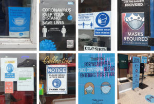
Sue and Emma’s project was all about gathering real-life examples of COVID images around us. Since it’s been months since the first Corona outbreak, it’s fair to say that we all got used to the repetitive posters and announcements that routinely remind us about the laws put in place to stop the spread of coronavirus in the UK. Having said this, a lot of us stopped paying attention to the posters themselves. I highly valued this experience as it’s not often that I look or analyse real-life examples of information design. It has taught me a lot about features found in Covid imagery, from the choice of colour to the specific fonts and typefaces.
As expected all of the imagery I collected using a sans-serif typeface. Most likely, this is a result of sans-serif fonts are often considered as cleaner and more serious, while also easier to read from up close or distance. A lot of the posters and images I have found had a centre alignment and used a very limited number of colours (2-4 at most). ‘Keeping it simple’ is the key fact in information design as you want everyone to understand the information you’re presenting. A lot 
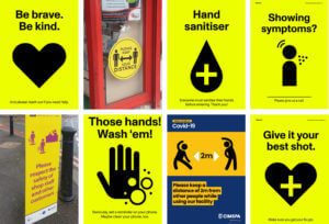
of the posters were also accompanied by icons and vector images that illustrated what was stated on the posters.
Notably, I have noticed that most of these posters came in 3 colours, blue, red and yellow. Blue is quite commonly used in information design as it is a neutral cool colour. While I agree that the posters in blue were effective, I feel like they are more of a guide rather than enforcement of the law. On the other hand, the yellow posters were combined with a highly contrasting colour such as Yellow (in the examples presented on this page). Unlike the blue posters, yellow draw much more attention, as the combination is known in nature for indicating caution.

Minding the gap is a tricky task

This session for design practice was taught by Gerry and was a very technical session where he explored different typefaces and analysed their individual properties. I thoroughly enjoyed being taught the effectiveness of how we should hold our pencil and the techniques that to use which can improve our sketching. For the morning exercise we had a look at the word ‘hesion’ which had been presented in three fonts and try guess what the letters would look like in the word ‘Cadbury’. I chose one font and tried analysing the way it goes thin in some areas as well as where it is thick or bold. My attempt was a little bit off from the correct version but from Gerry’s feedback I could see where I had gone wrong. I also learnt how to be a bit more precise when using fine liner pens. For the afternoon exercise we did a similar task however we were given some bits of the word ‘aden’ and we had to fill in the rest of the areas in the way we thought was correct. I found this time I had completed the take well but messed up some of the thin and thickness.

Reading Film Theatre Flyer

The Reading Film Theatre flyer task was a challenging but enjoyable one. As I’m quite new to Indesign compared to other Adobe softwares, I struggled a little bit in being able to make things the way I wanted them to be. However it was a perfect opportunity to implement what James taught us in one of recent sessions, which was using paragraph styles which made the process quicker than it would’ve been without the use of them. For this task I had various ideas on how I wanted to format it however along the way and across different drafts I found myself tweaking and changing things. I found that alignment was one of the things that I was concerned about the most as I found the flyer was more visually appealing and the information was articulated better when it was organised in that form.

During the feedback session, I was told to improve on trying to see if I could make it easier to read as they said there was too much typographic difference because the colour was hard to read. So for my improvement I decided to select a darker colour which was still engaging but softer on the eyes. I decided to pick a dark red as I liked how in class it was mentioned that it gave of the cinema feeling that you’d want to promote. Another point of feedback was that I could’ve chosen black for the dates to make them stand out more. However for the brief we could only have two colours so I decided to create that visual flare I would alternate between the red and grey colour.

what is your ideal gift?

For Kim’s project we had to design ideal gifts based off of our partners’ interests.

My first partner enjoys playing the violin as well as watching horror films and Studio Ghibli. I decided to design a horror themed violin using recognisable illustrations such as spider webs, bats and skeletons. However, the next stage of this project was incorporating a random word into our designs. My word was ‘bridge’. I decided to make the violin a ‘bridge to the other side’. I represented this through the ghosts appearing from the bow of the violin. My final gift can be seen below.

My second partner loves sparkling water as well as watching Disney and Marvel films. I decided to design a bottle of sparkling water that has buttons on, to allow you to change the flavour of the water. However, my random word was ‘aeroplane’. This gave me the idea of how to make this bottle more easily transported. I combined this concept with the prompt of Disney and came up with a bottle that can shrink and expand, taking inspiration from Disney’s Alice in Wonderland. My final design can be seen below.

I was unable to decide which design, out of these two, I preferred and so I decided to experiment with both and create final outcomes for them. They are both so different, and so I found it hard to compare them!

Overall this was a fun project as I was able to spend time creating many ideas and concepts, before experimenting with my two favourites. It was also a great opportunity to get to know my class mates, which has been difficult due to the current situation of Covid-19!

The Diary Of A Wimpy Kid Penguin Cover

For Tuesdays task, we began using InDesign and started by creating a book cover. To do this, we replicated a Penguin book cover. I really enjoyed this task of learning how to manoeuvre the software and found most of easy to follow along with. I found the top logo of ‘Penguin Books’ the most difficult to create.

I then went on to create my own cover, using the style of the Penguin books. I changed the colour to a purple and chose the book of ‘The Diary Of A Wimpy Kid’ as this was one of my favourite books when I was growing up. I changed the image of the penguin to a black and white one to fit in with the illustrations used within the book. I enjoyed making this, however found that as I exported it into a PDF, the quality of the images were lost. I then also included ‘My Diary’ for comedy to refer to the fact that I was the wimpy kid.


Bunny coronavirus signage!

Coronavirus signage


The signage used to negotiate social distancing, personal hygiene, and other precautions commonly advertised to prevent the spread of coronavirus, tends to include a similar colour palette, fonts and pictograms.


One key commonality between most of the designs was the use of a sans serif font, often in caps or bold, in a dark colour contrasting the background. This makes the message clear and urgent, while retaining the ability to be paired with other design features to make it seem friendly and helpful. The use of a bold, clear sans serif font makes the message readable to the target audience, employing a clinical, professional stance, while also remaining visually appealing.


Another key feature was the use of colour, specifically the use of only one colour or colour family, in combination with either black or white text. Colours that were most frequently used were yellow, blue and green. Yellow alerts danger and is eye-catching but doesn’t suggest immediate danger that might invoke an emotional response like the colour red, for example, would. Blue and green are often associated with healing or medical professionals, and are generally calming colours, so they work well to convey a message that is detrimental to the health and wellbeing of the general public.


I also saw the use of shape being utilised to grab attention, for example many stickers or signs used a circle to have a main message in the centre, with other, important text surrounding it. This works well to grab the attention of the audience, and then maintain their focus to process or follow a message.


Signs were often posted on the ground, in order to explain social distancing protocols, or simply because it provides a good surface area that people will frequently look at. Signs on common signposts or walls also are effective, especially when encouraging people to wash their hands or to direct them safely. The use of stickers on posts or walls also does this effectively.


Overall the use of bright colours associated with clinical practice, bold sans serif fonts, eye catching shapes, and accessible signage are key components in the effective employment of coronavirus signage, whether it is used to serve as a warning, a direction or simply a reminder to stay safe.

Are the Government making change happen?

The word I was given for this task was ‘Government’. To represent it, I chose to draw the Houses of Parliament as I felt they were a visual icon of the government in Britain. As the central buildings for the government in England, I felt this portrayed a strong message. To show opposition to Government. I chose the issue of climate change and the key figure Greta Thunberg. I turned half of the building into money with Gretas face on it. I then wrote the words ‘Any change?’ This was to question whether the government had actually made changes about climate change or whether they were still more concerned about money as changing to climate saving solutions can be expensive. I then used a Gif maker from the App Store to blend my two images.

For someone who likes skateboards and records.

For the ‘Ideal gift’ project, my partner was interested in skateboarding, guitars collecting records. I then chose my random words of ‘shoes’,  ‘clocks’ and ‘bottle’. I began brainstorming 6 different ideas focusing on their interests and my random words. I experimented putting a clock with hands on a guitar front and using a solar powered digital clock on a skateboard. For the word ‘bottle’, I created a guitar shaped water bottle, however felt this may not actually be very practical. To explore the idea of his record collection, I customised a pair of skateboard wheels and the front of a guitar with his favourite record. My final favourite idea that I developed was a pair of shoes with skateboard wheels on. For my final idea, I then also customised the wheels with his favourite record album on. This meant that I had incorporated 2 of his interests and my chosen word of ‘shoes’. I was very happy with how this came out and felt that it was a cool, personalised present. It encouraged out of the boxing thinking and fitting to somebody else’s specifications like a client.