
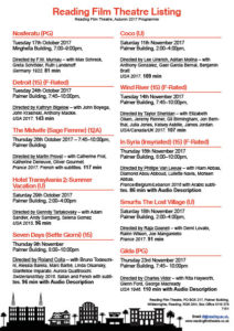
As part of this task, we were asked to recreate a cinema flyer using some information provided to enable us a better understanding about how it works in the professional world, when working with clients. We were given the opportunity to create our own categories according to what we felt was appropriate regarding our target audience. I split mine into three categories ensuring that the wording was fun and engaging just like it would be on a flyer. In these categories I put the films in order of the dates they were being aired to allow easy reading and navigation. I’ve used a san-serif typeface for similar reasons and to allow more of a modern feel.
I decided on black and white as a colour scheme to keep it relatively simple but I also felt like black was a colour commonly associated with cinemas and therefore fitted the criteria nicely. I’ve tried to create an order of hierarchy with the name of the theatre being the most important. The times of the movies are at the bottom of the criteria but i’ve done this because i thought the names of the movies were more important and if the consumer is interested in a movie they can easily see when and where it is below.
I’ve added the recognisable age certificates to not only add a pop of colour but too again, allow for easier navigation. One of the target audiences we were given was a family and so they would only be interested in the U or PG movies so they know where to look straight away. following on from this i wanted to create the same effect with the Audio Description and F-rated movies so I made sure to include to certificates for these.

 On the left is the sample text we were given, from this we were told to write ‘cadbury’ in the same font. Bellow you will see my attempt at doing so.
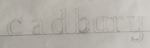 As you can see my photography skills needed some work, focusing on the text though one can tell immediately that i did not track ahead of time. Another thing I needed to improve upon is the proportions of the letters, as the bowl of the a is much too high. Once we compared the attempts to the actual font it also became apparent I needed more weight at the top of the c and the y was more linear than curved. Moreover the top of the letters only have serifs to the left not both ways as I did on the u and y.
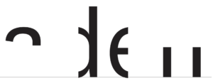 Having looked at my previous mistakes we tried another type of exercise. To find the hidden part of the letters. We were given the template on the right. Where do I go from here? I attempt to visualise the rest of the word of course! I had my logo game training, so I can see it’s obviously adell! Wrong. Luckily someone discovered that upon highlighting the word and right clicking it asks if you want to look up “aden”, mistake averted. Knowing the actual word then made me look back and question how I could have thought it was adell… the spacing between the two stems is much to far apart, it has to be an n.
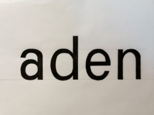 I used the letter shapes present to trace and check then letters I created before colouring it all in black for better contrast. The result can be seen on the left. From the d I traced the angle the a needed to split into a separate stroke and it’s thickness, tracing the first part of the allowed me to flip it in order to see where the second part should be. I also used the d to create the top of the n as I did for the bottom half of the a. Whilst it’s still not the exact same as the font this attempt is much closer to it than my previous attempt. I also downloaded a scanning app to improve my photography and overall am quite content with the outcome of todays project. I also decided I should play more guess the logo games again in order to sharpen this skill further and pay more attention to individual letter shapes.