Category: Student work

Lettering in Warnings

Lettering in Warnings

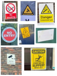
I took a lot of pictures while wandering around campus for this project, with no real focus as to the content of them while doing it, I’d mainly looked for lettering that intrigued my or caught my eye for one reason or another.

After sitting back down and looking at the images I’d taken I was drawn to the warning signs in particular, I thought it interesting how not all of these warnings will have been designed by the same person yet all follow a very similar pattern and method in their design, for example the bold text, similar fonts, use of bright contrasting combinations such as red and white or yellow and black in the colouring, they often put key words in boxes to seemingly highlight them and also the use of negative space is a very common factor amongst the lettering. Also I was intrigued by the use of similar shapes across all of them, triangles being very common and almost becoming a staple that you’d automatically connect to a warning.

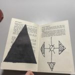
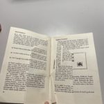
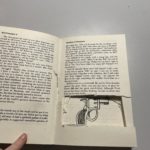
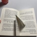
Labyrinth

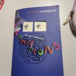
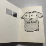
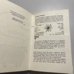
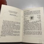
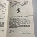
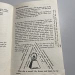
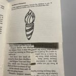
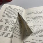
As indicated by the title, I chose the brief ‘Labyrinth.’ I started by taking literal ideas from the brief; i.e., I cut windows into the book’s front cover, so it resembled the front door of the house. I also drew a maze labyrinth on the front cover. As I got into the text, I wanted the reader to feel confused and played with the perception to convey the confusion the characters may feel. I did this initially by cutting pages, and this gave the illusion it was only one page, but it was multiple pages. Furthermore, I continued this theme by folding pages so the reader has to interact with the book to read it; this conveyed my idea of a labyrinth and choosing a path or turn. If I hadn’t run out of time, I had planned to use blank pages to unfold and essentially reach a dead end, leaving the reader to feel like the family in the book. I did, however, execute this idea by folding the pages and then gluing them down.

Eye-catching letters

For this particular task, I didn’t choose a theme. When taking photos, I looked at the most eye-catching examples in the environment around me and then identified a piece throughout what I had. I was drawn to individual letters and how the different styles and variations of weight etc. Moreso, I found it interesting how additional signage used formation and the grid system. My favourite photo I took was of the exclamation mark with “sustain it” I liked how it used the exclamation mark to draw attention. The change in conventional format made it memorable, along with the “Rollover” logo with the incorporated hotdog in the double l.

R in the Environment


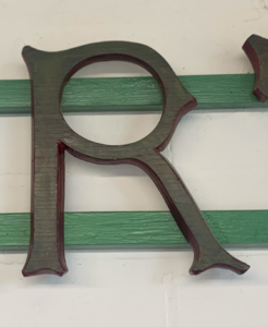
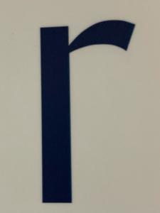
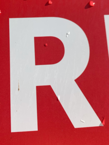
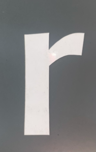
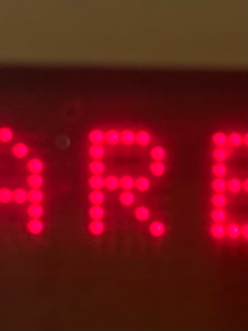
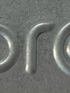
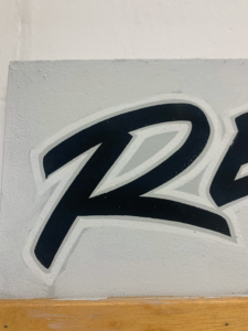
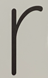
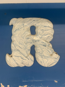
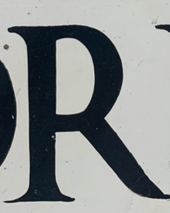
In this project I went around the Typography block and campus and payed particular attention to the letter R. Single letters are not normally something that stands out in day to day life, so I wanted to explore deeper into this. Focussing on just the ‘R’s around me, I noticed the variation in size, font, weight, texture and colour.

I organised my photos in a collage format so the wide variation of ‘R’s could be seen all at once. A collage looks busier than any other format choice which emphasises the amount of differences between the character.

Band on Call


For this project, my partner gave me their 3 interesting facts to be:

  • Left-handed
  • Plays bass guitar
  • Works in a pub

I decided to take the fact they play bass guitar and design an ideal gift with that as my starting point. After discussion, I found out they wanted to be in a band, so I then thought, how could I give this person an opportunity to play with other musicians with the same mindset? This is where Band on Call was created.

Band on Call is an app that allows you to connect with musicians all over the globe and start playing as a band. The app comes with a projecter that shows live hollograms of the rest of the chosen musicians. You can request any instrument and interact with them as there is live time hearing, which wipes out the problem of internet lagging. An optional camera can be set up to display yourself to the other users and the system can be connected to external speakers, making the overall experience much easier.

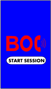
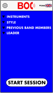
I used my iPad Pro and Apple Pencil to produce this and whilst designing, I stuck with the contrasting cold and warm colours of blue and red so the app icon stands out in the App Store and on a home screen. The logo has been made with a basic block letter, sans serif font as the telephone in the logo is the ‘C’, so this font worked best.

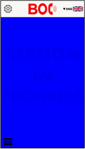
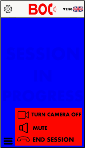
I created an opening page, a menu, a page that shows during a session, and an options page within the session page.

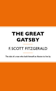
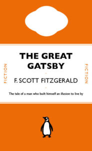
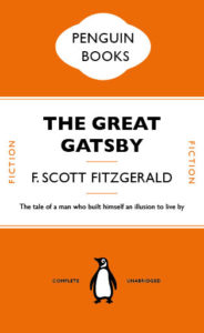
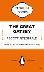
The Great Gatsby

Through the online class, I have learnt the fundamental skills using Indesign. One of the techniques I found MOST vital is to create paragraph style to the text while making different adjustment like tracking and leading in one panel. I have also learnt loads of useful shortcuts that will be useful to adapt in future designs, like holding shift to achieve perfect move and scale objects proportionally, as well as shift+alt to copy an image.

The hardest part will be working on the cartouche that at the top and  using shapes to crop it out, but the pen tool help me a lot with it at last. Overall, it’s such a great practice copying traditional book design and step in using Indesign.

70’s neutrals

70s retro theme

Initially, I started my logo thinking of mainly curved lines and neutral, warm tones. As I began to work in illustrator, I experimented with curved typefaces and settled on this chunky and organic shape font. I separated letters from my name to create a larger ‘M’ which allowed the letters to fit together better and create a more rounded appearance when alongside one another. I also decided to use a white stroke around the main name, to highlight this above the ‘designs’ below which I wanted to be secondary to the name and then closed off the negative space by using two circles and the ‘blend’ tool, to create a background reminiscent of vinyl records and in line with the curved lines I initially wanted to pull into the logo. I tweaked these variables until i found a balance i was happy with; however I would prefer to use this logo in a circular format rather than a square to eliminate some of the empty space and draw the eye back again to the centre logo.

Polka Dots Logo Type Trends

For this project, I chose the theme of polka dots. I created many mood-boards, my first consisting of general polka-dot-based branding. I then went onto creating one which incorporated polka dots and bright colours as I feel like bright colours represent me well. After not getting much inspiration from these mood-boards, I took the slightly different approach of researching into clouds as I am fascinated by them because they can be interpreted differently by everyone. And as a designer, I think it is effective when branding is created, to have a hidden meaning or multiple suggestions behind it.

Using Adobe Illustrator, I drew a continuous line drawing of 3 clouds, and then sticking to my theme of polka dots I added some circles of varying colours and sizes and placed them underneath the line drawing. The colour scheme reflects the sky with tinges of purple and pink to represent a sunset.

In terms of the text, I selected a minimalistic font as I think it is appropriate for complimenting the line drawing. It isn’t too bold so that it is distracting because I didn’t want it to take the attention away from the design of the branding itself.