Category: outreach

MA Communication Design: Open Morning 2023

Interested in the MA Communication Design? Join us at our Open Morning and discover our 4 pathways. Visit the Department of Typography & Graphic Communication, chat with lecturers and current students, and get advice about how to apply.

Date: Tuesday 25 April 2023, 11am to 1:30pm (BST)

Where: Department of Typography & Graphic Communication, Whiteknights Campus, University of Reading

After a welcome from Dr Ruth Blacksell, Department Director of Postgraduate Taught Programmes, a presentation about the MA Communication Design will focus on our 4 pathway routes: Book Design, Information Design, Graphic Design, Typeface Design. This will be followed by a walk around the Department and a look into the studios. In a Show and Tell session, you will get a glimpse of our special collections. We will close the morning with a tour around our current Department exhibition.

Interested in attending? Register here

13 July: a celebration of letterforms and ephemera

We are holding a one-day symposium on Saturday 13 July, where world-class experts in design research, teaching, and practice will discuss ways of positioning ephemera within graphic design and typeface design. Participants will experience the visual richness of printed ephemera through illustrated talks and hands-on sessions with material from our collections of ephemera. 
Hands-on sessions will be conducted by Martin Andrews, Paul Luna, Lucienne Roberts, and Michael Twyman. Talks will be given by Rathna Ramanathan and Fred Smeijers. (For past students and attendees of our events, the sessions will include material that has not been viewed before in any of the regular in-term sessions.) 
The Symposium will begin at 10:00 in the Department of Typography, and conclude at 17:30. Lunch will be  provided in the Meadow Suite. The event is capped to 60 participants to enable close access to the material, discussion and networking.


Real Jobs: Celebrating over five decades of professional design practice on our undergraduate course

Alongside our degree show opening last week, we also launched a new exhibition celebrating our ‘Real Jobs’ scheme.

Real Jobs has been our flagship professional experience programme for as long as Typography has existed as a department. It allows our students their first taste of working alongside clients to co-create, and deliver on, a design brief. Our graduates regularly tell us that their experiences on these projects exposed them to unique and powerful moments that helped them secure their first paid positions, and continue to inform their professional practice today.

Standout projects on display include the Tomos Jones’ recent gold medal-winning University display at the Chelsea Flower Show and Maddi Davies’ collaborative project on Margaret Atwood, Second Sight. But a full range of work is on show, everything from books to branding, and we hope it is a fitting tribute to the students, staff and clients who have contributed to making Real Jobs such a successful part of the curriculum here in Typography.

The exhibition runs until 28 June. If you’ve ever been a client of Real Jobs, or if you’d like to know more about how the scheme could help your project or organisation, please do stop by to enjoy this celebration of five decades of students’ first steps into the world of professional graphic design.

To see our archive of recent Real Jobs, click here. If you think you have a project that would benefit from student design support you can also book in your own project here.

“I believe this is a great scheme, both supporting students with real life projects and work experience and also providing great value to small companies in need of professional design support” – Sirin Myles, International Education Consultant

“The Real Jobs scheme is an excellent way for students to get experience working towards a brief and is a great way to help everyone involved gain experience that will be useful when transitioning into a working environment. I will be recommending the scheme to my employer as I believe it provides unique opportunities for all involved.” – Isabel Cash, Holland House Books

A selection of projects led by current students, including: animations, branding for charities and voluntary organisations, art catalogues and hockey stick graphics.


Production processes ranges from letter press posters to the latest digital printing techniques.


The exhibition includes (almost) every Typography degree show invitation ever produced, shown together in chronological order.


Creating flags to share identities at the Tate Exchange

In March, Typography’s ‘I am, we are … different by design’ project team designed and led a workshop to explore identity and movement as part of the Reading Assembly Tate Exchange. This year’s student team leaders Martha Macri and Seniz Husseyin look back on what made this such a successful day for all involved.

The Tate Exchange is an annual programme of events led by different educational partners hosted at the Tate Modern. Our University of Reading School of Arts & Communication Design were delighted to be invited back for the second year in a row to run our Reading Assembly in the first weekend of March. This year’s theme was Movement. Project teams in the School explored different interpretations of the theme to create fun and exciting activities for the public to get involved with.

Our ‘Different by design’ team for the day included: Camara Dick, Charlotte Prince, Labiba Haque, Liselot van Veen, Malaika Johnson, Martha and Seniz, supported by tutors Geoff Wyeth and Jeanne-Louise Moys. Our team is exploring ways to celebrate and explore diversity in creative disciplines. Our interpretation of the theme ‘movement’ was focusing on global movement and embracing everyone’s individual identities that reflect our diverse personal experiences, culture and journeys. Flags represent collective identities, so we wanted our participants to create flags that express their personal identities that we could collate to form a larger, composite and representative flag for the day.

Project management

In our weekly team meetings, we brainstormed and discussed ideas of what we could do for the workshop with the theme of ‘movement’. As a team we worked together and developed our flag idea. Martha and Seniz co-led the team, which meant we kept in regular contact with Anna Kontopoulou (the School’s Reading Assembly coordinator), identified what equipment and materials were needed and made sure all interim deadlines were met.

To ensure our activity would run smoothly on the day, our team set up a practice run of the workshop to test the process, equipment and to check for any altercations along the way. This proved a success as we perfected any aspects that needed changing and felt more confident as a whole. Overall, the planning process was spread over a few weeks.

On the day

Our workshop activity was designed to allow the public to express their identity through designing their own flag. We supplied them with paper to design on, readymade cut-outs of coloured paper and recyclable materials, as well as the option for them to create their own shapes and images. We encouraged the public to create anything personal to them and also displayed our team’s readymade bags to inspire or stimulate people’s creations.

Once the flags were created individuals handed them over to our scanning and printing section. We scanned the flags, not only to team. Our team printed these onto transfer paper and compiled all the flags into one collective flag showcasing everyone’s amazing work. The transfer paper printouts of each flag were ironed onto tote bags, enabling public partiicpants to take home a bag they designed themselves as a souvenir. Who doesn’t love taking things home after am eventful day out with friends and family…? We noticed that participants of all ages really liked this aspect of our activity and were happy to wait patiently to take home something they created, even when our ironing transfer queue was quite long!

Evaluation

The activity turned out to be a success with the table of crafting always being full and busy. We were happy that everything fell into place, ran smoothly and that our activity was popular to be a part of in the room on the day, highlighting that allowing people to express their identities is a good thing. The variety and quality of work the public created was wonderful to see and the collage of flags were inspiring to everyone.

Our team were very pleased that we received such positive feedback. We had people of all ages and backgrounds take part, from toddlers to Danish cabinet ministers, creating different interpretations of their own identity. All, however, expressed that they enjoyed their time and liked the idea of the activity – some people even stayed on the floor for hours. They especially enjoyed being able to take a tote bag home with something on it that they took their time creating. One person said: “I loved all of it. I would do it all over again”, which shows the positive impact it had on members of the public. The encouraging feedback has left our team eager to continue this workshop activity next year at the Tate Exchange and hope to be invited back.

Chinese publishing collaboration proceeds

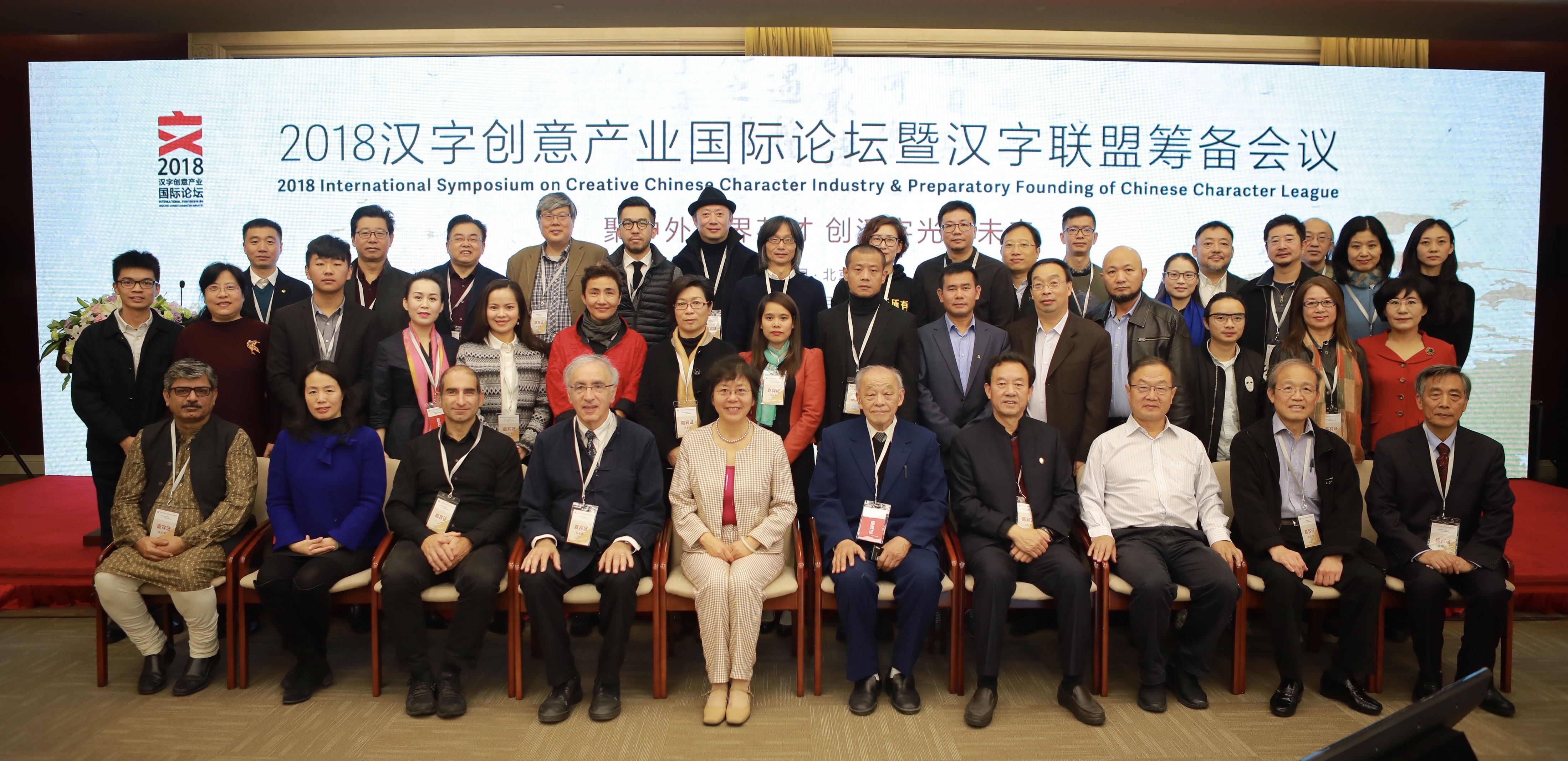
Group photo of the speakers and organisers of the Creative Chinese Character Industry Symposium

The inaugural symposium of the Creative Chinese Character Industry took place at the Beijing Convention Center on 3 and 4 November. The symposium brought together speakers from different areas of research and professional practice relating to the Chinese script: linguistics, Sinology, typeface design, publishing, and calligraphy. The symposium concluded with the preparatory work for the founding of the Chinese Character League, an interdisciplinary body bringing together organisations and agencies, including the Chinese Character Museum in Anyang.

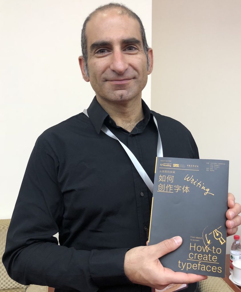
In addition to speaking at the Symposium and being invited to act as guide for the CCL, Gerry Leonidas had the opportunity to update plans for a project, supported by the University of Reading and ATypI, of publishing key typography texts in Chinese. The first title in the series, Jan Middendorp’s Shaping Text, is nearly out of print already; below, Gerry holds the proof edition of the second title, How to create typefaces by Cristobal Henestrosa, Laura Meseguer, and José Scaglione. The series extends to twelve titles, with a schedule of publishing two titles per year.

Gerry Leonidas holds the proof copy of How to create typefaces

Bauhaus typeface revived by MATD student

Adobe’s “Hidden Treasures” programme kicks off the typographic commemoration of the forthcoming centenary of the Bauhaus school by releasing four revivals based on lettering by Bauhaus staff. Drawing on original material in the archives of the  Bauhaus Dessau Foundation, a group of current typeface design students were selected to work on digitising the original lettering, extrapolating the missing letterforms and characters to fill out the required character set, and adapt the designs for digital formats. The fast-paced project was led and supervised by Ferdinand Ulrich and Erik Spiekermann, and included in-person meetings in Berlin and Dessau, online collaboration, and a launch event in New York City.

Ferdinand Ulrich, Hidetaka Yamasaki, and Erik Spiekermann being captured working on the Bauhaus project. Image by Robyn Steffen

Each of the four typefaces were revived by a student from a typeface design course: Hidetaka Yamasaki, a current MA Typeface Design student, worked on lettering by Carl Marx; Céline Hurka from the KABK on letters by Alfred Arndt; Luca Pellegrini from the ECAL on lettering by Xanti Schawinsky; Elia Preuss from HGB Leipzig worked on letters by Reinhold Rossig; and Flavia Zimbardi on letters by Joost Schmidt. The typefaces are released gradually through Typekit’s subscription service to professionals using Adobe’s dominant suite of applications, and are a superb example of archival material inspiring contemporary design.