Category: Lettering in the environment (Eric’s project)

Lettering in the environment

Eyes on the Little Things

Taking Picture from the Surrounding

The Best 3 Images

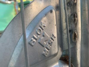
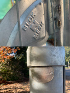
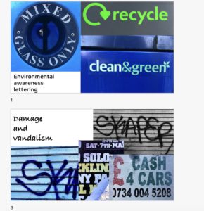
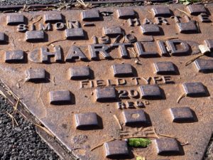
  1. A tiny corner from a mental fence

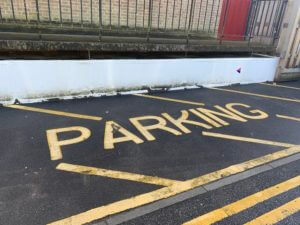
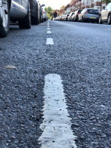
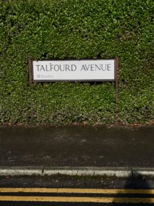
2. The parking label on the floor


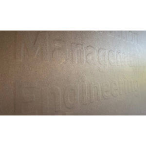
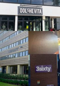
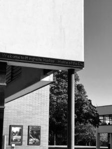
3. The building name of Contraction Management and Engineering

When I was searching around the campus, instead of taking pictures of large scale objects, I chose to look at some converted places. I took the above image from an undertaking area where they fenced up the whole building. I started looking closely at any objects and I found that so interesting I would never see those fonts on the fence if I was not standing in front of it at a certain distance. Not only did the distance matter, the angle of how you observe the thing also affect the look of the font. For example, I took the first picture and the third one in a side approach, rather than facing in front of the object. This way can show the depth of the font and create a three-dimensional effect. I liked how these fonts are carefully and neatly done for the second image. It was also interesting to see which strokes got written first, as the texture of its paint shows the layer of brushstrokes.


Grouping those Pictures in Different Category Orders

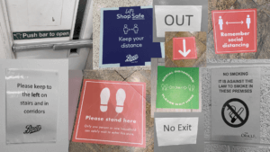
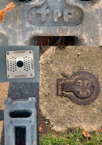
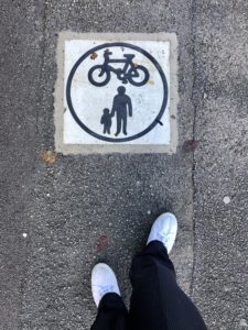
1. Angle (Looking downwards)

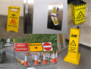
2. Material (Mental)

3. Colour scheme

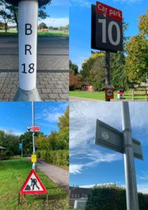
4. Object (Building’s names)

Classifying is an action to grouping up things that share some same characteristics. I tried to find their obvious similarities between each other, such as the first one, all of those pictures are taken in a downwards angle, from top to down, overlooking at those objects. This in fact shows no depth but only plainness. Another example, some images share the same colour palette, the blue sky, the redness from those signs and the green grass.

Self-reflection

This one-day project was really a fun time to experience around the campus. In fact, we seldom have time to hang around and observe things in detail, but today I finally got a chance to have a closer look at anything else in the surrounding. Moreover, I learnt about how letterings corporate with the environment. Some of them with only the intention of decorating purpose, some of them being particularly legible to readers, all letterings have their own function. Overall, it was such an interesting project to do individually or with classmates.

Lettering in the Environment

Lettering in the Environment

lettering in the environment

In Eric’s lesson we explored the campus for interesting pieces of typography. The powerpoint above the stop sign image has all the photos i took in the lesson. I feel as though i could’ve arranged them into better categories.

I enjoyed taking photos of different pieces of type around the campus, this activity also helped me explore the campus further. My favourite image i took is the one above, this is because i like the angle it was shot at and also how the bright red of the sign stands out among the blue background making it the focus point of the whole image.

Opening my eyes to the words around me

Lettering in the environment 

Eric’s task

For today’s mini project, we were asked to go out into the environment, around the university campus or out into town, and photograph lettering that we come across. We were not restricted in any way with what lettering we could take photos of, it could be anything from road markings, to building names and sign posts. Anything that we came across that interested us, we were told to photograph using different angles, lighting and compositions. This task really made me aware of my surroundings and I started to notice little things that I never did before. For example, the fonts and colours, the materials used, the shapes and techniques of the words displayed all around me. Actively seeking different forms of lettering around me enabled me to analyse the typography used to convey a message, instruction or display information and the effect it may have on the reader.

I came back with a series of photographs taken of all different words, phrases and names that I had found. We were then asked to sort these photos into groups of our choice. I chose 4 different themes which linked certain photos together and compared and contrasted them with my group. I found this project to be a fun way to learn about lettering in the environment and I came away feeling like my eyes had been opened to noticing new things.


Bleak, Boring, and Grey

In this project I looked at lettering the environment. Specifically, I took pictures of the greyest, most uninteresting lettering that I could find. Minus the sign on the library, I think I’d rarely notice any of it. This is actually interesting though as particularly with “Altron”, this lettering seems to be in public view but the target audience isn’t necessarily the general public. It’s very unclear as to what the name “Altron” is, so it’s meaningless to most who will see it.

All of this lettering is at a different elevation to the surface it exists on, either being raised above , sunken in, or been punched through. This should make the words more prominent, but really they will me ignored almost all of the time.

My Journey with UOR Lettering

It was a sunny but windy day on Monday and our task for the day was to take pictures of letterings that fascinated us around the campus. After exploring the campus and taking pictures for 2 hours we were then asked to organise the images whatever way we like.

As I explored the campus I didn’t really have any theme in mind however, I found lettering on the grounds really interesting. I took them in interesting angles so the images would not be too flat.

I like the fading of the ground lettering and rusted look of the metal relief these are caused by environmental elements such as air and water and as a result, gives the lettering a more interesting and unique look.

Click the link for  My lettering Composition


Variety in our everyday life

Whilst doing this project, I realised how much of lettering is present in our day to day lives. The different signs, logos and numerals we see around us inform, educate or inspire us in one way or another whether it be through an instructing sign, a warning, or a form of merchandising. Although most of the time it is clear what a sign means, sometimes we need to see the scene around it (the context) in order for us to understand the true meaning. After photographing the pictures, I categorised all the images into 4 sets of groups through collages. Each group follows a set of rules to communicate the intended meaning effectively to the public.

I noticed that especially during this unprecedented time due to the virus, we have a large variety of signs and lettering instructing  us to behave in a certain way. To show this in my collage, if you see below, I have accentuated these specific images by editing the ordinary instructive signs we see in our day to day lives black and white. Nearly all these signs use imperative verbs to not only convey the message across, but to highlight the significance and importance. This is also done through the use of the vibrant, pigmented colours. The font used is predominantly sans serif which makes it easier for the public to read. This conveniency is vital as these signs would usually be placed in any fast-paced environment (e.g. shopping centre, restaurant) where people should be able to understand the message without any hesitation or confusion.

Below are some more of the collages I created with the category labelled.

“Instructing”


“Temporary”


“Branding”


“Advertising/Merchandising”


Exploring Lettering Forms Found on Campus

For Eric’s Project, I captured the different forms of lettering found on the Whiteknights Campus. I aimed to photograph a variety of sign types, ranging from older and more worn signage to new and more pristine examples. On top of this, I wanted to capture different textures and surfaces of and around the signs. I used photographic techniques such as vantage point and depth of field and exploited the light and shadows to create intriguing images. Finally, I presented my selected outcomes on PowerPoint and categorised them into small groups. For example, metal surfaces and peeling vinyl stickers.

MY POWERPOINT:

Lettering in the Environment – TY1DP1 (PDF)