Category: events

Geri Reid: Creating design systems

In week 3 of Spring term, we were joined by design systems and accessibility consultant Geri Reid. Geri divulged information about life not always going the way you expect and the journey she took to be where she is today. Geri’s path is relatable to young people and the struggles that they face, with a positive outcome.


Early life

Geri comfortably shared her experience of parental expectations and the struggle with undiagnosed OCD, leading to her dropping out of school and getting a tattoo. She then chose to travel around the world, flicking between random jobs, with the feeling of being lost and struggling with the sense of being left behind due to everyone around her graduating and getting jobs, while she still worked on understanding what she wanted to do. The Internet came about and had Geri hooked; to this day, it “still feels like magic” to be able to code HTML and create a whole web site. Geri then felt ready to take on Uni and received a BA at UAL, learning how to code and design before working an entry-level coding job. She found success through someone taking a chance on her, and she likes to do the same for undergrads today. She proceeded to work in the UX/UI design field, and reflected with positivity that the job she has today wasn’t even invented until she reached her 40s. Things we study today didn’t exist when she began her education.

‘The job you end up enjoying probably hasn’t been invented yet’ – Geri Reid  

Design systems

A design system is a collection of reusable elements, guided by a clear set of standards, that can be assembled to make stuff.

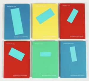
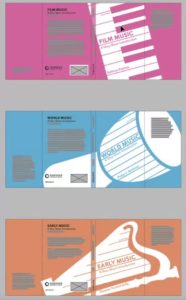
Massimo Vignelli was famous for his redesign of NYC subway signage, a design system he created to aid people through their everyday journeys. Up until mid-1960s, subway signage was unclear and disorganised; signage was overcrowded and overlapping. Vignelli used rational shapes, which are the result of deep cultural sensitivity, with shapes and colours to create an understanding of direction. The work of Vignelli indeed shows a timeless validity housed in its pragmatic, rational, and visually forceful nature.


the1970 New York City Transit Authority Graphics Standards Manual ...

‘Standards Manual’ –  by Massimo Vignelli 


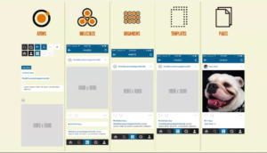
When Geri worked at large companies like Lloyds Bank, she noticed that the headers were never the same size or placement, which made it look like a scam website due to a lack of consistency. Design systems work when you break the designs into small, reusable chunks. This works for all aspects of design, not just UX/UI. An important thing to note is that when you break down the design, each element becomes known as an ‘Atom’; they are smaller components that create larger products. Brad Frost had the idea of atomic design, and to find out more, Geri suggested buying his book, Atomic Design. It stems from the metaphor of small atoms forming into molecules and then organisms to create templates, pages, or products. With further research, it has become known to us as designers that there is a layer before atoms, called design tokens, the foundation of a system: colour, typography, grid, and spacing.


The Atomic design process using instagram example steps.


When working on your design system, you will begin with your brand colours and create a design system ramp, a great website to use that was suggested during the talk by Geri is Leonardo (leonardocolor.io). Good colour contrast is essential for accessibility, this is beneficial to the 2.2 billion people worldwide with forms of visual impairments are able to read the content. Colour Contrast Checker will give you an instant pass or fail result for how well your contrast is working with your background. A useful way of scaling your typefaces for websites comes from free websites such as Typescale – Create stunning typography, generate CSS, and find inspiration. Another website that will be useful to you as a designer is Gridlover it is another free tool that Geri loves to use to help her split up the CSS and show her the underlying grid. A system that Geri helped design and shape herself is the NewsKit design system, made from code libraries to help create news formats for companies like TheSun, etc. NewsKit provides information on how to structure and utilise visual appearance to create fluidity and enables agile project management scheduling for designers, giving them objectives to complete, similar to Padlet for students.


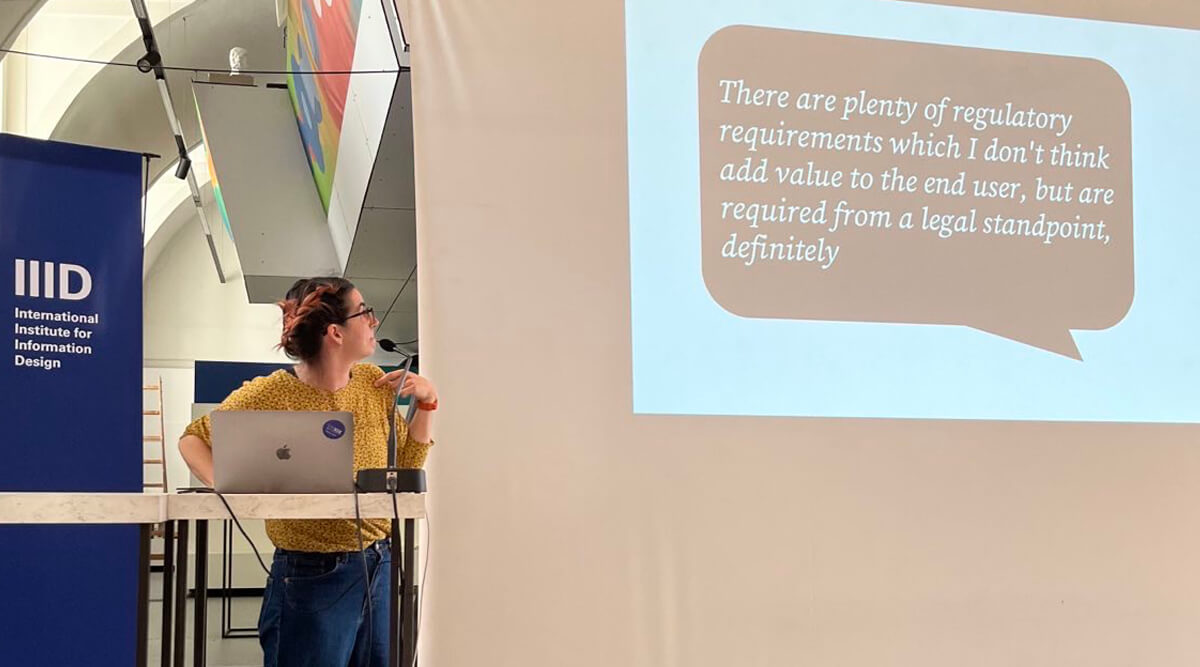
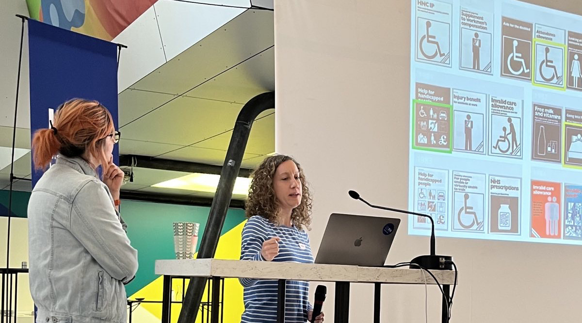
Digital accessibility

It is all about removing barriers that prevent interaction with or access to websites, digital tools, and technologies by people with disabilities. Disabilities are not always visible and can be situational or temporary, for example, a broken arm or being outside with light glare. Geri expresses the importance of being thoughtful with your design. Web Content Accessibility Guidelines (WCAG): Understanding WCAG 2.2 – Service Manual – GOV.UK (www.gov.uk). The four main principles of WCAG  are Perceivable, Operable, Understandable and Robust. Being excluded is like a punch in the gut, and leaving people out does not meet accessibility standards. Ability bias is unintentional and typically typically because we base our designs around ourselves and people we know. You will make mistakes and won’t make a perfectly accessible product the first time around, but this is how, as designers, we learn and improve. Be messy and experiment; before having a system, test and test and test again. Geri personally takes the approach of creating whole screens before breaking things down into her atoms and molecules, especially as some elements are reusable.

‘ You can apply a system to any sort of design’ – Geri Reid.

Below are examples of websites and books Geri shared that are very good at helping you understand and implement accessibility:


geri@gerireid.com

@gerireid


Conclusion

Geri’s talk was relatable and extremely valuable for students of all years, particularly for UX/UI projects. Her presentation was informative, covering her journey, design systems, and accessibility in design. She shared her wisdom and supplied lots of free websites that will be valuable to projects across students studies, and they spoke of wanting to watch the recording again as it was so informative. Geri ended her presentation by saying, ‘Everything you design and build leaves a legacy. Make yours a good one.’


‘Excellent and highly informative. Truly riveting.’  – Part 1 student 

‘Amazing speaker, and relevant to our practice across design disciplines.’  –  Department Lecturer

Feedback Jam: Book Sleeves and Web Design

Greg Bunbury, Josefina Bravo and James Lloyd joined together for Week 9 of Spring term provide their feedback and tips on students current projects, Real Jobs and personal work, offering advice on how to improve and enhance designs for upcoming deadlines and submissions.


American Revolution, Legal History and Politics

Matt from Part 2 shared his current project for the Design Practice module where he is designing a ‘collection’ of books taken from The Oxford University Press’ A Very Short Introduction. With 700 titles to choose from, Matt selected American Revolution, American Legal History and American Politics. His very distinctive focal points, connected all books together with the torn documents treated in the same way in terms of placements and size. He received feedback on this link and tutors questioned whether they need to be handled in the same way or if they can still be impactful with slight differences so that they are all not so uniform. James then showed examples of existing book covers with visually similar designs that are also different. He was advised of the potential ethical issues of ‘tearing up’ historical documents – however this was counter argued for the visually aesthetic look of the piece which was made more of a statement than a solid document and was therefore offered a variety of ways to still hold this effect, such as rolled up or folded paper. Matt was praised for his strong ‘American’ colour scheme and legibility of all three sleeves but was warned of an odd title placement which is quite close to the margin.

Part 2 student, Matt’s book sleeves for TY2DP2 project.
Examples shown by tutors to highlight similar yet different design across a series.

Film, World and Early Music

Also preparing for the submission of the same project, Jasmine showed her book jackets for her selection of Film music, World Music and Early Music. Tutors and students enjoyed the connection between the elements of Jasmines designs, however Greg offered a suggestion to standardise angles of the instruments to create uniformity between the set and so text can sit in the same yet legible way. James suggested that the piano works best and advised Jasmine to consider different instruments which work in the same way as the piano and designed with the same dimensions and the design for World Music appears more realistic than the others. Josefina commented on how the client details were positioned well, such as the barcode and how each page works well when stood alone.

Part 2 student, Jasmine’s book sleeves for TY2DP2 project.

Planets, Stars and the Black Hole

Again, with the same project, Tristan showed his book sleeves for Planets, Stars and the Black Hole to create his collection. Josefina stated how there was good visual impact in the three and how it was interesting to add all three on the inside flap. Greg offered advice to separate the authors name from the publisher as it could appear as misleading being too close to each other and James suggested editing methods within Photoshop to create further definition.

Part 2 student, Trsitan’s book sleeve for TY2DP2 project.

The Village Florist

Next was Part 1, Jony who showed his mobile web design for the Integrated Design module which required two working features using a prototype for an existing website that needs upgrading. Jony chose the The Village Florist and went through the pages of his file explaining how the features would work. Tutors enjoyed the way there was many ways to navigate to one place from a variety of different points such as the burger menu, links and actual clickable images but suggested how the website needs to look more like a website rather than an app in terms of placements and layout. Jony learnt how to connect an element to a certain part of the page instead of just to the top.

Part 1 student, Jony’s web home page for TY1INT project.

The Washbox

Similarly, Mathew showed his website prototype, for The Washbox, a laundry service in Reading, and had features of collection and delivery as well as a walk in facility. Mathew explained the navigation of a user on his website well and was advised by Josefina of the cluttering of elements on his homepage and how to prioritise entry points for different pages with methods such as colour. James suggested the use of alternative imagery to grab the users attention instead of the existing one.

Part 1 student, Mathew’s web home page for TY1INT project.

Conclusion

Drawing the session to a close, students expressed their gratitude for tutors who offered advice on ways to improve their current work.

‘I liked seeing other students work to gain inspiration!’
‘Feedback from different people with different experiences; a chance to show the tutors the work I wanted feedback on but might not have shown otherwise.’
‘Greg, Josefina and James’ advice was really helpful as they’re not all tutors I would usually see.’
‘It is very valuable getting feedback on my word as well as hearing feedback on others!’

Feedback Jam is a great way to gain different perspectives on both professional and personal work and is extremely valuable to being open to constructive criticism and and considering tips on how to progress.

Feedback Jam

Autumn term Feedback Jam, hosted in Week 7 of term with tutors Sara Chapman, Josefina Bravo and Geoff Wyeth was put in place to assist students with upcoming deadlines towards the end of term. A valuable Baseline Shift to obtain extra advice along with tips and tricks on how to improve before final submissions!

Part 3 Students

The session kicked off with Part 3 student, Mia, showing her Publishing Platform module work of her magazine spreads and covers for the chosen topic of surfing for women. This brief was to create spreads for three different articles, as well as interview, contents, and full sleeve cover – for a self-chosen topic. Tutors appreciated the handcrafted typography used for quotes however suggested the width of the stroke may not fit the overall aesthetic a surfing magazine might aim for. Linking to this, Mia was advised to ‘have more fun’ with layout and placements so that it doesn’t appear as linear and is more fit for surfing itself.

Mia’s main article opening spread, featuring hand-lettering.


Mia’s photography article text spread.

‘Experiment, rough it up a bit more!’ 

‘Be bold!’ 


Similarly, Part 3 student Ben presented his magazine spreads for the same project with his topic of graphic novels. Based on the layouts of graphic novels themselves, Ben’s cover incorporates this idea of how image is split to create a more interesting visual element. Both students and staff praised the connection between type and imagery, however felt the grid to feel quite forced and looking like something wanted to fill in every gap. Peers also noticed how the same character was shown in three spreads and and questioned if this was necessary. Geoff enforced the importance of production concerns when placing graphic elements over the centre of spreads which could be lost due to the binding and therefore lead to misalignment, perhaps even causing issues with how information is communicated.

Ben’s ‘Watchmen’ spread.
Ben’s Magazine cover

‘White space is so important!’

‘You want it to be serious but not the same.’ 


Part 2 Students

Second year student, Finn presented his posters for feedback working on a campaign project for sustainable development goals. Using wood type lettering, Finn was advised to consider the spacing between words, as the sentence was read differently than he intended. It showed the importance of hierarchy when placing text on a page.

Finn’s poster design which features wood-lettering , printed  with the help of Geoff.

‘Create a link between concept and message’.


Matthew also presented his work for the same project and received feedback on his image and how effective it is in communicating the message – It risked overpowering or competing with the type. Tutors also suggested the call for action could be amended to exploit the space more, and to visually match the content and what it communicates.

Matthew’s poster design.


Part 1 Students

Finally, first year Ethan showed his work for a book design project where the brief was to format text in either a modern or traditional style and compliment this with a foreword, table of contents and end matter. Discussing indents and spacing, Ethan learned about italics and how this can be used to differentiate between hierarchy of text, for example a letter in which he was presenting within the main body of text. 

Ethan’s book design, looking at formatting a letter within the book text.


Conclusion 

It is so important to gain insight into your work from a different perspective outside the regular classes. Sometimes we can be biased towards our own design or be too hard on ourselves. Fresh insights go a long way. As a designer, we should always be willing to receive new opinions and advice to enhance our current and future projects.

’The session is so helpful!’

‘Even though I didn’t show my work, it’s always great seeing my peers and using similar advice for my own work.’

Greg Bunbury: Ethical design

In Week 8 of Autumn Term, we were joined by Greg Bunbury a Graphic designer and consultant, as well as a sessional lecturer here at Reading. In this session, Greg spoke of real-life experiences, gave the students interactive elements throughout his presentation and really engaged with why ethical design is so crucial to today’s industry.


What is ethical design? 

Greg began by approaching the students with the trolley problem. This warmed them into understanding the most drastic form of moral principle. Greg states that as designers we do not always see the consequences of our ethical choices. Things get complex, and that is why Ethical design is so important.

Ethical design is all about respect – using a broad approach to design products/services or experiences that priorities moral principles/values. Ethical design is not just about something looking good or doing its job–  it must also contributes positively to society. Ethics is considered a route to advocacy and activism but in itself it is a different construct. Ethics can lead to advocacy and activism but that isn’t what ethics is. Most humans have a moral compass allowing them to be respectful and honest. However, this doesn’t stop them from being ignorant when it comes to understanding world issues to allow for ethical progression.

‘Design is about intention not delivery’ – Greg Bunbury

A good guide to follow is the ethical pyramid which represents respect beginning with human rights, leading to human efforts, and onto human experiences. Greg says that ‘ethics is not politics. It is moral human behaviour, a study of right and wrong.’


What is design?
A screenshot from Greg’s presentation explaining what design is.

Why is Ethical design Important?

Unethical design causes harm. Unethical design affects people in many different ways: physically, through financial strain, sleep deprivation, or the taking of personal data. People can feel betrayed by design, and can be affected emotionally and financially. Exclusion by design can be extremely debilitating for some people. For example, making a building inaccessible to wheelchair users by excluding ramps and lifts and disabled toilets is cruel. Design can also be ageist, biased, racist, employee greenwashing, or generally conceal rather than reveal truths.

Dark patterns are a seriously unethical way of mistreating humans basic rights, issues such as hidden costs, opting into handing over data to use their sites, roach motel, forced continuity and covert spam. Design should be clear and ethical and this is the key to great design.

I-can't-breathe-george-floyd-brixton-brotherhood-media-greg-bunbury
‘ I can’t breathe’ billboard designed by Greg Bunbury.

How can you bring ethics into your design work?

  1. Learn what you think – there’s nothing worse than having an opinion but no understanding of why you hold this opinion. People challenge and question you in life and you need to be prepared with why you think what you think.

2. Learn to ask powerful questions – question the suppliers you chose, the printers, your advisors, the images that you choose.

3. Learn to say ‘no’ – If something isn’t right or ethical say ‘no’, avoid dark patterns and choose a better path.

‘WHY?’ is such a strong question to ask yourself and others it challenges us to understand our choices and the choices of others. So next time you go to say ‘yes’ to something think about why your saying yes in a deeper perspective.

Never lose sight of your purpose and values in design.

Conclusion

Greg offered an extremely insightful talk that every student learned from. He made it clear how important being ethical in your design work is and the success to being more ethical. He covered a wide range of topics within his presentation such as the trolley problem is unrealistic and you will not necessarily see the effect that your design has on people but questioning why will be key to being as moral as you can be. Design is so much more than being creative it is about portraying a message, being inclusive and making it user friendly. Greg’s work and words are truly empowering and his passion and honesty in his journey and experience is inspiring to young designers searching for their place in design.


‘ I really liked how Greg highlighted and warned people of the potential mistreatment of freelance designers so that students can be more wary when handling clients should they choose to be freelancers, issues such as no credit of the work or even denying the work you created and not paying etc.’  – Part 2 student 

‘Seeing the emotional side of design and also seeing Greg’s work was amazing’ – Part 2 student

‘Greg’s insight into ethical design should be mentioned much more along this course’ – Part 3 Student 


James Hunter: Insight into magazine design

In week 3 of Autumn term, we were joined by editorial designer and co-founder of Senet magazine, James Hunter. In this session, James talked about his editorial design industry experience as well as his decision to co-found the magazine, based on his passion for boardgames.

Graduation and early career

After graduating from Falmouth University in 2010 with a degree in Graphic Design, James was adamant about not wanting to work for a traditional branding agency. Instead, he began working at the Guardian newspaper where he loved the “buzz of the newsroom”. Later in his career, James worked as an editorial designer for the Times newspaper, where the majority of his work revolved around designing early prototypes of the newspaper’s app, editorial design  work for print, and their magazine. During his time at there, he found the daily deadlines of work exciting, reminding him of his time at university, and motivating him to work consistently – a work ethic that all students could use! This work for daily newspapers inspired him to create his own magazine based on his passion for boardgames. James brought SENET magazine to life, after collaborating with many other like-minded people together to conceptualise the magazine.

‘Make a magazine about something you love, treat it like a magazine, not a business’ – James Hunter

 40 thoughts


The highlight of James’s lecture was his 40 thoughts behind making a magazine. There were many important points that students took with them to apply to their current projects; especially for the third year students who were working on a magazine design project. Point 21 advised students that the design of a magazine should be a response to the content that is being presented for audiences. This directly linked to point 22 which encouraged reading the the copy many times. This is because as an editorial designer the visuals and overall design needs to suit what has been written, therefore reading the copy is integral in helping make content and visuals compliment each other. Another point he emphasised was to ‘approach your magazine with a beginner’s mind, to keep it fresh’, telling students to design with an open mind when making an issue of a magazine as it would create new avenues to explore when designing instead of creating new concepts based on previous work.

SENET is a collaborative project made by James and his other colleagues who help to produce, design and sell the magazine. It is focused on boardgames and the fantasy genre, the aim of the magazine is to appeal to those who already have a passion for boardgames, while also inviting a new audience by producing appealing magazine designs.

SENET has enjoyed a growing circulation.

‘I’ve always loved magazines and always read them’ – James Hunter

Conclusion

Students were given valued advice from James’ talk for developing their projects further as the term progresses. Third year students especially benefitted hearing the 40 thoughts of designing a magazine, providing guidance to improve  their current magazine designs, as well as being able to apply James’ principles to their own work.

‘I really enjoyed how James established his work and career and then transitioned into how that informed Senet magazine. I also liked the level of detail he went into about the magazine that has to do not just with the design but all the logistical, financial, and business sides of self publishing.’ – MA student

‘It was inspiring to hear James’ insight into magazine design,  his talk has been really helpful for the upcoming magazine project.’ – Part 3 student

Toshi Omagari: Videogame typography

In week 2 of Autumn term, we were joined by typeface designer, Toshi Omagari. In this session, Toshi presented a wide range of enthralling videogame typefaces showing how they function to immerse users, along with providing students guidance on how to expertly produce typography for different projects. Followed by an 8×8 pixel type workshop and a fun retro arcade style party!

Arcade typography

Toshi presented many retro arcade typefaces, explaining the evolution of how type was designed since the start of videogames, emphasising the importance of type’s legibility and its interactive elements. His passion for arcade game typography came from Toshi being surrounded by arcade games in Japan whilst growing up. The wide variety of gaming’s colourful and animated type strongly influenced Toshi’s existing interest for fonts fonts and the characteristics of typefaces. This love for typography and videogames inspired him to research and write his book on Arcade Game Typography. The book contains a plethora of arcade game typefaces that Toshi researched to show how type in videogames interact digitally and how type is designed to present messages to audiences on screen.

Arcade Game Typography by Toshi Omagari.

Students were interested in how type has developed over time with the evolution from black and white to a wide array of colours and the introduction of drop-shadows, gradients and the progression of multi-lingual type. Toshi explained that ‘these fonts have been with us the whole time, but there was no comprehensive effort to document them. Maybe because it was not considered a serious subject by professional typographers, or maybe too technically demanding.’ But as he had shown students, there is no subject too broad or niche to explore when researching graphic design, which is comforting information for the part three students writing their dissertations. 

Toshi Omagari analysing pixel typography and how type interacts with the videogame on screen.

Pixel workshop & pixel party


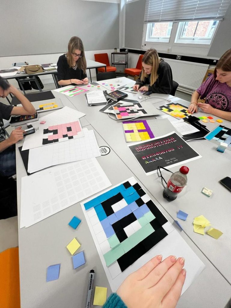
Students were engaged in various pixel typography exercises.

The department held workshops lead by tutors after Toshi’s lecture. Students practiced colourful Lego letter-pressing pixel styled letters, as well as creating fonts using post-it notes where students won some great prizes!

After the typeface workshops, the dance-mats and arcade games came out for a fun night of music, food and drink in the department. From games like Pac-man, Streetfighter and Mortal Kombat, students had an array of games to play while socialising with their course-mates. To conclude, all students and lecturers had an exciting day learning about retro typography and having the opportunity to play some classic arcade games.

Students loved playing all the retro-arcade games!

Conclusion

From arcade game typography to the pixel party, students adored this week’s Baseline shift. Students gained a lot of insight into producing typography along with the fun of playing against their classmates in retro arcade games.

‘His presentation was so intriguing and the passion behind Toshi’s work was incredible! ’ – Part 1 student

‘This Baseline shift was very interesting! I loved it.’ – Part 3 student

MA Communication Design Open Morning: Thursday 25 January 2024

Interested in MA Communication Design? Join us at our Open Mornings and discover our 4 study pathways. Visit the Department of Typography & Graphic Communication, chat with lecturers and current students, and get advice about how to apply.

Dates: Thursday 25 January 2024

Time: 11:00 am to 1:30 pm (UK time)

Where: Department of Typography & Graphic Communication, Whiteknights Campus, University of Reading

THIS IS AN IN-PERSON EVENT

After a welcome from Dr Ruth Blacksell, Department Director of Postgraduate Taught Studies, a presentation about MA Communication Design will focus on our 4 study pathways: Book Design, Information Design, Graphic Design, and Typeface Design. This will be followed by a walk around the Department and a look at our studios, special collections, and printing workshop, ending with a tour of the current Department exhibition.

Contact email: typography@reading.ac.uk

Register here to attend

Before that, discover more about our Master’s programmes and see our students’ work

Testing beyond Covid: Our point of use instructions at IIID Vision Plus 2023

At the 2023 IIID Vision Plus conference, Josefina gave a presentation about her, Sue Walker, and Al Edwards’s work on the project ‘Information Design for Diagnostics: Ensuring Confidence and Accuracy for Home Sampling and Home Testing’, which looked at the design and usability of instructions for point of use Covid-19 lateral flow rapid tests.

The talk focused on Josefina and Sue’s experience of applying the research findings and the design approach to a set of documents explaining how to use a test for viral flu. The team developed a toolkit to support the creation of point-of-use instructions, taking account of views from diagnostic industry members to inform an understanding of how instructions are produced currently and what guidance might be helpful.

A person presenting at a conference with a presentation slide behind them

Plus, the IIID award ceremony closed the conference, and Josefina won an award in the Healthcare category for her work with CwPAMS on their Antimicrobial Stewardship Toolkit. Congratulations to Josefina!

Design that cares? – IIID Vision Plus Conference 2023

Healthcare was the theme for the 2023 IIID Vision Plus Conference, held in the Design Forum in Vienna. Rachel and Josefina gave a joint talk about their ongoing work looking at documents from the Forms Information Centre Collection held at the Department of Typography & Graphic Communication. The documents were produced by the British government in the 1970s–80s to guide citizens in navigating public services. These services included claiming benefits, accessing healthcare, supporting disabilities, and help for those with caring responsibilities.

Presenting at the conference was a good opportunity to share examples of healthcare-related documents that are held in this unique collection. They shared a brief timeline of what was happening during the time that these documents were being produced. They then shared examples of document design that were of particular interest during their initial work. These include how symbols, pictograms, and illustrations were used to communicate healthcare topics, and how colour and layout helped people understand their options and take steps to access public services.

Two people presenting at a lectern with presentation slide behind

MA Communication Design: Open Morning 2023

Interested in the MA Communication Design? Join us at our Open Morning and discover our 4 pathways. Visit the Department of Typography & Graphic Communication, chat with lecturers and current students, and get advice about how to apply.

Date: Tuesday 25 April 2023, 11am to 1:30pm (BST)

Where: Department of Typography & Graphic Communication, Whiteknights Campus, University of Reading

After a welcome from Dr Ruth Blacksell, Department Director of Postgraduate Taught Programmes, a presentation about the MA Communication Design will focus on our 4 pathway routes: Book Design, Information Design, Graphic Design, Typeface Design. This will be followed by a walk around the Department and a look into the studios. In a Show and Tell session, you will get a glimpse of our special collections. We will close the morning with a tour around our current Department exhibition.

Interested in attending? Register here