Part 3 student Ben Brown's TY3DP3 magazine project.
Feedback Jam
Autumn term Feedback Jam, hosted in Week 7 of term with tutors Sara Chapman, Josefina Bravo and Geoff Wyeth was put in place to assist students with upcoming deadlines towards the end of term. A valuable Baseline Shift to obtain extra advice along with tips and tricks on how to improve before final submissions!
Part 3 Students
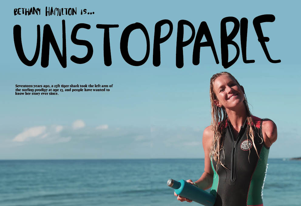
The session kicked off with Part 3 student, Mia, showing her Publishing Platform module work of her magazine spreads and covers for the chosen topic of surfing for women. This brief was to create spreads for three different articles, as well as interview, contents, and full sleeve cover – for a self-chosen topic. Tutors appreciated the handcrafted typography used for quotes however suggested the width of the stroke may not fit the overall aesthetic a surfing magazine might aim for. Linking to this, Mia was advised to ‘have more fun’ with layout and placements so that it doesn’t appear as linear and is more fit for surfing itself.
Mia’s main article opening spread, featuring hand-lettering.
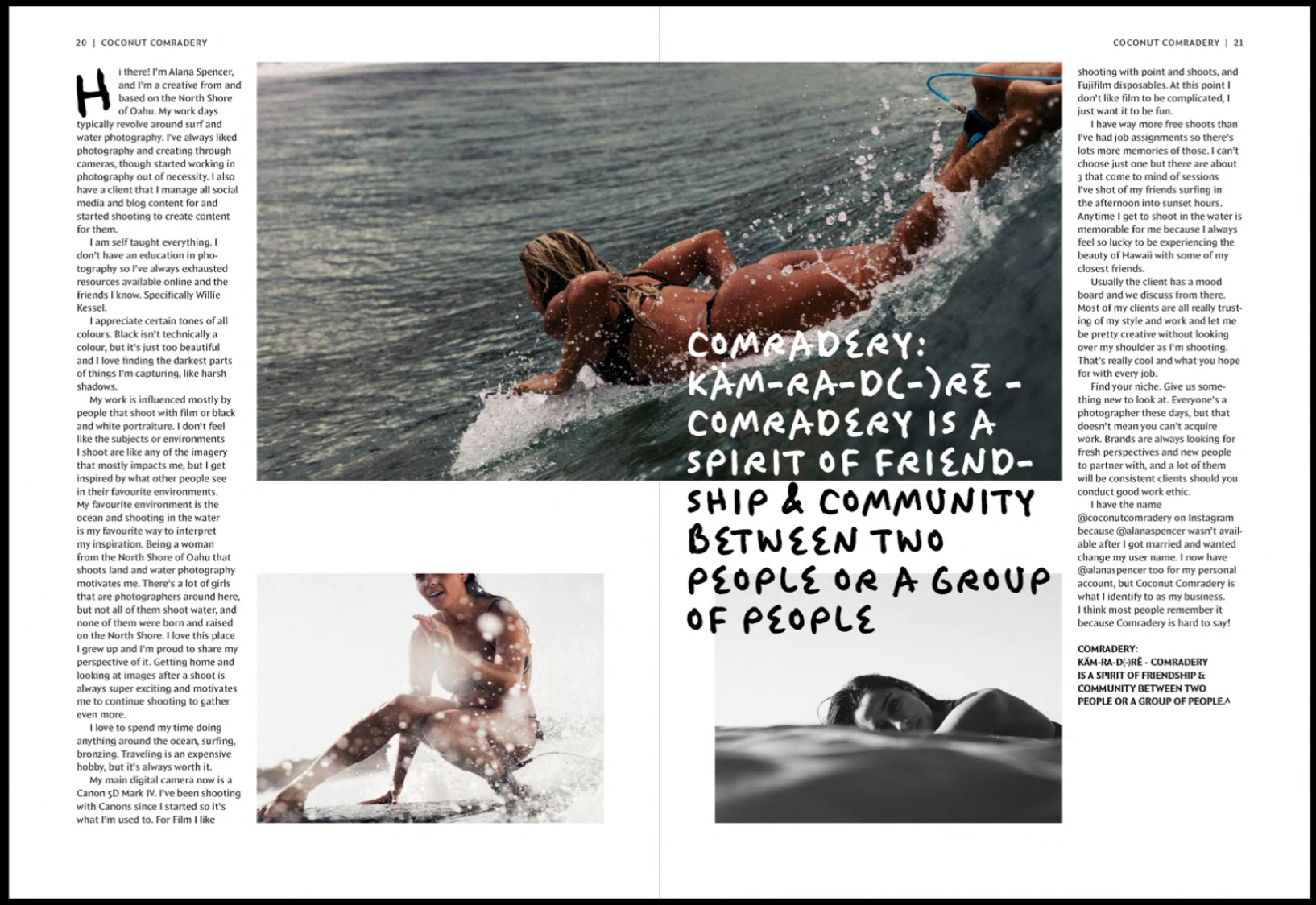
Mia’s photography article text spread.
‘Experiment, rough it up a bit more!’
‘Be bold!’
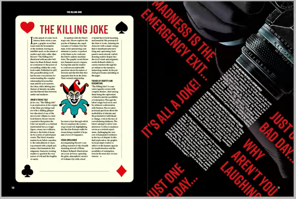
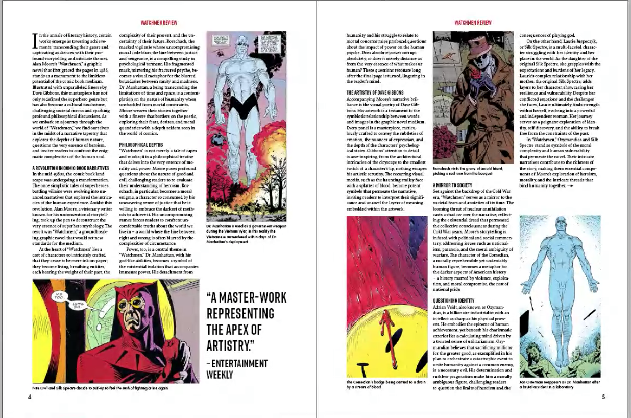
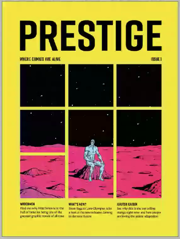
Similarly, Part 3 student Ben presented his magazine spreads for the same project with his topic of graphic novels. Based on the layouts of graphic novels themselves, Ben’s cover incorporates this idea of how image is split to create a more interesting visual element. Both students and staff praised the connection between type and imagery, however felt the grid to feel quite forced and looking like something wanted to fill in every gap. Peers also noticed how the same character was shown in three spreads and and questioned if this was necessary. Geoff enforced the importance of production concerns when placing graphic elements over the centre of spreads which could be lost due to the binding and therefore lead to misalignment, perhaps even causing issues with how information is communicated.
Ben’s ‘Watchmen’ spread.
Ben’s Magazine cover
‘White space is so important!’
‘You want it to be serious but not the same.’
Part 2 Students
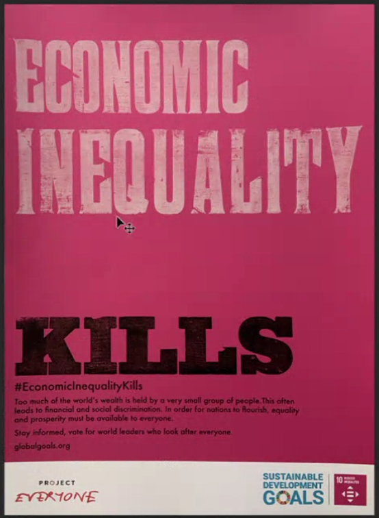
Second year student, Finn presented his posters for feedback working on a campaign project for sustainable development goals. Using wood type lettering, Finn was advised to consider the spacing between words, as the sentence was read differently than he intended. It showed the importance of hierarchy when placing text on a page.
Finn’s poster design which features wood-lettering , printed with the help of Geoff.
‘Create a link between concept and message’.
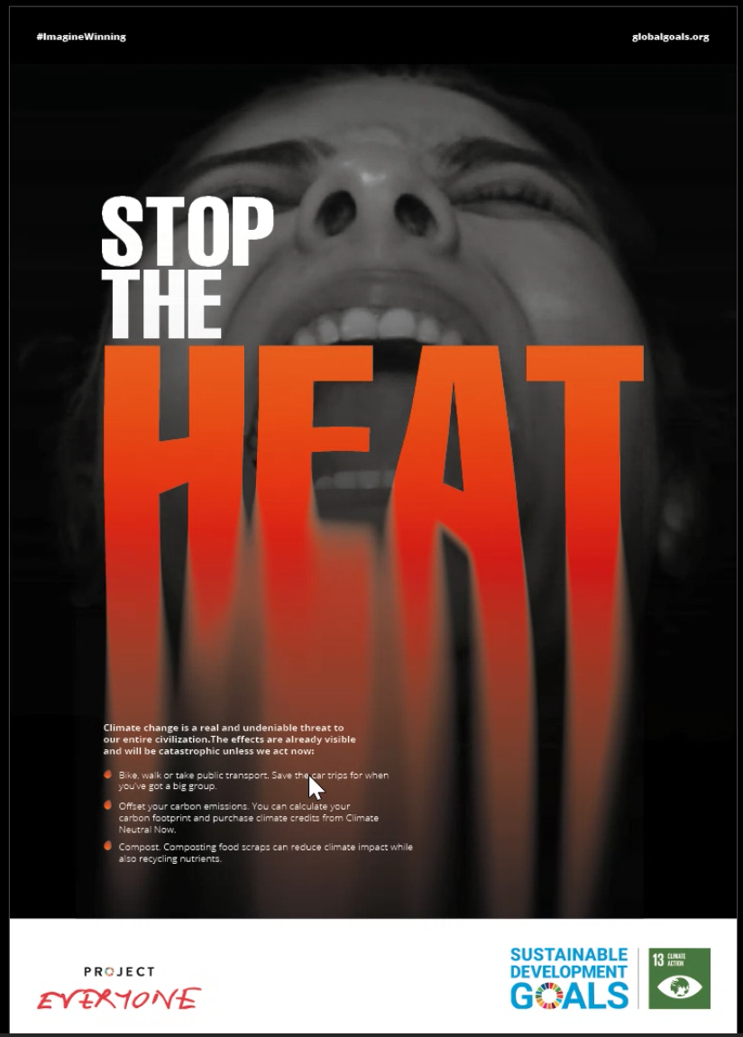
Matthew also presented his work for the same project and received feedback on his image and how effective it is in communicating the message – It risked overpowering or competing with the type. Tutors also suggested the call for action could be amended to exploit the space more, and to visually match the content and what it communicates.
Matthew’s poster design.
Part 1 Students
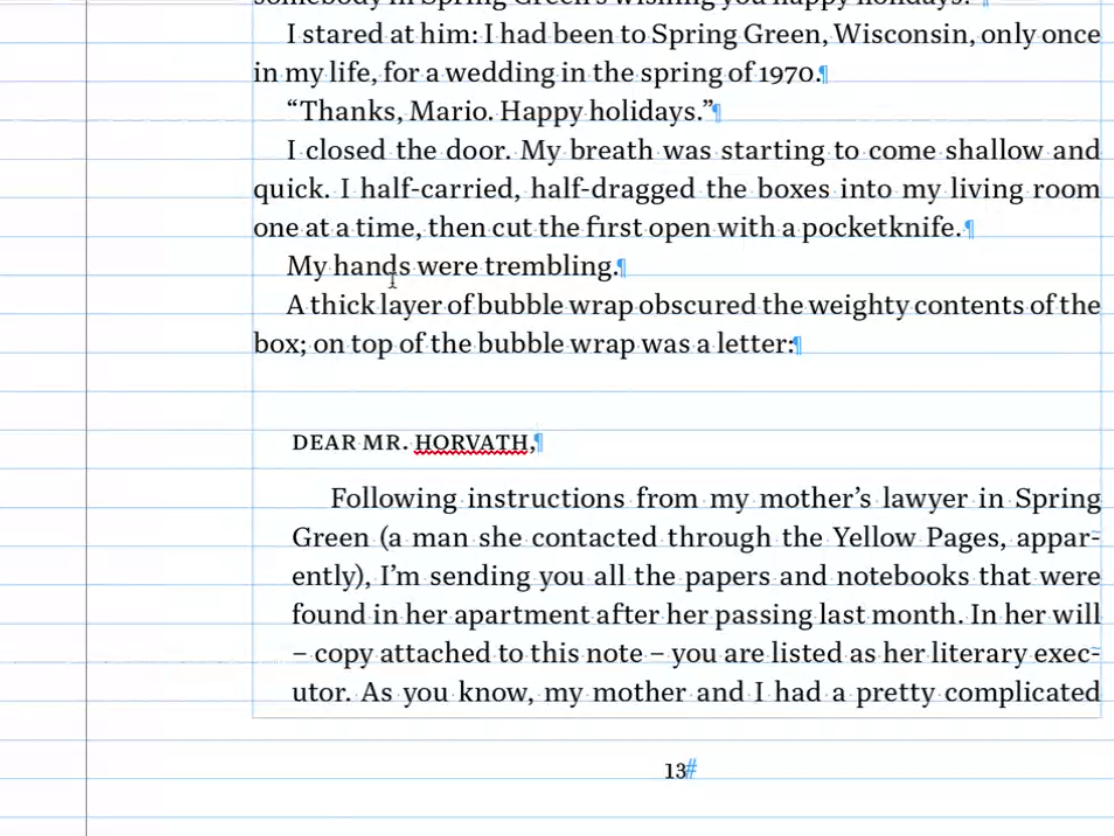
Finally, first year Ethan showed his work for a book design project where the brief was to format text in either a modern or traditional style and compliment this with a foreword, table of contents and end matter. Discussing indents and spacing, Ethan learned about italics and how this can be used to differentiate between hierarchy of text, for example a letter in which he was presenting within the main body of text.
Ethan’s book design, looking at formatting a letter within the book text.
Conclusion
It is so important to gain insight into your work from a different perspective outside the regular classes. Sometimes we can be biased towards our own design or be too hard on ourselves. Fresh insights go a long way. As a designer, we should always be willing to receive new opinions and advice to enhance our current and future projects.
’The session is so helpful!’
‘Even though I didn’t show my work, it’s always great seeing my peers and using similar advice for my own work.’