
The perfect gift. My partner for the project gave me three interesting facts, these facts were that he like F1, met Richard Branson before, and that he has four siblings. A had a couple ideas, but my first thought was to make a racing car for five people, which ending up looking almost like a sort of space shuttle. I wanted to include something about Richard Branson as well, he owns a lot of airlines, and the label that owned The Rolling Stones, so I thought to name the car ‘The Rolling Stone’. With a bit more time I would’ve made the car a bit more detailed, or added colour to car, probably focusing on black and red.
Author: ScarlettColquhoun
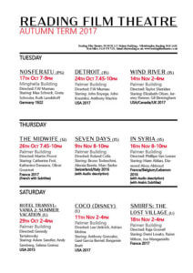
My Film Flyer
My cinema brochure. I experiment a bit with different layouts when it came to making my brochure, however will admit to going a bit off the brief as I wanted to explore looking at a design with the days at headings, as I noted that Tuesday, Thursday and Saturday were the days of film showings. I actually was quite happy with the final outcome, using black, red, and white for the whole colour scheme, as we were told we could add in just one more colour. I chose red of course, as it matches with the feel of a cinema and the red carpet. I do wish I’d perhaps used a bit more red, or had the time to create some kind of logo that linked with the key colours to link my brochure together a bit neater, and a logo always helps to look more professional or branded.
I used different fonts to help separate text, and messed around with using bold as well, as way of highlighting which films had subtitles and audio description, I didn’t want to make this detail too over powering, but enough that it clearly stands out for the reader. I used the red to highlight dates and times, including the ‘Autumn Term 2017’ at the top. As in my opinion, making sure the dates and times are clear, is one of the most important aspects, because if the audience can’t even tell when a film is showing, there is no way they’ll bother to book a ticket.
I definitely could have improved on my design in a could ways, such as at second glace I note there is spacing on the top row, and could have been made to be a lot more even. I did actually enjoy this task more than I thought I would, but to improve would next time want to add some small graphics or illustration.
Font Finding
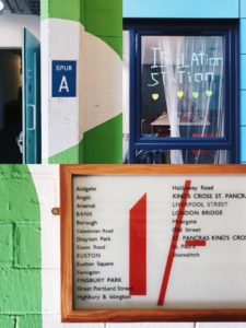
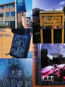
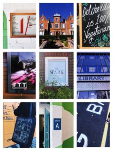
For Eric’s lesson on Monday we had to find lettering in our environment, eg around campus.
We got lucky with the weather being very sunny, and clear blue skies, as this meant a lot of light in our photographs, and a bright sky that on occasion helped add to the photo. I found signs, graffiti and stickers posted about campus. I also took a couple photos of the lettering in the typography department, however kept my focus to signs outside.
When it came to grouping our photos together and finding a common theme in them, my photos in honesty didn’t have much in common, when it came to font, topic, wording, or even colours. So I did create a collage of some of my favourites, editing them to have a common ground with yellow, blues and greens. And one similarity I did find between a couple photos was framing, where the type had been framed by a certain material, to be the centre of focus, such as, a window, wooden frame, or created on board and centred on a thin wall, giving it a frame.
After this project I will make an effort to look for more lettering in the environment, why it is used, and how communication varies from a sign being instruction (stop, slow down, caution. In bold capitals with bright warning colours). To creative welcoming advertising, for cafes or restaurants that use blues, or black and white for a professional sleek look.
My name and finding ways to shape it
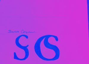
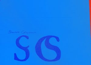
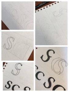

Creating a monogram. Today we took the time to experiment with making a monogram out of our initials, my initials being S and C, meant I did at times find it difficult to draw, and keep as clean cut at possible, however the curves in both letters meant I had a wide range of experimentation to do fitting the letters with each other. I started by just sketching the letters themselves and becoming familiar with their shapes. I drew them as both lower case and upper case. I then did a load of rough sketches on a piece of paper on how they could fit into one symbol and decided on two designs to make a final clean copy of.
I chose two designs, and each one containing where the S or C was large (being the letter that had the hierarchy in the design). The first design has a capital S, with a lowercase c in the top of it, I liked this design for its simplicity, and at first glace it almost looks like a normal S. The second design was a large C with the S fitted inside of it, I think this design was my favourite, just for how well the two letters fitted together, and I feel like it would be a good logo for a company to do with water (just as it looks like a drop of water in the centre). I manipulated the S slightly to make it fit better, and cut off part of its tail, but overall was quite happy with the outcome.
Lastly I experimented with a bit of colour using an app on my phone, just to see how they would look with different colour choices, but I still personally prefer the black and white.
The Signs of COVID-19
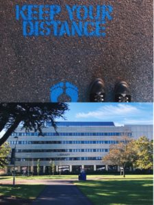
Today we were told to source signs made about COVID-19, signs made online, around us, at campus, homemade, government made and even asked if we had made anything ourselves. During lockdown I was bored and spent a lot of time on walks, and when doing so I would look for homemade signs around my town, so already had a few of these. I also found signs in our halls, on our stairs, our pin board, around reception. Then looked for government official posters, and NHS ones online, finding a wide range in total of things to look at and observe.
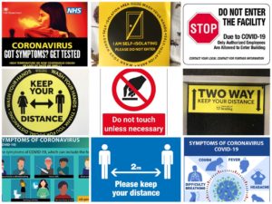
One key thing I noticed was the use of yellow, red and black colours, to draw attention and for a high level of contrast. Red and yellow are all associated with danger and warning signs so its easy to recognise. The use of bold founts and capitals letters was also very common, and the people sign(you see at airports and on toilets) with arrows between them, keeping them apart, recognising it as being government official from just the people sign, and a visual short hand communication that tells the public to all keep a distance from another.
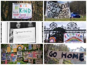
A key point that we talked about in the class after as well was the lack of imagery on the posters, and how they were so impersonal. Compared to for example the packing for smoking, where they show coughing up blood, blackened lungs, and a baby inhaling smoke, the covid-19 posters showed very few side effects, no emotive imagery, no one ill or in pain or dying. Which did relate with how many people also feel, as if the situation hasn’t been taken seriously enough, the posters also correlate with that feeling, where they blend into road signs and street signs, they are so easy to walk past that they give no sense of danger anymore, and don’t properly symbolise the severity of the situation.
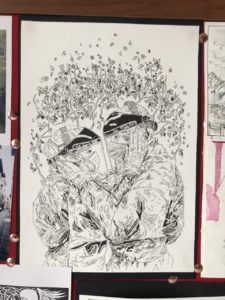
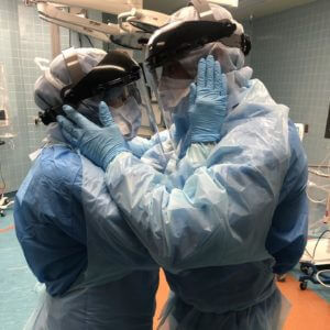
I did in my own time an illustration of an image during lockdown, of a husband and wife, both nurse anaesthetics getting ready for a shift with COVID-19 patients on the airway team. In the image they are both geared head to toe in plastic, and masks, and screen, and gloves, and holding on to another’s faces to say their goodbye, and good luck, right before their shift. The image for me struck how hard it must have been for your loved one to be sent to work, and to not know if they were going to get ill, how long they’d be ill for, and if they’d, like many others, be a number on the news death toll later that month. I can’t imagine how so many families managed to cope with isolating from loved ones for months on end for their job, and the awful things they would’ve had to see at their work, and the conditions that the NHS staff must have been put through. Wearing a mask, and keeping a distance, should be encouragement enough for people to comply with guidelines, and I wish they had used much more emotive tactics, in their signs, cause signs can be so powerful, to make more people take the situation much more seriously.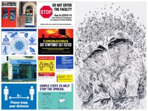
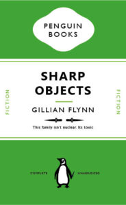
Sharp Objects (and a dangerous penguin)
I chose to recreate the front cover for one of my favourite books, being ‘Sharp Objects’ by Gillian Flynn, the book is an excellent read, dark, twisted and clever. The line on the front of the book I even love ‘This family isn’t nuclear, its toxic’. It’s a fun play on word with ‘nuclear family’ and chose it for my design. I changed the colouring of the book to green, to try and go for that slightly toxic look, however, wish I could have gotten the colour a bit more acidic looking, but still wanted it to fit with the classic penguin look. I chose to change the bottom short green line to two knifes, a very simple design, just adding in the ‘sharp objects’, and if you look closely you can see that the penguin himself is holding a tiny knife behind his back, all connecting to books name and story.
Money (makes the world go round)
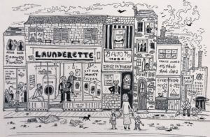
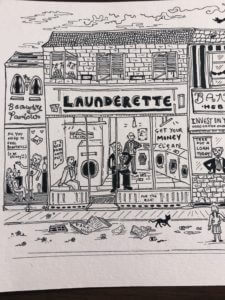
My word to focus on was Money. My design made up one piece in total, but had two very contrasting sides to it. One where those with lots of money are happy and busy being greedy. I drew inside the laundrette Donald Trump, Jeff Bezos, cleaning their money, a play on the term money laundering. Also it has a beauty parlour on the very left, containing only beautiful, slim women, that promise ‘beauty’.
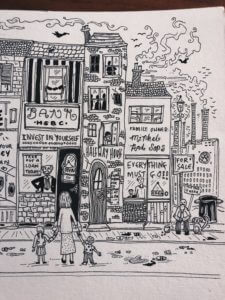
On the other side we start to see HSBC bank in the middle, a bank known for some very corrupt deals, including money laundering in Mexico, taking money from drug lords who were destroying the community and many families lives. (As seen the programme ‘Dirty Money’, I also make a reference to the Volkswagen on the far right with their factories polluting the air and sky above, followed by hundreds of black crows, a symbol of death or tragedy).
The centre of my piece shows a single mother and her children, standing outside a bank ready to take out a loan. Banks often pay out loans, that people will never be able to pay back, and are set back for years by interest that they can’t afford, all of which keeps rolling the ball of capitalism. Putting people like the mum and her children, in a very vulnerable spot. In the UK there is approximately 1.8 million single parents, and 90% of them are mums. And there isn’t much help or support for those struggling to keep the balance, of work, childcare and money.
On the very right is a homeless man, the whole street starts to slowly decade as you look down it, representing the poverty chain. Money is now how we measure success, and is what runs our high street, our banks, laundrettes, and everything basically.
A Noisy Book
Broken Narratives
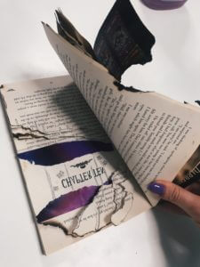
Noise
I chose at first to pick noise when experiment with our broken narratives project. I start first by tearing pages, cutting up words, doodling inside the book, to try and make it look chaotic, however, I was not satisfied with the results, and thought it didn’t look half chaotic enough, or exemplified a noisy book, or a noisy writer, where the story was almost trying to escape the book.
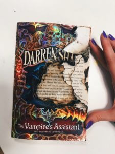
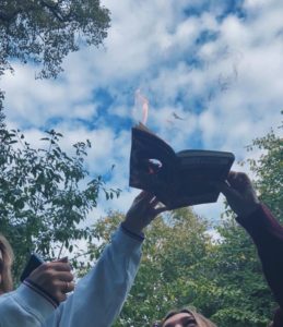
After some experimentation, I decided with a bit of help from my flatmates, to try and burn a hole through the book, starts with ripping out the centre of the first few pages and the cover, and as the front of the book is also covered in plastic this created a bubbling texture over the front. The book itself was a fantasy book about vampire hunter, which is what sparked the inspiration for setting the book on fire(as vampires, as we all know, burn in the sun). The colourful sheen of the front was magnified after the burning process, and made it look a lot more mystical in my opinion and created layering in the pages due to where the burning took, creating a very charred edge to it as well. I also included a picture of the process, where you can much more clearly see the hole now in the middle of the book while it’s still on fire.
(I also kept jug of water nearby for when necessary during this project).