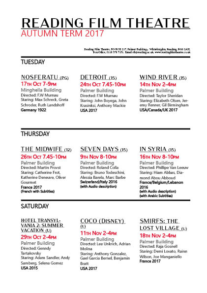
My cinema brochure. I experiment a bit with different layouts when it came to making my brochure, however will admit to going a bit off the brief as I wanted to explore looking at a design with the days at headings, as I noted that Tuesday, Thursday and Saturday were the days of film showings. I actually was quite happy with the final outcome, using black, red, and white for the whole colour scheme, as we were told we could add in just one more colour. I chose red of course, as it matches with the feel of a cinema and the red carpet. I do wish I’d perhaps used a bit more red, or had the time to create some kind of logo that linked with the key colours to link my brochure together a bit neater, and a logo always helps to look more professional or branded.
I used different fonts to help separate text, and messed around with using bold as well, as way of highlighting which films had subtitles and audio description, I didn’t want to make this detail too over powering, but enough that it clearly stands out for the reader. I used the red to highlight dates and times, including the ‘Autumn Term 2017’ at the top. As in my opinion, making sure the dates and times are clear, is one of the most important aspects, because if the audience can’t even tell when a film is showing, there is no way they’ll bother to book a ticket.
I definitely could have improved on my design in a could ways, such as at second glace I note there is spacing on the top row, and could have been made to be a lot more even. I did actually enjoy this task more than I thought I would, but to improve would next time want to add some small graphics or illustration.