Category: Penguin cover (James’s project)

Penguin cover

The Day of the Triffids

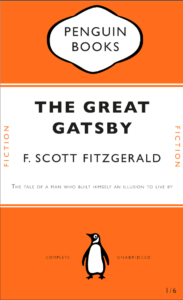
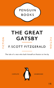
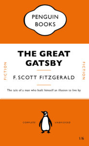
As a class, we all had to design a penguin classic book cover in Adobe InDesign and learn about the different elements that go into designing them. This was very useful as I’m a beginner in InDesign and don’t have any experience of even looking around the software. This project helped me in learning all the essential and important tools used in the software and as well as certain shortcuts we could use to make our work more fast and efficient. Overall, it was an enjoyable project that I could learn a lot from.
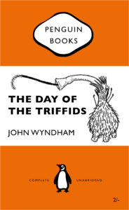
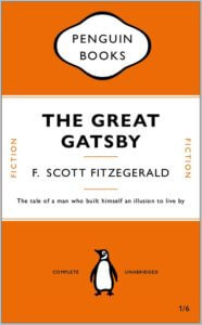
Based on learning the new skills from making the penguin classic book covers, we were told to create a new book cover of our own choice, and I went with another penguin classic book cover. Similar to the Great Gatsby cover, I had used a similar layout and had used the same font, Gill Sans, for all the words. However, in mine, I had also included an illustration that I had drawn separately in my iPad using the Ibis Paint X app and had saved and transferred the file as a png on my laptop. I had then laid out the png on the book cover and positioned it accurately on it. Overall, I found the whole process easy, except for making the cartouche which I struggled with a bit in terms of positioning and laying it out properly, but I believe I will eventually get the hang of it as I practice it more in the future.

Here are the links for a clear version of the two book design covers:

Penguin Classic

The day of the triffids

Charlie and the Chocolate Factory


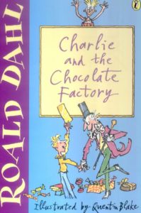
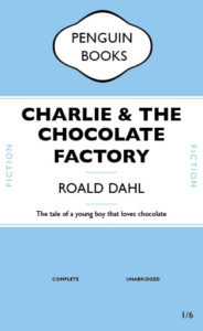
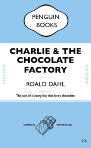
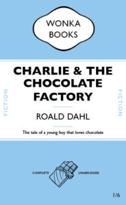
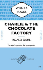
This is my “messed up version” for the penguin book cover brief. I chose Charlie and the Chocolate Factory as it is a well known classic in the novel world. I selected this light blue to be the main colour of the cover because the book cover I remember seeing as a child was mainly this colour (see above). I wanted to keep the general layout the same so didn’t swap around any of the features but I did exchange the penguin for a chocolate bar outline, which reflects the storyline. I chose to use an outline for the chocolate as opposed to a filled in version as it is lighter so suited the lighter writing it was placed with well. I also changed the publisher’s name to ‘Wonka Books’ as one of the main characters in the book is Willy Wonka. Finally, I added some repeated text to the top blue rectangle. The writing contains some of the peculiar sweets Wonka has in his factory. I selected a slightly darker blue for the text as I wanted it to stand out but this way I still stuck to my colour scheme. I think doing this created depth and texture, and also a contrast with the simple, blue section at the bottom.

CCF Book Cover 04

The Little Prince


Inspired by the penguin book cover, I create my messed up version for the famous fiction storybook ‘The Little Prince’. I did quite a lot changes from the penguin book to make it more mordernism, but still remain the basic font and elements. There are few insprations and variations compare to original penguin book in my design:

  • same font of Gill Sans Nova and paragraph style are adapted, while the headings are in wider tracking to fit with the childlike story, also used italic words in the book descriptions to emphazise the sentences
  • changing position between the author name and book title, so as to try emphasize the both maybe
  • illustrations of the little prince and fox are added to make it more appealling and visualize the story plot
  • the logos of penguin book are put in the right hand corner as it can grab less attension and let audience focus on others main elements

To review my book design, I could make it better by showing more influences from the penguin book, as it now looks a bit different from the original one. For example, making  funny variations to the penguin logo by adding the crown from the little prince, etc.

In these mini Indesign tasks, I realized that designing a simple book cover is much harder then normals expected, as there are so much to decision and progress go through with the layouting of text, as well as graphic to best communicate ideas. It is easy to mess up by making it looks too empty or complicated, and lot much to be considered. For now, I felt more respectful for the book designers and still have a long journey ahead to design like a pro.

The Cat In The Hat

For my Second book design we were given the instructions as followed…

  • Sticks to the basic rules of your first classic Penguin
  • Introduces new elements, or alters existing elements to create something funny / witty / insightful / relevant to the content or nature of your chosen book.

For this book cover design I chose to do ‘The Cat in the Hat’ as this was one of my favourite books as a kid. I stuck with the Penguin classic design but with my own twist. I chose the blue background colour for the base as this is the colour that the original book comes in. I also changed the font type to be more fun and in an unorganised arrangement as this is meant to be a book to attract kids.

I also added some Cat in the Hat features such as the well known hat and bow he wears and applied this to the penguin logo icon.

Fault in our Stars & Penguin

This is my Penguin book cover created using James’ online tutorial. I used Gill Sans font instead of the Gills Sans Nova font James suggested in the video. Unfortunately I had some trouble inserting the small orange lines upon and below the authors name, therefore I had to miss out this step however I enjoyed doing the rest. I enjoyed learning about paragraph styles and thought this video was a good introduction to InDesign, a software I had only previously used once. If I could change anything about this cover, I would change the cartouche at the top of the book. I think I could have rounded the black a bit more instead of leaving it a little pointy.

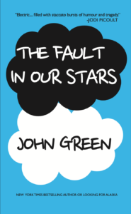
For my second book cover I chose John Green’s ‘The Fault in our Stars’. I chose this book because it’s such an iconic cover that everyone knows. This book design was also similar to the Penguin one as it involved creating circles to build up the cloud, similar to the cartouche from the Penguin book, a step i thought i needed to improve on. Unfortunately, I could find an exact match to the font used on the original cover which is chalk styled. So instead I went for a similar child-like style to try and fit the theme.

As I Walked Out One Midsummer Morning

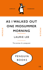
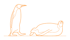
This is my messed up version for the Penguin Book Cover brief. ‘As I Walked Out One Midsummer Morning’ by Laurie Lee was my book of choice. My first edit to the original cover was to shrink the size of the title to make room for the longer title – this created more space around the type which makes it slightly easier to read without your eyes running off the edge of the cover. I kept the layout of the text the same but played around with other elements of the design. I swapped around the Penguin Books logotype and penguin illustration as I thought the logotype made the cover look top-heavy (it looks more balanced being bottom-heavy). To add to this effect I decreased the height of the orange space at the top. This also makes the design look less centred. My final tweak, to link the cover to the content of the book, was to change the penguin illustration. In my vector graphic version of the penguin I changed two things: I made him appear to be walking to represent the long journey Lee embarks on, he is also carrying a violin – an iconic item Laurie Lee took with him.

PDF version: Penguin Book Cover Laurie Lee Version

Reference Images for penguin:

Harry Potter

Harry Potter and the Goblet of Fire

I found this session because I’ve not used InDesign before, so it was a good introduction to the program and the tools it provides. I liked the usefulness of the paragraph styles and swatch styles and utilising these for recreating the same layout with different text made it so much easier.

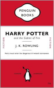
For my ‘messed up book’ I did Harry Potter and the goblet of fire. I used one of the original cover designs for the book and took inspiration from the colours used and the image of the dragon on the front and tried to incorporate these into my design, using both the red and blue colours on my creation and also using illustrator to create the appearance of a small fire coming out of the penguin images mouth.