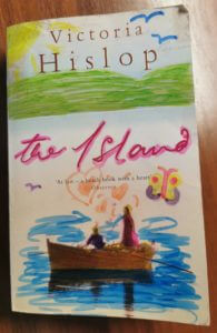
Category: Broken narratives (Berta’s project)

Broken narratives

Never ending narrative

Brief:

A client has written a novel and asks you to work on the design of the book. He wants you to develop a concept that enhances and brings forward the visual dimension of the story. He does not request a traditional design, but a book that helps to develop the narrative through its form and materiality.

  • Loop: a man picks up a novel and starts reading it sitting in an armchair with his back to the door. He sinks into the novel, in which a man and a woman meet in a cabin. They are lovers, but their attention is focused on murder: the man is going to kill the woman’s husband. Following her instructions, knife in hand, the man goes inside and sees his victim: a man who is sitting in an armchair reading a book with his back to the door.

Process:

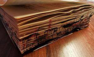
  • I had the idea to glue the two covers together to simulate the never ending narrative of this storyline, then to draw or cut an impression of the man reading in his chair throughout the pages. However I found that the binding of this book was quite strong and so rather than the pages spraying open evenly in a circular way when the covers were pulled together, instead few of the pages followed. This was not the desired effect so I experimented with removing the cover and slicing strips down the glue of the spine. I hoped this would give it more flexibility and allow the pages to look like one continuous loop. This proved quite difficult to execute and drastically weakened the spine so I decided to adjust the design.
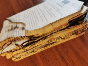
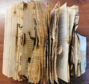
  • Instead I started to cut away the pages to develop a portrait of a mans face. At first I was cutting very carefully a group of pages at a time. But this meant I  had the same design running through the whole book. I quickly realised I could easily carve the pages, as if shaving cuttings off of wood, which made the face more 3D. I played with a few different ways of bringing shape and definition to the face also through using layers.
  • My initial idea imagined a complete head cut out to look 3D, so I had to keep in mind that this would be more of a slither of the centre line down a mans face. Being the section of the face with many main features I was confident that the shape would still be legible and reflect that of a portrait. My ability to bring in definition and round shape was a slightly limited due the thickness/thinness of the book. To adapt to this I cut some block layers from the front and the back of the book for more stark and abrupt shaping. I really like the effect of this, especially when it is played with the light.

Reflections:

I really like how the light plays with the shapes of the pages in this book to enhance the design and mirror the storyline. As each page is turned, the shadows echo the message of the book and the intended design. To further this design I would like to explore the impact of colour and shading applied directly to the pages to make each page turn more intriguing to turn. This would also aid in bringing more detailed definition to the structure of the face.

Looped Labyrinth:


In today’s project, I attempted a few iterations of ideas. My first idea was to create some kind of pop up labyrinth/castle through a template I acquired through https://www.youtube.com/c/JRpapercraft with a few of my own ideas to represent the family lost in the house presented in the labyrinth story. However, the creation of the said idea was scrapped as the detail needed for the castle was too great and I did not have the correct resources to finish the job (my knife for precision cutting was to blunt and I had no tweezers).

Never the less I came up with the idea of merging both the labyrinth story and the loop story together to create a trapped like event where the characters of the novel are trapped in the pages of the book – as were the family in the labyrinth – and the supernatural feel of the book sucking the character into the pages – as was the man in the loop. The eyes at the end of the portal are also used to represent the discovery “that they are not the only ones lost in the impossibly infinite labyrinth” as written in the labyrinth story.

Obsessive behaviour

Can a book tell a story without words? Or do we need the words in order to call it a book? During my experimentation I decided to let the physical book take you on the journey of someone who’s becoming obsessive.


I know we’re all told “don’t judge a book by its cover” and still we cannot help but do so. Similar to a child we tend to have a more idealistic view about our own choices, e.g. smoking, so why do we start? Like the child we’re attracted to the bright, the colourful and “cool” things which often includes peer pressure and wrong choices. This is why the cover of my book has been drawn in a more child like manor, misleading us to what comes next.


Once you start on your obsessive habitual behaviour you know it’ll get worse but you still go on. In order to represent this within my book I made my pages as noisy as I could, the further you go the more noise the pages make when you turn them. In order to do so I poured water over pages and dried them, I scrunched up some pages and glued others together so the book really rustles as you turn the pages.


Not only does the book get physically noisier but it also gets more visibly chaotic. Much like any obsession The further you go the worse it gets, it starts to consume and destroy.


In the end it will tear whole chunks out of a person and leave scars and bruises… I wanted the book to show this so I ripped out pages, tore others apart, as well as (under my flatmates’ supervision) burned holes into random pages. Singed and burned others and made paint splatters and scribbled on the pages and edges, especially towards the end of the book.

The maze beyond the gaze

In todays project presented by Berta Ferrer and Kim Marshall, we explored concepts of what a book is and what makes a book? Whether it be how it looks, the content it withholds or another aspect. We discussed how it doesn’t have to abide by the traditional format that we are used to seeing in our everyday lives. Through exploring various artists such as  Tom Philips and Alberto Hanadez, we were given an insight, which provided us with some inspiration, on how to transform our books narrative from ordinary words on paper, into a visual  narrative.  Alberto Hanadez for example, displayed the novella, Jekyll and Hyde’s narrative by dividing the core pages in to two, visually representing the split identity of the main character.

I decided to explore the theme of ‘Labyrinth’ by sketching ideas on how to represent the narrative of a family moving into an ordinary house and how they uncover it isn’t what it seems. I played with the idea of making the cover into an actual house, which I did through using a craft knife to shape a roof and windows, along with a physically operating door. I decided to incorporate the physically operated door and gaps in the cover to allow the audience to take a peak into the house and see it isn’t that of a normal one. When the door is opened, you are met with a pop up speech bubble which comes from the back of the book, displaying that the family is right at the back, beginning their journey through this maze and calling out for help. To display the idea that through every door they enter, the rooms change, I created layers of pages which get deeper and smaller, displaying a never-ending affect.


The staircase to success

The main concept of this was that the front page and cover would have a clear and meaningful design, showing the route or the stairway to success. Which is what the brief or Staircase story states. That a man arrived at a sanatorium, as he has an unnamed disease. The stairs always have layers and levels, to which you go up or down them. The reader would travel to the next page where they would find a stairway, however from a different perspective. Which the story describes the man moving away further away from the real world and closer to death.


Simplicity is Key

For Berta’s session today the brief was to bring forward the visual dimensions of the story. The story I chose was titled “obsession”.

I first experimented with ripping, crunching, cutting and glueing pages to create this double page spread below.

From this experimentation I liked the effect of the highlighted words so I took this further to create the double page spread you can see at the top of the page. For the left hand side I chose to isolate just one word that was in the middle of the body of text. This represented the womans solitude and calmness at the beginning of the book. For the second page I chose to isolate a number of words that were scattered all around the text, all the words I chose had negative meanings or connotations. The scattered yet isolated aesthetic helped to portray the womans thoughts which were no longer in focus and kept flicking between the book she was reading and the fear of what was going on behind her. In the end I liked the simplicity of my final design and I think it got across exactly what I wanted it to.

Loop – A book redesign

Today’s session was hosted by Berta Ferrer, who talked to us about books: What they are, what makes a book a book. We have also looked at examples by other artists and designers, who took an alternative approach in creating books. From cutting up pages to rearranging the words to create a novel, I have learnt that a book doesn’t necessarily need to look like a monotonous novel. A book is just an object, and the text within it is its content; therefore, books don’t need a narrative in order to be considered a book. Artists such as Keith Smith, whose work we looked at, replaces content with other objects (thread) to alter one’s experience with the book.
Consequently, we were asked to create our own book, using a book we already have. Since I haven’t found a book I could use, I chose to work with one of the magazines I own and alter it in that way. The title of my book was a loop, and it tells us a story of a man who gets pulled into a book, and re-lives the same memory over and over. Since the book mentioned a female character I decided to work with that instead, as I was intrigued by this mysterious character in the story.
Unlike the works of others, mine differed a lot due to my limited resources available. Working with a magazine proved to be a lot more difficult, as the pages were thin and full of images rather than text. The pages were also thinner which made them a lot more difficult to manipulate them to form different shapes. On the other hand, I quite enjoyed the activity, despite the ‘manual’ aspect of it. As a designer I find myself working more comfortably digitally, so working hands-on was a bit of a challenge. Having said this, however, I really enjoyed working with different media and creating collages, that I would have never thought of making.

Labyrinth

The brief was to design a book for a client writing a novel based on a labyrinth. I have therfore created a series of concept pages which could be filled with content from the book.

When I read the brief for the labyrinth book idea there were certain key words that stood out to me, I have chosen to focus on them within this design project. The first was “unexpected spatial characteristics,” to me this implies a change in the way the main body of text is presented, the unexpected may also suggest that this presentation is not consistent throughout the novel.

Next was the use of the word “shifting” from this I decided that the text would be at different levels and areas of the page.

The most interesting point was the “impossibly infinite” maze that the characters are stuck in. This gave me the idea to have each page or double page spread to have its own unique theme, not only does this work with the previous comments it links to the story and the lack of direction within the labyrinth.

A common thing in labyrinths is their lack of distinct features. This is used as a tactic, so you find it more difficult to gain your bearings, because of this I have chosen a simple color scheme with minimalist designs on the page rather than complex additions.

A book without words

In my first mini project, I attempted to tell the brief’s story within the pages. I represented the main character’s frantic search for nothing with rough edges and tears. I split the story into sections and varied cutting/ripping/sticking the pages of my book up until the end, where the reader finds nothing. If I redid this project, I would take it less literally and try to present the obsession so that it is clear what the story is upon first glance.

Labyrinth

Labyrinth: a family moves into a house with unexpected spatial characteristics. The rooms keep shifting position every time a door is opened. The family members are trapped inside the house and start a journey to find the front door. While they keep moving from one room to the next, they discover that they are not the only ones lost in the impossibly infinite labyrinth of the house.

In Berta’s project, our task was ‘to experiment with the form of an existing book to provide a concept that represents the content of an imaginary novel through the materiality of the object.’

I chose the story ‘Labrinth’ and tried to show the continuous journey through doors in the house by cutting out pages and gradually decreasing the size – this created a tunnel-like effect. In addition, I started to add characters trying to run down the corridor.

If I were to do this project again, I wouldn’t be afraid to be more adventurous with my design.