Category: Student work

Opening my eyes to the words around me

Lettering in the environment 

Eric’s task

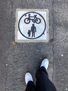
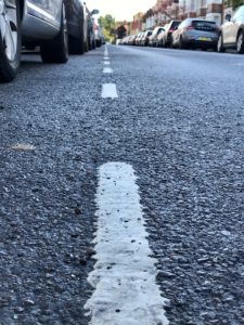
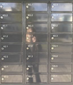
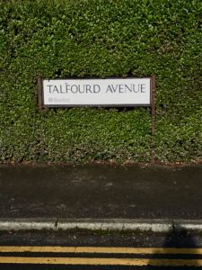
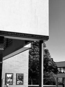
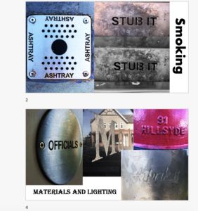
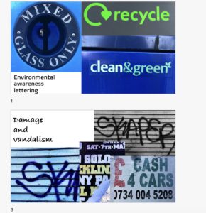
For today’s mini project, we were asked to go out into the environment, around the university campus or out into town, and photograph lettering that we come across. We were not restricted in any way with what lettering we could take photos of, it could be anything from road markings, to building names and sign posts. Anything that we came across that interested us, we were told to photograph using different angles, lighting and compositions. This task really made me aware of my surroundings and I started to notice little things that I never did before. For example, the fonts and colours, the materials used, the shapes and techniques of the words displayed all around me. Actively seeking different forms of lettering around me enabled me to analyse the typography used to convey a message, instruction or display information and the effect it may have on the reader.

I came back with a series of photographs taken of all different words, phrases and names that I had found. We were then asked to sort these photos into groups of our choice. I chose 4 different themes which linked certain photos together and compared and contrasted them with my group. I found this project to be a fun way to learn about lettering in the environment and I came away feeling like my eyes had been opened to noticing new things.


Broken Narratives- a staircase story

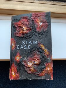
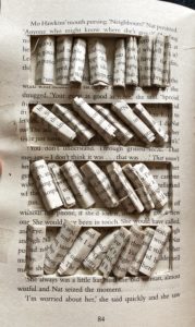
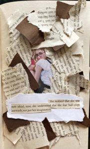
For the project ‘Broken Narratives’ I chose the theme of ‘Staircase’. As the brief stated, the man had an unknown disease. I wanted to create a book that looked as if it was also diseased. To create this, I used glue and tissue to make a 3D textured effect to look damaged and cut open. I then used acrylic paints to show the colours of decay.

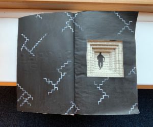
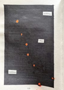
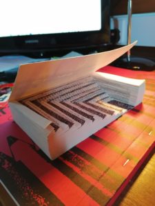
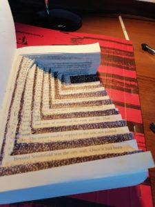
On the inside of the book, following the brief of the man being moved downstairs, I wanted to create the effect of stairs falling into an abyss, where that man was lying. To do this, I used my craft knife to cut out a series of different sized squares to look like stairs. I then drew the man at the bottom floor. I also painted the pages black to represent a feeling of hopelessness and painted some stairs that didn’t lead to any particular direction to represent no way out. I enjoyed creating this project and felt that it encourage out of the box thinking.

something was there…

OBSESSION

obssetion

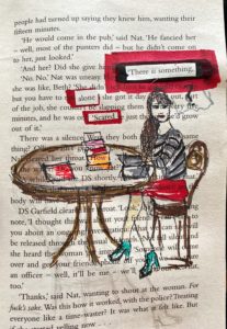
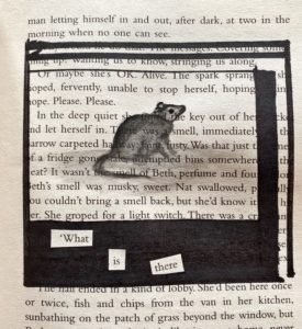
 I choose obsession , the story was about a girl who was sitting alone in the library when she hears a voice and she gets scared. she sees a shadow of a mouse and then she looks under the furniture and rips out all the books and she finds nothing. After reading the story I had decided to create at least 5 pages to show each stage the library, the girl sitting on the table scared , the mouse and the a last page where she goes crazy when she  finds nothing. I have used sharpies and fine pens to create illustrations.

Stairs


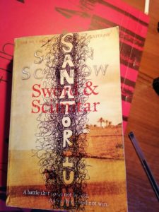
I chose the narrative about the man who starts at the top of the Sanatorium but as the days go by he is slowly moved to the bottom floor where he dies. I tried to capture the idea of travelling down through the sanatorium, I did this by cutting descending stairs into my book so like the protagonist in the narrative you too move down through the floors, each page being a step closer to your inevitable doom. On the last page I was going to write ‘death’ however I was concentrating so much on making the word look pretty I actually spelled death incorrectly so i just scribbled over it and drew skeletons, graves and other visuals you correspond with being dead.

Bleak, Boring, and Grey

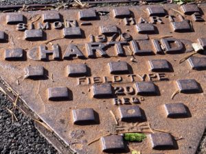
In this project I looked at lettering the environment. Specifically, I took pictures of the greyest, most uninteresting lettering that I could find. Minus the sign on the library, I think I’d rarely notice any of it. This is actually interesting though as particularly with “Altron”, this lettering seems to be in public view but the target audience isn’t necessarily the general public. It’s very unclear as to what the name “Altron” is, so it’s meaningless to most who will see it.

All of this lettering is at a different elevation to the surface it exists on, either being raised above , sunken in, or been punched through. This should make the words more prominent, but really they will me ignored almost all of the time.

My Journey with UOR Lettering

It was a sunny but windy day on Monday and our task for the day was to take pictures of letterings that fascinated us around the campus. After exploring the campus and taking pictures for 2 hours we were then asked to organise the images whatever way we like.

As I explored the campus I didn’t really have any theme in mind however, I found lettering on the grounds really interesting. I took them in interesting angles so the images would not be too flat.

I like the fading of the ground lettering and rusted look of the metal relief these are caused by environmental elements such as air and water and as a result, gives the lettering a more interesting and unique look.

Click the link for  My lettering Composition


E R

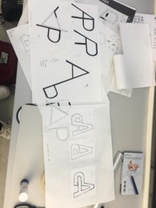
Todays task was to create a monogram using our own initials. I experimented with both Garamond and Futura. I drew them separately, as well as combining both fonts together. After joining both letters up, I began to experiment how they would appear on top of each other. I liked the idea of this as when you squint your eyes you can see both letters (the lower case ‘e’ and the upper case ‘R’) It almost looks like a symbol.

My final idea consists of the capitalised print using the Garamond font. Out of everything I done on the paper, I specifically liked how the Garamond font looks like a brand logo. I intended to join both letters up originally, however afterwards, I tried a different style. In the final idea, the ‘R’ is not fully shown, nevertheless you can still distinguish that it is the letter ‘R’.