Category: Student work

What letter is it?

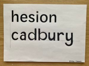
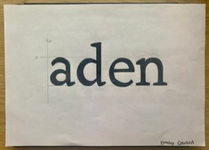
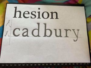
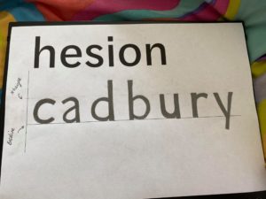
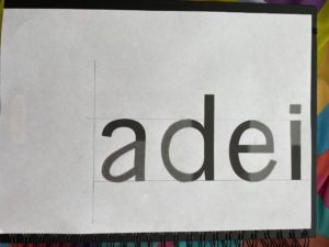
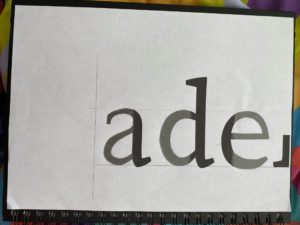
This session has allowed me to concentrate on finer details like using precision whilst sketching the letters. In the first task, we were given a typeface which we then had to replicate using a different word with different letters. The typeface was not specified so the challenge was to think about what the letter could look like with some help from the letters already given. The letters in the alphabet follow into specific groups. For example, characters with descenders fall into a group of their own; characters with ascenders fall into another. I drew in the x-height line as I knew it would help me know how tall/short the letter should be. In the second task, our objective was to use clues from the visible parts of the letters and then try to imagine what the rest of the letters may look like. We then had to draw this. From the feedback I got from the previous task, I concentrated on how much weight I put on the different parts of the characters.

PULP FICTION

Penguin Book cover2.2

Penguin Book cover3.3

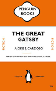
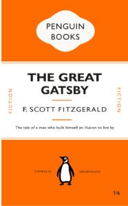
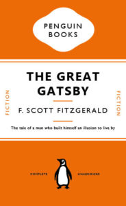
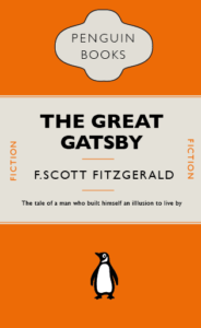
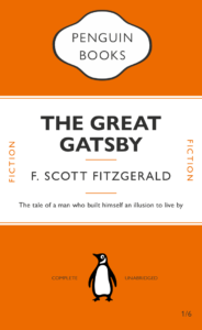
In todays session I learnt how to recreate the format of the iconic Penguin Classic book series. I recreated The Great Gatsby by F. Scott Fitzgerald. I learnt how to manipulate the type of the cover as one element, experimenting with leading, type size, font and paragraph rules to replicate the aesthetic of the original copy. along the way I picked up on how to create Pantone swatches from classic covers and use them within shapes for the design.

This came into effect when I had to adapt my remakes format into a new cover. I chose Pulp Fiction as Tarantino is one of my favourite directors. The format allowed me to change the name and subtitles whilst maintaining the same proportions. I decided to use a slightly dull yellow to represent the colour scheme in the movie title. I also imported elements such as the 10c sign and the silhouette of Mia and Vince dancing from one of the iconic scenes, which can be linked to the quotes I used from Vince in the last line of the sub-title. As a call back to the scene where Vince accidentally shoots Marvin, I decided to incorporate blood in the foreground and background by sandwiching them in-between the colour block layers. I adjusted the opacity in the foreground to show the characters trying to cover it up with Jimmie’s bed sheets.

The links above are of my original copy and my Pulp Fiction adaptation

Stranger Things.

TYINT Penguin Book Design

In class, we learnt how to design a classic penguin cover on InDesign and know the basic format of it. We were also showed the important tools that are used on a regular basis when using and how to use it.

I am not particularly fond of InDesign for cover design cause I find the program confusing to understand and tricky to use and I prefer photoshop but with the seminar, I was able to use and understand much more tools than before

There were many tryout and errors when designing the cover since the task for the day was to replicate it as much as possible. The hardest was designing the penguin logo cause it involved so many steps to get to the final product thou I believe my logo isn’t accurate with more practice I can do better.

Messed Up Version.

For my second tasked I did a book cover for one of my favourite series using a classic penguin book cover as inspiration. The series is called ‘Stranger Things’, It is a Fantasy, Horror TV Series on Netflix.

Stranger thing has an iconic bold logo that is recognizable anywhere. The font is ITC Benguiat, it’s a serif typeface with all letters stretched vertically. The colour theme for the cover is Red, white, and black because the logo for the series is a red or red outline with either a white or black background.

I turn the penguin upside down to represent a dimension in the series called ‘the upside-down’. The scratch marks represent the demon of the book and the marks that show that this film is horror.

The series Stranger Thing is a series I love because it has a 1983 theme, and I enjoyed the vintage layout in which the film is produced. It is influenced by Stephan king horror books so I wanted the theme of my cover to be dark.

I like the simplicity of the book and I feel like it communicates to viewers what can of the series cover is based on at the same time without giving to much information.

The Curious Incident of the dog in the nighttime.

‘The curious incident of the dog in the nighttime’, is a book about a 15 year old boy who discovers the body of his neighbor’s dog. The book is written, almost as a diary, about his experiences when trying to uncover the mystery. Although it is wasn’t explicitly stated, it is believed that this boy has autism which is a crucial fact in his adventures.

The main cover of the book is blue with white star shapes. It has a cartoon image of a dog in the middle. The font used is an imitated version of  a handwriting but in a 3D version, so I tried to find a type that looks handwritten but didn’t make it 3D to stick to the original Penguin cover. I made the symbol, that encapsulates the writing ‘penguin books’, purple.  I tried to stick to the main layout of the penguin cover whilst making sure that i add the appropriate features for ‘The Curious Incident of the dog in the nighttime’.

The Signs of COVID-19

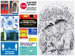
Today we were told to source signs made about COVID-19, signs made online, around us, at campus, homemade, government made and even asked if we had made anything ourselves. During lockdown I was bored and spent a lot of time on walks, and when doing so I would look for homemade signs around my town, so already had a few of these. I also found signs in our halls, on our stairs, our pin board, around reception. Then looked for government official posters, and NHS ones online, finding a wide range in total of things to look at and observe.
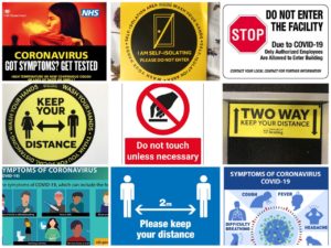
One key thing I noticed was the use of yellow, red and black colours, to draw attention and for a high level of contrast. Red and yellow are all associated with danger and warning signs so its easy to recognise. The use of bold founts and capitals letters was also very common, and the people sign(you see at airports and on toilets) with arrows between them, keeping them apart, recognising it as being government official from just the people sign, and a visual short hand communication that tells the public to all keep a distance from another.
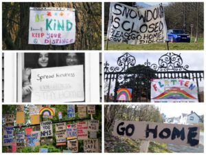
A key point that we talked about in the class after as well was the lack of imagery on the posters, and how they were so impersonal. Compared to for example the packing for smoking, where they show coughing up blood, blackened lungs, and a baby inhaling smoke, the covid-19 posters showed very few side effects, no emotive imagery, no one ill or in pain or dying. Which did relate with how many people also feel, as if the situation hasn’t been taken seriously enough, the posters also correlate with that feeling, where they blend into road signs and street signs, they are so easy to walk past that they give no sense of danger anymore, and don’t properly symbolise the severity of the situation.
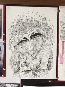
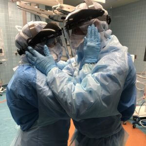
I did in my own time an illustration of an image during lockdown, of a husband and wife, both nurse anaesthetics getting ready for a shift with COVID-19 patients on the airway team. In the image they are both geared head to toe in plastic, and masks, and screen, and gloves, and holding on to another’s faces to say their goodbye, and good luck, right before their shift. The image for me struck how hard it must have been for your loved one to be sent to work, and to not know if they were going to get ill, how long they’d be ill for, and if they’d, like many others, be a number on the news death toll later that month. I can’t imagine how so many families managed to cope with isolating from loved ones for months on end for their job, and the awful things they would’ve had to see at their work, and the conditions that the NHS staff must have been put through. Wearing a mask, and keeping a distance, should be encouragement enough for people to comply with guidelines, and I wish they had used much more emotive tactics, in their signs, cause signs can be so powerful, to make more people take the situation much more seriously.
 

Sharp Objects (and a dangerous penguin)

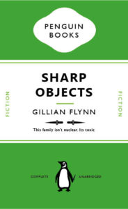
I chose to recreate the front cover for one of my favourite books, being ‘Sharp Objects’ by Gillian Flynn, the book is an excellent read, dark, twisted and clever. The line on the front of the book I even love ‘This family isn’t nuclear, its toxic’. It’s a fun play on word with ‘nuclear family’ and chose it for my design. I changed the colouring of the book to green, to try and go for that slightly toxic look, however, wish I could have gotten the colour a bit more acidic looking, but still wanted it to fit with the classic penguin look. I chose to change the bottom short green line to two knifes, a very simple design, just adding in the ‘sharp objects’, and if you look closely you can see that the penguin himself is holding a tiny knife behind his back, all connecting to books name and story.

The Handmaid’s Tale

After creating a replica of the penguin classics edition of ‘The Great Gatsby’ (pictured below), we were given the task to create our own book cover following the basic principles of the classic penguin format but deviating from this slightly in order to create some kind of symbology/irony within the cover.

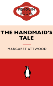
I chose the book ‘The Handmaids Tale’ as this is a book I enjoyed reading and feel as though is an appropriate title for a classic style penguin cover. I knew that I would use the colour red as this is symbolic for the book in that the dresses the handmaids wear are red. I also wanted to use white as this is the colour of their bonnets. I wanted the book cover to resemble the identity of the books main character. My first Idea is pictured on the left below, I switched the cartouche shape, that penguin covers use, to two shapes that create the image of a face and a bonnet in the style that the handmaids wear. I wasn’t overly pleased with the outcome of this so I decided to get rid of this and return back to the cartouche shape and work within this shape to create some imagery. I created a simple eye shape within the cartouche as there is lots of imagery throughout the book to do with ‘the eye’ and being watched. I kept it all red so the eye is slightly hidden (just like it is in the book). I used three colours to represent the white bonnet, a shade of colour to represent the characters skin and red to represent the dress. I felt that this three part background didn’t work well for the cover so I eventually settled on using white for the middle and upper section to allow for contrast against the title text and also to resemble the white of the Handmaid’s Bonnet.


Psycho

This was my first time using Indesign, I found it interesting how you can attach certain elements to text (in this case, lines) that would move with the text depending on what was written. I decided to base my second Penguin cover off the 1960 psychological horror Psycho. I played around with different ideas at first, for instance adding blood splatters across the cover or some sort of water damage effect to highlight the shower scene but I ended up going with a much more subdued look, just adding some drips down the title (although I am worried this makes it look slightly tacky and halloween-ish). I also changed all the colours to greyscale because the film is in black and white.

The Borrowers

Before this project, I’d used InDesign before, but I wasn’t aware of the depth of control that it offered. There is definitely a lot to learn here and I think it will be hard to remember all the tips and tricks, especially for text layout. Moving forward thought, I’m definitely interested to see how much can be accomplished on this software. The book I chose to redesign was ‘The Borrowers’ by Mary Norton. I’d certainly like to think my design doesn’t need an explanation!