
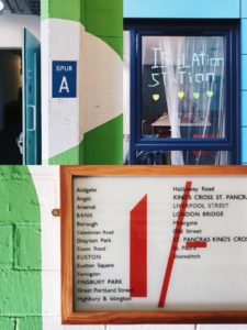
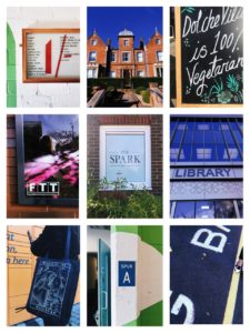
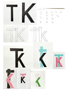
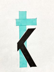
For Eric’s lesson on Monday we had to find lettering in our environment, eg around campus.
We got lucky with the weather being very sunny, and clear blue skies, as this meant a lot of light in our photographs, and a bright sky that on occasion helped add to the photo. I found signs, graffiti and stickers posted about campus. I also took a couple photos of the lettering in the typography department, however kept my focus to signs outside.
When it came to grouping our photos together and finding a common theme in them, my photos in honesty didn’t have much in common, when it came to font, topic, wording, or even colours. So I did create a collage of some of my favourites, editing them to have a common ground with yellow, blues and greens. And one similarity I did find between a couple photos was framing, where the type had been framed by a certain material, to be the centre of focus, such as, a window, wooden frame, or created on board and centred on a thin wall, giving it a frame.
After this project I will make an effort to look for more lettering in the environment, why it is used, and how communication varies from a sign being instruction (stop, slow down, caution. In bold capitals with bright warning colours). To creative welcoming advertising, for cafes or restaurants that use blues, or black and white for a professional sleek look.


 My chosen theme was labyrinth , in order to emulate that theme, i drove to make my book appear as if it has travelled through a vortex, a journey that can be seen throughout the layers of the book itself. To create texture i shaved down the sides of the pages and carved a whole all the way through to the other side . Furthermore, i singed and burned pages to represent the journey the characters of the book go through . It is distressed with a sense of hope , as there is light at the end of the tunnel i created with a torch , this is able to shine through the book as a whole as creates an interesting aesthetic . I would like to make some altercations such as removing the text of the book from the front cover to create more ambiguity .
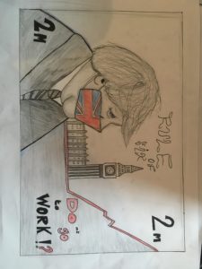 With the design brief , Britain in mind, I thought , as opposed to depicting Britain in a traditional sense, such as with big red buses and telephone boxes, i would display Britain in its current climate during the coronavirus pandemic. This image is a recreation of the British £5 note , with a covid 19 era Boris in place as the key figure on display , using a Great Britain facemask. As a famous landmark, always featured on notes , Big Ben can be seen , this is also to further familiarise the audience with its setting on Britain .The base on Big Ben transitions into the chart for infections on the rise. Further alterations to the original £5 design are the , 2m instead of £5 , in referance to how people had to keep a 2 metre distance from each other during lockdown. The rule of six text replaces, the Bank of England.The final element of text ‘ DOnt go to work ‘ has colour to emphaise how the quote can mean either do or do not go to work , a reflection of the confiusion caused by the Prime ministers speeches.Colour i used sparingly as a display of the dark times we are living in , however, some colour shows that there is still hope . A final addition i wished to have made was to feature a map of Britain in the background behind Boris and Big Ben in the upper half of the note .