
Real Job: Lamar Kaki worked for the Psychology department at the University of Reading to create an animation promoting a career as a Psychological Wellbeing Practitioner.
Category: Real Jobs
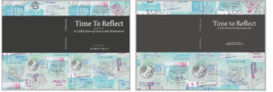
Time to Reflect: A collection of personal memories
Background
Often, Ronald Smith was told “You have led such an interesting life, you should write a book”. The memoir consists of Ronald’s life experiences, from the War to COVID-19 and his family and personal life. Working with his daughter Liz, the intentions of this memoir was to give his family and friends an insight into Ronald’s compelling 92 years, and continued, of life. We were asked to design both the interior and exterior of the memoir, whilst deciding on typography and layout decisions and having the chance to edit personal photos from Ronald’s extensive collection.
Deliverables
- Print ready PDF of interior and cover
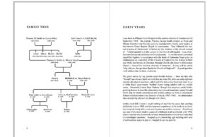
- Family tree design
- Final printed memoir
Design Process
Format
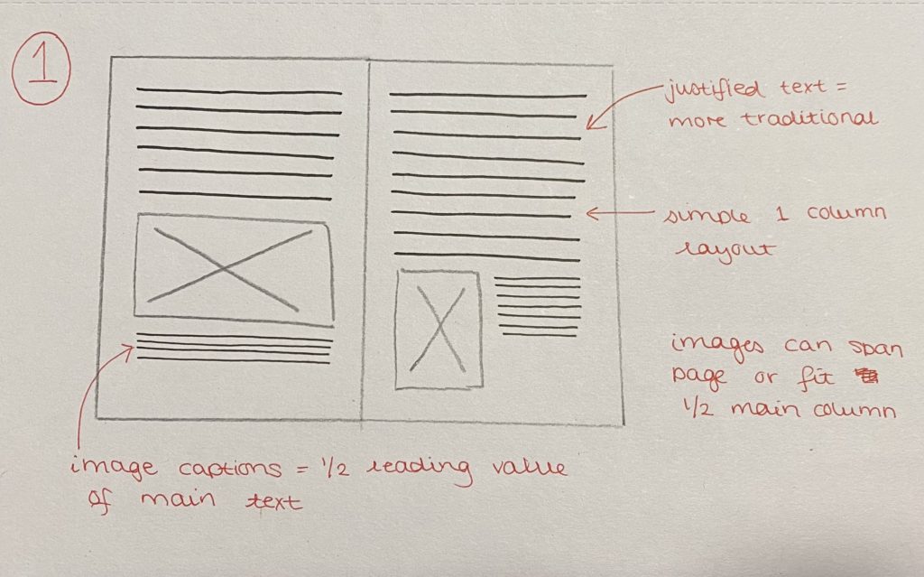
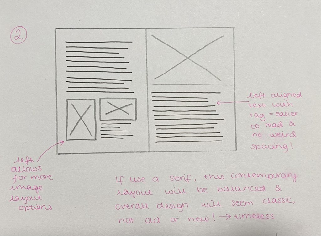
The first decision made was the overall formatting of the memoir. This involved deciding on page sizes, text justification, typeface choices, as well as the overall style of the project.
initial ideas
To present the client with a range of ideas, we mocked up different styles of text, as well as presenting different pages sizes that are considered suitable for memoirs. The overall aim of presenting the different mock ups was to gauge whether the style would eventually be considered as modern or traditional. After presenting our initial mock ups, our client decided on an A5 size, and initially they were set on having the memoir in a traditional style, with justified text, serif type, and indents. However, after showing our mock ups, the style that the clients began to favour was what we called, a traditional-modern hybrid style, as they insisted to combine a justified text block, with left aligned chapter headings (in a traditional serif), with a sans serif body text typeface.

Cover initial ideas
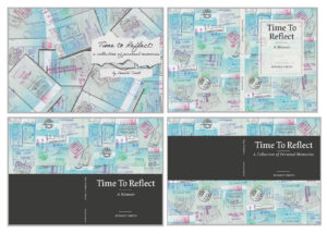
In terms of the memoir cover, the client wanted to explore one of two ideas. Due to the client’s background these ideas were either a music score that was sentimental to the client, or the use of the stamps in his passport from his travels abroad, both of which are a main feature within the client’s life story.
Initially, we wanted to explore the use of the music score, however there was scepticism with this, due to copyright issues, therefore we guided the client towards the passport stamp concept, which is when we presented them with our initial ideas for this. We were provided with scans of the passport, which we edited, and experimented with different ways to collate them all, which led to the client being in favour of a collage style of background. The design the client favoured is the bottom right, which was eventually developed to be a part of the final print.
Later on in the project, the client suggested some text on the inside of the front cover explaining the concept of the cover design in a few words.
COntents page initial ideas
As our client wanted a contents page, we felt as if we should also give them some options for the design of it, based on the design decisions they had chosen so far.
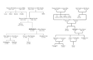
Family tree design
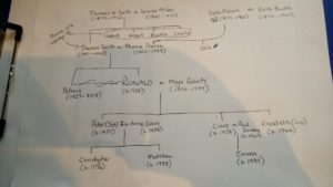
One of the deliverables for this project was the design of a simple family tree, which we designed from a quick sketch done by the client, seen below in figure 9. The client wanted it to be placed at the beginning of the memoir, and initially wanted it to be landscape, however we designed a portrait orientated one in order to fit the format of the memoir better, and to make the flow of reading easier.
Development
After going back and forth with the client, and our supervisor we made several improvements and additions to the memoir. The biggest change we made was to the margins, where we made them wider to ensure there was enough space around the outer and inner margins. Furthermore, we adjusted the chapter headings to create more space around them in order to make them stand out slightly more. In addition to this, we were advised to edit the cover ever so slightly, making the grey band slightly lighter, as well as removing some of the rules, in order to place and break up text more efficiently.
Production and Print Finishes
As our client wanted only a small number of copies, the printing of the memoir was done on campus with CPS. In terms of paper finishes, we showed our client several examples, as well as them showing us an example of a book that they were keen on. In the end the client chose white silk coated paper, and this was also recommended by Geoff because it aided with giving the images some lift, as they are an important feature of the memoir.
In terms of the print finish, the client’s example was a laminate finish, however due to the choice of silk coated paper, laminate finish was not possible, as well as it being a much more expensive option. Considering this, we guided the client to a more suitable finish, being a spot UV across the band of the front cover to give that section a subtle lift from the background.
Final Deliverables
digital MOCKUPS
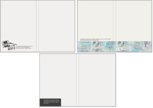
Prior to sending the memoirs to print, we felt it would be beneficial to the client to see a digital mockup of the memoir.
PHYSICAL Object
Figure 16 shows our final printed book. After seeing it on screen for many months, it was very rewarding to finally see all of the design components pieced together for this final outcome.
Reflection
Our client got back to us once she had picked up the printed books and said “We are delighted with the results – thank you for all your hard work”.
Having finally received the printed book ourselves, we were so pleased to be able to hold our design in our hands! We were so excited to see how the print finishes looked and also to see our design as a physical object, rather than a flat image on our screens. We were initially rather sceptical about how the format would look once bound, as we were unsure whether our margins were too small or not, but in the end they were a good size. Furthermore, it was also really rewarding to have a written letter from our client all the way from South Africa, as well as from his daughter saying how pleased they are with the printed product.
PLACEing Objects: Artist’s Publication
Background
This Real Job required us to design a publication for the PLACEing objects exhibition that ran in March 2020. The exhibition was part of Julie Brixey-Williams PhD requirements and showcased a selection of multidisciplinary artists. The client wanted a publication to showcase the both the work displayed at the exhibition and the workshops that occurred on the “Day of Dialogue”.
The brief
There was a selection of deliverables for this Real Job that adjusted slightly throughout the timeline. The main deliverable was a 48 page printed publication. The key unique aspect the client was interested in was that all pages in the publication must have equal importance. This meant we had to come up with a way to ensure the binding didn’t force a linear format, and that the users could rearrange each page.
The secondary deliverable was a logo that client would send off to be cast into a concrete block. The block was a structural part of the publication, giving the printed publication a stand.
Alongside these primary deliverables, we also designed an invitation, an acetate ingot – replicating the glass one used in the exhibition – and a pocket page to hold both of these.

Research
User personas and interviews
The initial stage of research was looking through the early content and images of the exhibition shown to us by Julie. We wanted to get a thorough understanding of what the meaning of the exhibition was and what it was showcasing before starting any design work.
The next stage was considering the types of users within the audience that would be consuming the publication. We created a set of interview questions to get an insight into what potential audiences may expect to see in an exhibition publication. We set up 3 key user personas and conducted interviews on real life people that fit those categories.

Mood boards
Initial research required both me and Amina going away and looking at examples of existing publications. We made 4 mood boards,. We then explore different approaches to this, including an abstract approach to the publication design, a clean cut approach and an approach where text or images commonly overlapped. Finally, we looked into existing editorial design for artists and exhibitions, examples of publications that could be considered a direct competitor. We sent these mood boards to the client to get an overview of the style she liked and allow us to begin some sketching.

Design
Deciding on formats
The client had used an iPad mini as part of the exhibition and wanted the publication designed with these dimensions, even down to the rounded edges.
The client also wanted a way to hold the publication together without it being physically bound. While this was initially intended on being a belly band we eventually designed for a screw to be drilled into the top. A screw was used in the exhibition and the client felt this was another way to integrate the physicality of the exhibition into the publication.
Testing layouts
Designing the pages for the publication was the main part of this project. We trialed different layouts and sent them to the client so she had options to choose from and discuss what she liked and what she felt didn’t work. Once we knew what the client wanted we created a grid and paragraph styles that all pages would utilise. This required a lot of testing as the content for each page was vastly different, yet it was important to keep a clear consistency throughout.

Concrete block and integrating a logo
The client came up with the concept of a sculptural way to hold the publication rather than a band to hold it together. Julie wanted to have the publication sit in between 2 concrete blocks working as bookends that she would get cast by a professional at a later date. We were tasked with the responsibility of finding a way to anchor the title and branding within the design of said concrete block.
At this stage of the project a logo was one of the deliverables. The client did not have a specific use for the logo at this time and therefore we discussed using this on the concrete block make the entire project more cohesive. The logo used on the block would showcase the name of the exhibition while also adding an element of design to the block. We tested various versions to see how different layouts could work but eventually settled on a logo where the title would be split in 2, ensuring the audience would know the block was one of two.

While we initially considered applying a vinyl sticker with the logo design on it to the concrete block, we eventually decided that getting the actual logo cast into the block would be a more subtle way to showcase the logo and create the sense of it being ingrained within the whole publication concept.
This was a unique request and required some specific conditions such the files would have to be sent in. However, after close conversations with Jon, the caster, we were able to get the logo cast into the block exactly how the client wished.

Finalising
Iterations
Meeting regularly with the client was key to the success of this publication. We would ensure that we were sending updated iterations of the project and having meetings in order to confer and review decisions about each page. We made a lot of alternations but this lead to a strong design that conveyed each artist honourably, in the way the client wanted.

Paper decisions
A large part of this project was the physical feel of the publication. We had a lot of conversations with the client about the shade and thickness of the paper. We printed out pages on a variety of different paper stocks to allow her to choose the one she felt represented her exhibition best. This was especially important as the main publication was printed on different stock to the invitation and the ingot. It was key to get the stock right so that they all worked together.

Production
The publication was a short run, but due to the variety of complex printing elements such as the acetate insert and pocket page we decided the Design Print Studio in the department was the most appropriate printer. It made the communication regarding all printing easier as we could talk directly to DPS and had Geoff to advise about complex parts of the publication.
Reflection
This Real Job was the first one I picked up. This meant it was a lot of new experiences for me, from working with my first client to sending my first job to print.
This project was incredibly large and intensive with lots of contributors. It took a lot longer than initially intended as we had to wait for different pieces of content alongside working to create a highly physical piece of work over multiple lockdowns. Additionally, much of the content can in different formats so it took a lot of time to work to standardise all copy and images.
Working in a group also had a lot of added complications. We couldn’t meet in person so everything had to be done over zoom which occasionally meant their was communication issues. Additionally, we could not work on a file at the same time and would have to ensure the latest file was uploaded to OneDrive at all times. Reflecting on this project, I think there could have been more appropriate ways to divide up workload to be more efficient, however this experience has helped guide future Real Jobs and other group projects.
Overall this has been an incredibly educational experience, providing me with invaluable opportunities and a printed publication that I am very proud to have collaborated on.


 .
. 
ICPH 2022 Conference Branding
Background
The biennial International Conference on Polyphenols and Health is the most important international forum to discuss the latest developments in the field of polyphenols, food, science and health. The conference changes location internationally every two years and is due to next be held in London in December 2021, however due to the coronavirus pandemic it was delayed until April 2022. We were approached by the co-presidents of the organising committee Jeremy P. E. Spencer, a professor of cardiovascular and metabolic research and Gunter G. C. Kuhnle, a professor of food and nutritional sciences, at the University of Reading. The main reasoning for the conference is so that professionals in the sector can come together to educate, share and learn from each other about the current developments in the Polyphenols and Nutritional Sciences industry.
Brief
The clients required a brand identity which communicated its London location and its contents roots in polyphenols – a chemical compound found in only plant-based foods. Additionally, the clients required a programme template (to add the details of the event themselves at a later date), that would utilise the brands identity, and communicate the details through a simple typographic system.
Deliverables
Primary deliverables
Our deliverables included a logo, and a document that demonstrated a systematic approach to the application of the brand – the brand identity guidelines.
Additionally, the clients wanted a medium that could be used to communicate the event’s details – through our process and discussions, we agreed that designing a programme was appropriate.
Secondary deliverables
Initially these deliverables were not outlined by the client, but to display the brands adaptability we also provided some mock ups of merchandise, social media, business cards, as well as the programme (as this was specified not to be printed).
Research and Ideation
Our initial approach to this project began with an introspective research phase. We wanted to liaise with our clients in order to get an understanding of the users who would be attending this event. From such discussions, we drew up personas on our clients, which could extend onto the general audience – as many of the attendees were also in similar professions, but from different nations. We approached this by developing a series of questions that were semi-structured, as it would allow us to extract valuable information for our value proposition canvases. In retrospect, our value proposition canvases were surface level, but still allowed us to draw useful ‘gains, pains and jobs’ and develop an approach to visual identities concepts.

Another way in which we addressed our research phase was by analysing the industry and the comparators’ visual identities. We categorised the different visual identities and analysed them for their logo (shape, semiotic meanings), colours and typography. This informed us on our initial ideas phase.

From our context and research, we developed a series of colour palettes from a wide scope. With the intention of using greens (seen amongst comparators), using our design knowledge of colour psychology that green reflects health.
Typeface selection for the brand began from the informed basis of our research. We looked at 4 different potential avenues. We drew on using typefaces to reflect the underground’s Johnston, however this is not available due to copyright. https://www.whatdotheyknow.com/request/new_johnston_typeface_opentype_f – some food for thought and controversy for designers who want to use this typeface.
Instead we looked at other types of sans serifs that reflected a more scientific, ‘personality’. There was also an issue that we needed to address that the ‘I’ needed more than a single stroke, to reduce confusion of a lowercase ‘L’.
Our ideation phase commenced by drawing on the visual identity categories and producing some sketches. It was evident (from our feedback) that all parties had a tendency to favour logos which drew on the idea of polyphenol structures.
Design Development
We developed our colour palette with the proposition of making it seem ‘earthy’, and arrived at our green and brown colours – a development from green and black. Interestingly, we base our colour pallete on one found through refinement, called ‘avocado’, ironically relating back to the idea of polyphenols found in plant based foods.

We resolved the issue of letters confusing the I and L, by revisiting earlier suggestions of typefaces from research: Noto Sans. The typeface also provides a simple, and legible read.

The logo solution drew on the two key concepts: London, and polyphenols. The logo could be criticised for being meaningless to those outside the industry, but from feedback we had got from our clients, they understood it exactly. We also received peer feedback from designers, and non-designers to see what they associated the logo with. It was successful in communicating the ‘London’ concept. We note that this is limited by our sample being exclusively familiar with London, and the underground.
The programme’s development was a consequence of the visual identity. It produces a very simple typographic layout to communicate the event details, as this was what was requested by the clients. Criticism has to be given to how the visual identity had not created a ‘style’ for imagery or illustration, which could be used within this document.


Reflection
As this was the first real job for both of us in our design careers, we were inevitably going to run into some challenges. Nevertheless, we embraced this throughout the project and it has definitely helped us grow as professional designers.
One of the most prominent challenges that we ran into, was creating an identity which communicates the conference’s location internationally, without clichés. As the conference changes location every two years it was important for the client that we reflected that year’s location (London) without adding common London features, such as the Shard or the London Eye. After excessive ideation and sketching we developed a logo using visual aspects of Harry Beck’s London Underground Tube Map to reflect the city. Although the clients loved this concept idea, in retrospect we believe that it does not succeed in its international communication of London. This was a compromise we actively made as without clichés it is difficult to reflect London to an international audience. However, on the other hand, we feel the decision was valuable as it is conveniently compatible with the chemical structure of Polyphenols and was too big a chance to miss.
On account of the coronavirus pandemic the conference was pushed from December 2021 to April 2022. This offered its own challenges in the fact that all aspects of the design relating to 2021 had to be adapted, however, the most difficult challenge that arose from this was the difficulty in communication with the clients. As the conference had to be delayed this caused numerous issues for Gunter and Jeremy that were more prominent than that of the visual identity design. We struggled to receive contact from them at times due to scheduling issues, however on reflection there is more we could have communicated to them, to fast-track the answers we needed instead of waiting on their response. With hindsight, it helped us understand the importance of communication between designer and client and how essential it is to maintain this relationship.
“We both wanted to say how pleased we are with the design and its outcome. The identity perfectly reflects so many aspects of the conference in a simple visual way. We look forward to seeing you at the event”
– Jermey Spencer and Gunter Kuhnle, co-presidents of ICPH.
Although we were faced with challenges, our visual identity was happily received and commended by Jeremy and Gunter, which was a fulfilling outcome of the project.
By Rebecca Allen and Alex Gwynne
The CoRAY Project
Overview
Summary of the project
For this real job, Cristele Saric and I worked collaboratively for Sue Walker as part of the CoRAY Project’s production partners. The CoRAY Project is working to produce evidence-based resources for young people aged 11–16, to support them with mental health issues, based on the effects of the Covid-19 pandemic. As part of the production partners team, we worked with colleagues from BBC Bitesize, Fully Focused and Headliners UK to produce resources in response to the research summary that the CoRAY research psychologists carried out.
This project was untraditional, in the sense that there was no set deliverables or outcomes. We produced briefs as the project developed: the research we carried out informed the deliverables we went on to make.
What is the CoRAY Project?
The CoRAY Project recognised a lack of evidence-based resources that are easily accessible and digestible to those who need them. The Co-RAY project set out to bridge this gap and produce trustworthy resources for YP (young people aged 11–16). Participatory design is part of the CoRAY project research methods. It recognises that effective design is designed with the intended user instead of for the user. The logo (figure 1) was designed in this way by Sue Walker and Josefina Bravo; Cristele and I also utilised this method in our work.
Communications
Since we worked as a part of the larger project, various communications were in place. Large meetings with all of the partners were used to explain the research findings and receive feedback. Production partner meetings were regularly scheduled to feedback on the progress of each other’s work. In addition to this, Cristele and I commonly met with our co-supervisors – Rachel Warner and Sue Walker, to discuss our contributions and project progression. Cristele and I also used Trello as a management tool.
Initial steps
The initial research carried out created the groundwork for the project. It helped us gauge an understanding of the CoRAY Project, the work done before we joined the project and the YP we were designing for. We produced some User Personas but in hindsight, these only provided surface-level information of our users, and we found our later workshops and interactions with the YP infinitely more valuable. The discussions at the beginning of the project – since the deliverables were unknown – were very concept-driven. I found it hard sometimes to understand and therefore contribute to these types of discussions about what should be achieved socially. As the project progressed I was able to input more on these types of conversations and reflecting, I can see the development of this skill. The production meetings focused on resources that could be made to present the evidence-based advice for the YP. The researchers inputted that they wished to have some infographics for this. An important role of ours was to creatively think of how best to present this information, in ways that the YP could engage with it. While also existing in the eco-system of the other resources: a series of short films by Headliners, a webpage on BBC Bitesize and accompanying animation, an art exhibition and podcast by Fully Focused.
Brief 1: Research Workshop
As a natural progression of our research, Cristele and I organised and led a workshop with a group of YP to understand types of infographics that appealed to them, aspects that they found useful and elements that caught their attention and kept them engaged. This was the first brief that we restated and carried out.
Collecting examples
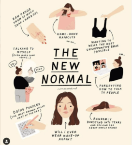
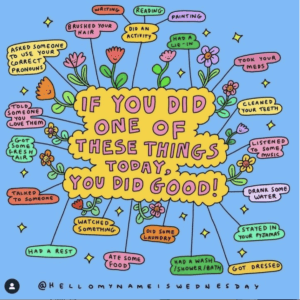
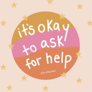
Finding a diverse range of examples to discuss was challenging. A lot of the examples that we used were from social media platforms (figures 2–5). We found when collecting examples that it was common for the examples to be aimed at specific genders so we decided to make our designs neutral. Recognising this was important as we soon realised, by talking to our workshop participants that 11–16 is a large age range with widely different interests and opinions (figures 2–5). Reflecting on this, it would have been better to account for this in our examples in some way. Perhaps if we split the audience down into smaller groups, we could have more effectively communicated the information to each age group, but there were limitations to what we could do as the audience was predefined in the research.
Preparing for the workshop
The preparatory work for the workshop was not overly challenging, though it was a fast turnaround between getting confirmation of the workshop and the workshop itself. We produced a slideshow with examples and prompt questions to initiate discussion – we found including questions on screen were effective as the participants could reread and comprehend the questions better (figure 6). With more time, it would have been ideal to release the prep work for the workshop earlier to give the YP more time to provide an example of an infographic that they thought was effective.
Running the workshop
The workshop itself was a big learning curve. It was challenging to encourage the YP to engage in discussion with us about the examples. Since we were working with children as young as 11, there were lots of prolonged silences and one-word answers. This made it difficult for us to gain the answers we needed for our research. By the end of the workshop, I had gauged how long to wait after asking a question. It was surprisingly difficult to make the judgement on whether the YP were thinking of a response or didn’t know and weren’t going to answer. I thought it was important not to move on in case someone would eventually answer, especially since sometimes the best answers came after long pauses.
Overall the workshop was successful and as participatory research, it provided us with a good understanding of how to design infographics that would be effective and useful for the YP.
Brief 2: Look and Feel guidelines
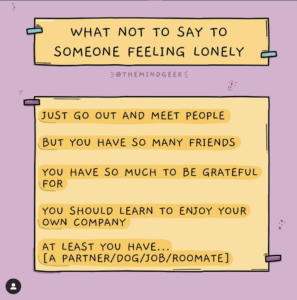
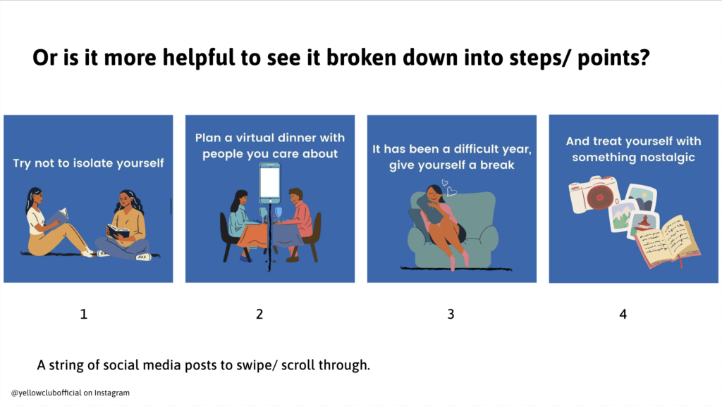
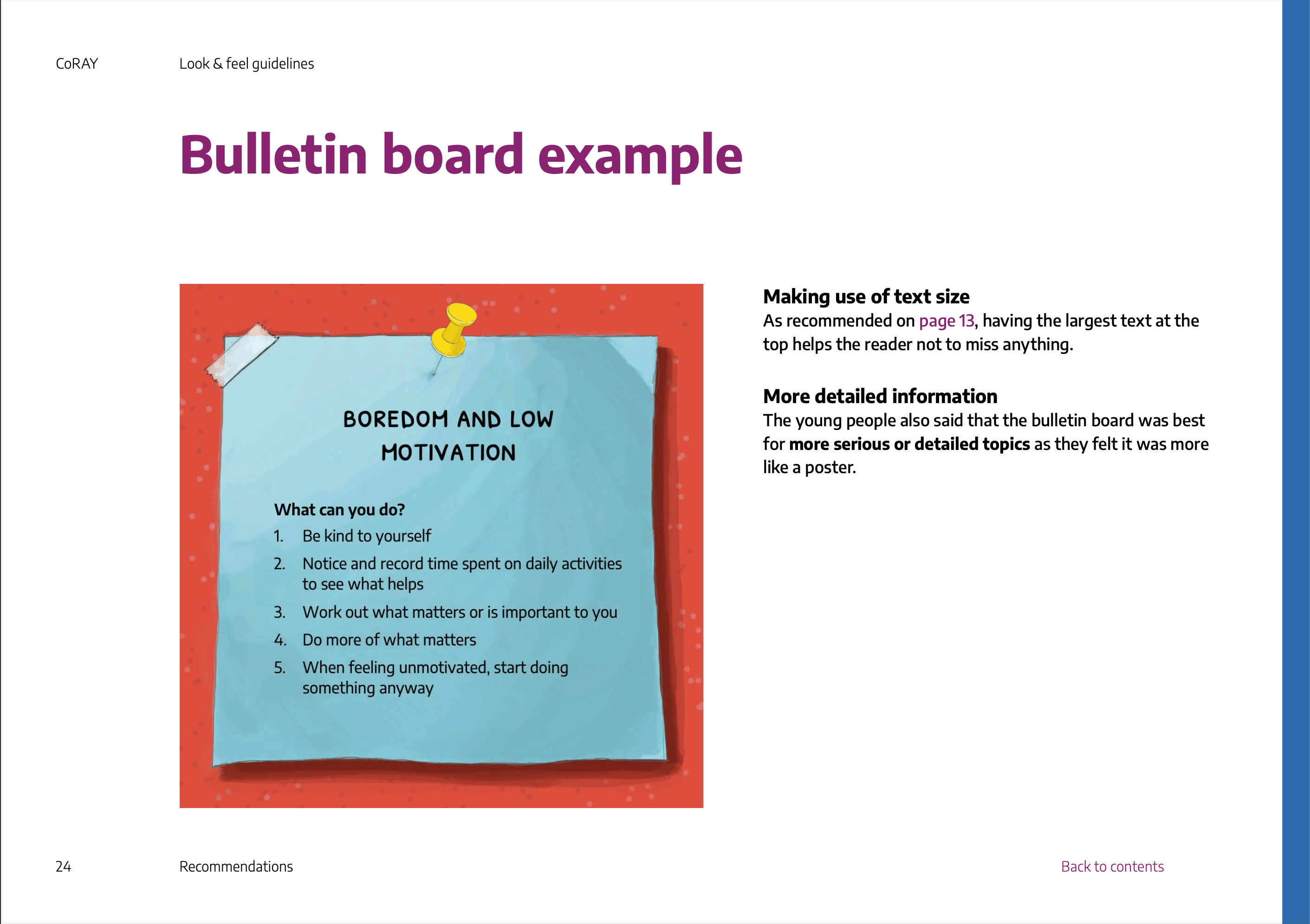
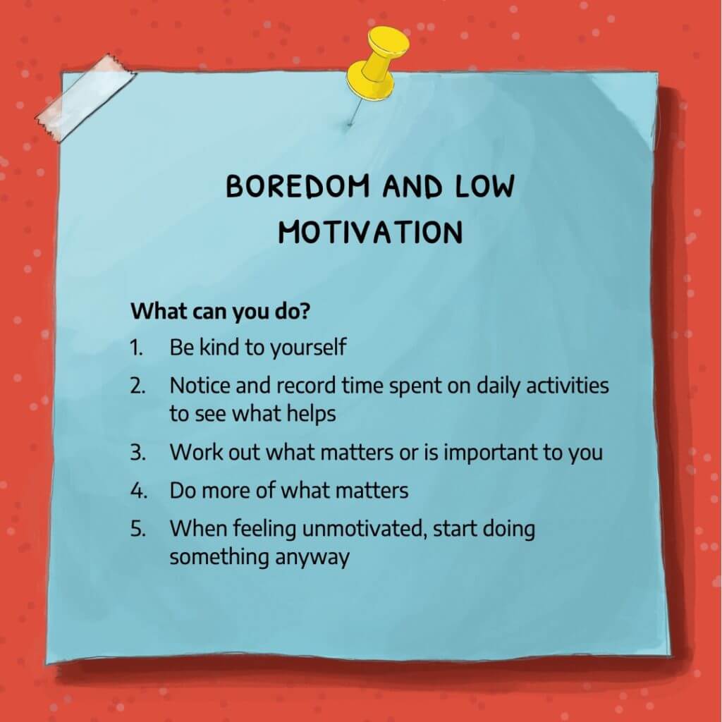
After discussion with the production partners, it was suggested that we should create a ‘look and feel’ for the CoRAY resources, so the project had an identity. We interpreted this as a set of guidelines to build upon the existing brand they had. This was our second restated brief, where we used evidenced points from our infographic workshop research to form a document outlining recommendations and a general look and feel to the CoRAY brand. A summary of our recommendations based on our research is as follows:
- YP had a preference for numbered lists over paragraphs
- However, lists should be on positive mental health topics only, as numbers make lists feel exhaustive even if it’s not.
- Bulleted lists, short statements and mindmaps are other preferable layout options
- The amount of content is important. Too much content can feel overwhelming.
- Long carousel posts can feel ‘never-ending’
- Keeping mental health topics lighthearted is important as it shouldn’t feel daunting
- Some use of humour can also help keep topics lighthearted
- Illustrations are best if abstract, instead of realistic
Creating recommendations
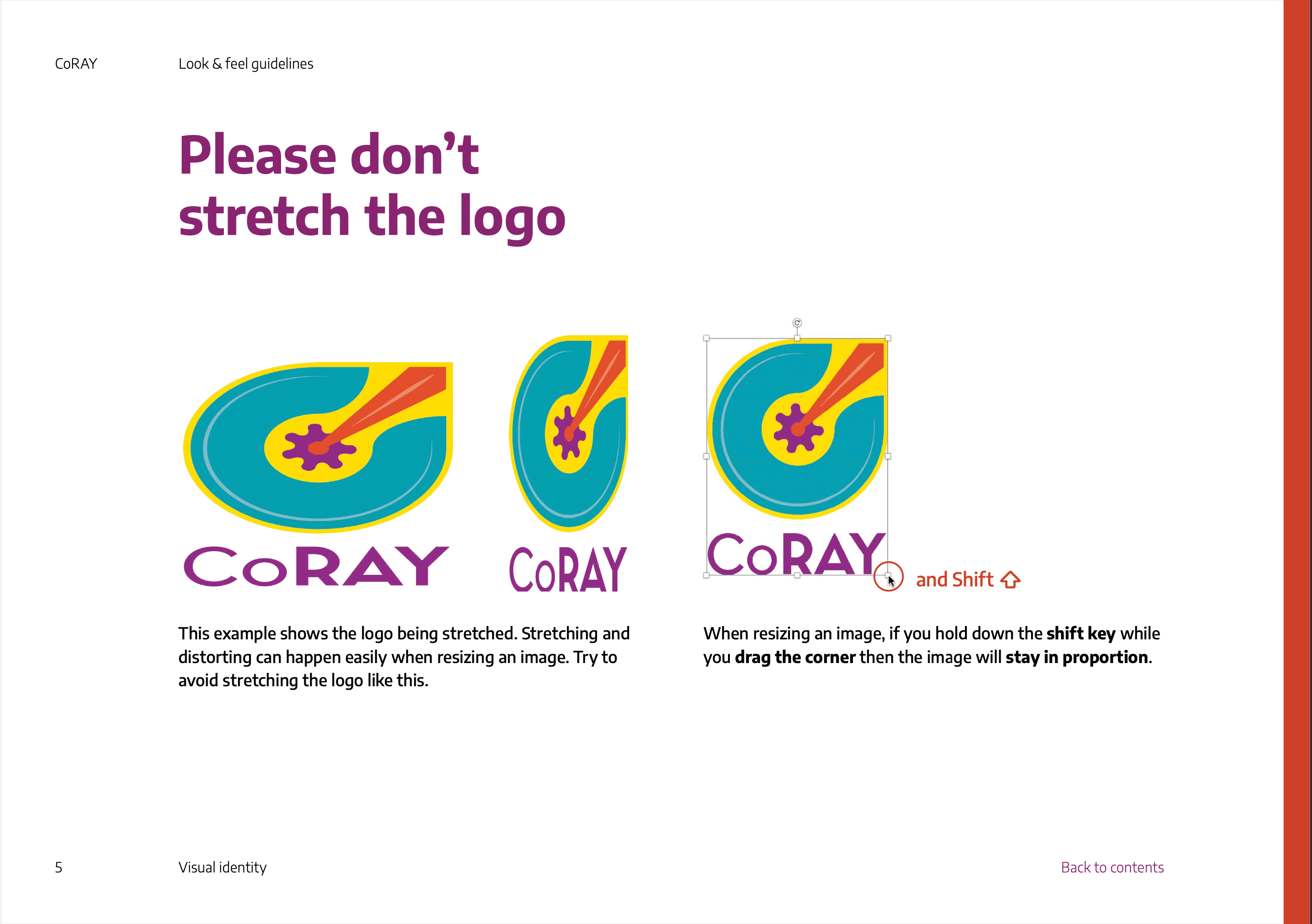
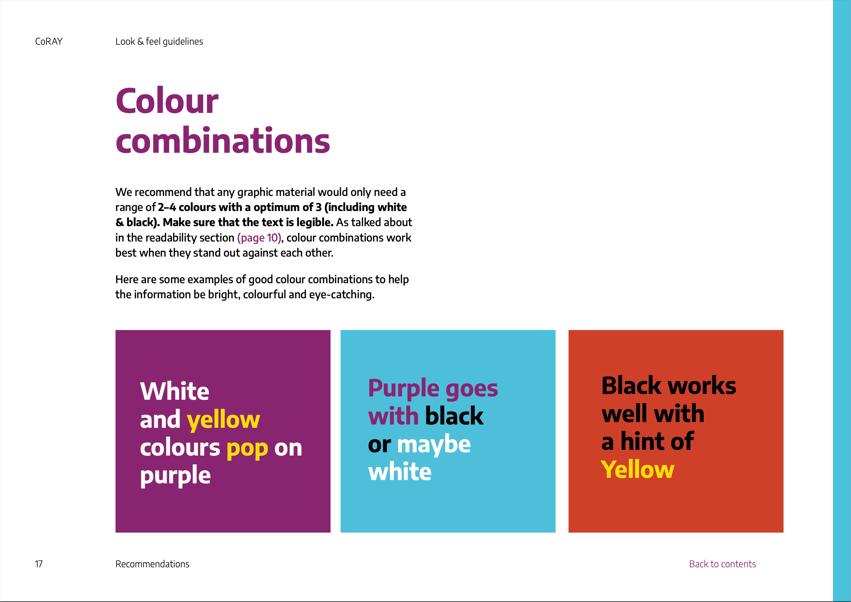
An interesting challange that we worked on was that our client didn’t want us to be too perceptive with our guidelines. Despite all the examples we used as inspiration, showing clear ‘dos and don’ts’, our guidelines had to be phrased as recommendations and suggestions based on research. This was difficult as we needed to ensure the guidelines were strict enough that they could be interpreted by different colleagues and still followed in the same way, while carefully formulating the language to frame the guidelines as recommendations (figures 7 and 8).
Building a robust document
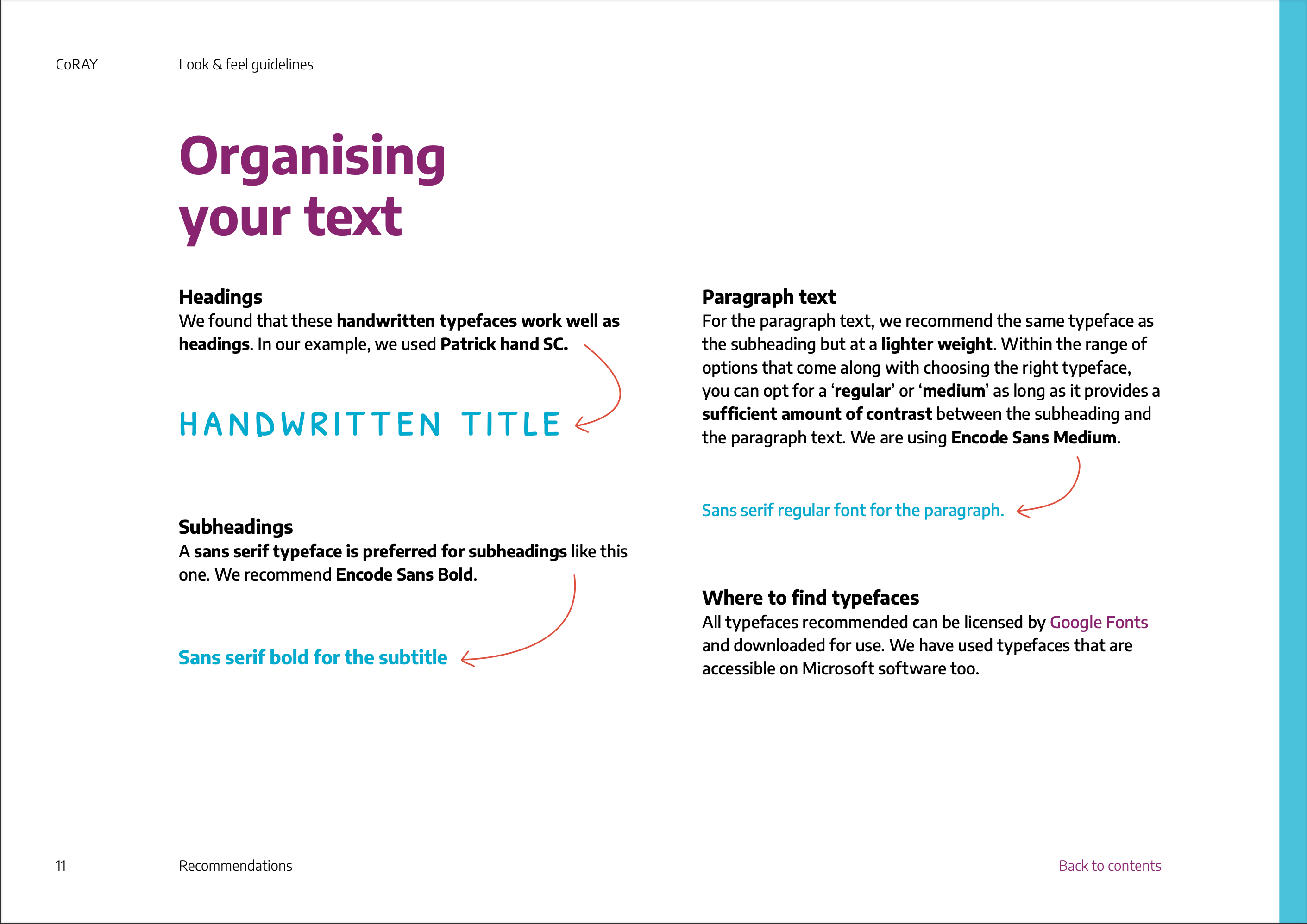
Working on these guidelines with Cristele meant that quickly I realised we needed a document that was easy to share. I found the best way for us to produce visually cohesive work was through regimented paragraph styles, object styles and a grid. However, this took some trial and error as we used different techniques and needed to be universal. For example, we disagreed on whether to have multiple line breaks or two separate text boxes for more complex shaping. This took some time and looking back, it would have been more effective to have a conversation directly about how we used the adobe suite instead of sharing files with different techniques until we naturally found a compromise.
Another way that we developed our guidelines to be more effective for our users was by making the document interactive. We added a clickable contents page and a ‘back to contents’ button on each page (figure 9) to aid user navigation, reading strategies and general usability.
Figure 9: Interactive feature of guidelines
An iterative document
The workstyle of this project was different from what I have previously experienced. We produced iterative versions of the guidelines. Each version was sent to the client, shared with colleagues and put into practice. Once the guidelines were in use, we reflected on what could be improved and identified sections that were being ignored. This allowed us to fix the problem areas and add new sections as felt necessary. In total, we had three distinct versions of the guidelines that were published. This work style was interesting and a valuable experience as it taught me to evaluate my work in a new light – putting myself in the perspective of the user and finding the gaps in the work. The more we did this the more confident I felt at identifying potential gaps in the work before rolling the new version out.
Brief 3: Social media templates
Establishing the appropriate deliverable
The final brief that we restated was for the infographics themselves. Initially, we produced a brief to design an infographic for YP on the topic of boredom. However, after some further discussion in the production meetings, we proposed that a template set would be more useful. We decided that this was a better solution as it allowed the researchers to write their copy for the infographics. It also meant they could produce as many infographics as they wished. This was important as we had time restraints, and producing the infographics themselves with the researchers would have been a longer process. I learnt while working with psychology researchers, it was important to always establish what was meant by specific terms. This was important for, and would have been detrimental if we hadn’t established what was meant by an infographic. Since infographic is such a broad term, we refined what was needed for the project. After discussion, we restated that they wanted a set of social media templates to help them in the social media campaign they were disseminating, to accompany other resources produced by CoRAY production partners.
Producing a design template
Another challange for this brief laid in the restraints of software colleagues had available. We needed to establish early on what type of software our audience had, and since we were sharing our templates with a wide group of users, we had to remain as accessible as possible. It was also important, however, to make sure the templates maintained flexibility for the user. In response to this, we used PowerPoint, setting the slides at the most universal social media size and using the master slide settings to create editable templates. Though we presumed that most of our users would have a general understanding of Powerpoint as a software, we had to ensure the templates were easy to use and as self-explanatory as possible. To combat this, we produced a subsection of the master slides with prefilled instructional information to guide the user (figure 10).
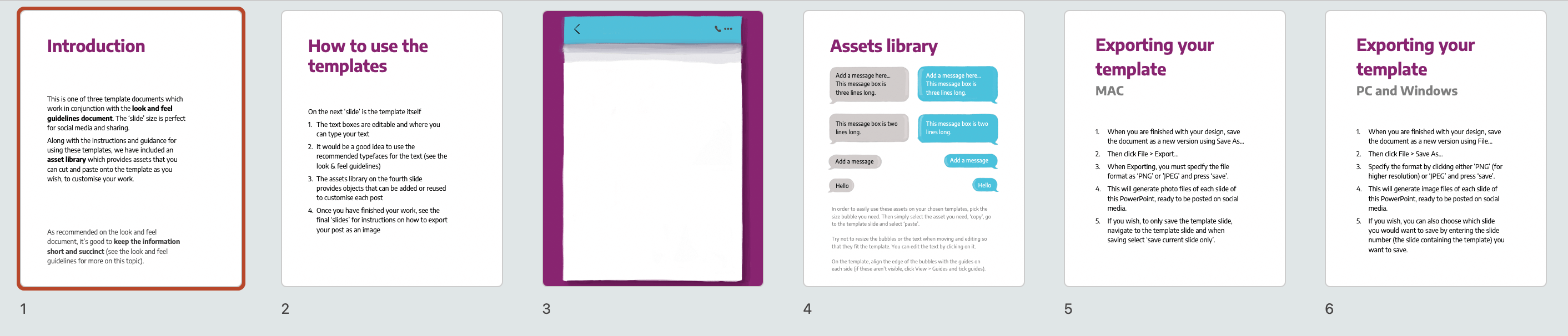
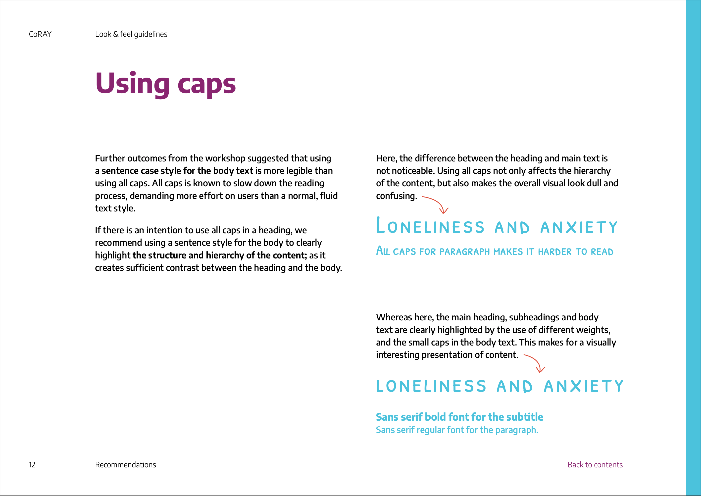
We struggled to make our templates robust typographically. We hit a lot of limitations of Powerpoint custom typographic presets. We utilised our guidelines document to try and give the users guidance on typographic detail and styling. However, we quickly found our recommendations were not detailed enough when the small-caps font we suggested was used excessively in sentence case. To improve and prevent this in the future, we added more detailed typographic guidelines with accompanying examples of the templates in use (figures 11–13).
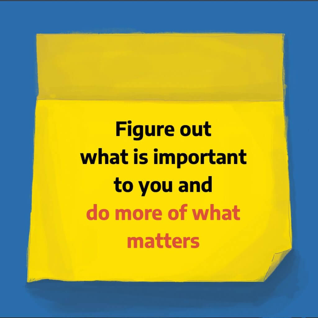
In the end, we produced three templates (examples of these in figures 14–16), each able to produce different types of content layouts. This provided variety and flexibility to the social media resources. These were all based on our look and feel guidelines that we previously designed. It was a really good exercise for us to design using our guidelines so that we could ensure they were usable and flexible enough to create varied outcomes.
Designing for multiple users
The templates were complex in terms of user experience as we were designing the templates for researchers to use – meeting their user needs of navigation and execution of the template production. All the while designing for the consumer as the template designs themselves needed to be visually and typography designed to appeal to the YP.
Navigating design consultancy
Another learning curve for me was navigating how to provide feedback on design topics for laypeople. This was difficult because through our guidelines we had to provide recommendations with soft language, so none of the recommendations were too perscriptive. Moreover, once our templates were in use, we adopted the role of design consultants for the project, giving feedback for work produced with our template designs. This was challenging as on the one hand, the researchers wanted the social media content to be designed to a professional standard, while on the other hand, the templates had limitations to how far they could be pre-designed. This was interesting for me as it taught me that the feedback people are looking for – even within the field of design – is highly dependant on the context in which they ask it.
User testing workshop
An amazing opportunity for this project was the chance to run another workshop as further participatory design. This took place once our templates had been shared with the researchers, used and we had provided feedback on the resulting social media content. As a team, we then ran a workshop to get feedback from the YP. Retrospectively this was more valuable than our first workshop because as designers we had the opportunity to test the functionality of the designs that were originally based on the initial participatory research, with broadly the same group of YP.
Overall, the YP were positive of the designs and little change was needed. The main feedback we received was more to do with the fine details of the examples rather than the overarching designs. These amendments fell into the execution of the templates. This felt frustrating as the fine details could have been polished before the workshop – allowing us to have potentially received more informative feedback. A lot of the fine details were typographic and could have been fixed quickly if the content was designed directly by us or if we had ideally worked closely with the researchers using the templates. However, realistically this is not feasible. Perhaps more robust template designs could have achieved the same level of typographic execution, but we had limited access to template software and PowerPoint had some limitations.
Improvements to guidelines
Following the second workshop, we amended and updated our look and feel guidelines to add a section focused on recommendations for using the templates. We had the idea of improving our interactive guidelines by adding a button to the template files (figure 17). However, we weren’t able to do this as the project wasn’t able to host the templates in a universal location.
Overall
This job was a big undertaking and therefore both exciting challenging at times. Reflecting on the project as a whole, I have learnt so much about, not only designing functional brand guidelines and social media templates but also much more diverse skills of running workshops, carrying out user testing and how large projects can function with varying levels of communication and work with different colleagues. I enjoyed the complexity of the design solutions and being involved in the conceptual ideation of developing what needed to be designed. It was an interesting new position for me to be a design consultant, which felt frustrating at times, not being able to do it myself but it taught me valuable skills of how to give feedback and is definitely something I wish to develop further. Looking forward, I am interested in further developing skills in information design for evidence-based research.
Feedback
Supervisor feedback
“Emily and Cristele – this is a really comprehensive and well organised set of guidelines, well done, they have really come on and I think rival many professional guidelines I have seen/used before! …[the] Links to contents page and back really help the navigation & usability. Plus, it’s a well structured and well-written document. Should be proud of this work!”
Dr Rachel Warner
Lecturer | Department Director of Academic Tutoring
Typography & Graphic Communication
University of Reading
Client Feedback
“Thanks Emily and Cristele for your work on developing these templates and guidelines. We really liked the text message template as this allows for a more informal / natural interaction.”
“Thank you very much for all your great work on the project!”
Dr Rebecca Watson
Postdoctoral Researcher
The Oxford Psychological Interventions for Children and adolescents (TOPIC) Research Group
Departments of Experimental Psychology and Psychiatry
University of Oxford
User testing Feedback
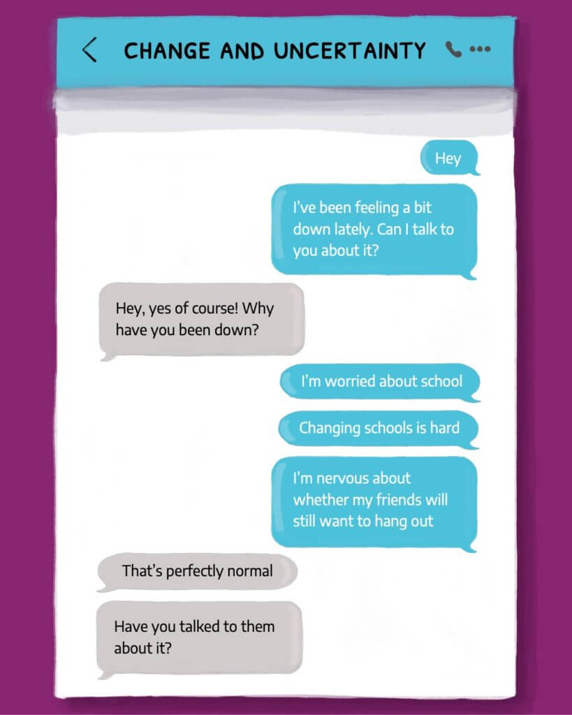
“[the text message example] Gives a good example of how you could talk someone over text rather than socialising. More personal feel, instead of just preaching advice”
“[the text message example] it’s like you’re talking to someone on the other end”
“for feeling unmotivated the post-its work because you could put some of the tips up on your wall or something, so it’s something practical you can do”
PLACEing objects Artist publication
Designing a publication to exhibit a client's exhibition as part of her Ph.D. is one of the greatest projects I have ever completed!
The School Outreach Company
Group collaborations: Generating ideas-Logo, branding, PowerPoint palette, website
Individual jobs:
(Kaylee) Website images, Diagram for ‘intervention’ services, ‘What we do’ and ‘An Evolving market’ illustration.
(Holly) Our services illustration, Website pictograms.
(Kory) Our Reach layout
Introduction – What was the brief?
During the months of June/July 2021 were assigned the brief of creating three deliverables: A logo, matching branding and fonts for a PowerPoint (to help our client explain the meaning and branding of our products to others) and a website for the company: The School Outreach Company. The School Outreach’s aim is to help disadvantaged students, and those labelled under the BANE category, from across the UK develop interview, work and communication skills. The school Outreach helps students, primarily from secondary schools, develop connections with big conglomerates such as virgin media and Google. The company gives students opportunities they would likely not receive after leaving school. Our aim was to connote the themes: social mobility, inclusivity and recruitment through the deliverables.
Research & Design Process
The main themes the client wanted us to connote through the deliverables were: social mobility, inclusivity and recruitment. Our first deliverables we began to work on were the logo and PowerPoint branding. Individually we researched these themes and found visuals we thought best represented each. From these images, we created our own initial sketches for the logo; trying to symbolise all the themes in one sketch as best as we could. For the branding of the PowerPoint layout and logo, we used the same process when deciding on a colour theme.
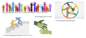
Figure 1: Research pictures
The Logo
When discussing the logo with the client, the client gave us a few example images he wanted us to base our ideas off of. An example image was the ‘BP’ logo. From this we decided to base our sketches off of ‘circular’ and ‘round’ shapes, whilst connoting unity and diversity. In the final iteration of the logo, we connoted ‘diversity’ through the colour scheme. Each semi-circle of the circular shaped logo, is a different colour; this represents the different themes the company represents. ‘Unity’ is displayed through the placement of each shape; the shapes placement and closeness signify how the themes and clients are brought together by the company.
After individually researching and collecting pictures related to the themes: inclusivity, recruitment and outreach, we discussed our ideas as a group. During this group discussion, we discussed: how the essence of the logo should be represented? What different levels of abstraction, and different shapes should be used? We further sketched the logo through the workshop as a collective group. In our original individual sketches, many of our concepts revolved around ‘people’ as when we thought of the themes (inclusivity, recruitment and outreach) a common denominator was the ‘people’ and our audience: students. We drew multiple versions of the sketch with people as the main element, whilst trying to incorporate the circular design into the concepts. However, after further deliberation, we realised this did not conform to the client’s original idea of the logo.
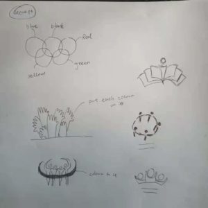
Figure 2: Concepts based on the theme of inclusivity
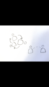
Figure 3: Concepts based on the theme of recruitment
Figure 4: Concepts based on the theme of outreach
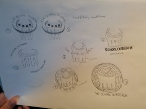
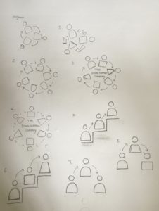
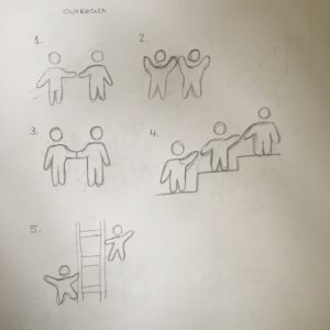
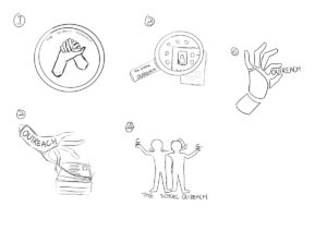
Figure 5: Refined sketches – After meeting with client (By Kaylee, Kory and Holly)
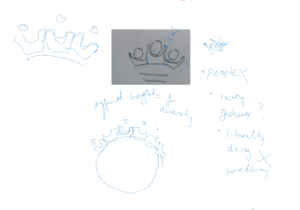
Figure 6: Sketches from group discussion
The Branding & PowerPoint Layouts
The second deliverable we created was the ‘Branding and PowerPoint layouts’ for the client. The client needed PowerPoint layouts so he could create presentations explaining the objectives of the company, the layouts needed to follow the same theme as the logo. We used the logo designed for the company in the PowerPoint templates. Similarly, to the process of creating the logo, we each individually sketched out layout ideas then came together as a group to discuss them and narrow down the most successful concepts. The client provided us with information each slide needed to contain and an idea of what the current presentation layouts he was using looked like. Using this information, we created sketches which connoted how text, titles and images could be laid out. We created a variety of sketches to test where the company logo appeared more appropriate. The top right corner seemed like the best choice as the logo will not block any text or images. From these sketches we created a variety of digital layouts using the colour scheme, type and logo we had already created. From this we created a design which used different colours placed on the side of each page to represent the different themes of the company. Next, as a group we discussed which concepts worked best and which we thought the client would like the most. After the client confirmed he was happy with our decisions, we moved onto the next deliverable: the website.
Figure 7: PowerPoint/Branding slides
Website design
Our website is aimed at 3 groups of people. The first is Hiring organize. The second is Student or parents. The third is School or teachers. Users can choose their identity to enter the corresponding content by clicking on the website. These three pages are composed of 6 parts: About us, Our reach, our service, Client’s and Testimonial, Resources and contact us. People with different identities will show content corresponding to their identities after clicking on them. For example, for schools and teachers, when they click on the ‘our reach’ interface, they will understand that TSoC can bring high-quality companies to students and also bring some activities to students. Bring them confidence and motivation. But if the object is parents or student, there will be no content that brings activity to students. Interviews have also been inserted on some pages to let the customer understand what effect TSoC has brought to customers.
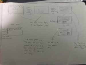
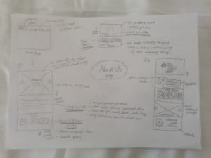
Figure 8: Website Homepage Concept (By Kaylee, Kory and Holly)
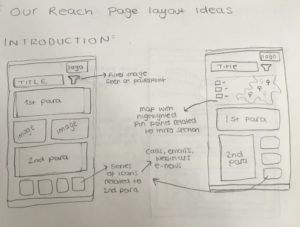
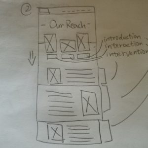
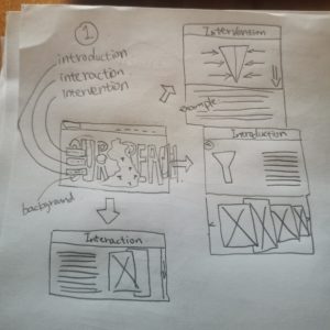
Figure 9: Website Our Reach Concept (By Kaylee, Kory and Holly)
Figure 10: Colour test for website (By Kaylee and Holly)
Website pictograms/Icons & Independent work (Pictograms & Illustrations by Holly)
As some of the group had more experience with website building, they played a more major role when creating the website. However, we still collaborated together and supported each other when designing the deliverable. My main role when creating this deliverable was creating pictograms which represented different sections of the website. The client gave me example images of pictograms he liked, from here I designed a variety of pictograms in the colours which matched the branding: red, purple and yellow. Before showing the client the initial digital sketches, I discussed with the rest of the group which concepts were the most successful. From here we limited the concepts down to a few designs from each group we thought represented each topic the best. I then had a meeting with the client to discuss the pictograms. From here, we eliminated the designs he disliked and further developed the concepts he preferred using his feedback. By the end of the process, I had developed: 17 yellow pictograms, 12 red pictograms and 6 purple pictograms. This part of the project helped me develop and expand my technical skills when using illustrator.
Later in the project, when the website had most of its content and was near completion, I created an illustration for the ‘Our services’ page. I read through the content the client had gave us for the page and tried to link them to a common theme in order to create one main illustration instead of multiple. The theme I felt connected the content ‘our services’ and ‘what we offer’ was unity. After multiple concept drawings and feedback from my group, I settled on a design which conveys two hands shaking with three arrows at the top going in different directions; the arrows are in the brand colour. The arrows represent different services the company offers.
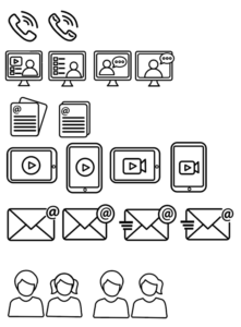
Figure 11: Yellow pictograms in black outline (online concept, version 1)
Figure 12: Red icons in red outline (version 1)
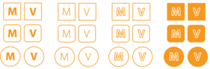
Figure 13: Yellow M & V Icons in outline and full colour (version 1)
Figure 14: Purple icons (version 1)
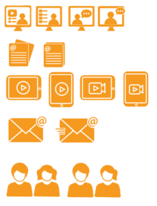
Figure 15: Yellow icons (version 5)
Figure 16: Red icons (version 5)
Figure 17: Purple and M & V (version 5)
Figure 18: Yellow icons (Final version)
Figure 19: Red icons (Final version)
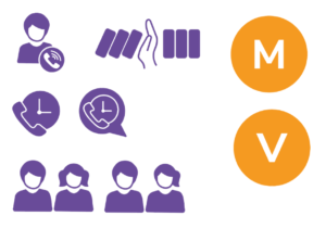
Figure 20: Purple and M & V icons (Final version)
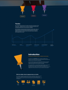
Figure 21: Our service final version
Independent work (Website image by Kaylee)
According to the needs of clients, I try to choose suitable pictures for the website to show the effect. When people browse the website, the pictures in the website can help people understand the content of the page. For websites, pictures are very important because their role is to attract users’ attention. They can transmit complex messages in the blink of an eye. I found some free and paid pictures. We constantly filter and replace photos through communication.
Figure 22: Picture selection stage
Independent work (Diagram for ‘intervention’ services by Kaylee)
I made a diagram of intervention for the website. When making the diagram, I used the colour palette provided in the brand guidelines. Because this diagram will be used in conjunction with the website, I used the same colour as the brand. I use Sequential palette to make this diagram. After some modifications to the diagram, I changed the colour of the pattern uniformly to purple. This is more consistent with the colour of the brand. Through the diagram could explain the concept helping people up to level up. When I drawing the diagram, let everyone at the same level of height. Use different numbers of boxes to represent student needs. Different height with different boxes means different students have different requirements. At the same time to use colour to indicate different levels.
Figure 23: Sketch of intervention diagram
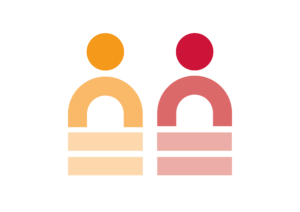
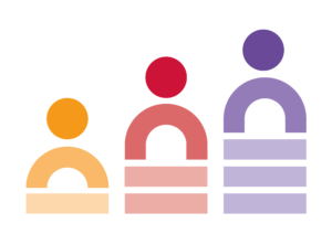
Figure 24: Digital version 1
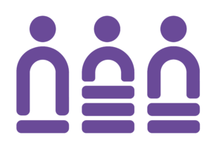
Figure 25: Final version of intervention diagram
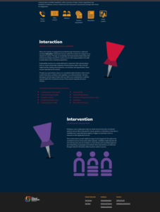
Figure 26: Our services final version
Independent work (‘What we do’ and ‘An Evolving market’ illustration services by Kaylee)
For these two illustrations, the sketches were done by me, Holly and Kory. We have drawn three different plans. The purpose of this illustration is to allow users to better understand the text when browsing the web. When I communicated this illustration with a client, we chose one of the options. The client also gave me the details of the illustration he wanted. I draw the digital version on the computer based on these feedbacks. Finally, I choose the colour according to the colour wheel of the branding guidelines.
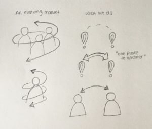
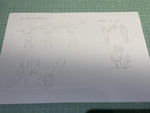
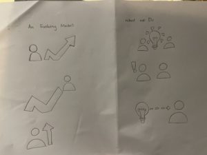
Figure 27: Sketches of ‘What we do’ and ‘An Evolving market’ illustration (By Kaylee, Kory and Holly)
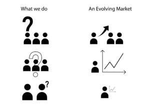
Figure 28: Digital version 1 (Without colour)
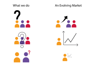
Figure 29: Digital version 2
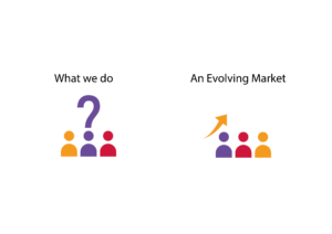
Figure 30: Final version
Independent work (Diagram for ‘intervention’ services by Kory)
The independent work I do is to modify our reach pages that we have done. I need to modify the original light blue part and the text next to the map and determine whether to add a map. After reading the page information provided by the client, I know what the page needs. The content is mainly about what kind of benefits TSoC will give to their customer groups. Like for the school, what they bring is the best choice for students. And to increase their confidence in students. It is almost the same for parents of students and customers. It is very interesting that I found a exactly the same thing in his description called: Gatsby Benchmarks. This word is very unusual in ordinary life. So I think this must be their outstanding part. So I went online to check the meaning of the word and made a design about it.
Figure 31: Our Reach with Gatsby Benchmark
I replaced the text in the middle with the definition of Gatsby Benchmarks and showed it in a mind map and problem-centric approach. I believe that most people like me are not very clear about what Gatsby Benchmarks is. It will be very clear and clear to show it through a mind map. Through this picture, the customer can know what TSoC can provide them. The light blue background and the white mind map can highlight the content very well. But after discussing Izzi, I feel that this part is not very important. She still hopes to keep the blue part of the car full of text. And I want me to adjust the text ‘National Network’ next to the map.
Because TSoC is a national company, it is not a global company. So highlighting this part will bring some benefits to the company but also some disadvantages. But in the end, we still decided to highlight this part. I made two versions of the draft design. The first is that the blue part is not changed. The second is to turn the blue part upwards like a card.
In the first type, I put the blue part in the middle of the map and enlarged the map. Because these things are accompanied by the map, I think if you put them on top or below, they will not change much with the map. The second one I do is similar to a card. After dragging down, the text will be overlaid up like a card.
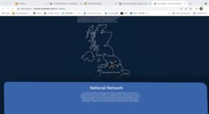
Figure 32: Our Reach with national network card motion
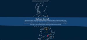
Figure 33: our reach with national network inside map
The final version did not adopt all my changes. The content of the change is to change the original blue part of the content from dot by dot to paragraph. And removed the following content. This makes this page look much cleaner than before.
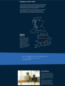
Figure 34: Our reach final version
Reflections:
Reflection on project (Holly)
During this real job, we had lots of time to perfect the design and meet the needs of the client as effectively as we could. As a team we worked well together, some of us had more significant roles in this project than others due to more experience. However, we all individually contributed large parts to the project (such as illustrations) and overall worked well as a team. Personally, this project helped me develop my communication and technical skills. At the beginning of this job I was hesitant to speak up but as soon as the project continued, I felt I contributed to discussions more. The job gave me a better insight on how to work with a client in a professional setting.
Reflection on project (Kaylee)
This time Real Job was a special experience for me. Before this Real Job, I had never done this kind of work for clients. It is also my first contact with design work. Enriched my resume in personal experience. In The School Outreach project, we have been working in small groups. In the group, I am mainly complicated to provide ideas for each step of the design and draw some illustrations. Projects that work in groups usually require excellent communication skills. I think at the beginning of this project, I lacked communication. But after everything is on track, everything is fine. In this project, from Logo to Branding to PowerPoint Palette, and finally to making an entire website. It can be said to be a big project. From this, I learned how to communicate with customers and after making a version, we will meet in a group to discuss which solution is more suitable for use. In terms of design, we often need to conceive an idea in a short period of time, and then draw a draft. Then choose which one has more potential for development. This also allows me to experience that design is not an easy job. We need to consider what customers like, not what we like. Sometimes we find it a version we really like it. Customers don’t like it that much. Group work projects really help me to work on mine communication skills and design skill. Group work projects really help me to work on mine communication skills and design skill.
Reflection on project (Kory)
Through this Real job, I learned a lot of things that I felt I couldn’t learn in university. I learned:
- How to communicate with customers in a professional setting.
- How to work well in a team whilst collaborating on a design.
- And how to meet the client’s needs by combining our own ideas with theirs.
From this experience, I also realised that the client’s ideas cannot always be achieved the way they would like them to be. As designers we must advise them of possible or even more suitable ways a design can be achieved while still meeting their needs.
Trello Link:
https://trello.com/b/7kGuxHtj/rj00514-the-school-outreach-company
The School Outreach Company Website:
submitted on behalf of Kaylee, Holly and Kory
Longhaul sports fuels packaging design
Overview
Longhaul is a growing brand which specialises in creating prolonged energy release food for athletes. Owners Staale Brinchmann and Amelia Watts found a gap in the market for savoury foods as other brands in the market have focused on sweet flavours. Our project – undertook by myself, Alex Ganczarski, Ro Dicker and Liselot van Veen – consisted of redesigning food pouches for their 4 existing flavours, creating a template that could easily be adapted to more flavours in the future.

Restating our brief
When this Real Job was advertised to us, we were expecting to provide an update of their logo and tag-line design, pouch designs for 4-6 flavours and advertising graphics and templates. However, after communicating with our client it became clear that they were happy with their existing logo design, but wanted to rework the tagline and intended to use the pouch designs themselves as advertisement to present on their social media platforms. Thus, our tasks became:
- Rework the tag-line
- Create an adaptable template for their food pouches, presenting completed examples for their 2 flavours currently on the market, as well as examples without the full copy for 2 flavours that are currently in the testing phase
As a result, the job was a lot smaller than we anticipated. We used this to our advantage as it meant all 4 of us could work together to bring a broad range of pouch design ideas forward for our client.
Understanding the market
A few of our client’s closest competitors are Clif, Tribe and Science in Sport. Staale identified that Tribe’s branding aligned with the way he envisioned Longhaul’s branding, with its vibrant landscapes and sense of being outdoors. This provided us with the challenge of drawing inspiration from Tribe, while standing out on a shelf with its own identity. Our client was also very keen to not include any images of food, an aspect with bothered them about their existing pouch designs. This encouraged us to think outside of the box. While looking at these competitors we noticed a few trends; the name of the brand being highest in the design’s hierarchy, the use of bright colours to stand out on shelves and key words on the front such as ‘protein’ to entice users.

Refining their branding
While our client was pleased with their existing logo design, we worked to improve its application. The existing version included a red symbol against a blue background which decreased its overall legibility. Due to cost implications, we could not introduce any more colours to the logo to fix this problem. To stay within our client’s budget we tweaked their existing colours by first testing different shades of red against the dark blue to see if we could get it to stand out more. In the end, we chose instead to swap the colour of the text with the colour of the background as the red stands out much more against white.

Initial sketches
We began the design process by each doing a set of sketches to present to our client and learn which direction they wanted us to go in. We struggled a lot with moving on from Longhaul’s existing pouch designs, with our early experiments consisting mainly of rearranging the elements from the previous design.

Developments
We found our ideas became a lot more broad in our digital developments as we could then play with colours and layering. One of the biggest challenges we faced was representing the wide range of sports that Longhaul’s pouches could be used for as they provide energy for any endurance sport, such as marathons, cycling or hiking. It was more difficult to work as a team when we reached the digital stage and found we all took vastly different approaches.
Drawing inspiration from competitors in the field, we experimented with bright colours and searched for ways we could advertise the nutritional benefits of the pouches. In our attempts to make those stand out however, we lost a sense of hierarchy.

To no avail, we spent a great deal of time trying to make a typographic solution work. As we were struggling to figure out what imagery we could use a typographic design seemed ideal, though in practice it did not have the desired affect. One reason this did not work is it competed with all the other text elements. However, communicating wit our supervisor we began to work more effectively with hierarchy.

While the typographic experiments were unsuccessful, we realised we liked the appearance of the mountain and found it was very useful as a tool for aesthetically dividing up all the cover copy. This prompted us to further explore mountain imagery. After a meeting with our client and looking back at our research on competitors that the name ‘Longhaul’ should stand out the most, acting as further advertising for the product when other athletes see someone using it.

Communicating with our client, we then developed their favourite versions of the design. To divide up the workload we shared the chosen design documents and each made our own tweaks. One thing that really helped us visualise the packaging was creating mockups for our designs which we presented to the client at each of our meetings.
Reworking the tag-line
Throughout the course of this project, we went through many iterations of tag-lines as our client was unsure which words would best advertise their product so we tested many variations to see which ones were received well. In the early stages of the project, they were very keen to promote the slow release energy of their product so our early experiments primarily focused on this aspect. Our client gave us many key words to work with such as ‘performance’, ‘endurance’, and ‘prolonged energy release’. However, later in the project Staale and Amelia saw the value in promoting their natural ingredients and were also set on including the word ‘fuel’ based on how competitors were advertising their products. This became difficult for us as our client wanted too many words for what was supposed to be a short tag-line, and we struggled with including as much as we could but also making clear who the product was for. After experimenting with options such as ‘performance fuel’ and ‘endurance fuel’ we eventually decided on ‘sports fuel’ to make it known that it is a product for athletes.
The final design
One consistent idea that stayed with us throughout the project was the use of mountain imagery to echo Longhaul’s logo. You can see this experimented with in my initial sketches and it eventually developed into the polygon mountain range we settled on.

The back cover
When it came to designing the back cover, we experienced delays in our project due to Covid19’s effects on our client’s business. While we were awaiting feedback from our client on the front cover designs, Alex took the initiative to move forward with the back cover as the front cover was almost finalised. To make it cohesive with the front cover he repeated the mountain texture. Aligning with Longhaul’s need for a sense of identity we were able to ask our clients for their signatures, adding a personalised touch to the brand.

Technical preparation
Once our final designs had been approved by our supervisor, Rob, we were ready to send our files to the client. We had expected to send off print-ready files but 2 of the pouch flavours had still not been completed by the end of the project. We agreed with our client to clean up our inDesign files for another designer’s use in the future once those flavours are completed. We packaged the files along with guidelines for another designer to use. We realised at this point that some of our colours needed to be switched to solid CMYK or Pantone colours to print correctly, though this was easily rectified.
Reflection
Given the size of our team and the reduced workload from our restated brief we expected this project to be completed swiftly though in the end it took nearly a year. This was due to difficulty establishing contact with our client on occasion when Staale took out of country visits, as well as the issues caused by Covid19. We also needed to contact Gualapack at one point to understand the printing specifications as our client was unsure. Overall I am pleased with the designs we came up with and believe they match the image Staale and Amelia envisioned.
‘We have been extremely impressed with the designs that you have all put forward & are very happy with the final results. So thank you for all of the hard work!’ – Amelia Watts
‘It’s been a pleasure working with you all and I’m very impressed and pleased with the final result.’ – Staale Brinchmann
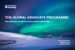
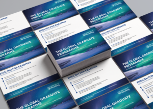
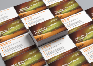
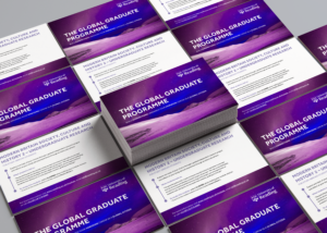
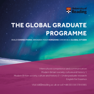
Global Graduate Branding
Background
This branding project was for a new and upcoming module established by Daniela Standen, which will be part of what the University of Reading will soon be offering in the new academic year approaching. Our goal was to deliver a visual identity for the client which would essentially promote this new module. Our challenge was to make sure that collectively the final deliverables worked together using the same visual identity to promote and communicate across what the Global Graduates module has to offer for potential and existing students. By taking part, they have the opportunity to improve and extend the asset of skills they already have and take part in activities outside their subject to become a better citizen and stand out to future employers.
Brief
Both me and Hanorah worked on to create a cohesive brand identity across the three deliverables we agreed on with our client Daniela. We knew that to achieve this, we had to remind ourselves of the existing brand identity of the university itself to ensure this cohesiveness was implemented throughout all the final outcomes, whilst echoing the visual identity of the university. The set of deliverables agreed on were:
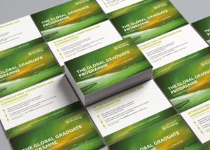
- A set of postcards for each sub-module (x4)
- A website banner (for the page corresponding to this programme on the university’s existing website)
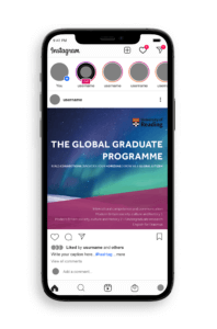
- A social media graphic (to be posted on platforms such as Instagram and Twitter)
These final outcomes were to be displayed ALL digitally, with the exception of the postcards which were to be printed as well to be handed out to new students during Welcome Week.
Research
User personas and needs
Establishing our target audience and generating ideas with them in mind was our first step. These outputs should promote the Global Graduates module to existing, new and global students and increase interest in taking part in this extra-curricular programme to build and enhance skills outside their degree course and academic development. We used the existing identity of the university and the brand guidelines provided by the client to ensure that the final outcomes echoed the identity of the university itself, whilst also bringing in a fresh and innovate design to distinguish the module. This approach ensured we targeted the user effectively – to have a professional design, whilst also keeping it fresh and engaging to attract the young people.
Visual references
To give our client some design overview of what the final outcome could potentially be like, we decided to produce some mood boards for each deliverable. This got both parties to begin to think about appropriate genre, graphic style and typography treatment.
From the feedback we got from our client, she preferred the simpler designs (mood boards 3 and 4) We noticed a set of features used by both of these visuals alongside images we found for inspiration (for the other deliverables) which made them successful:
- The background image has the most drama (instantly catches the audiences’ attention making them want to read the information.
- Theme of photography and editing – a consistent style in terms of the imagery used and the way the images have been edited is a common theme. Experimenting with different depths and densities of the hue, saturation and the luminosity of an image can transform the images from looking dull and boring to them looking mesmerising and appealing to the younger audience.
- Consistency of typefaces and sizing (use of the typeface Effra with minimal tracking)
- The use of the different weights in the typeface differentiates the types of information which helps the audience navigate through the information better.
- The use of white as the predominant colour for the typography acts as a nice contrast with the background colours.
- The use of the university logo (typically placed on the right-hand corner – mood board 6) endorses the identity, again helping the audience to distinguish where it has come from.
Design developments
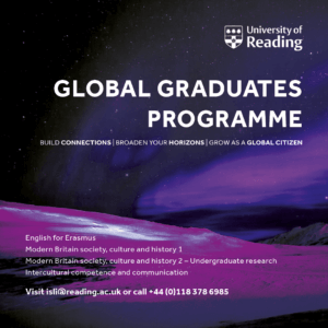
Postcards
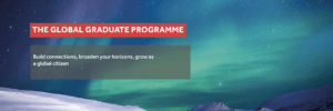
We had to produce a series of postcards which had a consistent visual identity across all, however still being differentiated by the different sub-modules. Our aim for our initial design (version 1) was to try and get all the elements (typography, imagery, logo) on the page. Although this design concept is neat, it was too simple, so our supervisor instructed us to add more innovativity to the design. As well as this, having this same background on all four postcards could make it seem as though they are all the same, when in fact they have different pieces of information behind them. When these are placed on a table at a welcoming event, students can easily assume this too and not pick them up. In light of this, we decided to edit the image we found on Pixabay, using Photoshop, inspired by the mood board we had made previously (mood board 4). After experimenting with different filters and luminosities, and changing the hue and saturations of the single image, we were able to compose four alike, yet different graphics which really helped make a big turn in our design developments (see graphics below).
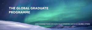
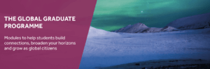
Postcard 2 shows a different layout of the elements with a more visual appeal. The timeline of the graphics draws the reader in and makes it more exciting to read as they are being guided through the postcard. We transferred the contact information at the back as the client wanted all the attention to be on the heading and slogan. We acted upon our feedback given by our supervisor to do something different with the slogan as the words had the ability to be manipulated in a way to be of more appeal. After capitalising the slogan and separating the phrases, we decided to increase the weight of the words “connections”, “horizons” and “global citizens” Accentuating these words intrigues and engages the audience as they want to have and be all these things. In the final outcome of the postcard (version 3) we also took out the anonymous icon graphic as it leaded towards the design getting overcrowded. We had to remember that when printed, it would be A5 and seeing all of this on such a small card can overwhelm the reader, leading onto them potentially showing no interest at all.


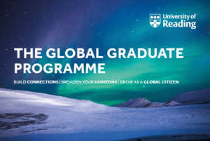
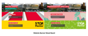
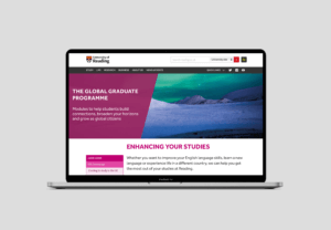
Website banner
We began the website banner by taking inspiration from the existing page banners from the university’s website and implementing a similar style (website banner version 1) The red box around the heading was something we saw which came up quite frequently, however it did not collaborate, or work well with the design of the postcards. After we removed it, there was still something missing – we did not want to just replicate the design of the postcard onto the banner directly, it had to be a bit different. Therefore, we added a new element (shown in website banner version 3) with a left alignment and a lower opacity of the fill so that the background can show though. This enabled us to place the typographic elements easily also following a left-alignment. We decided to change the slogan as we thought that by writing a sentence would connect to the reader more and would act as an invite to the web page.
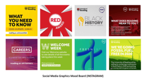
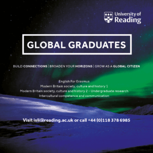
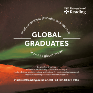
Social media graphic
Designing this deliverable was different as social media platforms need media which is firstly visual and secondly it needs to be easily read and accessible to readers. After completing version 1, we saw that it was difficult to read the small text due to the colour and how it sat on the background. We had taken the idea to surround the heading with a rectangle from the early stages of the website banner, however after being advised that we should use the same heading as the one on the postcard here too, this idea was not possible. Version 2 was also done in the early stages just for idea generation purposes as we felt as though giving the client more ideas to choose from was ideal for a better final outcome. This idea shows typographic manipulation; we wanted to make the shape of a globe, suggesting ‘global graduates.’ However, this idea was dismissed due to the heading we had to change and due to the fact how the white text did not sit right on this background either.
After further experimentation with the background and ensuring it shared the same visual identity as the postcards, we landed on our final idea (version 4) We thought that by introducing a background colour to the smaller text increased the legibility making it easier to read on a platform such as Instagram. All the elements here are left-aligned which cleans the design up, compared to the previous designs we had made which had multiple alignments which sometimes made the design messy and all over the place. We were advised by the client to change the university logo to the coloured-fill as it represented the university better in this context.
Reflection
The series of designs we produced received positive feedback from the client and their team. We believe we have created a series of deliverables that work well as a set, but also fit their current theme on the website through the pink shape on the left (website banner and social media graphics). Our client was so pleased with the work we had completed for them that they made an additional contribution to the Real Jobs fund, which we were extremely proud of!
This job as a whole took a little bit longer to complete than we anticipated it would, however, we were told at the start that the submission date was flexible if the print deliverables were sent before July to work with the printing date. But, the digital submissions could be flexible. We feel as though because our project was over the summer, it was difficult as some people had been out of the office for the summer break. But this was all a learning experience for us, which has prepared us for the real world.
The Gentlemen Danes book illustration
Background
My client for this real job was an independent publisher based in Reading. The client is writing and publishing a new book that details historic events dating back to the early 19th century. The book tells the story of Danish prisoners of war, residing in Reading during the years of 1807 – 1814; mainly taking from the memoirs of one of the prisoners, who became better known in the town as the Gentlemen Danes (also fittingly the title of the book). The book is the first to detail the ventures of this particular group of war prisoners as the memoirs were recently recovered and have only been translated fully as of 2020. The story of the Gentlemen Danes follows the group mainly throughout Reading and different parts of Berkshire; describing their lived experiences that make for an interesting, historic read.
Restated Brief and deliverables
The job originally started off as a commission for an illustrative font cover with a rather quick turn-around; it entailed that I create an illustration that works as an eye catching, historically accurate front cover that did allowed ample bleed and did allowed for the integration of text for the title to exist in the same space also. To begin with there were not many reference images to work from, aside from one sketch that my supervisor had quickly drawn herself. Ultimately the illustration was described to me as a somewhat realistic illustration for The Gentlemen Danes history book that displays one fete (‘Revel’) as described in the text (the text was provided for me also). After emailing my supervisor who was in direct contact with the client, I then found out more about the nature of the illustration and some possible additional deliverables on top of the proposed illustration. It was being discussed if the cover would also serve as a smaller sized thumbnail image on the inside of the book also. I was also told to consider using the colours that were see in the Danish flag and that the exact colour values I use would have to be noted for possible use elsewhere on the book; perhaps for the titles or other text on the cover. This meant that I also had to think carefully about which tones would work on top of the illustration for it to be legible enough.
After going back and forth further with my supervisor and client however, we came to an understanding that the colour would be dropped as a deliverable and that the main focus was just the cover as an illustration. During this process the dimensions of the cover (275mm x 212mm) were given to me as well as how much bleed was required (3mm around all sides). From the start the illustration was set as being CMYK as it was definitely going to be printed, and the point was made that care would have to be taken to make sure all necessary detail was big enough to be see on a cover at the size it was. The other considerations that were very important that I think about carefully were the accuracies of not only the scene being depicted, but the clothing, hairstyles etc. of the time as well.
There were only two reasons where the brief had to be changed in a substantial way; one being because of the change of deadline and the second being because the main deliverable changed. During around December time the client decided to change his mind about what he wanted for the cover. I was told that he came across an original painting that displayed the Danish flag on its sales and he thought it to be a very good cover for what he was writing about. This did not mean that I had been designing for nothing however, and he made the compromise to keep a space left in the book for my illustration to be displayed. The brief had to be updated from a cover illustration to a general inside pages illustration; which fortunately meant that I would not have to change much except fill in the space where I left empty for text to be.
Schedule
The job to begin with was a rather quick turn-around of Around 5 weeks, of which I was confident in reaching on time. This did not go as planned however, and the level of accuracy and detail that my client required was more than initially expected. Not reaching the deadline I was given was not however a problem; I had warned my client before time that I may not reach the deadline I was given, which was originally the 15th of October and he explained that he truly wanted the illustration done by January. I assumed then that the original date given wasn’t entirely true to the sentiments of the client. Over the time it took to create the illustration, I believe that I have kept a steady, suitable pace, even when other commitments got in the way. In terms of communication with my supervisor and client this real job felt a little different than the average. My supervisor was a Masters student who was very busy a lot of the time, and it became apparent when her reply times were getting longer and longer. We came to a happy medium however where I would directly email and set up video meetings with the client instead of going to my supervisor first. This was agreed on by all parties and in retrospect made sense for this kind of job; I was making changes as per the clients request so the supervisor just being an extra messenger was not the most efficient. From this point in about early November, I would be meeting frequently with the client, and every so often emailing my supervisor with an update on the illustration process.
Process
At the beginning the job ran like a normal real job would. I contacted my supervisor for feedback, and when given the green light I would get feedback from the client. Often times my supervisor would be medium between us, but after a while it was established that I was better off getting feedback directly from him as it was his specification I was catering to. It also meant that I wouldn’t have to go through my supervisor just to get to my client. From then we were in agreement that this be the process for communication. In the first couple weeks the interaction between me and the client was mostly to do with general styles of illustration and the composition of the scene. We settled fairly quickly on a style, but the layout of the scene took a while longer to agree on. At this time I was still working with barely any detail and mainly would move rough stickmen figures to signify where a person would be in the illustration; perhaps the lack of detail and didn’t allow for a true representation of what the layout actually looked like at this time. In this part of development we went over a lot of changes in a period of time, building up the composition piece by piece.
After a while of talking about research for the kind of clothing they would wear at the time, the client requested that I visit the Museum of English Rural life to get a more accurate and confident look and feel for this aspect. The visit was very fruitful, and the notes I took were very helpful to the character development over time. The books where I got the most useful information from were British Working Dress – occupational clothing 1750-1950 (Jayne Shrimpton) – Shire Library, and Pyne’s British Costumes (William H Pyne) It was the first time that I would have to an extended amount of research for an illustration. It was also a learning curve for me in terms of illustrating from descriptions in text.
Design
The first sketches I sent to the client were in pencil and were to get a feel for the number of people in the scene how the scene would be generally set up.
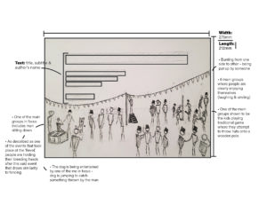
I would also draw in pencil a template for the styles I gave to the client to decide from. I had already been told that the client liked some of the styles shown on my portfolio, and I had also been told that the illustration was to be somewhat realistic. I drew the same human figure and took it to illustrator to create a few different styles of which the client picked the one that incorporated shading made up of hatching. The reason was that it resembled engraving and gave historical connotations in of itself.
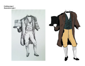
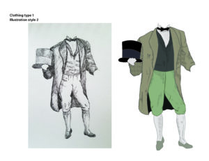
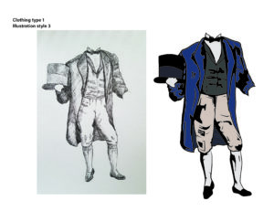
From here we would simultaneously go through different characters and the accuracy their clothing, and the composition of the scene as whole. Up until the last one, every meeting with the client would result in either a major or minor change to the illustration.
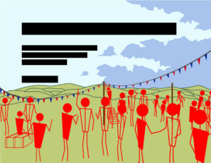
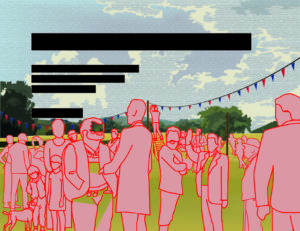
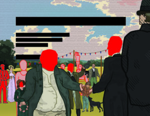
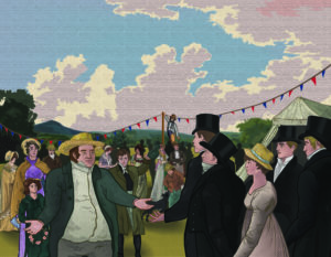
For a while it was quite intense with the number of changes suggested, but I soon got the hang of it. I also learnt very quickly to work in a way that would allow for things to be moved easily around the illustration without any problems, i.e. ensuring each person was their own entity (by grouping their components) so if they were to be moved to the left or made bigger, it was an easy change. After a while colour was incorporated, many characters were changed around, taken out or added and the whole scene became a reality.
Reflection
The real job ended different to how it started in more ways than one. Firstly I didn’t realise how much detail and research was required for this illustration, and it came as a little bit of a shock to me how much time I would go on to dedicate to it; it stands to reason that the initial brief set false expectations due to it being advertised as a quick turn-around. Another area where there was a big change was the connection between me, the supervisor, and the client, with the supervisor eventually becoming an unnecessary step in getting feedback from the client. The final area was when the job illustration changed from being a for the cover to being for the inside content.
At the start there were a few things that the client wanted to explicitly be in the illustration in some way or another. The list consisted of a black and white dog, some of the Gentlemen Danes in the frame, one of the main Danes being very tall and skinny, a large famer welcoming them into the fete, a line of fete banner across the field they were on and some kids playing one of traditional summer game. With all of these worked into the illustration, the client seemed very happy with what was achieved. A word from the client that further justified this;
“Lewis put his name forward to do an illustration of a country event in Berkshire in the early nineteenth century for a forthcoming book. In order to be as historically accurate as possible Lewis had to do a lot of work in researching the costumes people were wearing at the time. After many online meetings, and a number of adjustments and modifications to the original brief, we finally honed it down to a picture that I was very happy with. Happy not only because it is an authentic reproduction of how the event might have appeared like, but also because it was done in Lewis’ own graphic style. It was a very pleasant experience to work with Lewis and I wish him great success in the future”
Overall I was very happy with how the job turned out, and although the prospect of having my illustration as a book cover was more exciting, I am still very glad and grateful that it even gets to be in a publication of some sorts. The end product felt deserved due to all of the time, research and effort that went into the work. Thank you to Libby Skipp and John Nixon.