
Overview
Longhaul is a growing brand which specialises in creating prolonged energy release food for athletes. Owners Staale Brinchmann and Amelia Watts found a gap in the market for savoury foods as other brands in the market have focused on sweet flavours. Our project – undertook by myself, Alex Ganczarski, Ro Dicker and Liselot van Veen – consisted of redesigning food pouches for their 4 existing flavours, creating a template that could easily be adapted to more flavours in the future.

Restating our brief
When this Real Job was advertised to us, we were expecting to provide an update of their logo and tag-line design, pouch designs for 4-6 flavours and advertising graphics and templates. However, after communicating with our client it became clear that they were happy with their existing logo design, but wanted to rework the tagline and intended to use the pouch designs themselves as advertisement to present on their social media platforms. Thus, our tasks became:
- Rework the tag-line
- Create an adaptable template for their food pouches, presenting completed examples for their 2 flavours currently on the market, as well as examples without the full copy for 2 flavours that are currently in the testing phase
As a result, the job was a lot smaller than we anticipated. We used this to our advantage as it meant all 4 of us could work together to bring a broad range of pouch design ideas forward for our client.
Understanding the market
A few of our client’s closest competitors are Clif, Tribe and Science in Sport. Staale identified that Tribe’s branding aligned with the way he envisioned Longhaul’s branding, with its vibrant landscapes and sense of being outdoors. This provided us with the challenge of drawing inspiration from Tribe, while standing out on a shelf with its own identity. Our client was also very keen to not include any images of food, an aspect with bothered them about their existing pouch designs. This encouraged us to think outside of the box. While looking at these competitors we noticed a few trends; the name of the brand being highest in the design’s hierarchy, the use of bright colours to stand out on shelves and key words on the front such as ‘protein’ to entice users.

Refining their branding
While our client was pleased with their existing logo design, we worked to improve its application. The existing version included a red symbol against a blue background which decreased its overall legibility. Due to cost implications, we could not introduce any more colours to the logo to fix this problem. To stay within our client’s budget we tweaked their existing colours by first testing different shades of red against the dark blue to see if we could get it to stand out more. In the end, we chose instead to swap the colour of the text with the colour of the background as the red stands out much more against white.

Initial sketches
We began the design process by each doing a set of sketches to present to our client and learn which direction they wanted us to go in. We struggled a lot with moving on from Longhaul’s existing pouch designs, with our early experiments consisting mainly of rearranging the elements from the previous design.

Developments
We found our ideas became a lot more broad in our digital developments as we could then play with colours and layering. One of the biggest challenges we faced was representing the wide range of sports that Longhaul’s pouches could be used for as they provide energy for any endurance sport, such as marathons, cycling or hiking. It was more difficult to work as a team when we reached the digital stage and found we all took vastly different approaches.
Drawing inspiration from competitors in the field, we experimented with bright colours and searched for ways we could advertise the nutritional benefits of the pouches. In our attempts to make those stand out however, we lost a sense of hierarchy.

To no avail, we spent a great deal of time trying to make a typographic solution work. As we were struggling to figure out what imagery we could use a typographic design seemed ideal, though in practice it did not have the desired affect. One reason this did not work is it competed with all the other text elements. However, communicating wit our supervisor we began to work more effectively with hierarchy.

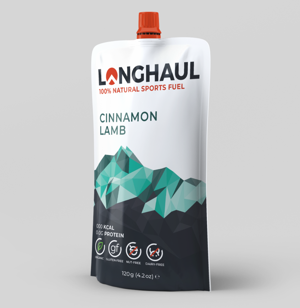
While the typographic experiments were unsuccessful, we realised we liked the appearance of the mountain and found it was very useful as a tool for aesthetically dividing up all the cover copy. This prompted us to further explore mountain imagery. After a meeting with our client and looking back at our research on competitors that the name ‘Longhaul’ should stand out the most, acting as further advertising for the product when other athletes see someone using it.

Communicating with our client, we then developed their favourite versions of the design. To divide up the workload we shared the chosen design documents and each made our own tweaks. One thing that really helped us visualise the packaging was creating mockups for our designs which we presented to the client at each of our meetings.
Reworking the tag-line
Throughout the course of this project, we went through many iterations of tag-lines as our client was unsure which words would best advertise their product so we tested many variations to see which ones were received well. In the early stages of the project, they were very keen to promote the slow release energy of their product so our early experiments primarily focused on this aspect. Our client gave us many key words to work with such as ‘performance’, ‘endurance’, and ‘prolonged energy release’. However, later in the project Staale and Amelia saw the value in promoting their natural ingredients and were also set on including the word ‘fuel’ based on how competitors were advertising their products. This became difficult for us as our client wanted too many words for what was supposed to be a short tag-line, and we struggled with including as much as we could but also making clear who the product was for. After experimenting with options such as ‘performance fuel’ and ‘endurance fuel’ we eventually decided on ‘sports fuel’ to make it known that it is a product for athletes.
The final design
One consistent idea that stayed with us throughout the project was the use of mountain imagery to echo Longhaul’s logo. You can see this experimented with in my initial sketches and it eventually developed into the polygon mountain range we settled on.

The back cover
When it came to designing the back cover, we experienced delays in our project due to Covid19’s effects on our client’s business. While we were awaiting feedback from our client on the front cover designs, Alex took the initiative to move forward with the back cover as the front cover was almost finalised. To make it cohesive with the front cover he repeated the mountain texture. Aligning with Longhaul’s need for a sense of identity we were able to ask our clients for their signatures, adding a personalised touch to the brand.

Technical preparation
Once our final designs had been approved by our supervisor, Rob, we were ready to send our files to the client. We had expected to send off print-ready files but 2 of the pouch flavours had still not been completed by the end of the project. We agreed with our client to clean up our inDesign files for another designer’s use in the future once those flavours are completed. We packaged the files along with guidelines for another designer to use. We realised at this point that some of our colours needed to be switched to solid CMYK or Pantone colours to print correctly, though this was easily rectified.
Reflection
Given the size of our team and the reduced workload from our restated brief we expected this project to be completed swiftly though in the end it took nearly a year. This was due to difficulty establishing contact with our client on occasion when Staale took out of country visits, as well as the issues caused by Covid19. We also needed to contact Gualapack at one point to understand the printing specifications as our client was unsure. Overall I am pleased with the designs we came up with and believe they match the image Staale and Amelia envisioned.
‘We have been extremely impressed with the designs that you have all put forward & are very happy with the final results. So thank you for all of the hard work!’ – Amelia Watts
‘It’s been a pleasure working with you all and I’m very impressed and pleased with the final result.’ – Staale Brinchmann