Background
The IC, abbreviated as the ‘International Collective’, are a company who specialise in internationalisation within the education sector globally. Founded by clients Sirin Myles and Charlene Allen, The IC, aim to create a community for individuals to share, learn, collaborate and support, to help each other grow within the field of internationalisation in the education sector. A way in which the company helps individuals working within this sector, take the next step within their career, is through the use of their online learning platform and training programmes, which provide individuals with workshops, mentoring and coaching.
With the clients wanting to progress further with the company, the development and design of a distinct brand, to represent The IC, became a priority. The clients therefore approached the Real Jobs scheme, at the beginning of February 2020, at which point I decided to take on this branding project after the opportunity was made available.
Restating the brief
To kick-start the job and begin thinking about what the visual identity for the company may entail, an initial meeting was held with both clients Sirin and Charlene in the typography building, to discuss the initial job briefing in further detail. The initial meeting was a very positive one, with my understanding of the field of internationalisation within the education sector, being strengthened. Prior to the meeting, my understanding about the sector the company sat in, was fairly confused and something which did require some time to get to grips with. However, through talking with the clients in depth about the company and what they do and what services they provide, my understanding of the sector improved, which was crucial because I wanted to feel comfortable and well informed of the field that I would be designing for. Following a very positive meeting with the clients, discussing the initial brief for the project, it was understood what deliverables were expected from this job, which are listed as follows:
- Visual Identity: Name and Slogan for the company, a logo (which can represent the companies three sectors: The IC Academy, executive and community and a set of brand guidelines
- Business cards
- Powerpoint, Word report and letterhead template designs
- Social media templates for Linkedin, Facebook and Instagram
- Iconography for the online teaching platform
Whilst a list of the initial deliverables was extensive, the job initially had a very quick turnaround, with the vast majority of the deliverables expected to be delivered within the space of the first month, highlighting the challenge that I was faced with.
Getting the job started
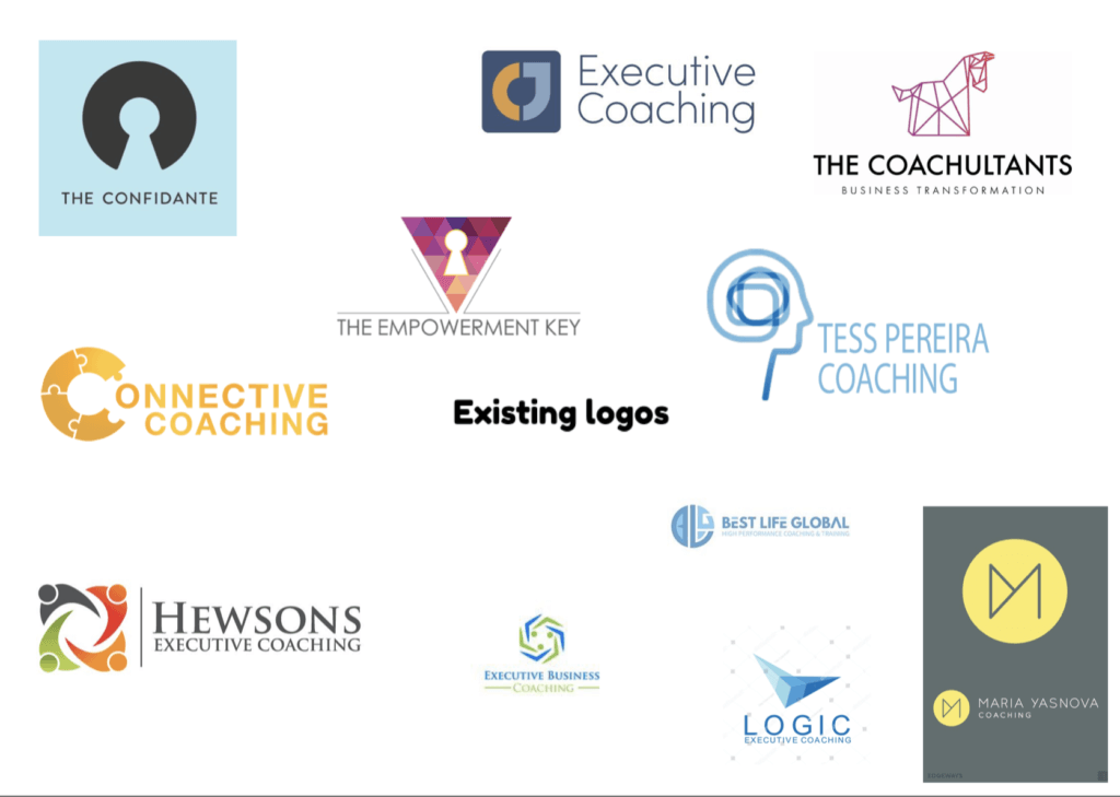
With an initial quick turnaround, research commenced shortly after a restated brief had been agreed and signed off by the clients after the initial meeting. A particularly useful amount of research, evolved from conversations with the clients in the initial meeting, where the clients were able to describe and talk about some of the competitors within their field such as Buila, Advance HE, Universities UK, EAIE, Nafsa and AEIA. Understanding who the company’s competitors were, was incredibly useful to know, as it enabled me to conduct further research into The IC’s competitors and begin to build moodboards analysing the visual design trends amongst these competitors and what common themes could be analysed. Many of the companies as showcased below, appeared to have similar styles of logo, with many logos in particular seeming to incorporate the globe frequently because of the close connotations to globalisation. Other companies’ identities on the other hand, appeared outdated such as NAFSA. With many of the identities within this sector looking relatively similar after surveying an array of logos within this field, it was evident that there was a gap in the market for The IC, to enter with a fresh identity that would give the company an edge over its competitors, with the clients highlighting that the brand needed convey a sense of vibrance, in order to communicate effectively with its audience.
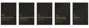
Further to this, a series of mindmaps and brainstorms were then drawn out, exploring key values which could be used to help suitably represent the identity for The IC. Some of the values brainstormed included values such as community, development, sustainability, progression, warmth, global, prestigious, contemporary, learning, connectivity and interlinking. Exploring values such as these was useful, because it helped to highlight potential routes the design for The IC’s identity could take.

Initial sketches
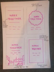
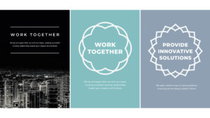
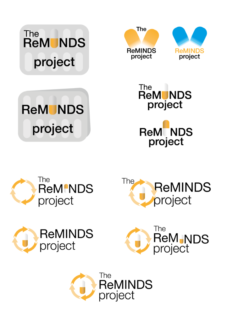
Having analysed the market and existing companies brand identities, initial logo sketches built off some of the values which were brainstormed, focusing on concepts such as education, globalisation, interlinking designs and progression. Sketching these ideas based off core values, was a good starting point in the logo design process. From here, the designs were then digitised with the initial turnaround for the delivery of the logos a fairly swift one.
Through showing the clients these digitised designs, the clients highlighted a preference towards the use of a san-serif typeface over a serif typeface. Through these initial designs, the clients did however express concerns towards using logos that were enclosed within a square as they felt it gave off the impression of being ‘boxed in’. Some of the initial logo concepts which used the concept of interlinking were appreciated by the clients because of the links to the theme of community. The clients however, were quick to disregard initial ideas which used the graduation hat, the use of stairs to indicate progression as they saw these as designs which were fairly common.
Developing logo concepts
With a critical eye looking back on the first round of digital iterations, many of the designs fell short in terms of being unique and as the clients put it, ‘vibrant’. Many of the initial designs had a conservative feel to them, but through a second iteration of logo design concepts, a better attempt was made at producing a series of more interesting design concepts for The IC, highlighted through concepts which explored the use of an arrow, and the interlinking of an I and C together. From this set, there were two designs in particular which caught the eye of the clients. The first concept integrated both the dot of the ‘I’ and the ‘c’ together to form an icon which began to actually look like a person, which could be a good way of trying to symbolise the theme of community, whilst the logo as well had been split into three sections which had the potential to represent the three different sectors to the company as well. The second iteration of logo design from this round of designs, produced another concept which was taken forward into further refinement whereby the actual shape of the letter C, was divided into three sections. Once again, the clients had a strong preference to a design such as this, with the 3 intersections of C having the capability to represent the companies three sectors: The Academy, Executive and Community.
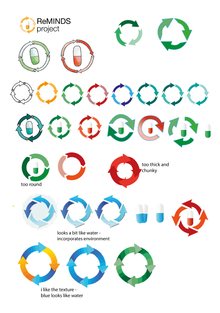
Further iteration of these two logo concepts progressed over an extended period of time. Due to the COVID-19 pandemic in March, the project deliverables and designs for the logos, were pushed back. The clients however, were interested in seeing how the design of the logo evolved with each round of iteration. With these two concepts, several colour ways were tested. Throughout, the clients would often highlight that they preffered to stay clear from colours such as light blues, greys and dark reds, whilst colours such as purple and orange were colours the clients had a strong pull towards. Orange and yellow shades emphasised warmth which would the clients liked in how this represented The IC, whilst the use of purple was something the clients liked, because of its ‘prestigious’ connotations.
Encountering issues with the logos
With both concepts, colour testing with the logos helped to see if the use of three colours within each of the logos was possible. This was explored thoroughly looking at how each colour could represent a sector within the company and correspondingly relate to the strapline in the logo. However, the colour balance when using 3 colours within a logo proved tricky to resolve. In addition to this, the clients were keen to see the strapline contain each of the three colours from the body of the icon. The issue with this, was that the colours in the strapline would often recede and fight for prominence. At this point, it was decided that the first logo concept which integrated both the dot of the I and the C, was the strongest out of the two. The placement of ‘The’ in te second concept proved a challenge and after deliberation by the clients, was disregarded.
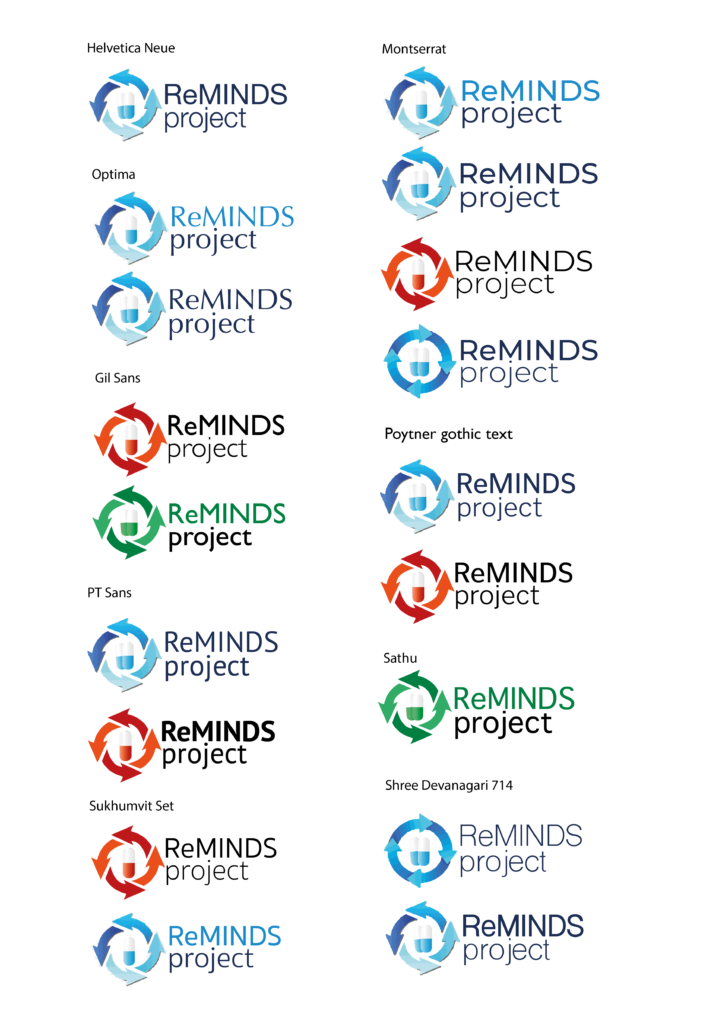
One of the major lessons learnt throughout this job, however, was that my process in designing a logo, was not refined from the start. Part of the issue in my production of the logo concepts, was that a lot of the time they were not designed in reverse and rather with counters around them, giving off a false sense of scale. In addition to this, my scaling of the logo was ineffective for quite a lot of my concepts in how the title scaled with the icon. A major and invaluable lesson learnt was how James Lloyd would often recommend to test the logo on a series of mock-ups to see how it would work as a unit. At this stage in the process, my logo did not work as a unit and the scale was rather awkward.
With this learning in place, reconfiguration of the logo into a more compact-like logo arrangement, proved to work better when placed amongst a variety of mock-ups. However, in this suggested change, the clients did not approve of this and were adamant to stick with the original arrangement. This was a slightly frustrating part to the job, as I was unable to convince the clients about why a change in the logo into more of a unit-like structure, would be of benefit to the user in how the logo would scale and work with other logos. This was an issue which needed to be resolved, as my logo which I had designed proved to be ineffective.

Overcoming issues with the logos
To resolve this issue and ensure that the clients remained happy and on the same page with the project, the logo icon was scaled down to form a more balanced unit in it’s relationship with the text and through testing of the logo against competitors and how it worked with other logos, the design was more effective. At this stage, the colour balance of the logo was also resolved. Initially, the logo design had the dot of the icon in a navy swatch whilst the other two thirds of the icon were in orange. This proved to be problematic especially as the colours seemed to connect with the title and make it seem part of the type.
Ultimately, to resolve this, the upper two thirds of the logo were placed in orange with the lower half in blue, which provided a much better balance overall.
![]()
Finalising the logo
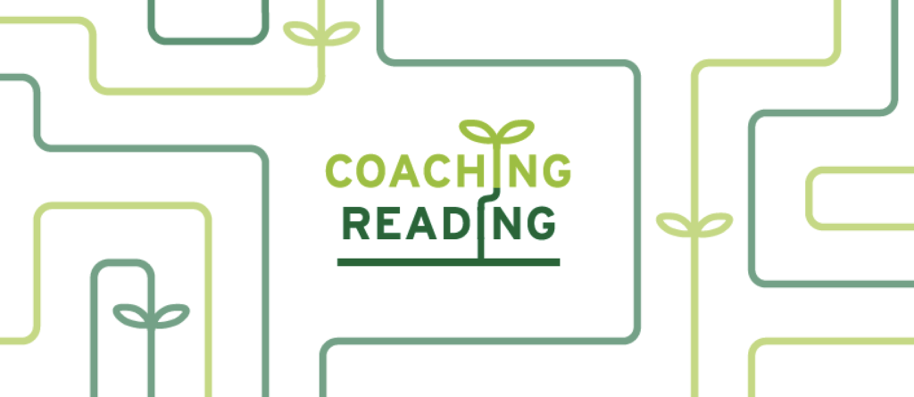
One final amendment was made to the logo in the last few phases of the project. The logo icon, whilst better resolved style had awkward spacing to it. To resolve this, the logo was scaled down to the cap-height of the type, which made the logo a much better unit overall. To persuade the clients of this change, I reflected on what I had learnt during the process of this job and showcased the logo on several mock-ups comparing the old version to the new amended logo, which persuaded the clients to make the alteration, highlighting the importance of always testing the logo in situ. With these refinements made, all that was needed to do, was to package the logo files and make some small refinements to the spacing and sizing of the strapline, as the primary logo for The IC, would be a logo without the strapline, whilst the secondary logo, contains the strapline. The finalised set of logos and all of the different colour ways can be seen from below.

Building coherent brand guidelines
With the logo finalised, all that was left to do, was to build a set of coherent brand guidelines which could be easily interpreted by the clients and anyone in fact reading them. To help get a sense of what sort of content and layout of content, brand guidelines contain, Spotify, Twitter and Co-op brand guidelines were analysed. All three had contrasting styles but helped to provide a steer as to what the job of the guidelines was, especially in trying to get a sense of what sort of tone these guidelines should be written in.
What I learnt during the process of constructing brand guidelines, was that the content both written and verbal should be concise, so that anyone reading them, can interpret them easily. This is especially true if designers themselves, need to refer to the guidelines.
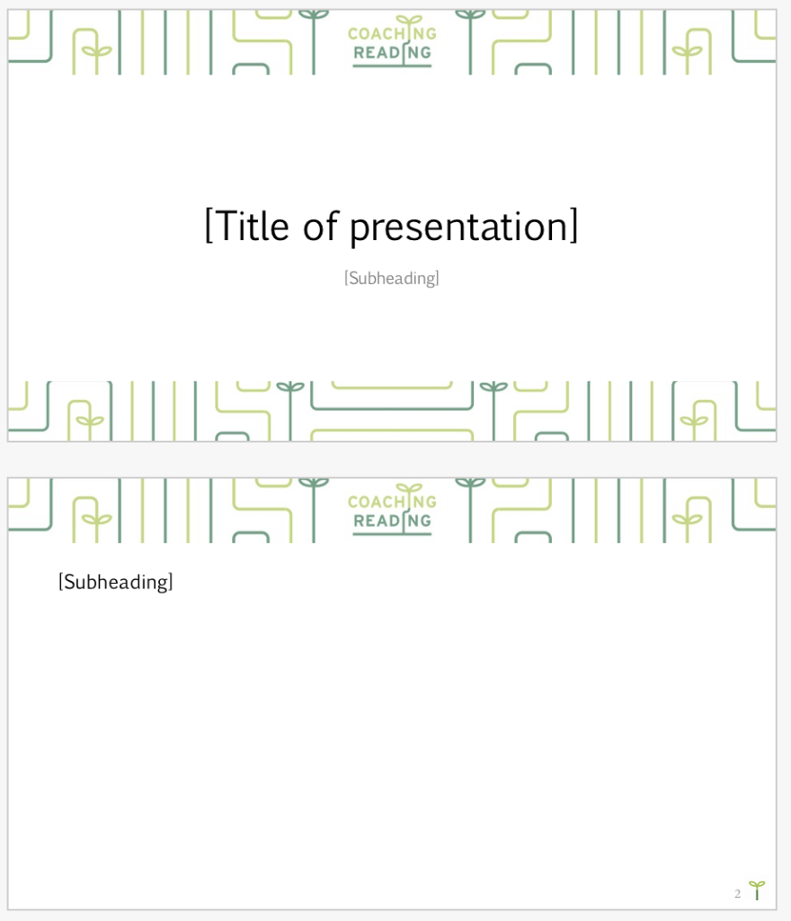
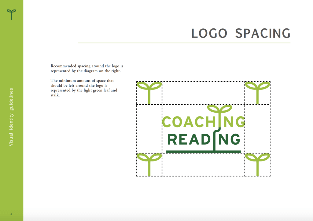
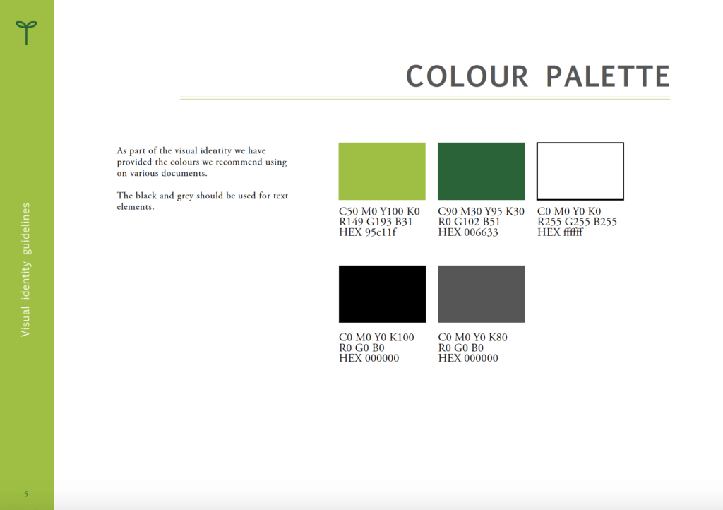
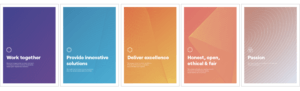
Therefore, the guidelines developed at the tail end of this project, adopted a relatively restricted aesthetic style. The main emphasis on my guidelines was communicating everything clearly to the clients. Therefore, pages were devised to show all of the different colour ways for the logos and what they are to be used for, how not to mistreat the logo and also how the logo should be scaled when placed alongside other logos, the minimum size at which the logo should be used and more. Pages on typography were then integrated into the guidelines simply informing the reader on what weight of font should be used in which instance. A draft page for the colours was added into the brand guidelines, although at the point of submission, the clients had yet to confirm what three secondary colours to represent their three sectors, they wished to proceed with.
An honest reflection
Unfortunately, whilst all variants of the logo and a set of comprehensive brand guidelines, were delivered to the client, it was slightly disappointing, that the full extent of all the deliverables initially stated in the original brief, could not be delivered. The rest of the deliverables including all the stationary, were delivered to a set of second year students. Whilst I am slightly frustrated that I could not deliver the full extent of the job, it will be good to see how the students get on with the branding I have produced for The IC. A test of both the quality of the logo design and the content of the brand guidelines, could be informed by the ease at which, the students can use and apply them.
Having had a period of time to reflect on the job, some of the learning experiences gained from working on a branding project, were invaluable, especially when working in Novemeber 2020 on a more current branding project, as there were skills, which I had learnt and lessons learnt from this job, that were applied to future branding projects and to great effect. This project has therefore allowed myself to evolve as a designer. On a general reflection, my skillset in terms of logo design have evolved and it is fair to say that I was not as adept in this discipline as I initially thought, but as the project evolved and more feedback and lessons were learnt, I believe I have become a much better logo designer, better understanding principles of the logo design process. All in all, I believe a strong identity for the IC was created and one which I hope the company will use for the foreseeable future.
Client feedback
“Sirin and I wanted to thank you for all the hard work you put into The IC project. We know it has been a juggling act and wanted to show our appreciation for your patience, creativity and wonderful contribution to what will be The IC visual identity. A legacy!” – Charlene Allen and Sirin Myles
“We appreciate Harvin and all the effort he has put into this project. He has been taking a very professional approach.”
Supervisor feedback
“I consider you having worked extremely well on this Real job, and think you should be proud of the final outcomes” – Rachel Warner