Category: exhibitions

HOPE: Designing for the future | Global Goals Exhibition

Background

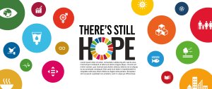
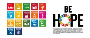
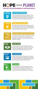
For our academic cohort, the last project of second year revolved around The Global Goals, a collection of 17 interlinked targets that tackle a range of environmental and cultural issues. In the project, each student was assigned one of the seventeen goals, with the task to design a cohesive campaign across an A2 poster, DL leaflet and D48 billboard animation. Although the goals might seem daunting to complete by the provisional target of 2030, outcomes needed to remind audiences that there is still hope, especially with meaningful action.

Our job, as the Real Job team, was to bring together both digital and physical outcomes to form an in-house exhibition – celebrating the work involved and shining a light of hope on global issues.

Restated brief

It was important for us to expand beyond the typical restated brief by including measurements (and visuals) of the panels within the exhibition space. Luckily, this was something we could obtain from Geoff, so we didn’t need to measure each panel ourselves, which would’ve proved a challenge over the summer vacation period.

Our greatest struggle was finalising deadlines, especially since we were collaborating virtually over the summer. Luckily our production dates were solidified from the get-go, but other dates including caption collection and file gathering depended on the cooperation from students and staff. We overcame this through frequent communication via email and text message, and this was often actioned months in advance.

Throughout the project, the brief didn’t change drastically, and our deliverables remained the same:

  • Introductory panel ( 280 x 118 mm )
  • Summary panel ( 224 x 118 mm )
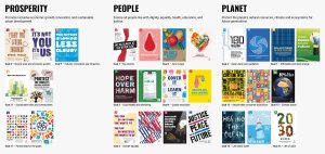
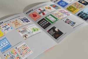
  • Prosperity, People and Planet categorisation panels ( 50 x 118 mm )
  • Leaflet (14.8 x 19.9 cm )
  • Digital exhibition with animation showreel
  • Social media post

Research

Initially, we looked at what the previous year did with their Global Goals exhibition. This was a necessary precaution since it prevented us from copying their concept and helped us identify their successful, and perhaps less successful components. Additionally, we looked at similar student showcases, identifying presentation methods of both artwork and corresponding copy within captions.

Design process

We began the design process by thinking of concepts and ideas for creating a brand image using the global goals branding. Our aim was to incorporate elements of their brand but it not to be a complete replica or a copy of last year’s exhibition. We had meetings with our clients, Rob and Greg, over the summer to which we presented our initial ideas across deliverables.

Initial logo ideas


Some of our initial ideas presented to our client.

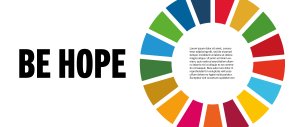
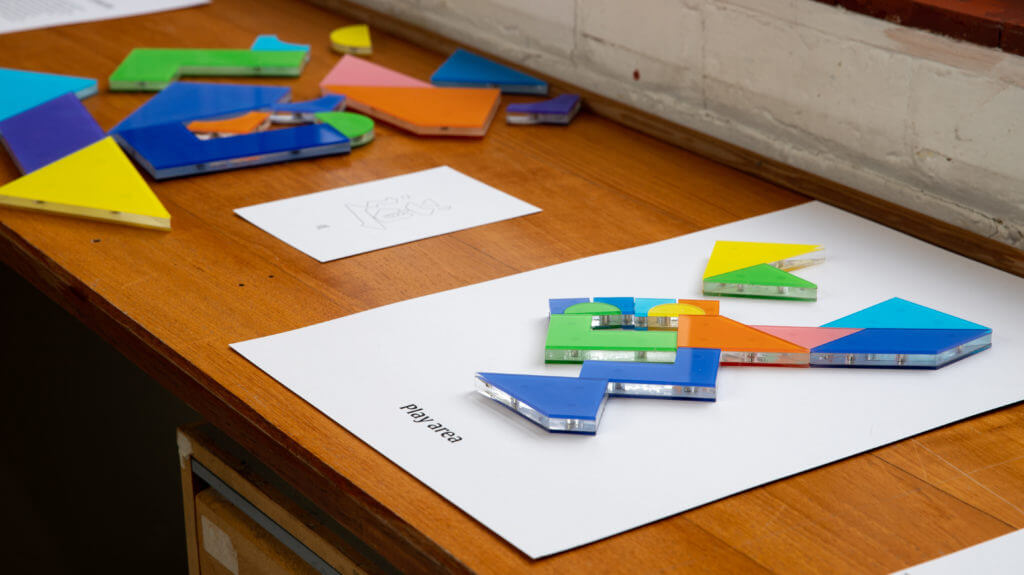
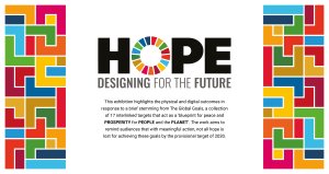
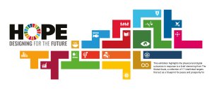
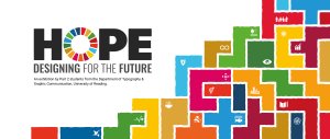
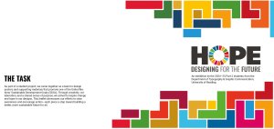
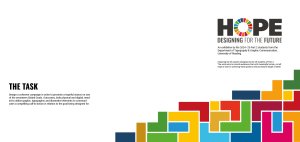
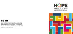
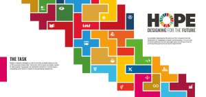
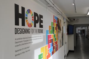
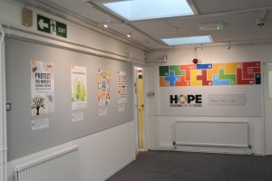
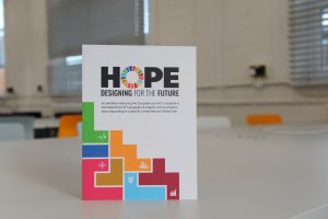
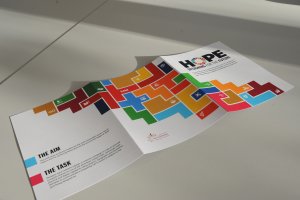
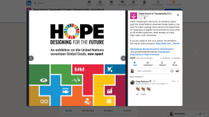
The strongest concept was one that used the global goals colours within a tetris-based design of different blocks. Greg suggested we create a narrative for our concept that fits with the work that is showcased in the exhibition. This is when we came up with HOPE: Designing for the future. The tetris blocks shows everyone’s individual efforts, the students’ responses to the global goals, and when put together we can tackle all issues as part of a bigger community.


Developed logo for our concept of Designing HOPE for the future.

Developed ideas for the summary panel that utilise the initial tetris designs.

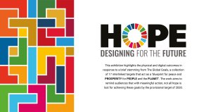
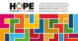
This design was then improved in Illustrator to get a clearer, more unified visual result. We continued to receive feedback from our client, suggesting improvements along the way. One big change we made was the designing of the tetris blocks, originally they were all very similar and rotated in different ways so it was hard to distinguish between different goals. Instead, we created a unique shape for each of the 17 Global Goals so it could be distinguished on its own – linking back to our narrative of individuals coming together. We also experimented with hand-drawn textures as it could be said that the shapes felt a bit too neat and could do with a bit of humanity and warmth. After exploring this idea, we found that the concept was strongest with its perfect shapes and lines.

Once we had established our concept of the tetris blocks, we then explored this through the different deliverables. We experimented with the different ways that the tetris could be positioned and created. The introduction panel shows it building upwards, suggesting growth towards the 17 Global Goals and bettering the planet through design. Further connotation is seen through 29 present shapes – each representing a student and response to the brief. The summary panel shows the lock up of all 17 Global Goals together to show the unity among them, together they represent everything that the Global Goals strive for.

Exploring different arrangements of the tetris.
Exploring creating imperfect versions of the shapes.

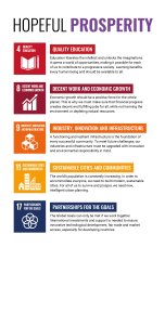
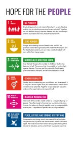
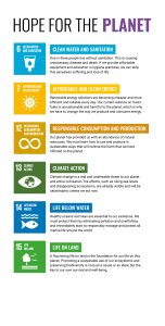
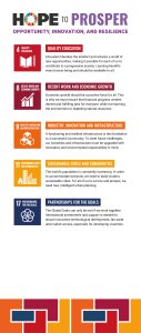
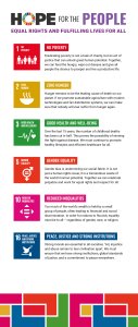
We decided to group our responses into three categories – Prosperity, People and Planet. The first category, Prosperity, highlights the goals that strive for innovation and new global opportunities. The second category, People, looks at the human population and how their lives are impacted by worldwide issues. The third and final category,  Planet, shines a light on the goals that express a concern for maintaining natural resources and Earth’s environments. To introduce these sub-categories, large panels were created to highlight the further aims of each goal. We experimented with no tetris, tetris on the bottom, and finally came to a unanimous decision of presenting a tetris pattern on the top that utilises the colours of the goals involved.

Initial Prosperity, People and Planet panels


Developed Prosperity, People and Planet panels


The tetris design was then explored and continued on through the leaflet. The three different categories allowed for a 3-panel leaflet, each panel showcasing a category of students work.  We looked at a few different ways to present the tetris concept on the front side of the leaflet but finalised on one that links back to the idea from the introduction panel, it bleeds across the back of the leaflet suggesting that we continue on having hope for the future through design.


Experimenting with arrangements of the tetris for the leaflet deliverable.


Installation

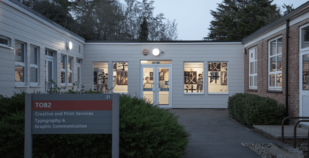
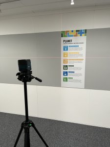
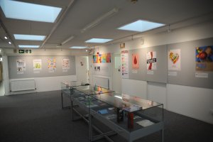
Final installation took place on Friday 19 September. A useful tool that we used was an InDesign document with the exact measurements of each panel. This helped us in planning the flow of the exhibition as well as keeping equal distances between the posters (and captions) on each wall.

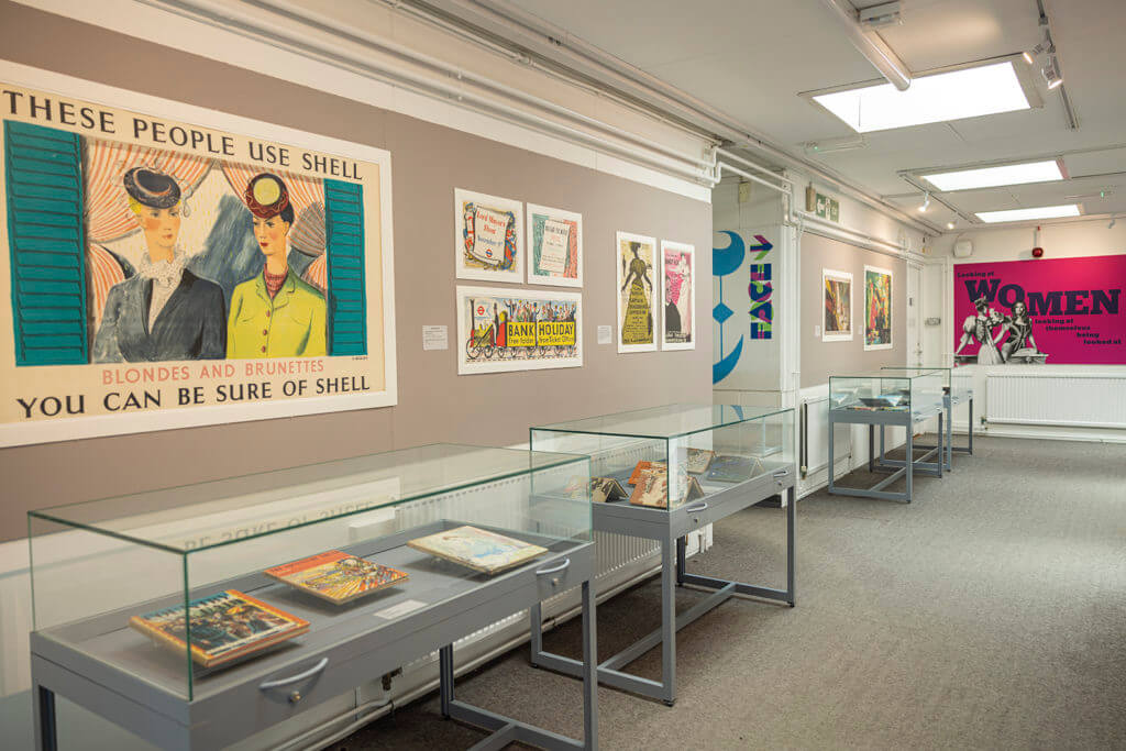
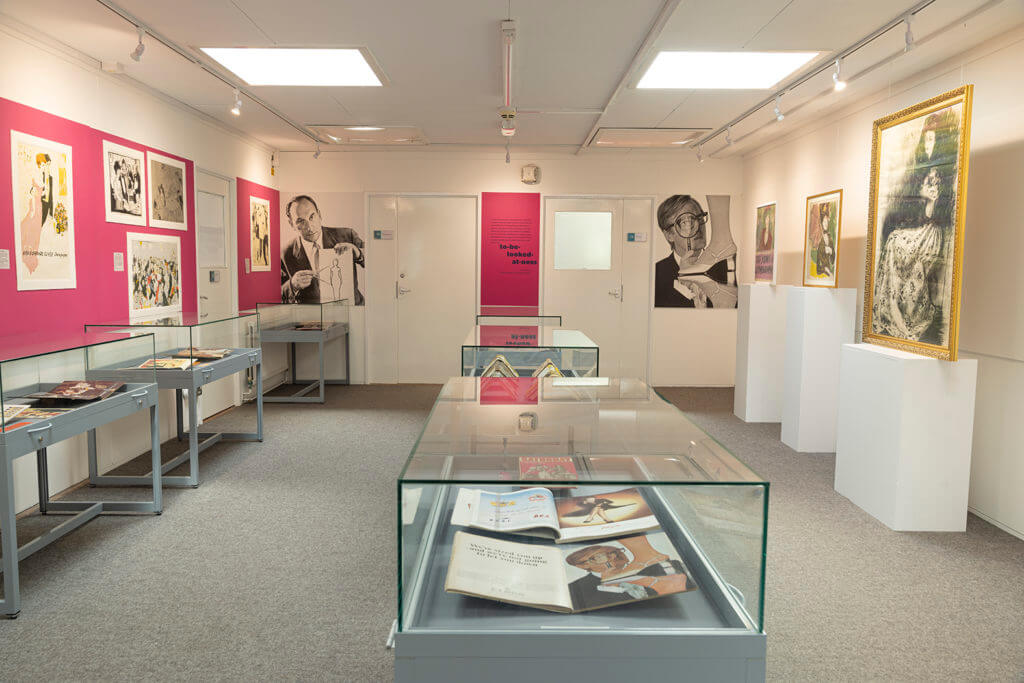
We applied the large introductory and summary panels first since these needed a group effort. Then we applied the smaller categorisation panels alongside the posters and captions. We heavily relied on using the laser level to ensure all wall assets were stuck on straight. All deliverables were printed on UTACK, a sticky-backed vinyl which meant all we needed to do was remove the backing and stick them to the walls. The adhesive backing was strong and durable, so if anything was applied at the wrong angle, we could easily readjust and restick.

Using the laser level on the final Planet panel to make sure all wall assets were stuck on straight.

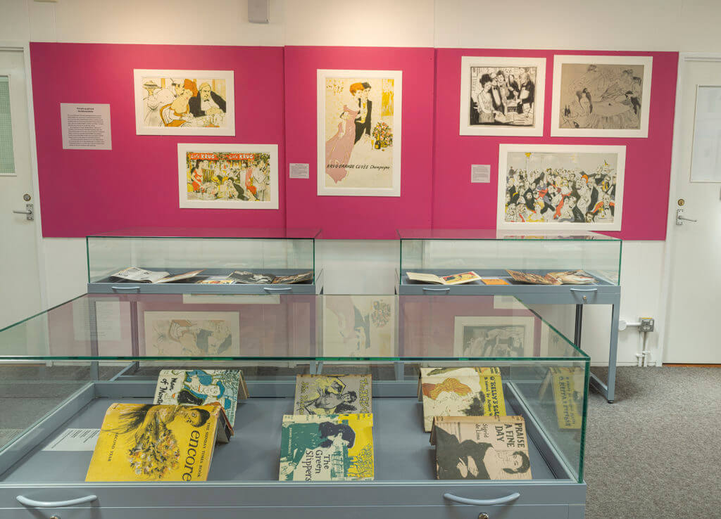
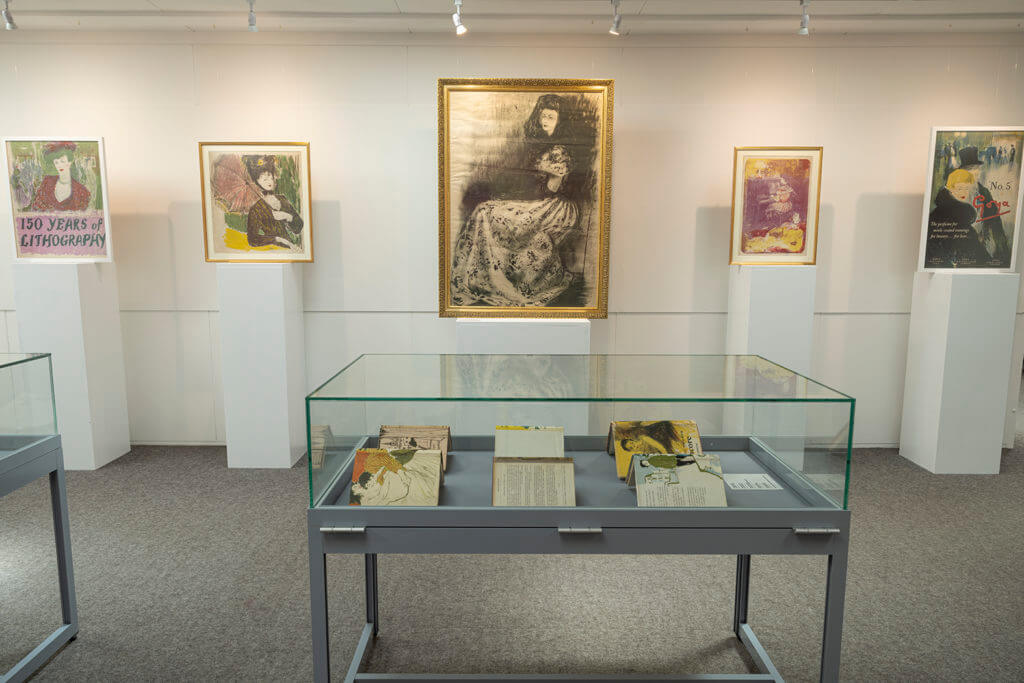
Throughout the summer, we had expressed a disinterest in displaying the DL leaflets since they differed across the academic cohort, with some students producing exciting tri-folds with die cuts and other special finishes. However, once the posters and animations were up in T-Spur, we felt that the centre of the corridor was too empty. It was then at this point, we decided to bring in three glass vitrines to display the student submissions. Having the leaflets further establishes the cohesiveness of the campaigns on display, and adds more interactivity for the visitor.
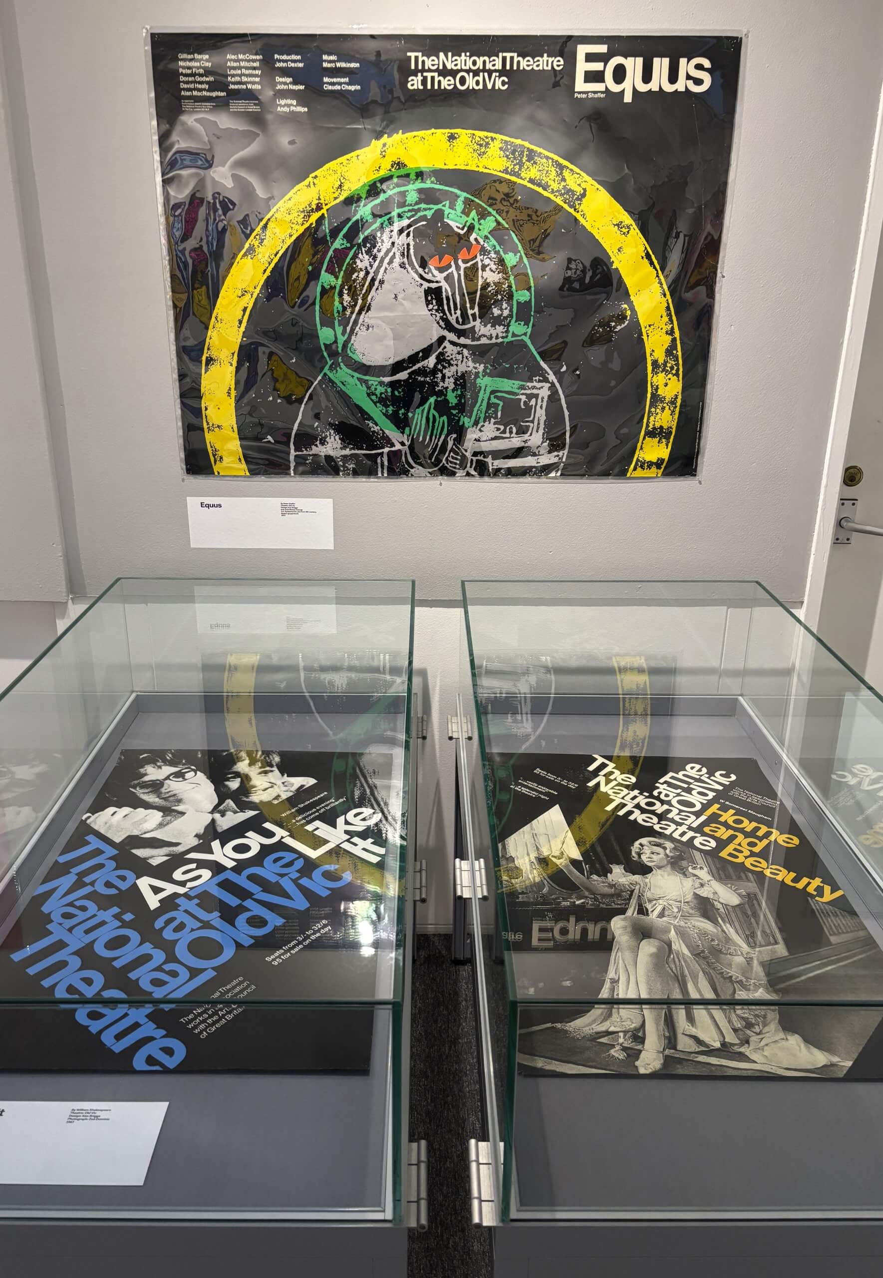
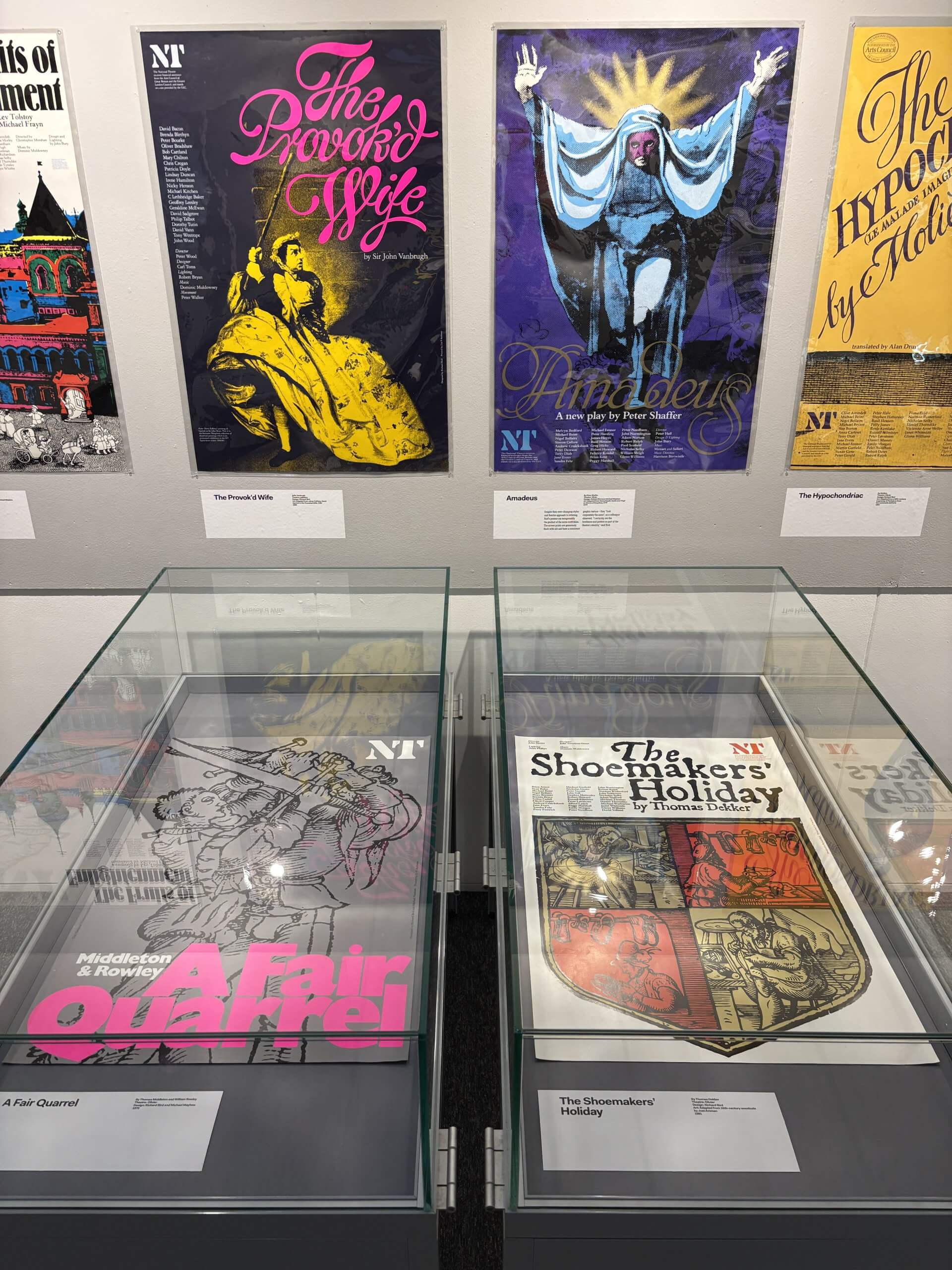
 

Final products

Physical exhibition space

Introduction panel, situated in front of the main entrance to the Department.
Summary panel with half of the responses to the Prosperity category.
The primary exhibition space, with the leaflets at the centre within the glass vitrines.
The digital display with the animation showreel on loop alongside the physical leaflets.

Leaflet

Front page of the leaflet.
Inner spread of the leaflets, showcasing the posters in the order in which they appear in the exhibition space.
The outer pages of the leaflet.


Promotion and awareness

In its initial weeks of opening, we gave in-house tours of the exhibition to Part 1 and Part 2 students. In these tours, we talked about the visuals on display and the benefits of completing an exhibition-orientated Real Job. These tours were a great way for us to distribute our leaflets and allow students to digest the campaigns, deliverable by deliverable.

In addition to the in-house talks, we were also given the opportunity to speak to design students from Cox Green sixth form. This allowed us to expand on our in-house talks, giving us the platform to talk about the course and Real Job experiences to an audience who are unfamiliar with the scheme.

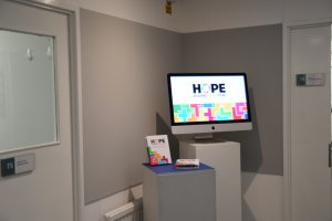
We also created social media posts to promote the exhibition on the department’s LinkedIn and Instagram accounts. This also linked users to the digital exhibition, to which we followed the frame of last years for. This showcased all the posters along with the animation showreel. Our digital exhibition can be viewed at: https://typography.network/globalgoals/

Social media post seen on the Department’s LinkedIn.


Self-reflection

Upon reflection, our exhibition could’ve strayed away from the typographic branding of The Global Goals, especially since the colours do most of the heavy lifting. This change would’ve differentiated our exhibition from the previous year, and perhaps would’ve elevated a sense of uniqueness with our work.

Additionally, we think that the project could’ve benefitted more from in-department contact hours. It was difficult to organise this due to the summer holidays, but with us all living close to Reading, it was perhaps something we could’ve done more often. This would’ve helped to finalise print decisions more efficiently.

Emma

As someone who was well-engaged with the project at the end of second year, it was a great honour to be a part of the team to put it all together in the department. Planning, designing and installing this exhibition greatly improved my problem-solving and communication skills – especially when we had the opportunity to talk to students about the work involved. This exhibition is not only a memorable outcome for the Real Job team and I, but also something the whole year can reflect upon and feel proud of.

Hannah

My favourite module of the year was unquestionably the Global Goals module, which motivated me to join the real job team. I developed in a lot of ways while working on the exhibition, from being more comfortable sharing my ideas to communicating and working with others. The whole experience was genuinely enjoyable when watching everything come together and seeing people’s excitement when they saw their work.

Josephine

This was such a great project to be a part of, not only learning how to design and set up an exhibition but also having the opportunity for this to showcase our own work. It pushed my boundaries, overcoming challenges and building my communication skills. This project has definitely sparked a personal interest in exhibition design and I am so happy with the final outcome, along with its impact.

The Graphic Play: Poster Design at the National Theatre

An exhibition of National Theatre posters and programmes from the Lettering, Printing and Graphic Design Collections that focuses on the contrasting design styles of Ken Briggs and Richard Bird – from structurally precise modernist typography to dramatically expressive illustration.

Curated by Rick Poynor

17 November 2025 to 13 February 2026
Monday to Wednesday, 10 am to 4 pm

Group visits by appointment: lpgdc@reading.ac.uk

Amadeus by Peter Shaffer. Design: Richard Bird & Michael Mayhew, 1979.

About the exhibition

Theatre posters require a gift for graphic distillation. A complex drama unfolding dynamically over two or three hours must be expressed in a single static image. The aim is to excite the viewer’s attention with bold and arresting imagery and typography while delivering necessary information about the production and venue.

The National Theatre has been at the centre of British cultural life since the early 1960s. Poster design at the NT has a history of remarkable commitment and consistency. In the theatre’s early years – the focus of this exhibition – two designers, Ken Briggs (1931–2013) and Richard Bird (1948–93), each held the position of poster designer for more than a decade. Their styles represent alternative ways of interpreting the theatrical image and expressing the identity of the theatre itself. Briggs’ work, influenced by the Swiss Style of typography, is structurally precise and the poster is conceived as a document of the performance. Bird was a versatile image-maker and lettering artist and his later conception of the poster’s purpose is much more illustrative and subjective. Both designers enjoyed considerable freedom to determine the theatre’s graphic identity and direction.

The exhibition, drawn from an extensive group of National Theatre posters in the Lettering, Printing and Graphic Design Collections, investigates and contrasts these two perspectives with a rich selection of examples. The posters are supplemented by a selection of elaborate NT programmes, which were carefully edited and inventively designed to support the theatregoer’s experience of the play.

Installation

Credits

Curator: Rick Poynor
Curatorial support: Emma Minns
Designer: Eric Kindel
Production support: Creative & Print Services, Geoff Wyeth

Global Goals Exhibition

Thursday 9 May marked the opening of the exhibition designed by Aaron James and Olivia Moors for the Global Goals campaign. Displayed in the University library were posters promoting the 17 Sustainable Development Goals, designed by Part 2 students in the Department of Typography & Graphic Communication. The project originated form a professional relationship between sessional lecturer Greg Bunbury and Project Everyone, a charity led by Richard Curtis.

The exhibition allowed students from across the University, not only our own department, to see the hard work the Part 2s had put in to bringing these goals to life. It was extremely rewarding to be able to see our own work on display for everyone to see. The opening event also allowed us to get a feel for how our posters could connect to the viewer, seeing how well the message came across, watching faces react, and hoping the work inspired change in people’s thinking or actions.

At the opening, there were short talks from James Lloyd, Eric Kindel, Greg Bunbury, and Hannah Cameron from Project Everyone. Everyone was sure to congratulate the students on their work, especially Aaron and Olivia for their contribution to the exhibition itself. But what stood out to me were Greg Bunbury’s words. He talked about creating work that means something. Creating work with a message. He mentioned that you should always create work that you care about, and that you believe in. I feel that this was the most important part of the project for the designers involved. We had the chance to create some meaningful work possibly for the first time, with the intention of getting a real message across. And through this exhibition, we were able to see the impact those messages can have.


Students and visitors exploring the impactful work


Promoting the Sustainable Development Goals

Spring Term 2024

An exhibition by second-year students in the Department of Typography & Graphic Communication

The work featured in this exhibition are posters designed in response to a brief inspired by Project Everyone, a United Nations Global Partner dedicated to promoting the Sustainable Development Goals (also known as the Global Goals). The work aims to inform, engage, and inspire individuals, organisations, and institutions to take meaningful action towards achieving the goals by 2030.

The task

The project to promote the Global Goals was devised and led by tutor Greg Bunbury. Each student was given the task of creating a compelling poster and supporting materials to promote one of the seventeen goals. Their work needed to incorporate graphic, typographic, or illustrative elements, and feature the ‘Halftime’ campaign hashtag #ImagineWinning, as well as project branding and a call-to-action.

The exhibition

The display of twenty-nine posters has been installed in the Department’s exhibition space, grouped under four headings: economy, equality, environment, and well-being. The exhibition was designed by second-year students, Aaron James and Olivia Moors, as part of the Department’s Real Jobs scheme. The exhibition project was supervised by tutors Sara Chapman and Geoff Wyeth with support from Department colleagues. The posters and other exhibition graphics were printed by the University’s Creative and Print Services.

The exhibition has been made possible by a generous award of funding from the University of Reading’s Arts Committee. Following its display in Typography & Graphic Communication, the exhibition will travel to the University’s library foyer where it will be installed for an additional run.

Installation

Way of type – Evolution of Chinese typeforms

17 April – 21 July 2023

An exhibition in the Department charting the development of Chinese type and type-making technologies.

Chinese typeforms are the visual form or shape of Chinese characters in a typeface. They reflect the function of reading Chinese and the aesthetics of Chinese calligraphy. Compared with Latin typefaces, the larger Chinese character set and the complexity and diversity of its typeforms have always presented a challenge to type makers, typeface designers, and typographers.

This exhibition charts the development of type and type-making technologies in China, from the invention of movable type in the eleventh century to the design of digital typefaces of today. It documents the rich variety of Chinese typefaces created in different eras using varied techniques and technologies, presented in high quality digital reproductions.

The exhibition is an abridged version of ‘Way of Type – Modernisation of Chinese typography’, originally curated by Jieqiong Yue and Zhao Liu, and is a collaboration between the University of Reading and the Central Academy of Fine Arts, Beijing. It represents the first exhibition in the UK featuring Chinese typeforms and type design.

Open weekdays, 10 am to 5 pm. Closed bank holidays.

Installation photos

‘Way of type – Evolution of Chinese typeforms’: introduction panel.
Main exhibition. Early Chinese movable type (left wall), Chinese movable type in Europe (right wall).
Main exhibition. Chinese founts of missionaries (left wall); Chinese typewriter (end wall), based on posters by Thomas Mullaney; Type design in modern China (right wall).
Main exhibition. Double Pigeon Chinese typewriter. Donated to the exhibition by Mr Xing Li.
Main exhibition. Typeface specimens and font production materials.
Contemporary Chinese typography. Typeforms shown on screen and in Chinese-language portfolios.
Contemporary Chinese typography. Fifteen-piece puzzle for constructing typeforms.
Exhibition window graphics.

Credits

China team
Academic chair: Di’an Fan
Curators: Jieqiong Yue, Zhao Liu
Coordinators:
 Xi Yang, Ping Ju,
Liping Du, Yanan Zhang
Assistant designers:
 Kui Zhu, Yue Chen, Peilin Song, Congyu Zhang, Kushim Jiang, Yangzhi Duan, Tengqi Zhaoxu

UK team
Academic chair: Eric Kindel
Curator: Xunchang Cheng
Visual designers:
 Xicheng Yang, Huati Wulan, Ahmet Berke Demir
Production: Geoff Wyeth

Special thanks
Thomas Mullaney, Yiyuan Ma, Li Xing

Texts by
Min Wang, Mingyuan Sun, Zhongxiao Cong,
Xunchang Cheng, Guoyan Ji

Guided by
China Foreign Languages Publishing Administration

 Organisers
University of Reading,
Central Academy of Fine Arts,
China Center for International Communication Development

Co-organisers
Department of Typography & Graphic Communication
Co-Innovation Center for Art Creation and Research on Silk Road of CAFA

Special thanks
Hanyi Fonts,
Arts Committee (University of Reading),
Shenzhen Graphic Design Association,
TypeTogether, LiuZhao Studio

Looking at women looking at themselves being looked at

9 June – 9 September 2022

This exhibition, now open in the Department of Typography & Graphic Communication, explores the concept of the male gaze in twentieth-century British illustration, and is curated by Cătălina Zlotea.

The exhibition analyses the work of the British illustrator, Charles Mozley (1914–1991), through a contemporary lens. It does so by foregrounding two female stereotypes depicted in advertisements, ephemera, and fine art lithographs made by Mozley between the late 1940s and the early 1980s. The exhibition arrangement creates contrast and conflict between the image of the middle-class “virtuous” woman – a virgin goddess placed on a pedestal – and the “loose” woman – an anonymous sex object signalled through hair colour and scanty clothing. This female presence, recurrent in Mozley’s work, demonstrates the quality of the artist’s draughtsmanship while connoting middle-class masculine virtues, follies, and sexual desires. 

The exhibition is open weekdays, 10 am to 5 pm. Closed bank holidays.

About Charles Mozley

Charles Mozley was born in Sheffield where he studied painting and drawing at the Sheffield College of Arts and Crafts. In 1933 he won a scholarship from the Royal College of Art and moved to London to study painting. After graduating, he taught life drawing, anatomy, and lithography at Camberwell School of Arts and Crafts. Following the Second World War and for the rest of his career, he worked as a freelance artist. 

Prolific and versatile, Mozley was among the artists commissioned by Frank Pick and Jack Beddington for prestigious London Transport and Shell-Mex advertising campaigns. He also created designs for the advertising agency Colman, Prentis & Varley, for theatre and film production companies, and for many British publishers. He painted a mural for the Festival of Britain, contributed to the popular “School Prints” and “Lyons Lithographs” series, and produced ephemera for restaurants and the wine trade. Alongside commercial work, Mozley continuously painted, made prints, and exhibited in solo and group shows. 

The long list of commissions, as well as the works held by the Charles Mozley Trust, provide evidence that Mozley’s pictures were widely seen in Britain in the second half of the twentieth century. As Nicolas Barker has remarked, Mozley’s work is “a graphic-mirror of the post-war era”, making it a valuable resource for the study of visual culture.

Credits

Curator: Cătălina Zlotea
Exhibition design: Cătălina Zlotea, Hannah Smith
Exhibition consultant: Eric Kindel
Archive consultant: Sallie Morris
Production: Geoff Wyeth

Thanks to the Charles Mozley Trust, which has supported this exhibition and the doctoral research by Cătălina Zlotea that informs it.

Installation

Selected works by Charles Mozley highlighting key projects.
Overview of the exhibition space contrasting the “loose” woman and the “virtuous” woman, as subjected to the male gaze.
Illustrations by Mozley depicting the “loose” woman.
Illustrations by Mozley depicting the “virtuous” woman.

Real Jobs: Celebrating over five decades of professional design practice on our undergraduate course

Alongside our degree show opening last week, we also launched a new exhibition celebrating our ‘Real Jobs’ scheme.

Real Jobs has been our flagship professional experience programme for as long as Typography has existed as a department. It allows our students their first taste of working alongside clients to co-create, and deliver on, a design brief. Our graduates regularly tell us that their experiences on these projects exposed them to unique and powerful moments that helped them secure their first paid positions, and continue to inform their professional practice today.

Standout projects on display include the Tomos Jones’ recent gold medal-winning University display at the Chelsea Flower Show and Maddi Davies’ collaborative project on Margaret Atwood, Second Sight. But a full range of work is on show, everything from books to branding, and we hope it is a fitting tribute to the students, staff and clients who have contributed to making Real Jobs such a successful part of the curriculum here in Typography.

The exhibition runs until 28 June. If you’ve ever been a client of Real Jobs, or if you’d like to know more about how the scheme could help your project or organisation, please do stop by to enjoy this celebration of five decades of students’ first steps into the world of professional graphic design.

To see our archive of recent Real Jobs, click here. If you think you have a project that would benefit from student design support you can also book in your own project here.

“I believe this is a great scheme, both supporting students with real life projects and work experience and also providing great value to small companies in need of professional design support” – Sirin Myles, International Education Consultant

“The Real Jobs scheme is an excellent way for students to get experience working towards a brief and is a great way to help everyone involved gain experience that will be useful when transitioning into a working environment. I will be recommending the scheme to my employer as I believe it provides unique opportunities for all involved.” – Isabel Cash, Holland House Books

A selection of projects led by current students, including: animations, branding for charities and voluntary organisations, art catalogues and hockey stick graphics.


Production processes ranges from letter press posters to the latest digital printing techniques.


The exhibition includes (almost) every Typography degree show invitation ever produced, shown together in chronological order.


—brace the space: Typography degree show 2019

We’d like to thank everyone who attended the private view of our degree show on Thursday evening. Our graduating class of BA Graphic Communication and MA Book Design students hosted a fantastic event which showcased not only their outstanding design work, but also their truly exemplary sense of teamwork and studio culture. Every aspect of the show – from promotion through to signage – is led by the students, and this year’s huge attendance and impressive co-ordination is testament to their efforts.

We’ll publish photos of the standout work on our flickr site shortly, and the student-run instagram is likely to fill up with more content soon. Meanwhile, if you’d like to see some of the work right away (including projects that won our coveted annual examiners awards), please do head over to the Department and ’embrace the space’ to enjoy the public view between Monday 17 and Saturday 22 June. The show covers everything from cutting edge UX to traditional book crafts, and there is an especially strong sense of experimentation and individuality this year.

For more information, visit https://embracethe.space

Undergraduate work by June Lin and Siu Yen Lo, including the award-winning ‘Second Sight’ book, produced in collaboration with students in English Literature.