
GOAL 1: NO POVERTY
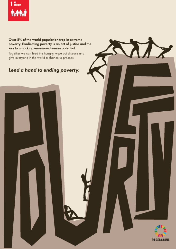
MELODY LIN
The poverty trap is a phenomenon in which people living in poverty have great difficulty escaping; it often requires individuals to achieve a certain level of income or financial capability just to break free. This poster portrays two figures, representing people suffering in poverty, who are trapped and stuck inside a giant “POVERTY” character, a powerful visual metaphor for the immense difficulties poor people face.
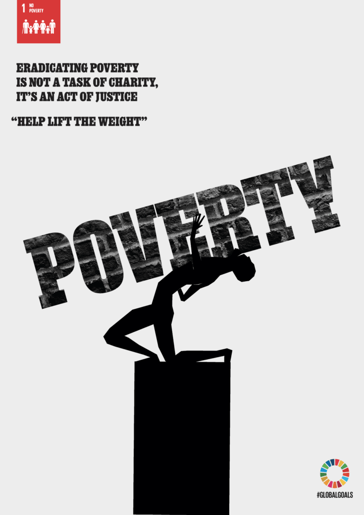
CONSTANTINE CHRISSOS
This poster represents poverty as a crushing weight carried by millions of people around the world. The figure bent beneath the word “poverty” symbolises the physical, emotional, and social burdens that limit opportunity, freedom, and human potential. It encourages the audience to recognise these challenges and help lift the weight through awareness, action, and support.
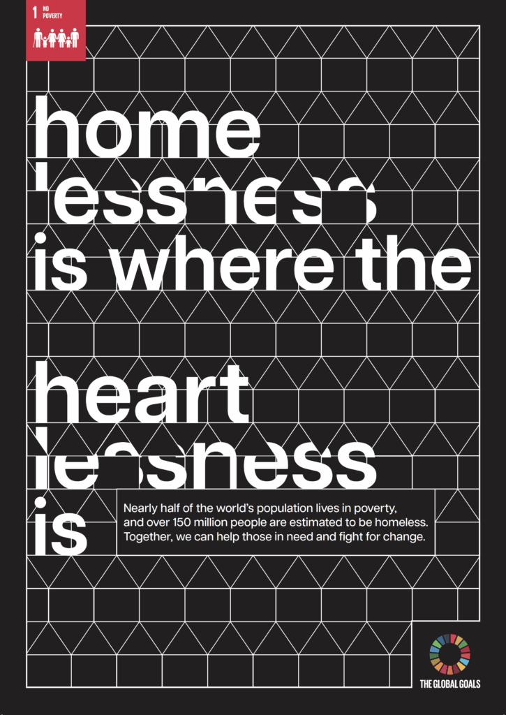
PHYLLIS HANSON-METTLE
Using the well-known phrase “home is where the heart is” and turning it on its head, this poster reflects how those who are without, or are struggling to afford, a home often don’t have a safe place to warm their hearts. The hidden characters show how not all cases of poverty are so easy to see, and it encourages people to open up their hearts, help those in need, and fight for change.
GOAL 2: ZERO HUNGER
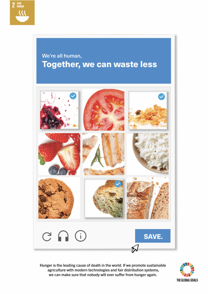
AIYSHA MAZHAR
This poster aims to raise awareness about food waste through an approach inspired by CAPTCHA human verification tests. Usually, CAPTCHAs are used to prove we are human, and this is a play on that idea. Around a third of food is wasted, showing how our habits contribute to this global issue. Rather than passing a test, the message is that being human means we can all make conscious choices and take responsibility. By recognising waste, we can all take small steps to help save food and tackle hunger.
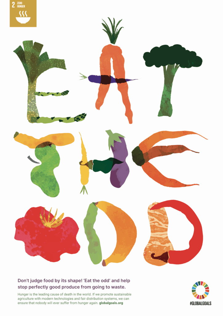
SAFFRON HILLS
This poster raises awareness of the large amounts of edible fruit and vegetables discarded due to their appearance. Vibrant, hand-drawn produce is used to create the typography, celebrating the individuality of imperfect food that would otherwise go to waste. The bold typographic slogan delivers a clear call to action, encouraging audiences to reconsider what food should look like. Through playful imagery and positive messaging, the design promotes a more sustainable approach to food consumption.
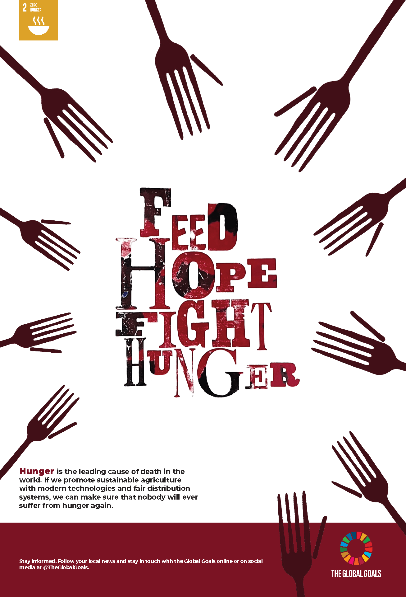
GELIE UNDALOC
This poster highlights the importance of providing food and support to those who suffer from hunger around the world. The fork-shaped hands reach toward the phrase “Feed hope, fight hunger”, symbolising people in need of food and nourishment. It encourages the audience to take action to end hunger and achieve food security for all.
GOAL 3: GOOD HEALTH AND WELL-BEING
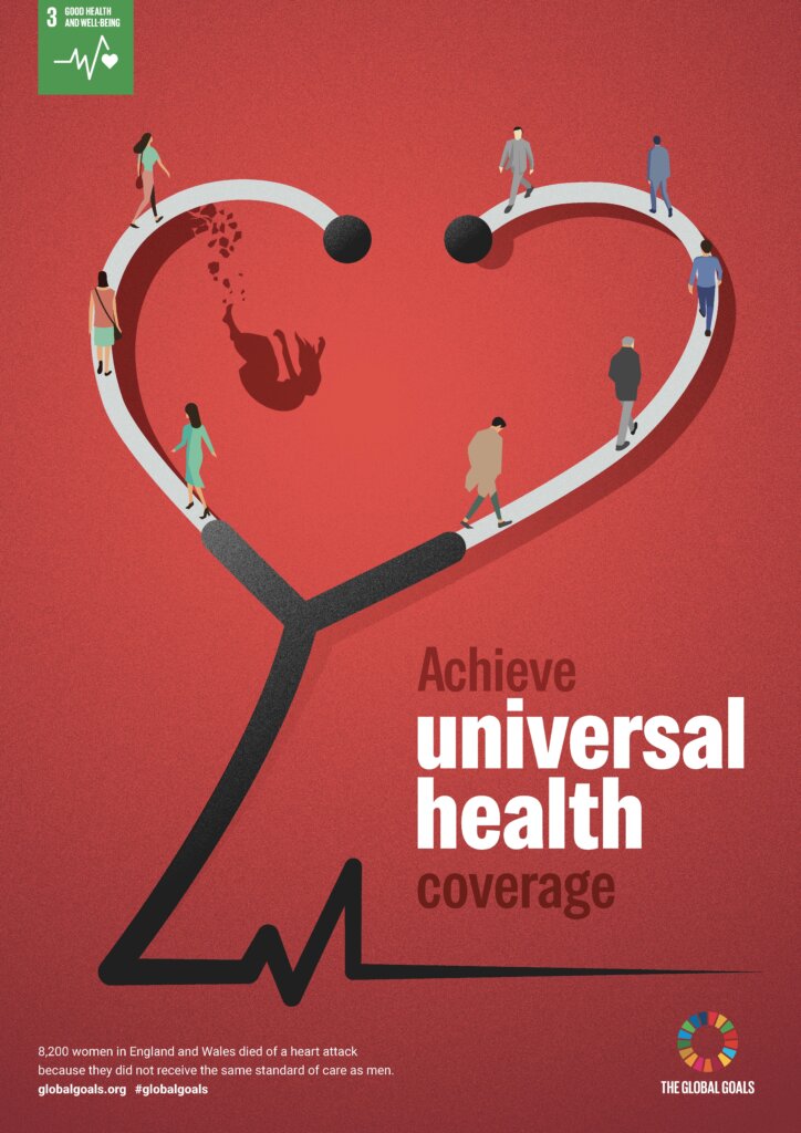
ADRIAN LAW
A heart-shaped stethoscope symbolises cardiovascular healthcare, while people walking along it represent access to medical services. The falling woman highlights gender gaps and inequalities in healthcare access. The colour red symbolises both the heart and the British Heart Foundation. This poster illustrates how unequal treatment can lead to preventable health outcomes and calls for inclusive, accessible healthcare systems worldwide.
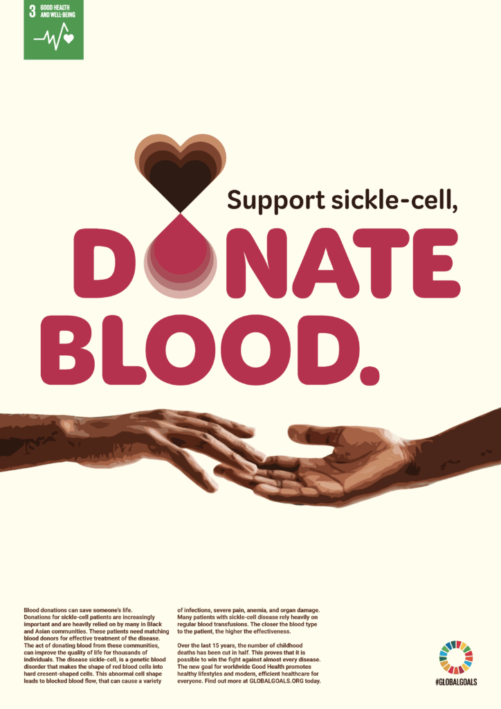
ELEANOR DENTON
This poster was designed to communicate the importance of blood donation in communities of Asian and Black heritage to support sickle-cell patients. It hopes to convey a loving and encouraging message that would increase donations from RO blood types to support those suffering within their communities.
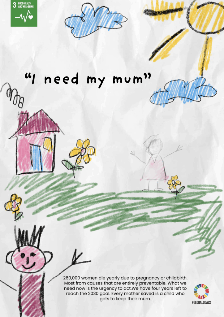
DASHA GRACIAS
This poster looks at maternal mortality from a child’s point of view. Instead of using statistics or medical imagery, a child draws a happy family scene with a house, flowers and sunshine, but the mum is missing.
GOAL 4: QUALITY EDUCATION
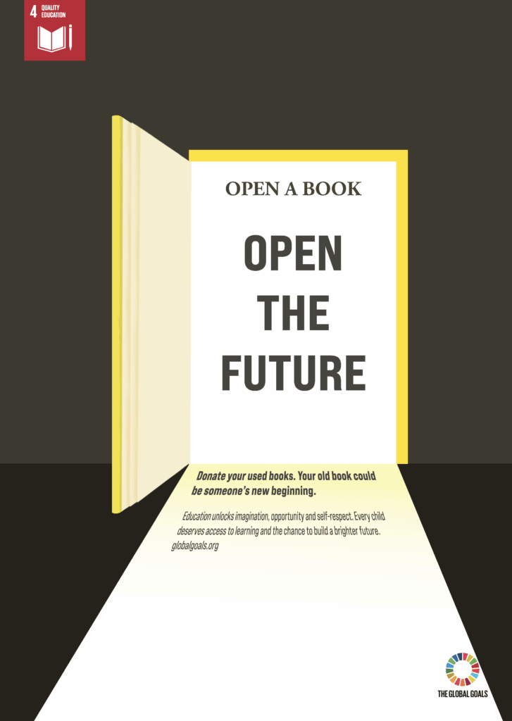
WENCHAN YU
This poster uses the visual metaphor of an open book becoming a doorway, suggesting that every book can eventually open a path towards a brighter future. This encourages people to donate their used books, showing how a simple action can help others access knowledge and learning. By focusing on hope and possibility, this poster highlights the positive impact that education can have on people’s lives.
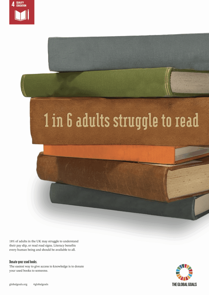
JESS LONNON
This poster aims to inspire individuals to donate used books to help battle the literacy crisis in the UK. It uses the statistic from a study from OECD on one of the spines. The other 5 books are left empty, to represent the “1 in 6 adults”.
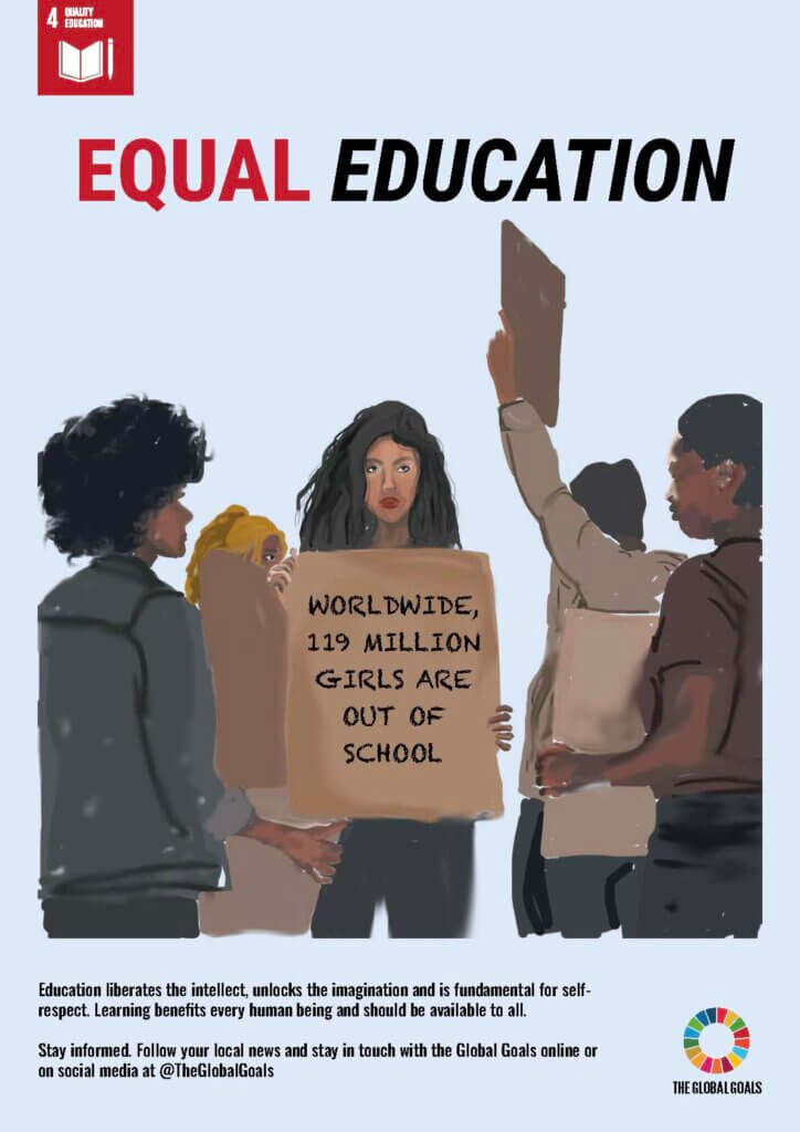
BEAU ANDERSON-GILSON
This poster aims to raise awareness about the education of women who may not have the same chance in life. The imagery represents diversity and togetherness.
GOAL 5: GENDER EQUALITY
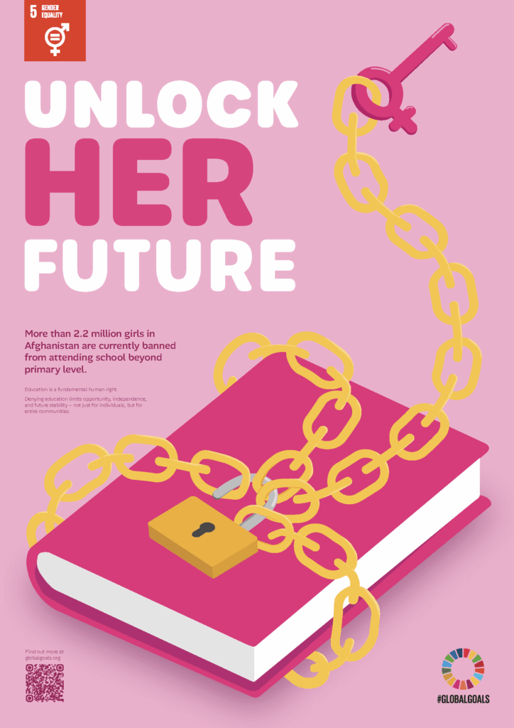
ALEKSANDRA STANIKOWSKA
Intending to raise awareness of an issue less widely known within gender equality topics, the poster references the banning of girls’ education in Afghanistan; the chained book symbolises a restricted future, with a key bearing the Venus symbol representing women. The use of pink – a traditionally feminine colour – reinforces this focus. The simple, rounded illustration style complements the typeface and helps maintain cohesion, allowing the book to speak for itself and communicate the message.

ZIM GBENGA-OLUWATOYE
This poster shows the flip side of our current reality: A woman standing out amongst her male peers, prompting the audience to choose her instead. The call-to-action, “Will you finally make the right choice?” challenges the current workplace climate where male candidates are usually chosen over female ones, whether that’s for employment, or a promotion. Purple is the colour used for International Women’s Days, it also reinforces the idea of men and women coming together. This is an issue that affects everyone.
GOAL 6: CLEAN WATER AND SANITATION
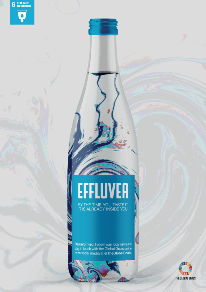
OMAR ALI
There is a preconception that water and sanitation are concerns that are far away in some developing countries. However, 2.1 billion people lack access to safely managed drinking water, and 3.4 billion lack safely managed sanitation services. The poster acts as an advertisement for a premium water-bottle brand, selling the crisis directly to you – and creating a visceral visual of what many turn a blind eye to. You won’t realise the crisis until it’s already in your mouth.
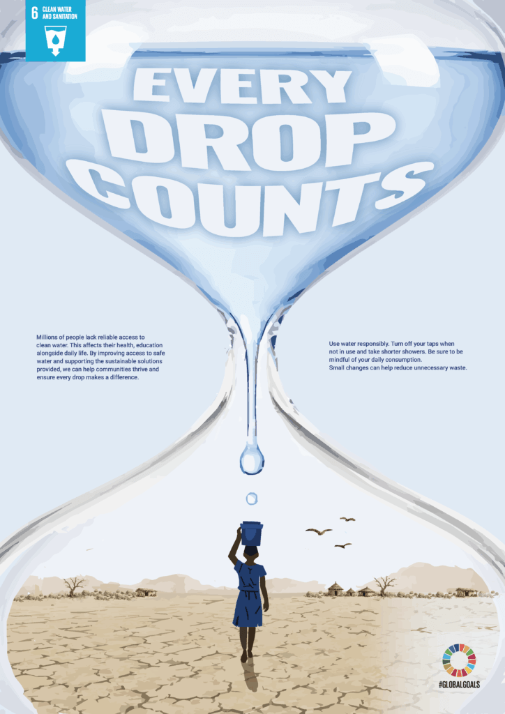
HARRY ROBINSON
This poster aims to raise awareness of the global water and sanitation crisis and encourage individual action with the slogan “Every drop counts”. The water-filled hourglass symbolises that water is a finite resource. The water drops dripping into the person’s bucket represent both urgency and value, and the arid landscape represents the water scarcity suffered by millions worldwide.
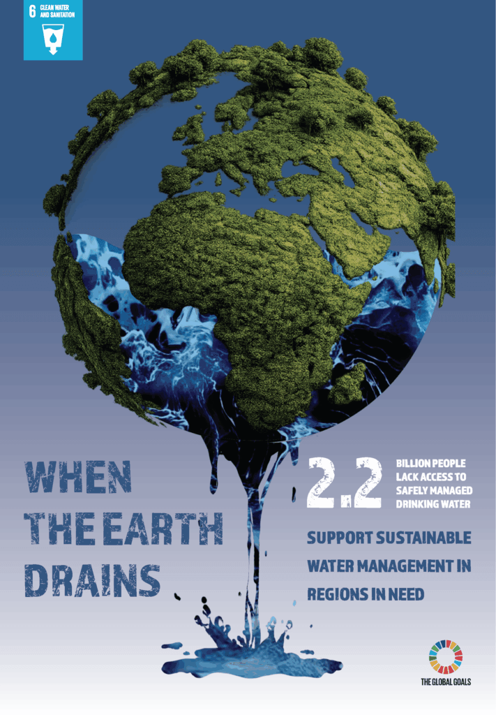
YIXIN WANG
This poster highlights the scarcity and the value of the earth’s clean water resources. Water flowing out of the earth like an hourglass symbolises the gradual depletion of clean water, emphasising that freshwater is a finite resource. It encourages viewers to reflect on the importance of clean drinking water in daily life and to realise that people often take it for granted. The poster aims to raise public awareness and call on people to cherish and protect freshwater resources, so that everyone can have access to drinking water.
GOAL 7: AFFORDABLE AND CLEAN ENERGY
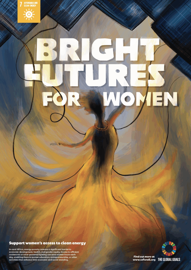
KEIRA SKEET
Clean and affordable energy can transform opportunities for women in rural Africa. Energy poverty remains a significant barrier to gender equity, and access to efficient cookstoves or solar-powered lighting can save women hours each day, enabling them to pursue education, entrepreneurship, or other activities that enhance their economic and social standing. The central figure in the poster represents women reaching toward new possibilities, while the illuminated space and connected power lines symbolise energy as a pathway to empowerment.
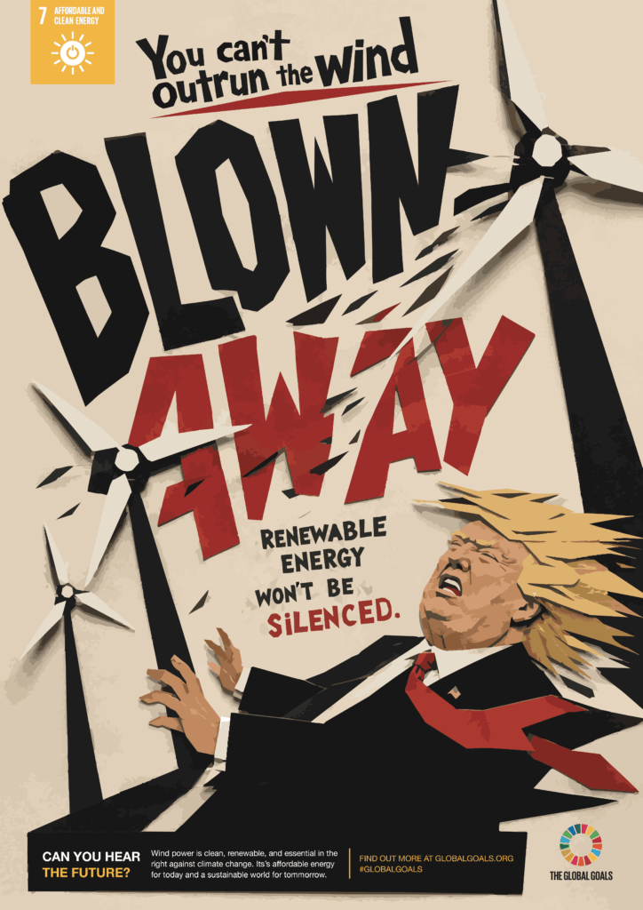
MATTHEW BANKS
This poster uses wind energy as a symbol of the unstoppable transition towards a cleaner future. The poster contrasts renewable energy with a fossil-fuel champion Donald Trump, encouraging viewers to consider which side they stand on.
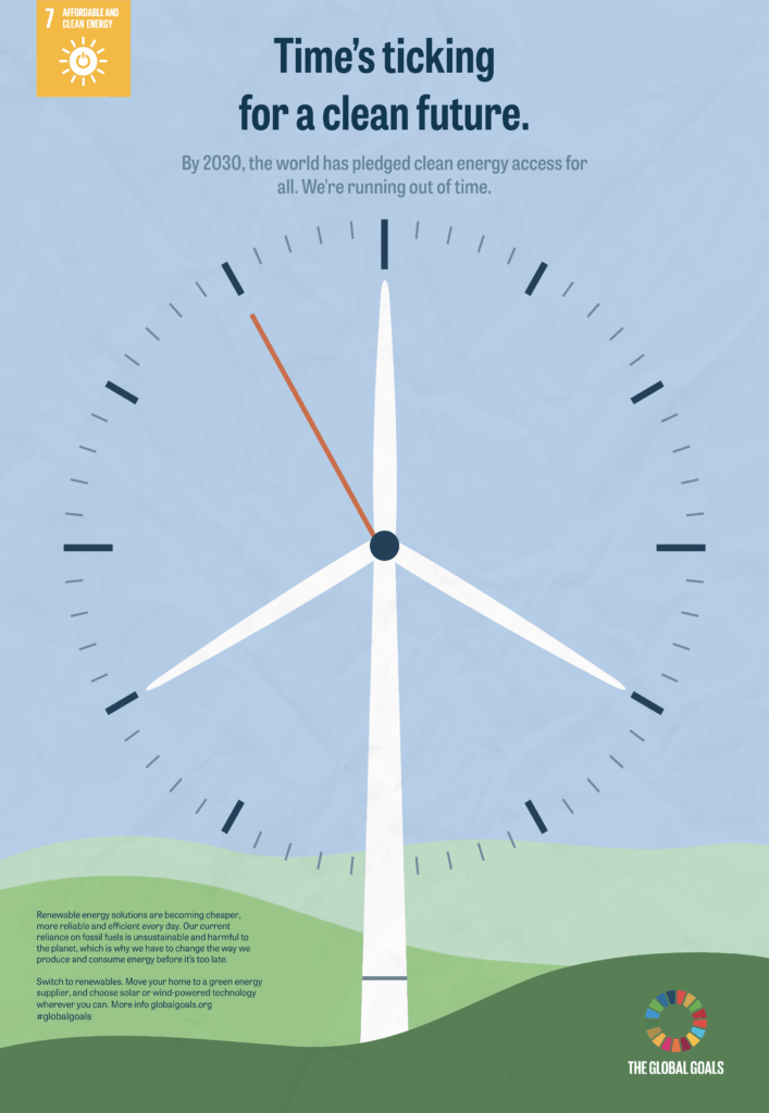
THEA LITTLEDALE
A common misconception is that it’s too late to make a difference. I wanted to challenge that idea and show that we still have time to act. Taking inspiration from Abram Games, this poster combines a wind turbine with a clock face to convey that time is running out – but it hasn’t run out yet.
GOAL 8: DECENT WORK AND ECONOMIC GROWTH
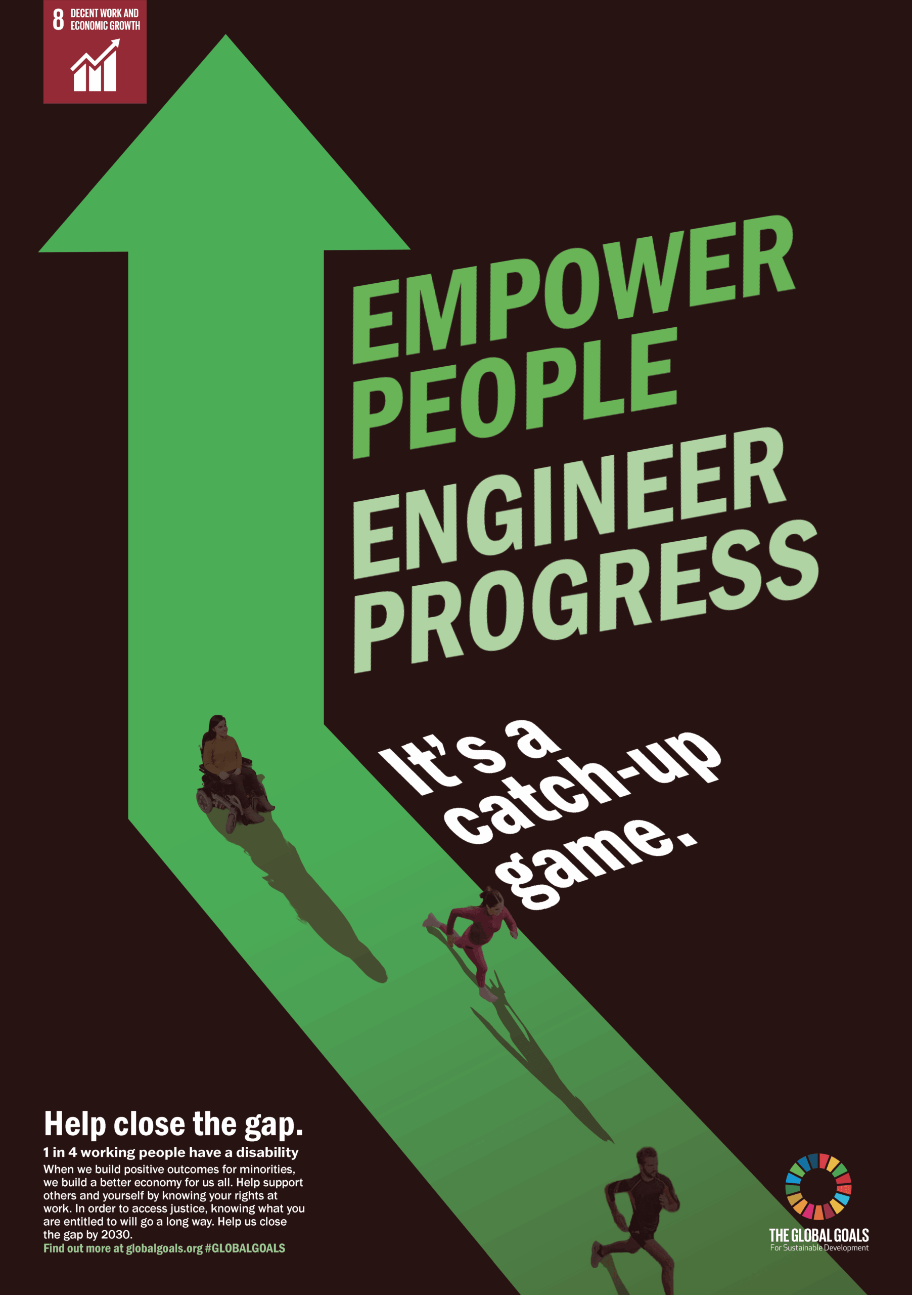
GABRIELLA TAYLOR
This poster highlights the importance of equal workplace rights in a strong economy. With one in four UK workers having a disability, understanding workers’ rights and addressing discrimination is crucial. Bold typography and a visual contrast between the able-bodied and disabled silhouettes represent those with hidden disabilities. The arrow pointing upwards reinforces the message that reducing discrimination can drive inclusion, productivity, and sustained economic growth.
ZEXIN LI
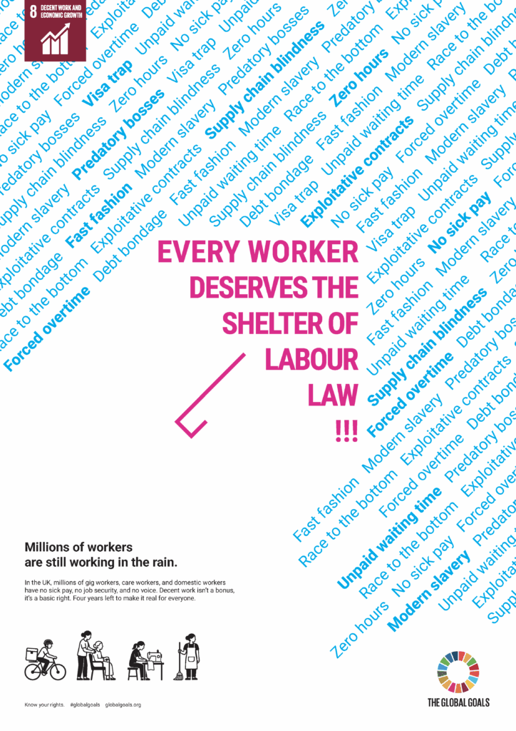
The umbrella in this poster serves as a metaphor for labour law: it is a protection that exists, but doesn’t reach everyone. A crimson umbrella protects the workers from a dense rain of labour exploitation and injustices.
ALIA ALDABAL
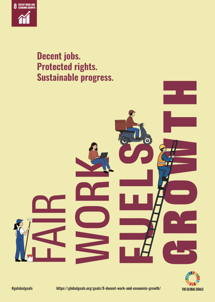
The phrase “Fair work fuels growth” in this poster shows that economic progress depends on people having fair jobs, safe working conditions, and protected rights.
GOAL 9: INDUSTRY, INNOVATION AND INFRASTRUCTURE
LILIA SHEWARD
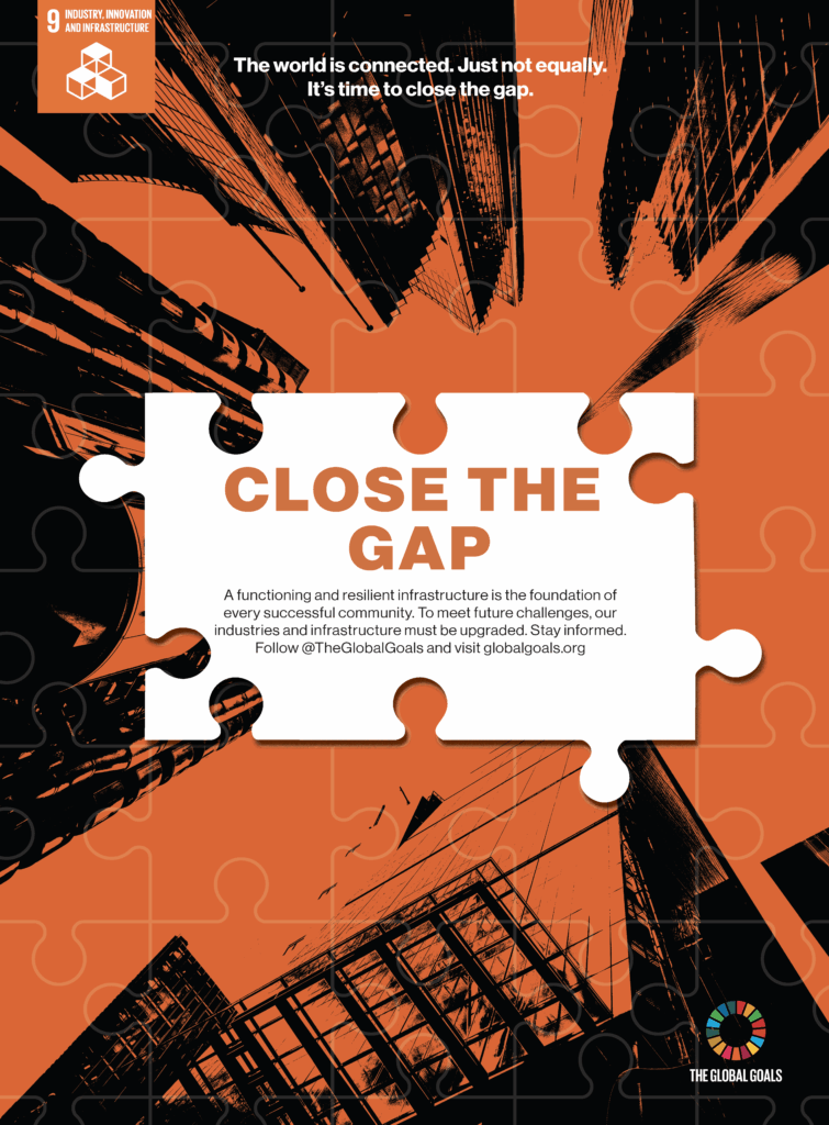
This poster focuses on innovation, infrastructure and industry. Not everyone has the same access to this; hence the need to “close the gap”. A puzzle piece on its own is useless, but connected to others, it can reveal a bigger picture. The missing pieces represent those still waiting to be connected. Until every piece fits, the picture isn’t complete.
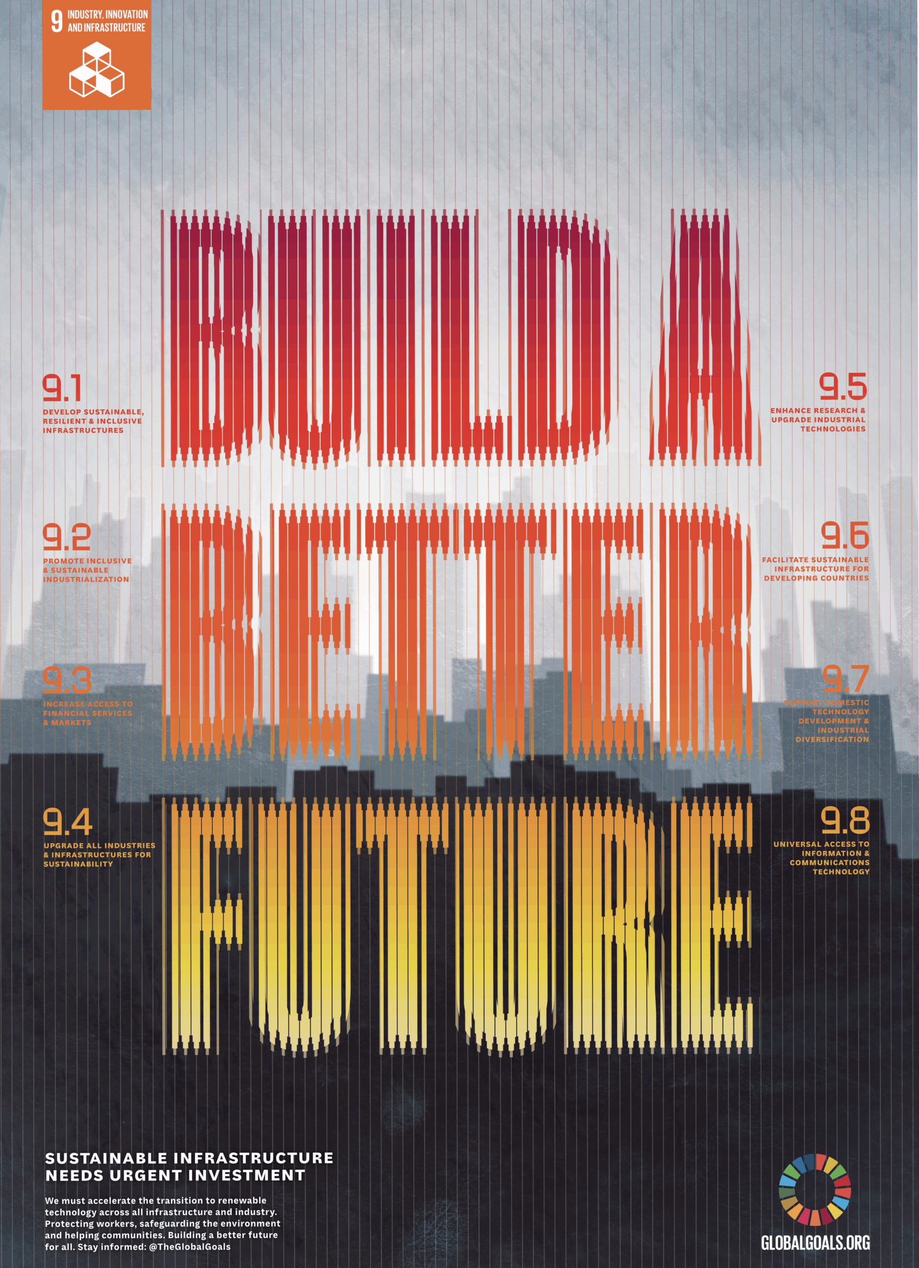
AURELIEN FLATMAN
This poster aims to highlight the need to accelerate the transition into sustainable infrastructure. It depicts a dark cityscape looming over the horizon to remind the audience of what is at stake. The image layers and the treatment of text is inspired by the work of Karel Martens.
GOAL 10: REDUCED INEQUALITIES
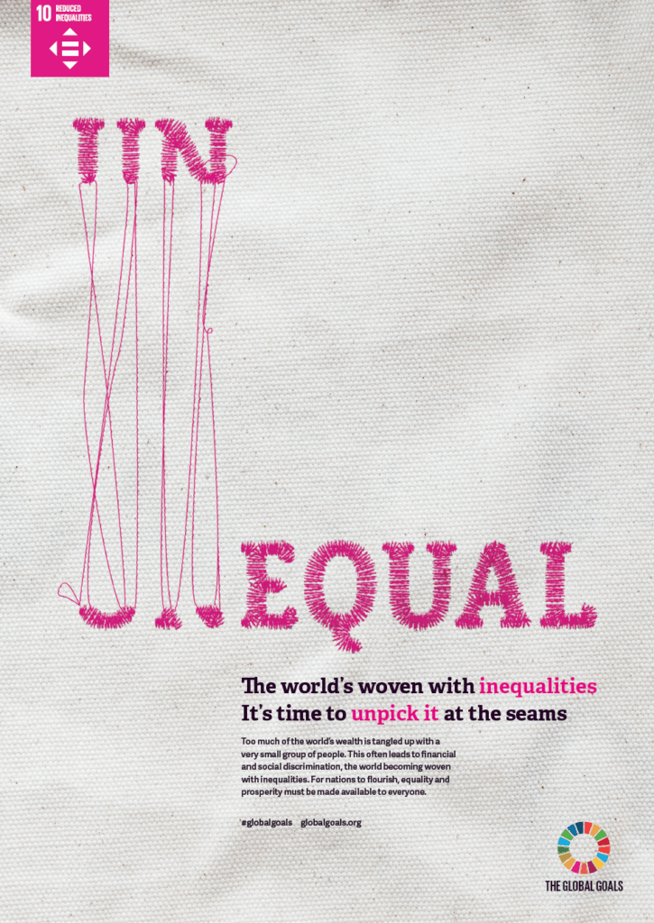
LOANNE LE
This poster communicates the feeling of inequality through typography – the letters “un” are elevated above the rest. The frayed stitching also provides a simple call to action, showing that we can undo the inequality if we undo it at the seams. The threads and embroidery have been carefully manipulated to provide a feeling of tension and balance.
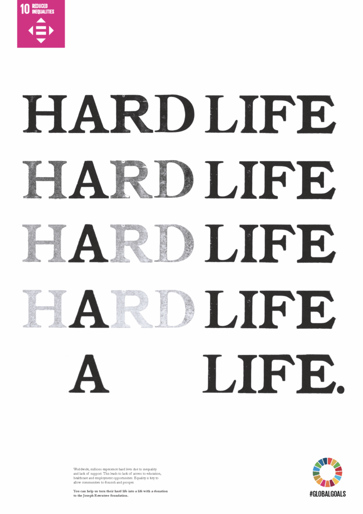
ALFE EYRE
The repeated phrase “HARD LIFE” on this poster gradually fades away, symbolising a transition from a “HARD LIFE” into “A LIFE”. It highlights the challenges addressed by inequality, and represents how a hard life might be turned around.
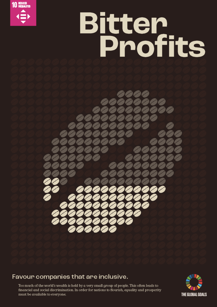
EVAN MONOHAN
This poster aims to draw attention to the inequalities in the coffee farming industry. It highlights the importance of buying from companies that support coffee farmers.
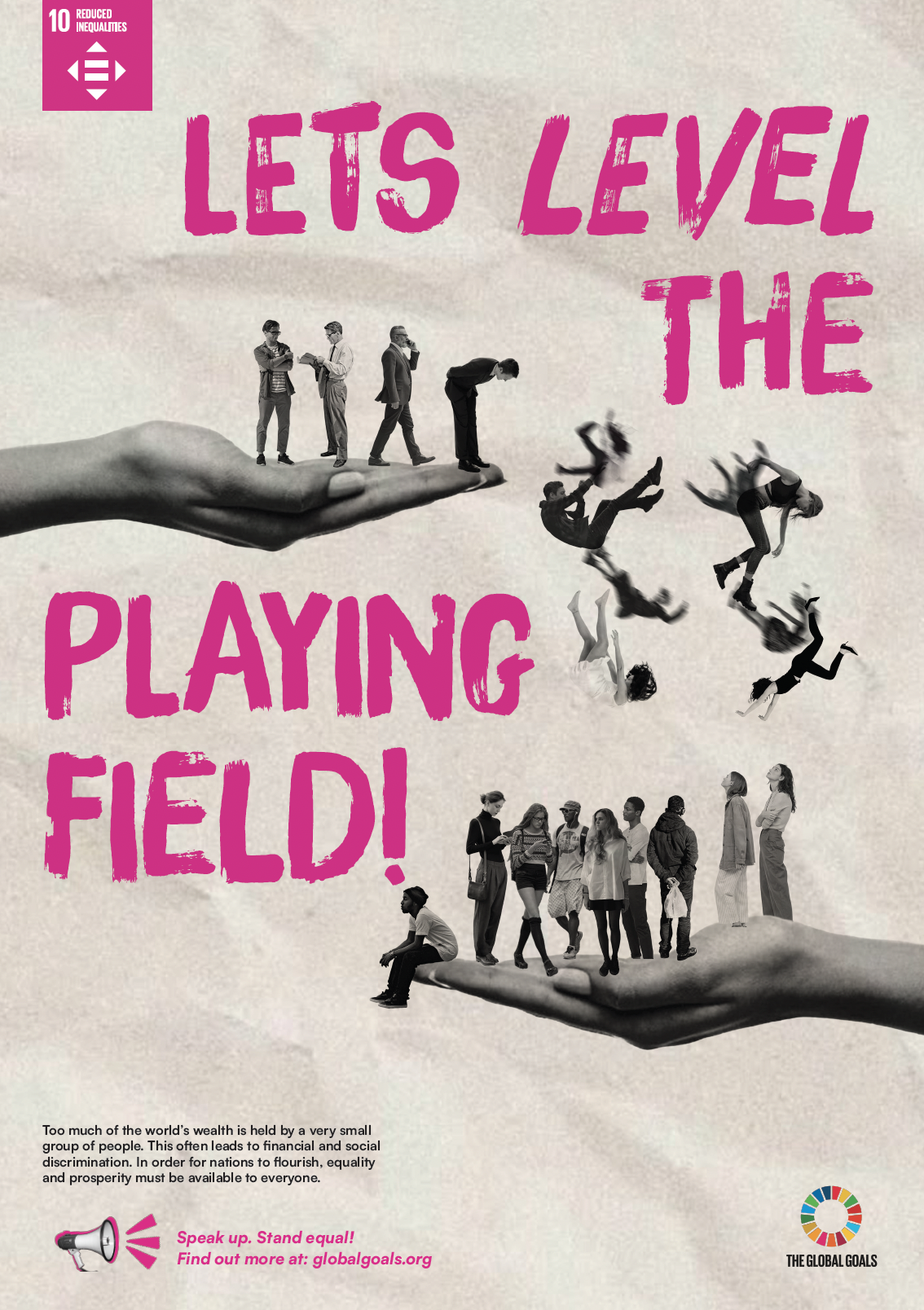
ARIT IBOK
Inequality is real and unfair, and affects everyone. This poster represents the unequal platforms and playing fields, experienced by many.
GOAL 11: SUSTAINABLE CITIES AND COMMUNITIES
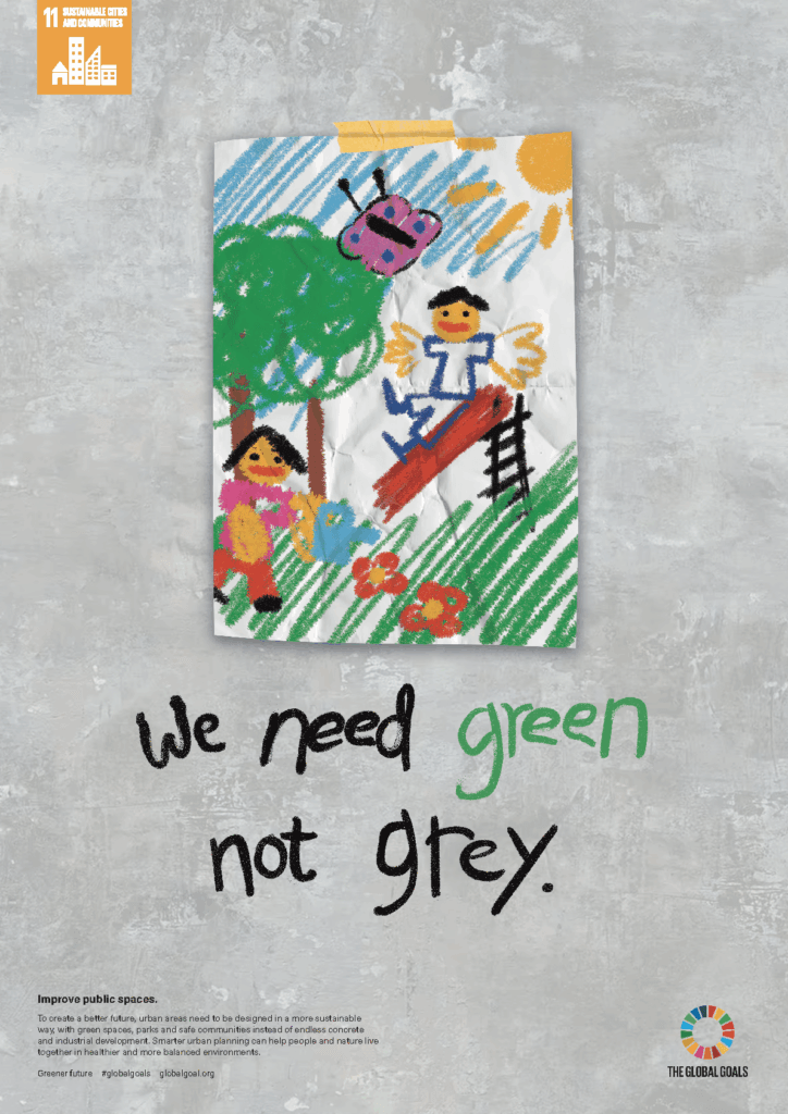
DANISH BIN ARNI DURAINE
This poster focuses on protecting our green spaces. It communicates this message through the perspective of children, young adults and parents. It uses a colourful child’s drawing placed against a dull grey industrial background to create a contrast between the world children want and the reality of many urban environments. I hope that my poster will encourage people to think about creating greener spaces for future generations.
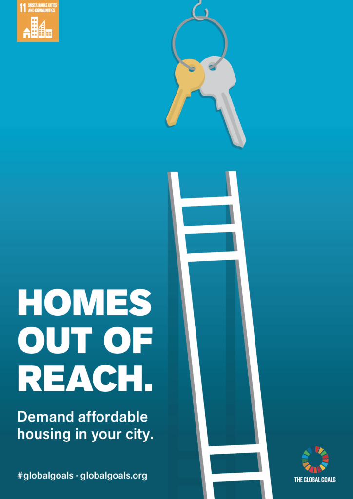
TOM HAWKINS
This poster uses the imagery of a property ladder reaching toward a set of dangling keys, but falling just short, to represent the problem of a housing market that is out of reach for many. The call to action challenges young adults to demand affordable housing in their city, empowering the generation that will be responsible for solving this crisis.
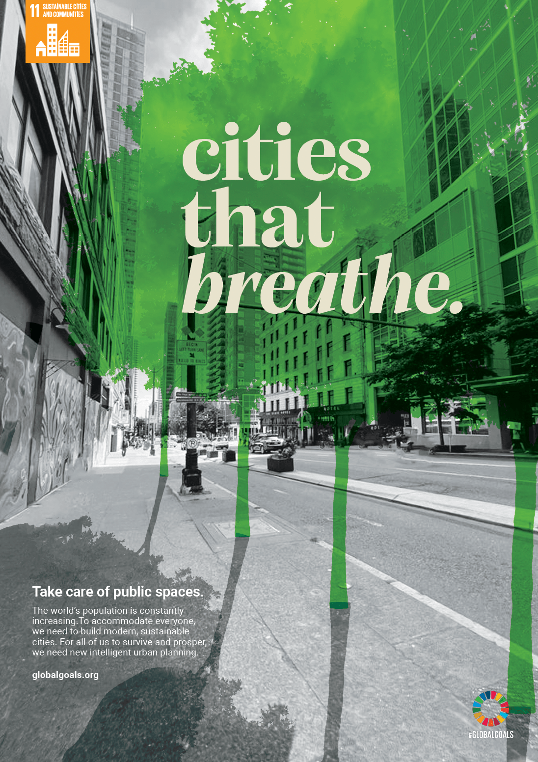
MAX NIXON
This poster promotes greener, safer, and more sustainable places for people to live. The tree illustrations symbolise growth, environmental protection, and the importance of green spaces in urban environments. Shadows create depth, and help the tree stand out.
GOAL 12: RESPONSIBLE CONSUMPTION AND PRODUCTION

ELISA DRUETT
LandfillMarket reimagines food waste as a supermarket transaction, exposing the hidden environmental costs of overconsumption. Through a fictional receipt that records discarded food rather than purchased goods, the poster highlights how everyday consumer habits contribute to waste. This poster encourages audiences to reconsider purchasing behaviours, reduce food waste, and recognise the resources lost when edible food is thrown away.
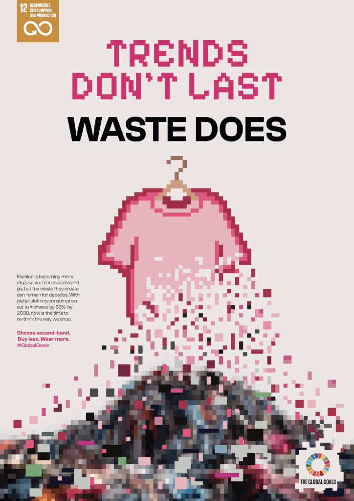
ELISE SIMPSON
This poster raises awareness of the environmental impact of fast fashion and overconsumption. The pixelated t-shirt references the digital nature of trend culture, while the deteriorating pixels show how quickly clothing is consumed and discarded, ultimately ending up in landfill. It encourages the audience to reflect on their own purchasing habits and recognise the influence social media trends have on how we treat the environment.
GOAL 13: CLIMATE ACTION
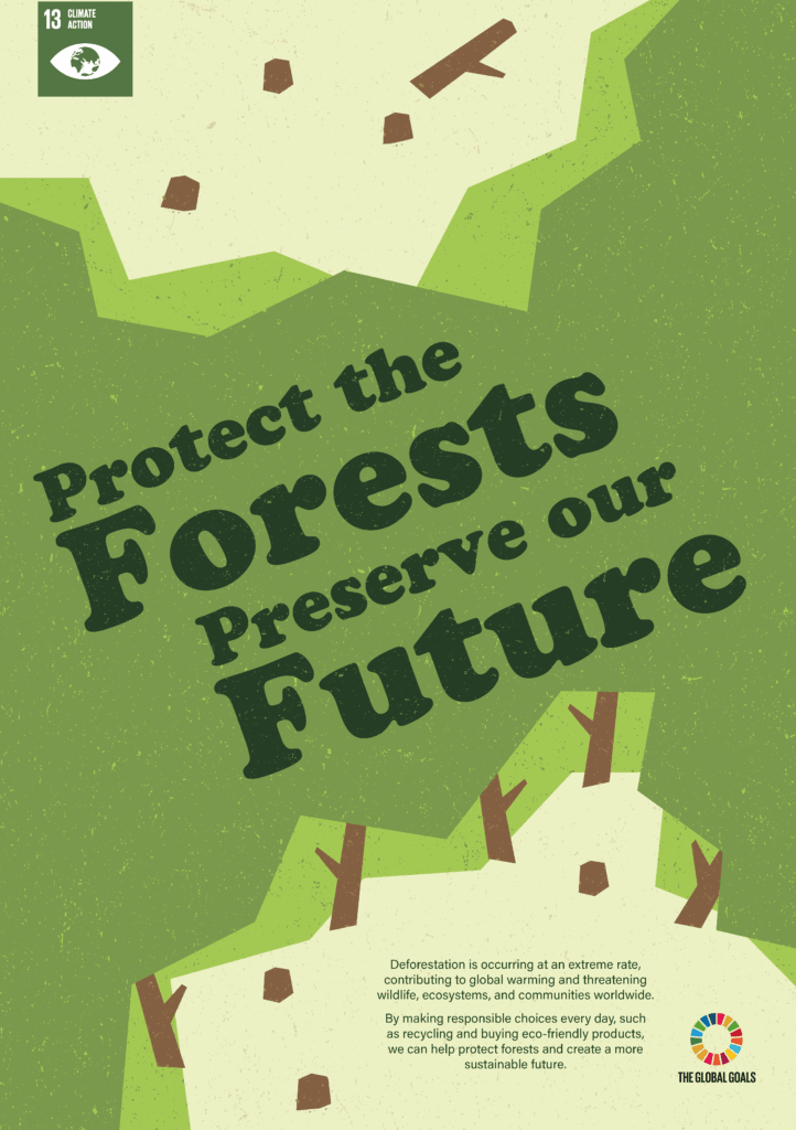
MADDY WORKMAN
This poster aims to raise awareness of deforestation and its significant impact on our planet, including rising global temperatures, the loss of biodiversity, and the disruption of communities worldwide. It uses bright colours to represent the richness and vibrancy of forests, contrasted with pale yellow areas where trees have been removed. The cut paper style symbolises how humans are cutting away sections of forest, while the straight edges and geometric shapes emphasise the unnatural nature of large-scale deforestation.
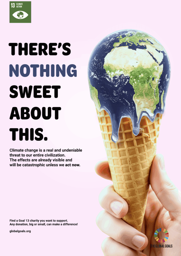
ERIN WILDE
This poster aims to create a sense of urgency around climate change. It uses a metaphor of the Earth melting like an ice cream to symbolise the effects of global warming. The image of the ice cream being held in a human hand further emphasises that climate change is largely driven by human actions. It also suggests that the responsibility for addressing the issue and preventing further environmental damage lies in our hands.
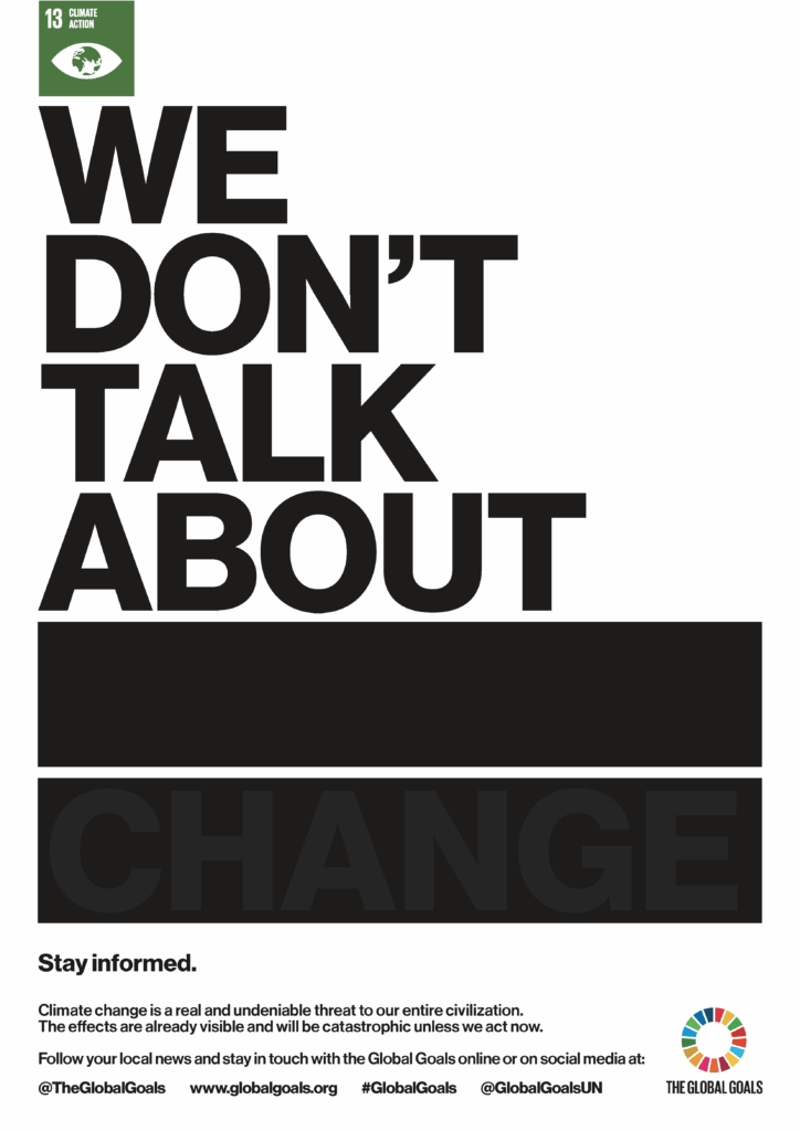
MATT WOOD
This poster represents climate change denial, using the visual language of document redaction of sensitive content to express what has been hidden from the public is more damning than what is openly said. The ghost lettering of “CLIMATE CHANGE” sits faintly in front of the bars, visible enough to incite curiosity.
GOAL 14: LIFE BELOW WATER
DUNYA FAQIRZADA
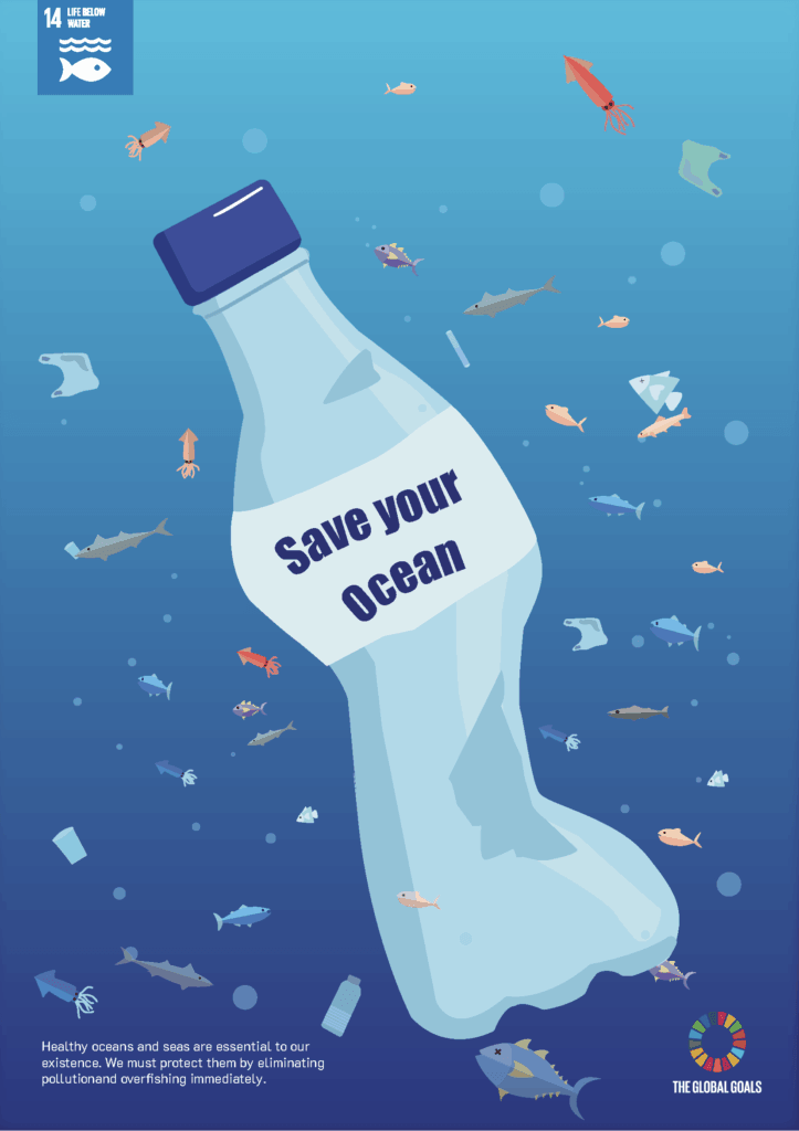
This poster focuses on the importance of preserving marine ecosystems and ocean biodiversity. The plastic bottle symbolises the harmful effects of pollution on our oceans and the wildlife that depends on them. Through the message “Save your ocean”, the poster encourages people to reduce plastic waste, recycle more often, and take responsibility for protecting marine environments for future generations.
JOSHUA FOUNTAIN
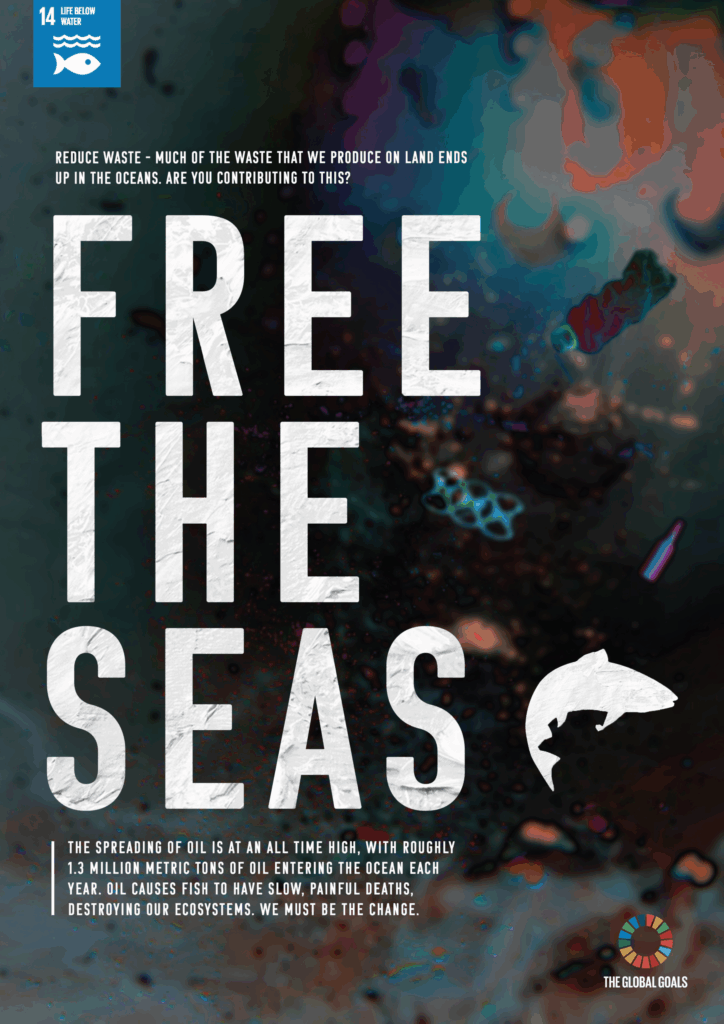
This poster uses dark and harsh imagery to highlight and emphasise the effects of plastic and oil polluting the sea. The typography is a stark contrast to the background, demonstrating the difference between purity and corruption. The call to action encourages the audience
to confront the issue directly and to join the Global Goals movement in any way that they can.
MYLES BROWN
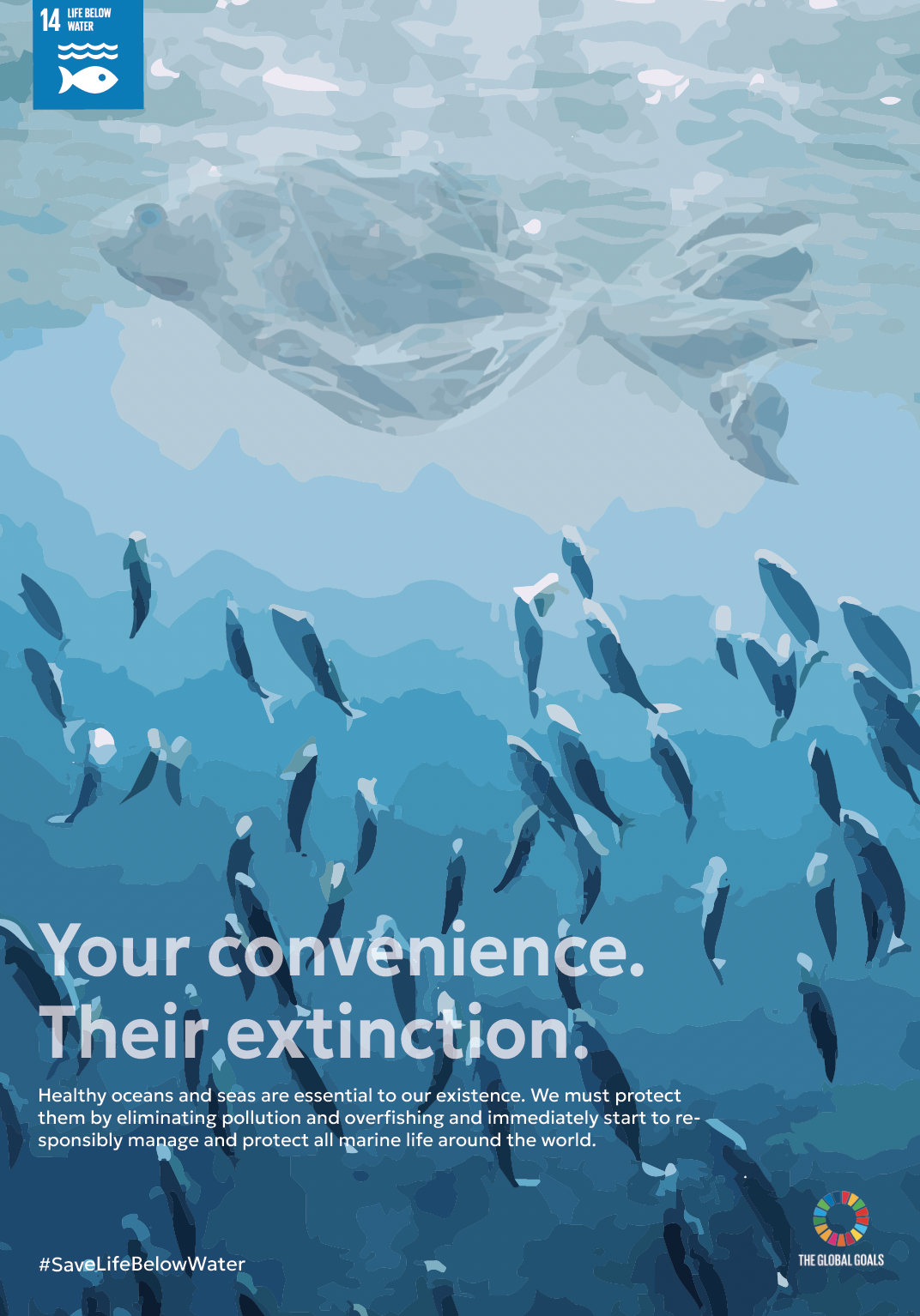
This poster aims to raise awareness about the pollution of marine ecosystems. The phrase “Your convenience. Their extinction” was used to tell people how the small actions can have a powerful effect on marine life and habitats. The plastic bag fish is intended to symbolise the integration of pollution into the marine environment.
GOAL 15: LIFE ON LAND
TIMOTHY POWELL
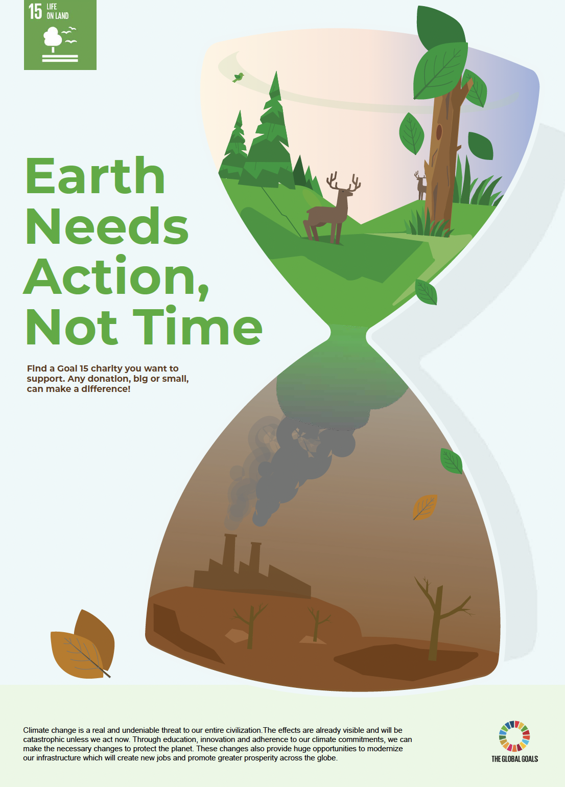
This poster aims to highlight the destruction of habitats and wildlife. Inspired by Salvador Dalí and his famous exploration of time in nature, it uses an hourglass design to represent the passing of time and its impact on the environment. The hourglass shows a contrast between a healthy, thriving habitat and a damaged, barren landscape, emphasising the urgent need to protect ecosystems and biodiversity before more species and natural environments are lost.
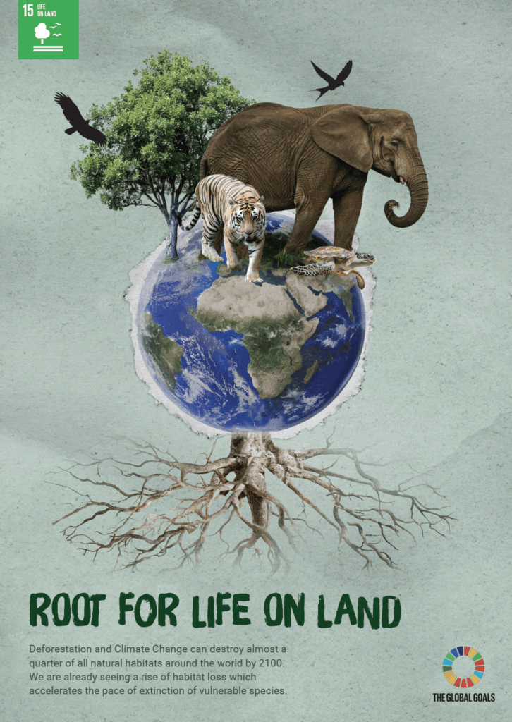
VALENTINA HOLOD
This poster celebrates the beauty and importance of nature while exploring the concept of a root as a symbol with multiple meanings. Whilst roots may be associated with plants growing beneath the soil, they can also represent the environmental issues that are often hidden. At the same time, the idea of being “rooted” suggests our ability to grow, develop, and take action. It encourages the audience to reflect on the environmental issues facing our planet and consider how individual and collective actions can help protect it and its species.
GOAL 16: PEACE, JUSTICE AND STRONG INSTITUTIONS
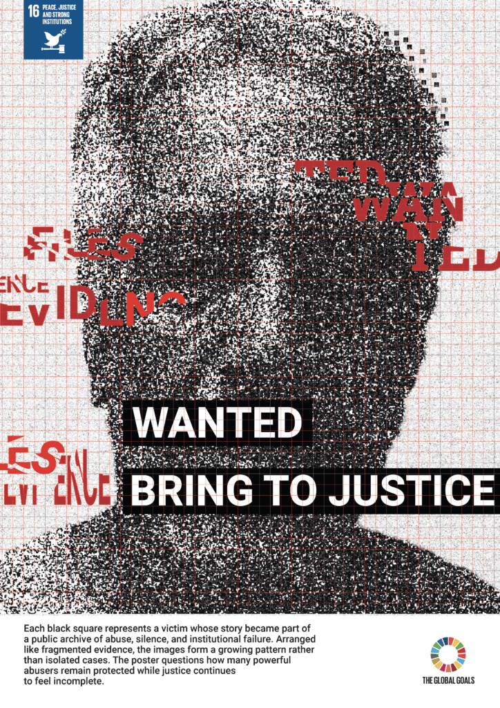
ATHEEL ALISMAILI
This poster was designed to communicate the importance of justice, accountability and strong institutions. The fragmented portrait represents victims whose voices have been silenced or hidden by systems of power, and the broken composition suggests corruption, secrecy and the failure of institutions to protect the vulnerable. The bold call to action reinforces the message that justice must apply to everyone, regardless of status, wealth or influence.
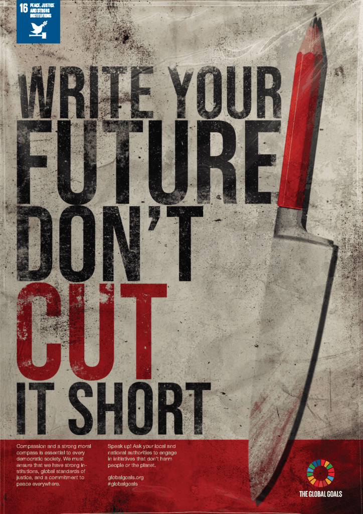
DANNY RUSSELL
This poster explores the idea of having control over your own future. The combination of a knife and a pencil creates a visual metaphor for how violence and conflict can cut lives short, while the pencil represents writing and shaping your own future. The title encourages viewers to consider the impact that violence can have on people’s lives and the importance of creating a safer future for everyone.
GOAL 17: PARTNERSHIPS FOR THE GOALS

JAYSHREE SENTHILKUMAR
This poster addresses the common misconception that partnerships are only made by large organisations, companies, and nations, when individual contributions and smaller partnerships are just as important for the development of societies and the achievement of the Global Goals. This idea is represented by exposed layers of fabric textures and threads that are layered and digitally ‘sewn’ together.
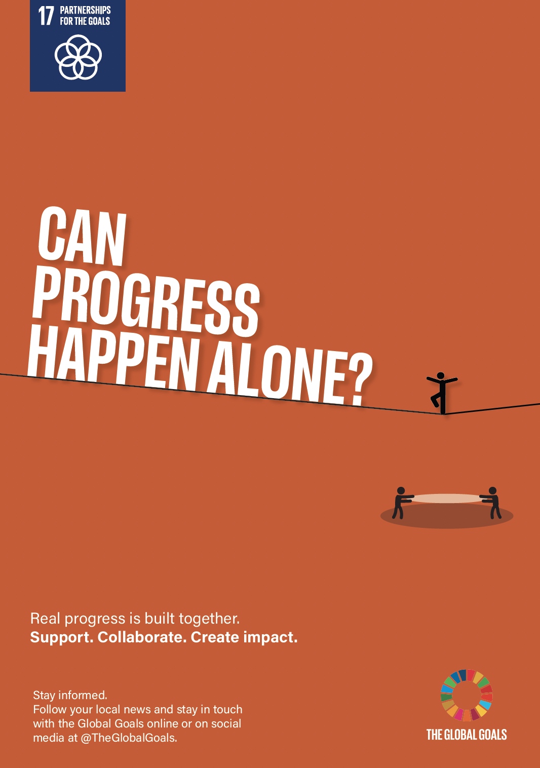
SAM BUXTON
This poster conveys the idea that meaningful progress happens when people support one another. It explores the idea that progress is rarely achieved alone, using a tightrope and human figures to represent support and achieving balance. By asking “Can progress happen alone?” the design encourages people to think about the role partnerships play in helping us move forward, whether on a global scale or in our everyday lives.
BEN MEYER
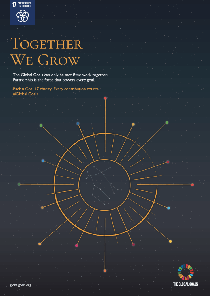
This poster focuses on partnerships between networks of organisations. It explores the idea of connections through outer-space imagery, honing in on constellations and how they might unify. Stars using the Global Goal palette act as an anchor to bring the other goals together.
The Global Goals (https://www.globalgoals.org/)
The Real Jobs Team: Sara Chapman (https://typography.network/real-jobs-scheme/)