Having looked at the brief lists, ‘Obsession’ immediately stood out to me. I intended to present the gradual progress of obsession, setting in after time and slowly creeping into borderline insanity.
Reflective of the woman happily reading in the library, the first half of the book remains in tact. However, after around half way, I begun to add to the book. I began to scribble over the pages in red pen, firstly just lines and then into words, transitioning from red pencil to red pen and finally a red Sharpie. These became more aggressive as the book continued on, showing the increasing annoyance the woman has in the sounds. As this change is a slow increase throughout the entire book, this is not seen in the images above.
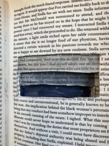
Similarly, I began folding the corners of the pages, becoming more noticeable and regular the further into the book you get. This is to mirror how the woman would keep putting her book down to investigate the source of the noise. Later in the pages, the woman’s written voice appears, first seen in pencil, then pen and finishing with a Sharpie, the same format as the mouse. The coherent sentences quickly turn into almost deranged scrawlings, ending with multiple pages of repeated questioning “Where is it?”, as seen in the first image. In my initial brainstorm, I decided that repetition was a key source of annoyance, which is why every choice is repeated with gradually increasing intensity.
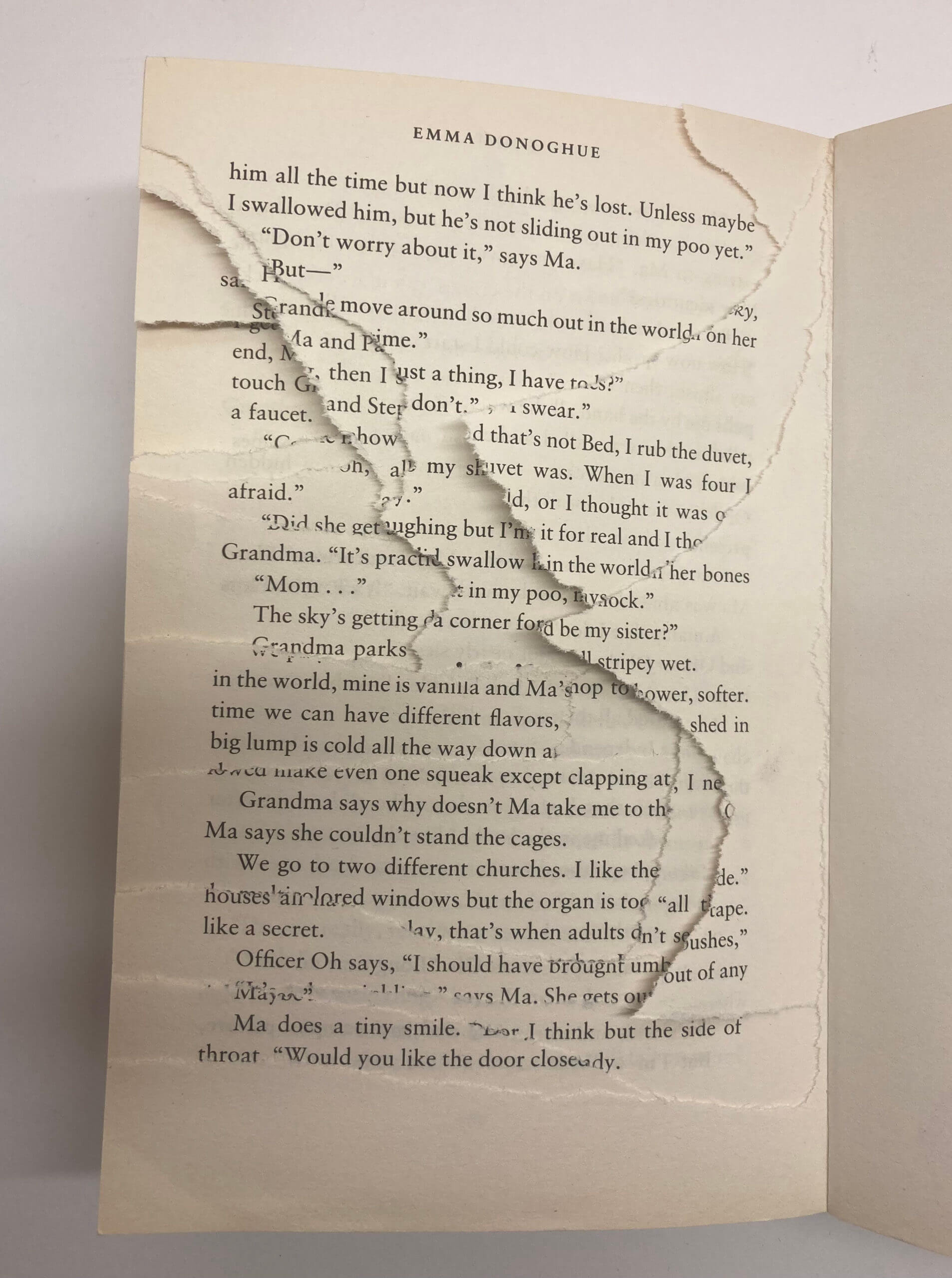
Finally, again mirroring the brief as the woman rips the library apart trying to find the source of the noise, I began tearing the final pages. By ripping more and more each time, a gradient wave is formed, creating a visually appealing textural difference and adding dimension to the book. The entire back cover is gone, as seen in the final two images, showing this as an endless narrative, the woman never finding the mouse and receiving the closure she desires, pushed to insanity by the noise.


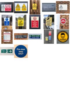
 After collecting the photos I began to sort through them. I noticed that nearly all of them were circles with only a handful being rectangular. Within the circles, I organised the images by colour: white, green, yellow and red. They abided by the universal traffic light system with green meaning go and red meaning stop. Yellow is used to give instructions.
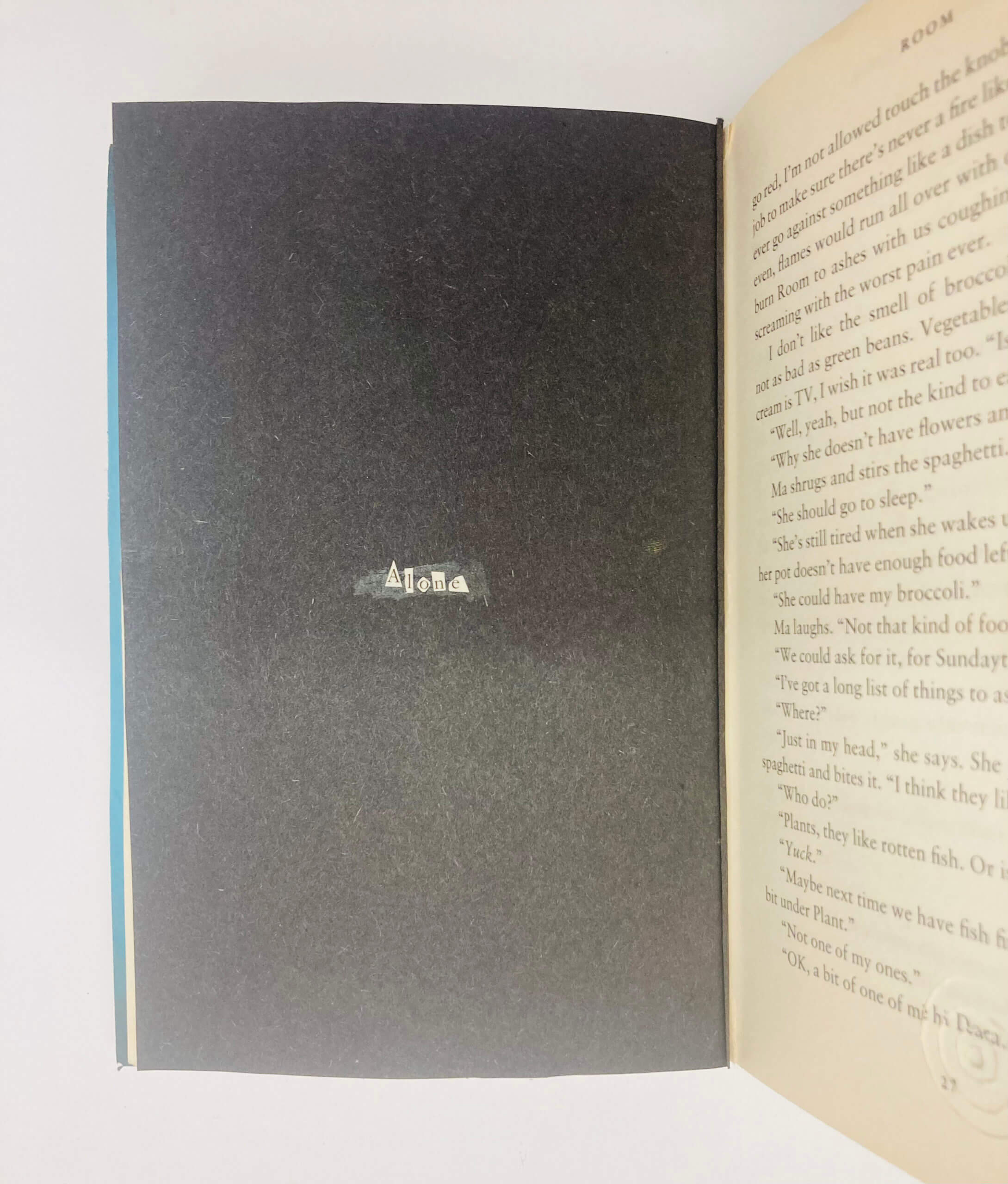 She is alone.
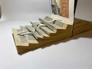
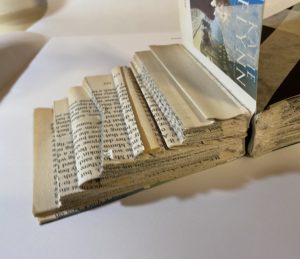
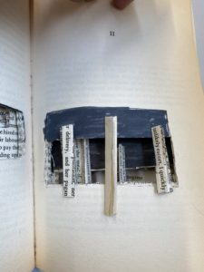
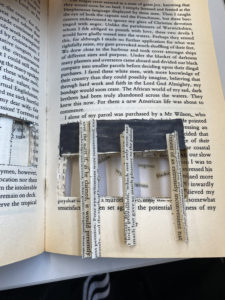
 For this mini project I picked the brief of staircases as I wanted to experiment with different levels within a book and how this manipulation would effect the text.