Category: Uncategorised

Paul Barnes: Type design

This week’s Baseline Shift session welcomed type designer and Commercial Type co-founder Paul Barnes back to the University of Reading, more than three decades after graduating from the course himself. Paul reflected on his path from studying hand lettering and letterpress printing at Reading to becoming one of the most influential contemporary type designers working today, creating typeface identities for major clients including The Guardian, Givenchy, The National Trust, Rapha and the V&A.


Early influences

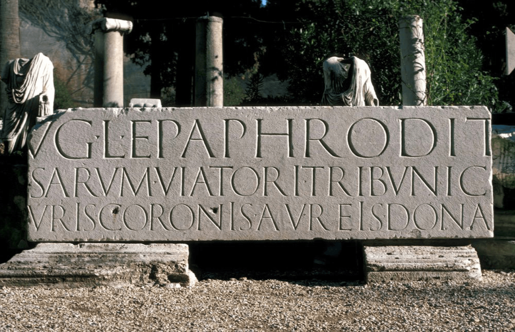
Paul’s love for typography stemmed from physically constructing layouts and lettering by hand back before digital workflows became standard. Studying at Reading, much of the course consisted of letterpress printing and creating artwork manually which Paul describes as being something he enjoyed thoroughly, explaining how there is real precision involved in these production techniques that can feel quite lost within workflows today. Lectures by Michael Twyman on the history of typography and trips to study the classical inscriptions in Rome were just a handful of memories Paul reflects on that continue to shape his work today.

Classical inscription from one of Paul's student trips to Rome
Classical inscription from one of Paul’s student trips to Rome


Typographic systems

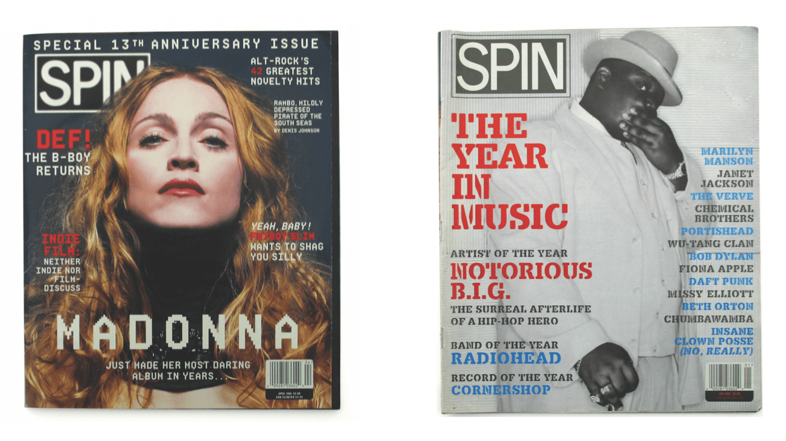
As a graduate, Paul started in the editorial and magazine design sector at a company called Spin that he later became the art director of. The constant cycle of experimentation with text, layout, image every month was an exciting environment for him to be in. However, within magazine design, the typographic systems were the main area that interested him rather than the overall art direction. Experimentation with software such as Fontographer, allowed him to create personalised headlines and adapt existing typefaces, developing an interest in consistency and structure within typography.

Example issues of Spin magazine that Paul worked on


Creation of Commercial Type

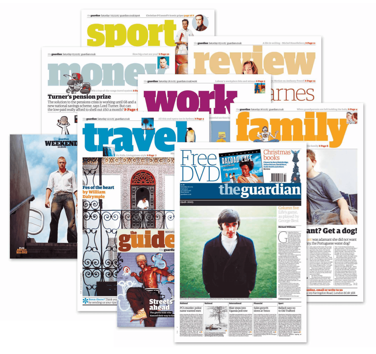
One of Paul’s earliest defining moments was his work on The Guardian redesign in the early 2000s. Working with Christian Schwartz, together they developed the typeface Guardian Egyptian, a custom slab serif family created during the newspaper’s transition to the Berliner format. The typeface gave a distinctive visual identity that showcases the move from fine serif styles and bold headline typography that remains so recognisable today.

Upon completing the project, both Paul and Christian knew that ownership of the typeface would return to them after the Guardian’s exclusivity period ended. So instead of keeping it as a one-off commission, they decided to treat this as a starting point for creating Commercial Type. The aim in creating their own company was to balance both commissioned projects with a growing retail library of typefaces, allowing the pair to work across commercial branding systems and more experimental typographic projects.

Paul and Christian Schwarz's typeface used in the redesign of The Guardian
Paul and Christian Schwarz’s typeface used in the redesign of The Guardian


Historical typography

Throughout the talk, Paul kept coming back to the fascination of nineteenth-century typography that included old playbills, specimen books and printing archives which was the first moment where typography started to become expressive with weights and size as the printing techniques evolved. Commercial Classics was an element Paul spoke about, a section that focused on reviving the forgotten nineteenth-century typefaces that disappeared over time. Paul’s intention with these forgotten typefaces is not to reproduce the historical forms, but to create a balance between research and interpretation, starting from incomplete alphabets or collections found in archives like the St Bride Library in London.

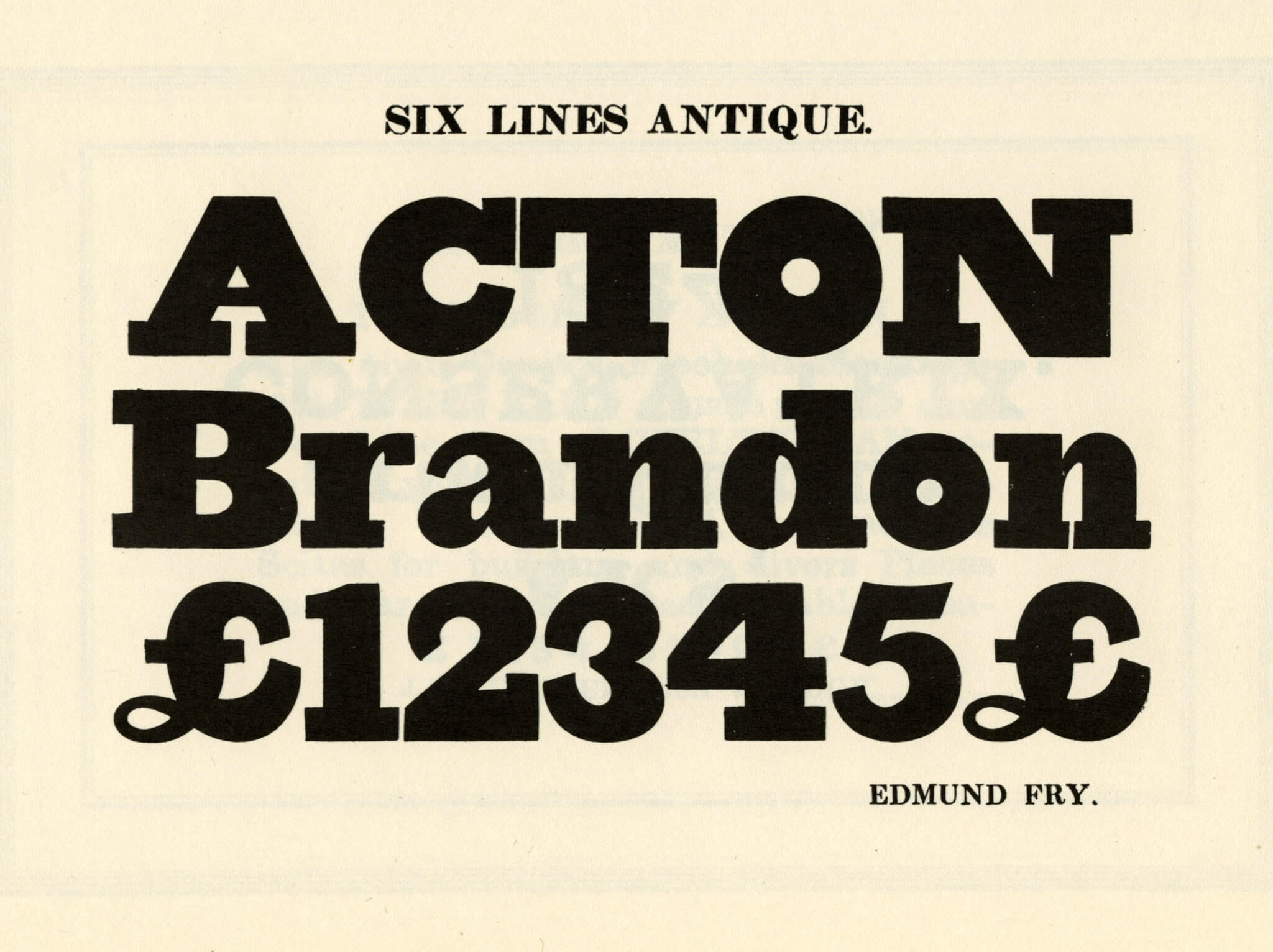
Example specimen of nineteenth-century typeface used as inspiration for a contemporary remake – Fry Six Line Antique, as shown Specimen of Modern Types, 1828, Facsimile


Variable fonts and The V&A

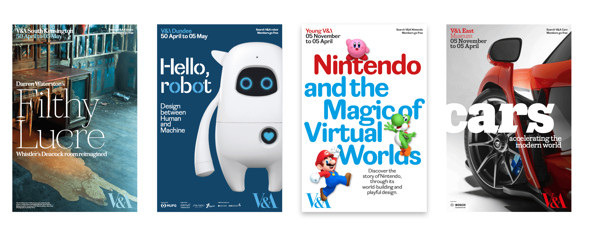
During the pandemic, Paul was asked to lead the redevelopment of the V&A’s typographic identity, prompting him to explore variable fonts and how they could create consistency across the museum’s network of locations. The typeface Spiller was created as a system featuring variations of the same typographic structure to represent each venue. Designed with variable widths and contrast options, Spiller was able to adapt across applications such as signage, advertising, and gallery interpretation while maintaining a consistent identity. Paul’s aim was to combine contemporary digital technology with historical references, creating a nineteenth-century typeface while keeping the form appropriate for readability in exhibition spaces.

Commercial Type's variable typeface pitched for the rebrand of The V&A
Commercial Type’s variable typeface pitched for the rebrand of The V&A


Designing for cycling culture

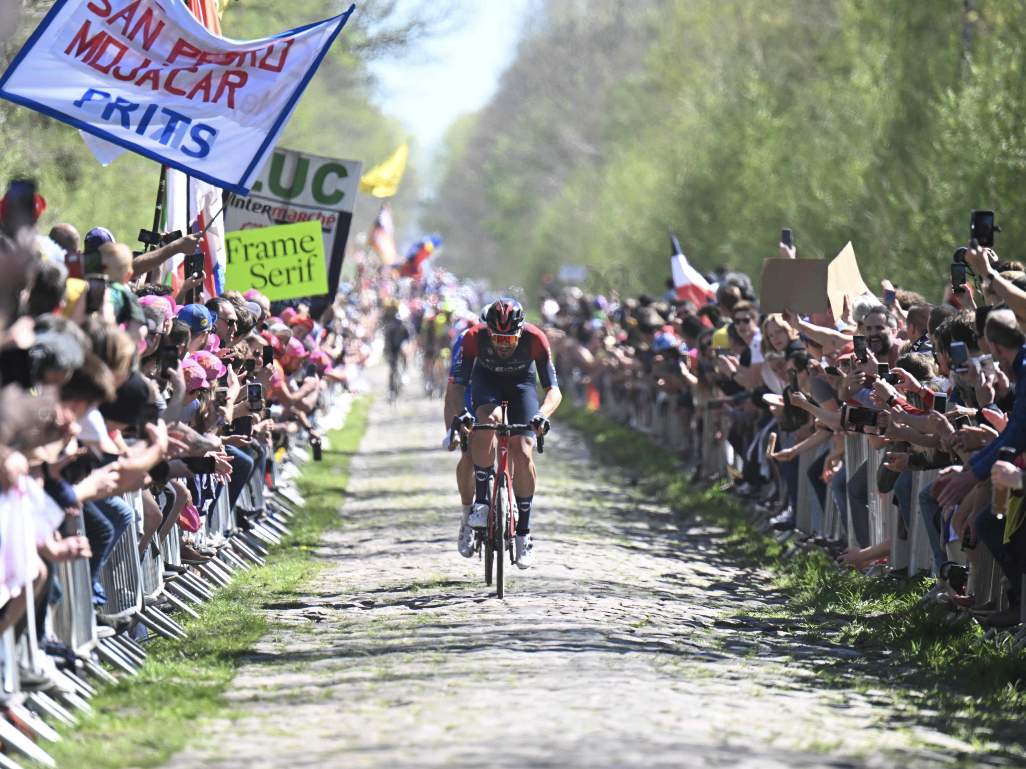
Another branding project Paul worked on was for Rapha, the high-fashion cycling brand. He was initially brought in to simplify the typography across the company’s visual identity. Due to licensing issues with existing typefaces, a new custom typeface called Frame was developed. Based on historical Caslon features, Frame incorporated a larger x-height and sharper detailing to improve readability across the brand’s platforms. Paul explained how even small typographic adjustments can significantly affect how a typeface performs across digital layouts.

The project later expanded into a wider promotional campaign, with large-scale signage used to promote the new typefaces around major cycling races across Europe. Reflecting on the campaign, Paul joked that “you need to promote the promotion”, highlighting how typography within branding systems must also function effectively in public spaces.

Commercial Type advertising typefaces at cycling events


Jan Tschichold exhibition

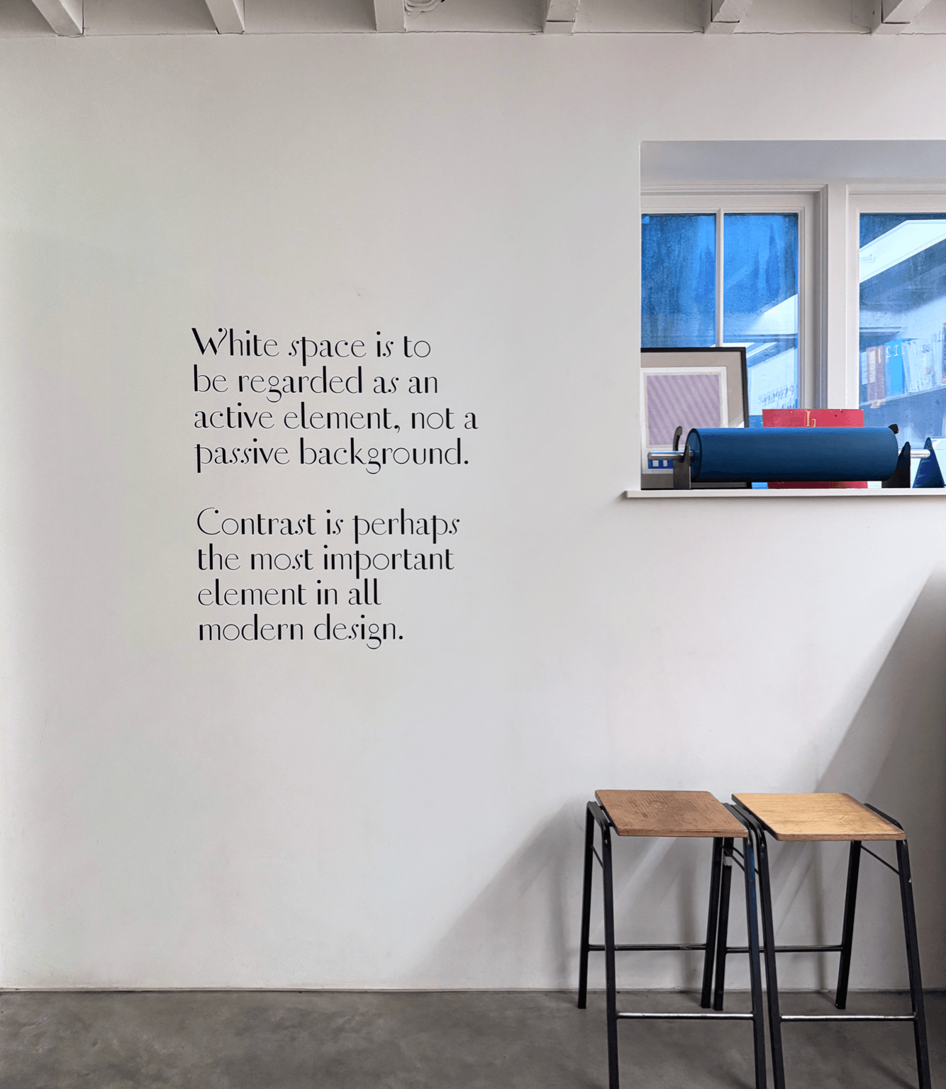
Towards the end of the session, Paul described how, while studying at Reading, he became fascinated by Jan Tschichold’s approach to lettering, layout, and clarity. Over time, he built up an extensive personal collection of Tschichold’s publications. This interest later developed into an exhibition created with fellow Reading graduate Fraser Muggeridge, showcasing Tschichold’s typography and archival material. For the project, they digitised historical lettering and recreated posters using traditional letterpress techniques. Many of Tschichold’s unfinished designs and typographic experiments had never been fully developed, so Paul used this opportunity to extend and reinterpret the work using contemporary technology.

Jan Tschichold exhibition hosted by Paul and Fraser Muggeridge


Advice for young designers

  • Continue to explore different areas of design rather than specialising too early
  • Build relationships and stay connected with people throughout your career as opportunities often develop over time
  • Focus on consistency and attention to detail
  • Be open to different ways of working and continue adapting as technology and design industries evolve


– Written by Sam Buxton

– Edited by Tommy Molnar

Sammy Rudkin: Motion design

Sharing his journey this week was the incredible Sammy Rudkin, Graphic Designer for the internationally successful content creation group, Sidemen. Sammy delivered an inspiring talk on his impressive career journey so far, speaking honestly about what to expect from the industry, being transparent about income at every stage of his career, and offering valuable advice on how to stand out as a designer.


An early start

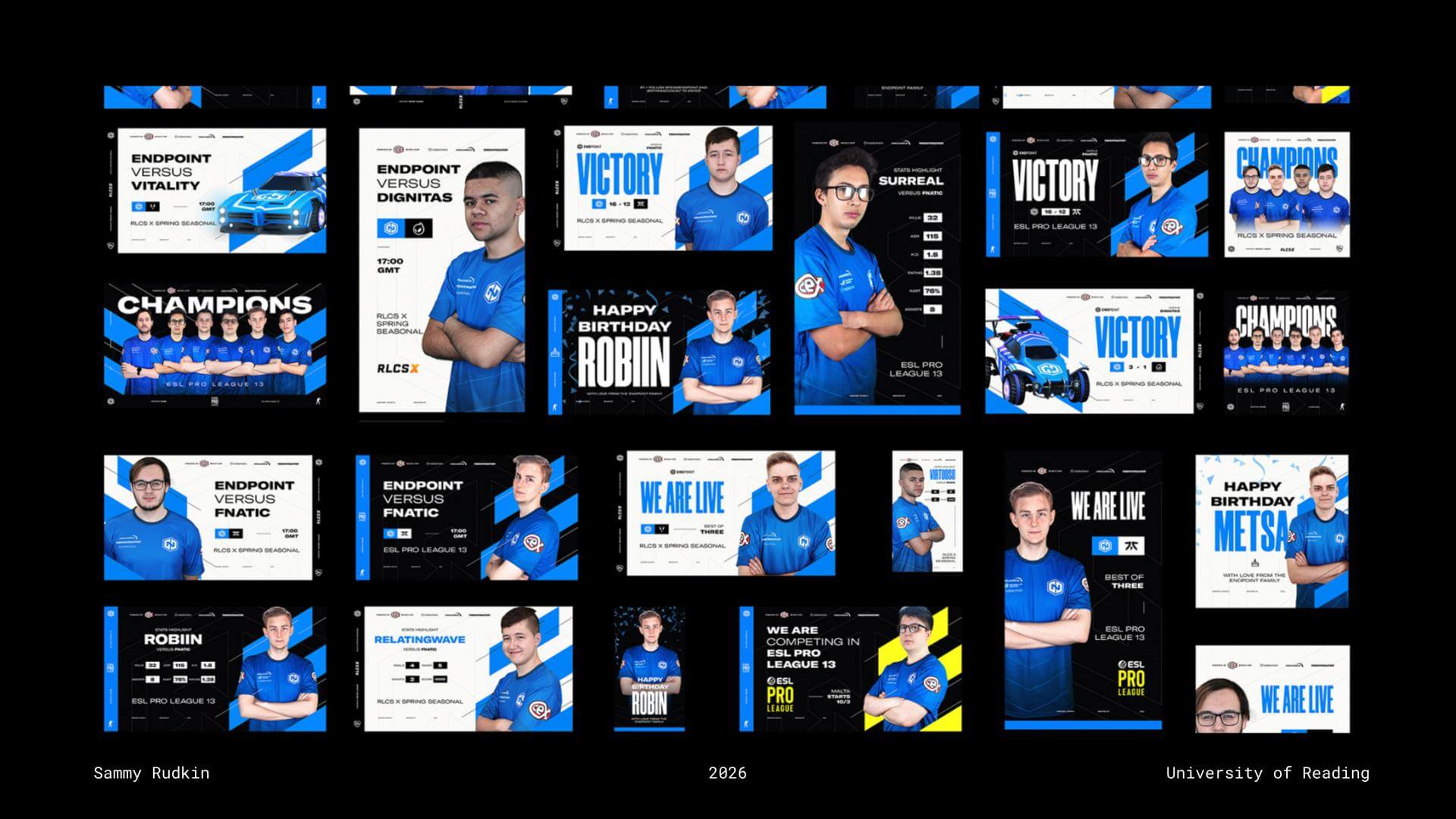
Sammy’s interest in design began at an early age. From as young as ten years old, he developed many of his practical skills through YouTube tutorials, perhaps why he now believes that “YouTube is the best website in the world.” Experimenting with small VFX and motion graphics for YouTube intros helped Sammy continually refine his software skills. At 15, he offered to create a graphic for a colleague at his part-time job in a local pub, who later went on to establish an esports team. That opportunity snowballed into Sammy becoming involved in much of the early design work for competitive esports organisation Endpoint. Sammy used this stage of his journey to remind students to “just make stuff all the time,” explaining that you never know where personal projects and experimentation may lead.

Sammy's work for competitive esports organisation Endpoint
Sammy’s work for competitive esports organisation Endpoint


Side hustles

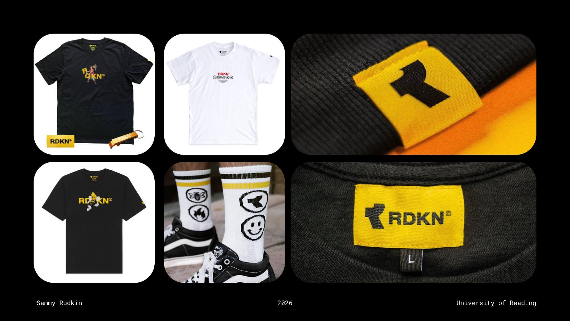
Alongside his graphic design work for Endpoint, Sammy also advocated for taking on side hustles. His side project of choice was launching his own clothing brand, which he sold within his personal circle and generated impressive revenue from at just 16 years old. A few years later, Sammy began studying Graphic Communication and Illustration at Loughborough University. When Covid forced teaching online during the first two years of his degree, Sammy found himself completing coursework ahead of deadlines, leaving him with valuable free time to further develop his software skills. During this period, his focus shifted towards 3D software, beginning with Cinema 4D. Reflecting on this time, Sammy reminded students that “Uni is the only time where you’ll have three years to just learn stuff, so make the most of that time.”

Sammy's own clothing brand, RDKN
Sammy’s own clothing brand, RDKN


Having something to show

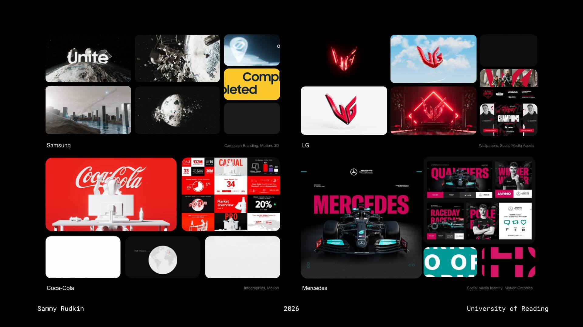
By building an Adobe Portfolio featuring work created during his time at Loughborough alongside projects completed for Endpoint, Sammy was able to begin applying for placement opportunities. After sending more than 50 emails, he secured a placement year position at gaming-focused marketing agency Kairos Group (now NewGen). During his time there, Sammy worked with several globally recognised brands, significantly strengthening both his CV and portfolio. Projects included designing wallpapers for Coca-Cola and creating social media templates for Mercedes. Looking back, Sammy reflected on how the esports experience that began from creating a small motion graphic “for fun” ultimately helped him secure his placement year, and later kickstart his design career.

Work done throughout Sammy's placement year with Kairos Group
Work done throughout Sammy’s placement year with Kairos Group


Make your work work for you

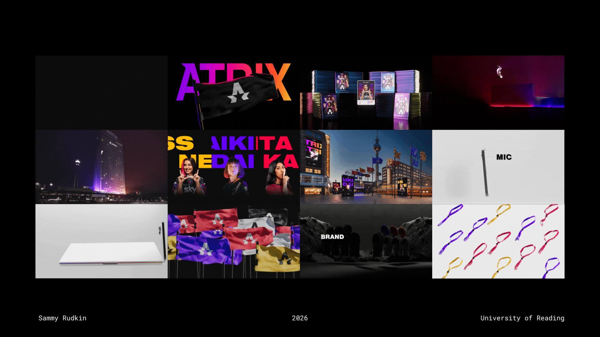
Sammy encouraged students to make the most of final-year coursework by creating projects that would strengthen their portfolios and push them creatively, rather than simply designing for grades. He followed this philosophy himself, producing visually striking final-year projects with a strong emphasis on motion design, helping his portfolio stand out amongst the competition. Alongside university work, Sammy also entered competitions such as D&AD, where he won a Yellow Pencil for his motion work on the IMAX brief. He later submitted his final-year branding project, Atrix, to the Adobe Digital Edge Awards, winning a cash prize for the project’s impressive visuals. These achievements eventually led to him being invited to speak at Adobe MAX while still studying at university, an incredible feat.

Sammy's final year project, Atrix
Sammy’s final year project, Atrix


Sidemen

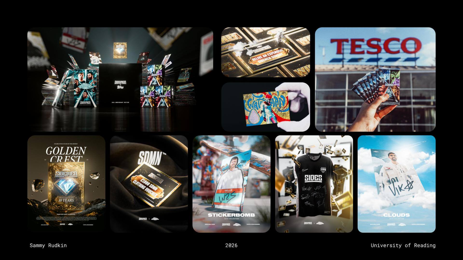
Following graduation, Sammy began searching for career opportunities. Inspired by the journey of a Loughborough alumnus, he reached out to ask about his career path and whether any opportunities might be available. Although no immediate role emerged, the connection remembered Sammy’s work and later contacted him to join the Sidemen project. Sammy emphasised that the best way to build opportunities is to “make yourself known to people.” His early work with Sidemen involved creating social assets and card designs for collaborations such as Sidemen x Topps, alongside graphics for podcast intros and transitions.

Early work done for Sidemen


Owning projects

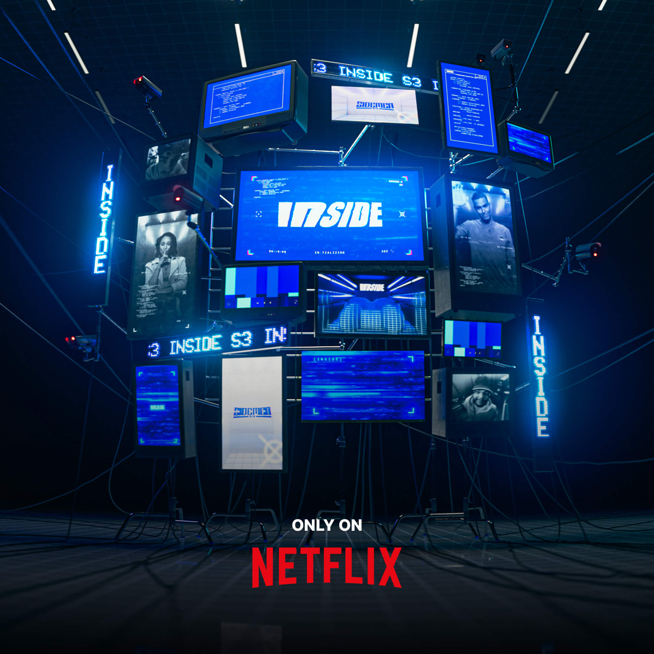
Despite only graduating a few years prior, Sammy has progressed at incredible pace, taking on more responsibility within his role. He gained full ownership of the 2025 Charity football match for Sidemen, which is something that he feels only comes with working inhouse, suggesting that a designer is unlikely to gain full ownership within an agency (and to keep this in mind when looking at what career path you want to pursue). For this project, Sammy designed with fan engagement in mind as the Charity match’s aim was to push social media reach as much as possible across several platforms. He more recently had the opportunity to take similar authority over Netflix’s hugely successful Sidemen series, ‘Inside’. Sammy elevated the visuals in this project to another level, proving that continuously honing your craft, saying yes to opportunities, and getting involved in ambitious projects will always be reflected in the quality of your work.

Visual for Netflix's 'Inside', a series starring the Sidemen
Visual for Netflix’s ‘Inside’, a series starring the Sidemen


AI’s role in design

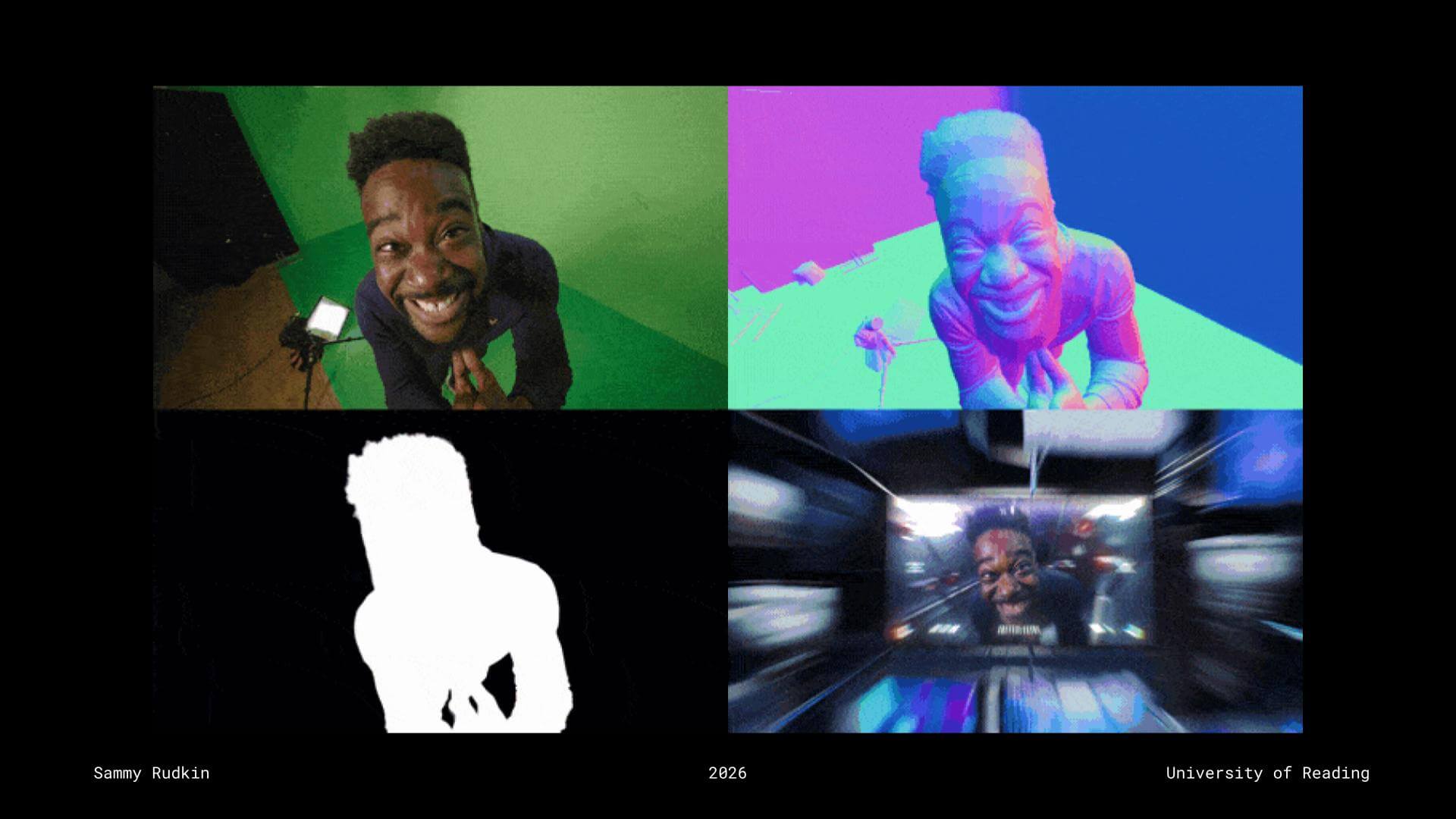
Sammy spoke openly about AI’s place within the creative industry, encouraging students to view AI as a tool rather than a replacement for designers. Using examples from his recent work on Inside, he demonstrated how AI-integrated software such as Beeble could assist his workflow by analysing green screen footage and estimating object contours and camera proximity through bump and depth maps. Rather than feeling threatened by AI, Sammy encouraged students to stay informed about emerging technologies and learn how to integrate them into their workflows. While AI can support efficiency, the industry still values human creativity, originality, and practical design skills.

Example of Sammy using AI integrated software within his work for Sidemen


Advice for young designers

  • Constantly create, starting with personal projects because your portfolio is crucial
  • Uni is the last time you have this much spare time so use it to learn as many disciplines and pieces of software as possible
  • Be sure to prioritise a work life balance
  • Make yourself valuable by finding out what skills the industry is asking for in your field – gain those skills
  • Don’t work for free… unless:
    • It’s a personal project
    • For a friend/in exchange for something
    • It’s short and too good to turn down


– Written and edited by Tommy Molnar

Kieron Lewis: Editorial design

This week’s Baseline Shift session welcomed editorial designer Kieron Lewis, who shared an honest journey through design, failure, and finding purpose. Rather than focusing only on polished outcomes, he spoke openly about setbacks and uncertainty, offering a more realistic perspective on building a creative career. Kieron also reflected on growing up in Brixton, explaining how its strong sense of community and cultural diversity continues to influence his work.


Finding the right path

Kieron began by reflecting on his early creative journey. Initially studying video game design, animation, and life drawing, he quickly realised that this path wasn’t right for him. This moment of realisation, although difficult, became a defining step in his career. It led him to pivot towards graphic design at the University of Winchester, where he began to explore branding and editorial design more seriously.

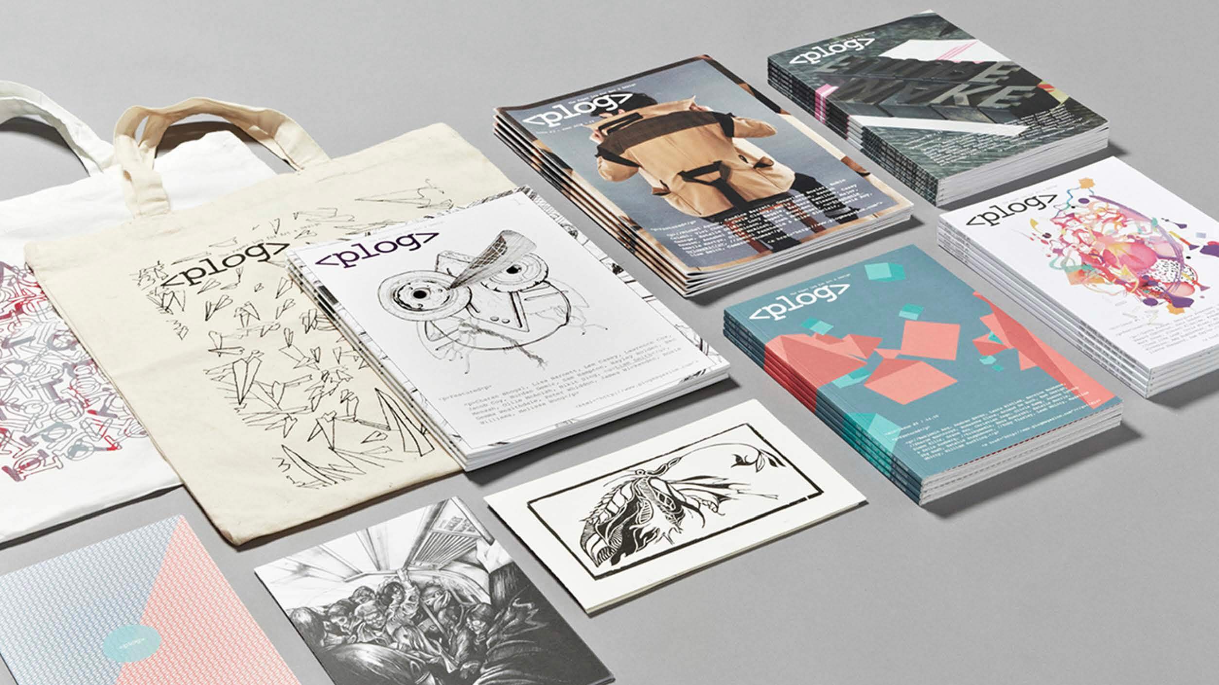
During his time at university, he co-founded Plog Magazine, a publication focused on documenting student experiences and creative work. What began as a small, self-initiated project grew significantly, eventually receiving university funding to produce further issues. This experience demonstrated the value of taking initiative and building something independently, rather than waiting for opportunities to appear.

The magazine also allowed Kieron to explore print as a medium for storytelling, understanding how editorial design can capture voices and document experiences, while also creating a sense of community. It set the foundation for the type of work he would go on to pursue later in his career.

Plog Magazine
Plog Magazine


TEDx Euston

After graduating, Kieron started his career in advertising but quickly realised it wasn’t the right fit, and after several months, he was let go. This prompted a shift towards voluntary work, joining TEDx Euston as a designer. Working on an event centred around African leadership and global conversations, he was surrounded by creatives who shared similar values and motivations. The work felt meaningful, and the collaborative environment helped rebuild his confidence and creative energy.

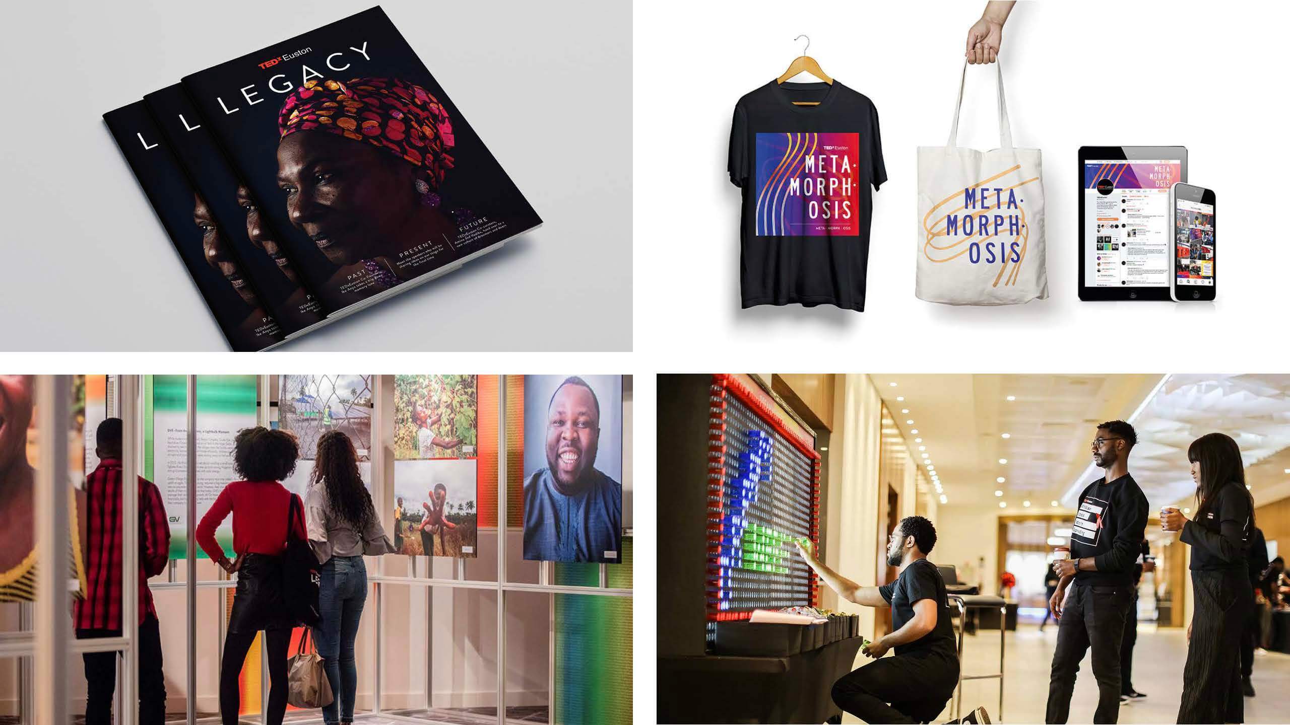
His time working with TEDx Euston became a key turning point, both creatively and personally. Alongside developing his confidence and collaboration skills, he worked on a range of outputs, including Legacy, a publication that brought together years of speakers, ideas, and conversations from the event. The project acted as a reflection of the community behind it, while also marking an important step in shaping his direction as an editorial designer.

Kieron’s work with TEDx Euston, including Legacy publication


Freelance and meaningful work

After building up his portfolio and stepping away from volunteer work, Kieron secured his first role in editorial design. This position gave him valuable experience working on publications and leading client meetings. However, after being made redundant, he was pushed to reassess his direction once again.

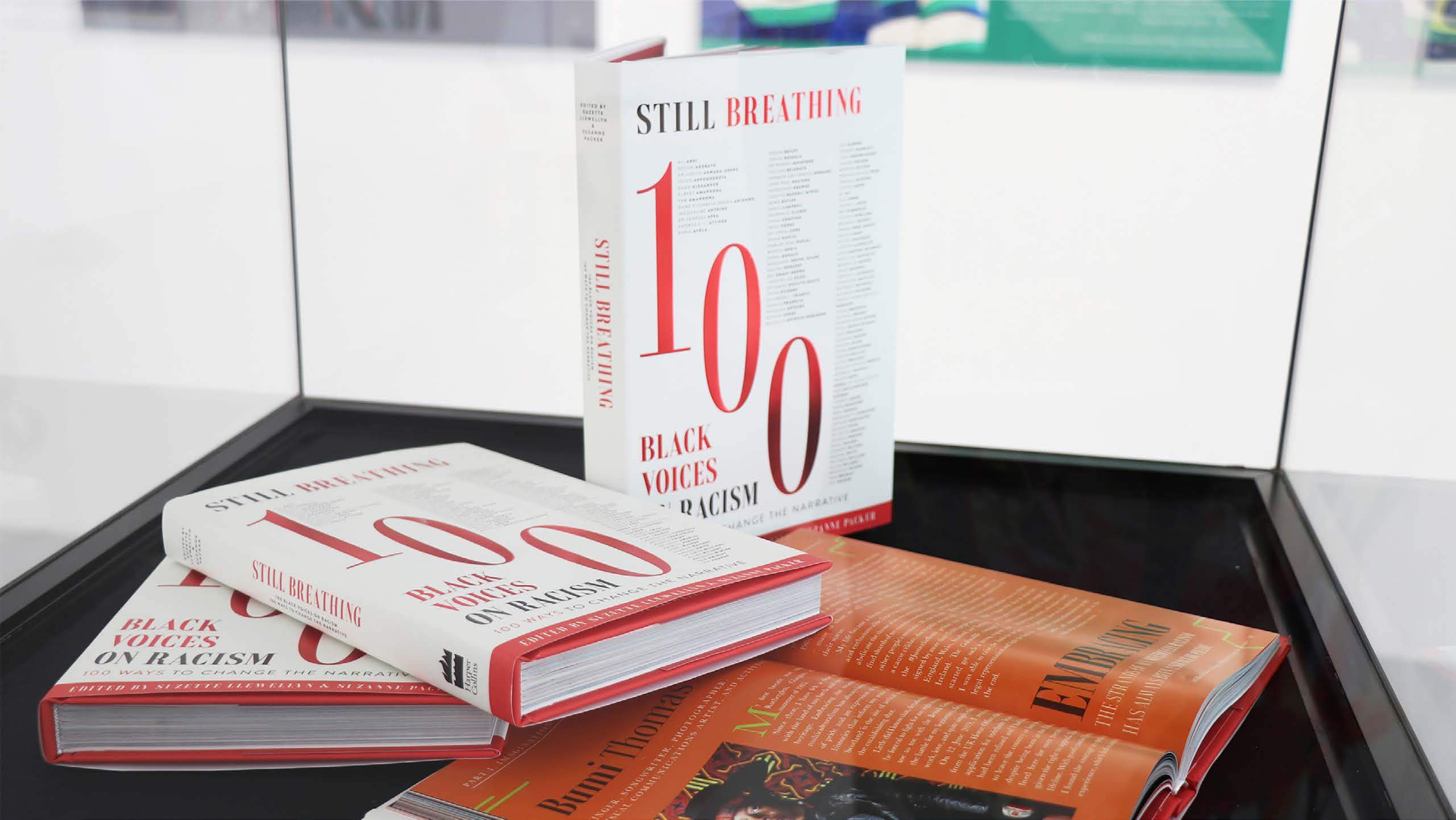
Moving to freelance meant he could focus on projects more closely aligned with his values and interests. This change allowed him to take on more meaningful and self-directed work. One of his most impactful projects, Still Breathing, was a 300-page publication created in response to the murder of George Floyd. The book features contributions from 100 individuals, each sharing personal experiences, reflections, and responses to racism in their chosen field

Still Breathing: 100 Black Voices on Racism—100 Ways to Change the Narrative

What made the project particularly powerful was its approach to design. Each contributor was given space to express their voice individually, resulting in a wide range of visual styles and perspectives. At the same time, the overall design maintained a sense of unity, using typography to express different emotional tones.

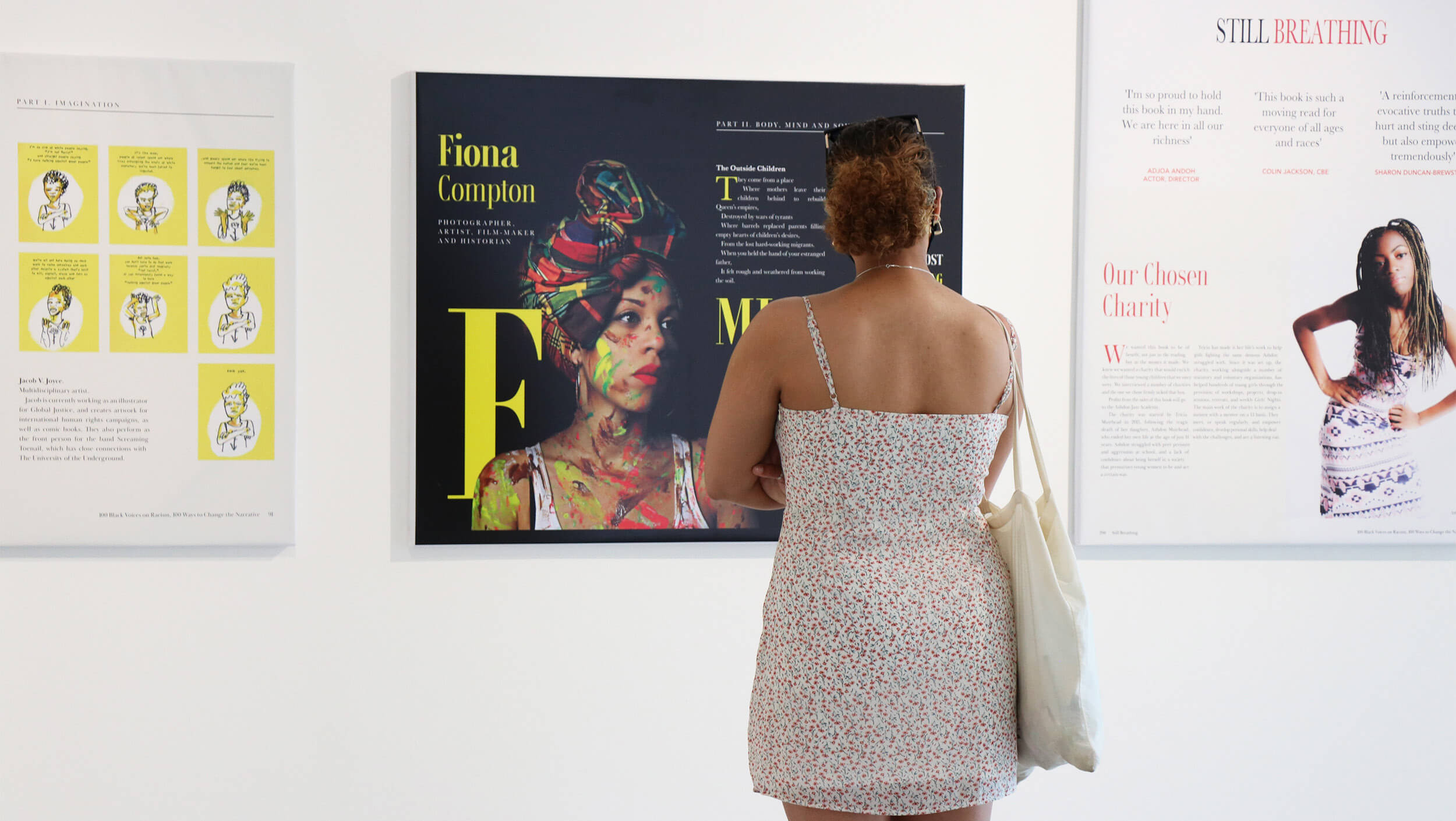
The book extended beyond its physical form, with exhibitions across London, displaying selected spreads. These exhibitions invited public interaction and encouraged conversation around difficult and often uncomfortable topics. The project showed how editorial design can be more than just something visual, creating space for conversation and deeper engagement.

Still Breathing Page spreads shown within London exhibition


Creative opportunities

Kieron also spoke about his work with Adobe Live, which began when Adobe reached out to him to take part in a three-hour livestream. Initially unsure if the message was even real, he later found himself designing live on stream, sharing his process with an online audience in real time.

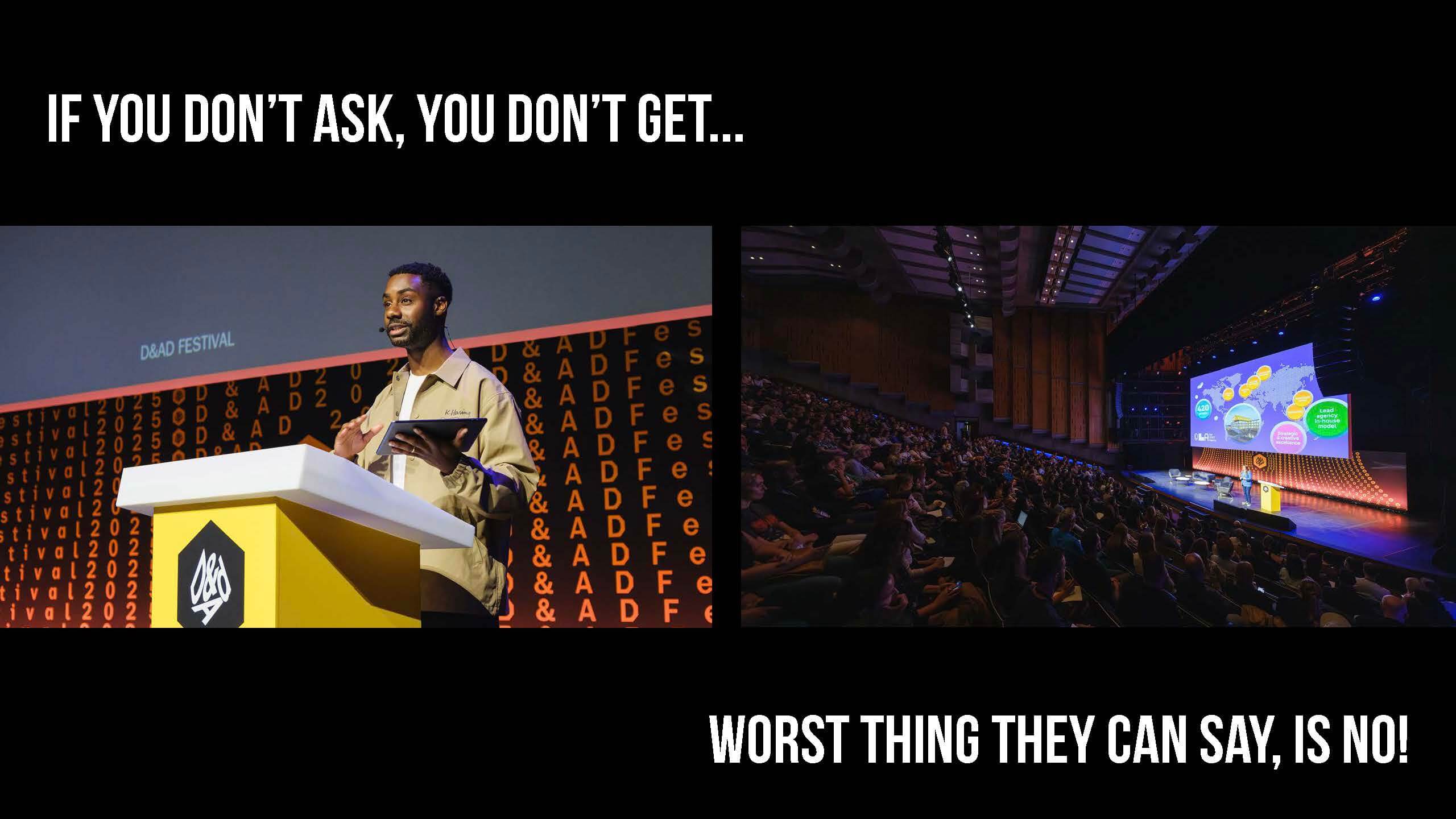
After the success of the session, Adobe invited him back in a hosting role. This shifted the experience from designing under pressure to leading conversations with other creatives, and over time became a consistent part of his practice. Alongside online sessions, he expanded his collaboration into in-person events, including work with organisations like D&AD.

Kieron’s expanded collaboration into person events with D&AD

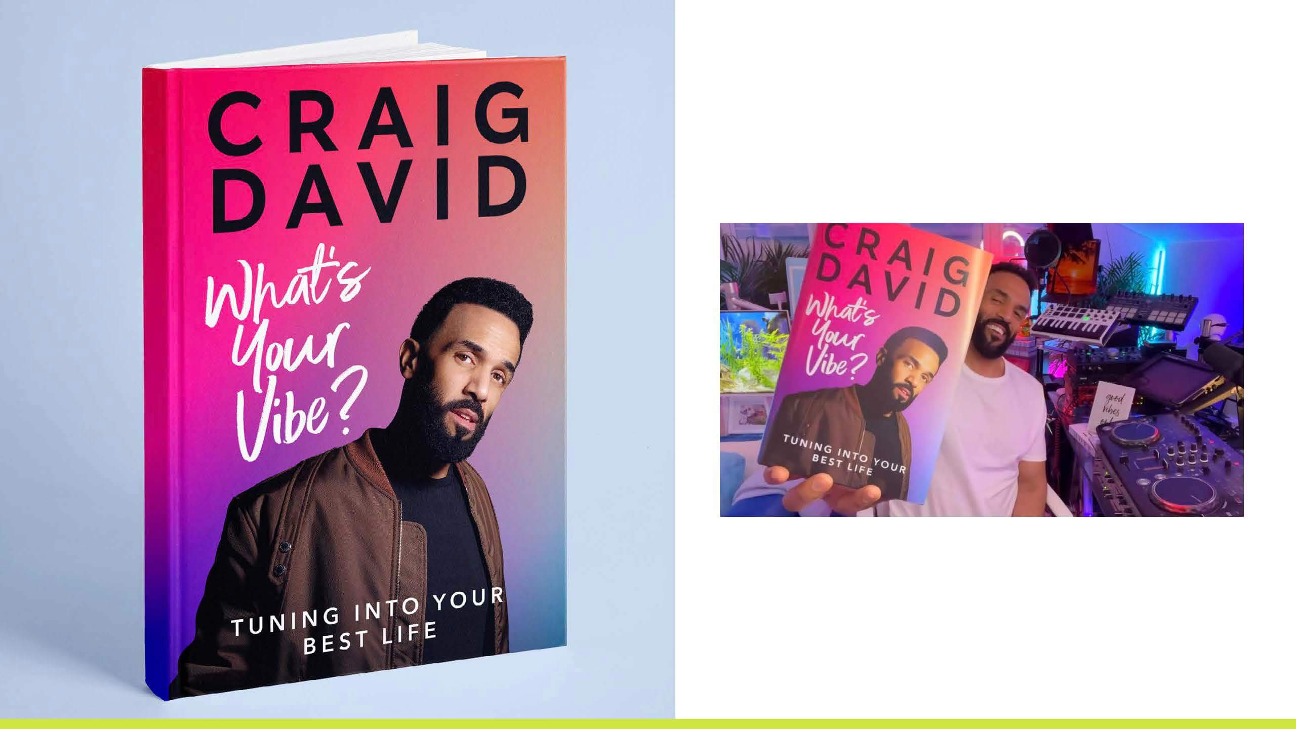
Alongside building his reputation through projects like this, Kieron was approached by HarperCollins to design a book cover for Craig David. This project offered a contrasting perspective on design, highlighting the realities of client work. Producing 40–50 design variations, with only a small number being shortlisted, demonstrated the level of iteration required in professional practice.

It also reinforced the importance of understanding the client’s perspective. While designers may have personal preferences, the outcome ultimately depends on the client’s vision and learning to navigate that balance is key to building strong working relationships.

Kieron’s book cover for Craig David, a valuable piece of work shows how much effort goes into one design


Collaboration, scale, and craft

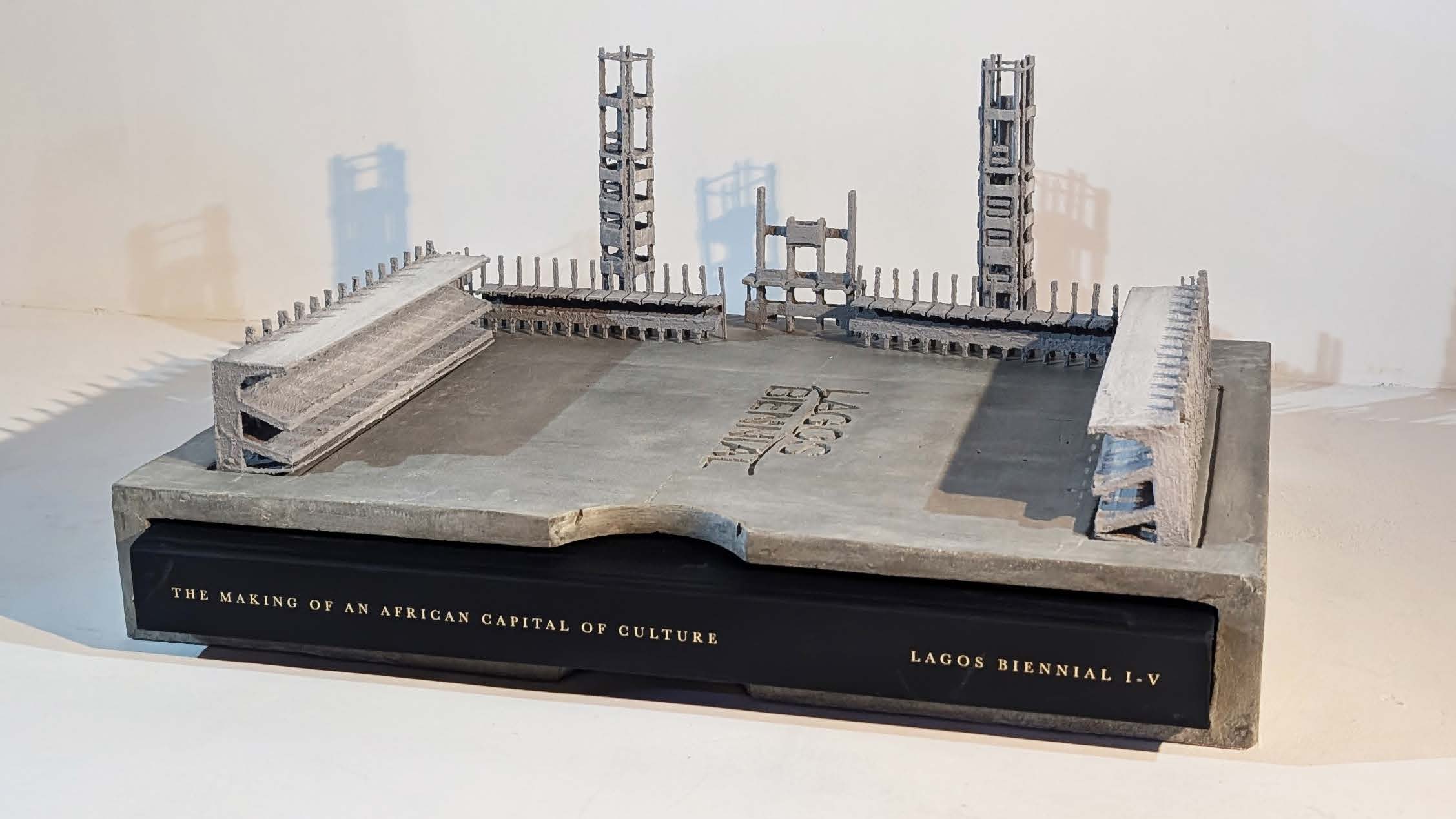
One of Kieron’s most recent projects, Lagos Biennial, represents editorial design at a much larger and more ambitious scale. The project took the form of a 456-page hardback publication, enclosed within a 7kg concrete sculptural case, immediately positioning it as more than just a book. At 336 × 494mm in size, the physical presence of the piece reinforces the idea of “large-scale” design, both conceptually and materially, bringing together the work of 161 contemporary Nigerian artists into a single, carefully crafted outcome.

Lagos Biennial book encased within 7kg concrete bookcase

The project took over two years to complete and involved close collaboration across an international team. Managing such a large volume of content required strong design judgement, alongside a clear and consistent approach to organising and handling material throughout the process.

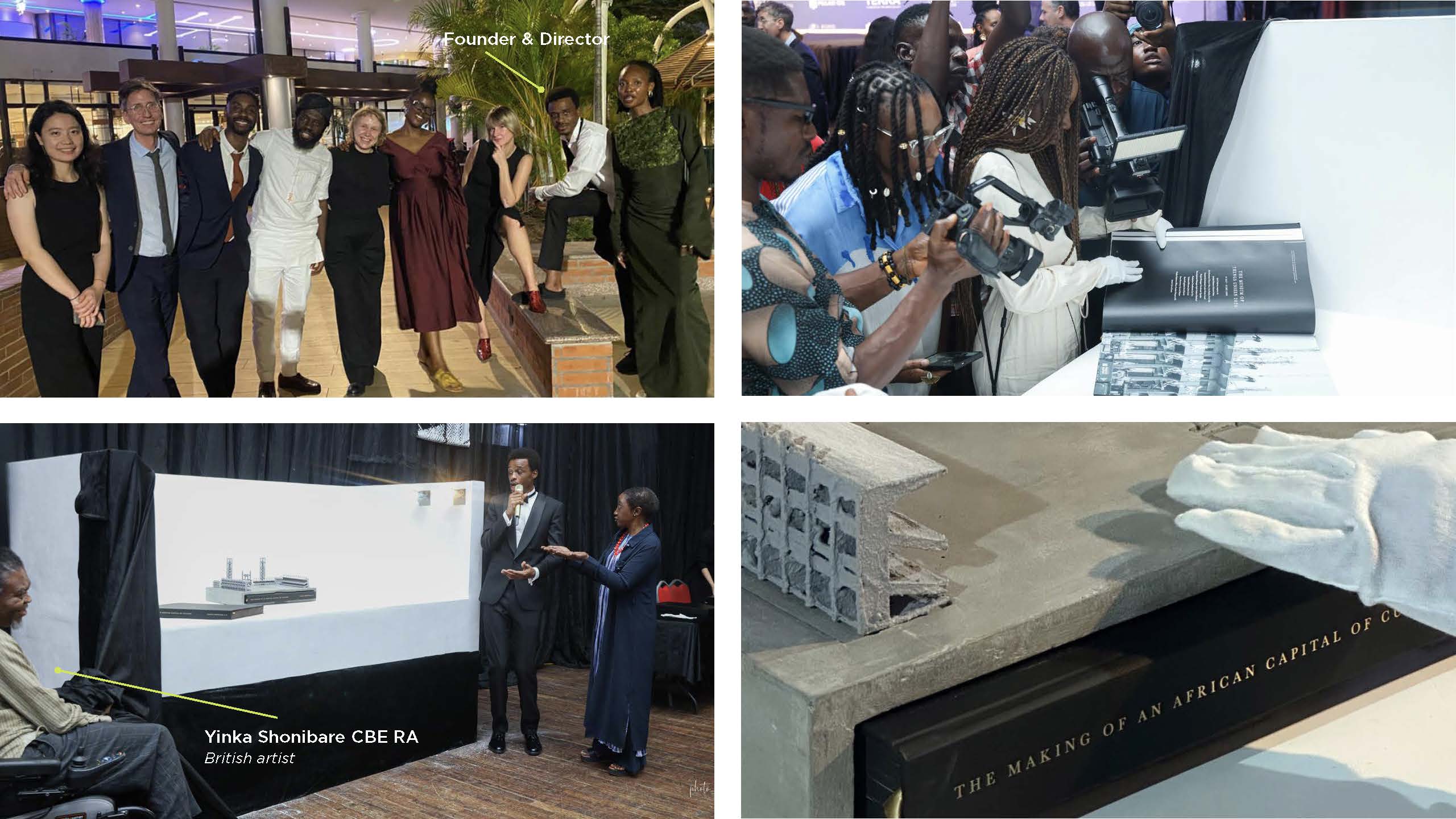
The project also extended beyond the design process itself. Kieron was flown out to Lagos for the book launch, where the publication was presented within the same cultural context it documents. Seeing the work exist physically, both as a publication and as a sculptural object, marked a full-circle moment in the project. It reinforced the idea that editorial design is not just about creating pages, but about shaping how work is experienced, shared, and remembered. Lagos Biennial stands out for giving artists visibility while capturing a unique cultural moment.

Lagos Biennial work in progress and parts of the team that made things happen.


Advice for young designers

  • Start small, think big
  • If you don’t ask, you don’t get.
  • Document and organise everything, capture ideas, sketches, and process; keep files clear and easy to navigate.
  • Take risks and embrace failure, learn from setbacks, and grow through experience.
  • Work with purpose and collaborate, choose projects that matter and build your network through teamwork.
  • Explore beyond the screen, seeing things physically, visit inspiring spaces, and engage with the world of design


– Written by Matthew Banks

– Edited by Tommy Molnar

MA Communication Design 2026 open afternoons

We are holding two Open Afternoons for the MA Communication Design in 2026. These events are open to those interested to apply (or have that applied) to any of our 4 pathways: Typeface design, Information design, Book design and Graphic design. The event is held in the Department and includes a look at our studios, special collections, and historical presses workshop. Pathways leads are on hand, so this is a good opportunity to talk to tutors about your interests and discuss how to explore them in our Masters.

Dates: Monday 19 January & Thursday 2 July 2026

Time: 2-4 pm (UK time)

Where: Department of Typography & Graphic Communication, Whiteknights Campus, University of Reading

Book your place here

This is an in-person event, so we encourage prospective students who cannot join us in person to attend one of the University’s virtual Open Days. These are held regularly and details are posted here as they become available.

Discover more about our Master’s programmes and see our students’ work

For any questions about the MACD Open Afternoon or MACD application, drop us email to typography@reading.ac.uk

Vision A3 scanner instructions

This larger scanner, located in the Resource Centre and prioritised for collections use, is useful if your source material is bigger than A4. It cannot be moved out of the collections area.

Connecting to the scanner

  1. Plug the scanner into a power outlet  and switch it on using the switch on the top. A blue light will come on.
  2. Switch it on using the switch on the top).
  3. Connect your laptop to the scanner via the USB-C cable attached to scanner.
  4. Note that only the power button on the scanner is functional in our context. Ignore the other buttons – you need to use software to control the scanner.

Installing drivers

  1. Download the scanner driver from Viisan.
    • Look for the VF3240 driver for your operating system
    • The website should contain the latest drivers, but we also have an archive here:
      • Mac driver
      • Windows driver is too large for us to host.
  2. Extract and run the downloaded setup app.

Using the scanner

Mac

  1. Make sure the scanner is powered on and connected to your laptop via USB.
  2. Macs come with an app called ‘Image Capture’. Find it and open it.
  3. You should now see the Vision scanner listed as ‘VF4320 Scanner’
  4. Open the scanner and place the document to be scanned, facing downwards on the glass.
  5. Choose your settings on the right of the window
  6. Press the ‘overview’ button to get a Quick Look of what’s on the scanner bed. This is not a proper scan, just to help you identify the are for scanning
  7. Draw rectangles (Marquees) to identify one or more areas to scan. Each rectangle will produce a separate file, so you scan many smaller items in one go.
  8. When finished, switch the scanner off and put it back to its original place. Tidy up any other materials or tools you have also used.

Windows

  1. Make sure the scanner is powered on and connected to your laptop via USB.
  2. Run the Vision Windows software that you previously installed
  3. Open the scanner and place the document to be scanned, facing downwards on the glass.
  4. Choose your settings
  5. Press the ‘overview’ button to get a Quick Look of what’s on the scanner bed. This is not a proper scan, just to help you identify the are for scanning
  6. Draw rectangles (Marquees) to identify one or more areas to scan. Each rectangle will produce a separate file, so you scan many smaller items in one go.
  7. When finished, switch the scanner off and put it back to its original place. Tidy up any other materials or tools you have also used.


Jane Austen 250th Anniversary

Context

We had the privilege to work alongside the Reading Museum and the English Department to celebrate the 250th anniversary of the birth of Jane Austen. This celebration would consist of six A1 information boards and pull up banners with text provided by the English students. Reading has many connections to Jane Austen and her family, the boards would be displayed at the Abbey Quarter and Abbey Gatehouse where Jane and her sister attended school. These are available to go visit until October 2025 book now on the Reading Museum website.

Restated brief

Aim for the project

For this project we plan to honour Jane Austen’s legacy and provide an educational and visually engaging way for audiences to learn more about her story.

Deliverables

  • Outline of Jane Austin’s life
  • Her 6 major novels
  • Female accomplishments at the start of the nineteenth century
  • Early 19th century education
  • Austen country (in the Berkshire area)
  • The Abbey Gatehouse schoolroom

All these information boards will be reformatted to pull up banners.

Schedule

  • Friday 10th January:
    Send off restated brief to supervisor and make any necessary changes.
  • Monday 13th January:
    Carry out initial research if needed, plus start on rough sketches of ideas for the boards, finalise restated brief based on feedback
  • Tuesday 14th January:
    Submit restated brief for final approval from supervisor
  • Wednesday 15th January:
    Send the restated brief to the client and organise a meeting to present initial sketches and discuss their feedback.
  • Thursday 16th January – Friday 17th January:
    Update initial designs based on client feedback
  • Monday 20th January:
    Begin designing the information boards in InDesign, schedule weekly feedback meetings with the client
  • Friday 24th January:
    Present the first set of draft designs (for e.g. 3 boards) for feedback
  • Friday 31st January:
    Submit drafts for all six information boards
  • Monday 3rd February – Friday 7th February:
    Incorporate feedback into designs and finalise designs for five pull-up banners
  • Monday 10th February 2025:
    Final review with the client to make any final adjustments
  • Friday 14th February 2025:
    Submit print-ready designs for approval

Research

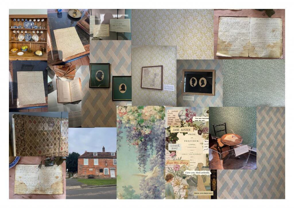
In terms of initial research, we visited Jane Austen’s house in Chawton where Jane lived for the last 8 years of her life. This helped us gain an insight to the visual aesthetic of the period. The visit gave us more of an understanding of the architecture during Jane Austen’s life, we were particularly moved by the colourful wallpaper used throughout the house. There were also mannequins showcasing garments and jewellery that would have been worn by Jane and her sister, consisting of delicate silks and embroidered fine muslins. Being able to see real, physical letters written by Jane taught us that typography during this period was mainly handwritten. However, Jane’s handwriting is lively and in a beautifully neat, calligraphic style which we though would be a good addition to the our designs.

Moodboard of images taken at the Chawton house for inspiration.

Moodboard of images taken at the Chawton house for inspiration.

Development

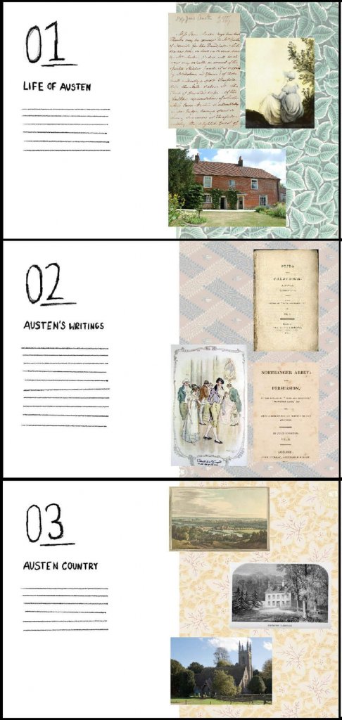
Before our first client meeting we sketched and created mockups of the information boards incorporating the Chawton House wallpaper to the designs. The clients agreed that adding a part of Jane’s personal life was an effective connection the anniversary of her life. Some feedback we received included making the boards portrait not numbering them as there was no specific sequence for the boards and the education board was going to be placed at her school.

Initial Ideas for boards

Our initial ideas

Once a rough idea for the layout and design had been agreed on, we started digitising our ideas in InDesign. We split the design work between the two of us, where each one of us was working on three of the information boards. Having weekly feedback with our supervisor Gerry and our Clients was very useful and helped us throughout the development process. Seen below are our first and last iterations of one of the boards after adjusting the design based off of the feedback received.

First iterationFinal outcome

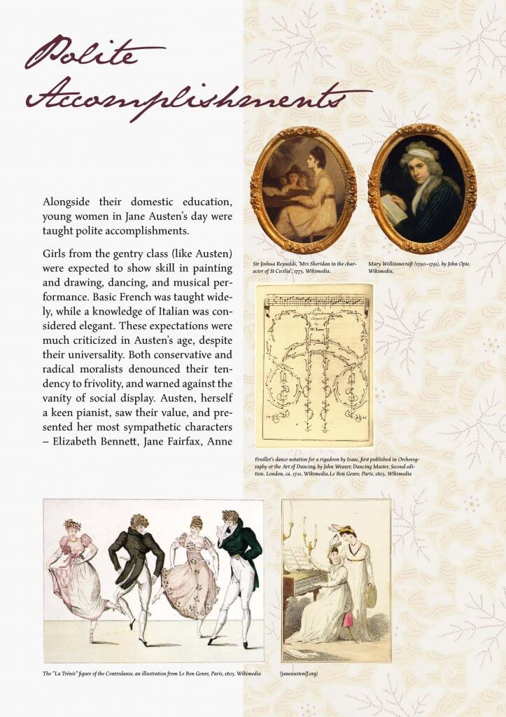
First and final outcome of the board ‘Polite Accomplishments’

Outcome

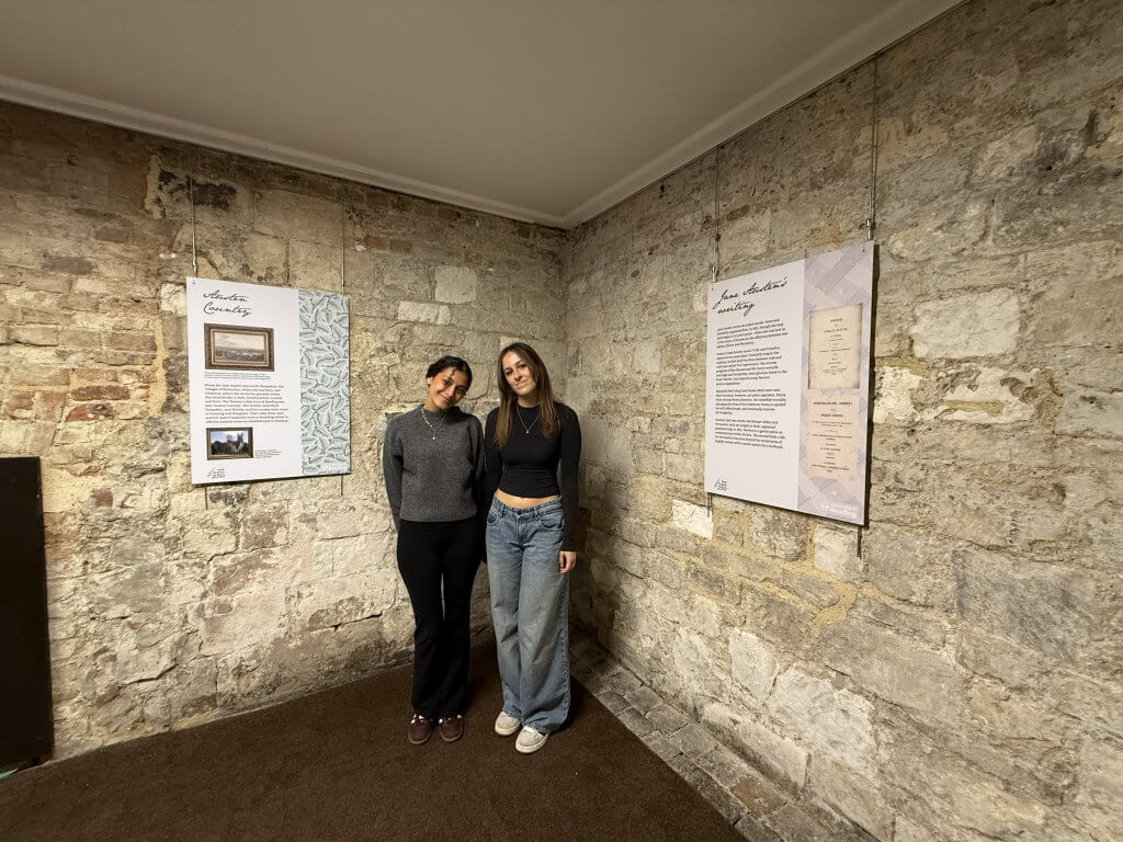
The outcome of the information boards were produced and installed by the museum itself. As seen below they are hung on a brick wall in Reading Museums Abbey Gatehouse. The typeface of the title incorporates Jane Austen’s handwriting, inspired by the books and letters stored at Chawton House.


Client Feedback

“Your professionalism has been evident from the start, your communications with us timely, polite, and well-informed, and the work itself is stunning. We’ve been particularly impressed by your commitment to the project, most notably in taking the time to visit Chawton. This trip has proved really decisive in ensuring the quality and distinctiveness of the final product, and it will tell in ensuring that visitors to the Schoolroom get a much more tangible sense of Austen’s period, and her own life. You’ve been very responsive to the project brief, and to our suggestions as the work has progressed, and you’ve communicated very clearly the parameters within which you’re working, and the practical considerations that we need to bear in mind. It’s been a real pleasure to work with you. Thank you both very much.”

Paddy and Gail, English department of University of Reading.

It was a pleasure to work with Paddy Bullard and Gail Marshall from the English department here at Reading University, they offered us a responsive and engaging client experience that will benefit us greatly in future jobs we partake in.

Reflection

This project was our first real job, it taught us the importance of understanding the brief and clear communication between us and the client at all times. Our client was very happy with the deliverables and it was very rewarding to go and see our work installed at the Abbey.

Picture of us reviewing our work at the AbbeyPicture of us reviewing our work at the Abbey Quarter

Although we were happy with the outcomes we were faced with a few challenges. For example we had to revise the body text and remove some images due to the layout and format we had chosen. These changes went through our clients first and were approved and welcomed to provide the best results. Another main challenge we faced was improving the resolution of the wallpaper backgrounds. Since the deliverables were being printed at a large scale, particularly the banners, we had to ensure the images were of high enough quality to avoid any blurriness. To solve this, we learned to use a new software tool, ‘Topaz’ which is an AI based programme that enhances the resolution of images and scans. As a result of this real job we feel we have both become better designers and we will apply all the skills we learnt into all our future projects and jobs.

This project was a valuable learning experience, and the outcomes were extremely rewarding and a great success for the exhibition in Reading Museum’s Abbey Gatehouse, celebrating the 250th Anniversary of Jane Austen’s life. The information boards capsulate elements from Janes home in Chawton, where she spent her final years, resulting in a more personal and historically accurate outcome.

RJ00615: Synthetic Media Research Network

WHO ARE SMRN

The Synthetic Media Research Network is a community of researchers dedicated to discovery within the area of synthetic media. They focus on the social, legal, and political challenges regarding upcoming deepfake technology, as well as prototyping “AI-generated photo-realistic synthetic media in areas such as film and screen, healthcare, and education”.

BRIEF RESTATED

DELIVERABLES

Brand guidelines for how to use the logo.

Logo suite (vector, bitmap)

Pull banner (W 850mm x H 2150mm)

Extra proposal – leaflet/programme (2-fold A3, double sided = 4 pages A4)

Extra proposal – foamboard placard with logo printed (W 630mm x H 300mm)

The logo was used on a banner, leaflet and foamboard and will be used in many future documents.


RESEARCH
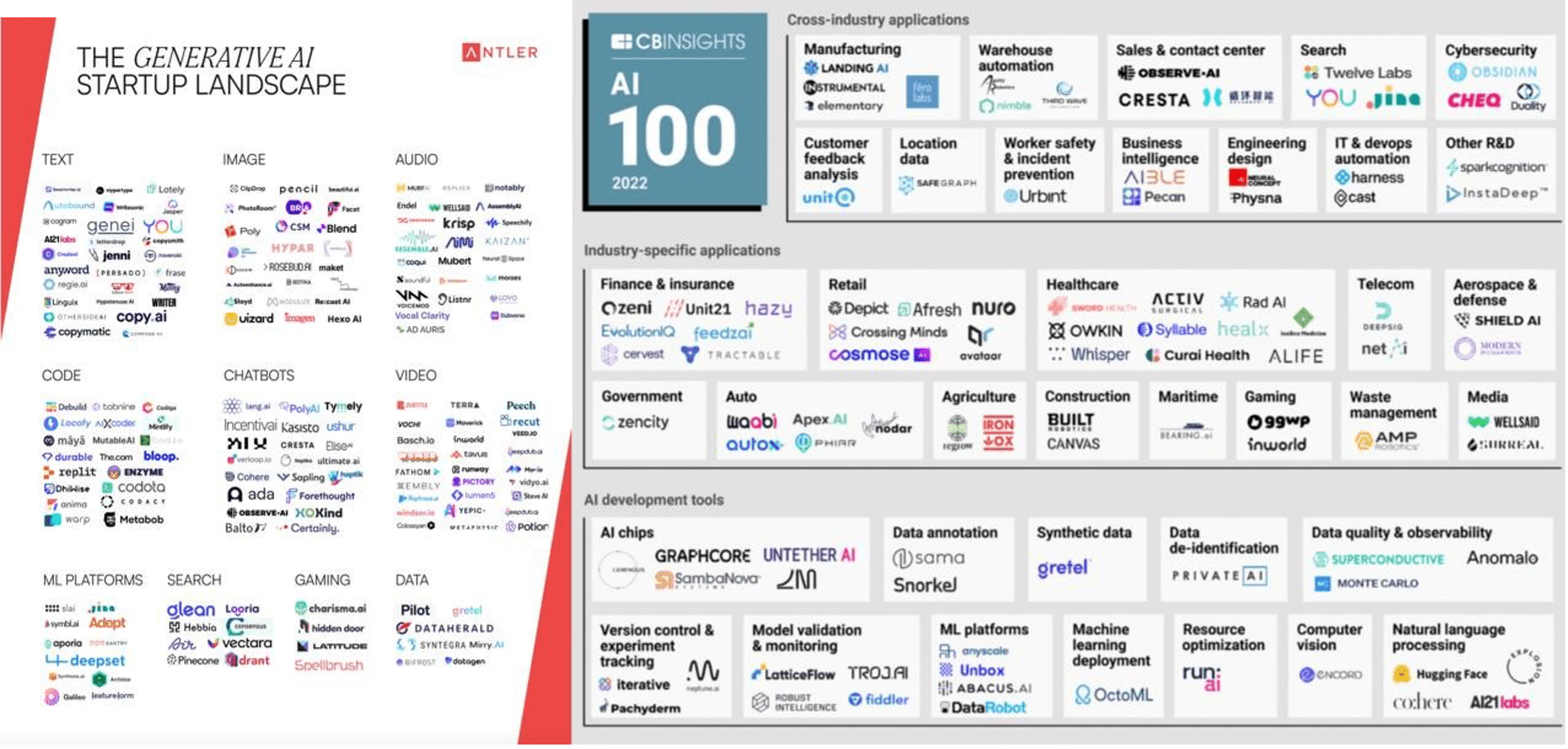
Figure 1: Logo Research 1

The design process began with research into the area of logo design within the AI industry (fig 1). From this research, you can see how the majority of these logos use abstract shapes, repeating patterns, geometric shapes and typefaces. The issue regarding the abstract shapes was the lack of relevancy to the field of AI. In addition to this, the scalability of certain logos was unsuitable for screen due to their light typefaces.

Further research into logo design was utilised to discover various ways of stacking logos that we may need when creating a logo suite (fig 2).
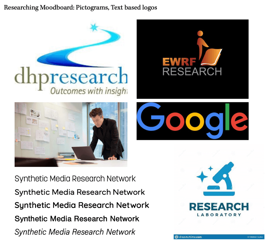
Figure 2: Logo Research 2

Research was undertaken around colour psychology, discovering that the two main colours you see within AI organisations logo design are red and blue as seen in figure 1. However, after research we decided blue was the most appropriate colour as it represents areas such as technology and innovation.

Finally, research was conducted into the target audience of the symposium and who the members of the research network may be. From this, personas of the intended audience were formed in order to understand what their personalities and brand values are (fig 3).
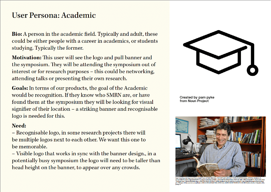
Figure 3: User Personas

UNDERSTANDING THE CLIENT

In order for the team to begin ideation, understanding the client was essential, therefore a meeting took place to discuss the values, ideas, and purpose of the brand. On top of this, it was essential to understand how the brand will operate and under what circumstances our designs might be used. The client pointed us towards a web page that was under development which described the organisation, and the client highlighted the situations our designs will be used in. For example, originally it was thought that the banner would be only used in the upcoming symposium, however we were informed it will also be used as decoration in the backdrop of a podcast.

DESIGN

LOGO

The next step in the design process, was to undertake icon ideation. The reason an icon logo was used rather than a wordmark logo was that the client specified a preference for icon logos. To begin, a mind map was used to explore areas of AI and synthetic media, from which icons could be developed (fig 4 and 5).
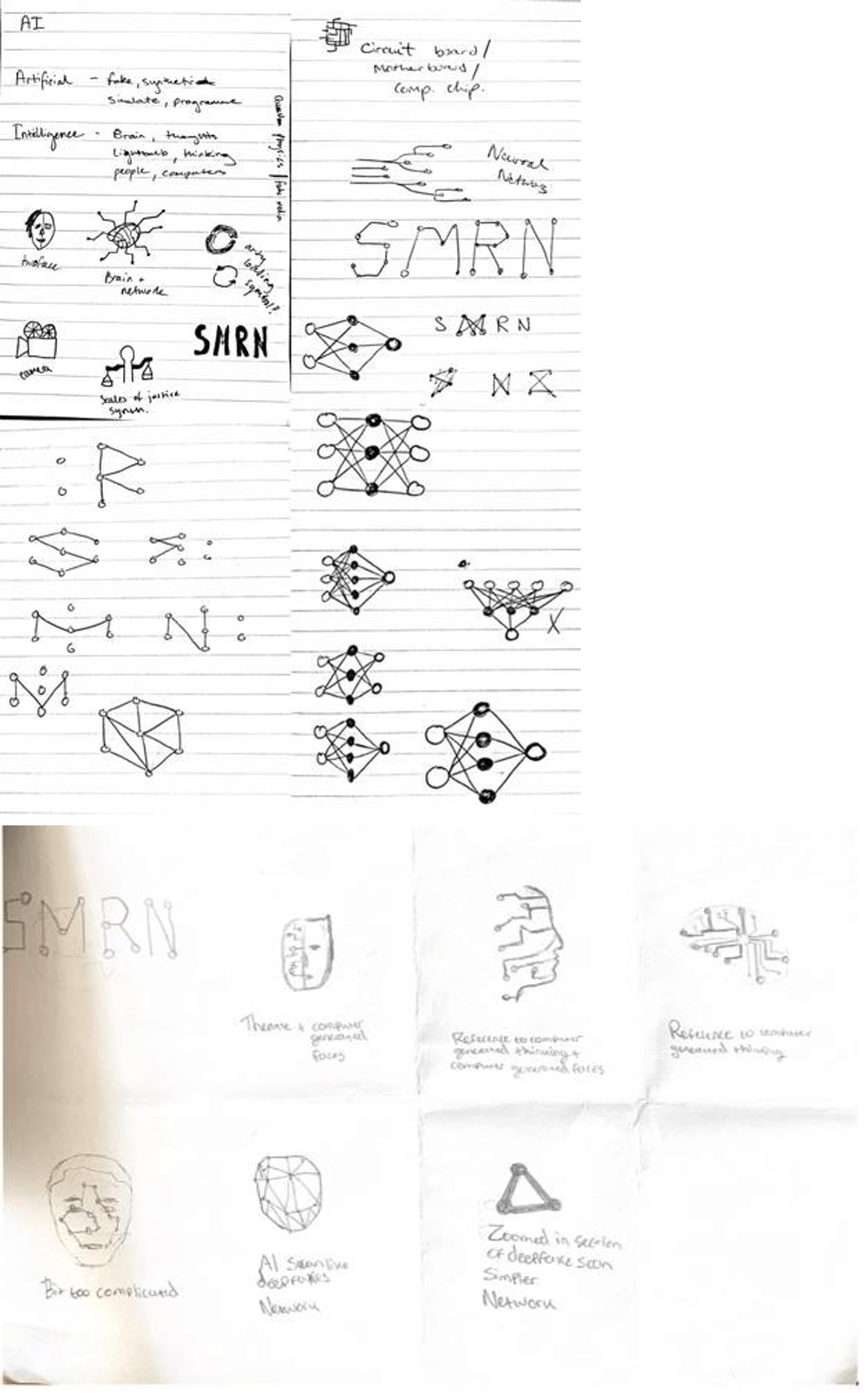
Figure 4: Initial Sketches 1(top)      Figure 5: Initial Sketches 2 (bottom)

After copious options had been explored and both supervisor and client input were taken into consideration, five concepts were developed further (fig 6). These icons, once completed, were paired alongside various typefaces that were chosen based on client’s preference, alongside our knowledge and research into how typeface personality can affect a reader’s perception (fig 7).
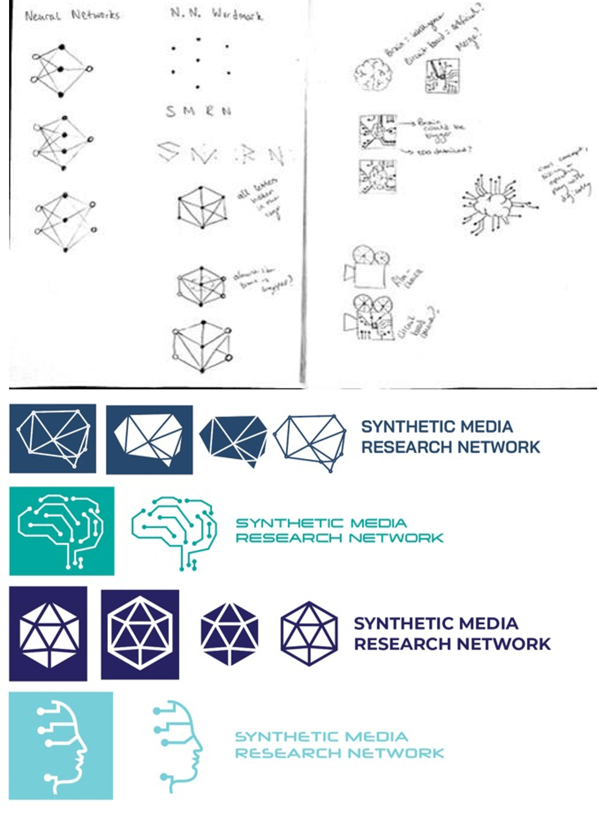
Figure 6: Further Sketches (top)
Figure 7: Typeface Pairings (bottom)

After meeting with both client and supervisor, a decision was made regarding the icon and typeface choice. The chosen icon represented the ‘Neural Network’, a key symbol within the community of Artificial Intelligence researchers (fig 8). This symbol represents “a type of machine learning process, called deep learning, that uses interconnected nodes or neurons in a layered structure that resembles the human brain. It creates an adaptive system that computers use to learn from their mistakes and improve continuously” (Amazon, 1978). The client liked this iconography as it was a recognisable shape to anyone in the industry, so they would be aware of what it meant.

Figure 8: Neural Network Symbol

The typeface chosen was “Halyard Display”. Originally, the title of the organisation “Synthetic Media Research Network” was kept under the same weight (fig 9). However, after multiple iterations whilst working on the layout of the paired icon and text, the symmetry within the name was noticed. Synthetic Media and Research Network, although being a part of a whole title, shared different levels of hierarchy alongside being a pair of separate titles. Therefore, after experimentation regarding the correct weights to use (regarding scalability and hierarchy), it was decided that medium would be used for Synthetic Media and book would be used for Research Network (fig 10).

Figure 9: Typeface Experimentation
Figure 10: Chosen Text Halyard Display

The finalised colour, blue, was tied into the concept another way. The varying shades of blue (fig 11) represent direction and progression which ties into the icon itself as well as the organisations goals. The team also showed the client the logos on black and white backgrounds which sparked a debate about which they preferred and what might be appropriate in many situations. As the client preferred the design on the black background, we decided to finalise those designs. However, the team advised the client that the logo on a white background was essential, and we would also provide him with those files.
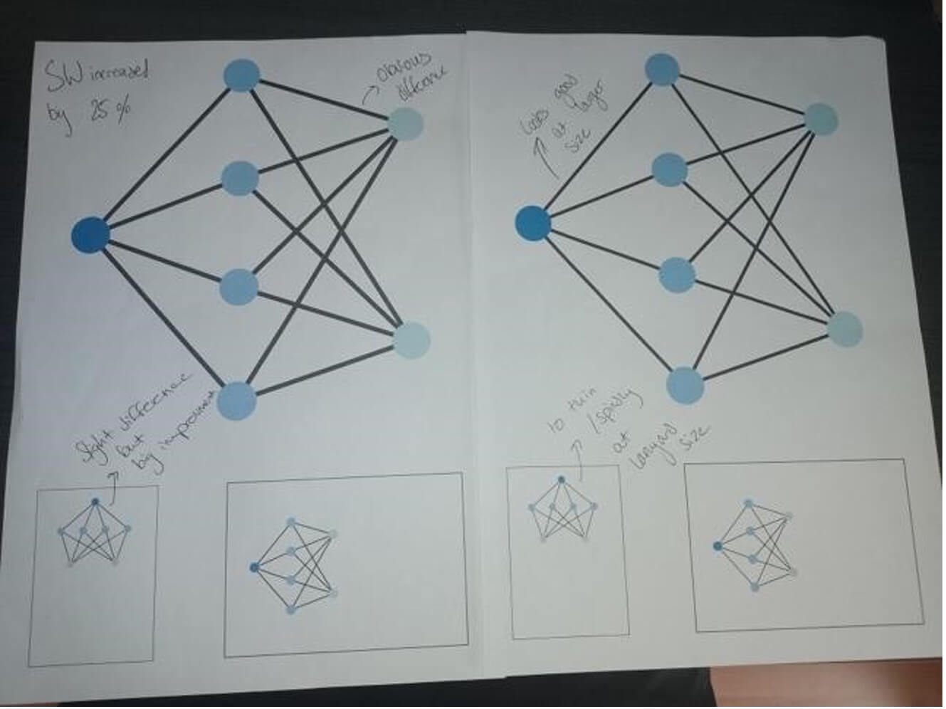
Figure 11: Icon Experimentation

Finally, after meetings with both our client and the University of Reading Marketing Department regarding layout and scaling, our logo design was complete. Two logos were created in both landscape and square formats (fig 12) and were exported into a logo suite with both EPS and PNG files.
Figure 12: Finalised landscape and portrait logos

BANNER

Once the logo had been completed, work on the other deliverables began. The client has informed us that the banner would be both used in the backing of the upcoming symposium as well as in the setting of a podcast studio. Furthermore, the banner would need to include the logos of both the University of Reading and the AHRC (Arts & Humanities Research Council).

The process began with a meeting. The client had a preference for a pattern on the banner, as the banner had a relatively low amount of content on it. The patterns needed to both fit the visual style of the logo and allow for possible branding applications (fig 13).
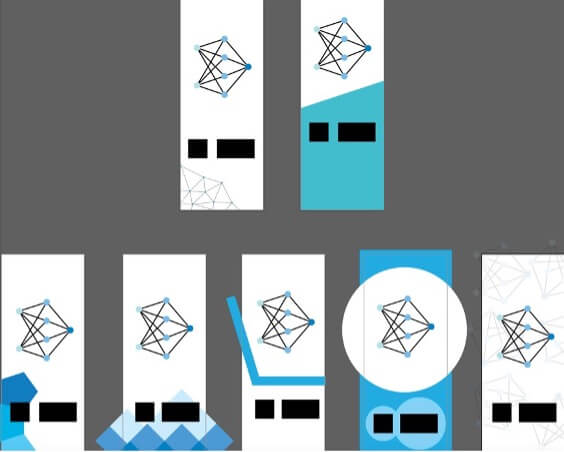
Figure 13: Banner Experimentation

After multiple variations were shown, the client preference was for a brush stroke pattern. This pattern was based on expression of the creative side of Synthetic Media and AI (figure 14).
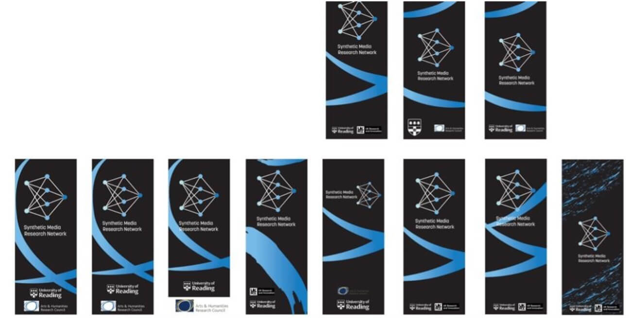
Figure 14: Brush stroke pattern banners

Due to the logos being on both black and white backgrounds, the client thought it appropriate to have two banners on black and white. However, as the

design variations continued, the client chose the banner on a black background and decided that the team should only take that forward.

After testing variations (fig 15), we found the differentiation used in the typographic element of the logo was applicable for use on the title of the banner, creating a stacked effect (fig 16). The stacked title was used to allow the text to be as large as possible. This was essential as the text would need to be visible in the back of a podcast that may be watched on a phone/smaller screen.
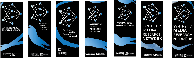
Figure 15: Banner text variation
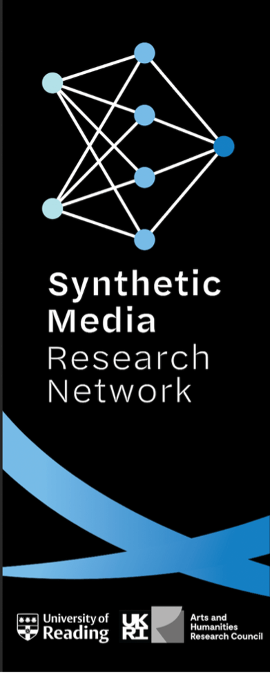
Figure 16: Final banner text

Finally, a meeting with the University of Reading Marketing Department took place. Here, both teams and the client discussed layout and the necessary sizes for the UoR and AHRC logos. The SMRN logo on the banner was placed high, so it could be above head height during the symposium. This caused the logos for UoR and AHRC to be placed on the bottom of the page next to each other, allowing for equal hierarchy (fig 17).
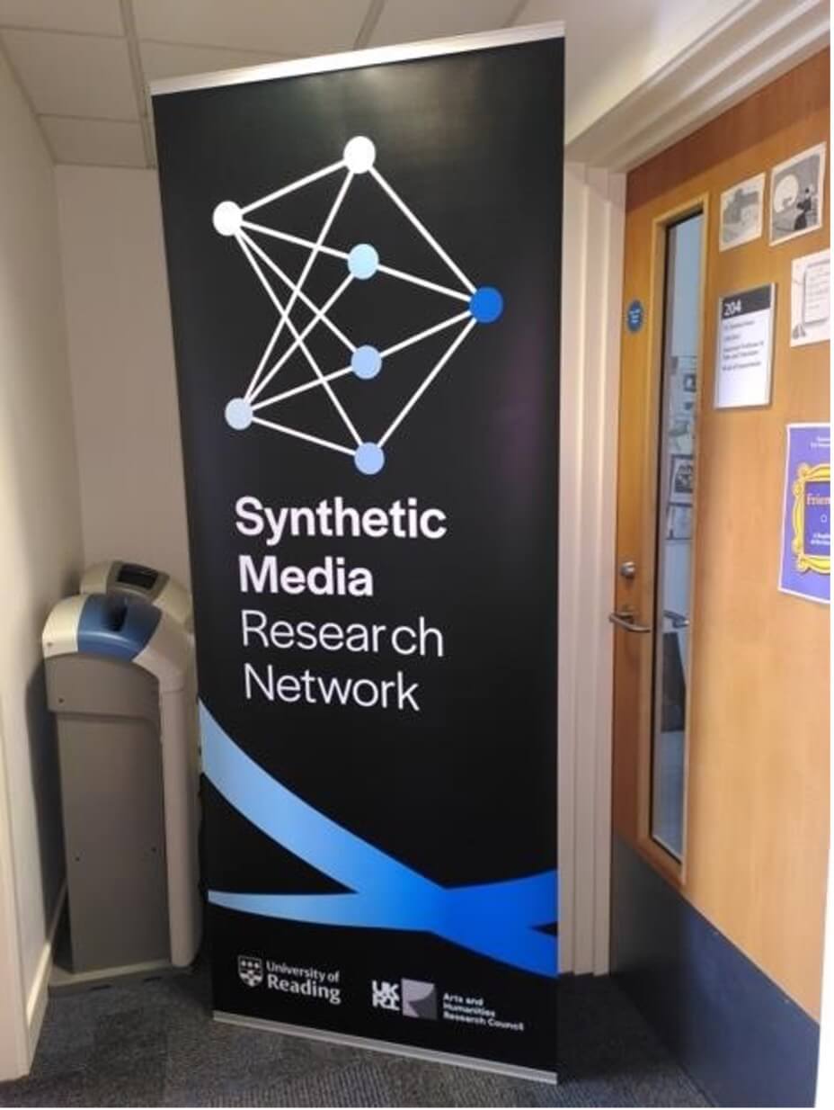
Figure 17: Final banner

PROGRAMME

As the project continued, another deliverable was introduced. The client required a 4-page A4 programme that would be provided to attendees of the symposium. This programme would include information about the genesis of the research network, the schedule for the symposium, and introductions for each of the guest speakers that would be attending the symposium. During a meeting with the client, the team discussed ways in which the schedule could be used. We suggested removing the schedule from the programme, to allow for more space on the pages. After discussion, the client insisted that the schedule should be on the programme as every attendee would be given one. For this to happen, he agreed to compromise and shorten the body copy to allow everything to fit.

As the programme would be used in the same event as the banner, the team and client both expressed that the same brush stroke decoration should be used. However, due to the large amount of content within the programme, designs in which used copious brush strokes were inappropriate. Also due to the content size, the programme could not have a typical ‘cover page’. A 6-page booklet was suggested, however due to the ease of printing a 4-page spread the client was reluctant.

During the design process for the programme, several meetings with the client aided in informing us of our direction. The design needed to be clean and concise, as well as effectively highlight key pieces of information relevant to the upcoming symposium. These two key pieces of advice from client and tutor encouraged a large shift regarding how space and hierarchy was utilised within the design. The front page (figure 18) was changed massively due to this feedback. Thanks to the client’s willingness to allow the introductory paragraph further space and reduce their own, we were able to effectively balance the paragraphs of text on the page.
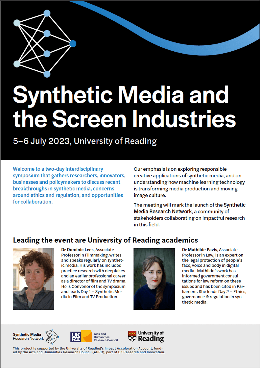
Figure 18: Programme front page

The inside pages (figure 19) consisted of the schedule. Paragraph rules, colour, alignment, and use of space allowed for the design, which initially was overpopulated and cramped, to become clearer and more legible.
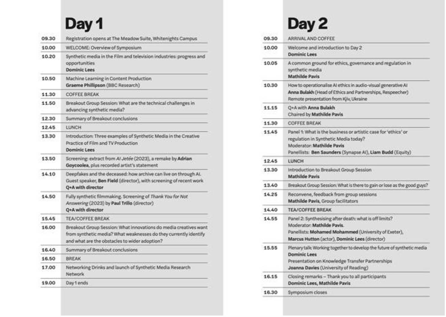
Figure 19: Programme inside pages

Finally, the back page (figure 20) included the guest speakers. Again, colour and space is used to effectively separate the speakers. On top of this, appropriate and consistent formatting is used.
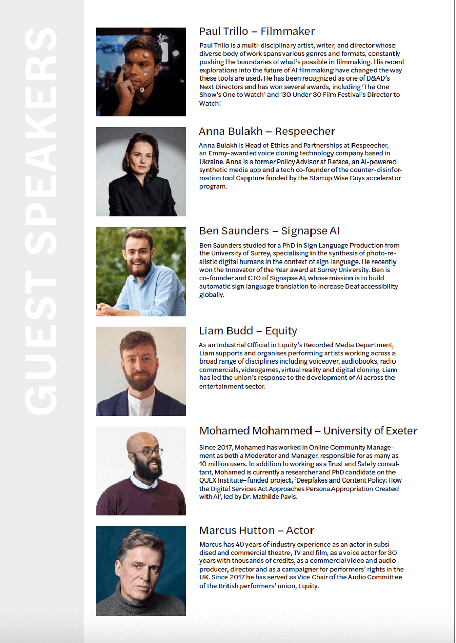
Figure 20: Programme back page

FOAMBOARD

The final deliverable was introduced late into the project by the client. They required a 300mm  630mm foamboard that would be used on the front facing side of a lectern during the upcoming symposium. This project proved to be simple as the client had expressed his vision for this board clearly. The client simply required the landscape black and white logo for the brand, centred on the board (fig 21). After formatting the design for print as well as final meetings with the client, the final deliverable for the project was completed.
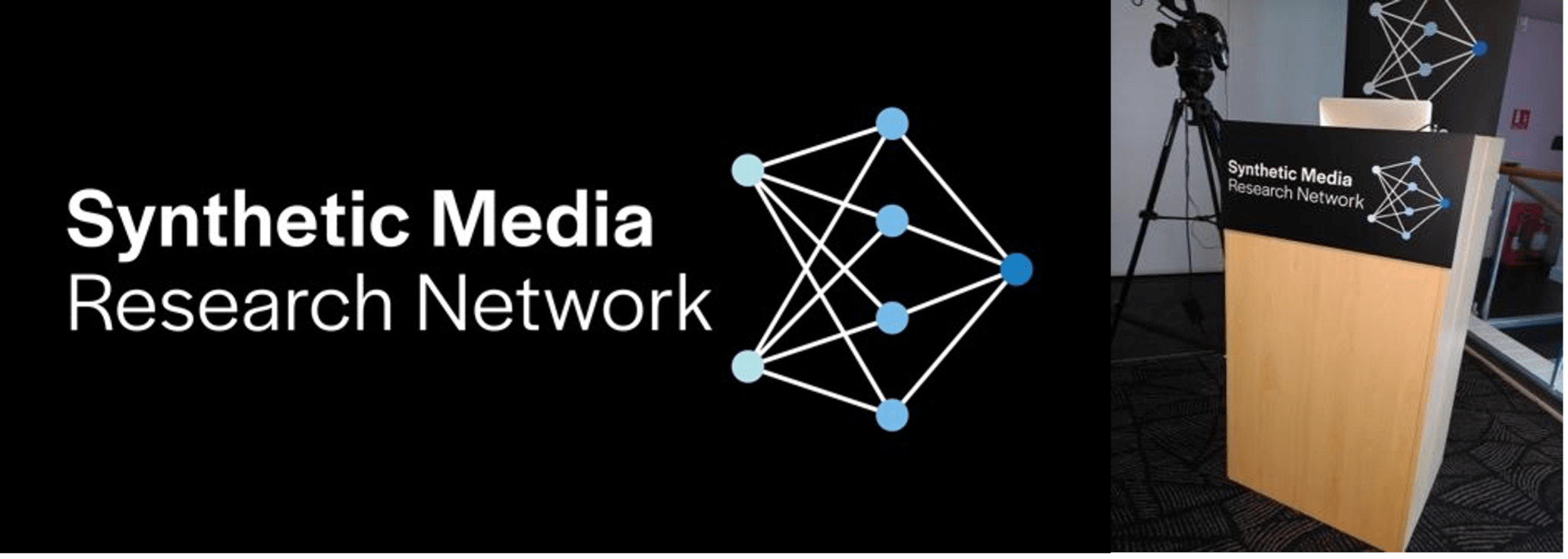
Figure 21: Final foamboard

REFLECTION

This was our first Real Jobs Project, and the experience was both educational and challenging. Despite the various complications such as timescale, illness, and inexperience, we believe we handled this project with both professionalism and skill. Unfortunately, our supervisor was unwell in the early stages of the project, and this caused us to work more independently than is normally expected. We contacted an alternative Real Jobs supervisor when we encountered obstacles during the process. They were able to help us work through problems until our supervisor returned. We believe we came to the correct conclusions in terms of creating effective designs during this period, and when our supervisor was back we updated her with all work and progress made. Furthermore, our consistent planning and communication with the client allowed for us to keep their input relevant in all scenarios, therefore ensuring the client is happy with all work created.

This project’s timescale meant that certain sections of this project we would have liked to complete in a more professional manner. For example, whilst only being able to create small presentations for our design proposals, we would have preferred to create intricate proposals which could include mock-ups and inspiration. This would have aided us in keeping the client meetings cleaner and more efficient. On the other hand, we feel we were very organised during a hectic period, and kept to a timetable well even when the client was expanding the brief.

Aaron

“I have thoroughly enjoyed this project, as not only has it leant into my areas of interest within graphic design, but it has also given me an insight into how the industry operates. I have gained experience in client-facing situations alongside design skills. This project has made me eager to pursue further real jobs in this area of design, and push for more client-facing/management roles.”

Jony

“This job provided a unique set of challenges for us. Working with the team and the client to overcome these and produce finalised deliverables was very rewarding and satisfying. This was a great job to complete and have under my belt, as I feel the experience I obtained from this Real Job will help me excel in future Real Jobs.”
Gavin Strange: Motion Design

For our penultimate Baseline Shift session of the year, we were joined by the talented Gavin Strange, Director and Designer for Bristol’s Aardman, and “a passion project pursuer under the alias, JamFactory”.


Creative journey

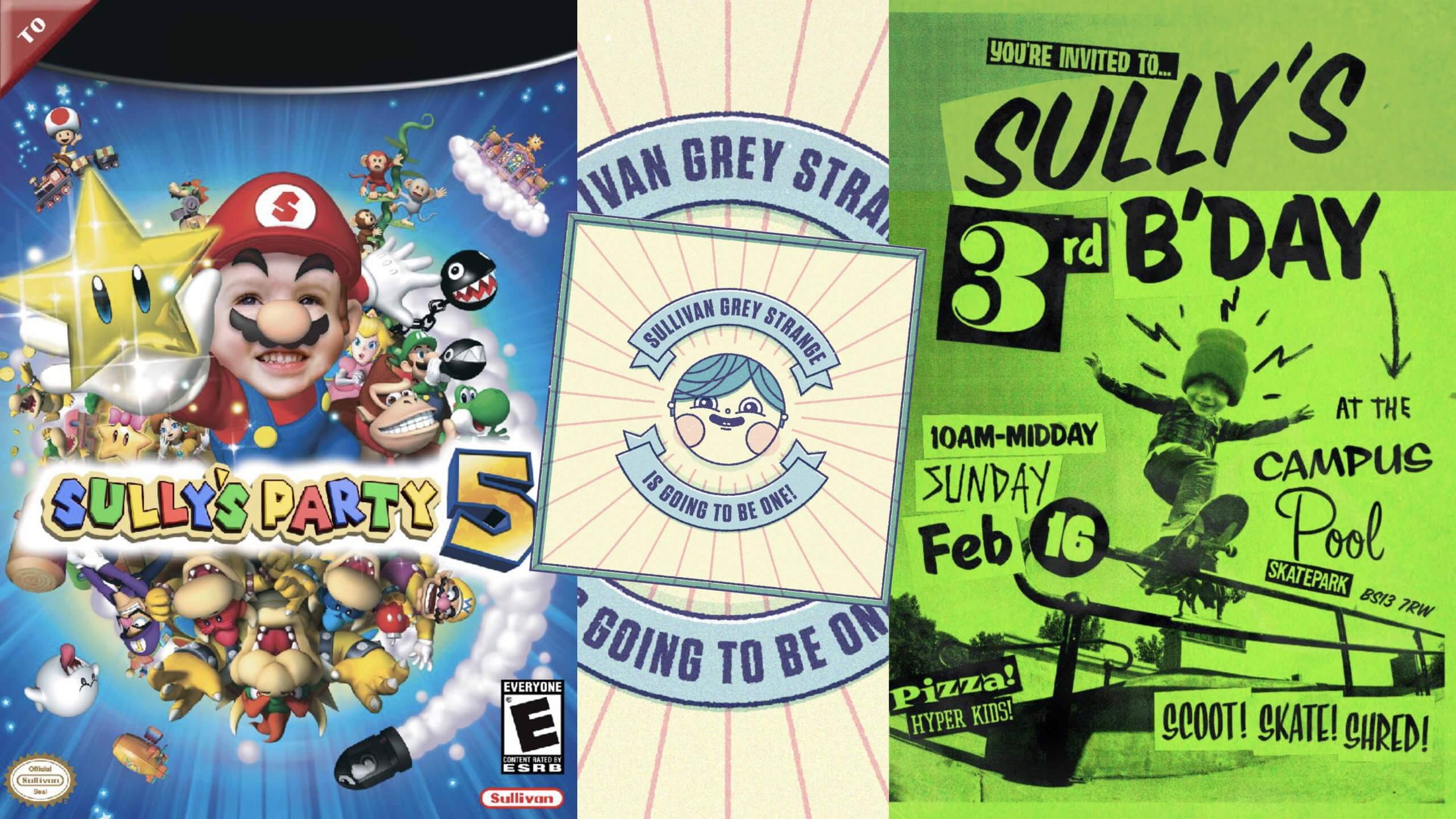
Gavin began by emphasising how important moving to Bristol 20 years ago was in his journey as a young creative, explaining how rich in art and culture the city is. Alongside Bristol being a pertinent source of inspiration, Gavin also highlighted how important his children are for keeping him motivated and creatively-engaged. Producing fantastically vibrant invites for their birthday parties and even creating them their own Duplo pinball machine, Gavin stresses that “the more you do, the easier it is to stay creative” even if it’s “for the sake of it”.

Playful family projects


Aardman

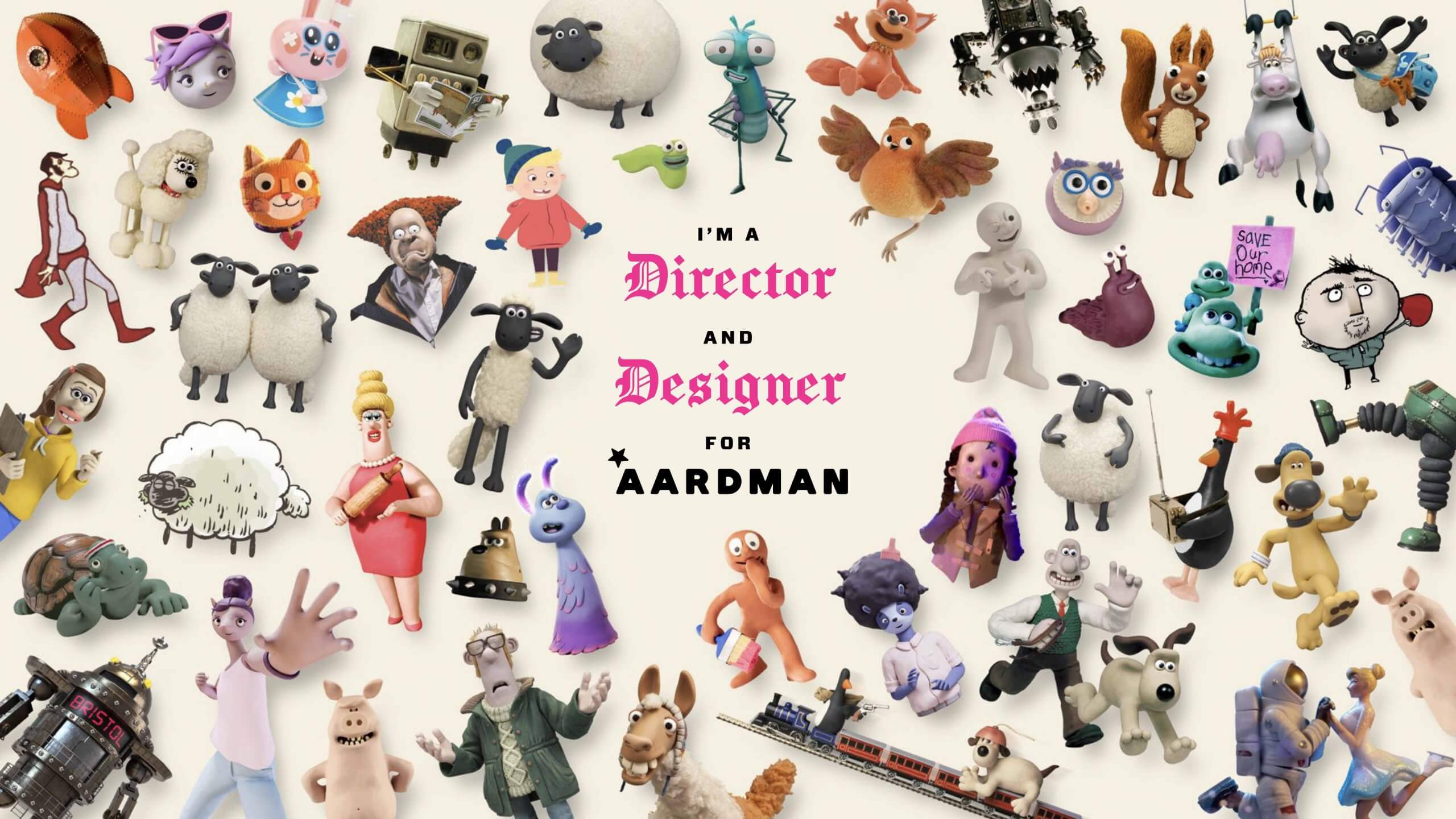
Aardman is a Bristol-based, stop-frame animation specialist studio that most notably animates productions such as Shaun the Sheep, Wallace and Gromit and Chicken Run. Gavin first joined the studio as a Senior Digital Designer while continuing to make passion project films and motion graphics under the alias, JamFactory. Eventually, Gavin’s love for filmmaking bled into his work at Aardman, leading to him officially becoming Director and Designer for the studio. Gavin resonates with the human-natured ethos of Aardman, finding value in working with other humans, opting for “human intelligence” as opposed to “the two letters” (referring to AI).

Showcase of characters animated by Aardman


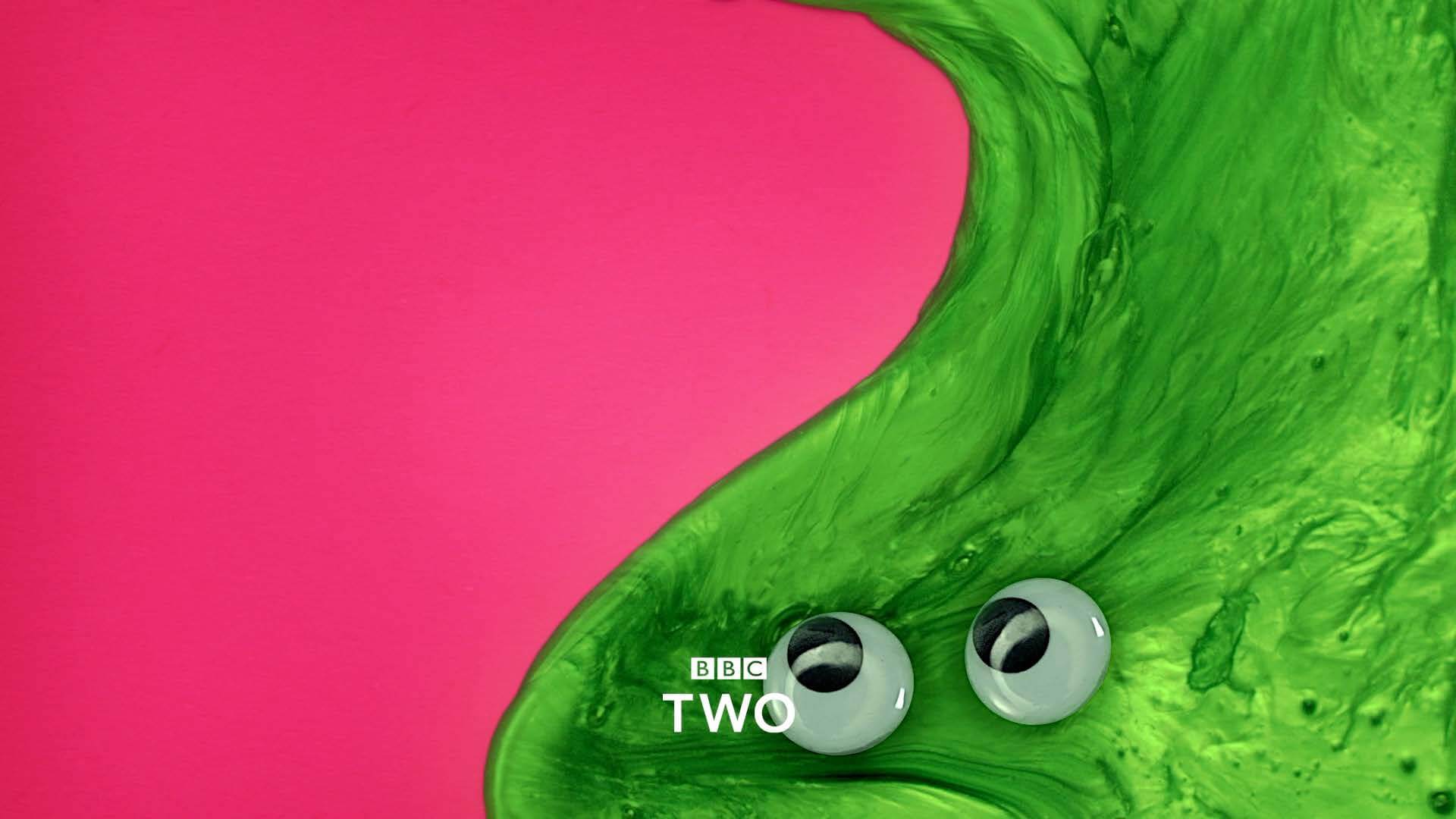
Gavin articulated how much he enjoys the variety that comes with working for Aardman, for example, in one project he might be making a “stop-frame, live-action, motion-graphic, rap video, title sequence” for the OFFF Festival in Barcelona, and in another, he’s working with “real-life slime and magnetically-puppeteered eyeballs” to produce programme transition cards for BBC Two. The dual role Gavin has at Aardman means that when he’s not directing, he’s designing, for instance, making motion graphics animation scenes featuring Wallce and Gromit’s smart gnome character ‘Norbot’ for their 2024 Christmas special, hiding jokes and gags in segments of the scenes. This way of working is great for Gavin as it allows him to contribute to both creative outlets.

BBC Two slime programme transition card


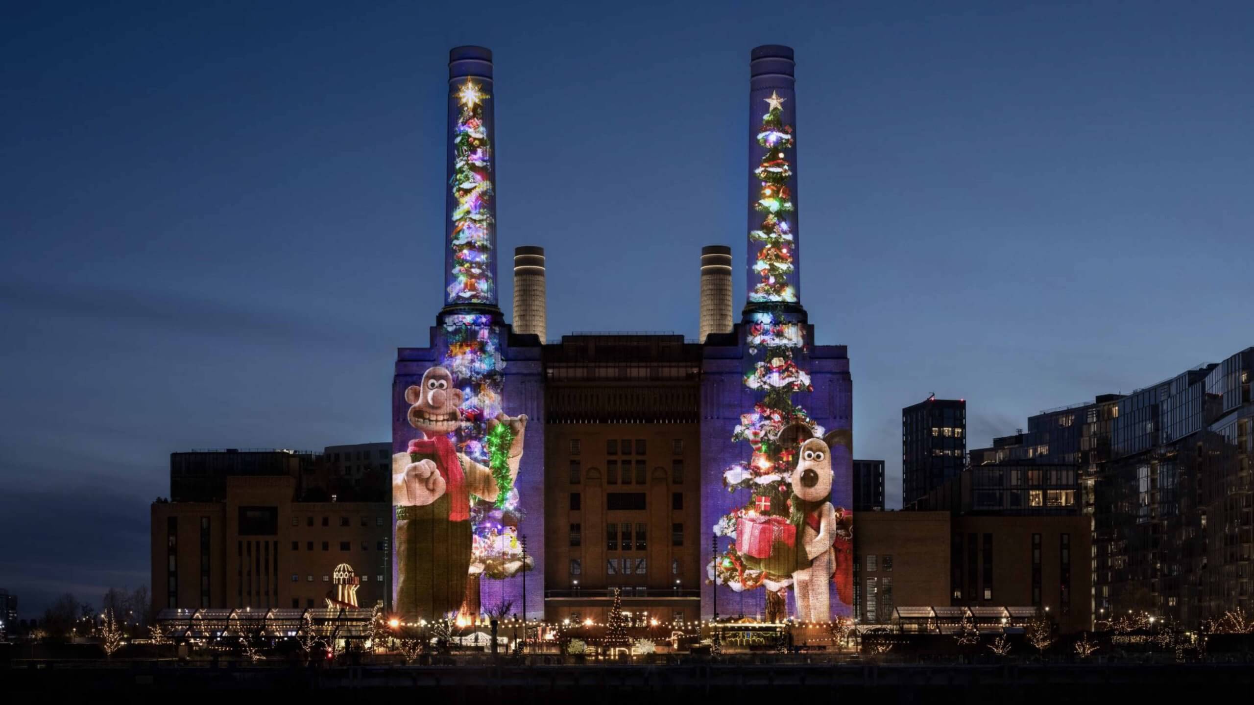
Working at Aardman also means the scale of the brief can be large, specifically as large as Battersea Power Station, where Gavin and his team projected animations of Wallace and Gromit for a project titled ‘Wallace and Gromit, shot on iPhone‘ onto the front of the building. The animation was entirely shot on an iPhone 16 Pro Max and was in collaboration with Apple. The projection was a whopping 101 metres tall and was shown every night of December 2024. Gavin related all of these projects back to his philosophy of “never knowing where things will take you” and “keeping your tools sharp”, stating that while we all have responsibilities during the day, as creatives, we should allow these responsibilities to spawn seeds of ideas to expand upon at night – which is precisely what Gavin has done for the past 25 years with JamFactory.

'Wallace and Gromit, shot on iPhone'
‘Wallace and Gromit, shot on iPhone’


Passion projects

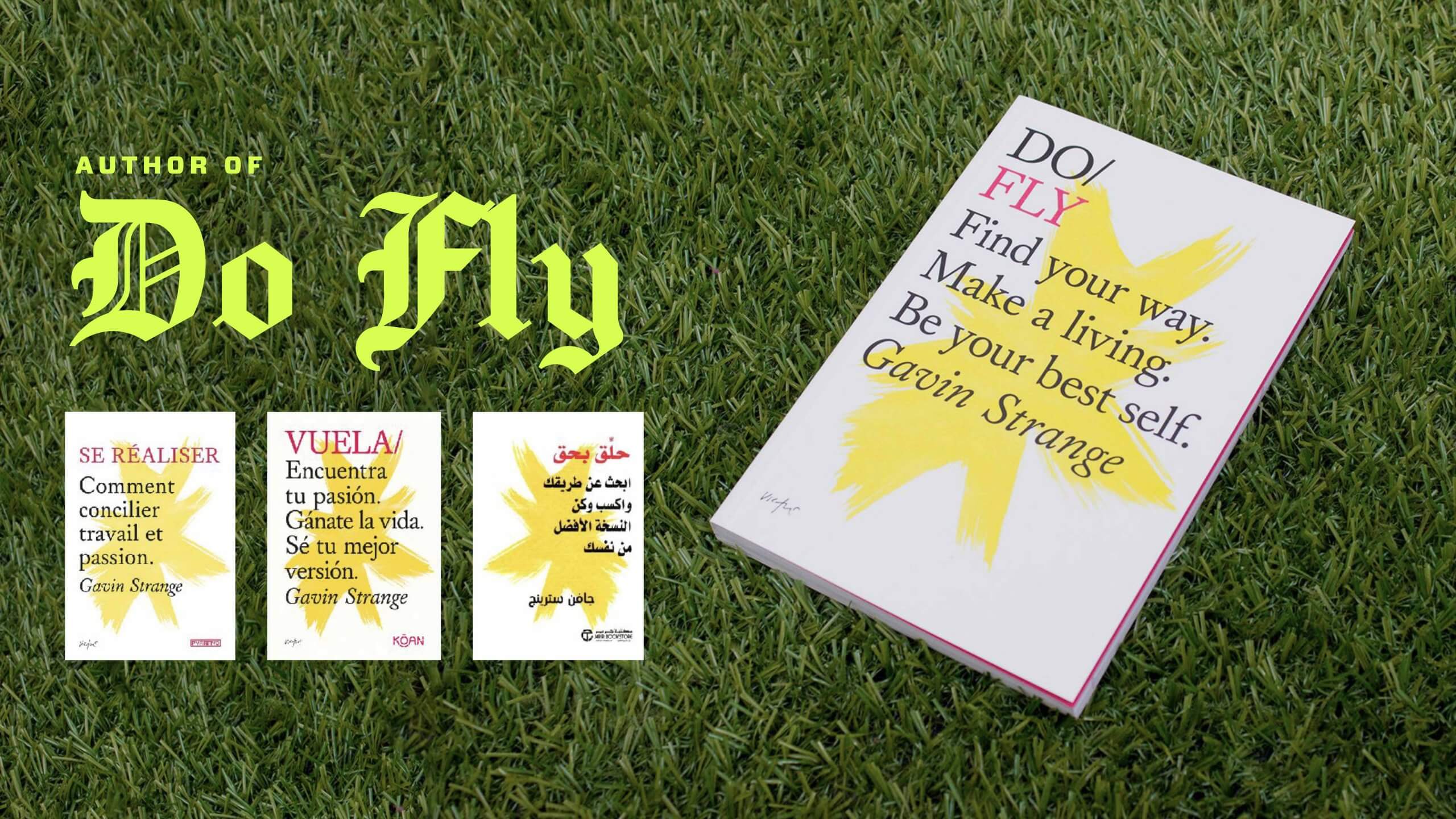
Outside of animating and designing, Gavin also has a vibrant passion for combining MIDI audio signals from his retro gaming gear into real-time visuals. Most recently, Gavin created a title-sequence for his friend in Dusseldorf, Germany and performed a “silly musical interlude” live at the event. Gavin mentioned that before pushing himself to expose his passion projects to an audience, he “was so preoccupied with worrying about what others were thinking, [he] was stopping [him]self from pushing forward”. Gavin has even written a motivational book ‘Do Fly‘ – something his English teacher would ‘never ever deem as being part of the plan’. This anecdote of believing in your own ability and pushing yourself to do the unexpected, is something that resonated with many of the students listening.

Gavin's motivational book 'Do Fly'
Gavin’s motivational book ‘Do Fly’


Creating your own space

Gavin emphasised the importance of carving out and creating your own space as a creative to make things happen both physically and digitally. He offered students the valuable advice; “you won’t stand out unless you’ve told someone what you’re capable of”, and while it is important to display your primary skills (those that you’re most capable at), it is equally important to showcase your secondary and tertiary skills. Gavin highlighted his maximalist outlook of presenting work; advising that we choose a method of presenting that represents us as designers. Students were left with one last piece of advice; “if I find my voice, then my audience will find me”.


Key takeaways

  • Don’t wait to be asked.
  • Seek creative satisfaction wherever you can get it.
  • Less thinkering, more tinkering.
  • Be productive, not precious.
  • Make portfolio full of work you want to be hired for.
  • Always keep your tools sharp.


– Written by Oscar Dudley